
Search results for "Increasingly prioritizing" in Home Design Ideas
 SERGIO HALFON | Architecture & Interior Design
English – Project Description
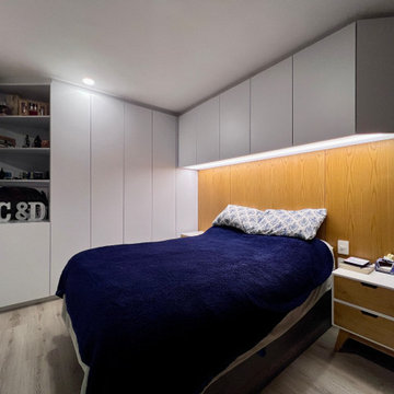
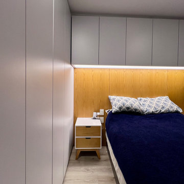
This project involved the complete transformation of a small bedroom in Mexico City, redefining the space through integrated architectural millwork and a clear, cohesive design strategy.
Prior to the intervention, the room lacked sufficient storage and contained a mix of unrelated furniture pieces that created visual clutter and inefficient use of space. The design addressed these limitations by replacing all existing furniture with custom-built elements conceived as part of the architectural envelope.
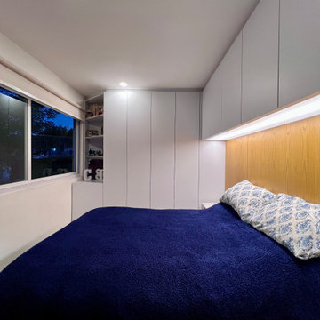
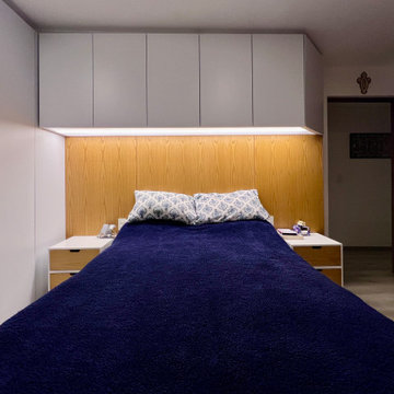
Two full-height closets were designed to significantly increase storage capacity and establish visual order. One closet was executed during the initial phase, with the second planned for future implementation to further optimize the space. In addition, a continuous storage volume was integrated above the bed, incorporating concealed compartments and linear integrated lighting that provides soft, indirect illumination.
A wood headboard panel was introduced to bring warmth and material balance to the composition, contrasting with the clean, neutral millwork and reinforcing the architectural identity of the space.
By consolidating storage into integrated elements and eliminating fragmented furniture, the intervention freed usable floor area, improved circulation, and created a calm, organized, and visually coherent environment. The result is a contemporary bedroom that prioritizes spatial clarity, functional efficiency, and material harmony through precise architectural integration.
Español – Descripción del Proyecto
Este proyecto consistió en la transformación completa de una recámara pequeña en la Ciudad de México, redefiniendo el espacio mediante carpintería arquitectónica integrada y una estrategia de diseño clara y coherente.
Antes de la intervención, la recámara carecía de suficiente espacio de guardado y contenía una mezcla de muebles sin relación entre sí, lo que generaba desorden visual y un uso ineficiente del espacio. El diseño resolvió estas limitaciones reemplazando el mobiliario existente por elementos hechos a medida, concebidos como parte de la arquitectura.
Se diseñaron dos closets de altura completa para incrementar significativamente la capacidad de almacenamiento y establecer orden visual. Uno de los closets fue construido en la primera etapa, mientras que el segundo está previsto para una futura implementación, con el fin de optimizar aún más el espacio. Adicionalmente, se integró un volumen continuo de guardado sobre la cama, incorporando compartimentos ocultos e iluminación lineal integrada que proporciona luz indirecta y uniforme.
Se introdujo un panel de madera como cabecera para aportar calidez y balance material a la composición, contrastando con la carpintería neutra y reforzando la identidad arquitectónica del espacio.
Al consolidar el almacenamiento en elementos integrados y eliminar el mobiliario fragmentado, la intervención liberó superficie útil, mejoró la circulación y creó un ambiente tranquilo, ordenado y visualmente coherente. El resultado es una recámara contemporánea que prioriza la claridad espacial, la eficiencia funcional y la armonía material mediante una integración arquitectónica precisa.
 KURV Architecture DPC (Alex Hughes Architects)
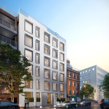
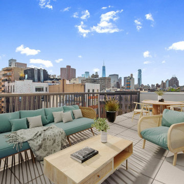
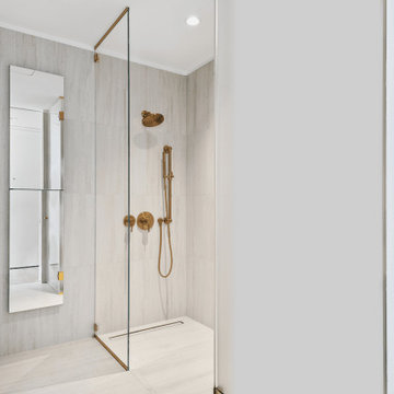
Located in the heart of Manhattan’s Lower East Side, the building was erected on a shallow commercial lot between two 120 year old masonry buildings and a new residential rental building. 330 Grand Street is a mix of 725 SF 1BRs and 1050 SF 2BR apartments. It also contains a 1100 SF two story duplex as well as private and public rooftop space, large private balconies for most units and two large private terraces for the ground floor units.
330 Grand Street was originally designed and approved at the NYC DOB as a prefabricated modular building. During the pandemic, as shipping costs skyrocketed putting the project at risk, we suggested redesigning the building as a reinforced cast-in-place concrete structure. Concrete was readily available and prices had not been affected by the demand increase that many other materials suffered in the pandemic. We took this opportunity to raise floor to ceiling heights, enlarge high performance windows and redistribute the buildings MEPFS and Structural Systems to create very open floor plans.
The challenge was to create a luxurious sensorial living experience with very limited means. In a city with very high construction costs, low cost residential buildings in the area are usually devoid of good quality, design and character. Our approach was to aim high for the end user, prioritizing natural light, open space with long visual perspectives, high ceilings and as always, rejecting the use of predefined building templates.
Our biggest challenge was to ensure that the small spaces feel as clean cut, large and bright as possible. Several unique design decisions were made to ensure low cost and high quality;
Floor plans were laid out so that spaces were wide open and free of clutter from mechanical or structural interruptions. Therefore all infrastructure was placed in lateral demising walls, which in turn act as the unit’s storage and kitchen. The apartments feel wide open, are super quiet and have more storage space than any other comparable apartment in the city.
To solve the problem of the site’s shallow commercial lot which is typically prone to dark interior spaces we focused our attention on the building’s envelope. Instead of the usual small punched window openings, oversized high performance windows were designed to ensure that light penetrated as far as possible into the units. In the smaller 1BR units, the full 50’ depth of the lot is perceived by partitioning spaces with sliding pocket doors that can be retracted to allow deep visual perspectives, making the sight lines in the space feel longer, larger, more ample than normal. In addition to the full height glazing, each unit above the 2nd floor receives a 7 foot covered balcony, adding 120 to 240 sf to each apartment, something unusual in New York City buildings. The space is large enough for a full size dining table, when the weather permits being outside.
We also worked hard to ensure modularity. For example, all kitchen units are all identical throughout the building. The idea of modularity and the economy of the repetitive unit is exercised to the maximum through the building.
Hardware, appliances, flooring, wall coverings and material finishes are all carefully selected to feel bespoke, high quality and unique.
It was important to KURV that the result of this work manifest into something that would deeply connect with the end user and sustain relationships with the consumers of this space.
All images by KURV Architecture ©
 SERGIO HALFON | Architecture & Interior Design
English – Project Description
This project involved the complete transformation of a small bedroom in Mexico City, redefining the space through integrated architectural millwork and a clear, cohesive design strategy.
Prior to the intervention, the room lacked sufficient storage and contained a mix of unrelated furniture pieces that created visual clutter and inefficient use of space. The design addressed these limitations by replacing all existing furniture with custom-built elements conceived as part of the architectural envelope.
Two full-height closets were designed to significantly increase storage capacity and establish visual order. One closet was executed during the initial phase, with the second planned for future implementation to further optimize the space. In addition, a continuous storage volume was integrated above the bed, incorporating concealed compartments and linear integrated lighting that provides soft, indirect illumination.
A wood headboard panel was introduced to bring warmth and material balance to the composition, contrasting with the clean, neutral millwork and reinforcing the architectural identity of the space.
By consolidating storage into integrated elements and eliminating fragmented furniture, the intervention freed usable floor area, improved circulation, and created a calm, organized, and visually coherent environment. The result is a contemporary bedroom that prioritizes spatial clarity, functional efficiency, and material harmony through precise architectural integration.
Español – Descripción del Proyecto
Este proyecto consistió en la transformación completa de una recámara pequeña en la Ciudad de México, redefiniendo el espacio mediante carpintería arquitectónica integrada y una estrategia de diseño clara y coherente.
Antes de la intervención, la recámara carecía de suficiente espacio de guardado y contenía una mezcla de muebles sin relación entre sí, lo que generaba desorden visual y un uso ineficiente del espacio. El diseño resolvió estas limitaciones reemplazando el mobiliario existente por elementos hechos a medida, concebidos como parte de la arquitectura.
Se diseñaron dos closets de altura completa para incrementar significativamente la capacidad de almacenamiento y establecer orden visual. Uno de los closets fue construido en la primera etapa, mientras que el segundo está previsto para una futura implementación, con el fin de optimizar aún más el espacio. Adicionalmente, se integró un volumen continuo de guardado sobre la cama, incorporando compartimentos ocultos e iluminación lineal integrada que proporciona luz indirecta y uniforme.
Se introdujo un panel de madera como cabecera para aportar calidez y balance material a la composición, contrastando con la carpintería neutra y reforzando la identidad arquitectónica del espacio.
Al consolidar el almacenamiento en elementos integrados y eliminar el mobiliario fragmentado, la intervención liberó superficie útil, mejoró la circulación y creó un ambiente tranquilo, ordenado y visualmente coherente. El resultado es una recámara contemporánea que prioriza la claridad espacial, la eficiencia funcional y la armonía material mediante una integración arquitectónica precisa.
Find the right local pro for your project
 KURV Architecture DPC (Alex Hughes Architects)
Located in the heart of Manhattan’s Lower East Side, the building was erected on a shallow commercial lot between two 120 year old masonry buildings and a new residential rental building. 330 Grand Street is a mix of 725 SF 1BRs and 1050 SF 2BR apartments. It also contains a 1100 SF two story duplex as well as private and public rooftop space, large private balconies for most units and two large private terraces for the ground floor units.
330 Grand Street was originally designed and approved at the NYC DOB as a prefabricated modular building. During the pandemic, as shipping costs skyrocketed putting the project at risk, we suggested redesigning the building as a reinforced cast-in-place concrete structure. Concrete was readily available and prices had not been affected by the demand increase that many other materials suffered in the pandemic. We took this opportunity to raise floor to ceiling heights, enlarge high performance windows and redistribute the buildings MEPFS and Structural Systems to create very open floor plans.
The challenge was to create a luxurious sensorial living experience with very limited means. In a city with very high construction costs, low cost residential buildings in the area are usually devoid of good quality, design and character. Our approach was to aim high for the end user, prioritizing natural light, open space with long visual perspectives, high ceilings and as always, rejecting the use of predefined building templates.
Our biggest challenge was to ensure that the small spaces feel as clean cut, large and bright as possible. Several unique design decisions were made to ensure low cost and high quality;
Floor plans were laid out so that spaces were wide open and free of clutter from mechanical or structural interruptions. Therefore all infrastructure was placed in lateral demising walls, which in turn act as the unit’s storage and kitchen. The apartments feel wide open, are super quiet and have more storage space than any other comparable apartment in the city.
To solve the problem of the site’s shallow commercial lot which is typically prone to dark interior spaces we focused our attention on the building’s envelope. Instead of the usual small punched window openings, oversized high performance windows were designed to ensure that light penetrated as far as possible into the units. In the smaller 1BR units, the full 50’ depth of the lot is perceived by partitioning spaces with sliding pocket doors that can be retracted to allow deep visual perspectives, making the sight lines in the space feel longer, larger, more ample than normal. In addition to the full height glazing, each unit above the 2nd floor receives a 7 foot covered balcony, adding 120 to 240 sf to each apartment, something unusual in New York City buildings. The space is large enough for a full size dining table, when the weather permits being outside.
We also worked hard to ensure modularity. For example, all kitchen units are all identical throughout the building. The idea of modularity and the economy of the repetitive unit is exercised to the maximum through the building.
Hardware, appliances, flooring, wall coverings and material finishes are all carefully selected to feel bespoke, high quality and unique.
It was important to KURV that the result of this work manifest into something that would deeply connect with the end user and sustain relationships with the consumers of this space.
All images by KURV Architecture ©
 SERGIO HALFON | Architecture & Interior Design
English – Project Description
This project involved the complete transformation of a small bedroom in Mexico City, redefining the space through integrated architectural millwork and a clear, cohesive design strategy.
Prior to the intervention, the room lacked sufficient storage and contained a mix of unrelated furniture pieces that created visual clutter and inefficient use of space. The design addressed these limitations by replacing all existing furniture with custom-built elements conceived as part of the architectural envelope.
Two full-height closets were designed to significantly increase storage capacity and establish visual order. One closet was executed during the initial phase, with the second planned for future implementation to further optimize the space. In addition, a continuous storage volume was integrated above the bed, incorporating concealed compartments and linear integrated lighting that provides soft, indirect illumination.
A wood headboard panel was introduced to bring warmth and material balance to the composition, contrasting with the clean, neutral millwork and reinforcing the architectural identity of the space.
By consolidating storage into integrated elements and eliminating fragmented furniture, the intervention freed usable floor area, improved circulation, and created a calm, organized, and visually coherent environment. The result is a contemporary bedroom that prioritizes spatial clarity, functional efficiency, and material harmony through precise architectural integration.
Español – Descripción del Proyecto
Este proyecto consistió en la transformación completa de una recámara pequeña en la Ciudad de México, redefiniendo el espacio mediante carpintería arquitectónica integrada y una estrategia de diseño clara y coherente.
Antes de la intervención, la recámara carecía de suficiente espacio de guardado y contenía una mezcla de muebles sin relación entre sí, lo que generaba desorden visual y un uso ineficiente del espacio. El diseño resolvió estas limitaciones reemplazando el mobiliario existente por elementos hechos a medida, concebidos como parte de la arquitectura.
Se diseñaron dos closets de altura completa para incrementar significativamente la capacidad de almacenamiento y establecer orden visual. Uno de los closets fue construido en la primera etapa, mientras que el segundo está previsto para una futura implementación, con el fin de optimizar aún más el espacio. Adicionalmente, se integró un volumen continuo de guardado sobre la cama, incorporando compartimentos ocultos e iluminación lineal integrada que proporciona luz indirecta y uniforme.
Se introdujo un panel de madera como cabecera para aportar calidez y balance material a la composición, contrastando con la carpintería neutra y reforzando la identidad arquitectónica del espacio.
Al consolidar el almacenamiento en elementos integrados y eliminar el mobiliario fragmentado, la intervención liberó superficie útil, mejoró la circulación y creó un ambiente tranquilo, ordenado y visualmente coherente. El resultado es una recámara contemporánea que prioriza la claridad espacial, la eficiencia funcional y la armonía material mediante una integración arquitectónica precisa.
 M3Decks & Outdoor Living
Woodinville WA Phased Farmhouse Transformation Project
Project Overview
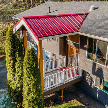
In Woodinville, WA, our team at M3Decks & Outdoor Living executed a multi-phase, three-year transformation of a 1970s woody walk-up home, converting it into a stunning farmhouse-style retreat. This project, tailored to the client’s vision, showcases our expertise in custom deck construction, structural enhancements, and outdoor living solutions, with a focus on quality and timeless design.
Project Phases
Phase 1: Deck and Entry Deck (Year 1)
Scope: Designed and constructed a composite deck using premium TimberTech materials, paired with a welcoming entry deck to enhance curb appeal. The decks were built with Fortress Steel Framing for durability, aligning with the farmhouse aesthetic through clean lines and rustic charm.
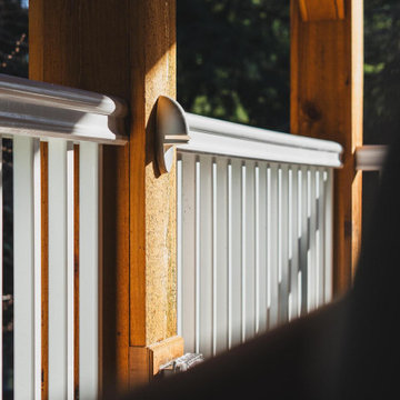
Features: Incorporated a multi-level layout to maximize usable space, with decorative railings and a drink rail cap for functionality and style.
Outcome: The new decks provided a seamless indoor-outdoor flow, transforming the home’s exterior into a functional and inviting space.
Phase 2: Roof Extension and DrySpace Installation (Year 2)
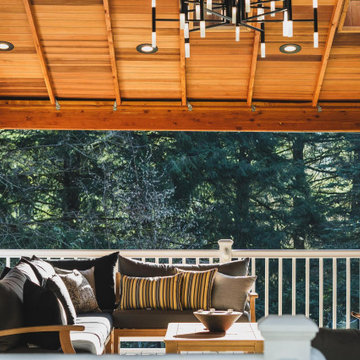
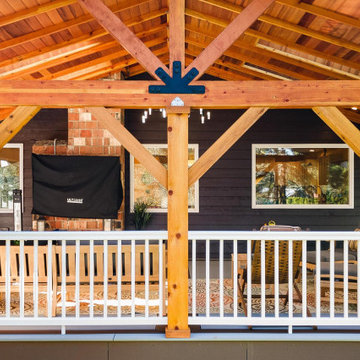
Scope: Extended the roof over the second-story deck and entryway to create a covered outdoor living area. Installed TimberTech DrySpace under the deck to create a dry, usable space below, ideal for a future hot tub.
Design Elements: The roof extension featured farmhouse-inspired gabled roofing with exposed beams, complementing the home’s updated aesthetic. The DrySpace system ensured weather protection for the under-deck area.
Outcome: The covered deck became a year-round outdoor oasis, while the DrySpace addition increased the home’s functional space, adding value and versatility.
Phase 3: Hardscaping (Planned for Year 3)
Scope: Scheduled to return for the final phase, which will focus on hardscaping to complete the outdoor transformation. Plans include a stamped concrete patio, planter boxes with Pacific Northwest-native plants, and a fire pit to enhance the farmhouse vibe.
Goals: Create a cohesive outdoor environment that integrates with the existing deck and roof structures, prioritizing biophilic design principles for a natural, inviting space.
Anticipated Outcome: The hardscaping will finalize the property’s evolution into a luxurious, functional outdoor retreat, perfect for entertaining and relaxation.
Key Features
Farmhouse Aesthetic: Rustic yet modern design with TimberTech composite decking, exposed beam roofing, and farmhouse-inspired detailing.
TimberTech DrySpace: Innovative under-deck system to ensure a dry, usable space for future additions like a hot tub.
Durable Materials: Fortress Steel Framing and TimberTech products for low-maintenance, long-lasting results.
Phased Approach: Flexible, client-focused construction timeline to accommodate budget and evolving needs.
Outcome
This phased project transformed a dated 1970s walk-up into a modern farmhouse masterpiece, significantly enhancing the home’s aesthetic and functional value. The deck and roof extensions have already elevated the client’s outdoor living experience, and the upcoming hardscaping phase will complete the vision of a cohesive, luxurious backyard retreat. The project exemplifies our commitment to quality craftsmanship and client satisfaction.
Location
Woodinville, WA
Project Type
Residential Phased Design-Build
 KURV Architecture DPC (Alex Hughes Architects)
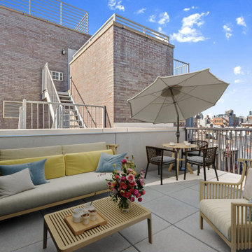
Located in the heart of Manhattan’s Lower East Side, the building was erected on a shallow commercial lot between two 120 year old masonry buildings and a new residential rental building. 330 Grand Street is a mix of 725 SF 1BRs and 1050 SF 2BR apartments. It also contains a 1100 SF two story duplex as well as private and public rooftop space, large private balconies for most units and two large private terraces for the ground floor units.
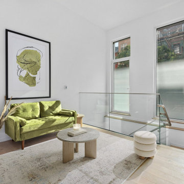
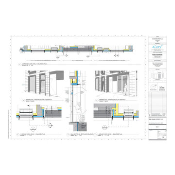
330 Grand Street was originally designed and approved at the NYC DOB as a prefabricated modular building. During the pandemic, as shipping costs skyrocketed putting the project at risk, we suggested redesigning the building as a reinforced cast-in-place concrete structure. Concrete was readily available and prices had not been affected by the demand increase that many other materials suffered in the pandemic. We took this opportunity to raise floor to ceiling heights, enlarge high performance windows and redistribute the buildings MEPFS and Structural Systems to create very open floor plans.
The challenge was to create a luxurious sensorial living experience with very limited means. In a city with very high construction costs, low cost residential buildings in the area are usually devoid of good quality, design and character. Our approach was to aim high for the end user, prioritizing natural light, open space with long visual perspectives, high ceilings and as always, rejecting the use of predefined building templates.
Our biggest challenge was to ensure that the small spaces feel as clean cut, large and bright as possible. Several unique design decisions were made to ensure low cost and high quality;
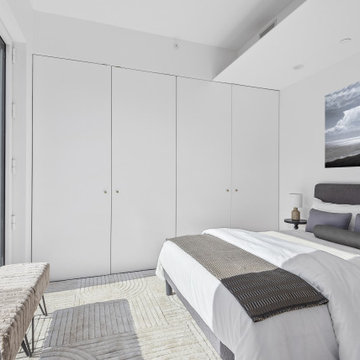
Floor plans were laid out so that spaces were wide open and free of clutter from mechanical or structural interruptions. Therefore all infrastructure was placed in lateral demising walls, which in turn act as the unit’s storage and kitchen. The apartments feel wide open, are super quiet and have more storage space than any other comparable apartment in the city.
To solve the problem of the site’s shallow commercial lot which is typically prone to dark interior spaces we focused our attention on the building’s envelope. Instead of the usual small punched window openings, oversized high performance windows were designed to ensure that light penetrated as far as possible into the units. In the smaller 1BR units, the full 50’ depth of the lot is perceived by partitioning spaces with sliding pocket doors that can be retracted to allow deep visual perspectives, making the sight lines in the space feel longer, larger, more ample than normal. In addition to the full height glazing, each unit above the 2nd floor receives a 7 foot covered balcony, adding 120 to 240 sf to each apartment, something unusual in New York City buildings. The space is large enough for a full size dining table, when the weather permits being outside.
We also worked hard to ensure modularity. For example, all kitchen units are all identical throughout the building. The idea of modularity and the economy of the repetitive unit is exercised to the maximum through the building.
Hardware, appliances, flooring, wall coverings and material finishes are all carefully selected to feel bespoke, high quality and unique.
It was important to KURV that the result of this work manifest into something that would deeply connect with the end user and sustain relationships with the consumers of this space.
All images by KURV Architecture ©
 KURV Architecture DPC (Alex Hughes Architects)
Located in the heart of Manhattan’s Lower East Side, the building was erected on a shallow commercial lot between two 120 year old masonry buildings and a new residential rental building. 330 Grand Street is a mix of 725 SF 1BRs and 1050 SF 2BR apartments. It also contains a 1100 SF two story duplex as well as private and public rooftop space, large private balconies for most units and two large private terraces for the ground floor units.
330 Grand Street was originally designed and approved at the NYC DOB as a prefabricated modular building. During the pandemic, as shipping costs skyrocketed putting the project at risk, we suggested redesigning the building as a reinforced cast-in-place concrete structure. Concrete was readily available and prices had not been affected by the demand increase that many other materials suffered in the pandemic. We took this opportunity to raise floor to ceiling heights, enlarge high performance windows and redistribute the buildings MEPFS and Structural Systems to create very open floor plans.
The challenge was to create a luxurious sensorial living experience with very limited means. In a city with very high construction costs, low cost residential buildings in the area are usually devoid of good quality, design and character. Our approach was to aim high for the end user, prioritizing natural light, open space with long visual perspectives, high ceilings and as always, rejecting the use of predefined building templates.
Our biggest challenge was to ensure that the small spaces feel as clean cut, large and bright as possible. Several unique design decisions were made to ensure low cost and high quality;
Floor plans were laid out so that spaces were wide open and free of clutter from mechanical or structural interruptions. Therefore all infrastructure was placed in lateral demising walls, which in turn act as the unit’s storage and kitchen. The apartments feel wide open, are super quiet and have more storage space than any other comparable apartment in the city.
To solve the problem of the site’s shallow commercial lot which is typically prone to dark interior spaces we focused our attention on the building’s envelope. Instead of the usual small punched window openings, oversized high performance windows were designed to ensure that light penetrated as far as possible into the units. In the smaller 1BR units, the full 50’ depth of the lot is perceived by partitioning spaces with sliding pocket doors that can be retracted to allow deep visual perspectives, making the sight lines in the space feel longer, larger, more ample than normal. In addition to the full height glazing, each unit above the 2nd floor receives a 7 foot covered balcony, adding 120 to 240 sf to each apartment, something unusual in New York City buildings. The space is large enough for a full size dining table, when the weather permits being outside.
We also worked hard to ensure modularity. For example, all kitchen units are all identical throughout the building. The idea of modularity and the economy of the repetitive unit is exercised to the maximum through the building.
Hardware, appliances, flooring, wall coverings and material finishes are all carefully selected to feel bespoke, high quality and unique.
It was important to KURV that the result of this work manifest into something that would deeply connect with the end user and sustain relationships with the consumers of this space.
All images by KURV Architecture ©
 SERGIO HALFON | Architecture & Interior Design
English – Project Description
This project involved the complete transformation of a small bedroom in Mexico City, redefining the space through integrated architectural millwork and a clear, cohesive design strategy.
Prior to the intervention, the room lacked sufficient storage and contained a mix of unrelated furniture pieces that created visual clutter and inefficient use of space. The design addressed these limitations by replacing all existing furniture with custom-built elements conceived as part of the architectural envelope.
Two full-height closets were designed to significantly increase storage capacity and establish visual order. One closet was executed during the initial phase, with the second planned for future implementation to further optimize the space. In addition, a continuous storage volume was integrated above the bed, incorporating concealed compartments and linear integrated lighting that provides soft, indirect illumination.
A wood headboard panel was introduced to bring warmth and material balance to the composition, contrasting with the clean, neutral millwork and reinforcing the architectural identity of the space.
By consolidating storage into integrated elements and eliminating fragmented furniture, the intervention freed usable floor area, improved circulation, and created a calm, organized, and visually coherent environment. The result is a contemporary bedroom that prioritizes spatial clarity, functional efficiency, and material harmony through precise architectural integration.
Español – Descripción del Proyecto
Este proyecto consistió en la transformación completa de una recámara pequeña en la Ciudad de México, redefiniendo el espacio mediante carpintería arquitectónica integrada y una estrategia de diseño clara y coherente.
Antes de la intervención, la recámara carecía de suficiente espacio de guardado y contenía una mezcla de muebles sin relación entre sí, lo que generaba desorden visual y un uso ineficiente del espacio. El diseño resolvió estas limitaciones reemplazando el mobiliario existente por elementos hechos a medida, concebidos como parte de la arquitectura.
Se diseñaron dos closets de altura completa para incrementar significativamente la capacidad de almacenamiento y establecer orden visual. Uno de los closets fue construido en la primera etapa, mientras que el segundo está previsto para una futura implementación, con el fin de optimizar aún más el espacio. Adicionalmente, se integró un volumen continuo de guardado sobre la cama, incorporando compartimentos ocultos e iluminación lineal integrada que proporciona luz indirecta y uniforme.
Se introdujo un panel de madera como cabecera para aportar calidez y balance material a la composición, contrastando con la carpintería neutra y reforzando la identidad arquitectónica del espacio.
Al consolidar el almacenamiento en elementos integrados y eliminar el mobiliario fragmentado, la intervención liberó superficie útil, mejoró la circulación y creó un ambiente tranquilo, ordenado y visualmente coherente. El resultado es una recámara contemporánea que prioriza la claridad espacial, la eficiencia funcional y la armonía material mediante una integración arquitectónica precisa.
 M3Decks & Outdoor Living
Woodinville WA Phased Farmhouse Transformation Project
Project Overview
In Woodinville, WA, our team at M3Decks & Outdoor Living executed a multi-phase, three-year transformation of a 1970s woody walk-up home, converting it into a stunning farmhouse-style retreat. This project, tailored to the client’s vision, showcases our expertise in custom deck construction, structural enhancements, and outdoor living solutions, with a focus on quality and timeless design.
Project Phases
Phase 1: Deck and Entry Deck (Year 1)
Scope: Designed and constructed a composite deck using premium TimberTech materials, paired with a welcoming entry deck to enhance curb appeal. The decks were built with Fortress Steel Framing for durability, aligning with the farmhouse aesthetic through clean lines and rustic charm.
Features: Incorporated a multi-level layout to maximize usable space, with decorative railings and a drink rail cap for functionality and style.
Outcome: The new decks provided a seamless indoor-outdoor flow, transforming the home’s exterior into a functional and inviting space.
Phase 2: Roof Extension and DrySpace Installation (Year 2)
Scope: Extended the roof over the second-story deck and entryway to create a covered outdoor living area. Installed TimberTech DrySpace under the deck to create a dry, usable space below, ideal for a future hot tub.
Design Elements: The roof extension featured farmhouse-inspired gabled roofing with exposed beams, complementing the home’s updated aesthetic. The DrySpace system ensured weather protection for the under-deck area.
Outcome: The covered deck became a year-round outdoor oasis, while the DrySpace addition increased the home’s functional space, adding value and versatility.
Phase 3: Hardscaping (Planned for Year 3)
Scope: Scheduled to return for the final phase, which will focus on hardscaping to complete the outdoor transformation. Plans include a stamped concrete patio, planter boxes with Pacific Northwest-native plants, and a fire pit to enhance the farmhouse vibe.
Goals: Create a cohesive outdoor environment that integrates with the existing deck and roof structures, prioritizing biophilic design principles for a natural, inviting space.
Anticipated Outcome: The hardscaping will finalize the property’s evolution into a luxurious, functional outdoor retreat, perfect for entertaining and relaxation.
Key Features
Farmhouse Aesthetic: Rustic yet modern design with TimberTech composite decking, exposed beam roofing, and farmhouse-inspired detailing.
TimberTech DrySpace: Innovative under-deck system to ensure a dry, usable space for future additions like a hot tub.
Durable Materials: Fortress Steel Framing and TimberTech products for low-maintenance, long-lasting results.
Phased Approach: Flexible, client-focused construction timeline to accommodate budget and evolving needs.
Outcome
This phased project transformed a dated 1970s walk-up into a modern farmhouse masterpiece, significantly enhancing the home’s aesthetic and functional value. The deck and roof extensions have already elevated the client’s outdoor living experience, and the upcoming hardscaping phase will complete the vision of a cohesive, luxurious backyard retreat. The project exemplifies our commitment to quality craftsmanship and client satisfaction.
Location
Woodinville, WA
Project Type
Residential Phased Design-Build
 M3Decks & Outdoor Living
Woodinville WA Phased Farmhouse Transformation Project
Project Overview
In Woodinville, WA, our team at M3Decks & Outdoor Living executed a multi-phase, three-year transformation of a 1970s woody walk-up home, converting it into a stunning farmhouse-style retreat. This project, tailored to the client’s vision, showcases our expertise in custom deck construction, structural enhancements, and outdoor living solutions, with a focus on quality and timeless design.
Project Phases
Phase 1: Deck and Entry Deck (Year 1)
Scope: Designed and constructed a composite deck using premium TimberTech materials, paired with a welcoming entry deck to enhance curb appeal. The decks were built with Fortress Steel Framing for durability, aligning with the farmhouse aesthetic through clean lines and rustic charm.
Features: Incorporated a multi-level layout to maximize usable space, with decorative railings and a drink rail cap for functionality and style.
Outcome: The new decks provided a seamless indoor-outdoor flow, transforming the home’s exterior into a functional and inviting space.
Phase 2: Roof Extension and DrySpace Installation (Year 2)
Scope: Extended the roof over the second-story deck and entryway to create a covered outdoor living area. Installed TimberTech DrySpace under the deck to create a dry, usable space below, ideal for a future hot tub.
Design Elements: The roof extension featured farmhouse-inspired gabled roofing with exposed beams, complementing the home’s updated aesthetic. The DrySpace system ensured weather protection for the under-deck area.
Outcome: The covered deck became a year-round outdoor oasis, while the DrySpace addition increased the home’s functional space, adding value and versatility.
Phase 3: Hardscaping (Planned for Year 3)
Scope: Scheduled to return for the final phase, which will focus on hardscaping to complete the outdoor transformation. Plans include a stamped concrete patio, planter boxes with Pacific Northwest-native plants, and a fire pit to enhance the farmhouse vibe.
Goals: Create a cohesive outdoor environment that integrates with the existing deck and roof structures, prioritizing biophilic design principles for a natural, inviting space.
Anticipated Outcome: The hardscaping will finalize the property’s evolution into a luxurious, functional outdoor retreat, perfect for entertaining and relaxation.
Key Features
Farmhouse Aesthetic: Rustic yet modern design with TimberTech composite decking, exposed beam roofing, and farmhouse-inspired detailing.
TimberTech DrySpace: Innovative under-deck system to ensure a dry, usable space for future additions like a hot tub.
Durable Materials: Fortress Steel Framing and TimberTech products for low-maintenance, long-lasting results.
Phased Approach: Flexible, client-focused construction timeline to accommodate budget and evolving needs.
Outcome
This phased project transformed a dated 1970s walk-up into a modern farmhouse masterpiece, significantly enhancing the home’s aesthetic and functional value. The deck and roof extensions have already elevated the client’s outdoor living experience, and the upcoming hardscaping phase will complete the vision of a cohesive, luxurious backyard retreat. The project exemplifies our commitment to quality craftsmanship and client satisfaction.
Location
Woodinville, WA
Project Type
Residential Phased Design-Build
 KURV Architecture DPC (Alex Hughes Architects)
Located in the heart of Manhattan’s Lower East Side, the building was erected on a shallow commercial lot between two 120 year old masonry buildings and a new residential rental building. 330 Grand Street is a mix of 725 SF 1BRs and 1050 SF 2BR apartments. It also contains a 1100 SF two story duplex as well as private and public rooftop space, large private balconies for most units and two large private terraces for the ground floor units.
330 Grand Street was originally designed and approved at the NYC DOB as a prefabricated modular building. During the pandemic, as shipping costs skyrocketed putting the project at risk, we suggested redesigning the building as a reinforced cast-in-place concrete structure. Concrete was readily available and prices had not been affected by the demand increase that many other materials suffered in the pandemic. We took this opportunity to raise floor to ceiling heights, enlarge high performance windows and redistribute the buildings MEPFS and Structural Systems to create very open floor plans.
The challenge was to create a luxurious sensorial living experience with very limited means. In a city with very high construction costs, low cost residential buildings in the area are usually devoid of good quality, design and character. Our approach was to aim high for the end user, prioritizing natural light, open space with long visual perspectives, high ceilings and as always, rejecting the use of predefined building templates.
Our biggest challenge was to ensure that the small spaces feel as clean cut, large and bright as possible. Several unique design decisions were made to ensure low cost and high quality;
Floor plans were laid out so that spaces were wide open and free of clutter from mechanical or structural interruptions. Therefore all infrastructure was placed in lateral demising walls, which in turn act as the unit’s storage and kitchen. The apartments feel wide open, are super quiet and have more storage space than any other comparable apartment in the city.
To solve the problem of the site’s shallow commercial lot which is typically prone to dark interior spaces we focused our attention on the building’s envelope. Instead of the usual small punched window openings, oversized high performance windows were designed to ensure that light penetrated as far as possible into the units. In the smaller 1BR units, the full 50’ depth of the lot is perceived by partitioning spaces with sliding pocket doors that can be retracted to allow deep visual perspectives, making the sight lines in the space feel longer, larger, more ample than normal. In addition to the full height glazing, each unit above the 2nd floor receives a 7 foot covered balcony, adding 120 to 240 sf to each apartment, something unusual in New York City buildings. The space is large enough for a full size dining table, when the weather permits being outside.
We also worked hard to ensure modularity. For example, all kitchen units are all identical throughout the building. The idea of modularity and the economy of the repetitive unit is exercised to the maximum through the building.
Hardware, appliances, flooring, wall coverings and material finishes are all carefully selected to feel bespoke, high quality and unique.
It was important to KURV that the result of this work manifest into something that would deeply connect with the end user and sustain relationships with the consumers of this space.
All images by KURV Architecture ©
 KURV Architecture DPC (Alex Hughes Architects)
Located in the heart of Manhattan’s Lower East Side, the building was erected on a shallow commercial lot between two 120 year old masonry buildings and a new residential rental building. 330 Grand Street is a mix of 725 SF 1BRs and 1050 SF 2BR apartments. It also contains a 1100 SF two story duplex as well as private and public rooftop space, large private balconies for most units and two large private terraces for the ground floor units.
330 Grand Street was originally designed and approved at the NYC DOB as a prefabricated modular building. During the pandemic, as shipping costs skyrocketed putting the project at risk, we suggested redesigning the building as a reinforced cast-in-place concrete structure. Concrete was readily available and prices had not been affected by the demand increase that many other materials suffered in the pandemic. We took this opportunity to raise floor to ceiling heights, enlarge high performance windows and redistribute the buildings MEPFS and Structural Systems to create very open floor plans.
The challenge was to create a luxurious sensorial living experience with very limited means. In a city with very high construction costs, low cost residential buildings in the area are usually devoid of good quality, design and character. Our approach was to aim high for the end user, prioritizing natural light, open space with long visual perspectives, high ceilings and as always, rejecting the use of predefined building templates.
Our biggest challenge was to ensure that the small spaces feel as clean cut, large and bright as possible. Several unique design decisions were made to ensure low cost and high quality;
Floor plans were laid out so that spaces were wide open and free of clutter from mechanical or structural interruptions. Therefore all infrastructure was placed in lateral demising walls, which in turn act as the unit’s storage and kitchen. The apartments feel wide open, are super quiet and have more storage space than any other comparable apartment in the city.
To solve the problem of the site’s shallow commercial lot which is typically prone to dark interior spaces we focused our attention on the building’s envelope. Instead of the usual small punched window openings, oversized high performance windows were designed to ensure that light penetrated as far as possible into the units. In the smaller 1BR units, the full 50’ depth of the lot is perceived by partitioning spaces with sliding pocket doors that can be retracted to allow deep visual perspectives, making the sight lines in the space feel longer, larger, more ample than normal. In addition to the full height glazing, each unit above the 2nd floor receives a 7 foot covered balcony, adding 120 to 240 sf to each apartment, something unusual in New York City buildings. The space is large enough for a full size dining table, when the weather permits being outside.
We also worked hard to ensure modularity. For example, all kitchen units are all identical throughout the building. The idea of modularity and the economy of the repetitive unit is exercised to the maximum through the building.
Hardware, appliances, flooring, wall coverings and material finishes are all carefully selected to feel bespoke, high quality and unique.
It was important to KURV that the result of this work manifest into something that would deeply connect with the end user and sustain relationships with the consumers of this space.
All images by KURV Architecture ©
 M3Decks & Outdoor Living
Woodinville WA Phased Farmhouse Transformation Project
Project Overview
In Woodinville, WA, our team at M3Decks & Outdoor Living executed a multi-phase, three-year transformation of a 1970s woody walk-up home, converting it into a stunning farmhouse-style retreat. This project, tailored to the client’s vision, showcases our expertise in custom deck construction, structural enhancements, and outdoor living solutions, with a focus on quality and timeless design.
Project Phases
Phase 1: Deck and Entry Deck (Year 1)
Scope: Designed and constructed a composite deck using premium TimberTech materials, paired with a welcoming entry deck to enhance curb appeal. The decks were built with Fortress Steel Framing for durability, aligning with the farmhouse aesthetic through clean lines and rustic charm.
Features: Incorporated a multi-level layout to maximize usable space, with decorative railings and a drink rail cap for functionality and style.
Outcome: The new decks provided a seamless indoor-outdoor flow, transforming the home’s exterior into a functional and inviting space.
Phase 2: Roof Extension and DrySpace Installation (Year 2)
Scope: Extended the roof over the second-story deck and entryway to create a covered outdoor living area. Installed TimberTech DrySpace under the deck to create a dry, usable space below, ideal for a future hot tub.
Design Elements: The roof extension featured farmhouse-inspired gabled roofing with exposed beams, complementing the home’s updated aesthetic. The DrySpace system ensured weather protection for the under-deck area.
Outcome: The covered deck became a year-round outdoor oasis, while the DrySpace addition increased the home’s functional space, adding value and versatility.
Phase 3: Hardscaping (Planned for Year 3)
Scope: Scheduled to return for the final phase, which will focus on hardscaping to complete the outdoor transformation. Plans include a stamped concrete patio, planter boxes with Pacific Northwest-native plants, and a fire pit to enhance the farmhouse vibe.
Goals: Create a cohesive outdoor environment that integrates with the existing deck and roof structures, prioritizing biophilic design principles for a natural, inviting space.
Anticipated Outcome: The hardscaping will finalize the property’s evolution into a luxurious, functional outdoor retreat, perfect for entertaining and relaxation.
Key Features
Farmhouse Aesthetic: Rustic yet modern design with TimberTech composite decking, exposed beam roofing, and farmhouse-inspired detailing.
TimberTech DrySpace: Innovative under-deck system to ensure a dry, usable space for future additions like a hot tub.
Durable Materials: Fortress Steel Framing and TimberTech products for low-maintenance, long-lasting results.
Phased Approach: Flexible, client-focused construction timeline to accommodate budget and evolving needs.
Outcome
This phased project transformed a dated 1970s walk-up into a modern farmhouse masterpiece, significantly enhancing the home’s aesthetic and functional value. The deck and roof extensions have already elevated the client’s outdoor living experience, and the upcoming hardscaping phase will complete the vision of a cohesive, luxurious backyard retreat. The project exemplifies our commitment to quality craftsmanship and client satisfaction.
Location
Woodinville, WA
Project Type
Residential Phased Design-Build
 KURV Architecture DPC (Alex Hughes Architects)
Located in the heart of Manhattan’s Lower East Side, the building was erected on a shallow commercial lot between two 120 year old masonry buildings and a new residential rental building. 330 Grand Street is a mix of 725 SF 1BRs and 1050 SF 2BR apartments. It also contains a 1100 SF two story duplex as well as private and public rooftop space, large private balconies for most units and two large private terraces for the ground floor units.
330 Grand Street was originally designed and approved at the NYC DOB as a prefabricated modular building. During the pandemic, as shipping costs skyrocketed putting the project at risk, we suggested redesigning the building as a reinforced cast-in-place concrete structure. Concrete was readily available and prices had not been affected by the demand increase that many other materials suffered in the pandemic. We took this opportunity to raise floor to ceiling heights, enlarge high performance windows and redistribute the buildings MEPFS and Structural Systems to create very open floor plans.
The challenge was to create a luxurious sensorial living experience with very limited means. In a city with very high construction costs, low cost residential buildings in the area are usually devoid of good quality, design and character. Our approach was to aim high for the end user, prioritizing natural light, open space with long visual perspectives, high ceilings and as always, rejecting the use of predefined building templates.
Our biggest challenge was to ensure that the small spaces feel as clean cut, large and bright as possible. Several unique design decisions were made to ensure low cost and high quality;
Floor plans were laid out so that spaces were wide open and free of clutter from mechanical or structural interruptions. Therefore all infrastructure was placed in lateral demising walls, which in turn act as the unit’s storage and kitchen. The apartments feel wide open, are super quiet and have more storage space than any other comparable apartment in the city.
To solve the problem of the site’s shallow commercial lot which is typically prone to dark interior spaces we focused our attention on the building’s envelope. Instead of the usual small punched window openings, oversized high performance windows were designed to ensure that light penetrated as far as possible into the units. In the smaller 1BR units, the full 50’ depth of the lot is perceived by partitioning spaces with sliding pocket doors that can be retracted to allow deep visual perspectives, making the sight lines in the space feel longer, larger, more ample than normal. In addition to the full height glazing, each unit above the 2nd floor receives a 7 foot covered balcony, adding 120 to 240 sf to each apartment, something unusual in New York City buildings. The space is large enough for a full size dining table, when the weather permits being outside.
We also worked hard to ensure modularity. For example, all kitchen units are all identical throughout the building. The idea of modularity and the economy of the repetitive unit is exercised to the maximum through the building.
Hardware, appliances, flooring, wall coverings and material finishes are all carefully selected to feel bespoke, high quality and unique.
It was important to KURV that the result of this work manifest into something that would deeply connect with the end user and sustain relationships with the consumers of this space.
All images by KURV Architecture ©
 KURV Architecture DPC (Alex Hughes Architects)
Located in the heart of Manhattan’s Lower East Side, the building was erected on a shallow commercial lot between two 120 year old masonry buildings and a new residential rental building. 330 Grand Street is a mix of 725 SF 1BRs and 1050 SF 2BR apartments. It also contains a 1100 SF two story duplex as well as private and public rooftop space, large private balconies for most units and two large private terraces for the ground floor units.
330 Grand Street was originally designed and approved at the NYC DOB as a prefabricated modular building. During the pandemic, as shipping costs skyrocketed putting the project at risk, we suggested redesigning the building as a reinforced cast-in-place concrete structure. Concrete was readily available and prices had not been affected by the demand increase that many other materials suffered in the pandemic. We took this opportunity to raise floor to ceiling heights, enlarge high performance windows and redistribute the buildings MEPFS and Structural Systems to create very open floor plans.
The challenge was to create a luxurious sensorial living experience with very limited means. In a city with very high construction costs, low cost residential buildings in the area are usually devoid of good quality, design and character. Our approach was to aim high for the end user, prioritizing natural light, open space with long visual perspectives, high ceilings and as always, rejecting the use of predefined building templates.
Our biggest challenge was to ensure that the small spaces feel as clean cut, large and bright as possible. Several unique design decisions were made to ensure low cost and high quality;
Floor plans were laid out so that spaces were wide open and free of clutter from mechanical or structural interruptions. Therefore all infrastructure was placed in lateral demising walls, which in turn act as the unit’s storage and kitchen. The apartments feel wide open, are super quiet and have more storage space than any other comparable apartment in the city.
To solve the problem of the site’s shallow commercial lot which is typically prone to dark interior spaces we focused our attention on the building’s envelope. Instead of the usual small punched window openings, oversized high performance windows were designed to ensure that light penetrated as far as possible into the units. In the smaller 1BR units, the full 50’ depth of the lot is perceived by partitioning spaces with sliding pocket doors that can be retracted to allow deep visual perspectives, making the sight lines in the space feel longer, larger, more ample than normal. In addition to the full height glazing, each unit above the 2nd floor receives a 7 foot covered balcony, adding 120 to 240 sf to each apartment, something unusual in New York City buildings. The space is large enough for a full size dining table, when the weather permits being outside.
We also worked hard to ensure modularity. For example, all kitchen units are all identical throughout the building. The idea of modularity and the economy of the repetitive unit is exercised to the maximum through the building.
Hardware, appliances, flooring, wall coverings and material finishes are all carefully selected to feel bespoke, high quality and unique.
It was important to KURV that the result of this work manifest into something that would deeply connect with the end user and sustain relationships with the consumers of this space.
All images by KURV Architecture ©
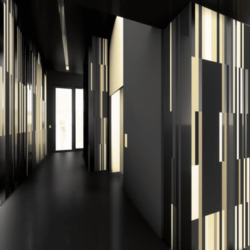 KURV Architecture DPC (Alex Hughes Architects)
Located in the heart of Manhattan’s Lower East Side, the building was erected on a shallow commercial lot between two 120 year old masonry buildings and a new residential rental building. 330 Grand Street is a mix of 725 SF 1BRs and 1050 SF 2BR apartments. It also contains a 1100 SF two story duplex as well as private and public rooftop space, large private balconies for most units and two large private terraces for the ground floor units.
330 Grand Street was originally designed and approved at the NYC DOB as a prefabricated modular building. During the pandemic, as shipping costs skyrocketed putting the project at risk, we suggested redesigning the building as a reinforced cast-in-place concrete structure. Concrete was readily available and prices had not been affected by the demand increase that many other materials suffered in the pandemic. We took this opportunity to raise floor to ceiling heights, enlarge high performance windows and redistribute the buildings MEPFS and Structural Systems to create very open floor plans.
The challenge was to create a luxurious sensorial living experience with very limited means. In a city with very high construction costs, low cost residential buildings in the area are usually devoid of good quality, design and character. Our approach was to aim high for the end user, prioritizing natural light, open space with long visual perspectives, high ceilings and as always, rejecting the use of predefined building templates.
Our biggest challenge was to ensure that the small spaces feel as clean cut, large and bright as possible. Several unique design decisions were made to ensure low cost and high quality;
Floor plans were laid out so that spaces were wide open and free of clutter from mechanical or structural interruptions. Therefore all infrastructure was placed in lateral demising walls, which in turn act as the unit’s storage and kitchen. The apartments feel wide open, are super quiet and have more storage space than any other comparable apartment in the city.
To solve the problem of the site’s shallow commercial lot which is typically prone to dark interior spaces we focused our attention on the building’s envelope. Instead of the usual small punched window openings, oversized high performance windows were designed to ensure that light penetrated as far as possible into the units. In the smaller 1BR units, the full 50’ depth of the lot is perceived by partitioning spaces with sliding pocket doors that can be retracted to allow deep visual perspectives, making the sight lines in the space feel longer, larger, more ample than normal. In addition to the full height glazing, each unit above the 2nd floor receives a 7 foot covered balcony, adding 120 to 240 sf to each apartment, something unusual in New York City buildings. The space is large enough for a full size dining table, when the weather permits being outside.
We also worked hard to ensure modularity. For example, all kitchen units are all identical throughout the building. The idea of modularity and the economy of the repetitive unit is exercised to the maximum through the building.
Hardware, appliances, flooring, wall coverings and material finishes are all carefully selected to feel bespoke, high quality and unique.
It was important to KURV that the result of this work manifest into something that would deeply connect with the end user and sustain relationships with the consumers of this space.
All images by KURV Architecture ©
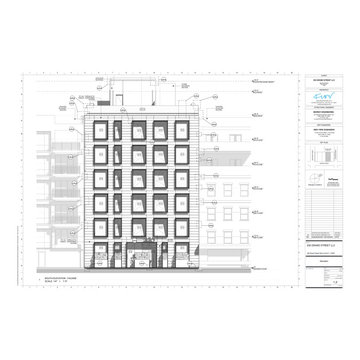 KURV Architecture DPC (Alex Hughes Architects)
Located in the heart of Manhattan’s Lower East Side, the building was erected on a shallow commercial lot between two 120 year old masonry buildings and a new residential rental building. 330 Grand Street is a mix of 725 SF 1BRs and 1050 SF 2BR apartments. It also contains a 1100 SF two story duplex as well as private and public rooftop space, large private balconies for most units and two large private terraces for the ground floor units.
330 Grand Street was originally designed and approved at the NYC DOB as a prefabricated modular building. During the pandemic, as shipping costs skyrocketed putting the project at risk, we suggested redesigning the building as a reinforced cast-in-place concrete structure. Concrete was readily available and prices had not been affected by the demand increase that many other materials suffered in the pandemic. We took this opportunity to raise floor to ceiling heights, enlarge high performance windows and redistribute the buildings MEPFS and Structural Systems to create very open floor plans.
The challenge was to create a luxurious sensorial living experience with very limited means. In a city with very high construction costs, low cost residential buildings in the area are usually devoid of good quality, design and character. Our approach was to aim high for the end user, prioritizing natural light, open space with long visual perspectives, high ceilings and as always, rejecting the use of predefined building templates.
Our biggest challenge was to ensure that the small spaces feel as clean cut, large and bright as possible. Several unique design decisions were made to ensure low cost and high quality;
Floor plans were laid out so that spaces were wide open and free of clutter from mechanical or structural interruptions. Therefore all infrastructure was placed in lateral demising walls, which in turn act as the unit’s storage and kitchen. The apartments feel wide open, are super quiet and have more storage space than any other comparable apartment in the city.
To solve the problem of the site’s shallow commercial lot which is typically prone to dark interior spaces we focused our attention on the building’s envelope. Instead of the usual small punched window openings, oversized high performance windows were designed to ensure that light penetrated as far as possible into the units. In the smaller 1BR units, the full 50’ depth of the lot is perceived by partitioning spaces with sliding pocket doors that can be retracted to allow deep visual perspectives, making the sight lines in the space feel longer, larger, more ample than normal. In addition to the full height glazing, each unit above the 2nd floor receives a 7 foot covered balcony, adding 120 to 240 sf to each apartment, something unusual in New York City buildings. The space is large enough for a full size dining table, when the weather permits being outside.
We also worked hard to ensure modularity. For example, all kitchen units are all identical throughout the building. The idea of modularity and the economy of the repetitive unit is exercised to the maximum through the building.
Hardware, appliances, flooring, wall coverings and material finishes are all carefully selected to feel bespoke, high quality and unique.
It was important to KURV that the result of this work manifest into something that would deeply connect with the end user and sustain relationships with the consumers of this space.
All images by KURV Architecture ©
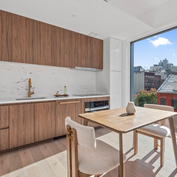 KURV Architecture DPC (Alex Hughes Architects)
Located in the heart of Manhattan’s Lower East Side, the building was erected on a shallow commercial lot between two 120 year old masonry buildings and a new residential rental building. 330 Grand Street is a mix of 725 SF 1BRs and 1050 SF 2BR apartments. It also contains a 1100 SF two story duplex as well as private and public rooftop space, large private balconies for most units and two large private terraces for the ground floor units.
330 Grand Street was originally designed and approved at the NYC DOB as a prefabricated modular building. During the pandemic, as shipping costs skyrocketed putting the project at risk, we suggested redesigning the building as a reinforced cast-in-place concrete structure. Concrete was readily available and prices had not been affected by the demand increase that many other materials suffered in the pandemic. We took this opportunity to raise floor to ceiling heights, enlarge high performance windows and redistribute the buildings MEPFS and Structural Systems to create very open floor plans.
The challenge was to create a luxurious sensorial living experience with very limited means. In a city with very high construction costs, low cost residential buildings in the area are usually devoid of good quality, design and character. Our approach was to aim high for the end user, prioritizing natural light, open space with long visual perspectives, high ceilings and as always, rejecting the use of predefined building templates.
Our biggest challenge was to ensure that the small spaces feel as clean cut, large and bright as possible. Several unique design decisions were made to ensure low cost and high quality;
Floor plans were laid out so that spaces were wide open and free of clutter from mechanical or structural interruptions. Therefore all infrastructure was placed in lateral demising walls, which in turn act as the unit’s storage and kitchen. The apartments feel wide open, are super quiet and have more storage space than any other comparable apartment in the city.
To solve the problem of the site’s shallow commercial lot which is typically prone to dark interior spaces we focused our attention on the building’s envelope. Instead of the usual small punched window openings, oversized high performance windows were designed to ensure that light penetrated as far as possible into the units. In the smaller 1BR units, the full 50’ depth of the lot is perceived by partitioning spaces with sliding pocket doors that can be retracted to allow deep visual perspectives, making the sight lines in the space feel longer, larger, more ample than normal. In addition to the full height glazing, each unit above the 2nd floor receives a 7 foot covered balcony, adding 120 to 240 sf to each apartment, something unusual in New York City buildings. The space is large enough for a full size dining table, when the weather permits being outside.
We also worked hard to ensure modularity. For example, all kitchen units are all identical throughout the building. The idea of modularity and the economy of the repetitive unit is exercised to the maximum through the building.
Hardware, appliances, flooring, wall coverings and material finishes are all carefully selected to feel bespoke, high quality and unique.
It was important to KURV that the result of this work manifest into something that would deeply connect with the end user and sustain relationships with the consumers of this space.
All images by KURV Architecture ©
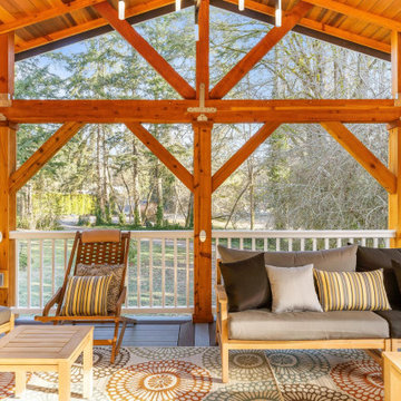 M3Decks & Outdoor Living
Woodinville WA Phased Farmhouse Transformation Project
Project Overview
In Woodinville, WA, our team at M3Decks & Outdoor Living executed a multi-phase, three-year transformation of a 1970s woody walk-up home, converting it into a stunning farmhouse-style retreat. This project, tailored to the client’s vision, showcases our expertise in custom deck construction, structural enhancements, and outdoor living solutions, with a focus on quality and timeless design.
Project Phases
Phase 1: Deck and Entry Deck (Year 1)
Scope: Designed and constructed a composite deck using premium TimberTech materials, paired with a welcoming entry deck to enhance curb appeal. The decks were built with Fortress Steel Framing for durability, aligning with the farmhouse aesthetic through clean lines and rustic charm.
Features: Incorporated a multi-level layout to maximize usable space, with decorative railings and a drink rail cap for functionality and style.
Outcome: The new decks provided a seamless indoor-outdoor flow, transforming the home’s exterior into a functional and inviting space.
Phase 2: Roof Extension and DrySpace Installation (Year 2)
Scope: Extended the roof over the second-story deck and entryway to create a covered outdoor living area. Installed TimberTech DrySpace under the deck to create a dry, usable space below, ideal for a future hot tub.
Design Elements: The roof extension featured farmhouse-inspired gabled roofing with exposed beams, complementing the home’s updated aesthetic. The DrySpace system ensured weather protection for the under-deck area.
Outcome: The covered deck became a year-round outdoor oasis, while the DrySpace addition increased the home’s functional space, adding value and versatility.
Phase 3: Hardscaping (Planned for Year 3)
Scope: Scheduled to return for the final phase, which will focus on hardscaping to complete the outdoor transformation. Plans include a stamped concrete patio, planter boxes with Pacific Northwest-native plants, and a fire pit to enhance the farmhouse vibe.
Goals: Create a cohesive outdoor environment that integrates with the existing deck and roof structures, prioritizing biophilic design principles for a natural, inviting space.
Anticipated Outcome: The hardscaping will finalize the property’s evolution into a luxurious, functional outdoor retreat, perfect for entertaining and relaxation.
Key Features
Farmhouse Aesthetic: Rustic yet modern design with TimberTech composite decking, exposed beam roofing, and farmhouse-inspired detailing.
TimberTech DrySpace: Innovative under-deck system to ensure a dry, usable space for future additions like a hot tub.
Durable Materials: Fortress Steel Framing and TimberTech products for low-maintenance, long-lasting results.
Phased Approach: Flexible, client-focused construction timeline to accommodate budget and evolving needs.
Outcome
This phased project transformed a dated 1970s walk-up into a modern farmhouse masterpiece, significantly enhancing the home’s aesthetic and functional value. The deck and roof extensions have already elevated the client’s outdoor living experience, and the upcoming hardscaping phase will complete the vision of a cohesive, luxurious backyard retreat. The project exemplifies our commitment to quality craftsmanship and client satisfaction.
Location
Woodinville, WA
Project Type
Residential Phased Design-Build
5