
Search results for "Increasingly ubiquitous" in Home Design Ideas
 Jonathan Quesnel
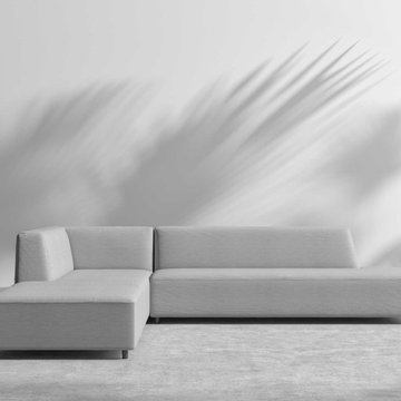
Very poor-quality fabrics
Beautiful design, but very disappointing product quality and customer service
I purchased Mika outdoor sectional sofas in 2022 (Order #1599844). By 2024, despite meticulous care (stored indoors every winter), the seating already shows 5 tears.
The fabric is of questionable quality—worse than that of some low-end outdoor furniture. A tiny hole quickly grows and becomes impossible to control…
I reported the issue to customer service, but no solution was offered. It’s even impossible to purchase matching fabric to reupholster the seats.
I recommend avoiding this product, or at the very least—if you're willing to take the risk—covering it with protective covers after each use, as the fabric is extremely fragile.
 Neumann & Rudy Architecture
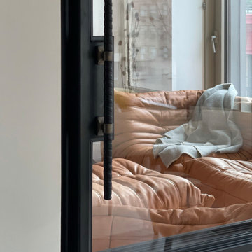
The wider door detail reveals how the dark frame divides the glazing into measured rectangular sections around the long vertical pull. Its narrow profiles allow the low tan seating, blue-gray throw, and bright window beyond to remain visually connected to the adjoining space. Pale wood flooring at the bottom of the view extends that continuity across the threshold. Daylight and reflections animate the glass, while the wrapped handle introduces a darker, more tactile line close to the viewer. The combination has a clear contemporary character, balancing an architectural boundary with an open view. The lounge would remain part of the apartment’s visual life even when seen through the glazed panels.

 Baine Contracting, Inc.
Brand new exterior gives Jersey Shore home a modern look! Built by Baine Contracting and photographed by Osprey Perspectives.
Example of a large beach style beige three-story wood gable roof design in New York with a shingle roof
Example of a large beach style beige three-story wood gable roof design in New York with a shingle roof
Find the right local pro for your project



 Living Gardens Landscape Design
Contemporary backyard. White stucco wall retains slope. Ceramic tile flows from inside out. Concrete steppers and mexican beach pebbles keep it clean and contemporary. Benches to be installed at the firepit and dining area. More photos to come as plants grow in and furniture arrives.
 KURV Architecture DPC (Alex Hughes Architects)
Located in the heart of Manhattan’s Lower East Side, the building was erected on a shallow commercial lot between two 120 year old masonry buildings and a new residential rental building. 330 Grand Street is a mix of 725 SF 1BRs and 1050 SF 2BR apartments. It also contains a 1100 SF two story duplex as well as private and public rooftop space, large private balconies for most units and two large private terraces for the ground floor units.
330 Grand Street was originally designed and approved at the NYC DOB as a prefabricated modular building. During the pandemic, as shipping costs skyrocketed putting the project at risk, we suggested redesigning the building as a reinforced cast-in-place concrete structure. Concrete was readily available and prices had not been affected by the demand increase that many other materials suffered in the pandemic. We took this opportunity to raise floor to ceiling heights, enlarge high performance windows and redistribute the buildings MEPFS and Structural Systems to create very open floor plans.
The challenge was to create a luxurious sensorial living experience with very limited means. In a city with very high construction costs, low cost residential buildings in the area are usually devoid of good quality, design and character. Our approach was to aim high for the end user, prioritizing natural light, open space with long visual perspectives, high ceilings and as always, rejecting the use of predefined building templates.
Our biggest challenge was to ensure that the small spaces feel as clean cut, large and bright as possible. Several unique design decisions were made to ensure low cost and high quality;
Floor plans were laid out so that spaces were wide open and free of clutter from mechanical or structural interruptions. Therefore all infrastructure was placed in lateral demising walls, which in turn act as the unit’s storage and kitchen. The apartments feel wide open, are super quiet and have more storage space than any other comparable apartment in the city.
To solve the problem of the site’s shallow commercial lot which is typically prone to dark interior spaces we focused our attention on the building’s envelope. Instead of the usual small punched window openings, oversized high performance windows were designed to ensure that light penetrated as far as possible into the units. In the smaller 1BR units, the full 50’ depth of the lot is perceived by partitioning spaces with sliding pocket doors that can be retracted to allow deep visual perspectives, making the sight lines in the space feel longer, larger, more ample than normal. In addition to the full height glazing, each unit above the 2nd floor receives a 7 foot covered balcony, adding 120 to 240 sf to each apartment, something unusual in New York City buildings. The space is large enough for a full size dining table, when the weather permits being outside.
We also worked hard to ensure modularity. For example, all kitchen units are all identical throughout the building. The idea of modularity and the economy of the repetitive unit is exercised to the maximum through the building.
Hardware, appliances, flooring, wall coverings and material finishes are all carefully selected to feel bespoke, high quality and unique.
It was important to KURV that the result of this work manifest into something that would deeply connect with the end user and sustain relationships with the consumers of this space.
All images by KURV Architecture ©







 Bella Interiors
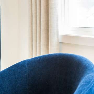
Love how this photo shows the subtle texture of the drapes against the blue chair
Trendy home design photo in Edmonton
Trendy home design photo in Edmonton


 Pierre Jean-Baptiste Interiors
This quaint living room space is especially cozy. For this design we incorporated a variety of natural products to achieve a soft, subtle, and most importantly comfortable space. As you kick back and relax on the oversized plush sofa it will be hard to take your attention from the custom media center. We designed this media center using grey plywood veneer which gives it depth as well as a finished natural wood look. We hung two wall sconces one on each side of the media center to provide just the right amount of light to perfect the natural nook ambiance we were trying to achieve here. Each wall sconce is made of capiz shells more commonly known as windowpane oysters. This room has amazing natural design details down to the tops of the tables. Each of the end tables has a starburst effect in the black forest grove wood tops which are accented by a chrome finish on the iron table legs. The centerpiece that completes this nook is the stunning reclaimed wood coffee table that has personality with its natural cracks and crevices intact.
pierreji.com




45