
Search results for "Instance" in Home Design Ideas
 Miller-Roodell Architects Ltd
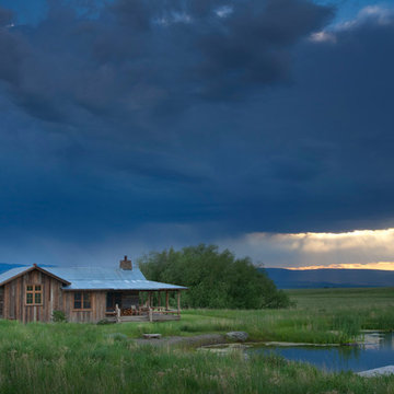
Set in Montana's tranquil Shields River Valley, the Shilo Ranch Compound is a collection of structures that were specifically built on a relatively smaller scale, to maximize efficiency. The main house has two bedrooms, a living area, dining and kitchen, bath and adjacent greenhouse, while two guest homes within the compound can sleep a total of 12 friends and family. There's also a common gathering hall, for dinners, games, and time together. The overall feel here is of sophisticated simplicity, with plaster walls, concrete and wood floors, and weathered boards for exteriors. The placement of each building was considered closely when envisioning how people would move through the property, based on anticipated needs and interests. Sustainability and consumption was also taken into consideration, as evidenced by the photovoltaic panels on roof of the garage, and the capability to shut down any of the compound's buildings when not in use.
 Redecorating Vancouver
A modern home with an eclectic mix
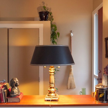
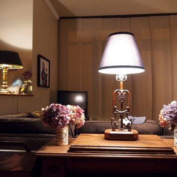
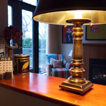
My clients in this space were divided. They were split by competing aesthetics. There were Vietnamese art pieces with modern motifs and bold colours mixed with hand-crafted rustic tables and antique Canadiana. I quickly identified a lack of cohesion and an uncomfortable conversation area as the primary issues that were causing my clients stress.
A change was in order. We partitioned their large connected dining room, living and entryway areas using the existing furniture and floor covering. We were able to create several distinct and cohesive areas that each brought out the best of their contents. Each grouping now seemed natural and harmonious. Smooth international contemporary style and rustic heritage pieces now coexisted in the same space without causing my clients decorating headaches. To organize future projects and to summarize personalized decorating tips, Redecorating Vancouver provided them with a written Design Plan at the conclusion of the consultation.
Family is important to me. I recognize that items in my clients' homes have unseen significance. In this instance, I was able to gather items to create a grand-parents nook to honour the couple's family. We took advantage of an heirloom antique radio that belonged to the client's grandfather and a meaningful handmade table. It is both pleasing to the eye and a daily reminder to the couple of who really matters in a home: the family that lives in it.
 Severe Weather Roofing & Restoration, LLC
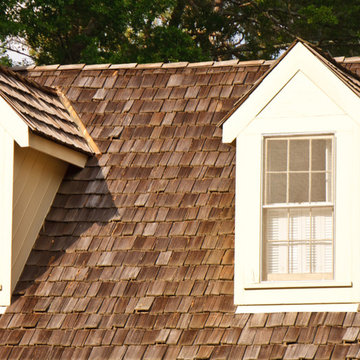
In many instances, Colorado home owners are unaware that their roofing system needs certain roofing repairs. When you neglect to have your roof repaired you can run into expensive damages down the road, even if your roofing problem seems insignificant. The tiniest roof leak can quickly develop into a large, costly problem. Our team of professional roofers has years of knowledge and experience when it comes to repairing your roof leaks. We can provide long term roofing repairs in Fort Collins that that will stop any leakage and prevent any further damage from occuring.
Our professional contractors can inspect your Colorado roof and determine if there is any damage that needs to be repaired. If you want to make sure that your roof stays in the best conditioning possible, then contact Severe Weather Roofing & Restoration for all of your roof repair needs. We can provide you with expert advice regarding the condition of your roof and what repairs, if any, may be required.
Find the right local pro for your project

 Nar Design Group
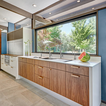
This mid-century modern kitchen was developed with the original architectural elements of its mid-century shell at the heart of its design. Throughout the space, the kitchen’s repetition of alternating dark walnut and light wood uses in the cabinetry and framework reflect the contrast of the dark wooden beams running along the white ceiling. The playful use of two tones intentionally develops unified work zones using all modern day elements and conveniences. For instance, the 5’ galley workstation stands apart with grain-matched walnut cabinetry and stone wrap detail for a furniture-like feeling. The mid-century architecture continued to be an emphasis through design details such as a flush venting system within a drywall structure that conscientiously disappears into the ceiling affording the existing post-and-beams structures and clerestory windows to stand in the forefront.
Along with celebrating the characteristic of the mid-century home the clients wanted to bring the outdoors in. We chose to emphasis the view even more by incorporating a large window centered over the galley kitchen sink. The final result produced a translucent wall that provokes a dialog between the outdoor elements and the natural color tones and materials used throughout the kitchen. While the natural light and views are visible because of the spacious windows, the contemporary kitchens clean geometric lines emphasize the newly introduced natural materials and further integrate the outdoors within the space.
The clients desired to have a designated area for hot drinks such as coffee and tea. To create a station that could house all the small appliances & accessories and was easily accessible we incorporated two aluminum tambours together with integrated power lift doors. One tambour acting as the hot drink station and the other acting as an appliance garage. Overall, this minimalistic kitchen is nothing short of functionality and mid-century character.
Photo Credit: Fred Donham of PhotographerLink
 Berry Design Build
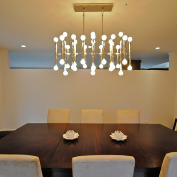
If you are familiar with our work, at Berry Design Build, you know that to us each project is more than just sticks and mortar. Each home, each client, each family we have the privilege to work with becomes part of our team. We believe in the value of excellence, the importance of commitment, and the significance of delivery. This renovation, along with many, is very close to our hearts because it’s one of the few instances where we get to exercise more than just the Design Build division of our company. This particular client had been working with Berry for many years to find that lifetime home. Through many viewings, agent caravans, and lots of offers later she found a house worth calling home. Although not perfectly to her personality (really what home is until you make it yours) she asked our Design Build division to come in and renovate some areas: including the kitchen, hall bathroom, master bathroom, and most other areas of the house; i.e. paint, hardwoods, and lighting. Each project comes with its challenges, but we were able to combine her love of mid-century modern furnishings with the character of the already existing 1962 ranch.
Photos by Nicole Cosentino
 Redecorating Vancouver
A modern home with an eclectic mix
My clients in this space were divided. They were split by competing aesthetics. There were Vietnamese art pieces with modern motifs and bold colours mixed with hand-crafted rustic tables and antique Canadiana. I quickly identified a lack of cohesion and an uncomfortable conversation area as the primary issues that were causing my clients stress.
A change was in order. We partitioned their large connected dining room, living and entryway areas using the existing furniture and floor covering. We were able to create several distinct and cohesive areas that each brought out the best of their contents. Each grouping now seemed natural and harmonious. Smooth international contemporary style and rustic heritage pieces now coexisted in the same space without causing my clients decorating headaches. To organize future projects and to summarize personalized decorating tips, Redecorating Vancouver provided them with a written Design Plan at the conclusion of the consultation.
Family is important to me. I recognize that items in my clients' homes have unseen significance. In this instance, I was able to gather items to create a grand-parents nook to honour the couple's family. We took advantage of an heirloom antique radio that belonged to the client's grandfather and a meaningful handmade table. It is both pleasing to the eye and a daily reminder to the couple of who really matters in a home: the family that lives in it.
 Redecorating Vancouver
A modern home with an eclectic mix
My clients in this space were divided. They were split by competing aesthetics. There were Vietnamese art pieces with modern motifs and bold colours mixed with hand-crafted rustic tables and antique Canadiana. I quickly identified a lack of cohesion and an uncomfortable conversation area as the primary issues that were causing my clients stress.
A change was in order. We partitioned their large connected dining room, living and entryway areas using the existing furniture and floor covering. We were able to create several distinct and cohesive areas that each brought out the best of their contents. Each grouping now seemed natural and harmonious. Smooth international contemporary style and rustic heritage pieces now coexisted in the same space without causing my clients decorating headaches. To organize future projects and to summarize personalized decorating tips, Redecorating Vancouver provided them with a written Design Plan at the conclusion of the consultation.
Family is important to me. I recognize that items in my clients' homes have unseen significance. In this instance, I was able to gather items to create a grand-parents nook to honour the couple's family. We took advantage of an heirloom antique radio that belonged to the client's grandfather and a meaningful handmade table. It is both pleasing to the eye and a daily reminder to the couple of who really matters in a home: the family that lives in it.
 Nar Design Group
This mid-century modern kitchen was developed with the original architectural elements of its mid-century shell at the heart of its design. Throughout the space, the kitchen’s repetition of alternating dark walnut and light wood uses in the cabinetry and framework reflect the contrast of the dark wooden beams running along the white ceiling. The playful use of two tones intentionally develops unified work zones using all modern day elements and conveniences. For instance, the 5’ galley workstation stands apart with grain-matched walnut cabinetry and stone wrap detail for a furniture-like feeling. The mid-century architecture continued to be an emphasis through design details such as a flush venting system within a drywall structure that conscientiously disappears into the ceiling affording the existing post-and-beams structures and clerestory windows to stand in the forefront.
Along with celebrating the characteristic of the mid-century home the clients wanted to bring the outdoors in. We chose to emphasis the view even more by incorporating a large window centered over the galley kitchen sink. The final result produced a translucent wall that provokes a dialog between the outdoor elements and the natural color tones and materials used throughout the kitchen. While the natural light and views are visible because of the spacious windows, the contemporary kitchens clean geometric lines emphasize the newly introduced natural materials and further integrate the outdoors within the space.
The clients desired to have a designated area for hot drinks such as coffee and tea. To create a station that could house all the small appliances & accessories and was easily accessible we incorporated two aluminum tambours together with integrated power lift doors. One tambour acting as the hot drink station and the other acting as an appliance garage. Overall, this minimalistic kitchen is nothing short of functionality and mid-century character.
Photo Credit: Fred Donham of PhotographerLink
 User
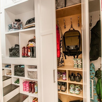
UserTo maximize every inch of this home, I designed built-ins for the staircase as well.
Example of a huge classic ceramic tile mudroom design in Chicago
Example of a huge classic ceramic tile mudroom design in Chicago
 Berry Design Build
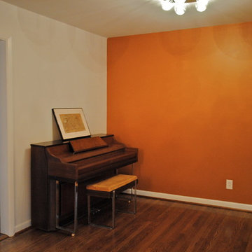
If you are familiar with our work, at Berry Design Build, you know that to us each project is more than just sticks and mortar. Each home, each client, each family we have the privilege to work with becomes part of our team. We believe in the value of excellence, the importance of commitment, and the significance of delivery. This renovation, along with many, is very close to our hearts because it’s one of the few instances where we get to exercise more than just the Design Build division of our company. This particular client had been working with Berry for many years to find that lifetime home. Through many viewings, agent caravans, and lots of offers later she found a house worth calling home. Although not perfectly to her personality (really what home is until you make it yours) she asked our Design Build division to come in and renovate some areas: including the kitchen, hall bathroom, master bathroom, and most other areas of the house; i.e. paint, hardwoods, and lighting. Each project comes with its challenges, but we were able to combine her love of mid-century modern furnishings with the character of the already existing 1962 ranch.
Photos by Nicole Cosentino
 Nar Design Group
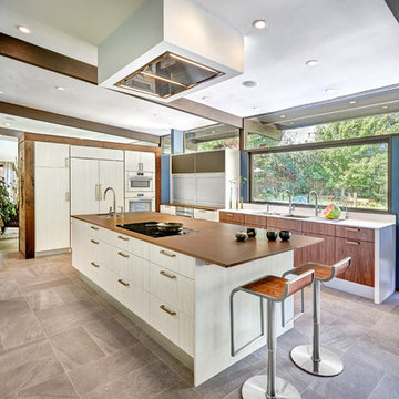
This mid-century modern kitchen was developed with the original architectural elements of its mid-century shell at the heart of its design. Throughout the space, the kitchen’s repetition of alternating dark walnut and light wood uses in the cabinetry and framework reflect the contrast of the dark wooden beams running along the white ceiling. The playful use of two tones intentionally develops unified work zones using all modern day elements and conveniences. For instance, the 5’ galley workstation stands apart with grain-matched walnut cabinetry and stone wrap detail for a furniture-like feeling. The mid-century architecture continued to be an emphasis through design details such as a flush venting system within a drywall structure that conscientiously disappears into the ceiling affording the existing post-and-beams structures and clerestory windows to stand in the forefront.
Along with celebrating the characteristic of the mid-century home the clients wanted to bring the outdoors in. We chose to emphasis the view even more by incorporating a large window centered over the galley kitchen sink. The final result produced a translucent wall that provokes a dialog between the outdoor elements and the natural color tones and materials used throughout the kitchen. While the natural light and views are visible because of the spacious windows, the contemporary kitchens clean geometric lines emphasize the newly introduced natural materials and further integrate the outdoors within the space.
The clients desired to have a designated area for hot drinks such as coffee and tea. To create a station that could house all the small appliances & accessories and was easily accessible we incorporated two aluminum tambours together with integrated power lift doors. One tambour acting as the hot drink station and the other acting as an appliance garage. Overall, this minimalistic kitchen is nothing short of functionality and mid-century character.
Photo Credit: Fred Donham of PhotographerLink

 Donald Lococo Architects
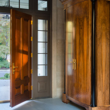
Awarded by the Classical institute of art and architecture , the linnean house has a restrained and simple elevation of doors and windows. Nestled in the Forest Hills neighborhood of Washington, D.C., the Linnean House is classical in both plan and elevation throughout its award-winning house plans. The main mass, comprising of the most formal and public spaces, is a spatial triptych along a symmetrical main axis. Inside the luxury home, the limestone façade, simple but well-proportioned with classical elements, extends itself into both the entry portico and main foyer with consistent proportions and materiality. This introduction allows the flanking living and dining rooms to be perceived as separate pavilions, each equipped with eight equal-proportioned French doors symmetrical of the main axis.
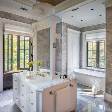
Beyond the classical spaces are two wings which lead to the master suite and a kitchen/family space, respectively. Both of which are situated to queue from the French door axis, a focal feature in the repeatedly published home design. At the entry foyer, the stark stone luxury architecture is warmed by two symmetrical wood armoire-like freestanding sculptural objects, a persistent theme throughout the luxury house. In the kitchen, for instance, stand four similar wood armoire objects at opposite corners that act as columns and help give this space a sense of boundary and enclosure. The master bath vanity, in similar fashion, is introduced as a central free-standing form anchoring itself as a notable presence in the space. Lastly, the wine room is designed as a series of free-standing heavy wood cavity walls spanned only by a hint of glass.
 Charlie Allen Renovations, Inc.
Renovation is stressful. Wouldn’t it be nice to let someone else oversee product selections, manage day-to-day issues, and bring your project to a successful completion? The owners of a two-family in Arlington recently did just that, flying off to Florida just as we began renovating their first floor unit.
Of course, before they left we thoroughly discussed all aspects of the work order, which included renovating the kitchen and bathroom, painting the bedroom, and adding a laundry closet. We reviewed color and material selections, and set up a schedule for regular briefings.
A handful of issues did come up. But because we had planned ahead, we were able to resolve them with very little stress for our clients. For instance, the client had chosen a bright yellow paint color for the kitchen walls, but once the new cabinets, countertop, and flooring had been installed, it was clear that yellow would clash. We suggested a more complementary Benjamin Moore Lancaster Whitewash shade instead.
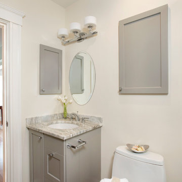
In the bathroom, the clients had selected a deep inset mirrored medicine cabinet. But when the wall behind the vanity was opened, it revealed a pipe running up the wall, too close for the inset model. In this small space, a bump-out medicine cabinet would be awkward, so instead we placed a mirror over the sink and two smaller inset cabinets on either side – a solution that pleased the homeowners, who now have his-and-hers storage spaces.
Finally, the homeowners had resigned themselves to the fact that the laundry closet would be too small for storing detergent and other needs. However once the units were in place, we realized that a small custom shelf could be built and had it installed to the delight of the homeowners.
Photo by Shelly Harrison
 Donald Lococo Architects
Awarded by the Classical institute of art and architecture , the linnean house has a restrained and simple elevation of doors and windows. Nestled in the Forest Hills neighborhood of Washington, D.C., the Linnean House is classical in both plan and elevation throughout its award-winning house plans. The main mass, comprising of the most formal and public spaces, is a spatial triptych along a symmetrical main axis. Inside the luxury home, the limestone façade, simple but well-proportioned with classical elements, extends itself into both the entry portico and main foyer with consistent proportions and materiality. This introduction allows the flanking living and dining rooms to be perceived as separate pavilions, each equipped with eight equal-proportioned French doors symmetrical of the main axis.
Beyond the classical spaces are two wings which lead to the master suite and a kitchen/family space, respectively. Both of which are situated to queue from the French door axis, a focal feature in the repeatedly published home design. At the entry foyer, the stark stone luxury architecture is warmed by two symmetrical wood armoire-like freestanding sculptural objects, a persistent theme throughout the luxury house. In the kitchen, for instance, stand four similar wood armoire objects at opposite corners that act as columns and help give this space a sense of boundary and enclosure. The master bath vanity, in similar fashion, is introduced as a central free-standing form anchoring itself as a notable presence in the space. Lastly, the wine room is designed as a series of free-standing heavy wood cavity walls spanned only by a hint of glass.
 Redecorating Vancouver
A modern home with an eclectic mix
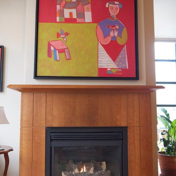
My clients in this space were divided. They were split by competing aesthetics. There were Vietnamese art pieces with modern motifs and bold colours mixed with hand-crafted rustic tables and antique Canadiana. I quickly identified a lack of cohesion and an uncomfortable conversation area as the primary issues that were causing my clients stress.
A change was in order. We partitioned their large connected dining room, living and entryway areas using the existing furniture and floor covering. We were able to create several distinct and cohesive areas that each brought out the best of their contents. Each grouping now seemed natural and harmonious. Smooth international contemporary style and rustic heritage pieces now coexisted in the same space without causing my clients decorating headaches. To organize future projects and to summarize personalized decorating tips, Redecorating Vancouver provided them with a written Design Plan at the conclusion of the consultation.
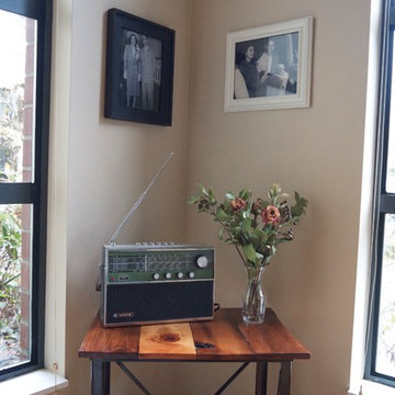
Family is important to me. I recognize that items in my clients' homes have unseen significance. In this instance, I was able to gather items to create a grand-parents nook to honour the couple's family. We took advantage of an heirloom antique radio that belonged to the client's grandfather and a meaningful handmade table. It is both pleasing to the eye and a daily reminder to the couple of who really matters in a home: the family that lives in it.
 Redecorating Vancouver
A modern home with an eclectic mix
My clients in this space were divided. They were split by competing aesthetics. There were Vietnamese art pieces with modern motifs and bold colours mixed with hand-crafted rustic tables and antique Canadiana. I quickly identified a lack of cohesion and an uncomfortable conversation area as the primary issues that were causing my clients stress.
A change was in order. We partitioned their large connected dining room, living and entryway areas using the existing furniture and floor covering. We were able to create several distinct and cohesive areas that each brought out the best of their contents. Each grouping now seemed natural and harmonious. Smooth international contemporary style and rustic heritage pieces now coexisted in the same space without causing my clients decorating headaches. To organize future projects and to summarize personalized decorating tips, Redecorating Vancouver provided them with a written Design Plan at the conclusion of the consultation.
Family is important to me. I recognize that items in my clients' homes have unseen significance. In this instance, I was able to gather items to create a grand-parents nook to honour the couple's family. We took advantage of an heirloom antique radio that belonged to the client's grandfather and a meaningful handmade table. It is both pleasing to the eye and a daily reminder to the couple of who really matters in a home: the family that lives in it.
 Charlie Allen Renovations, Inc.
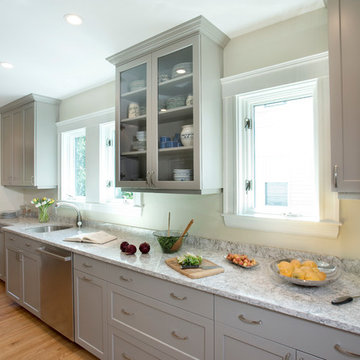
Renovation is stressful. Wouldn’t it be nice to let someone else oversee product selections, manage day-to-day issues, and bring your project to a successful completion? The owners of a two-family in Arlington recently did just that, flying off to Florida just as we began renovating their first floor unit.
Of course, before they left we thoroughly discussed all aspects of the work order, which included renovating the kitchen and bathroom, painting the bedroom, and adding a laundry closet. We reviewed color and material selections, and set up a schedule for regular briefings.
A handful of issues did come up. But because we had planned ahead, we were able to resolve them with very little stress for our clients. For instance, the client had chosen a bright yellow paint color for the kitchen walls, but once the new cabinets, countertop, and flooring had been installed, it was clear that yellow would clash. We suggested a more complementary Benjamin Moore Lancaster Whitewash shade instead.
In the bathroom, the clients had selected a deep inset mirrored medicine cabinet. But when the wall behind the vanity was opened, it revealed a pipe running up the wall, too close for the inset model. In this small space, a bump-out medicine cabinet would be awkward, so instead we placed a mirror over the sink and two smaller inset cabinets on either side – a solution that pleased the homeowners, who now have his-and-hers storage spaces.
Finally, the homeowners had resigned themselves to the fact that the laundry closet would be too small for storing detergent and other needs. However once the units were in place, we realized that a small custom shelf could be built and had it installed to the delight of the homeowners.
Photo by Shelly Harrison
 Donald Lococo Architects
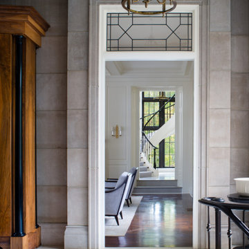
Awarded by the Classical institute of art and architecture , the linnean house has a restrained and simple elevation of doors and windows. Nestled in the Forest Hills neighborhood of Washington, D.C., the Linnean House is classical in both plan and elevation throughout its award-winning house plans. The main mass, comprising of the most formal and public spaces, is a spatial triptych along a symmetrical main axis. Inside the luxury home, the limestone façade, simple but well-proportioned with classical elements, extends itself into both the entry portico and main foyer with consistent proportions and materiality. This introduction allows the flanking living and dining rooms to be perceived as separate pavilions, each equipped with eight equal-proportioned French doors symmetrical of the main axis.
Beyond the classical spaces are two wings which lead to the master suite and a kitchen/family space, respectively. Both of which are situated to queue from the French door axis, a focal feature in the repeatedly published home design. At the entry foyer, the stark stone luxury architecture is warmed by two symmetrical wood armoire-like freestanding sculptural objects, a persistent theme throughout the luxury house. In the kitchen, for instance, stand four similar wood armoire objects at opposite corners that act as columns and help give this space a sense of boundary and enclosure. The master bath vanity, in similar fashion, is introduced as a central free-standing form anchoring itself as a notable presence in the space. Lastly, the wine room is designed as a series of free-standing heavy wood cavity walls spanned only by a hint of glass.
 miniki
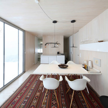
miniki is the first kitchen system that transforms into an elevated sideboard after use. There is nothing there to betray the actual function of this piece of furniture. So the surprise is even greater when a fully functional kitchen is revealed after it’s opened. When miniki was designed, priority was given not only to an elegant form but above all to functionality and absolute practicality for everyday use. All the requirements of a kitchen are organized into the smallest of spaces. And space is often at a premium.
Different modules are available to match all individual requirements. These modules can be combined to suit all tastes and so provide the perfect kitchen for all purposes. There are kitchens for all requirements – from the mini-kitchen with just one sink and some storage room for small offices to kitchenettes with, for instance, a fridge and two cooking zones, or a fully equipped eat-in kitchen with the full range of functions. This makes miniki a flexible, versatile, multi-purpose kitchen system. Simple to assemble and with its numerous combination options, the modules can be adapted swiftly and easily to any kind of setting.
miniki facts
module miniki
: 3 modules – mk 1, mk 2, mk 3
: module dimensions 120 x 60 x 60 cm / 60 x 60 x 60 cm (H x W x D)
: birch plywood with HPL laminate and sealed edges
: 15 colors
: mk 1 from 4,090 EUR (net plus devices)
: mk 3 from 1,260 EUR (net)
For further information see http://miniki.eu/en/home.html
52