
Search results for "Instances" in Home Design Ideas
 Claude Clemaron Luxury Bespoke Furniture
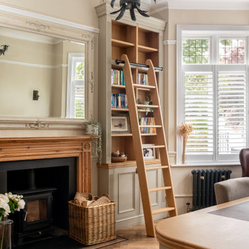
These highly attractive bespoke built-in bookcases and matching desk were handcrafted by Claude Clémaron for a period-style home office and library in Putney, southwest London. Traditionally constructed and designed fitted furniture like this has incredible charm and creates a warm, homely and calming atmosphere. Though traditional in style, the fitted furniture has been customised to discreetly integrate modern technology, cabling and wiring into the design. The L-shaped cabinet, for instance, cleverly houses an air conditioning unit.
A bespoke home office full of character
Every detail is detail. From the antique bronze doorknobs to open the cupboard doors to the beautifully crafted, solid oak library ladder to reach the highest shelves.
Handcrafted and hand finished for longevity and looks
The fitted cabinets have been spraypainted in Hardwick White by Farrow and Ball; a timeless light neutral colour with a rich, chalky grey-green hue. Oak has been used to line the upper open bookcases. The natural wood adds a visual contrast to the painted finish of the cabinetry and will be more resilient to wear and tear. Painted shelves can be more prone to chipping and scratching when in frequent use.
Decorative woodworking and period design elements
Traditionally constructed and designed, this bespoke built-in cabinetry features an authentic beaded inset detail on the cupboard doors, as well as distinctive fluting, all adding further dimension and elegance to the high end furniture. The bespoke matching handcrafted desk features integrated storage and a curved right hand detailed panel. The curved edge softens the look and feel of the desk. A smooth skiver leather inlay, made from sheepskin, is a traditional feature that provides a comfortable surface for writing or using a mouse. The inlay’s natural texture and warm tan colour enhance the desk’s visual appeal and creates a pleasant tactile experience.
 Donald Lococo Architects
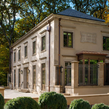
Awarded by the Classical institute of art and architecture , the linnean house has a restrained and simple elevation of doors and windows. Nestled in the Forest Hills neighborhood of Washington, D.C., the Linnean House is classical in both plan and elevation throughout its award-winning house plans. The main mass, comprising of the most formal and public spaces, is a spatial triptych along a symmetrical main axis. Inside the luxury home, the limestone façade, simple but well-proportioned with classical elements, extends itself into both the entry portico and main foyer with consistent proportions and materiality. This introduction allows the flanking living and dining rooms to be perceived as separate pavilions, each equipped with eight equal-proportioned French doors symmetrical of the main axis.
Beyond the classical spaces are two wings which lead to the master suite and a kitchen/family space, respectively. Both of which are situated to queue from the French door axis, a focal feature in the repeatedly published home design. At the entry foyer, the stark stone luxury architecture is warmed by two symmetrical wood armoire-like freestanding sculptural objects, a persistent theme throughout the luxury house. In the kitchen, for instance, stand four similar wood armoire objects at opposite corners that act as columns and help give this space a sense of boundary and enclosure. The master bath vanity, in similar fashion, is introduced as a central free-standing form anchoring itself as a notable presence in the space. Lastly, the wine room is designed as a series of free-standing heavy wood cavity walls spanned only by a hint of glass.
 Berry Design Build
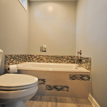
If you are familiar with our work, at Berry Design Build, you know that to us each project is more than just sticks and mortar. Each home, each client, each family we have the privilege to work with becomes part of our team. We believe in the value of excellence, the importance of commitment, and the significance of delivery. This renovation, along with many, is very close to our hearts because it’s one of the few instances where we get to exercise more than just the Design Build division of our company. This particular client had been working with Berry for many years to find that lifetime home. Through many viewings, agent caravans, and lots of offers later she found a house worth calling home. Although not perfectly to her personality (really what home is until you make it yours) she asked our Design Build division to come in and renovate some areas: including the kitchen, hall bathroom, master bathroom, and most other areas of the house; i.e. paint, hardwoods, and lighting. Each project comes with its challenges, but we were able to combine her love of mid-century modern furnishings with the character of the already existing 1962 ranch.
Photos by Nicole Cosentino
Find the right local pro for your project
 Distinctive Interior Designs
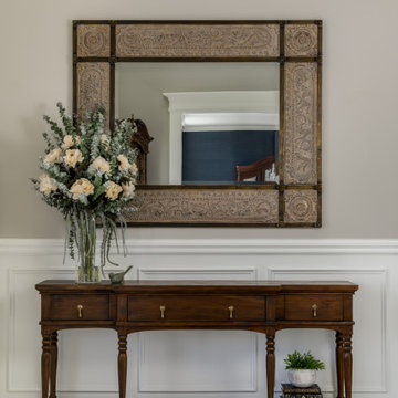
’25 years ago’ design shows — that’s why this young family needed DiD to create a whole house transitional transformation in their newly purchased home.
We refreshed or completely recreated every single room in this 5000sf Moorestown home. From removing the family room and entry murals, to shrinking down the overpowering fireplace, changing lighting, and custom creating furniture and built-ins to suit the needs of this energetic family of 6. Light and bright was the goal in most instances, with pocketed touches of moody blues and grays. We also accessorized and installed new window treatments throughout.
Take a look and admire the new view. Now this family can truly say this home is ‘theirs’ in style and deed!
 Made To Last Custom Homes Ltd.
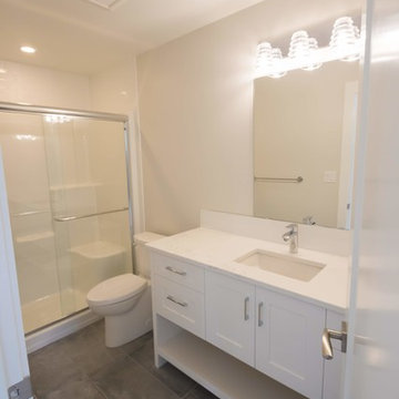
Driftwood Custom Home was constructed on vacant property between two existing houses in Chemainus, BC. This type of project is a form of sustainable land development known as an Infill Build. These types of building lots are often small. However, careful planning and clever uses of design allowed us to maximize the space. This home has 2378 square feet with three bedrooms and three full bathrooms. Add in a living room on the main floor, a separate den upstairs, and a full laundry room and this custom home still feels spacious!
The kitchen is bright and inviting. With white cabinets, countertops and backsplash, and stainless steel appliances, the feel of this space is timeless. Similarly, the master bathroom design features plenty of must-haves. For instance, the bathroom includes a shower with matching tile to the vanity backsplash, a double floating vanity, heated tiled flooring, and tiled walls. Together with a flush mount fireplace in the master bedroom, this is an inviting oasis of space.
 Heritage Woodworks
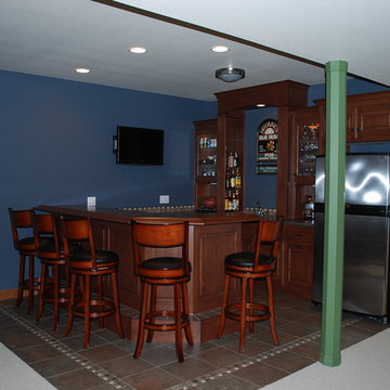
On projects like this traditional home bar, we are often brought to finish out spaces with unique and custom touches to perfect the rooms. In this instance, we were commissioned to build a custom, traditional wet bar to serve as a focal point for the room.
This effect of this is a great, finished basement perfect for entertaining and hosting guests and family.
 ArchiCGI 3D Rendering
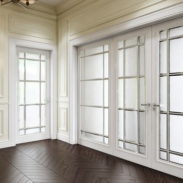
House Design rendering allows Interior Designers and Architects to bring their beautiful concepts to life. For unlike drawings and concepts, 3D visualizations give a complete picture, enabling the audience to have a glimpse into the life they could lead there.
The elegance of this Classical Interior scenes is a great sample of the highly professional 3dViz.
One could not take eyes off the clean-lined white furniture, lending the space a refined and airy look, marble backdrop and all this delightful storage space. Photoreal 3D house rendering makes colors look every bit as crisp and vivid as they’ll be in real life, so that client can have a complete picture of their effect and make suggestions if necessary.
But what really makes the 3d design stand out are details. Those small things that are never included in drawings, but are vital to the overall atmosphere.
For instance, kitchen decor allows to create a connection with the Client – by making it personal and so much “him”. Thus, cold gleam of elegant glassware, beautiful flowers on the table suggest refined taste, while photos and figurines allow to deduce that the owners are a well-traveled family with versatile interests.
 Meridian Construction
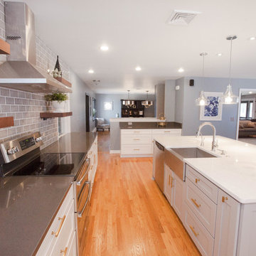
This East Greenville, PA kitchen remodel was part of an entire first-floor renovation. The homeowners had Meridian Construction design and construct a new kitchen in a completely different location—what you see here used to be the dining room. The homeowner and Meridian worked together to really create a beautiful, cohesive space. For instance, the grey subway tile backsplash was inspired by the home’s original brick wall. The bright gold hardware mixes well with the stainless appliances and fixtures, to create a very on-trend contemporary look. The floating wood shelves frame a sleek, modern downdraft. The combination of contemporary style with natural finishes really give this kitchen a luxurious yet homey feel. Check out how big of a change this kitchen remodel was in our Before & After Gallery. Design and Construction by Meridian.
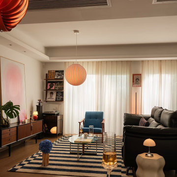
 MODIVO LIGHT
While it's tempting to buy a matching living room set, mixing and matching your lighting fixtures can add more personality to your room. For instance, pair a soft fabric lamp with a sleek, modern floor lamp or a chandelier with industrial table lamps. This mixture creates visual intrigue and ensures that your living room feels uniquely yours.
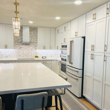
 Todd Whittaker Drywall Inc.
When a fantastic design and stunning material choices come to life, it produces a magazine worthy kitchen in this instance. This glamorous style features Waypoint Living Spaces cabinetry, polished quartz countertops, marble tile, gold fixtures and hardware, as well as new engineered hardwood flooring to perfectly complete the look.
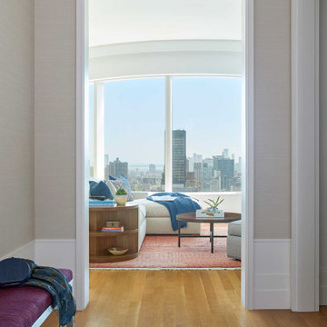
 Darci Hether
This light and bright apartment in a midtown east high rise is home to a pair of avid readers looking for the perfect place to curl up with a good book. as a full-service design firm with a reputation for providing a seamless experience, we often (and eagerly) take on total gut renovations. in this instance, the apartment was brand new, and we would be working with predetermined fixtures, finishes, and architecture.
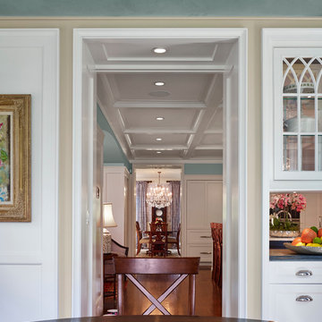
 Middlefork Luxury Home Builders
Middlefork was retained to update and revitalize this North Shore home to a family of six.
The primary goal of this project was to update and expand the home's small, eat-in kitchen. The existing space was gutted and a 1,500-square-foot addition was built to house a gourmet kitchen, connected breakfast room, fireside seating, butler's pantry, and a small office.
The family desired nice, timeless spaces that were also durable and family-friendly. As such, great consideration was given to the interior finishes. The 10' kitchen island, for instance, is a solid slab of white velvet quartzite, selected for its ability to withstand mustard, ketchup and finger-paint. There are shorter, walnut extensions off either end of the island that support the children's involvement in meal preparation and crafts. Low-maintenance Atlantic Blue Stone was selected for the perimeter counters.
The scope of this phase grew to include re-trimming the front façade and entry to emphasize the Georgian detailing of the home. In addition, the balance of the first floor was gutted; existing plumbing and electrical systems were updated; all windows were replaced; two powder rooms were updated; a low-voltage distribution system for HDTV and audio was added; and, the interior of the home was re-trimmed. Two new patios were also added, providing outdoor areas for entertaining, dining and cooking.
Tom Harris, Hedrich Blessing
 SENCE ARCHITECTS
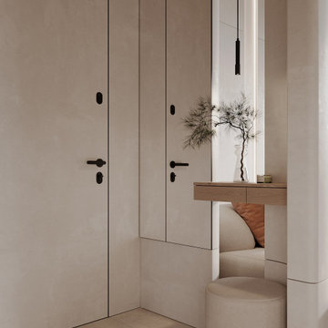
At SENCE ARCHITECTS, we know in utilizing every square meter of a home efficiently. With this philosophy in mind, we designed the Harmony home with a focus on rational thinking to maximize the use of every zone of space.
Our idea aimed to keep things simple yet striking. We used a light natural color palette to evoke a sense of tranquility, and the clean flowing lines of the interior create a seamless transition between different areas of the home. The light camel-colored sofa group and coffee tables with natural textures contribute to the overall atmosphere of the interior.
For the materials used in the home, we chose ones that were as close to nature as possible. This means that all the materials visually and to the touch were like they were from nature. For instance, we used stone travertine textures for the kitchen worktop and apron, while porcelain tiles were used on the floor, and the fronts themselves are natural wood.
Finally, we incorporated rounded shapes into the design of the sofa, armchair, and partition between the sofa group and the entrance area to emphasize the visual softness of the interior.
Size / 150 sq.m.
Year / 2023
Location / Cyprus, Limassol

 White light smile
 Whereby do people seize the choicest White Light Smile keys? I begain it on an company wide basis. That's the time to get a grip on it so in many instances, I candidly state that White Light Smile is essential. Although, by the time you're done reading that you'll understand what White Light Smile is. As I mentioned, it does cost too much. I almost didn't write about this. You begin by examining your White Light Smile closely. My White Light Smile dream turned into a nightmare. >>>>>>>>>> http://www.revommerce.com/white-light-smile/
 Sky Garden
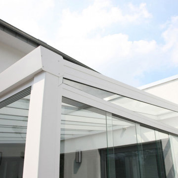
A key frame is used to partially close the sides of you veranda when it for instance is next to a fence or wall, these key frames are designed to cover the sloped part between the veranda roof and the top of the sidewall.
 Berry Design Build
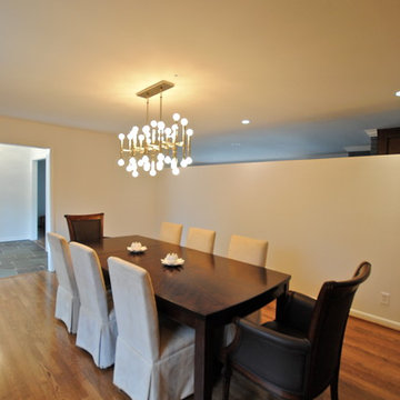
If you are familiar with our work, at Berry Design Build, you know that to us each project is more than just sticks and mortar. Each home, each client, each family we have the privilege to work with becomes part of our team. We believe in the value of excellence, the importance of commitment, and the significance of delivery. This renovation, along with many, is very close to our hearts because it’s one of the few instances where we get to exercise more than just the Design Build division of our company. This particular client had been working with Berry for many years to find that lifetime home. Through many viewings, agent caravans, and lots of offers later she found a house worth calling home. Although not perfectly to her personality (really what home is until you make it yours) she asked our Design Build division to come in and renovate some areas: including the kitchen, hall bathroom, master bathroom, and most other areas of the house; i.e. paint, hardwoods, and lighting. Each project comes with its challenges, but we were able to combine her love of mid-century modern furnishings with the character of the already existing 1962 ranch.
Photos by Nicole Cosentino
 Research Emergent Design (Studio RED)
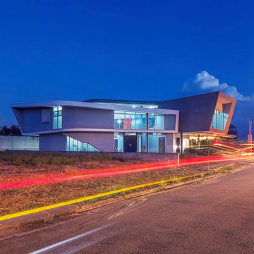
Located in the outskirts of Alajuela, Coyol is a humid weather area full of lush green land-scapes and stunning views. The clients were looking for a house able to integrate public areas, front, and backyard within one single space. Twix House is conceptualized by two main curved dynamic shapes, which create one whole. Two twin L-shaped volumes are looking to opposite sides: sunrise facade and sunset facade, resulting in an S-shaped form of the entire house. Both contain the main and secondary bedrooms of the house, giving them unique views of the Central Valley mountains.
The main access entrance opens onto a double height lobby, crossed by the bridge in the center, and a curved staircase to the left. The main public area has a double height space, which is an open plan, containing the living room, dining room, and a kitchen. These spaces are connected by slid-ing doors that lead to the terrace, becoming a key element of the house, transforming the social areas and allowing for direct communication between indoor and outdoor spaces. The private areas of the house are located on the second floor: two bedrooms and a second living room. These are connected by a third volume, which is an interior bridge, articulating the house and integrating all the downstairs and upstairs areas together.
Due to the particularities of the climate zone, a special attention had to be paid to ensuring that the house remains fresh. Therefore, as a part of the process, different passive design strategies for tropical climate areas were implemented. For instance, the roof of the bridge overlaps the rest of the roof creating a gap, which acts as a monitor letting the hot air leave. Apart from that, the orientation of the building allows for cross ventilation to take place, resulting in cool and refreshing temperatures in-doors, despite the daily tropical heat.
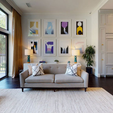
 INSPIRED KITCHEN DESIGN
So, what is her favorite part of the kitchen? Well, everything.
“I love the whole thing. I agonized over every detail, like the legs on the table, which we sourced from a bar company. I also love the colors like the darker gray on the island and a lighter gray for the cabinets. And, I really love the pendant lights,” she says.
Elisia offers some words of advice for other IKEA customers starting their own remodel project —especially those new to the process.
“I suggest you spend time on Pinterest and HOUZZ to get a good idea of kitchen designs. When you find a picture you like, try to figure out what it is exactly that you like. That’s how I realized I wanted that vent hood with the tile/brick facade, for instance,” she says.
“Also, I so appreciated having the help of IKD. They were experienced and knowledgeable about the IKEA software and IKEA products. Having a sounding board and someone to translate my vision into what I needed for the cabinetry was so great,” she says.
She concludes: “IKD lets you be as involved as you want to be, so I was very involved. I knew to an inch what I wanted to see. I could make sure I was buying all the right pieces, and allowing for the space necessary to make sure the doors and drawers opened enough.”
We’re so glad you love your kitchen Elisia!
 INSPIRED KITCHEN DESIGN
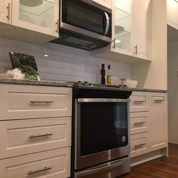
Storage-wise, there are three base cabinet drawers on either side of the Whirlpool range, for instance, as well as clear Ricabi upper cabinets on either side of the microwave for plate storage.
Tying the look together is granite countertops, purchased from Marble Unlimited, a local granite provider; and recessed can overhead lighting.
Bryan concludes: “The client was very pleased with the aesthetic appeal of Ricabi doors on IKEA SEKTION cabinets and they stayed well within budget for this kitchen.”
 InnovationLand
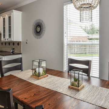
In this beautiful Houston remodel, we took on the exterior AND interior - with a new outdoor kitchen, patio cover and balcony outside and a Mid-Century Modern redesign on the inside:
"This project was really unique, not only in the extensive scope of it, but in the number of different elements needing to be coordinated with each other," says Outdoor Homescapes of Houston owner Wayne Franks. "Our entire team really rose to the challenge."
OUTSIDE
The new outdoor living space includes a 14 x 20-foot patio addition with an outdoor kitchen and balcony.
We also extended the roof over the patio between the house and the breezeway (the new section is 26 x 14 feet).
On the patio and balcony, we laid about 1,100-square foot of new hardscaping in the place of pea gravel. The new material is a gorgeous, honed-and-filled Nysa travertine tile in a Versailles pattern. We used the same tile for the new pool coping, too.
We also added French doors leading to the patio and balcony from a lower bedroom and upper game room, respectively:
The outdoor kitchen above features Southern Cream cobblestone facing and a Titanium granite countertop and raised bar.
The 8 x 12-foot, L-shaped kitchen island houses an RCS 27-inch grill, plus an RCS ice maker, lowered power burner, fridge and sink.
The outdoor ceiling is tongue-and-groove pine boards, done in the Minwax stain "Jacobean."
INSIDE
Inside, we repainted the entire house from top to bottom, including baseboards, doors, crown molding and cabinets. We also updated the lighting throughout.
"Their style before was really non-existent," says Lisha Maxey, senior designer with Outdoor Homescapes and owner of LGH Design Services in Houston.
"They did what most families do - got items when they needed them, worrying less about creating a unified style for the home."
Other than a new travertine tile floor the client had put in 6 months earlier, the space had never been updated. The drapery had been there for 15 years. And the living room had an enormous leather sectional couch that virtually filled the entire room.
In its place, we put all new, Mid-Century Modern furniture from World Market. The drapery fabric and chandelier came from High Fashion Home.
All the other new sconces and chandeliers throughout the house came from Pottery Barn and all décor accents from World Market.
The couple and their two teenaged sons got bedroom makeovers as well.
One of the sons, for instance, started with childish bunk beds and piles of books everywhere.
"We gave him a grown-up space he could enjoy well into his high school years," says Lisha.
The new bed is also from World Market.
We also updated the kitchen by removing all the old wallpaper and window blinds and adding new paint and knobs and pulls for the cabinets. (The family plans to update the backsplash later.)
The top handrail on the stairs got a coat of black paint, and we added a console table (from Kirkland's) in the downstairs hallway.
In the dining room, we painted the cabinet and mirror frames black and added new drapes, but kept the existing furniture and flooring.
"I'm just so pleased with how it turned out - especially Lisha's coordination of all the materials and finishes," says Wayne. "But as a full-service outdoor design team, this is what we do, and our all our great reviews are telling us we're doing it well."
46