
Search results for "Intentional" in Home Design Ideas
 George Ocampo
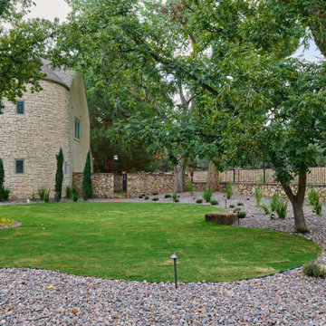
Upper Valley Estate Curb Appeal – El Paso, Texas
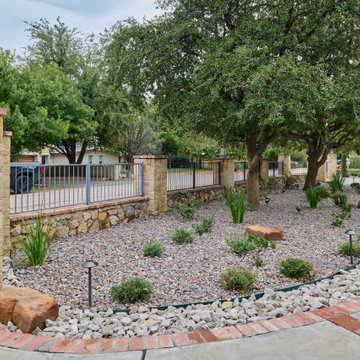
This curb appeal transformation was conceived as a deliberate sequence—an arrival experience where architecture, landscape, and lighting work together as one. Every element was designed to honor the home’s stone construction, turreted forms, and Old World character while responding precisely to the Upper Valley climate and lifestyle.
By day, the experience is grounded and composed. Brick-edged concrete drives establish order and permanence, guiding movement through the property with clarity and intention. Natural stone walls and columns anchor the architecture, while layered gravel beds, drought-tolerant plantings, and manicured turf soften transitions and connect the home to its desert setting. Mature trees were preserved and carefully integrated, providing scale, shade, and a sense of continuity.
As afternoon shifts toward sunset, the materials begin to speak differently. Stone warms, textures deepen, and sightlines subtly draw the eye toward the front entry. The landscape narrows the focus, creating a moment of pause before arrival—calm, quiet, and refined.
At night, the design reveals its final layer. Low-voltage lighting is integrated with precision, washing stone surfaces, tracing architectural curves, and uplighting specimen trees to create depth without glare. The drive, walkways, and entry feel safe, legible, and inviting, while the home itself glows with a restrained elegance. Coming home after dark feels intentional—protected, welcoming, and unmistakably yours.
What was created is more than curb appeal. It is a cohesive design-build solution where nothing is ornamental without purpose and nothing is built without intention. A daily experience of arrival that reflects craftsmanship, care, and the enduring character of the Upper Valley.
 George Ocampo
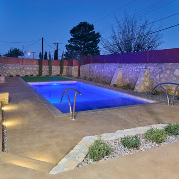
Central El Paso Backyard Renovation:
Fifteen years is a long time for a backyard to quietly wait.
At first, it was full of intention—a pool that promised summers, laughter, and long evenings. But time has a way of settling in. The water turned still, then green. Edges cracked. The space became less of a destination and more of something you looked past. Life moved forward, but the backyard stayed behind.
Then came the decision: it was time.
Not a patch job. Not a quick fix. A complete reset.
The transformation didn’t begin beautifully—it began with demolition. The old pool was drained, exposing years of neglect etched into its surface. Crews stepped in, breaking, clearing, reshaping. What once held stagnant water became an open cavity of possibility. Steel rebar formed a new skeleton, precise and intentional. Every line measured. Every elevation reconsidered.
This wasn’t just construction—it was rethinking how the space should live.
The shell was rebuilt. Surfaces were refined. Plumbing, structure, and flow were corrected at their core. What had once been outdated and failing was now engineered to last.
Then the shift happened.
Hardscape came in—clean, warm-toned concrete replacing worn decking. Stone walls, once just boundaries, were elevated into features. Subtle textures, intentional lines. A visual language that matched the architecture of the home instead of competing with it.
The pool returned—but not as it was.
Now it was sharp, modern, and inviting. A long, clean body of water with a shallow tanning ledge that catches the sun just right. Stainless steel scuppers arc water into the pool—movement, sound, life. Steps are crisp, geometry is balanced, and the water reflects clarity instead of neglect.
Around it, the yard found purpose.
Artificial turf introduced contrast—green, controlled, low-maintenance. A pergola structure rose in the corner, creating a destination within the destination. Beneath it, a built-in outdoor kitchen turned the backyard into a place to gather, not just pass through. Lighting stitched everything together, making the space just as alive at dusk as it is under the midday sun.
By the end, nothing felt accidental.
What was once forgotten is now deliberate. What was once avoided is now the center of attention.
Fifteen years later, the backyard didn’t just come back—it finally became what it was always supposed to be.

Find the right local pro for your project
 Prime Design and Build
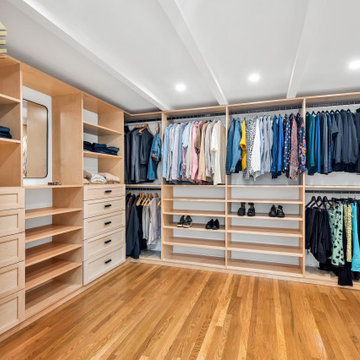
Clean. Calm. Custom.
This Scandinavian-inspired walk-in closet features light wood cabinetry, sleek lines, and smart storage—designed by Prime Design & Build for effortless organization and timeless style in Redwood City.
 KSI Kitchen & Bath
Every design project has its own story, and this one stands out for the creative collaboration and smart decision-making that brought it to life. Our client—a designer herself—came to us with a clear vision: she wanted a lighter, brighter kitchen with more functional storage and a larger island for seating that wouldn’t disrupt the flow of the space. From our first meeting, I knew we were going to build something special together!
 George Ocampo
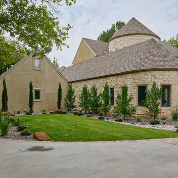
Upper Valley Estate Curb Appeal – El Paso, Texas
This curb appeal transformation was conceived as a deliberate sequence—an arrival experience where architecture, landscape, and lighting work together as one. Every element was designed to honor the home’s stone construction, turreted forms, and Old World character while responding precisely to the Upper Valley climate and lifestyle.
By day, the experience is grounded and composed. Brick-edged concrete drives establish order and permanence, guiding movement through the property with clarity and intention. Natural stone walls and columns anchor the architecture, while layered gravel beds, drought-tolerant plantings, and manicured turf soften transitions and connect the home to its desert setting. Mature trees were preserved and carefully integrated, providing scale, shade, and a sense of continuity.
As afternoon shifts toward sunset, the materials begin to speak differently. Stone warms, textures deepen, and sightlines subtly draw the eye toward the front entry. The landscape narrows the focus, creating a moment of pause before arrival—calm, quiet, and refined.
At night, the design reveals its final layer. Low-voltage lighting is integrated with precision, washing stone surfaces, tracing architectural curves, and uplighting specimen trees to create depth without glare. The drive, walkways, and entry feel safe, legible, and inviting, while the home itself glows with a restrained elegance. Coming home after dark feels intentional—protected, welcoming, and unmistakably yours.
What was created is more than curb appeal. It is a cohesive design-build solution where nothing is ornamental without purpose and nothing is built without intention. A daily experience of arrival that reflects craftsmanship, care, and the enduring character of the Upper Valley.

 Swatch Design Group
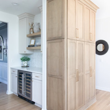
As a part of a larger transformation, the kitchen served as an anchor for rethinking how the home could feel and function. The goal was to create a space that felt truly integrated, flowed naturally within itself, and connected seamlessly to the outdoors. Storage was a top priority, with an emphasis on keeping countertops clean and the space feeling calm and open. Flow was equally important. What began as a layout optimized for entertaining evolved into a more intentional approach, where every sightline and transition was thoughtfully considered. The clients also needed the kitchen to work hard for their lifestyle, with a commercial-size refrigerator and freezer, generous prep space, and room to gather. The challenge was to bring purpose and polish to a space that didn’t quite feel like it belonged. The result is a kitchen that’s not only highly functional but finally feels like part of the home.
Project challenges:
- Maximizing storage was a primary challenge, especially with the inclusion of a commercial-sized fridge and freezer that occupied valuable cabinetry space.
- The need for clean, uninterrupted lines throughout the kitchen required thoughtful detailing, especially around cabinetry transitions and appliance integration.
- The oversized island design required two stone slabs and waterfall edges on both sides which posed both visual and logistical challenges.
- Incorporating electrical outlets into the island in a way that felt intentional and unobtrusive demanded creative problem-solving.
- The unique rooflines created strong visual angles that required a considered design approach to ensure the space felt cohesive rather than disjointed.
- Balancing symmetry and flow in a kitchen with structural constraints required precise layout planning to maintain a cohesive visual rhythm.
- Creating an intentional indoor/outdoor living flow, especially in the transitional space between the sliding doors to the backyard and the kitchen.
Project solutions:
- To balance the visual weight of the commercial-grade fridge and freezer, we flanked the range and hood with full-height pocket cabinetry, which created symmetry while reclaiming storage space. We also took a look into internal organization and carefully mapped out where every kitchen item would live. This allowed us to make informed decisions about drawer versus door configurations, and when to incorporate features like roll-out shelving to maximize accessibility and function.
- Linear light fixtures above the island were chosen for their low visual impact, allowing sightlines to remain clear and emphasizing the thoughtful spatial layout.
- The oversized island was carefully executed using two coordinated slabs, with a subtle brass inlay detail between them to turn a logistical challenge into a design feature.
- Pop-up electrical outlets were integrated into the island to keep surfaces clutter-free while maintaining easy access, which combined form and function seamlessly.
- With multiple focal points and a peaked vaulted ceiling, layout precision was key. The island, hood, and adjacent staircase were all perfectly centered on the vault, creating a sense of alignment across the open space.
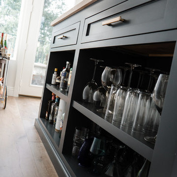
- In the transitional area between kitchen and backyard, we added a wet bar that visually and functionally connects the indoor space with the outdoors. This addition provides extra storage and creates a dedicated entertainment spot for guests, enhancing the overall flow and usability of the home.
 George Ocampo
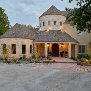
Upper Valley Estate Curb Appeal – El Paso, Texas
This curb appeal transformation was conceived as a deliberate sequence—an arrival experience where architecture, landscape, and lighting work together as one. Every element was designed to honor the home’s stone construction, turreted forms, and Old World character while responding precisely to the Upper Valley climate and lifestyle.
By day, the experience is grounded and composed. Brick-edged concrete drives establish order and permanence, guiding movement through the property with clarity and intention. Natural stone walls and columns anchor the architecture, while layered gravel beds, drought-tolerant plantings, and manicured turf soften transitions and connect the home to its desert setting. Mature trees were preserved and carefully integrated, providing scale, shade, and a sense of continuity.
As afternoon shifts toward sunset, the materials begin to speak differently. Stone warms, textures deepen, and sightlines subtly draw the eye toward the front entry. The landscape narrows the focus, creating a moment of pause before arrival—calm, quiet, and refined.
At night, the design reveals its final layer. Low-voltage lighting is integrated with precision, washing stone surfaces, tracing architectural curves, and uplighting specimen trees to create depth without glare. The drive, walkways, and entry feel safe, legible, and inviting, while the home itself glows with a restrained elegance. Coming home after dark feels intentional—protected, welcoming, and unmistakably yours.
What was created is more than curb appeal. It is a cohesive design-build solution where nothing is ornamental without purpose and nothing is built without intention. A daily experience of arrival that reflects craftsmanship, care, and the enduring character of the Upper Valley.
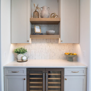 KSI Kitchen & Bath
Every design project has its own story, and this one stands out for the creative collaboration and smart decision-making that brought it to life. Our client—a designer herself—came to us with a clear vision: she wanted a lighter, brighter kitchen with more functional storage and a larger island for seating that wouldn’t disrupt the flow of the space. From our first meeting, I knew we were going to build something special together!
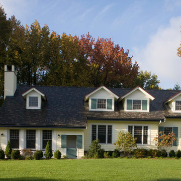
 Kevin Mason, Architect
A CUSTOM DUTCH DOOR leads to the potting shed, used to store trash cans convenient to the street for pick up.
DIAGONAL BEAD BOARD is used here, on exterior shutters and on doors inside the house.
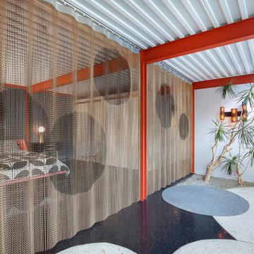
 Boyenga Team / Compass
Eichler X-100 Bedroom: A Private Retreat Defined by Light and Calm
The bedrooms of the Eichler X-100 offer a quieter, more intimate expression of the home’s architectural vision—spaces designed for rest, reflection, and connection to light and nature. Conceived by A. Quincy Jones and Frederick Emmons for Joseph Eichler, these rooms balance simplicity with thoughtful design in a way that feels both modern and timeless.
Minimalism with Purpose
The bedrooms are intentionally restrained—free of unnecessary detail—allowing the architecture itself to define the experience. Clean lines, open volumes, and uncluttered surfaces create a sense of calm that feels almost meditative.
Every element serves a purpose, reinforcing a lifestyle centered on clarity and ease.
Light, Softened and Controlled
Unlike the expansive public spaces, the bedrooms receive light in a more subtle way:
Skylights filter daylight from above, creating a soft, even glow
Carefully placed glazing maintains brightness while preserving privacy
Light shifts gently throughout the day, enhancing the room’s tranquil atmosphere
This approach transforms light into something quiet and restorative.
A Connection to Nature—On Your Terms
Even in these more private spaces, the X-100 maintains its connection to the outdoors. Views often extend toward interior gardens or landscaped areas, allowing nature to remain present without sacrificing seclusion.
The result is a unique balance:
open, yet protected.
Integrated Within the Plan
Positioned along the home’s central circulation, the bedrooms are seamlessly connected to the rest of the house while still feeling distinctly separate. The layout allows for easy movement, yet maintains a clear transition from public to private zones.
There are no long corridors or wasted space—just efficient, intentional design.
Comfort Through Design
The bedrooms reflect Eichler’s belief that architecture should enhance everyday life. Radiant-heated floors, natural materials, and thoughtful proportions create an environment that is both comfortable and visually refined.
It’s a space that supports rest without distraction.
A Quiet Expression of Modernism
While the X-100 is known for its bold experimentation, the bedrooms reveal a softer side—where modernism becomes personal. These rooms are not about making a statement; they are about creating a sense of peace within a larger architectural vision.
In the Eichler X-100, even the most private spaces are designed with intention—proving that great architecture isn’t just experienced in grand gestures, but in the quiet moments of everyday life.
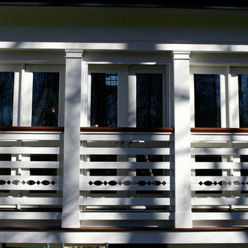 Kevin Mason, Architect
EYELET RAILING GUARDS JULIET BALCONY that overlooks terrace from the living room.
Inspiration for a small eclectic wood railing balcony remodel in New York
Inspiration for a small eclectic wood railing balcony remodel in New York
 Kevin Mason, Architect
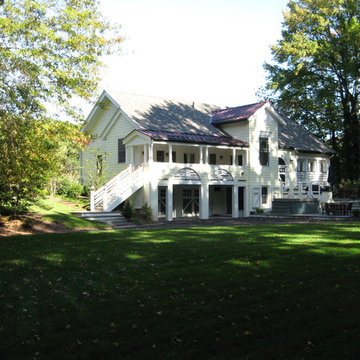
THE ELABORATE GARDEN FACADE comes as a surprise given the more modest street façade.
THE TOWER HOUSES the dining room above and a ground floor foyer below.
GARAGE DOORS ARE SET BACK to make room for a grade-level covered area.
 lavish
When a professional office space needs to make a lasting impression on clients and create an inspiring environment for staff, the design details matter just as much as they do at home. This thoughtful commercial interior refresh transformed a dated, purely functional office into a warm, sophisticated, and beautifully layered space — one that feels more like a high-end boutique or luxury residence than a typical workplace.
The guiding philosophy throughout was clear: every space, no matter how utilitarian its purpose, deserves intentional design. From the reception corridor to the staff break room, from the client restrooms to the storage corridor, each area received careful attention to finish, color, and texture.
Restrooms Reimagined
The two client-facing restrooms were the most dramatic transformations in the project. Rather than the builder-grade wallpaper and basic fixtures typically found in commercial spaces, both were treated as true design moments.
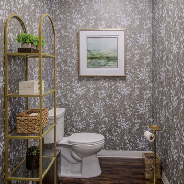
The first features floor-to-ceiling wallpaper in a rich taupe with a delicate white botanical branch pattern, creating an immersive, jewel-box feel. A white shaker vanity with dark granite countertop grounds the space, while an arched frameless mirror and brushed gold wall sconce add glamour. A tall gold and glass etagere serves as both decorative storage and a sculptural element, styled with woven baskets, greenery, and stacked accessories. Framed landscape watercolor art adds a serene, organic note, and a freestanding brass toilet paper holder elevates a typically overlooked detail.
The second restroom takes an entirely different but equally compelling direction — soft, dusty blue-grey grasscloth-style wallpaper printed with a tone-on-tone chevron leaf stripe wraps every wall, creating a calm, spa-like atmosphere. A weathered wood console provides casual charm beneath a large-scale botanical tulip artwork in sage and cream. The wall-mount sink with exposed plumbing adds an intentional, editorial touch. An arched mirror with a sleek multi-bulb bar sconce in brushed nickel completes the look, while a pair of sculptural brass branch wall sculptures mounted directly to the wallpaper serve as unexpected, memorable art.
Storage Made Beautiful
The internal storage corridor received a full wall of custom floor-to-ceiling white shaker cabinetry with chrome pulls, flanked by open shelving sections for accessible display and storage. Clean, crisp, and highly organized — this space proves that even a purely functional corridor can be architectural and refined.
The Break Room & Kitchenette
The staff break room was updated with white shaker cabinetry, light speckled granite countertops, stainless appliances — including a French door refrigerator, dishwasher, and over-counter microwave — and warm sage green walls that bring a restful, refreshing energy to the space. Dark hardwood luxury vinyl plank flooring runs throughout the room, warming the look considerably. A round walnut dining table with upholstered chairs creates a proper gathering space for the team, and framed landscape oil art in an ornate gold frame adds a touch of collected character to the room.
Reception & Corridor Details
The reception and corridor spaces were treated with deep navy blue paint — bold, sophisticated, and unexpected in a commercial setting. A large abstract landscape painting in warm blues, blush, and gold hangs in a gilded frame against the navy wall, making an immediate statement. A brass and lucite table lamp sits on a floating brass-trimmed shelf alongside a sculptural art object, creating a vignette that communicates creativity and intentionality from the moment clients arrive.
The result is a professional environment that communicates confidence, taste, and care — one that clients will remember long after their visit, and one that staff will genuinely enjoy working in every day.
 Studio Vice
Ryan Stadler Photography
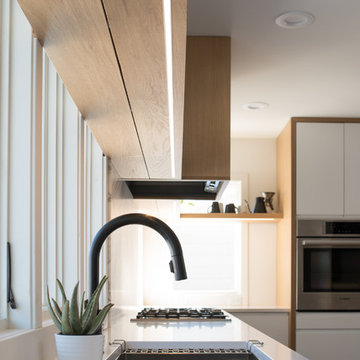
Example of a mid-century modern eat-in kitchen design in Minneapolis with flat-panel cabinets, white cabinets, quartz countertops, multicolored backsplash, stone slab backsplash, stainless steel appliances and no island
Example of a mid-century modern eat-in kitchen design in Minneapolis with flat-panel cabinets, white cabinets, quartz countertops, multicolored backsplash, stone slab backsplash, stainless steel appliances and no island
 Kevin Mason, Architect
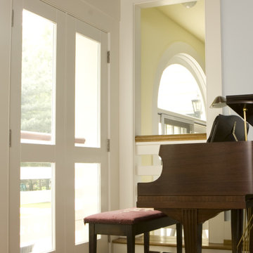
GRANDMOTHER'S GRAND PIANO sits near a Juliette balcony. Its player can look into the light-filled secondary stair well.
Inspiration for a mid-sized eclectic open concept medium tone wood floor and brown floor living room remodel in New York with blue walls, a wood stove, a stone fireplace, a concealed tv and a music area
Inspiration for a mid-sized eclectic open concept medium tone wood floor and brown floor living room remodel in New York with blue walls, a wood stove, a stone fireplace, a concealed tv and a music area
 George Ocampo
Upper Valley Estate Curb Appeal – El Paso, Texas
This curb appeal transformation was conceived as a deliberate sequence—an arrival experience where architecture, landscape, and lighting work together as one. Every element was designed to honor the home’s stone construction, turreted forms, and Old World character while responding precisely to the Upper Valley climate and lifestyle.
By day, the experience is grounded and composed. Brick-edged concrete drives establish order and permanence, guiding movement through the property with clarity and intention. Natural stone walls and columns anchor the architecture, while layered gravel beds, drought-tolerant plantings, and manicured turf soften transitions and connect the home to its desert setting. Mature trees were preserved and carefully integrated, providing scale, shade, and a sense of continuity.
As afternoon shifts toward sunset, the materials begin to speak differently. Stone warms, textures deepen, and sightlines subtly draw the eye toward the front entry. The landscape narrows the focus, creating a moment of pause before arrival—calm, quiet, and refined.
At night, the design reveals its final layer. Low-voltage lighting is integrated with precision, washing stone surfaces, tracing architectural curves, and uplighting specimen trees to create depth without glare. The drive, walkways, and entry feel safe, legible, and inviting, while the home itself glows with a restrained elegance. Coming home after dark feels intentional—protected, welcoming, and unmistakably yours.
What was created is more than curb appeal. It is a cohesive design-build solution where nothing is ornamental without purpose and nothing is built without intention. A daily experience of arrival that reflects craftsmanship, care, and the enduring character of the Upper Valley.
51