
Search results for "Investigation" in Home Design Ideas
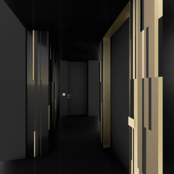
 KURV Architecture DPC (Alex Hughes Architects)
Located in the heart of Manhattan’s Lower East Side, the building was erected on a shallow commercial lot between two 120 year old masonry buildings and a new residential rental building. 330 Grand Street is a mix of 725 SF 1BRs and 1050 SF 2BR apartments. It also contains a 1100 SF two story duplex as well as private and public rooftop space, large private balconies for most units and two large private terraces for the ground floor units.
330 Grand Street was originally designed and approved at the NYC DOB as a prefabricated modular building. During the pandemic, as shipping costs skyrocketed putting the project at risk, we suggested redesigning the building as a reinforced cast-in-place concrete structure. Concrete was readily available and prices had not been affected by the demand increase that many other materials suffered in the pandemic. We took this opportunity to raise floor to ceiling heights, enlarge high performance windows and redistribute the buildings MEPFS and Structural Systems to create very open floor plans.
The challenge was to create a luxurious sensorial living experience with very limited means. In a city with very high construction costs, low cost residential buildings in the area are usually devoid of good quality, design and character. Our approach was to aim high for the end user, prioritizing natural light, open space with long visual perspectives, high ceilings and as always, rejecting the use of predefined building templates.
Our biggest challenge was to ensure that the small spaces feel as clean cut, large and bright as possible. Several unique design decisions were made to ensure low cost and high quality;
Floor plans were laid out so that spaces were wide open and free of clutter from mechanical or structural interruptions. Therefore all infrastructure was placed in lateral demising walls, which in turn act as the unit’s storage and kitchen. The apartments feel wide open, are super quiet and have more storage space than any other comparable apartment in the city.
To solve the problem of the site’s shallow commercial lot which is typically prone to dark interior spaces we focused our attention on the building’s envelope. Instead of the usual small punched window openings, oversized high performance windows were designed to ensure that light penetrated as far as possible into the units. In the smaller 1BR units, the full 50’ depth of the lot is perceived by partitioning spaces with sliding pocket doors that can be retracted to allow deep visual perspectives, making the sight lines in the space feel longer, larger, more ample than normal. In addition to the full height glazing, each unit above the 2nd floor receives a 7 foot covered balcony, adding 120 to 240 sf to each apartment, something unusual in New York City buildings. The space is large enough for a full size dining table, when the weather permits being outside.
We also worked hard to ensure modularity. For example, all kitchen units are all identical throughout the building. The idea of modularity and the economy of the repetitive unit is exercised to the maximum through the building.
Hardware, appliances, flooring, wall coverings and material finishes are all carefully selected to feel bespoke, high quality and unique.
It was important to KURV that the result of this work manifest into something that would deeply connect with the end user and sustain relationships with the consumers of this space.
All images by KURV Architecture ©

 ARTANA
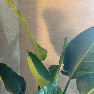
I placed this Fiddlehead to activate a dull corner and to keep the plant close to sunlight per its instructions. Here the light dances on the plant which casts a shadow onto the wall- adding more intrigue. It truly is another lovely (understated moment). SAY YES TO THE POWER OF PLANTS. Preferably, I use living plants for my client’s psyche and to have these green living cells keep them company. However, if one can't commit to keeping plants alive, then go for the silk!
Find the right local pro for your project



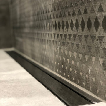


 Alpenglow Lighting Design, Inc,
Inspiration for a large modern hallway remodel in Denver with beige walls
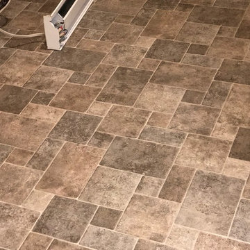


 Dungan's Floors
Large transitional formal carpeted living room photo in Dallas with beige walls, a standard fireplace, a tile fireplace and no tv


 Drury Design
The Setup
The homeowners of this Barrington Hills residence approached Drury Design with a clear vision: transform their existing kitchen into a space that would better serve their active family of four. With two young children who are homeschooled and love to bake with their mom, plus two dogs, this kitchen needed to function as the true heart of the home.
The existing kitchen was functional but didn’t maximize the potential of the beautiful natural light and scenic views available through the floor-to-ceiling windows. The space was locked between the dining room and family room, which limited structural modifications, but the homeowners wanted to create a more family-friendly environment that would complement the warm walnut built-ins and furnishings in the adjacent dining room while staying true to the home’s overall aesthetic.
Design Objectives:
Create a highly functional workspace that accommodates multiple family members cooking and gathering simultaneously
Maximize the connection to the beautiful outdoor scenery and natural light through thoughtful design choices
Establish a cohesive color palette that complements the existing walnut elements in the adjacent dining room without becoming too tone-on-tone (aka “matchy matchy”)
Improve the seating arrangement to take advantage of the stunning views (rather than facing away from the windows)
Work within the existing architectural constraints, including a curved soffit that could not be removed
Increase storage capacity while maintaining clean, uncluttered sightlines throughout the space
Design Challenges:
The curved soffit presented a design dilemma of whether to echo the curve throughout the kitchen or work with it in a more subtle way
The relatively low ceiling height required careful consideration to avoid making the space feel cramped or cave-like
The existing hardwood floor could not be refinished, which meant the new kitchen footprint had to match or exceed the original layout exactly
Finding the right balance of warm and neutral tones to complement both the existing walnut elements nearby and the natural outdoor views proved challenging
The refrigerator placement was constrained by door swing requirements, which affected the entire layout and prevented centering the sink on the back wall
Rethinking the original seating, which faced inward toward the kitchen (turning backs to the beautiful windows and outdoor views)
Pendant lighting from the previous kitchen obstructed views to the outdoors despite the abundant natural light available
The Renewed Space
Design Solutions:
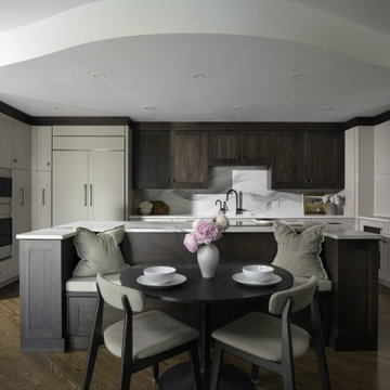
The curved soffit was embraced subtly through the full slab backsplash, which echoes the curve without requiring curved cabinetry or architectural elements that might feel forced
Low ceiling challenges were addressed by using lighter painted cabinets for some tall elements, including the double oven, pantries, and refrigerator area, creating an airy feel while reserving the darker stained walnut for the center section and island
The floor constraint was managed by designing the new layout to cover all previously unfinished areas while maintaining the exact footprint, with only minor touch-ups needed in a few areas
The color palette balances warm walnut stain (harmonizing with the dining room built-ins) with soft, neutral painted cabinets – avoiding stark white that wouldn’t complement the home’s warm aesthetic
Refrigerator placement was optimized with a slim pullout pantry to the left, allowing proper door clearance while maintaining the desired layout flow and enabling the main pantry to be positioned adjacently
The seating was completely reimagined with a built-in banquette facing the windows, allowing diners to enjoy the outdoor views while providing flexible seating for two to four people
Decorative pendant lighting was eliminated in favor of recessed can lights, preserving the unobstructed views to the beautiful outdoor scenery
This kitchen transformation demonstrates how thoughtful design can dramatically improve functionality for a busy family while honoring existing architectural elements. The children immediately began cooking and baking with their mother in the new space, and the window-facing banquette has become a favorite gathering spot where the family can enjoy both meals and the beautiful outdoor views.
101