
Search results for "Kill lane" in Home Design Ideas



 K&B Interiors
Organic, warm, refreshing primary bedroom with walnut moments galore.
Example of a 1960s master medium tone wood floor and brown floor bedroom design in Philadelphia with green walls
Example of a 1960s master medium tone wood floor and brown floor bedroom design in Philadelphia with green walls

Find the right local pro for your project


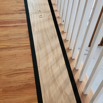
 The Stair Repair, LLC
This project included the railing for the staircase and balcony, and the client requested a custom floor inlay which concealed an opening viewable from below. This opening had a glass bottom, lighting and showcased books selected by our client.

 The Amendola Group, Inc.
Creating a reclusive spot for enjoying a small pond, this project in Poughkeepsie takes full advantage of the surrounding splendor. A welcoming gazebo, situated on the thriving bank, affords views of the pond and other nearby wonders. A short path offers guests a reprieve from conversation with a stroll by the pond.


 Elevated Outdoors
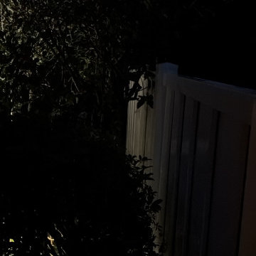
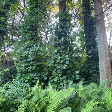
This area is located behind the hanging pod chairs. It was a very dark space with only the trunks of the cypress trees visible. We loaded the beds with ferns, lysimachia and climbing hydrangeas, which eventually grew up the neighboring fence and trees.






 Classic Kitchens Designs & Renovations Ltd.
Our homeowners had an issue with their old kitchen in that it felt very cramped and didn't work well. Additionally the bulkheads made it feel very closed in. We put together a design to more efficiently use the space, picked some amazing materials, and the rest is history as they say. Premium Canadian made cabinetry was utilized in the customers chosen Benjamin Moore colours, along with new quartz countertops and waterproof Luxury vinyl plank flooring which is ideal for a kitchen space. A porcilain "brick look" backsplash tied it all together. As you can see, unifying the eating area with the island is a vastly better use of space than the original builder plan and for those larger gatherings, the dining room is right beside the kitchen. Have a look at the original photos and you will see that this kitchen has improved dramatically for the better!




 Knock On Wood Studio
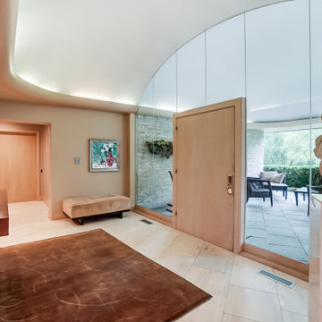
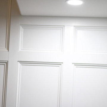
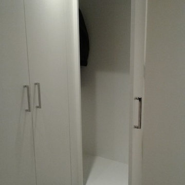
A modern urban residence designed with sleek lines, custom storage solutions, and a minimalist aesthetic. Thoughtfully integrated cabinetry enhances both functionality and style while complementing the home's contemporary architecture.

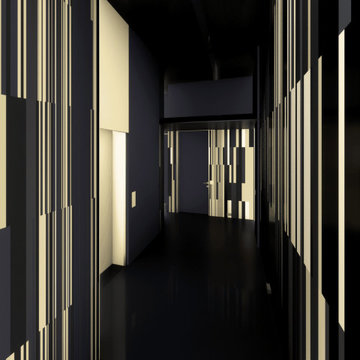
 KURV Architecture DPC (Alex Hughes Architects)
Located in the heart of Manhattan’s Lower East Side, the building was erected on a shallow commercial lot between two 120 year old masonry buildings and a new residential rental building. 330 Grand Street is a mix of 725 SF 1BRs and 1050 SF 2BR apartments. It also contains a 1100 SF two story duplex as well as private and public rooftop space, large private balconies for most units and two large private terraces for the ground floor units.
330 Grand Street was originally designed and approved at the NYC DOB as a prefabricated modular building. During the pandemic, as shipping costs skyrocketed putting the project at risk, we suggested redesigning the building as a reinforced cast-in-place concrete structure. Concrete was readily available and prices had not been affected by the demand increase that many other materials suffered in the pandemic. We took this opportunity to raise floor to ceiling heights, enlarge high performance windows and redistribute the buildings MEPFS and Structural Systems to create very open floor plans.
The challenge was to create a luxurious sensorial living experience with very limited means. In a city with very high construction costs, low cost residential buildings in the area are usually devoid of good quality, design and character. Our approach was to aim high for the end user, prioritizing natural light, open space with long visual perspectives, high ceilings and as always, rejecting the use of predefined building templates.
Our biggest challenge was to ensure that the small spaces feel as clean cut, large and bright as possible. Several unique design decisions were made to ensure low cost and high quality;
Floor plans were laid out so that spaces were wide open and free of clutter from mechanical or structural interruptions. Therefore all infrastructure was placed in lateral demising walls, which in turn act as the unit’s storage and kitchen. The apartments feel wide open, are super quiet and have more storage space than any other comparable apartment in the city.
To solve the problem of the site’s shallow commercial lot which is typically prone to dark interior spaces we focused our attention on the building’s envelope. Instead of the usual small punched window openings, oversized high performance windows were designed to ensure that light penetrated as far as possible into the units. In the smaller 1BR units, the full 50’ depth of the lot is perceived by partitioning spaces with sliding pocket doors that can be retracted to allow deep visual perspectives, making the sight lines in the space feel longer, larger, more ample than normal. In addition to the full height glazing, each unit above the 2nd floor receives a 7 foot covered balcony, adding 120 to 240 sf to each apartment, something unusual in New York City buildings. The space is large enough for a full size dining table, when the weather permits being outside.
We also worked hard to ensure modularity. For example, all kitchen units are all identical throughout the building. The idea of modularity and the economy of the repetitive unit is exercised to the maximum through the building.
Hardware, appliances, flooring, wall coverings and material finishes are all carefully selected to feel bespoke, high quality and unique.
It was important to KURV that the result of this work manifest into something that would deeply connect with the end user and sustain relationships with the consumers of this space.
All images by KURV Architecture ©

78