
Search results for "Larger crowd" in Home Design Ideas
 Designs by KS
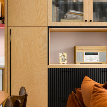
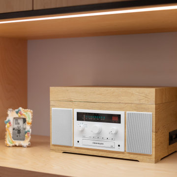
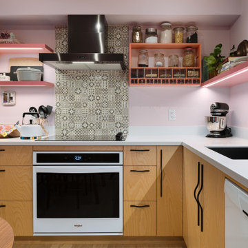
By not having any upper cabinets, the space feels less crowded and bigger, as if it belongs to a larger home. The few cabinets in the kitchen are efficiently utilized, but we had to compensate for storage elsewhere.
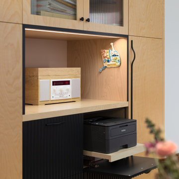
We have designed a custom hutch for Michelle that serves multiple purposes. It not only provides storage for overstock from the kitchen but also acts as a hub for her electronics, paperwork, printer, filing drawer, and craft supplies.
The kitchen is influenced by Scandinavian design, featuring playful shades of pink on the walls, the floating shelf, and the vintage spice cubby (coral). Timeless black and white accents throughout the space complement the pink accents in a subtle way.
 Everything Home
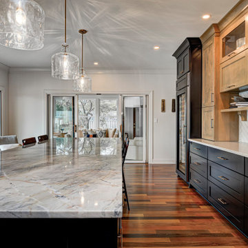
The centerpiece of this exquisite kitchen is the deep navy island adorned with a stunning quartzite slab. Its rich hue adds a touch of sophistication and serves as a captivating focal point. Complementing this bold choice, the two-tone color-blocked cabinet design elevates the overall aesthetic, showcasing a perfect blend of style and functionality. Light counters and a thoughtfully selected backsplash ensure a bright and inviting atmosphere.
The intelligent layout separates the work zones, allowing for seamless workflow, while the strategic placement of the island seating around three sides ensures ample space and prevents any crowding. A larger window positioned above the sink not only floods the kitchen with natural light but also provides a picturesque view of the surrounding environment. And to create a cozy corner for relaxation, a delightful coffee nook is nestled in front of the lower windows, allowing for moments of tranquility and appreciation of the beautiful surroundings.
---
Project completed by Wendy Langston's Everything Home interior design firm, which serves Carmel, Zionsville, Fishers, Westfield, Noblesville, and Indianapolis.
For more about Everything Home, see here: https://everythinghomedesigns.com/
To learn more about this project, see here:
https://everythinghomedesigns.com/portfolio/carmel-indiana-elegant-functional-kitchen-design
 Drury Design
THE SETUP
Client Background: Our clients, a couple who have transitioned into the empty nest phase, have cherished their home for over three decades without undergoing any significant renovations. With a newfound desire to adapt their living space to better suit their current lifestyle, they’ve embarked on a journey to reimagine their kitchen — the heart of their home. Their aspiration is to cultivate a serene, neutral-toned sanctuary on the first floor that seamlessly merges with their family room, ensuring a harmonious and inviting environment.
Design Inspiration: The renovation is inspired by the couple’s penchant for soft, calming neutrals, using their cherished family room and the kitchen’s existing tile flooring as the cornerstone for the color scheme. This approach aims to foster a sense of warmth and tranquility throughout.
Design Objectives:
Harmonize the kitchen with the family room by adopting a soothing, neutral color scheme, ensuring a seamless flow across the first floor.
Enhance kitchen functionality with thoughtfully designed cabinetry, providing a designated place for every item and maximizing storage efficiency.
Cultivate an inviting and comfortable atmosphere that reflects the homeowners’ desire for a calm and relaxing space.
Design Challenges:
The homeowners wish to retain the existing kitchen tile flooring and integrate it into a refreshed, modern design.
Accommodating a dining area spacious enough for family visits without compromising the kitchen’s open feel or functional layout.
Despite liking the current placement of plumbing and appliances, the homeowners aspire for a more open floor plan to facilitate better movement and interaction.
The need to amplify natural light in the kitchen, especially around the sink area, where existing lighting is insufficient.
Preserving the half-wall between the kitchen and family room, a feature the homeowners want to keep, while ensuring it complements the new design.
THE RENEWED SPACE
Design Solutions:
By choosing a neutral color palette that complements the existing tile, the design unifies the kitchen with the adjacent spaces. The tile’s grout was cleaned and restored, enhancing the floor’s appearance and integrating it seamlessly with the new kitchen aesthetic.
The inclusion of a larger island with seating for two, alongside maintaining a substantial dining table, was achieved by optimizing the spatial layout. This allowed for a sociable yet functional kitchen, accommodating large family gatherings without feeling crowded.
Minor adjustments to the kitchen’s layout maintained the preferred locations for plumbing and appliances while introducing an ‘open’ design concept. Strategic modifications, such as angling the pantry wall, improved the flow and accessibility within the space.
Replacing the garden window with a broader, standard window significantly increased natural light, transforming the sink area into a bright, welcoming space with enhanced views of the outdoors.
The decision to keep the half-wall was ingeniously leveraged to define the dining area while maintaining an open connection to the family room. This feature not only serves as a visual separator but also ties the two spaces together through the shared color scheme and design elements.
The homeowners are thrilled with their newly remodeled kitchen, which has become a hub of warmth and hospitality. Hosting a wedding shower and a birthday party, they have shared their renewed space with friends and family, who have been equally enamored. This remodel has not only met their functional and aesthetic desires but has also enriched their home with a fresh sense of serenity and joy.
The upstairs part of the home is shaping up nicely. Here’s their newly remodeled primary bathroom.
Find the right local pro for your project
 Touchstone Kitchen and Bath
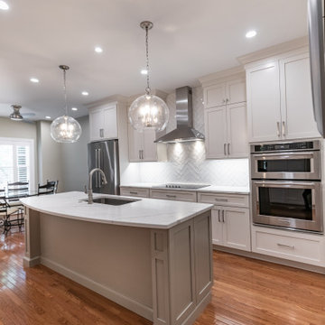
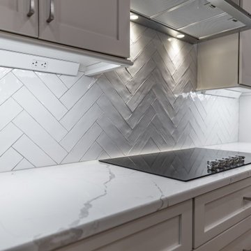
From crowded and cluttered to open and clean! This kitchen renovation streamlined and simplified the space to make it more functional for this Blue Bell, PA family. The kitchen flows seamlessly into the dining space instead of being cut off by a countertop; the bright whites in this design make the room feel larger. We also did away with a small, barely functional pantry closet in favor of two floor to ceiling cabinets that really maximize storage potential!
 Stacey Kocevar Designs, LLC
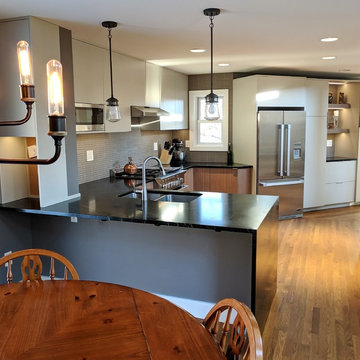
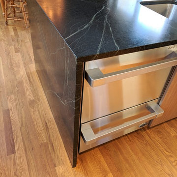
This space was an addition off of an existing small living space, which was designed by an architect who created a beautifully dramatic, two-story, living space by angling walls and making the living room area 2 stories high, with an overlook at the top of the spiral staircase to the second floor. The appliances were already set in place, and the homeowners did not want to move the existing plumbing, electrical, or venting, so I had to work within those parameters. They wanted a contemporary, industrial, feel for the kitchen, which I believe is described as Midcentry Modern, was acheived by using slab-style doors and drawers, mixing painted with walnut veneered finishes, along with other custom and unique items. The soapstone was a must-have for the homeowners, providing a source for the painted cabinetry color, which draws out the beautiful veins in the countertop. They needed pantry space, and as much usable storage as possible for the space, which included the angled wall that the refrigerator was on, along with not crowding the walk space between that wall and the necessary column adjacent to it. By building in the refrigerator with panels on either side to conceal the refrigerator "box", I was able to create a storage section which included a 2-drawer base for storage of larger items, with 2 pantries flanking either end, with contrasting walnut floating shelves in between. along with that custom section, in order to provide additional storage, and counter space, I created a free-standing piece, which had to feel like a part of the kitchen, yet also feel like a furniture piece, when viewed from the living room. In order to achieve that look, I used 3" wide columns to frame the piece, which I also repeated as floating shelves in the middle, to house their crockpot, but most importantly, a "home" for their roomba. The island also provided the space for separate pull-out trash and recycling bins, which I did not have space for elsewhere. Collaborating with the homeowners on this project enabled me to design a kitchen that was in a style that I hadn't had the opportunity to design in before, and I now appreciate and love this style myself!
 Touchstone Kitchen and Bath
From crowded and cluttered to open and clean! This kitchen renovation streamlined and simplified the space to make it more functional for this Blue Bell, PA family. The kitchen flows seamlessly into the dining space instead of being cut off by a countertop; the bright whites in this design make the room feel larger. We also did away with a small, barely functional pantry closet in favor of two floor to ceiling cabinets that really maximize storage potential!
 Stacey Kocevar Designs, LLC
This space was an addition off of an existing small living space, which was designed by an architect who created a beautifully dramatic, two-story, living space by angling walls and making the living room area 2 stories high, with an overlook at the top of the spiral staircase to the second floor. The appliances were already set in place, and the homeowners did not want to move the existing plumbing, electrical, or venting, so I had to work within those parameters. They wanted a contemporary, industrial, feel for the kitchen, which I believe is described as Midcentry Modern, was acheived by using slab-style doors and drawers, mixing painted with walnut veneered finishes, along with other custom and unique items. The soapstone was a must-have for the homeowners, providing a source for the painted cabinetry color, which draws out the beautiful veins in the countertop. They needed pantry space, and as much usable storage as possible for the space, which included the angled wall that the refrigerator was on, along with not crowding the walk space between that wall and the necessary column adjacent to it. By building in the refrigerator with panels on either side to conceal the refrigerator "box", I was able to create a storage section which included a 2-drawer base for storage of larger items, with 2 pantries flanking either end, with contrasting walnut floating shelves in between. along with that custom section, in order to provide additional storage, and counter space, I created a free-standing piece, which had to feel like a part of the kitchen, yet also feel like a furniture piece, when viewed from the living room. In order to achieve that look, I used 3" wide columns to frame the piece, which I also repeated as floating shelves in the middle, to house their crockpot, but most importantly, a "home" for their roomba. The island also provided the space for separate pull-out trash and recycling bins, which I did not have space for elsewhere. Collaborating with the homeowners on this project enabled me to design a kitchen that was in a style that I hadn't had the opportunity to design in before, and I now appreciate and love this style myself!



 Designs by KS
By not having any upper cabinets, the space feels less crowded and bigger, as if it belongs to a larger home. The few cabinets in the kitchen are efficiently utilized, but we had to compensate for storage elsewhere.
We have designed a custom hutch for Michelle that serves multiple purposes. It not only provides storage for overstock from the kitchen but also acts as a hub for her electronics, paperwork, printer, filing drawer, and craft supplies.
The kitchen is influenced by Scandinavian design, featuring playful shades of pink on the walls, the floating shelf, and the vintage spice cubby (coral). Timeless black and white accents throughout the space complement the pink accents in a subtle way.
 Swati Goorha Designs
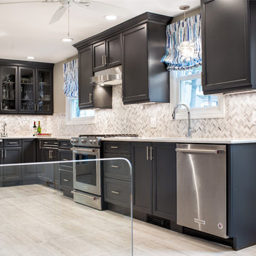
The client hired Swati Goorha Designs after they downsized from a 5 bedroom house to a smaller fixer-upper in Scotch Plains NJ. The main pain point of the house was an awkward circulation flow and a tiny dated kitchen. Our clients love cooking and entertain often. The small kitchen was crowded with just two people in it, lacked ample prep space and storage. Additionally, there was no direct access to the kitchen from the main entrance. In order to get to the “Sitting room” the clients had to circulate through a tiny powder room off of the entry. The client had to circulate through the Living room, the formal Dining Room, to finally arrive at the Kitchen. The entire space was awkward, choppy and dark.
We assessed the existing space, our clients needs and wants, and designed a utilitarian kitchen to fit the client’s lifestyle, their entertaining habits, and their aesthetic sensibilities. We knocked down the wall between the kitchen and the family room to open the area, and made the entire space into one large kitchen. We designed an unusual custom angled island to maximize the use of space without infringing the circulation or the usability of the kitchen. The island can now accommodate 3-4 people for an intimate dinner or function as a food setup area for larger parties. The island also provides extra storage. We used dark kitchen cabinets with light backsplash, countertops, and floor to brighten the space and hide the inevitable pet hair from clients four dogs.
We moved the Dining Room into the earlier Sitting room. In order to improve the circulation in the home, we closed the entry through the powder room and knocked out a coat closet. This allowed direct access to the kitchen and created a more open and easy flowing space. Now the entire house is a bright, light-filled space, with natural light and open circulation. Our client’s needs and wants have been satisfied!
 Wood-Mode Fine Custom Cabinetry
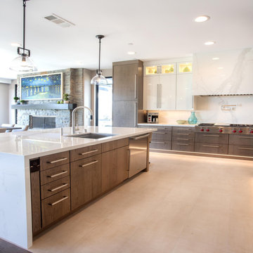
The homeowners asked the designer of this kitchen to create a larger, modern space that would “entertain a crowd.” A light color palette featuring Vanguard MDF in Nordic White was selected to brighten up the space and reflect the coastal view just outside the kitchen windows. The previous space underutilized the center of the room, and the decision to include two islands created a viable space for seating for guests. To create this space, however, the designer was challenged to remove a walk-in pantry and add a large steel beam. To offset the white and create dimension, Vanguard Plus in a Matte Foundry finish on rough sawn euro oak veneer was used for the island bases and then wrapped in the same porcelain material used on the backsplashes. And floor-to-ceiling wall cabinets more than made the storage space, packed with organizational extras like an appliance garage to keep countertops clear, swing-out spice rack within easy reach of the stove, and tall pull-out pantries to house cookware and cleaning supplies.
Designed by Alice Sin
Sierra Custom Kitchens, Baths & Designs
 Skill Construction & Design, LLC
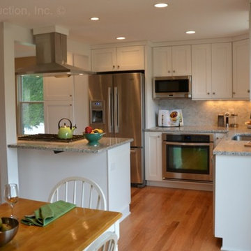
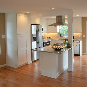
There are so many design elements to this kitchen, I almost don’t know where to start. Bright and airy with crisp clean white cabinets, the kitchen is open and welcoming. Still crisp but gently contrasting, the stainless steel appliance add depth amid the white. To keep this kitchen warm, natural oak covers the floors and a toasted wheat color washes the walls. And then there is the architectural elements. You know. That post and beam in the middle of the room. It’s the center of attention.
When you walk into a room your eyes roam around, establishing the size and shape of the room as your feet take you forward. From the front door of this home straight ahead you encountered this wall. The dining area to the right gives you a glimpse of things to come. Where there is a dining room you will usually find a kitchen.
The architecture of years gone by consistently hides the kitchen, the heart of the home, behind walls. I sympathize with my Mom, and all the other Moms, who have had to spend so much time tucked into a tight kitchen, away from the family. This wall had to go, but it was structural. We needed its support but not its bulk.
So we got rid of the bulk and only the bulk. Instead of a wall we have a post and beam, offering all of the structure we need. We could have installed a huge steel beam and reconfigure the joists to upset the beam, but why? The small beam and post add an incredible architectural element. It’s turning lemons into lemon, we simply made the most of what we had. It may be functional but it’s so fantastic. It looks like we created the effect just for the drama.
The original kitchen may have had a working triangle and some counter space, but it was fairly small, with each area only a step or two away. The dark cabinets made the space feel even smaller and the butcher block patterned laminate counter tops were very dated. The appliances were feeling their age as well, from a coil burner electric stove to a top freezer refrigerator. To keep this kitchen within its space, a half wall separated it from the dining area.
With the wall gone we borrowed some space from the living room and extended what was a U shaped kitchen into an L. At the living room window we start our new kitchen. We kept a small part of the wall to support the other end of our decorative beam. Sandwiched between a large pantry and our new French door refrigerator, the wall disappears. With our new open floor plan a sizable island was in order.
We split our cooking areas and installed a continuous grill gas cooktop into the island. A sleek island hood takes care of exhaust and adds an extra element to our architectural feature. Under the cooktop we added over-sized drawers for pots and pan storage. The frameless cabinets from New River Cabinetry are maple, painted white, with the Herndon door style. With the cooktop safely nestled into our island, we still had to add an oven.
We used the space where the old range sat for a large single oven of stainless steel and glass. If it worked for one, why not two? We created a home for a microwave in the wall cabinets. It’s perfect for heating leftovers so close to the refrigerator.
An important consideration for hot spots in your kitchen is landing zones. Each of our cooking areas have generous landing zones, one on each side of the cooktop and an entire counter area above or below the ovens, depending on which one you’re using.
We wanted to give the sink area more room so the half wall had to come out. We moved the trash and recycle cans into a cabinet, removed the heavy soffits and kept the sink under the window.
With that little bit of extra space we were able to add a larger cabinet above the dishwasher and slide it all down. This used to be where the carpeting met the vinyl floor, but all of it is gone. Long oak planks eliminate that final divide between the kitchen and the dining area, while adding visual length to the area. White wall cabinets on each side of the window reflect the sunlight for a brighter view.
With all of the darker cabinetry the backsplash walls had been painted white. Even still, there was a darkness in the corners and it wasn’t very exciting. We wanted to add visual interest and reflect the new under-cabinet lighting, eliminating the shadows in this corner.
With 1″x 2″ Arabescato Honed marble mosaics and those under-cabinet lights, we achieved the perfect balance. The marble has subtle swirls in gray and beige on a clean white background, but with the honed finish the light is softly reflected instead of glaring. For granite, we chose the soft gray tones of Luna Pearl. The speckles of gray and beige are a gentle contrast to the white cabinets and emulate the color of the stainless steel.
Between the carpet, red half wall, dark railing and dated light fixture, the dining area felt tired. Since the kitchen lacked sufficient storage, a large utility cabinet crowded the table space without adding any decorate elements.
Although it didn’t get any bigger, our dining area feels fresher and more open too. With the oak flooring joining the area to the rest of our space and the toasted wheat on the walls, the white table and chairs compliment the cabinetry while contrasting the warmer colors. We replaced the chandelier with recessed lighting and changed that railing too.
With our new open floor plan, we ended up with a fairly open area in between our foyer closet and the living room window. Not one to miss an opportunity, we filled the space with a multi-functional work space.
With the sunlight streaming in this bright corner works for anything this family needs.
There’s plenty of space for a chair under this large desk drawer. A closed cabinet below, glass doors above and lots of open shelving let you store and or showcase your belongings. We added a lite area at the top to keep away the darker corners.
The transformation is complete. This kitchen and all of its features are truly the center of attention in this home.
http://www.designsbyskill.com/
http://www.rjkconstructioninc.com/
 Holly Larsen
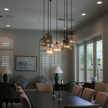
Without columns to block traffic and views, the Dining and Living areas now flow together and allow for larger dinner parties without crowding.
Inspiration for a transitional dining room remodel in Houston
Inspiration for a transitional dining room remodel in Houston
 Skill Construction & Design, LLC
There are so many design elements to this kitchen, I almost don’t know where to start. Bright and airy with crisp clean white cabinets, the kitchen is open and welcoming. Still crisp but gently contrasting, the stainless steel appliance add depth amid the white. To keep this kitchen warm, natural oak covers the floors and a toasted wheat color washes the walls. And then there is the architectural elements. You know. That post and beam in the middle of the room. It’s the center of attention.
When you walk into a room your eyes roam around, establishing the size and shape of the room as your feet take you forward. From the front door of this home straight ahead you encountered this wall. The dining area to the right gives you a glimpse of things to come. Where there is a dining room you will usually find a kitchen.
The architecture of years gone by consistently hides the kitchen, the heart of the home, behind walls. I sympathize with my Mom, and all the other Moms, who have had to spend so much time tucked into a tight kitchen, away from the family. This wall had to go, but it was structural. We needed its support but not its bulk.
So we got rid of the bulk and only the bulk. Instead of a wall we have a post and beam, offering all of the structure we need. We could have installed a huge steel beam and reconfigure the joists to upset the beam, but why? The small beam and post add an incredible architectural element. It’s turning lemons into lemon, we simply made the most of what we had. It may be functional but it’s so fantastic. It looks like we created the effect just for the drama.
The original kitchen may have had a working triangle and some counter space, but it was fairly small, with each area only a step or two away. The dark cabinets made the space feel even smaller and the butcher block patterned laminate counter tops were very dated. The appliances were feeling their age as well, from a coil burner electric stove to a top freezer refrigerator. To keep this kitchen within its space, a half wall separated it from the dining area.
With the wall gone we borrowed some space from the living room and extended what was a U shaped kitchen into an L. At the living room window we start our new kitchen. We kept a small part of the wall to support the other end of our decorative beam. Sandwiched between a large pantry and our new French door refrigerator, the wall disappears. With our new open floor plan a sizable island was in order.
We split our cooking areas and installed a continuous grill gas cooktop into the island. A sleek island hood takes care of exhaust and adds an extra element to our architectural feature. Under the cooktop we added over-sized drawers for pots and pan storage. The frameless cabinets from New River Cabinetry are maple, painted white, with the Herndon door style. With the cooktop safely nestled into our island, we still had to add an oven.
We used the space where the old range sat for a large single oven of stainless steel and glass. If it worked for one, why not two? We created a home for a microwave in the wall cabinets. It’s perfect for heating leftovers so close to the refrigerator.
An important consideration for hot spots in your kitchen is landing zones. Each of our cooking areas have generous landing zones, one on each side of the cooktop and an entire counter area above or below the ovens, depending on which one you’re using.
We wanted to give the sink area more room so the half wall had to come out. We moved the trash and recycle cans into a cabinet, removed the heavy soffits and kept the sink under the window.
With that little bit of extra space we were able to add a larger cabinet above the dishwasher and slide it all down. This used to be where the carpeting met the vinyl floor, but all of it is gone. Long oak planks eliminate that final divide between the kitchen and the dining area, while adding visual length to the area. White wall cabinets on each side of the window reflect the sunlight for a brighter view.
With all of the darker cabinetry the backsplash walls had been painted white. Even still, there was a darkness in the corners and it wasn’t very exciting. We wanted to add visual interest and reflect the new under-cabinet lighting, eliminating the shadows in this corner.
With 1″x 2″ Arabescato Honed marble mosaics and those under-cabinet lights, we achieved the perfect balance. The marble has subtle swirls in gray and beige on a clean white background, but with the honed finish the light is softly reflected instead of glaring. For granite, we chose the soft gray tones of Luna Pearl. The speckles of gray and beige are a gentle contrast to the white cabinets and emulate the color of the stainless steel.
Between the carpet, red half wall, dark railing and dated light fixture, the dining area felt tired. Since the kitchen lacked sufficient storage, a large utility cabinet crowded the table space without adding any decorate elements.
Although it didn’t get any bigger, our dining area feels fresher and more open too. With the oak flooring joining the area to the rest of our space and the toasted wheat on the walls, the white table and chairs compliment the cabinetry while contrasting the warmer colors. We replaced the chandelier with recessed lighting and changed that railing too.
With our new open floor plan, we ended up with a fairly open area in between our foyer closet and the living room window. Not one to miss an opportunity, we filled the space with a multi-functional work space.
With the sunlight streaming in this bright corner works for anything this family needs.
There’s plenty of space for a chair under this large desk drawer. A closed cabinet below, glass doors above and lots of open shelving let you store and or showcase your belongings. We added a lite area at the top to keep away the darker corners.
The transformation is complete. This kitchen and all of its features are truly the center of attention in this home.
http://www.designsbyskill.com/
http://www.rjkconstructioninc.com/
 Designs by KS
By not having any upper cabinets, the space feels less crowded and bigger, as if it belongs to a larger home. The few cabinets in the kitchen are efficiently utilized, but we had to compensate for storage elsewhere.
We have designed a custom hutch for Michelle that serves multiple purposes. It not only provides storage for overstock from the kitchen but also acts as a hub for her electronics, paperwork, printer, filing drawer, and craft supplies.
The kitchen is influenced by Scandinavian design, featuring playful shades of pink on the walls, the floating shelf, and the vintage spice cubby (coral). Timeless black and white accents throughout the space complement the pink accents in a subtle way.
 Designs by KS
By not having any upper cabinets, the space feels less crowded and bigger, as if it belongs to a larger home. The few cabinets in the kitchen are efficiently utilized, but we had to compensate for storage elsewhere.
We have designed a custom hutch for Michelle that serves multiple purposes. It not only provides storage for overstock from the kitchen but also acts as a hub for her electronics, paperwork, printer, filing drawer, and craft supplies.
The kitchen is influenced by Scandinavian design, featuring playful shades of pink on the walls, the floating shelf, and the vintage spice cubby (coral). Timeless black and white accents throughout the space complement the pink accents in a subtle way.
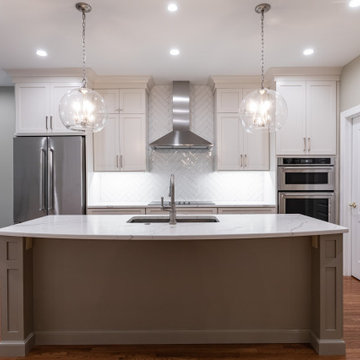 Touchstone Kitchen and Bath
From crowded and cluttered to open and clean! This kitchen renovation streamlined and simplified the space to make it more functional for this Blue Bell, PA family. The kitchen flows seamlessly into the dining space instead of being cut off by a countertop; the bright whites in this design make the room feel larger. We also did away with a small, barely functional pantry closet in favor of two floor to ceiling cabinets that really maximize storage potential!
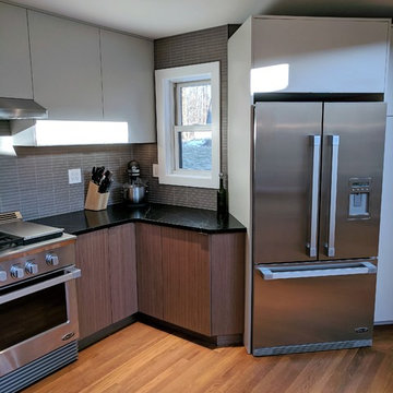 Stacey Kocevar Designs, LLC
This space was an addition off of an existing small living space, which was designed by an architect who created a beautifully dramatic, two-story, living space by angling walls and making the living room area 2 stories high, with an overlook at the top of the spiral staircase to the second floor. The appliances were already set in place, and the homeowners did not want to move the existing plumbing, electrical, or venting, so I had to work within those parameters. They wanted a contemporary, industrial, feel for the kitchen, which I believe is described as Midcentry Modern, was acheived by using slab-style doors and drawers, mixing painted with walnut veneered finishes, along with other custom and unique items. The soapstone was a must-have for the homeowners, providing a source for the painted cabinetry color, which draws out the beautiful veins in the countertop. They needed pantry space, and as much usable storage as possible for the space, which included the angled wall that the refrigerator was on, along with not crowding the walk space between that wall and the necessary column adjacent to it. By building in the refrigerator with panels on either side to conceal the refrigerator "box", I was able to create a storage section which included a 2-drawer base for storage of larger items, with 2 pantries flanking either end, with contrasting walnut floating shelves in between. along with that custom section, in order to provide additional storage, and counter space, I created a free-standing piece, which had to feel like a part of the kitchen, yet also feel like a furniture piece, when viewed from the living room. In order to achieve that look, I used 3" wide columns to frame the piece, which I also repeated as floating shelves in the middle, to house their crockpot, but most importantly, a "home" for their roomba. The island also provided the space for separate pull-out trash and recycling bins, which I did not have space for elsewhere. Collaborating with the homeowners on this project enabled me to design a kitchen that was in a style that I hadn't had the opportunity to design in before, and I now appreciate and love this style myself!
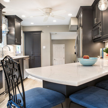 Swati Goorha Designs
The client hired Swati Goorha Designs after they downsized from a 5 bedroom house, to a smaller fixer upper in Scotch Plains NJ. The main pain point of the house was an awkward circulation flow, and a tiny dated kitchen. Our clients love cooking and entertain often. The small kitchen was crowded with just two people in it, lacked ample prep space and storage. Additionally, there was no direct access to the kitchen from the main entrance. In order to get to the “Sitting room” the clients had to circulate through a tiny powder room off of the entry. The client had to circulate through the Living room, the formal Dining Room, to finally arrive at the Kitchen. The entire space was awkward, choppy and dark.
We assessed the existing space, our clients needs and wants, and designed a utilitarian kitchen to fit the client’s lifestyle, their entertaining habits and their aesthetic sensibilities. We knocked down the wall between the kitchen and the family room to open the area, and made the entire space into one large kitchen. We designed an unusual custom angled island to maximize the use of space without infringing the circulation or the usability of the kitchen. The island can now accommodate 3-4 people for a intimate dinner or function as a food setup area for larger parties. The island also provides extra storage. We used dark kitchen cabinets with light backsplash, countertops and floor to brighten the space and hide the inevitable pet hair from clients four dogs.
We moved the Dining Room into the earlier Sitting room. In order to improve the circulation in the home we closed the entry through the powder room and knocked out a coat closet. This allowed direct access into the kitchen and created a more open and easy flowing space. Now the entire house is a bright, light filled space, with natural light and open circulation. Our client’s needs and wants have been satisfied!
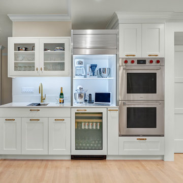
 Nar Design Group
This house built in the 1990s never had renovations done prior to this whole house remodel. Filled with vibrant wallpaper and shiny brass finishes so indicative of the time the house was in need of a major upgrade and refresh.
The laundry room already had ample space and storage, but we tailored the storage for the family. An integrated shoe shelf allows for a clean space to store shoes in this no shoe household. A fold down, integrated ironing board provides functionality without crowding the space.
The powder bath is the only bath on the first floor, so is a full bath, but functions as a powder bath 90% of the time. We wanted to keep the focus away from the shower and keep the fun of a powder bath. A custom window pane patterned etched glass shower allows the shower to stay in the background.
In the master bath there was also ample space, but the design was in great need of an upgrade. With a decked-in tub and shower that you had to step up and then down into, the space needed a better flow and easier access. A freestanding tub allowed all of the decking to be removed and gave space for a larger, more luxurious shower. A huge linen storage with bench that double as a suitcase stand finishes out the space nicely. The room was given a clean, modern farmhouse feel to really freshen up the space.
The focus of this kitchen was to open up the workflow, creating a space for the family to work comfortably while also creating a beautiful and inspiring space. Placing a large refrigerator at the edge of the kitchen, adding a beverage refrigerator, using a Galley Workstation and having the island at a slightly lower height makes it highly functional for the whole family. It is rare to achieve a long line of symmetry, but with a feature wall created around the range top we were able to do so. We created an antique armoire feel with the panel ready refrigerator and custom panel design above.
A mixture of hardware was used, the gray stained hickory cabinets were paired with matte black hardware, while the designer white cabinets were paired with brass hardware. A very custom refrigerator cabinet was created that emphasized the armoire feel. A long wall of 9” deep tall cabinets created a very beautiful as well as highly functional pantry space.
16