
Search results for "Logical" in Home Design Ideas
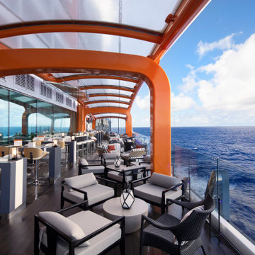
 Celebrity Cruises
The beloved Magic Carpet® is an engineering feat soaring cantilevered above the sea, offering guests uninterrupted views while sipping cocktails or having dinner.


 Klopf Architecture
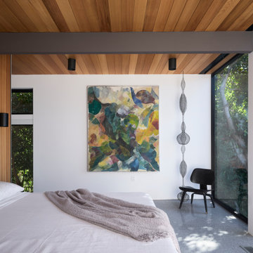
Malibu Glass Box House by Klopf Architecture
Following the devastating Woolsey Fire of 2018, the site in Malibu offered a unique opportunity to rebuild not just a home, but a new architectural composition that highlighted the property’s potential while navigating strict fire-rebuild codes in the area. Designed by Klopf Architecture, this project embraced a set of limitations and translated them into an architectural asset.
The city’s fire-rebuild process required the new structure to remain close to the original footprint, size and bulk, a constraint that ultimately clarified the architectural direction. Perched near the front of a long, narrow lot, the new home frames and overlooks a private, park-like rear expanse, an uncommon luxury especially in this part of Malibu .
Without a fixed program, the design process allowed for a different kind of creative focus allowing Klopf Architecture the opportunity to explore how a modernist home could best respond to this site. The team approached the project not with a list of requirements, but with a question: How might a modernist live here? What spatial qualities would inspire calm, connection, and a sense of wonder in this setting? The process became less about problem-solving and more about architectural storytelling—letting the site, the light, and the principles of modern design guide the form and flow of the home.
The response emerged in the form of a glass-box pavilion, an open, Mid-Century Modern inspired living, dining, and kitchen space that floats at the edge of the property’s natural descent. Connected to the more enclosed, private areas of the home by a glass-walled hallway, the living pavilion becomes a distinct centerpiece of the design. It opens on all four sides to the landscape with decks and patios on the flanks, an internal garden and water feature to the north, and a dramatic unguarded view of the expansive backyard and ocean horizon to the south.
Because of the mandated footprint, careful planning was required to ensure every space could still engage with light, landscape, or both. Strategic voids in the form of atriums and courtyards allow daylight to filter deep into the home’s core, while offering moments of surprise and retreat. These design gestures allow natural light to filter deep into the interior, creating a sense of brightness and openness throughout the day. At the same time, they expand the perceptual boundaries between inside and out, making the home feel more expansive while anchoring its connection to the surrounding landscape.
The siting of the house is what gives it its unique character. Rather than receding into the backyard like the neighboring homes, the house holds a slight prominence. From the central living pavilion, stepping down into the landscape feels more like entering a secluded park where a separate existing accessory structure, trail, and recreational areas await. The home’s modest street presence gives way to this unfolding drama of space, view, and nature.
Fire-resilient materials and assemblies are integrated seamlessly throughout including triple-pane glazing, under-slab and roof insulation, and locally sourced fire-rated cladding ensure the house not only meets Calfornia’s rigorous wildland-urban interface (WUI) standards, but feels effortlessly aligned with them. While technical decisions like fire-hardening and mechanical systems presented some construction challenges, particularly around the cantilevered glass box, the team found a functional compromise that preserved the integrity of the design.
Inside, a restrained palette and exposed post and beam design celebrate the ethos of mid-century modernism. A central circulation spine extends from the entry to the rear glass wall, offering a continuous visual link from street to ocean. Spaces such as the library and office, though more intimate in scale, are never cut off from nature as each opens to its own unique courtyard or garden view.
Though born out of a strict regulatory framework and developed without a specific client, the rebuild design unfolded with remarkable clarity. Grounded in site logic, refined by limitations and an emphasis on timeless spatial relationships – light, proportion, and a strong connection to nature, the resulting design feels both effortless and uplifting. The home lives lightly on the land, opens generously to its surroundings, and strikes a careful balance between privacy, openness, and calm. For Klopf Architecture, it stands as a compelling case study in how site, code, and circumstantial constraints can inspire enduring, modernist architecture. With years of experience reimagining mid-century modern design for how people live today, the firm took the project’s limitations as an opportunity. The result is a home shaped by open, flowing spaces, strong indoor-outdoor connections, and a calm, clear sense of structure. It’s a good reminder that even with strict constraints, there’s still room for architecture to breathe—and for modernism to keep moving forward.
Klopf Architecture project team: Geoff Campen, John Klopf, AIA, and Sherry Tan
Structural Engineer: ZFA
Contractor: Maison D’Artiste
Photography: ©2025 Mariko Reed
Year Completed: 2023
Find the right local pro for your project


 Ferriss - Architectural Renderings
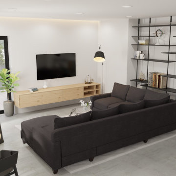
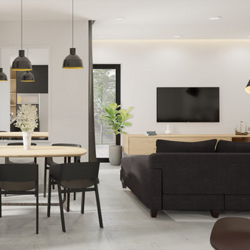
Here are some practical tips for creating a beautiful, comfortable and thoughtful living room design.
The living room in the house is the place where, as the name suggests, receives guests. However, the owners themselves relax here, spending time in front of the TV or a book, with drinks, pleasant conversation and other activities. Therefore, the living room should be the most comfortable place in your home.
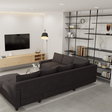
The place of the sofa in the design of the living room
The sofa does not need to be placed in a draft. This means that it should not be on an imaginary line from window to door - if you drew a floor plan, it will just be easy to trace.
1. The sofa in front of the TV, diagonally from the door, is a great location. As if inviting you to sit down :)
2. Sofa near the door. A good solution if you often have overnight guests.
3. Corner sofa in the living room. Best placed in the farthest corner from the door. This will make the room look more spacious.
Correct opening of the door in the living room. Inward or outward?
Open inward or outward? There is no clear rule here, because everything depends on the layout and on the furniture placed. The main thing is that the door leaf opens freely and does not interfere with entering and exiting the room. Also, the door should not interfere with free access to the closet or dressing room.
TV in living room size and location. Location.
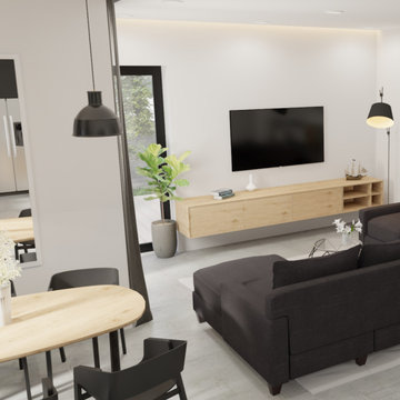
The TV is placed on the wall opposite to the sofa - this is the most logical and reasonable place for it in the living room. Moreover, the distance to it does not really matter: modern TV models can be placed close to the sofa.
Cabinet or bracket? To your taste. The main thing is that the television zone looks neat and presentable. Provide in advance a cable channel in which all the wires and numerous sockets for the receiver, modem, set-top box, sound bar will hide. Nothing spoils a design like sticking wires!
Height from the floor. It is optimal to place the TV 1 m from the floor to the middle of the screen - this is exactly the level of the eyes of a seated person.
Diagonal size. If there is a financial opportunity, consider options from 50 inches - smaller screens look lonely and lonely on an empty wall.
Living room furniture.
Armchair. Often the chair becomes an accent item in the interior, then its shade, and sometimes its shape, differ from the rest of the furniture. When choosing a chair, be guided also by your habits: for example, it will be more convenient to climb up with your feet and read a book in an armchair with dimensions of 90x90 cm, and you can “just sit comfortably” in a fireplace chair with a high back, comfortable armrests and with a seat 80x80 cm.
TV stand. Large TV stands are no longer as relevant as they used to be, when it was necessary to store a player, cassettes and discs there. For now, a console table or a narrow elegant pedestal is enough.
Coffee table. Nice piece of furniture that creates a cozy atmosphere. Some models, if necessary, can be transformed into a more spacious table for receiving guests - however, finding comfortable and beautiful specimens is not easy, plus they usually cost a lot.
Rack. An extremely useful type of furniture. :) Firstly, a large number of decor items can be beautifully placed on the rack. And secondly, it can also play the role of a light through partition, which divides the room into zones and does not select light at the same time. This is a very big plus for small apartments.
Fireplace. Here we are talking about electric fireplaces. Some of them come with a humidifier and heated, so 3-in-1 models can be very helpful. Fireplace portals have different styles: classic, antique, modern. Inconsistency with the general style of the living room can greatly spoil the impression of the room, so be careful with creativity. Sizing is an important issue. A large wall with a high ceiling also needs a proportionate fireplace; in horror, a small portal will look lonely and ridiculous.
What do you think about our new living room project?
https://www.ferriss.co
#ferriss #We_bring_objects_to_life #3drendering #architecture #San_Francisco
 Neumann & Rudy Architecture
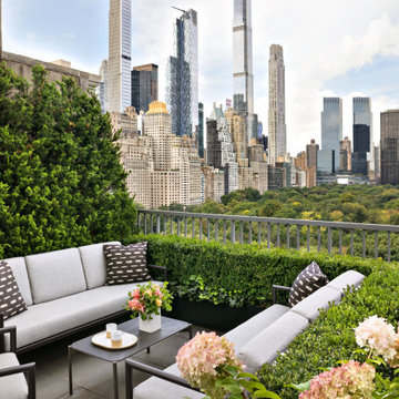
**Paragraph 1: Spatial Composition & Architectural Volume**
This terrace operates as an outdoor room in the fullest architectural sense — a compressed foreground plane opening onto one of the most consequential borrowed landscapes in the world. The composition is organized along a strong diagonal: an L-shaped seating arrangement anchors the lower left and right quadrants, its low-slung horizontality deliberately calibrated to sit beneath the sightline of the parapet rail so that the vista remains uninterrupted from a seated position. The spatial logic is one of layered thresholds. First, the intimate zone of the furniture group; second, the clipped boxwood hedge set within a matte-dark planter, functioning as a green datum line and soft balustrade; third, the slender vertical picket railing, whose rhythmic cadence reads as a fine-grained screen rather than a barrier; and finally the middle-ground canopy of Central Park and the distant supergraphic of the Billionaires' Row skyline. To the left, a mature juniper mass performs as a living pilaster, terminating the composition and screening the adjacent stone masonry wall — a rough-hewn ashlar remnant of the prewar building envelope that grounds the scheme in its architectural provenance. The stepped stone paving and the raked geometry of the railing as it descends to the right introduce a subtle asymmetry, preventing the picturesque from becoming static.
**Paragraph 2: Materiality, Color & Texture**
The material palette is disciplined to the point of austerity, precisely so the horticulture and the skyline may carry the chromatic load. Powder-coated aluminum in a deep graphite-bronze forms the furniture armature — slender, squared-section framing with an almost Miesian restraint — paired with performance-grade upholstery in a warm dove grey whose greige undertone reads neither cold nor sallow against the surrounding foliage. The single decorative gesture, ikat-patterned scatter cushions in charcoal and ecru, introduces a hand-loomed irregularity that humanizes the machined frames. Underfoot, large-format bluestone or cast-stone pavers in a cool grey provide a matte, granular ground plane, echoed in the honed surface of the low cocktail table. Against this monochrome scaffolding, the botanical register supplies saturation: the dense, glossy, small-leaf texture of the boxwood; the feathery, blue-green needling of the juniper; trailing ivy softening the planter edge; and, in the near foreground, the blowsy, dessicating panicles of hydrangea in blush, sage and antique rose. A ceramic vessel of coral-and-butter garden roses and a pair of banded stoneware cups on a rimmed tray introduce warm terracotta accents — small, deliberate points of chromatic heat within an otherwise tonal field.
**Paragraph 3: Lighting, Atmosphere & Style Profile**
The scheme is lit almost entirely by ambient, high-latitude daylight, diffused through a stratus-laced sky that acts as an enormous softbox. The result is shadowless modeling: the upholstery reads as luminous rather than glaring, the foliage retains full chromatic depth without specular hotspots, and the pale limestone and glass towers beyond are rendered in atmospheric perspective, receding into a silvered haze. No artificial fixtures assert themselves in the frame — a confident editorial choice that keeps the scheme legible as a daytime sanctuary and defers entirely to the natural theatre of the site. The prevailing mood is one of cultivated repose: urbane but unhurried, private without being hermetic. Stylistically, the project synthesizes into what might be termed **Refined Metropolitan Naturalism** — a hybrid of Soft Minimalism's tonal restraint and reductive geometry with the structured horticultural formality of a classical English terrace garden. The vocabulary is contemporary and materially honest, yet it observes the compositional manners of the prewar building it inhabits, treating the skyline not as backdrop but as the primary work of art around which the entire interior architecture of the terrace has been quietly framed.
 Neumann & Rudy Architecture
**I. Spatial Composition & Architectural Volume**
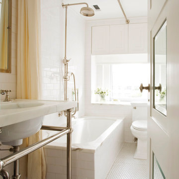
This is an exercise in the disciplined choreography of a constrained footprint — a narrow, rectilinear bathroom whose length is exploited rather than disguised. The composition unfolds along a single axis, the viewer's eye drawn from the foreground console lavatory, past the drop-in tub, to the terminal glazed aperture that anchors the far wall and releases the volume outward. The photograph's vantage, taken through a partially opened multi-paneled door with its cushioned rail-and-stile profile and beveled glazing, establishes a layered threshold condition: the room is framed, glimpsed, and entered simultaneously. Ceiling height is generous relative to plan dimension, and the architect has resisted the temptation to lower it; instead, a slender crown profile and a delicate picture-rail cornice terminate the field tile at a consistent datum, reinforcing the vertical proportion. Above the tub, a bank of recessed-panel cabinetry is set flush into the reveal of a soffit, borrowing the depth of the wall assembly to gain storage without protrusion — a deft piece of joinery logic. The window is treated as an architectural niche, its deep jambs and marble sill establishing a plinth that reads as inhabited rather than merely functional. Overhead, an exposed nickel-plated curtain rod traverses the ceiling plane in a single diagonal gesture, its cantilevered support rendering the drapery a movable spatial partition rather than a fixed enclosure.
**II. Materiality, Color & Texture**
The palette is a study in monochromatic gradation, calibrated almost entirely within the white spectrum yet richly differentiated by surface behavior. Hand-glazed subway tile in a running-bond pattern clads the wet walls, its subtle undulation and pooled glaze catching light unevenly to produce a soft, ceramic luminosity that no machine-pressed tile could replicate. Underfoot, a penny-round mosaic in matte porcelain introduces fine-grain granularity and a faintly warm grout line, its curvilinear tessellation providing tactile counterpoint to the orthogonal wall coursing. Marble — likely a Calacatta or lightly veined Carrara — appears strategically at the lavatory deck, the tub apron cap, and the window sill, its ochre-gold and cool grey veining supplying the room's only true figuration and its principal chromatic warmth. Polished nickel is the unifying metal, deployed with unusual generosity: the exposed console legs and cross-braced towel bar, the exposed riser and telephone-style handshower, the cross-handle fittings, and the rose-mounted door knob with its knurled backplate. Its cool, silvery reflectivity absorbs and redistributes ambient light, dissolving the hardware into the field. The single yielding material is the shower curtain — an unlined linen or cotton voile in pale butter-yellow — whose slubby weave, gravity-drawn folds, and warm undertone break the room's cool register and introduce the necessary note of domestic softness.
**III. Lighting, Atmosphere & Style Profile**
Illumination is overwhelmingly diurnal and unapologetically singular in source: the window at the terminus floods the space with diffuse, high-key daylight that blows toward pure white at the aperture and falls off gradually along the tile, modeling the wall's minute irregularities into a low-relief texture. The absence of visible decorative fixtures — save a discreet ceiling-recessed vent or downlight above the shower — is deliberate; artificial lighting is subordinated so that the material palette performs under natural light. The resulting atmosphere is serene, hygienic without sterility, and quietly luxurious: light behaves as a material in its own right, and the white-on-white scheme functions as a reflector rather than a void. Stylistically, the room synthesizes early-twentieth-century Anglo-American sanitary vernacular — the exposed-plumbing console lavatory, the exposed-riser shower, the metro tile and penny mosaic — with a contemporary editorial restraint that strips out ornament and pattern in favor of proportion and craft. It might be characterized as Refined Classicism, or more precisely, a Transitional Pre-War Revival: historically literate in its detailing, resolutely modern in its spatial economy and tonal discipline. The single pale-yellow textile is the design's signature move, a calibrated warm accent that prevents the achromatic scheme from tipping into clinical austerity and confirms the project's essential thesis — that restraint, correctly executed, reads as generosity.
 Neumann & Rudy Architecture
**Spatial Composition & Architectural Volume**
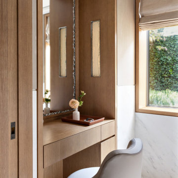
This is an exercise in the architecture of the alcove — a vanity niche carved from a continuous run of full-height oak joinery, its recess reading less as furniture placed against a wall than as volume subtracted from mass. The composition is governed by a strict orthogonal discipline: the reveal-jointed cabinet stiles establish a vertical rhythm that the photographer's oblique sightline compresses into layered planes, while the cantilevered vanity slab introduces a single decisive horizontal that arrests the vertical drift. The niche is capped by a soffited overhead panel, giving the recess a deliberate lintel and lending the aperture the proportional gravitas of a doorway. Depth is orchestrated through nested framing: the pocketed sliding door in the foreground crops the scene, the joinery reveal frames the alcove, and the full-height mirror frames a reflected secondary volume — a window, a Roman shade, a second bloom — extending the room's apparent envelope well beyond its physical bounds. To the right, the plane pivots into a marble-clad wall and a deeply reveal-set casement whose broad oak jamb and stool are detailed with the same tectonic logic as the millwork, unifying opening and cabinetry into a single architectural grammar. Above, a recessed perimeter shadow-gap ceiling floats the plaster plane free of the wall, dematerializing the junction and heightening the sense of contained, cabin-like intimacy.
**Materiality, Color & Texture**
The palette is narrow, warm, and rigorously controlled — a study in tonal adjacency rather than contrast. Rift-sawn white oak dominates, its cathedral and straight-grain figure deliberately book-matched and run vertically to accentuate height, finished in a matte, low-sheen sealer that reads as raw yet refined; note the subtle chromatic modulation between the honeyed door leaves, the slightly cooler carcass panels, and the pale, almost bleached drawer fronts, a gradient that provides articulation without resorting to hue shift. Against this, the Calacatta- or Carrara-type marble wainscot introduces a cool, silvery counterpoint, its soft grey veining offering the only real graphic incident in the field. The mirror surround — a hand-cast, rope-twist metal frame in polished nickel or silvered bronze — supplies a jewel-like glint and a moment of organic, almost baroque relief against the sobriety of the flat panels, echoed in the pair of églomisé or reverse-painted glass insets set flush into the alcove wall like recessed cabochons. Textiles are handled with restraint: a raw-silk or textured linen Roman shade in a tobacco-taupe stacks in generous, softly rumpled folds, while the swivel chair is upholstered in a taut, sueded greige leather whose sculpted, scrolled back offers the room's most sensuous curve. The tan saddle-leather tray and the milk-glazed ceramic bud vase complete a haptic register that moves from cool stone to warm hide to matte ceramic to silken wood.
**Lighting, Atmosphere & Style Profile**
Illumination is almost entirely daylit and side-cast, with the diffused southern wash filtered through the linen shade to produce a luminous, shadowless bloom across the marble and a raking, grain-revealing light along the oak. The design conspicuously withholds decorative fixtures; instead, light is architecturalized — the églomisé panels flanking the mirror function as concealed backlit apertures, glowing softly to provide flattering vertical face-lighting at the vanity, while the perimeter ceiling reveal implies a cove source for ambient wash. This suppression of visible hardware is central to the atmosphere: serene, hushed, and hotel-like in its precision, yet domesticated by the flowers and the intimate scale of the nook. Stylistically the project synthesizes into a refined **Soft Minimalism with a couture-modernist inflection** — the reductive planarity and reveal-detailing of contemporary minimalism warmed by mid-century Scandinavian wood craft and elevated by discreet Art Deco–adjacent flourishes in the metalwork and glass. It is a vocabulary of quiet luxury, where value is signaled not through ornament but through the tolerances of the joinery, the calibration of tone-on-tone, and the confidence to let a single ranunculus carry the room's only note of chroma.
 Ferriss - Architectural Renderings
Here are some practical tips for creating a beautiful, comfortable and thoughtful living room design.
The living room in the house is the place where, as the name suggests, receives guests. However, the owners themselves relax here, spending time in front of the TV or a book, with drinks, pleasant conversation and other activities. Therefore, the living room should be the most comfortable place in your home.
The place of the sofa in the design of the living room
The sofa does not need to be placed in a draft. This means that it should not be on an imaginary line from window to door - if you drew a floor plan, it will just be easy to trace.
1. The sofa in front of the TV, diagonally from the door, is a great location. As if inviting you to sit down :)
2. Sofa near the door. A good solution if you often have overnight guests.
3. Corner sofa in the living room. Best placed in the farthest corner from the door. This will make the room look more spacious.
Correct opening of the door in the living room. Inward or outward?
Open inward or outward? There is no clear rule here, because everything depends on the layout and on the furniture placed. The main thing is that the door leaf opens freely and does not interfere with entering and exiting the room. Also, the door should not interfere with free access to the closet or dressing room.
TV in living room size and location. Location.
The TV is placed on the wall opposite to the sofa - this is the most logical and reasonable place for it in the living room. Moreover, the distance to it does not really matter: modern TV models can be placed close to the sofa.
Cabinet or bracket? To your taste. The main thing is that the television zone looks neat and presentable. Provide in advance a cable channel in which all the wires and numerous sockets for the receiver, modem, set-top box, sound bar will hide. Nothing spoils a design like sticking wires!
Height from the floor. It is optimal to place the TV 1 m from the floor to the middle of the screen - this is exactly the level of the eyes of a seated person.
Diagonal size. If there is a financial opportunity, consider options from 50 inches - smaller screens look lonely and lonely on an empty wall.
Living room furniture.
Armchair. Often the chair becomes an accent item in the interior, then its shade, and sometimes its shape, differ from the rest of the furniture. When choosing a chair, be guided also by your habits: for example, it will be more convenient to climb up with your feet and read a book in an armchair with dimensions of 90x90 cm, and you can “just sit comfortably” in a fireplace chair with a high back, comfortable armrests and with a seat 80x80 cm.
TV stand. Large TV stands are no longer as relevant as they used to be, when it was necessary to store a player, cassettes and discs there. For now, a console table or a narrow elegant pedestal is enough.
Coffee table. Nice piece of furniture that creates a cozy atmosphere. Some models, if necessary, can be transformed into a more spacious table for receiving guests - however, finding comfortable and beautiful specimens is not easy, plus they usually cost a lot.
Rack. An extremely useful type of furniture. :) Firstly, a large number of decor items can be beautifully placed on the rack. And secondly, it can also play the role of a light through partition, which divides the room into zones and does not select light at the same time. This is a very big plus for small apartments.
Fireplace. Here we are talking about electric fireplaces. Some of them come with a humidifier and heated, so 3-in-1 models can be very helpful. Fireplace portals have different styles: classic, antique, modern. Inconsistency with the general style of the living room can greatly spoil the impression of the room, so be careful with creativity. Sizing is an important issue. A large wall with a high ceiling also needs a proportionate fireplace; in horror, a small portal will look lonely and ridiculous.
What do you think about our new living room project?
https://www.ferriss.co
#ferriss #We_bring_objects_to_life #3drendering #architecture #San_Francisco

 Village Home Stores
Full-overlay Rustic Beech cabinets in the "Charleston" door style and "Briarwood" finish.
Village Home Stores
Example of a large mountain style kitchen design in Chicago
Example of a large mountain style kitchen design in Chicago
 Ferriss - Architectural Renderings
Here are some practical tips for creating a beautiful, comfortable and thoughtful living room design.
The living room in the house is the place where, as the name suggests, receives guests. However, the owners themselves relax here, spending time in front of the TV or a book, with drinks, pleasant conversation and other activities. Therefore, the living room should be the most comfortable place in your home.
The place of the sofa in the design of the living room
The sofa does not need to be placed in a draft. This means that it should not be on an imaginary line from window to door - if you drew a floor plan, it will just be easy to trace.
1. The sofa in front of the TV, diagonally from the door, is a great location. As if inviting you to sit down :)
2. Sofa near the door. A good solution if you often have overnight guests.
3. Corner sofa in the living room. Best placed in the farthest corner from the door. This will make the room look more spacious.
Correct opening of the door in the living room. Inward or outward?
Open inward or outward? There is no clear rule here, because everything depends on the layout and on the furniture placed. The main thing is that the door leaf opens freely and does not interfere with entering and exiting the room. Also, the door should not interfere with free access to the closet or dressing room.
TV in living room size and location. Location.
The TV is placed on the wall opposite to the sofa - this is the most logical and reasonable place for it in the living room. Moreover, the distance to it does not really matter: modern TV models can be placed close to the sofa.
Cabinet or bracket? To your taste. The main thing is that the television zone looks neat and presentable. Provide in advance a cable channel in which all the wires and numerous sockets for the receiver, modem, set-top box, sound bar will hide. Nothing spoils a design like sticking wires!
Height from the floor. It is optimal to place the TV 1 m from the floor to the middle of the screen - this is exactly the level of the eyes of a seated person.
Diagonal size. If there is a financial opportunity, consider options from 50 inches - smaller screens look lonely and lonely on an empty wall.
Living room furniture.
Armchair. Often the chair becomes an accent item in the interior, then its shade, and sometimes its shape, differ from the rest of the furniture. When choosing a chair, be guided also by your habits: for example, it will be more convenient to climb up with your feet and read a book in an armchair with dimensions of 90x90 cm, and you can “just sit comfortably” in a fireplace chair with a high back, comfortable armrests and with a seat 80x80 cm.
TV stand. Large TV stands are no longer as relevant as they used to be, when it was necessary to store a player, cassettes and discs there. For now, a console table or a narrow elegant pedestal is enough.
Coffee table. Nice piece of furniture that creates a cozy atmosphere. Some models, if necessary, can be transformed into a more spacious table for receiving guests - however, finding comfortable and beautiful specimens is not easy, plus they usually cost a lot.
Rack. An extremely useful type of furniture. :) Firstly, a large number of decor items can be beautifully placed on the rack. And secondly, it can also play the role of a light through partition, which divides the room into zones and does not select light at the same time. This is a very big plus for small apartments.
Fireplace. Here we are talking about electric fireplaces. Some of them come with a humidifier and heated, so 3-in-1 models can be very helpful. Fireplace portals have different styles: classic, antique, modern. Inconsistency with the general style of the living room can greatly spoil the impression of the room, so be careful with creativity. Sizing is an important issue. A large wall with a high ceiling also needs a proportionate fireplace; in horror, a small portal will look lonely and ridiculous.
What do you think about our new living room project?
https://www.ferriss.co
#ferriss #We_bring_objects_to_life #3drendering #architecture #San_Francisco

 Two Street Studio
Inspiration for a small mid-century modern brown two-story wood house exterior remodel in New York with a shingle roof and a black roof
 Ferriss - Architectural Renderings
Here are some practical tips for creating a beautiful, comfortable and thoughtful living room design.
The living room in the house is the place where, as the name suggests, receives guests. However, the owners themselves relax here, spending time in front of the TV or a book, with drinks, pleasant conversation and other activities. Therefore, the living room should be the most comfortable place in your home.
The place of the sofa in the design of the living room
The sofa does not need to be placed in a draft. This means that it should not be on an imaginary line from window to door - if you drew a floor plan, it will just be easy to trace.
1. The sofa in front of the TV, diagonally from the door, is a great location. As if inviting you to sit down :)
2. Sofa near the door. A good solution if you often have overnight guests.
3. Corner sofa in the living room. Best placed in the farthest corner from the door. This will make the room look more spacious.
Correct opening of the door in the living room. Inward or outward?
Open inward or outward? There is no clear rule here, because everything depends on the layout and on the furniture placed. The main thing is that the door leaf opens freely and does not interfere with entering and exiting the room. Also, the door should not interfere with free access to the closet or dressing room.
TV in living room size and location. Location.
The TV is placed on the wall opposite to the sofa - this is the most logical and reasonable place for it in the living room. Moreover, the distance to it does not really matter: modern TV models can be placed close to the sofa.
Cabinet or bracket? To your taste. The main thing is that the television zone looks neat and presentable. Provide in advance a cable channel in which all the wires and numerous sockets for the receiver, modem, set-top box, sound bar will hide. Nothing spoils a design like sticking wires!
Height from the floor. It is optimal to place the TV 1 m from the floor to the middle of the screen - this is exactly the level of the eyes of a seated person.
Diagonal size. If there is a financial opportunity, consider options from 50 inches - smaller screens look lonely and lonely on an empty wall.
Living room furniture.
Armchair. Often the chair becomes an accent item in the interior, then its shade, and sometimes its shape, differ from the rest of the furniture. When choosing a chair, be guided also by your habits: for example, it will be more convenient to climb up with your feet and read a book in an armchair with dimensions of 90x90 cm, and you can “just sit comfortably” in a fireplace chair with a high back, comfortable armrests and with a seat 80x80 cm.
TV stand. Large TV stands are no longer as relevant as they used to be, when it was necessary to store a player, cassettes and discs there. For now, a console table or a narrow elegant pedestal is enough.
Coffee table. Nice piece of furniture that creates a cozy atmosphere. Some models, if necessary, can be transformed into a more spacious table for receiving guests - however, finding comfortable and beautiful specimens is not easy, plus they usually cost a lot.
Rack. An extremely useful type of furniture. :) Firstly, a large number of decor items can be beautifully placed on the rack. And secondly, it can also play the role of a light through partition, which divides the room into zones and does not select light at the same time. This is a very big plus for small apartments.
Fireplace. Here we are talking about electric fireplaces. Some of them come with a humidifier and heated, so 3-in-1 models can be very helpful. Fireplace portals have different styles: classic, antique, modern. Inconsistency with the general style of the living room can greatly spoil the impression of the room, so be careful with creativity. Sizing is an important issue. A large wall with a high ceiling also needs a proportionate fireplace; in horror, a small portal will look lonely and ridiculous.
What do you think about our new living room project?
https://www.ferriss.co
#ferriss #We_bring_objects_to_life #3drendering #architecture #San_Francisco
 Klopf Architecture
Malibu Glass Box House by Klopf Architecture
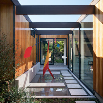
Following the devastating Woolsey Fire of 2018, the site in Malibu offered a unique opportunity to rebuild not just a home, but a new architectural composition that highlighted the property’s potential while navigating strict fire-rebuild codes in the area. Designed by Klopf Architecture, this project embraced a set of limitations and translated them into an architectural asset.
The city’s fire-rebuild process required the new structure to remain close to the original footprint, size and bulk, a constraint that ultimately clarified the architectural direction. Perched near the front of a long, narrow lot, the new home frames and overlooks a private, park-like rear expanse, an uncommon luxury especially in this part of Malibu .
Without a fixed program, the design process allowed for a different kind of creative focus allowing Klopf Architecture the opportunity to explore how a modernist home could best respond to this site. The team approached the project not with a list of requirements, but with a question: How might a modernist live here? What spatial qualities would inspire calm, connection, and a sense of wonder in this setting? The process became less about problem-solving and more about architectural storytelling—letting the site, the light, and the principles of modern design guide the form and flow of the home.
The response emerged in the form of a glass-box pavilion, an open, Mid-Century Modern inspired living, dining, and kitchen space that floats at the edge of the property’s natural descent. Connected to the more enclosed, private areas of the home by a glass-walled hallway, the living pavilion becomes a distinct centerpiece of the design. It opens on all four sides to the landscape with decks and patios on the flanks, an internal garden and water feature to the north, and a dramatic unguarded view of the expansive backyard and ocean horizon to the south.
Because of the mandated footprint, careful planning was required to ensure every space could still engage with light, landscape, or both. Strategic voids in the form of atriums and courtyards allow daylight to filter deep into the home’s core, while offering moments of surprise and retreat. These design gestures allow natural light to filter deep into the interior, creating a sense of brightness and openness throughout the day. At the same time, they expand the perceptual boundaries between inside and out, making the home feel more expansive while anchoring its connection to the surrounding landscape.
The siting of the house is what gives it its unique character. Rather than receding into the backyard like the neighboring homes, the house holds a slight prominence. From the central living pavilion, stepping down into the landscape feels more like entering a secluded park where a separate existing accessory structure, trail, and recreational areas await. The home’s modest street presence gives way to this unfolding drama of space, view, and nature.
Fire-resilient materials and assemblies are integrated seamlessly throughout including triple-pane glazing, under-slab and roof insulation, and locally sourced fire-rated cladding ensure the house not only meets Calfornia’s rigorous wildland-urban interface (WUI) standards, but feels effortlessly aligned with them. While technical decisions like fire-hardening and mechanical systems presented some construction challenges, particularly around the cantilevered glass box, the team found a functional compromise that preserved the integrity of the design.
Inside, a restrained palette and exposed post and beam design celebrate the ethos of mid-century modernism. A central circulation spine extends from the entry to the rear glass wall, offering a continuous visual link from street to ocean. Spaces such as the library and office, though more intimate in scale, are never cut off from nature as each opens to its own unique courtyard or garden view.
Though born out of a strict regulatory framework and developed without a specific client, the rebuild design unfolded with remarkable clarity. Grounded in site logic, refined by limitations and an emphasis on timeless spatial relationships – light, proportion, and a strong connection to nature, the resulting design feels both effortless and uplifting. The home lives lightly on the land, opens generously to its surroundings, and strikes a careful balance between privacy, openness, and calm. For Klopf Architecture, it stands as a compelling case study in how site, code, and circumstantial constraints can inspire enduring, modernist architecture. With years of experience reimagining mid-century modern design for how people live today, the firm took the project’s limitations as an opportunity. The result is a home shaped by open, flowing spaces, strong indoor-outdoor connections, and a calm, clear sense of structure. It’s a good reminder that even with strict constraints, there’s still room for architecture to breathe—and for modernism to keep moving forward.
Klopf Architecture project team: Geoff Campen, John Klopf, AIA, and Sherry Tan
Structural Engineer: ZFA
Contractor: Maison D’Artiste
Photography: ©2025 Mariko Reed
Year Completed: 2023
 J&S by STARK
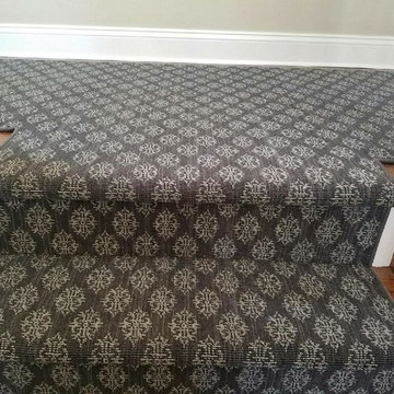
Mid-sized elegant carpeted straight wood railing home design photo in New York with carpeted risers
 Ferriss - Architectural Renderings
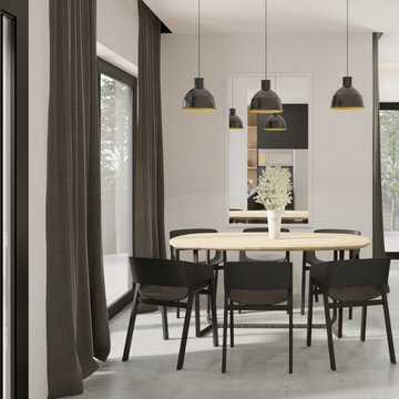
Here are some practical tips for creating a beautiful, comfortable and thoughtful living room design.
The living room in the house is the place where, as the name suggests, receives guests. However, the owners themselves relax here, spending time in front of the TV or a book, with drinks, pleasant conversation and other activities. Therefore, the living room should be the most comfortable place in your home.
The place of the sofa in the design of the living room
The sofa does not need to be placed in a draft. This means that it should not be on an imaginary line from window to door - if you drew a floor plan, it will just be easy to trace.
1. The sofa in front of the TV, diagonally from the door, is a great location. As if inviting you to sit down :)
2. Sofa near the door. A good solution if you often have overnight guests.
3. Corner sofa in the living room. Best placed in the farthest corner from the door. This will make the room look more spacious.
Correct opening of the door in the living room. Inward or outward?
Open inward or outward? There is no clear rule here, because everything depends on the layout and on the furniture placed. The main thing is that the door leaf opens freely and does not interfere with entering and exiting the room. Also, the door should not interfere with free access to the closet or dressing room.
TV in living room size and location. Location.
The TV is placed on the wall opposite to the sofa - this is the most logical and reasonable place for it in the living room. Moreover, the distance to it does not really matter: modern TV models can be placed close to the sofa.
Cabinet or bracket? To your taste. The main thing is that the television zone looks neat and presentable. Provide in advance a cable channel in which all the wires and numerous sockets for the receiver, modem, set-top box, sound bar will hide. Nothing spoils a design like sticking wires!
Height from the floor. It is optimal to place the TV 1 m from the floor to the middle of the screen - this is exactly the level of the eyes of a seated person.
Diagonal size. If there is a financial opportunity, consider options from 50 inches - smaller screens look lonely and lonely on an empty wall.
Living room furniture.
Armchair. Often the chair becomes an accent item in the interior, then its shade, and sometimes its shape, differ from the rest of the furniture. When choosing a chair, be guided also by your habits: for example, it will be more convenient to climb up with your feet and read a book in an armchair with dimensions of 90x90 cm, and you can “just sit comfortably” in a fireplace chair with a high back, comfortable armrests and with a seat 80x80 cm.
TV stand. Large TV stands are no longer as relevant as they used to be, when it was necessary to store a player, cassettes and discs there. For now, a console table or a narrow elegant pedestal is enough.
Coffee table. Nice piece of furniture that creates a cozy atmosphere. Some models, if necessary, can be transformed into a more spacious table for receiving guests - however, finding comfortable and beautiful specimens is not easy, plus they usually cost a lot.
Rack. An extremely useful type of furniture. :) Firstly, a large number of decor items can be beautifully placed on the rack. And secondly, it can also play the role of a light through partition, which divides the room into zones and does not select light at the same time. This is a very big plus for small apartments.
Fireplace. Here we are talking about electric fireplaces. Some of them come with a humidifier and heated, so 3-in-1 models can be very helpful. Fireplace portals have different styles: classic, antique, modern. Inconsistency with the general style of the living room can greatly spoil the impression of the room, so be careful with creativity. Sizing is an important issue. A large wall with a high ceiling also needs a proportionate fireplace; in horror, a small portal will look lonely and ridiculous.
What do you think about our new living room project?
https://www.ferriss.co
#ferriss #We_bring_objects_to_life #3drendering #architecture #San_Francisco
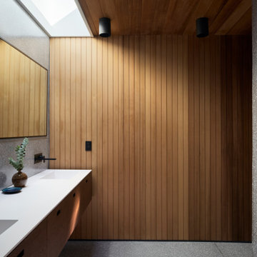 Klopf Architecture
Malibu Glass Box House by Klopf Architecture
Following the devastating Woolsey Fire of 2018, the site in Malibu offered a unique opportunity to rebuild not just a home, but a new architectural composition that highlighted the property’s potential while navigating strict fire-rebuild codes in the area. Designed by Klopf Architecture, this project embraced a set of limitations and translated them into an architectural asset.
The city’s fire-rebuild process required the new structure to remain close to the original footprint, size and bulk, a constraint that ultimately clarified the architectural direction. Perched near the front of a long, narrow lot, the new home frames and overlooks a private, park-like rear expanse, an uncommon luxury especially in this part of Malibu .
Without a fixed program, the design process allowed for a different kind of creative focus allowing Klopf Architecture the opportunity to explore how a modernist home could best respond to this site. The team approached the project not with a list of requirements, but with a question: How might a modernist live here? What spatial qualities would inspire calm, connection, and a sense of wonder in this setting? The process became less about problem-solving and more about architectural storytelling—letting the site, the light, and the principles of modern design guide the form and flow of the home.
The response emerged in the form of a glass-box pavilion, an open, Mid-Century Modern inspired living, dining, and kitchen space that floats at the edge of the property’s natural descent. Connected to the more enclosed, private areas of the home by a glass-walled hallway, the living pavilion becomes a distinct centerpiece of the design. It opens on all four sides to the landscape with decks and patios on the flanks, an internal garden and water feature to the north, and a dramatic unguarded view of the expansive backyard and ocean horizon to the south.
Because of the mandated footprint, careful planning was required to ensure every space could still engage with light, landscape, or both. Strategic voids in the form of atriums and courtyards allow daylight to filter deep into the home’s core, while offering moments of surprise and retreat. These design gestures allow natural light to filter deep into the interior, creating a sense of brightness and openness throughout the day. At the same time, they expand the perceptual boundaries between inside and out, making the home feel more expansive while anchoring its connection to the surrounding landscape.
The siting of the house is what gives it its unique character. Rather than receding into the backyard like the neighboring homes, the house holds a slight prominence. From the central living pavilion, stepping down into the landscape feels more like entering a secluded park where a separate existing accessory structure, trail, and recreational areas await. The home’s modest street presence gives way to this unfolding drama of space, view, and nature.
Fire-resilient materials and assemblies are integrated seamlessly throughout including triple-pane glazing, under-slab and roof insulation, and locally sourced fire-rated cladding ensure the house not only meets Calfornia’s rigorous wildland-urban interface (WUI) standards, but feels effortlessly aligned with them. While technical decisions like fire-hardening and mechanical systems presented some construction challenges, particularly around the cantilevered glass box, the team found a functional compromise that preserved the integrity of the design.
Inside, a restrained palette and exposed post and beam design celebrate the ethos of mid-century modernism. A central circulation spine extends from the entry to the rear glass wall, offering a continuous visual link from street to ocean. Spaces such as the library and office, though more intimate in scale, are never cut off from nature as each opens to its own unique courtyard or garden view.
Though born out of a strict regulatory framework and developed without a specific client, the rebuild design unfolded with remarkable clarity. Grounded in site logic, refined by limitations and an emphasis on timeless spatial relationships – light, proportion, and a strong connection to nature, the resulting design feels both effortless and uplifting. The home lives lightly on the land, opens generously to its surroundings, and strikes a careful balance between privacy, openness, and calm. For Klopf Architecture, it stands as a compelling case study in how site, code, and circumstantial constraints can inspire enduring, modernist architecture. With years of experience reimagining mid-century modern design for how people live today, the firm took the project’s limitations as an opportunity. The result is a home shaped by open, flowing spaces, strong indoor-outdoor connections, and a calm, clear sense of structure. It’s a good reminder that even with strict constraints, there’s still room for architecture to breathe—and for modernism to keep moving forward.
Klopf Architecture project team: Geoff Campen, John Klopf, AIA, and Sherry Tan
Structural Engineer: ZFA
Contractor: Maison D’Artiste
Photography: ©2025 Mariko Reed
Year Completed: 2023
 Neumann & Rudy Architecture
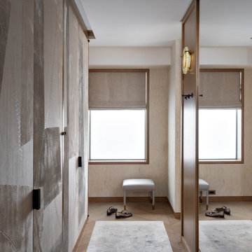
**Paragraph 1: Spatial Composition & Architectural Volume**
This dressing vestibule is an exercise in the choreography of compression and release — a narrow processional corridor that opens onto a shallow window alcove, terminating the sightline in a single, deliberately staged tableau. The plan is organized between two parallel planes of full-height joinery: at left, a monumental run of flush-faced wardrobe doors executed in bespoke decorative panelling, and at right, a mirror-clad pier whose reflective face doubles the room's apparent width and recapitulates the window, the bench, and the herringbone floor in a quiet trompe-l'oeil. The millwork is detailed with an admirable restraint — reveal-shadow gaps rather than architraves, concealed pivot hinges, and slim bronze-toned frames that read as drawn lines rather than mouldings. Overhead, a stepped soffit and recessed cornice detail lower the datum at the corridor, then release into the fuller ceiling height of the alcove; the effect is subtly perspectival, drawing the eye toward the luminous aperture. The punched window, generously reveal-deep and set within a wide oak surround, functions less as a view and more as a light well, its frosted glazing dissolving the exterior into pure illuminated field. The upholstered bench, centered beneath it and flanked casually by a pair of double-monk shoes, provides the anthropometric anchor — a note of inhabited scale that keeps the geometry from tipping into abstraction.
**Paragraph 2: Materiality, Color & Texture**
The palette operates within an exceptionally disciplined tonal register — a graduated field of oyster, greige, bone, and pale putty, all sharing a warm mineral undertone that prevents the achromatic scheme from turning cold. The hero surface is undoubtedly the wardrobe fronts: a hand-applied, gesso-like plaster or lacquered artisanal finish, its brushed and troweled passages bearing faint calligraphic incisions and pinpricked stitch-like perforations, evoking a Japanese ink study or an aged fresco fragment. Against this painterly softness, the joinery frames and window casings deliver rift-sawn oak with a fine, linear grain, while the perimeter walls are dressed in a subtly striated textile or grasscloth wallcovering punctuated by small inlaid tesserae — a low-frequency rhythm that reads as texture at distance and as craft detail at proximity. Hardware provides the scheme's only true contrast: elongated blackened-bronze pulls, rectilinear and unornamented, act as punctuation marks on the pale field. Metals are otherwise handled with restraint — satin brass sabots capping the bench legs, an unlacquered brass sconce armature — introducing warmth without glitter. Underfoot, the chevron-laid oak parquet supplies directional energy, softened by a plush viscose or silk-blend rug whose sheen shifts from pearl to shadow. The tactile logic is one of graduated softness: matte plaster against silk pile, honed timber against brushed textile, with mirror as the single hard, cool interruption.
**Paragraph 3: Lighting, Atmosphere & Style Profile**
Natural light is the primary compositional instrument here, and it has been diffused rather than admitted — the obscured glazing and half-drawn linen Roman shade convert daylight into a soft, north-facing luminous plane, evenly modelling the plaster and revealing its topography in raking gradients. This ambient wash is calibrated against a single decorative gesture: a wall-mounted sconce in alabaster or hand-formed opaline glass, its warm amber core providing the room's only chromatic accent and a welcome note of imperfection against the otherwise machined precision. Architectural lighting is entirely concealed — no downlight apertures interrupt the ceiling plane — reinforcing the sense that illumination emanates from the surfaces themselves. The resulting atmosphere is contemplative, hushed, almost sacral: a threshold space treated with the gravity of a chapel narthex. Stylistically, the project sits at the confluence of Soft Minimalism and contemporary Parisian couture interiors — the reductive planarity and monochromatic discipline of the former married to the artisanal, hand-wrought materiality and bronze detailing associated with the latter, with a distinctly Japandi sensibility in its reverence for wabi-sabi surface irregularity and asymmetric compositional balance. It is a scheme that achieves luxury not through ornament or contrast but through the sustained rigour of tonal control, the quality of the hand in its finishes, and the confidence to leave the volume largely empty.
 Neumann & Rudy Architecture
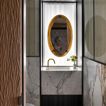
**I. Spatial Composition & Architectural Volume**
This powder room operates as a compressed, processional vestibule — a jewel-box volume whose narrowness is deliberately weaponized to intensify the encounter with a single focal event. The plan reads as a tight rectilinear corridor, entered obliquely past a pivoting sculptural door leaf at the left foreground, with the sightline funnelling directly to a recessed alcove at the terminal wall. That alcove is the compositional engine of the room: a deep, orthogonal reveal framed in slender blackened-metal profiles, within which a monolithic marble vanity cantilevers as a full-width plinth, its shadow-gap plinth detail dissolving the mass into apparent levitation. The full-height glazed screens flanking both side walls — divided into a disciplined grid of stile-and-rail metal mullions above a stone dado — introduce a Miesian rhythm of verticals that visually widen the space while preserving enclosure. Above, a crisp plaster soffit with a razor-thin perimeter reveal caps the volume, while the mullion grid's continuation across the ceiling plane and door surround creates a cage-like armature, an architectural drawing rendered in three dimensions. The suspended, wall-hung water closet at left is deliberately subordinated, half-concealed by the stone return, ensuring the axial procession terminates not on plumbing but on art.
**II. Materiality, Color & Texture**
The material palette is orchestrated as a controlled dialogue between the geologic, the vegetal, and the metallic. Book-matched Calacatta Viola — or a closely related Paonazzo — sheathes the dado and vanity in slabs whose oxblood, umber, and graphite veining reads as gestural brushwork, its cool bone-white ground counterweighted by the warm ferrous rust of its fissures; the veining on the right-hand wall is sequenced to cascade, treating stone as a continuous painterly field rather than a modular cladding. Against this, the foreground door presents a deeply carved, three-dimensional sculpted timber relief in a mid-tone oak or walnut, its undulating, plaited chevron texture introducing a haptic, almost textile-like tactility that provides the composition's most overtly artisanal register. The glazed screens deploy reeded or fluted glass in a smoky sage-olive cast, their striations diffusing and abstracting whatever lies beyond into vertical striae of light — a translucent counterpoint to the opacity of stone and wood. Blackened bronze or patinated steel mullions supply the graphic scaffolding, while unlacquered brass appears as accent punctuation: the gooseneck spout with exposed swivel collar, and, most emphatically, the flame-patinated bronze oval of the mirror frame, whose molten amber bloom is the single high-saturation event in an otherwise desaturated envelope of greys, greiges, and bone. Underfoot, chevron-laid oak parquet in a soft tobacco stain grounds the palette and repeats the door's zigzag geometry at a domestic scale.
**III. Lighting, Atmosphere & Style Profile**
Lighting is handled with theatrical restraint and a distinctly museological logic. The terminal alcove is backlit by a full-height plane of sheer, pinch-pleated linen sheers washed with daylight — an ambiguous, screened luminance that functions as a lightbox, silhouetting the mirror and reading as a window without conceding a view. Concealed cove or perimeter LED at the soffit reveal lifts the ceiling and grazes the plaster, while the reeded glass side screens capture and refract borrowed light along their flutes, producing a soft vertical shimmer that keeps the narrow volume from collapsing into gloom. The lower register is intentionally darker, the recessed shadow gap beneath the vanity and the bronze toe detail anchoring the composition in a low-key, chiaroscuro base. The atmosphere is hushed, contemplative, and faintly ecclesiastical — the alcove operating as a reredos, the framed portrait glimpsed in the mirror's reflection functioning as an unexpected, wry apparition that injects narrative and humor into an otherwise austere scheme. Stylistically, the room synthesizes into what might be termed *Tactile Luxe Modernism* or Refined Warm Modernism: the structural clarity and metal-gridded transparency of mid-century International Style, tempered by Italian post-war sensuality in the bronze and marble, and finally humanized by contemporary craft-forward texture. The result is a space of considerable discipline that nonetheless privileges touch, patina, and surprise over minimalist abstinence.

 JM Carpets
Large country u-shaped medium tone wood floor kitchen photo in Milwaukee with white cabinets and a peninsula
104