
Search results for "Lower risk" in Home Design Ideas



Find the right local pro for your project
 CROSS GRAIN CABINETRY (Formerly Ambiance Cabinets)
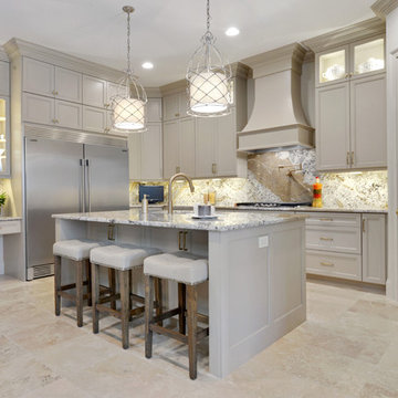
Transitional Kitchen
Open concept kitchen - large transitional u-shaped travertine floor and beige floor open concept kitchen idea in New Orleans with an undermount sink, recessed-panel cabinets, beige cabinets, granite countertops, beige backsplash, marble backsplash, stainless steel appliances and an island
Open concept kitchen - large transitional u-shaped travertine floor and beige floor open concept kitchen idea in New Orleans with an undermount sink, recessed-panel cabinets, beige cabinets, granite countertops, beige backsplash, marble backsplash, stainless steel appliances and an island
 Cummings Architecture + Interiors
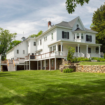
The beautiful, old barn on this Topsfield estate was at risk of being demolished. Before approaching Mathew Cummings, the homeowner had met with several architects about the structure, and they had all told her that it needed to be torn down. Thankfully, for the sake of the barn and the owner, Cummings Architects has a long and distinguished history of preserving some of the oldest timber framed homes and barns in the U.S.
Once the homeowner realized that the barn was not only salvageable, but could be transformed into a new living space that was as utilitarian as it was stunning, the design ideas began flowing fast. In the end, the design came together in a way that met all the family’s needs with all the warmth and style you’d expect in such a venerable, old building.
On the ground level of this 200-year old structure, a garage offers ample room for three cars, including one loaded up with kids and groceries. Just off the garage is the mudroom – a large but quaint space with an exposed wood ceiling, custom-built seat with period detailing, and a powder room. The vanity in the powder room features a vanity that was built using salvaged wood and reclaimed bluestone sourced right on the property.
Original, exposed timbers frame an expansive, two-story family room that leads, through classic French doors, to a new deck adjacent to the large, open backyard. On the second floor, salvaged barn doors lead to the master suite which features a bright bedroom and bath as well as a custom walk-in closet with his and hers areas separated by a black walnut island. In the master bath, hand-beaded boards surround a claw-foot tub, the perfect place to relax after a long day.
In addition, the newly restored and renovated barn features a mid-level exercise studio and a children’s playroom that connects to the main house.
From a derelict relic that was slated for demolition to a warmly inviting and beautifully utilitarian living space, this barn has undergone an almost magical transformation to become a beautiful addition and asset to this stately home.
 Swati Goorha Designs
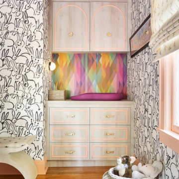
Example of a mid-sized eclectic gender-neutral light wood floor, brown floor, wallpaper ceiling and wallpaper nursery design in New York with white walls
 William Jackson Inc.
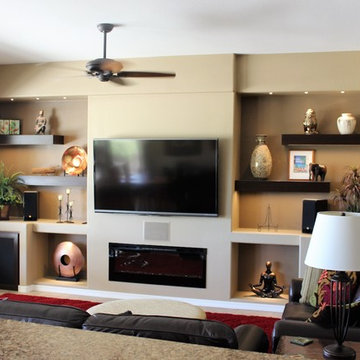
Entertainment system with wall mounted T.V., shelves, lighting, and built in cabinets for cable boxes.
Example of a mid-sized trendy open concept porcelain tile and beige floor family room design in Phoenix with beige walls and a wall-mounted tv
Example of a mid-sized trendy open concept porcelain tile and beige floor family room design in Phoenix with beige walls and a wall-mounted tv

Sponsored
Delaware, OH

Buckeye Basements, Inc.
Central Ohio's Basement Finishing ExpertsBest Of Houzz '13-'21

 Zola European Windows
McKeesport Downtown Housing, formerly a YMCA, is an 84-unit SRO for people at risk of homelessness. The old brick and terracotta building was important historically for McKeesport. The decision to design the project to Passive House criteria actually went a long way to making the pro-forma work. This project was the first large scale retrofit to be designed to meet Passive House Standards in the US. Another major concern of the project team was to maintain the historic charm of the building.
Space was at a premium and a reorganization of space allowed for making larger resident rooms. Through a community process with various stakeholders, amenities were identified and added to the project, including a community room, a bike storage area, exterior smoking balconies, single-user rest rooms, a bed bug room for non-toxic treatment of bed bugs, and communal kitchens to provide healthy options for food. The renovation includes new additional lighting, air-conditioning, make-up air and ventilation systems, an elevator, and cooking facilities. A cold-weather shelter, 60-day emergency housing, bridge housing, and section 8 apartment rentals make up the housing programs within the shelter. Thoughtful Balance designed the interiors, and selected the furniture for durability and resistance to bed bugs.
The project team worked closely with Zola Windows to specify a unique uPVC window that not only offers passive house performance levels at an affordable cost, but also harmonizes with the building’s historic aesthetic. Zola’s American Heritage SDH (simulated double hung) from the popular, budget-friendly Thermo uPVC line was specified for the project. The windows implemented in this project feature a lower tilt & turn window and a fixed upper for maximum airtightness and thermal performance. The implementation of these windows helped the project team achieve a very significant energy consumption reduction of at least 75%.
Photographer: Alexander Denmarsh
 Polo MA Inc. Interior Design
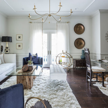
Example of a classic dark wood floor living room design in New York with white walls and no tv

 Noelle Johnson Landscape Consulting
Painted citrus trunk resists sunburn
Photo of a landscaping in Phoenix.
Photo of a landscaping in Phoenix.
 Drury Design
The Setup:
After purchasing this home, the homeowners faced a unique opportunity to reimagine their kitchen and nearby spaces. Water damage from a burst pipe had left much of the home’s interior in need of repair, and while the existing kitchen was functional and in relatively good shape, it didn’t align with the family’s vision for their new home. The layout included a peninsula that wasn’t ideal, and there were some druthers with the nearby pantry.
Since the space needed to be rebuilt anyway, the homeowners saw this as a chance to create a kitchen that was both highly functional for their four young children and timeless in its design. The project also included a refresh of the adjacent message center and dining room — spaces that play key roles in the family’s daily life. The goal was to create a cohesive flow between these areas, balancing modern functionality with the craftsman-inspired character of the rest of the home.
Design Objectives:
- Replace the outdated peninsula with a large island to maximize counter space and create new seating options.
- Open up the space visually by removing soffits and rethinking the cabinetry layout.
Incorporate concealed refrigeration and freezer units to provide significant storage for the family while maintaining a streamlined aesthetic.
- Integrate black cabinetry into the design without making the space feel harsh or heavy.
- Ensure the lighting plan balances functional task lighting with ambient accent lighting.
- Avoid visual clutter in the cabinetry design while still giving a nod to the craftsman aesthetic.
- Incorporate a slab backsplash as a key design feature.
Design Challenges:
- The outdated peninsula left dead space in the kitchen and lacked sufficient seating for the family.
- The cooktop wall was cramped, with small cabinets flanking the hood, limited storage, and soffits that made the space feel closed-in.
- The family needed significant refrigeration space (two refrigerators and a freezer) but wanted to avoid a cluttered look with visible stainless steel appliances.
- Adding black cabinetry risked making the space feel too dark or heavy.
- The original lighting plan was insufficient, particularly over the dining table where a decorative fixture proved too dim.
- The family wanted shaker-style drawer fronts to match the home’s arts-and-crafts design but worried that too much shaker cabinetry might look overly busy.
- Prioritizing a slab backsplash in the wish list priority planning.
The Renewed Space
Design Solutions:
- A functional island: The peninsula was replaced with a large island that provides continuous countertop space for prepping and serving. The island also features seating for four people, creating a central hub for informal meals and activities.
- Streamlined cooktop wall: The soffits were removed, and the upper cabinets on the cooktop wall were eliminated to create a more open, streamlined design. A custom oversized hood became the focal point of the wall, with the blower unit offset inside it to align with the cooktop while maintaining exterior visual symmetry.
- Concealed refrigeration: Two column refrigerators and one freezer were integrated into the cabinetry, concealing them behind wood paneling that blends seamlessly with the overall design.
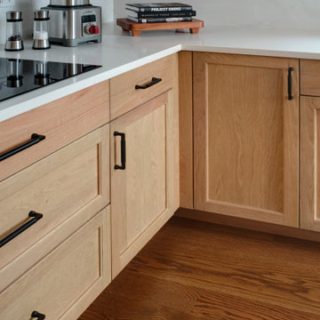
- Warm black cabinetry: The black cabinetry was crafted from hickory with a visible grain, softening its appearance and adding warmth. The grain detail gives the cabinetry a rich, textured look that avoids feeling stark or overpowering.
- Additional lighting: In the dining area, recessed can lights were added during an additional installation phase to supplement the gorgeous decorative fixture’s dim output. The new lighting plan creates a layered effect, combining functional task lighting with softer ambient lighting.
- Simplified cabinetry details: Slab drawer fronts were used on the upper drawers, while five-piece shaker fronts (with slightly less prominent rail and stile pieces) were reserved for the middle and lower drawers. This approach simplified the overall look while maintaining the craftsman-inspired aesthetic.
- Slab backsplash priority: The slab backsplash was prioritized by making thoughtful adjustments elsewhere, like opting not to extend cabinetry to the ceiling, which also helped visually prioritize the gorgeous slab backsplash. This decision also enhanced the kitchen’s furniture-like feel, aligning with the home’s craftsman character.
- This kitchen perfectly balances practicality with timeless style. By addressing the family’s functional needs — ample seating, smart storage, and effective lighting — while incorporating thoughtful design elements like warm black cabinetry and a striking slab backsplash, Alicia created a space that works beautifully for a busy household. The result is a cohesive, inviting kitchen that honors the home’s craftsman roots and will serve the family well for years to come.
 Hedrick Architecture
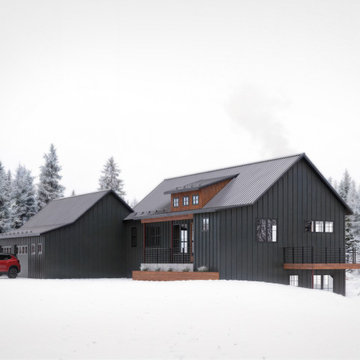
Nestled in the trees at 8500 feet, this home sits at the foot of the Continental Divide. A sloping site allowed us to bring the main living area upstairs in order to take advantage of views to the south, east, and northwest.
For the overall design of the house, we took cues from ranch and agrarian buildings found throughout Colorado, incorporating broken gable roofs and simple shed dormers. Because the home is located in a high-risk wildfire zone, exterior materials need to be highly fire-resistant. In keeping with our ranch-inspired aesthetic, the house is clad with standing seam metal roofing and cementitious board and batten siding.
On the main floor, visitors are greeted with a dramatic entry, featuring high ceilings, lots of light, an open stairway, and views through the house. This level also includes the primary suite, with private access to the deck. The lower level is dedicated to guest accommodations and a large flex space that opens to the backyard.
 Stone Action
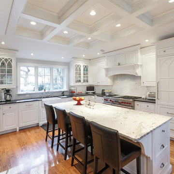
This kitchen was fabricated by Lapptops and the cabinets were done by King's Woodwork!
http://lapptops.net/
This kitchen features Calacatta marble with a polished finish on the island. The surrounding countertops are absolute black granite with a honed finish. This kitchen is so clean and bright!
Search "calacatta" or "black", see variations of this marble & granite, or other stone options: http://www.stoneaction.com
Learn more about granite to see if it’s right for you:
Granite countertops can last a lifetime. It contains no harmful chemicals and do not emit harmful radiation or gasses. Granite is heat resistant and is one of the most heat-resistant countertops on the market. You can place a hot pan out of the oven directly onto the countertop surface. Experts do recommend the use of a trivet when using appliances that emit heat for long periods of time, such as crockpots. Since the material is so dense, there is a small possibility heating one area of the top and not the entire thing, could cause the countertop to crack.
Granite is scratch resistant. You can cut on it, but it will dull your knives! Granite scores a seven on Moh’s hardness scale.
Granite countertops are considered to be a low maintenance countertop surface. The likelihood of needing to be repaired or resurfaced is low. Granite is a porous material. Most fabricators will apply a sealer to granite countertops before they are installed which will protect them from absorbing liquids too quickly. Many sealers last more than 10 years before needing to be reapplied. When they do need to be reapplied, it is something that most homeowners can do on their own as the process is similar to cleaning. Darker granites are very dense and sometimes don’t even require a sealer.
When it comes to pricing, there are a lot of variables such as edge profile, total square footage, backsplash, etc. Don’t be fooled by the stereotype that all granite is expensive. Lower-range granites will cost less than high-range laminate. Though granite countertops are not considered “low range” in pricing, there are a lot of affordable options.
If you are looking for something truly unique, consider an exotic granite. Some quarries are not easily accessible and/or only able to be quarried for short periods of time throughout the year. If these circumstances exist in a quarry with gorgeous stone, the price will be driven upward.
You won’t find a lot of solid patterns or bright colors, but both do exist. Also, watch for a large range of color and pattern within the same color of stone. It’s always a good idea to view the exact slab(s) that will be fabricated for your kitchen to make sure they are what you expected to see from the sample. Another factor is that many exotic types of granite have huge flowing waves, and a small sample will not be an accurate representation of the whole slab.
Granite countertops are very resistant to chemicals. Acids and bases will not harm the material.
Understanding Marble:
Marble is a porous, high-maintenance surface.
Be prepared to see some scratches. Marble is a softer stone. However, marble is still so beautiful with the scratches! If you’ve ever gone to Italy, you can see the beautiful marble on floors and many restaurants. It’s a classic lasting look. Even with scratches.
If you don't mind the extra work, they are a beautiful addition. Marble has a multifaceted ability to work with so many different design styles. If you're a homeowner looking for a wipe-and-go countertop, though, you'll probably want to skip this one.
It's cost-effective, depending on the type of marble you buy. Carrara marble (a grayer version with softer veins from Carrara, Italy) is one of the least expensive natural countertop materials on the market, mainly because it's readily available. Calacatta marble, which offers a whiter surface and more dramatic veining, and the price tag goes up.
Marble is heat-resistant — which is great — but you still need to be careful. Marble is heat resistant. Despite its ability to withstand high temps, you never want to place a piping hot pot on for risk of discoloring or burning the surface. We recommend always using a pot holder anyways.
We don’t want to dissuade you from using marble. In fact, I personally have a marble island in my kitchen. Stone Action solely wants you to be informed so that you’re choosing the right material for your project.
We hope you personally come check out our marble or other stone selection!
See more marble or other types of Stone Action’s stone selection:
http://www.stoneaction.com

Sponsored
Sunbury, OH

J.Holderby - Renovations
Franklin County's Leading General Contractors - 2X Best of Houzz!
 Zola European Windows
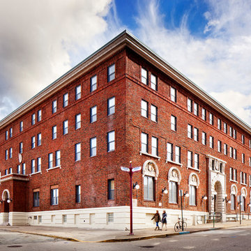
McKeesport Downtown Housing, formerly a YMCA, is an 84-unit SRO for people at risk of homelessness. The old brick and terracotta building was important historically for McKeesport. The decision to design the project to Passive House criteria actually went a long way to making the pro-forma work. This project was the first large scale retrofit to be designed to meet Passive House Standards in the US. Another major concern of the project team was to maintain the historic charm of the building.
Space was at a premium and a reorganization of space allowed for making larger resident rooms. Through a community process with various stakeholders, amenities were identified and added to the project, including a community room, a bike storage area, exterior smoking balconies, single-user rest rooms, a bed bug room for non-toxic treatment of bed bugs, and communal kitchens to provide healthy options for food. The renovation includes new additional lighting, air-conditioning, make-up air and ventilation systems, an elevator, and cooking facilities. A cold-weather shelter, 60-day emergency housing, bridge housing, and section 8 apartment rentals make up the housing programs within the shelter. Thoughtful Balance designed the interiors, and selected the furniture for durability and resistance to bed bugs.
The project team worked closely with Zola Windows to specify a unique uPVC window that not only offers passive house performance levels at an affordable cost, but also harmonizes with the building’s historic aesthetic. Zola’s American Heritage SDH (simulated double hung) from the popular, budget-friendly Thermo uPVC line was specified for the project. The windows implemented in this project feature a lower tilt & turn window and a fixed upper for maximum airtightness and thermal performance. The implementation of these windows helped the project team achieve a very significant energy consumption reduction of at least 75%.
Photographer: Alexander Denmarsh
 Drury Design
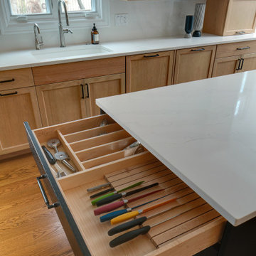
The Setup:
After purchasing this home, the homeowners faced a unique opportunity to reimagine their kitchen and nearby spaces. Water damage from a burst pipe had left much of the home’s interior in need of repair, and while the existing kitchen was functional and in relatively good shape, it didn’t align with the family’s vision for their new home. The layout included a peninsula that wasn’t ideal, and there were some druthers with the nearby pantry.
Since the space needed to be rebuilt anyway, the homeowners saw this as a chance to create a kitchen that was both highly functional for their four young children and timeless in its design. The project also included a refresh of the adjacent message center and dining room — spaces that play key roles in the family’s daily life. The goal was to create a cohesive flow between these areas, balancing modern functionality with the craftsman-inspired character of the rest of the home.
Design Objectives:
- Replace the outdated peninsula with a large island to maximize counter space and create new seating options.
- Open up the space visually by removing soffits and rethinking the cabinetry layout.
Incorporate concealed refrigeration and freezer units to provide significant storage for the family while maintaining a streamlined aesthetic.
- Integrate black cabinetry into the design without making the space feel harsh or heavy.
- Ensure the lighting plan balances functional task lighting with ambient accent lighting.
- Avoid visual clutter in the cabinetry design while still giving a nod to the craftsman aesthetic.
- Incorporate a slab backsplash as a key design feature.
Design Challenges:
- The outdated peninsula left dead space in the kitchen and lacked sufficient seating for the family.
- The cooktop wall was cramped, with small cabinets flanking the hood, limited storage, and soffits that made the space feel closed-in.
- The family needed significant refrigeration space (two refrigerators and a freezer) but wanted to avoid a cluttered look with visible stainless steel appliances.
- Adding black cabinetry risked making the space feel too dark or heavy.
- The original lighting plan was insufficient, particularly over the dining table where a decorative fixture proved too dim.
- The family wanted shaker-style drawer fronts to match the home’s arts-and-crafts design but worried that too much shaker cabinetry might look overly busy.
- Prioritizing a slab backsplash in the wish list priority planning.
The Renewed Space
Design Solutions:
- A functional island: The peninsula was replaced with a large island that provides continuous countertop space for prepping and serving. The island also features seating for four people, creating a central hub for informal meals and activities.
- Streamlined cooktop wall: The soffits were removed, and the upper cabinets on the cooktop wall were eliminated to create a more open, streamlined design. A custom oversized hood became the focal point of the wall, with the blower unit offset inside it to align with the cooktop while maintaining exterior visual symmetry.
- Concealed refrigeration: Two column refrigerators and one freezer were integrated into the cabinetry, concealing them behind wood paneling that blends seamlessly with the overall design.
- Warm black cabinetry: The black cabinetry was crafted from hickory with a visible grain, softening its appearance and adding warmth. The grain detail gives the cabinetry a rich, textured look that avoids feeling stark or overpowering.
- Additional lighting: In the dining area, recessed can lights were added during an additional installation phase to supplement the gorgeous decorative fixture’s dim output. The new lighting plan creates a layered effect, combining functional task lighting with softer ambient lighting.
- Simplified cabinetry details: Slab drawer fronts were used on the upper drawers, while five-piece shaker fronts (with slightly less prominent rail and stile pieces) were reserved for the middle and lower drawers. This approach simplified the overall look while maintaining the craftsman-inspired aesthetic.
- Slab backsplash priority: The slab backsplash was prioritized by making thoughtful adjustments elsewhere, like opting not to extend cabinetry to the ceiling, which also helped visually prioritize the gorgeous slab backsplash. This decision also enhanced the kitchen’s furniture-like feel, aligning with the home’s craftsman character.
- This kitchen perfectly balances practicality with timeless style. By addressing the family’s functional needs — ample seating, smart storage, and effective lighting — while incorporating thoughtful design elements like warm black cabinetry and a striking slab backsplash, Alicia created a space that works beautifully for a busy household. The result is a cohesive, inviting kitchen that honors the home’s craftsman roots and will serve the family well for years to come.
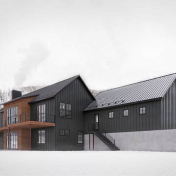 Hedrick Architecture
Nestled in the trees at 8500 feet, this home sits at the foot of the Continental Divide. A sloping site allowed us to bring the main living area upstairs in order to take advantage of views to the south, east, and northwest.
For the overall design of the house, we took cues from ranch and agrarian buildings found throughout Colorado, incorporating broken gable roofs and simple shed dormers. Because the home is located in a high-risk wildfire zone, exterior materials need to be highly fire-resistant. In keeping with our ranch-inspired aesthetic, the house is clad with standing seam metal roofing and cementitious board and batten siding.
On the main floor, visitors are greeted with a dramatic entry, featuring high ceilings, lots of light, an open stairway, and views through the house. This level also includes the primary suite, with private access to the deck. The lower level is dedicated to guest accommodations and a large flex space that opens to the backyard.
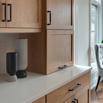 Drury Design
The Setup:
After purchasing this home, the homeowners faced a unique opportunity to reimagine their kitchen and nearby spaces. Water damage from a burst pipe had left much of the home’s interior in need of repair, and while the existing kitchen was functional and in relatively good shape, it didn’t align with the family’s vision for their new home. The layout included a peninsula that wasn’t ideal, and there were some druthers with the nearby pantry.
Since the space needed to be rebuilt anyway, the homeowners saw this as a chance to create a kitchen that was both highly functional for their four young children and timeless in its design. The project also included a refresh of the adjacent message center and dining room — spaces that play key roles in the family’s daily life. The goal was to create a cohesive flow between these areas, balancing modern functionality with the craftsman-inspired character of the rest of the home.
Design Objectives:
- Replace the outdated peninsula with a large island to maximize counter space and create new seating options.
- Open up the space visually by removing soffits and rethinking the cabinetry layout.
Incorporate concealed refrigeration and freezer units to provide significant storage for the family while maintaining a streamlined aesthetic.
- Integrate black cabinetry into the design without making the space feel harsh or heavy.
- Ensure the lighting plan balances functional task lighting with ambient accent lighting.
- Avoid visual clutter in the cabinetry design while still giving a nod to the craftsman aesthetic.
- Incorporate a slab backsplash as a key design feature.
Design Challenges:
- The outdated peninsula left dead space in the kitchen and lacked sufficient seating for the family.
- The cooktop wall was cramped, with small cabinets flanking the hood, limited storage, and soffits that made the space feel closed-in.
- The family needed significant refrigeration space (two refrigerators and a freezer) but wanted to avoid a cluttered look with visible stainless steel appliances.
- Adding black cabinetry risked making the space feel too dark or heavy.
- The original lighting plan was insufficient, particularly over the dining table where a decorative fixture proved too dim.
- The family wanted shaker-style drawer fronts to match the home’s arts-and-crafts design but worried that too much shaker cabinetry might look overly busy.
- Prioritizing a slab backsplash in the wish list priority planning.
The Renewed Space
Design Solutions:
- A functional island: The peninsula was replaced with a large island that provides continuous countertop space for prepping and serving. The island also features seating for four people, creating a central hub for informal meals and activities.
- Streamlined cooktop wall: The soffits were removed, and the upper cabinets on the cooktop wall were eliminated to create a more open, streamlined design. A custom oversized hood became the focal point of the wall, with the blower unit offset inside it to align with the cooktop while maintaining exterior visual symmetry.
- Concealed refrigeration: Two column refrigerators and one freezer were integrated into the cabinetry, concealing them behind wood paneling that blends seamlessly with the overall design.
- Warm black cabinetry: The black cabinetry was crafted from hickory with a visible grain, softening its appearance and adding warmth. The grain detail gives the cabinetry a rich, textured look that avoids feeling stark or overpowering.
- Additional lighting: In the dining area, recessed can lights were added during an additional installation phase to supplement the gorgeous decorative fixture’s dim output. The new lighting plan creates a layered effect, combining functional task lighting with softer ambient lighting.
- Simplified cabinetry details: Slab drawer fronts were used on the upper drawers, while five-piece shaker fronts (with slightly less prominent rail and stile pieces) were reserved for the middle and lower drawers. This approach simplified the overall look while maintaining the craftsman-inspired aesthetic.
- Slab backsplash priority: The slab backsplash was prioritized by making thoughtful adjustments elsewhere, like opting not to extend cabinetry to the ceiling, which also helped visually prioritize the gorgeous slab backsplash. This decision also enhanced the kitchen’s furniture-like feel, aligning with the home’s craftsman character.
- This kitchen perfectly balances practicality with timeless style. By addressing the family’s functional needs — ample seating, smart storage, and effective lighting — while incorporating thoughtful design elements like warm black cabinetry and a striking slab backsplash, Alicia created a space that works beautifully for a busy household. The result is a cohesive, inviting kitchen that honors the home’s craftsman roots and will serve the family well for years to come.

Sponsored
Delaware, OH
Buckeye Basements, Inc.
Central Ohio's Basement Finishing ExpertsBest Of Houzz '13-'21
 Zola European Windows
McKeesport Downtown Housing, formerly a YMCA, is an 84-unit SRO for people at risk of homelessness. The old brick and terracotta building was important historically for McKeesport. The decision to design the project to Passive House criteria actually went a long way to making the pro-forma work. This project was the first large scale retrofit to be designed to meet Passive House Standards in the US. Another major concern of the project team was to maintain the historic charm of the building.
Space was at a premium and a reorganization of space allowed for making larger resident rooms. Through a community process with various stakeholders, amenities were identified and added to the project, including a community room, a bike storage area, exterior smoking balconies, single-user rest rooms, a bed bug room for non-toxic treatment of bed bugs, and communal kitchens to provide healthy options for food. The renovation includes new additional lighting, air-conditioning, make-up air and ventilation systems, an elevator, and cooking facilities. A cold-weather shelter, 60-day emergency housing, bridge housing, and section 8 apartment rentals make up the housing programs within the shelter. Thoughtful Balance designed the interiors, and selected the furniture for durability and resistance to bed bugs.
The project team worked closely with Zola Windows to specify a unique uPVC window that not only offers passive house performance levels at an affordable cost, but also harmonizes with the building’s historic aesthetic. Zola’s American Heritage SDH (simulated double hung) from the popular, budget-friendly Thermo uPVC line was specified for the project. The windows implemented in this project feature a lower tilt & turn window and a fixed upper for maximum airtightness and thermal performance. The implementation of these windows helped the project team achieve a very significant energy consumption reduction of at least 75%.
Photographer: Alexander Denmarsh
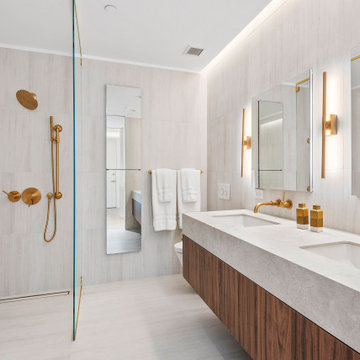
 KURV Architecture DPC (Alex Hughes Architects)
Located in the heart of Manhattan’s Lower East Side, the building was erected on a shallow commercial lot between two 120 year old masonry buildings and a new residential rental building. 330 Grand Street is a mix of 725 SF 1BRs and 1050 SF 2BR apartments. It also contains a 1100 SF two story duplex as well as private and public rooftop space, large private balconies for most units and two large private terraces for the ground floor units.
330 Grand Street was originally designed and approved at the NYC DOB as a prefabricated modular building. During the pandemic, as shipping costs skyrocketed putting the project at risk, we suggested redesigning the building as a reinforced cast-in-place concrete structure. Concrete was readily available and prices had not been affected by the demand increase that many other materials suffered in the pandemic. We took this opportunity to raise floor to ceiling heights, enlarge high performance windows and redistribute the buildings MEPFS and Structural Systems to create very open floor plans.
The challenge was to create a luxurious sensorial living experience with very limited means. In a city with very high construction costs, low cost residential buildings in the area are usually devoid of good quality, design and character. Our approach was to aim high for the end user, prioritizing natural light, open space with long visual perspectives, high ceilings and as always, rejecting the use of predefined building templates.
Our biggest challenge was to ensure that the small spaces feel as clean cut, large and bright as possible. Several unique design decisions were made to ensure low cost and high quality;
Floor plans were laid out so that spaces were wide open and free of clutter from mechanical or structural interruptions. Therefore all infrastructure was placed in lateral demising walls, which in turn act as the unit’s storage and kitchen. The apartments feel wide open, are super quiet and have more storage space than any other comparable apartment in the city.
To solve the problem of the site’s shallow commercial lot which is typically prone to dark interior spaces we focused our attention on the building’s envelope. Instead of the usual small punched window openings, oversized high performance windows were designed to ensure that light penetrated as far as possible into the units. In the smaller 1BR units, the full 50’ depth of the lot is perceived by partitioning spaces with sliding pocket doors that can be retracted to allow deep visual perspectives, making the sight lines in the space feel longer, larger, more ample than normal. In addition to the full height glazing, each unit above the 2nd floor receives a 7 foot covered balcony, adding 120 to 240 sf to each apartment, something unusual in New York City buildings. The space is large enough for a full size dining table, when the weather permits being outside.
We also worked hard to ensure modularity. For example, all kitchen units are all identical throughout the building. The idea of modularity and the economy of the repetitive unit is exercised to the maximum through the building.
Hardware, appliances, flooring, wall coverings and material finishes are all carefully selected to feel bespoke, high quality and unique.
It was important to KURV that the result of this work manifest into something that would deeply connect with the end user and sustain relationships with the consumers of this space.
All images by KURV Architecture ©
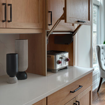 Drury Design
The Setup:
After purchasing this home, the homeowners faced a unique opportunity to reimagine their kitchen and nearby spaces. Water damage from a burst pipe had left much of the home’s interior in need of repair, and while the existing kitchen was functional and in relatively good shape, it didn’t align with the family’s vision for their new home. The layout included a peninsula that wasn’t ideal, and there were some druthers with the nearby pantry.
Since the space needed to be rebuilt anyway, the homeowners saw this as a chance to create a kitchen that was both highly functional for their four young children and timeless in its design. The project also included a refresh of the adjacent message center and dining room — spaces that play key roles in the family’s daily life. The goal was to create a cohesive flow between these areas, balancing modern functionality with the craftsman-inspired character of the rest of the home.
Design Objectives:
- Replace the outdated peninsula with a large island to maximize counter space and create new seating options.
- Open up the space visually by removing soffits and rethinking the cabinetry layout.
Incorporate concealed refrigeration and freezer units to provide significant storage for the family while maintaining a streamlined aesthetic.
- Integrate black cabinetry into the design without making the space feel harsh or heavy.
- Ensure the lighting plan balances functional task lighting with ambient accent lighting.
- Avoid visual clutter in the cabinetry design while still giving a nod to the craftsman aesthetic.
- Incorporate a slab backsplash as a key design feature.
Design Challenges:
- The outdated peninsula left dead space in the kitchen and lacked sufficient seating for the family.
- The cooktop wall was cramped, with small cabinets flanking the hood, limited storage, and soffits that made the space feel closed-in.
- The family needed significant refrigeration space (two refrigerators and a freezer) but wanted to avoid a cluttered look with visible stainless steel appliances.
- Adding black cabinetry risked making the space feel too dark or heavy.
- The original lighting plan was insufficient, particularly over the dining table where a decorative fixture proved too dim.
- The family wanted shaker-style drawer fronts to match the home’s arts-and-crafts design but worried that too much shaker cabinetry might look overly busy.
- Prioritizing a slab backsplash in the wish list priority planning.
The Renewed Space
Design Solutions:
- A functional island: The peninsula was replaced with a large island that provides continuous countertop space for prepping and serving. The island also features seating for four people, creating a central hub for informal meals and activities.
- Streamlined cooktop wall: The soffits were removed, and the upper cabinets on the cooktop wall were eliminated to create a more open, streamlined design. A custom oversized hood became the focal point of the wall, with the blower unit offset inside it to align with the cooktop while maintaining exterior visual symmetry.
- Concealed refrigeration: Two column refrigerators and one freezer were integrated into the cabinetry, concealing them behind wood paneling that blends seamlessly with the overall design.
- Warm black cabinetry: The black cabinetry was crafted from hickory with a visible grain, softening its appearance and adding warmth. The grain detail gives the cabinetry a rich, textured look that avoids feeling stark or overpowering.
- Additional lighting: In the dining area, recessed can lights were added during an additional installation phase to supplement the gorgeous decorative fixture’s dim output. The new lighting plan creates a layered effect, combining functional task lighting with softer ambient lighting.
- Simplified cabinetry details: Slab drawer fronts were used on the upper drawers, while five-piece shaker fronts (with slightly less prominent rail and stile pieces) were reserved for the middle and lower drawers. This approach simplified the overall look while maintaining the craftsman-inspired aesthetic.
- Slab backsplash priority: The slab backsplash was prioritized by making thoughtful adjustments elsewhere, like opting not to extend cabinetry to the ceiling, which also helped visually prioritize the gorgeous slab backsplash. This decision also enhanced the kitchen’s furniture-like feel, aligning with the home’s craftsman character.
- This kitchen perfectly balances practicality with timeless style. By addressing the family’s functional needs — ample seating, smart storage, and effective lighting — while incorporating thoughtful design elements like warm black cabinetry and a striking slab backsplash, Alicia created a space that works beautifully for a busy household. The result is a cohesive, inviting kitchen that honors the home’s craftsman roots and will serve the family well for years to come.
3