
Search results for "Made up term" in Home Design Ideas

 Landis Architects | Builders
We worked with a corporation and their out-of-town architect on this residential condominium construction in Washington D.C. The company uses the apartment for executive housing and meetings. Its goal was to create a flexible space to be used for both purposes. We renovated the kitchen, two bathrooms, and one bedroom. The central focus is the sleek new open kitchen, though we worked on the entire 1200 square foot apartment.
The client provided the architectural design for the kitchen and the rest of the apartment. The biggest layout changes were:
*Removing the walls of the existing kitchen to create a dramatic open kitchen that runs all the way to the window on one side and an island with a waterfall countertop on the other side.
*A layout that provided space for a large conference table
*Closing off one door of the bedroom and creating a larger opening from the living room side and installing pocket doors
These changes required extensive systems work throughout the apartment, including redoing all the ductwork, modifying the sprinkler system and relocating sprinkler heads to meet fire code. We didn’t run into any surprises with the systems because our team had investigated the structure in the pre-construction stage and cut holes in the drywall to locate the plumbing pipes, columns, and wiring. We had to turn and move the existing HVAC system so we could hide it in one of the kitchen cabinets.
We built the structure that anchors one end of the kitchen. It hides a refrigerator (with flush panel doors), electrical panel, and writing for the flat screen television. A soffit above the kitchen hides all the ductwork, and is fitted with recessed lights and LED cove lighting above.
The client supplied the kitchen cabinetry. The countertops are quartz by Caesarstone in Haze. We installed the flooring material on the base of one side of the island.
Backsplash. The dramatic backsplash is made of thin sheets of porcelain. The 5 mm thick material by Fiandre comes in 5-foot by 10-foot sheets that comes in a continuous pattern or can be book-matched. A fabricator measured the layout and cuts for the wall outlets, cut the material and installed it. Our team delivered three sheets of the material up the stairwell of the building. Though they created a template of the material out of wood to make sure it would fit, the actual material was more rigid and it took them a while to maneuver it.
The new wide opening at the end of the living room has pocket doors. We closed off the original hallway door to the bedroom.
Michael K. Wilkinson
 Neil Kelly Company
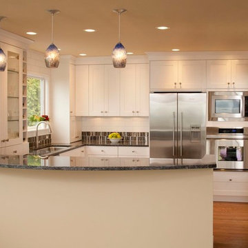
Her contemporary Seattle features a limitless sky and water view. The view inside Leslie’s kitchen was a little different. “Our kitchen was very dated and in need of renovation,” she says. Her 1974 contemporary home is perched on a bluff overlooking Puget Sound, but her dark, cramped kitchen didn’t take advantage of the stellar views. For Leslie and her husband, Peter, the kitchen only allowed one person at a time to cook.
This was not like Leslie’s charming cottage. She longed for the welcoming, light filled, open space of her cottage kitchen. But how to bring that feel to a mid-70’s contemporary, especially one that allowed no room for expansion?
For Seattle Neil Kelly Design Consultant, Diane Forman, the goal was simple. “How do I translate the crisp, clean, cheering feeling of a Victorian cottage kitchen to a contemporary space?”
Diane needed some extra space, and what she found wasn’t much. She found 12 inches of space that was available without infringing on the dining room window nearest the existing kitchen. “The impact of that additional 12 inches was immense in that it opened up storage solutions not previously conceivable,” Diane says. “It made it possible for two people to comfortably occupy and move within that space. Just one foot, that’s all it took,” she says.
As their current locations and sizes took full advantage of the view, it made no sense to move the windows, but she still needed to “lighten up” the dark kitchen. “I needed to create a joyously simple, very traditional color palette for a sophisticated contemporary setting,” Diane says. “And I replaced the ubiquitous 1970’s fluorescent light boxes with recessed can lighting, under cabinet task lighting, and some beautiful hand-blown pendant lights placed above the peninsula.”
But there was one more hurdle to overcome: Storage. Diane needed to create storage for dishes, pans, spices, wine, trays, cookbooks, small appliances and recycling. And she also had to make space for her client’s crystal collection. “Relocated the display cabinet and adding a new gently curved eating bar accommodates seating for four without intruding on the existing window nearest the kitchen”, Diane says.
There are multiple details that add up to a distinctly modern feeling and optimism to the space. And in the long run Leslie and Peter have a kitchen that matches their view. “Diane and I were trying to find a transitional style that would be cottage-like, and also urban modern,” says Leslie. “I think she did a very good job.”
 Klopf Architecture
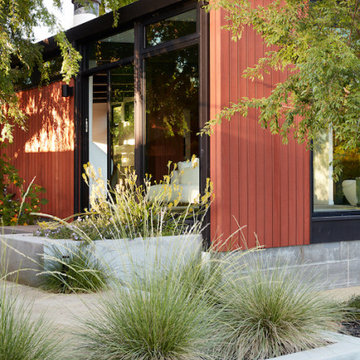
The Roger Lee designed house from 1962 was purchased by the current homeowners in almost original condition, as the previous owners elected to defer most maintenance projects over the years. The clients were able to see beyond the dated materials and finishes, single-paned glass and uninsulated walls and they approached Klopf Architecture to help them expand and update the entire home, one the family could settle into and enjoy for years to come. It was important that the new designs were aligned with Lee's original intent not only because of the client's appreciation for mid-century modern architecture, but also because the house was deemed historical. The Stanford Real Estate Office requires a stringent design review which safeguards the integrity of the community, which Klopf Architecture was happy to oblige going into their updated designs.
As with many original mid-century modern homes, the house was scaled to the 1960s lifestyle where rooms were smaller and openings to views were limited and tightly framed. The original conditions defined the direction the family of four would take in updating the house and making it comfortable for their modern lifestyle. Klopf designed a full gut remodel and major addition to bring the house into the 21st century and provide the living area needed for the client's family. The newly expanded house added just about 1,100 sf to create an airy, comfortable and family friendly house, taking full advantage of the beautiful southwestern views that extend out to the hills beyond. The enclosed garage created an additional 240 sf of covered space for long-term storage.
A cracked swimming pool created an eyesore taking up a majority of the backyard landscape, so it was one of the first elements to go during the transformation. Working with Outer Space Landscape Architects, the family asked for a mix of relaxing outdoor patio spaces that eventually blend into the native landscaping, extending their views outward toward the natural greenery of the trees beyond their property. Filling in the old pool was a smart way to expand the living spaces outward. The orientation of the house was designed to enjoy the views, but the original architecture provided the first homeowners with mere glimpses of the landscape outside.
Klopf was able to broaden those views, continuing and extending on the original architecture to take full advantage of the unobstructed natural views across the rear facade of the house. Small horizontal openings in the primary bedroom and office were replaced with much taller windows that now follow the angled roof line upward, extending across almost all of the facade. We worked with Western Windows, whose designs included an oblique-shaped, operable casement that allowed our design to rise with the slope. A new corner office added to the primary suite, offers a bright and functional work-from-home solution that looks out at the distant views and added natural light from the expanded window configuration that now wraps around the corner.
The existing lower level was designed by Lee as a utilitarian space, serving as a wet pool room with a drain in the center of the floor, bathroom, laundry and storage areas. Without the need for a pool room, Klopf was able to convert the area into a much more comfortable and functional living space with a new family room and guest suite. The new spaces enjoy easy access to a new outdoor patio through floor to ceiling, full-width glass sliders.
Continuing along the rear facade, a previously exposed deck extending from the living room and hallway provided access to the backyard through a single set of stairs leading toward the side of the house which made sense when the pool was in place. The new deck was re-envisioned as an extension of the main living room and now serves as a second outdoor living room. A new slatted pergola above provides the homeowners welcome relief from the hot afternoon sun. A second set of stairs now creates a better connection to the redesigned lower level. Klopf was able to reconfigure the spaces, extending the living room outward toward the views, where the family now claims it as the heart of the home, spending a large majority of their time outdoors.
Back inside, the original wood-burning Malm fireplace was beautifully restored and a gas burner installed to comply with California's strict air standards. It now rests in front of a wall of Heath accent tiles where a dated red brick wall used to stand. A new taller window brings more light and views into the refreshed interior living room. The original glass doors opposite the fireplace were replaced by larger sliders that when fully opened, create a seamless transition to the new outdoor living area so the two spaces feel like one connected space. The original utilitarian kitchen was needlessly tucked into the far back corner and closed-off, out of sight from the living room, so the clients asked Klopf to open it up and expand the kitchen forward so it felt more connected. Today the much larger kitchen is connected to the living area where a short wall with a cutout offers a visual glimpse into the kitchen and a handy pass-through counter for serving guests. A new breakfast nook was also added to create another spot where the family can gather for casual meals. Just outside, a new built-in outdoor grill and prep area extends the kitchen outside and connects to a new outdoor dining spot nestled amongst the trees, taking advantage of the views out back.
Klopf was able to expand the other two bedrooms, add a new laundry room and half-bath and convert the carport to an enclosed garage to add more storage areas which was lost when the pool house was converted to the family and guest room.
To maintain a historical connection to the original designs, the exterior siding was repeated on all exterior walls, a full-height stained glass window at the front entryway restored, and an interior slatted screen element repeated outside at the exterior entry courtyard and over the new outdoor living room to create a shade trellis. The new house stands proudly and shines against it's new landscaping features, while respecting and expanding on the original intent of Roger Lee's designs epitomizing the comforts of indoor-outdoor living in Northern California.
Completion year: 2020
Klopf Architecture project team: John Klopf, Klara Kevane, Noel Andrade
Contractor: ORB Construction, Brendan O'Reilly
Structural engineer: Sezen and Moon
Landscape architect: Outer space
Furnishings and decoration: Urbanism Designs
Photographer: Mariko Reed
Find the right local pro for your project
 Saikley Architects
Our busy Silicon Valley clients asked us to convert their tight-quartered 1960’s ranch house to a gracious family home that would meet their long term needs. Ease of living was paramount, both in functionality and in ordered design.
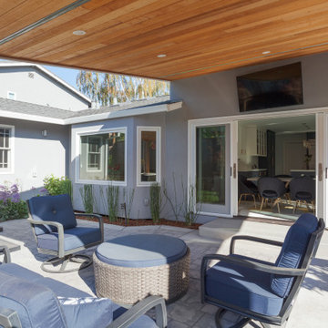
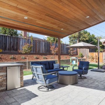
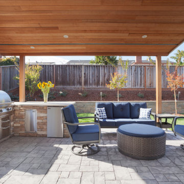
The project was completed on a moderate budget.While retaining most of the structure of the existing house to avoid costly structural changes, we opened walls to improve the sight lines and flow of the house and bring in more light. We made small additions at the front and back bedrooms to gain space for the family and relatives. An existing underused patio area was improved with a simple outdoor kitchen and overhang to extend the living space to the outside. Costs were kept down with choices of modest materials.
Everything was made to be functional. Ample storage has been built into the right places. The details of the kitchen were carefully worked out to accommodate all the wishes of the various cooks in the family. The house is set up to be easy to keep clean. Acoustic walls separate living from bedroom spaces so adults can enjoy time together while children sleep. The outdoor kitchen has easy access to the indoor kitchen and the garage, and its setup promotes socializing while cooking outdoors.
A large part of the narrow back yard was previously unusable space due to a steep slope up to a neighbor’s higher fence. With a new retaining wall and some re-grading we took back more of the yard for the patio and play space on a new lawn.
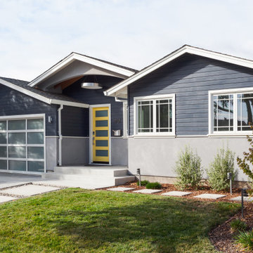
The remodeled house is a mix of contemporary and traditional elements. Cool colors have a calming effect. Traditional items such as prairie style windows, trellis, mosaic tiles, and Shaker style cabinets, break down the scale in an otherwise streamlined, contemporary design. A new gabled roof with a broad arch at the front of the house marks the entry and resolves a challenging form where the central entry is set back from walls on both sides.
Photography: Kurt Manley
https://saikleyarchitects.com/portfolio/modern-ranch/
 SabaRehman Abdulrehman
Bathrooms are no longer just functional spaces; they’re mini sanctuaries where we unwind, reset, and start or end the day. One of the biggest trends driving modern bathroom design is the move towards open, spacious layouts – and at the centre of that look is the wet room shower screen.
At BathroomNation, we’ve helped countless homeowners transform traditional bathrooms into sleek, practical wet rooms using high-quality wet room shower screens. In this blog, we’ll explain what a wet room shower screen is, why it’s such a smart choice, how to plan and style it, and what to look for when choosing the perfect one for your home.
What Is a Wet Room Shower Screen?
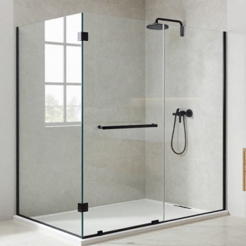
A wet room shower screen is a fixed or semi-fixed glass panel designed to separate your shower area from the rest of the bathroom floor, without enclosing it like a traditional cubicle. Instead of a full tray and door, you have:
- A level or gently sloped floor (often fully tiled)
- A walk-in, open shower space
- One or more glass panels providing splash protection
- Small bathrooms that feel cramped
- Rooms with limited or no natural light
- Long, narrow spaces where every inch counts
- Ideal for people with limited mobility
- Safer for older users and children
- More comfortable for everyday use
- Almost invisible glass boundaries
- Minimal metal hardware and framing
- A seamless link between shower and non-shower areas
- Quick to wipe down after a shower
- Simple to clean with standard glass cleaner
- Less prone to discoloured seals and hard-to-reach dirt
- The shower head is positioned sensibly to minimise overspray
- Your bathroom is medium or large in size
- You want an ultra‑open, walk‑in feel
- Extends coverage
- Helps keep more water inside the shower area
- Still keeps the openness of a walk‑in design
- Increase the effective width of protection during showering
- Fold the panel away slightly when not in use to open up the space
- 8mm toughened safety glass as standard
- 10mm toughened glass for an even more solid, premium feel
- Prevent water spots and mineral build-up
- Make daily and weekly cleaning quicker
- Keep your wet room shower screen looking clear and new for longer
- Taller screens (often 1900mm or more) provide better splash control
- Various widths let you create both compact and expansive walk-in areas
- Enhance rigidity and safety
- Are typically mounted at the top, near the ceiling or wall
- Can be designed in finishes that match your brassware (chrome, black, brass, etc.)
- Chrome
- Brushed nickel
- Matt black
- Brushed brass or gold tone
- Where the shower head will be placed (ceiling, wall‑mounted, or both)
- How water will naturally fall and drain
- How much splash you’re comfortable with elsewhere in the room
- The floor needs a gentle, even fall towards the drain
- You can use a central drain or linear (channel) drain
- Waterproofing (tanking) is essential beneath tiles or flooring
- Catch most of the spray from your shower head
- Shield the main walkway and dry areas
- Clear, frameless-style glass panel
- Large-format light grey or stone‑effect tiles
- Wall‑mounted rainfall shower head with matching controls
- Floating vanity and wall-hung toilet
- Wet room shower screen with black profile and support bar
- Concrete or stone-look tiles on floor and walls
- Black rainfall shower and matching mixer valve
- Simple timber stool or bench for warmth
- Ultra-clear glass wet room shower screen
- Natural stone or stone‑effect tiles in warm tones
- Brushed brass shower fittings
- Niche shelving built into the wall for toiletries
- Open, walk-in design
- Easier access, especially for mobility needs
- More airy look, less visual clutter
- Simpler to clean (fewer frames and corners)
- Fully enclosed, more contained water
- Usually involves a tray and door
- Can feel more “boxed in” in smaller rooms
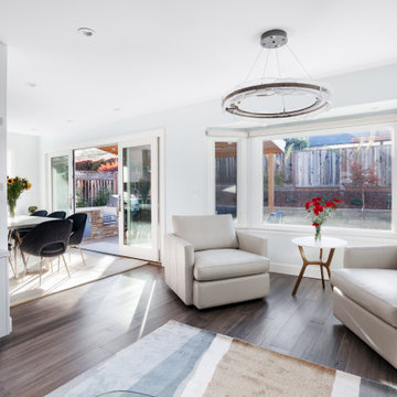 Saikley Architects
Our busy Silicon Valley clients asked us to convert their tight-quartered 1960’s ranch house to a gracious family home that would meet their long term needs. Ease of living was paramount, both in functionality and in ordered design.
The project was completed on a moderate budget.While retaining most of the structure of the existing house to avoid costly structural changes, we opened walls to improve the sight lines and flow of the house and bring in more light. We made small additions at the front and back bedrooms to gain space for the family and relatives. An existing underused patio area was improved with a simple outdoor kitchen and overhang to extend the living space to the outside. Costs were kept down with choices of modest materials.
Everything was made to be functional. Ample storage has been built into the right places. The details of the kitchen were carefully worked out to accommodate all the wishes of the various cooks in the family. The house is set up to be easy to keep clean. Acoustic walls separate living from bedroom spaces so adults can enjoy time together while children sleep. The outdoor kitchen has easy access to the indoor kitchen and the garage, and its setup promotes socializing while cooking outdoors.
A large part of the narrow back yard was previously unusable space due to a steep slope up to a neighbor’s higher fence. With a new retaining wall and some re-grading we took back more of the yard for the patio and play space on a new lawn.
The remodeled house is a mix of contemporary and traditional elements. Cool colors have a calming effect. Traditional items such as prairie style windows, trellis, mosaic tiles, and Shaker style cabinets, break down the scale in an otherwise streamlined, contemporary design. A new gabled roof with a broad arch at the front of the house marks the entry and resolves a challenging form where the central entry is set back from walls on both sides.
Photography: Kurt Manley
https://saikleyarchitects.com/portfolio/modern-ranch/
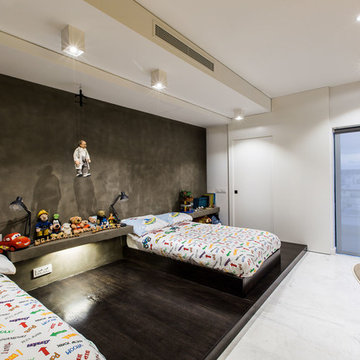
 Daniel Scerri Periti
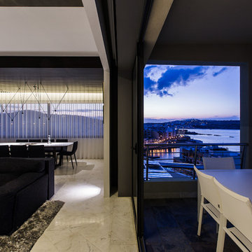
We were approached with a request to design the furnishings for an existing ‘finished’ apartment. The intention was to move in relatively fast, and the property already had an existing marble floor, kitchen and bathrooms which had to be kept. The property also boasted a fantastic 270 degree view, seen from most of the apartment. The clients had a very important role in the completion of the project. They were very involved during the design process and through various decoration choices. The final design was kept as a rigid guideline when faced with picking out all the different elements.
Once clear of all previous furniture, the space felt cold and bare; so we immediately felt the need for warmth, and raw, natural elements and textures to complement the cold marble floor while visually tying in the design of the whole apartment together.
Since the existing kitchen had a touch of dark walnut stain, we felt this material was one we should add to the palette of materials to contest the stark materials. A raw cement finish was another material we felt would add an interesting contrast and could be used in a variety of ways, from cabinets to walls and ceilings, to tie up the design of various areas of the apartment.
To warm up the living/dining area, keeping the existing marble floor but visually creating zones within the large living/dining area without hindering the flow, a dark timber custom-made soffit, continuous with a floor-to-ceiling drinks cabinet zones the dining area, giving it a degree of much-needed warmth.
The various windows with a stupendous 270 degree view needed to be visually tied together. This was done by introducing a continuous sheer [drape] which also doubled up as a sound-absorbing material along 2 of the 4 walls of the space.
A very large sofa was required to fill up the space correctly, also required for the size of the young family.
Services were integrated within the units and soffits, while a customized design in the corner between the kitchen and the living room took into consideration the viewpoints from the main areas to create a pantry without hindering the flow or views. A strategically placed floor-to-ceiling mirror doubles up the space and extends the view to the inner parts of the apartment.
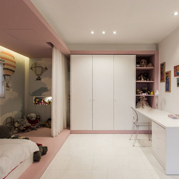
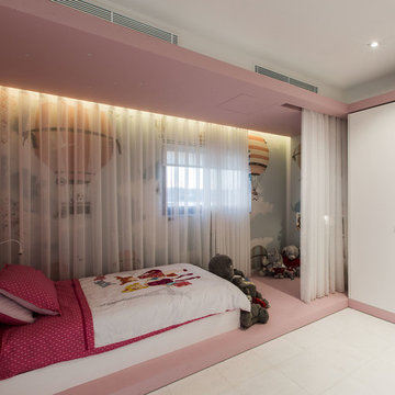
The daughter’s bedroom was a small challenge in itself, and a fun task, where we wanted to achieve the perception of a cozy niche with its own enclosed reading nook [for reading fairy tales], behind see-through curtains and a custom-ordered wall print sporting the girl’s favorite colors.
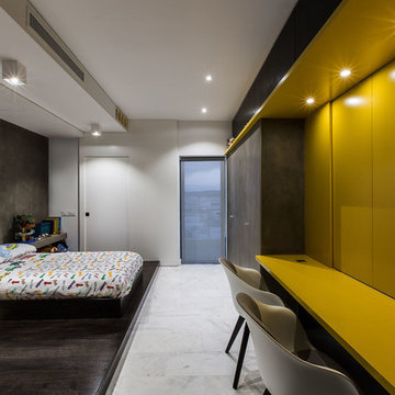
The sons’ bedroom had double the requirements in terms of space needed: more wardrobe, more homework desk space, a tv/play station area… “We combined a raised platform area between the boys’ beds to become an area with cushions where the kids can lay down and play, and face a hidden screen behind the homework desk’s sliding back panel for their play station”. The color of the homework desk was chosen in relation to the boys’ ages. A more masculine material palette was chosen for this room, in contrast to the light pastel palette of the girl’s bedroom. Again, this colour can easily be changed over time for a more mature look.
PROJECT DATA:
St. Paul’s Bay, Malta
DESIGN TEAM:
Perit Rebecca Zammit, Perit Daniel Scerri, Elyse Tonna
OTHER CREDITS:
Photography: Tonio Lombardi
Styling : TKS

Sponsored
Sunbury, OH

J.Holderby - Renovations
Franklin County's Leading General Contractors - 2X Best of Houzz!
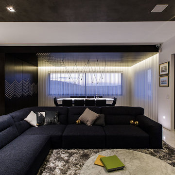 Daniel Scerri Periti
We were approached with a request to design the furnishings for an existing ‘finished’ apartment. The intention was to move in relatively fast, and the property already had an existing marble floor, kitchen and bathrooms which had to be kept. The property also boasted a fantastic 270 degree view, seen from most of the apartment. The clients had a very important role in the completion of the project. They were very involved during the design process and through various decoration choices. The final design was kept as a rigid guideline when faced with picking out all the different elements.
Once clear of all previous furniture, the space felt cold and bare; so we immediately felt the need for warmth, and raw, natural elements and textures to complement the cold marble floor while visually tying in the design of the whole apartment together.
Since the existing kitchen had a touch of dark walnut stain, we felt this material was one we should add to the palette of materials to contest the stark materials. A raw cement finish was another material we felt would add an interesting contrast and could be used in a variety of ways, from cabinets to walls and ceilings, to tie up the design of various areas of the apartment.
To warm up the living/dining area, keeping the existing marble floor but visually creating zones within the large living/dining area without hindering the flow, a dark timber custom-made soffit, continuous with a floor-to-ceiling drinks cabinet zones the dining area, giving it a degree of much-needed warmth.
The various windows with a stupendous 270 degree view needed to be visually tied together. This was done by introducing a continuous sheer [drape] which also doubled up as a sound-absorbing material along 2 of the 4 walls of the space.
A very large sofa was required to fill up the space correctly, also required for the size of the young family.
Services were integrated within the units and soffits, while a customized design in the corner between the kitchen and the living room took into consideration the viewpoints from the main areas to create a pantry without hindering the flow or views. A strategically placed floor-to-ceiling mirror doubles up the space and extends the view to the inner parts of the apartment.
The daughter’s bedroom was a small challenge in itself, and a fun task, where we wanted to achieve the perception of a cozy niche with its own enclosed reading nook [for reading fairy tales], behind see-through curtains and a custom-ordered wall print sporting the girl’s favorite colors.
The sons’ bedroom had double the requirements in terms of space needed: more wardrobe, more homework desk space, a tv/play station area… “We combined a raised platform area between the boys’ beds to become an area with cushions where the kids can lay down and play, and face a hidden screen behind the homework desk’s sliding back panel for their play station”. The color of the homework desk was chosen in relation to the boys’ ages. A more masculine material palette was chosen for this room, in contrast to the light pastel palette of the girl’s bedroom. Again, this colour can easily be changed over time for a more mature look.
PROJECT DATA:
St. Paul’s Bay, Malta
DESIGN TEAM:
Perit Rebecca Zammit, Perit Daniel Scerri, Elyse Tonna
OTHER CREDITS:
Photography: Tonio Lombardi
Styling : TKS
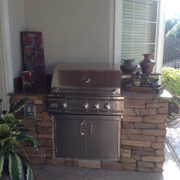
 InnovationLand
Outdoor furniture from Restoration Hardware really made this Houston outdoor living space design project shine.
“It really went well,” says Wayne Franks, owner of Outdoor Homescapes of Houston. “It's not a huge space, but moving the existing two columns about four feet and bringing the roof out only three feet made all the difference in the world.”
“This particular client wanted a larger space to entertain,” says senior designer Lisha Maxey, who served as an outdoor furniture consultant while managing construction for the project.
The original space, Lisha explains, had two oddly placed columns blocking a clear view of the beautiful pool area from inside the home. “We removed those columns and gave her three more feet of roof, which extended her living area while also giving her the view she wanted.”
Since the client - a woman in her mid-50s with grown children who visit frequently - only wanted a small outdoor kitchen island with a 30-inch RCS grill Outdoor Homescapes closed up a French door that led from the master bedroom (which she never used) and created a new stucco wall for the kitchen.
“I would definitely call the style of this space ‘transitional,” says Lisha. The client is a very eclectic world traveler and a collector of art, yet wanted her outdoor living space to feel like a warm, homey living room once we placed the furniture and décor. In the end, her finishes centered around rustic stone, detailed columns and furniture leaning towards the contemporary.”
Much of the warmth in the space, she says, comes from the colors of the dry-stacked Sunset Canyon ledgestone. “It looks just like it sounds – like the sun setting in a deep canyon!”
“The columns are unique – decorative and fluted,” adds Wayne.
The client, who’d received five free hours of outdoor furniture consultation as part of an ongoing promotion, also wanted Lisha to help her select, buy and help place furnishings.
“I believe that now - more than ever - consumers are looking for turn-key operations in any type of service industry - a ‘one-stop-shop,’ so to speak,” says Lisha. “It gives us a more personal touch with the client, as well as an edge in the industry in terms of selling our designs, as the client is reassured that we’ll work with them in every aspect to give them the outdoor living space of their dreams.”
The client ended up choosing the Biscayne collection – including a chair that rocks and swivels - from Restoration Hardware. They also went with a lower, unique teak coffee table from the Belvedere collection.
“We mixed wicker with teak for an equally soft and hard look and added pops of color to bring out the beautiful art collection inside,” says Lisha. “The neutral gray wicker, by the way, was the perfect match for the distressed teak coffee table and credenza. The grays of the Key West granite countertop also echoed this color palette.”
For the fabric, Lisha helped keep it neutral with a Mocha linen and popped the color with royal blue throw pillows matching the area rug: “To make the space truly her own, we added some unique copper pots from her collection and a few items she's collected abroad.”
Ready to let outdoor furniture transform your living space? Contact us, and we'll get your outdoor design project started!
 Daniel Scerri Periti
We were approached with a request to design the furnishings for an existing ‘finished’ apartment. The intention was to move in relatively fast, and the property already had an existing marble floor, kitchen and bathrooms which had to be kept. The property also boasted a fantastic 270 degree view, seen from most of the apartment. The clients had a very important role in the completion of the project. They were very involved during the design process and through various decoration choices. The final design was kept as a rigid guideline when faced with picking out all the different elements.
Once clear of all previous furniture, the space felt cold and bare; so we immediately felt the need for warmth, and raw, natural elements and textures to complement the cold marble floor while visually tying in the design of the whole apartment together.
Since the existing kitchen had a touch of dark walnut stain, we felt this material was one we should add to the palette of materials to contest the stark materials. A raw cement finish was another material we felt would add an interesting contrast and could be used in a variety of ways, from cabinets to walls and ceilings, to tie up the design of various areas of the apartment.
To warm up the living/dining area, keeping the existing marble floor but visually creating zones within the large living/dining area without hindering the flow, a dark timber custom-made soffit, continuous with a floor-to-ceiling drinks cabinet zones the dining area, giving it a degree of much-needed warmth.
The various windows with a stupendous 270 degree view needed to be visually tied together. This was done by introducing a continuous sheer [drape] which also doubled up as a sound-absorbing material along 2 of the 4 walls of the space.
A very large sofa was required to fill up the space correctly, also required for the size of the young family.
Services were integrated within the units and soffits, while a customized design in the corner between the kitchen and the living room took into consideration the viewpoints from the main areas to create a pantry without hindering the flow or views. A strategically placed floor-to-ceiling mirror doubles up the space and extends the view to the inner parts of the apartment.
The daughter’s bedroom was a small challenge in itself, and a fun task, where we wanted to achieve the perception of a cozy niche with its own enclosed reading nook [for reading fairy tales], behind see-through curtains and a custom-ordered wall print sporting the girl’s favorite colors.
The sons’ bedroom had double the requirements in terms of space needed: more wardrobe, more homework desk space, a tv/play station area… “We combined a raised platform area between the boys’ beds to become an area with cushions where the kids can lay down and play, and face a hidden screen behind the homework desk’s sliding back panel for their play station”. The color of the homework desk was chosen in relation to the boys’ ages. A more masculine material palette was chosen for this room, in contrast to the light pastel palette of the girl’s bedroom. Again, this colour can easily be changed over time for a more mature look.
PROJECT DATA:
St. Paul’s Bay, Malta
DESIGN TEAM:
Perit Rebecca Zammit, Perit Daniel Scerri, Elyse Tonna
OTHER CREDITS:
Photography: Tonio Lombardi
Styling : TKS
 Daniel Scerri Periti
We were approached with a request to design the furnishings for an existing ‘finished’ apartment. The intention was to move in relatively fast, and the property already had an existing marble floor, kitchen and bathrooms which had to be kept. The property also boasted a fantastic 270 degree view, seen from most of the apartment. The clients had a very important role in the completion of the project. They were very involved during the design process and through various decoration choices. The final design was kept as a rigid guideline when faced with picking out all the different elements.
Once clear of all previous furniture, the space felt cold and bare; so we immediately felt the need for warmth, and raw, natural elements and textures to complement the cold marble floor while visually tying in the design of the whole apartment together.
Since the existing kitchen had a touch of dark walnut stain, we felt this material was one we should add to the palette of materials to contest the stark materials. A raw cement finish was another material we felt would add an interesting contrast and could be used in a variety of ways, from cabinets to walls and ceilings, to tie up the design of various areas of the apartment.
To warm up the living/dining area, keeping the existing marble floor but visually creating zones within the large living/dining area without hindering the flow, a dark timber custom-made soffit, continuous with a floor-to-ceiling drinks cabinet zones the dining area, giving it a degree of much-needed warmth.
The various windows with a stupendous 270 degree view needed to be visually tied together. This was done by introducing a continuous sheer [drape] which also doubled up as a sound-absorbing material along 2 of the 4 walls of the space.
A very large sofa was required to fill up the space correctly, also required for the size of the young family.
Services were integrated within the units and soffits, while a customized design in the corner between the kitchen and the living room took into consideration the viewpoints from the main areas to create a pantry without hindering the flow or views. A strategically placed floor-to-ceiling mirror doubles up the space and extends the view to the inner parts of the apartment.
The daughter’s bedroom was a small challenge in itself, and a fun task, where we wanted to achieve the perception of a cozy niche with its own enclosed reading nook [for reading fairy tales], behind see-through curtains and a custom-ordered wall print sporting the girl’s favorite colors.
The sons’ bedroom had double the requirements in terms of space needed: more wardrobe, more homework desk space, a tv/play station area… “We combined a raised platform area between the boys’ beds to become an area with cushions where the kids can lay down and play, and face a hidden screen behind the homework desk’s sliding back panel for their play station”. The color of the homework desk was chosen in relation to the boys’ ages. A more masculine material palette was chosen for this room, in contrast to the light pastel palette of the girl’s bedroom. Again, this colour can easily be changed over time for a more mature look.
PROJECT DATA:
St. Paul’s Bay, Malta
DESIGN TEAM:
Perit Rebecca Zammit, Perit Daniel Scerri, Elyse Tonna
OTHER CREDITS:
Photography: Tonio Lombardi
Styling : TKS
 Saikley Architects
Our busy Silicon Valley clients asked us to convert their tight-quartered 1960’s ranch house to a gracious family home that would meet their long term needs. Ease of living was paramount, both in functionality and in ordered design.
The project was completed on a moderate budget.While retaining most of the structure of the existing house to avoid costly structural changes, we opened walls to improve the sight lines and flow of the house and bring in more light. We made small additions at the front and back bedrooms to gain space for the family and relatives. An existing underused patio area was improved with a simple outdoor kitchen and overhang to extend the living space to the outside. Costs were kept down with choices of modest materials.
Everything was made to be functional. Ample storage has been built into the right places. The details of the kitchen were carefully worked out to accommodate all the wishes of the various cooks in the family. The house is set up to be easy to keep clean. Acoustic walls separate living from bedroom spaces so adults can enjoy time together while children sleep. The outdoor kitchen has easy access to the indoor kitchen and the garage, and its setup promotes socializing while cooking outdoors.
A large part of the narrow back yard was previously unusable space due to a steep slope up to a neighbor’s higher fence. With a new retaining wall and some re-grading we took back more of the yard for the patio and play space on a new lawn.
The remodeled house is a mix of contemporary and traditional elements. Cool colors have a calming effect. Traditional items such as prairie style windows, trellis, mosaic tiles, and Shaker style cabinets, break down the scale in an otherwise streamlined, contemporary design. A new gabled roof with a broad arch at the front of the house marks the entry and resolves a challenging form where the central entry is set back from walls on both sides.
Photography: Kurt Manley
https://saikleyarchitects.com/portfolio/modern-ranch/
 Daniel Scerri Periti
We were approached with a request to design the furnishings for an existing ‘finished’ apartment. The intention was to move in relatively fast, and the property already had an existing marble floor, kitchen and bathrooms which had to be kept. The property also boasted a fantastic 270 degree view, seen from most of the apartment. The clients had a very important role in the completion of the project. They were very involved during the design process and through various decoration choices. The final design was kept as a rigid guideline when faced with picking out all the different elements.
Once clear of all previous furniture, the space felt cold and bare; so we immediately felt the need for warmth, and raw, natural elements and textures to complement the cold marble floor while visually tying in the design of the whole apartment together.
Since the existing kitchen had a touch of dark walnut stain, we felt this material was one we should add to the palette of materials to contest the stark materials. A raw cement finish was another material we felt would add an interesting contrast and could be used in a variety of ways, from cabinets to walls and ceilings, to tie up the design of various areas of the apartment.
To warm up the living/dining area, keeping the existing marble floor but visually creating zones within the large living/dining area without hindering the flow, a dark timber custom-made soffit, continuous with a floor-to-ceiling drinks cabinet zones the dining area, giving it a degree of much-needed warmth.
The various windows with a stupendous 270 degree view needed to be visually tied together. This was done by introducing a continuous sheer [drape] which also doubled up as a sound-absorbing material along 2 of the 4 walls of the space.
A very large sofa was required to fill up the space correctly, also required for the size of the young family.
Services were integrated within the units and soffits, while a customized design in the corner between the kitchen and the living room took into consideration the viewpoints from the main areas to create a pantry without hindering the flow or views. A strategically placed floor-to-ceiling mirror doubles up the space and extends the view to the inner parts of the apartment.
The daughter’s bedroom was a small challenge in itself, and a fun task, where we wanted to achieve the perception of a cozy niche with its own enclosed reading nook [for reading fairy tales], behind see-through curtains and a custom-ordered wall print sporting the girl’s favorite colors.
The sons’ bedroom had double the requirements in terms of space needed: more wardrobe, more homework desk space, a tv/play station area… “We combined a raised platform area between the boys’ beds to become an area with cushions where the kids can lay down and play, and face a hidden screen behind the homework desk’s sliding back panel for their play station”. The color of the homework desk was chosen in relation to the boys’ ages. A more masculine material palette was chosen for this room, in contrast to the light pastel palette of the girl’s bedroom. Again, this colour can easily be changed over time for a more mature look.
PROJECT DATA:
St. Paul’s Bay, Malta
DESIGN TEAM:
Perit Rebecca Zammit, Perit Daniel Scerri, Elyse Tonna
OTHER CREDITS:
Photography: Tonio Lombardi
Styling : TKS

Sponsored
Columbus, OH

Structural Remodeling
Franklin County's Heavy Timber Specialists | Best of Houzz 2020!
 Saikley Architects
Our busy Silicon Valley clients asked us to convert their tight-quartered 1960’s ranch house to a gracious family home that would meet their long term needs. Ease of living was paramount, both in functionality and in ordered design.
The project was completed on a moderate budget.While retaining most of the structure of the existing house to avoid costly structural changes, we opened walls to improve the sight lines and flow of the house and bring in more light. We made small additions at the front and back bedrooms to gain space for the family and relatives. An existing underused patio area was improved with a simple outdoor kitchen and overhang to extend the living space to the outside. Costs were kept down with choices of modest materials.
Everything was made to be functional. Ample storage has been built into the right places. The details of the kitchen were carefully worked out to accommodate all the wishes of the various cooks in the family. The house is set up to be easy to keep clean. Acoustic walls separate living from bedroom spaces so adults can enjoy time together while children sleep. The outdoor kitchen has easy access to the indoor kitchen and the garage, and its setup promotes socializing while cooking outdoors.
A large part of the narrow back yard was previously unusable space due to a steep slope up to a neighbor’s higher fence. With a new retaining wall and some re-grading we took back more of the yard for the patio and play space on a new lawn.
The remodeled house is a mix of contemporary and traditional elements. Cool colors have a calming effect. Traditional items such as prairie style windows, trellis, mosaic tiles, and Shaker style cabinets, break down the scale in an otherwise streamlined, contemporary design. A new gabled roof with a broad arch at the front of the house marks the entry and resolves a challenging form where the central entry is set back from walls on both sides.
Photography: Kurt Manley
https://saikleyarchitects.com/portfolio/modern-ranch/
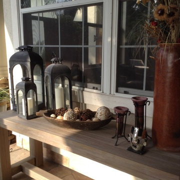 InnovationLand
Outdoor furniture from Restoration Hardware really made this Houston outdoor living space design project shine.
“It really went well,” says Wayne Franks, owner of Outdoor Homescapes of Houston. “It's not a huge space, but moving the existing two columns about four feet and bringing the roof out only three feet made all the difference in the world.”
“This particular client wanted a larger space to entertain,” says senior designer Lisha Maxey, who served as an outdoor furniture consultant while managing construction for the project.
The original space, Lisha explains, had two oddly placed columns blocking a clear view of the beautiful pool area from inside the home. “We removed those columns and gave her three more feet of roof, which extended her living area while also giving her the view she wanted.”
Since the client - a woman in her mid-50s with grown children who visit frequently - only wanted a small outdoor kitchen island with a 30-inch RCS grill Outdoor Homescapes closed up a French door that led from the master bedroom (which she never used) and created a new stucco wall for the kitchen.
“I would definitely call the style of this space ‘transitional,” says Lisha. The client is a very eclectic world traveler and a collector of art, yet wanted her outdoor living space to feel like a warm, homey living room once we placed the furniture and décor. In the end, her finishes centered around rustic stone, detailed columns and furniture leaning towards the contemporary.”
Much of the warmth in the space, she says, comes from the colors of the dry-stacked Sunset Canyon ledgestone. “It looks just like it sounds – like the sun setting in a deep canyon!”
“The columns are unique – decorative and fluted,” adds Wayne.
The client, who’d received five free hours of outdoor furniture consultation as part of an ongoing promotion, also wanted Lisha to help her select, buy and help place furnishings.
“I believe that now - more than ever - consumers are looking for turn-key operations in any type of service industry - a ‘one-stop-shop,’ so to speak,” says Lisha. “It gives us a more personal touch with the client, as well as an edge in the industry in terms of selling our designs, as the client is reassured that we’ll work with them in every aspect to give them the outdoor living space of their dreams.”
The client ended up choosing the Biscayne collection – including a chair that rocks and swivels - from Restoration Hardware. They also went with a lower, unique teak coffee table from the Belvedere collection.
“We mixed wicker with teak for an equally soft and hard look and added pops of color to bring out the beautiful art collection inside,” says Lisha. “The neutral gray wicker, by the way, was the perfect match for the distressed teak coffee table and credenza. The grays of the Key West granite countertop also echoed this color palette.”
For the fabric, Lisha helped keep it neutral with a Mocha linen and popped the color with royal blue throw pillows matching the area rug: “To make the space truly her own, we added some unique copper pots from her collection and a few items she's collected abroad.”
Ready to let outdoor furniture transform your living space? Contact us, and we'll get your outdoor design project started!
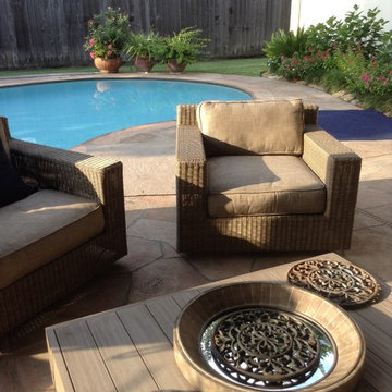 InnovationLand
Outdoor furniture from Restoration Hardware really made this Houston outdoor living space design project shine.
“It really went well,” says Wayne Franks, owner of Outdoor Homescapes of Houston. “It's not a huge space, but moving the existing two columns about four feet and bringing the roof out only three feet made all the difference in the world.”
“This particular client wanted a larger space to entertain,” says senior designer Lisha Maxey, who served as an outdoor furniture consultant while managing construction for the project.
The original space, Lisha explains, had two oddly placed columns blocking a clear view of the beautiful pool area from inside the home. “We removed those columns and gave her three more feet of roof, which extended her living area while also giving her the view she wanted.”
Since the client - a woman in her mid-50s with grown children who visit frequently - only wanted a small outdoor kitchen island with a 30-inch RCS grill Outdoor Homescapes closed up a French door that led from the master bedroom (which she never used) and created a new stucco wall for the kitchen.
“I would definitely call the style of this space ‘transitional,” says Lisha. The client is a very eclectic world traveler and a collector of art, yet wanted her outdoor living space to feel like a warm, homey living room once we placed the furniture and décor. In the end, her finishes centered around rustic stone, detailed columns and furniture leaning towards the contemporary.”
Much of the warmth in the space, she says, comes from the colors of the dry-stacked Sunset Canyon ledgestone. “It looks just like it sounds – like the sun setting in a deep canyon!”
“The columns are unique – decorative and fluted,” adds Wayne.
The client, who’d received five free hours of outdoor furniture consultation as part of an ongoing promotion, also wanted Lisha to help her select, buy and help place furnishings.
“I believe that now - more than ever - consumers are looking for turn-key operations in any type of service industry - a ‘one-stop-shop,’ so to speak,” says Lisha. “It gives us a more personal touch with the client, as well as an edge in the industry in terms of selling our designs, as the client is reassured that we’ll work with them in every aspect to give them the outdoor living space of their dreams.”
The client ended up choosing the Biscayne collection – including a chair that rocks and swivels - from Restoration Hardware. They also went with a lower, unique teak coffee table from the Belvedere collection.
“We mixed wicker with teak for an equally soft and hard look and added pops of color to bring out the beautiful art collection inside,” says Lisha. “The neutral gray wicker, by the way, was the perfect match for the distressed teak coffee table and credenza. The grays of the Key West granite countertop also echoed this color palette.”
For the fabric, Lisha helped keep it neutral with a Mocha linen and popped the color with royal blue throw pillows matching the area rug: “To make the space truly her own, we added some unique copper pots from her collection and a few items she's collected abroad.”
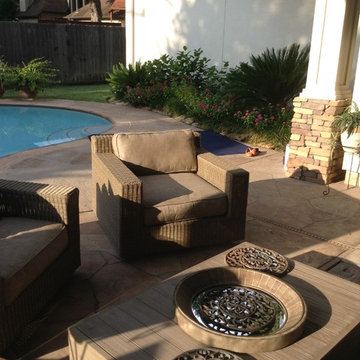 InnovationLand
Outdoor furniture from Restoration Hardware really made this Houston outdoor living space design project shine.
“It really went well,” says Wayne Franks, owner of Outdoor Homescapes of Houston. “It's not a huge space, but moving the existing two columns about four feet and bringing the roof out only three feet made all the difference in the world.”
“This particular client wanted a larger space to entertain,” says senior designer Lisha Maxey, who served as an outdoor furniture consultant while managing construction for the project.
The original space, Lisha explains, had two oddly placed columns blocking a clear view of the beautiful pool area from inside the home. “We removed those columns and gave her three more feet of roof, which extended her living area while also giving her the view she wanted.”
Since the client - a woman in her mid-50s with grown children who visit frequently - only wanted a small outdoor kitchen island with a 30-inch RCS grill Outdoor Homescapes closed up a French door that led from the master bedroom (which she never used) and created a new stucco wall for the kitchen.
“I would definitely call the style of this space ‘transitional,” says Lisha. The client is a very eclectic world traveler and a collector of art, yet wanted her outdoor living space to feel like a warm, homey living room once we placed the furniture and décor. In the end, her finishes centered around rustic stone, detailed columns and furniture leaning towards the contemporary.”
Much of the warmth in the space, she says, comes from the colors of the dry-stacked Sunset Canyon ledgestone. “It looks just like it sounds – like the sun setting in a deep canyon!”
“The columns are unique – decorative and fluted,” adds Wayne.
The client, who’d received five free hours of outdoor furniture consultation as part of an ongoing promotion, also wanted Lisha to help her select, buy and help place furnishings.
“I believe that now - more than ever - consumers are looking for turn-key operations in any type of service industry - a ‘one-stop-shop,’ so to speak,” says Lisha. “It gives us a more personal touch with the client, as well as an edge in the industry in terms of selling our designs, as the client is reassured that we’ll work with them in every aspect to give them the outdoor living space of their dreams.”
The client ended up choosing the Biscayne collection – including a chair that rocks and swivels - from Restoration Hardware. They also went with a lower, unique teak coffee table from the Belvedere collection.
“We mixed wicker with teak for an equally soft and hard look and added pops of color to bring out the beautiful art collection inside,” says Lisha. “The neutral gray wicker, by the way, was the perfect match for the distressed teak coffee table and credenza. The grays of the Key West granite countertop also echoed this color palette.”
For the fabric, Lisha helped keep it neutral with a Mocha linen and popped the color with royal blue throw pillows matching the area rug: “To make the space truly her own, we added some unique copper pots from her collection and a few items she's collected abroad.”
Ready to let outdoor furniture transform your living space? Contact us, and we'll get your outdoor design project started!


 Saikley Architects
Our busy Silicon Valley clients asked us to convert their tight-quartered 1960’s ranch house to a gracious family home that would meet their long term needs. Ease of living was paramount, both in functionality and in ordered design.
The project was completed on a moderate budget.While retaining most of the structure of the existing house to avoid costly structural changes, we opened walls to improve the sight lines and flow of the house and bring in more light. We made small additions at the front and back bedrooms to gain space for the family and relatives. An existing underused patio area was improved with a simple outdoor kitchen and overhang to extend the living space to the outside. Costs were kept down with choices of modest materials.
Everything was made to be functional. Ample storage has been built into the right places. The details of the kitchen were carefully worked out to accommodate all the wishes of the various cooks in the family. The house is set up to be easy to keep clean. Acoustic walls separate living from bedroom spaces so adults can enjoy time together while children sleep. The outdoor kitchen has easy access to the indoor kitchen and the garage, and its setup promotes socializing while cooking outdoors.
A large part of the narrow back yard was previously unusable space due to a steep slope up to a neighbor’s higher fence. With a new retaining wall and some re-grading we took back more of the yard for the patio and play space on a new lawn.
The remodeled house is a mix of contemporary and traditional elements. Cool colors have a calming effect. Traditional items such as prairie style windows, trellis, mosaic tiles, and Shaker style cabinets, break down the scale in an otherwise streamlined, contemporary design. A new gabled roof with a broad arch at the front of the house marks the entry and resolves a challenging form where the central entry is set back from walls on both sides.
Photography: Kurt Manley
https://saikleyarchitects.com/portfolio/modern-ranch/
 Daniel Scerri Periti
We were approached with a request to design the furnishings for an existing ‘finished’ apartment. The intention was to move in relatively fast, and the property already had an existing marble floor, kitchen and bathrooms which had to be kept. The property also boasted a fantastic 270 degree view, seen from most of the apartment. The clients had a very important role in the completion of the project. They were very involved during the design process and through various decoration choices. The final design was kept as a rigid guideline when faced with picking out all the different elements.
Once clear of all previous furniture, the space felt cold and bare; so we immediately felt the need for warmth, and raw, natural elements and textures to complement the cold marble floor while visually tying in the design of the whole apartment together.
Since the existing kitchen had a touch of dark walnut stain, we felt this material was one we should add to the palette of materials to contest the stark materials. A raw cement finish was another material we felt would add an interesting contrast and could be used in a variety of ways, from cabinets to walls and ceilings, to tie up the design of various areas of the apartment.
To warm up the living/dining area, keeping the existing marble floor but visually creating zones within the large living/dining area without hindering the flow, a dark timber custom-made soffit, continuous with a floor-to-ceiling drinks cabinet zones the dining area, giving it a degree of much-needed warmth.
The various windows with a stupendous 270 degree view needed to be visually tied together. This was done by introducing a continuous sheer [drape] which also doubled up as a sound-absorbing material along 2 of the 4 walls of the space.
A very large sofa was required to fill up the space correctly, also required for the size of the young family.
Services were integrated within the units and soffits, while a customized design in the corner between the kitchen and the living room took into consideration the viewpoints from the main areas to create a pantry without hindering the flow or views. A strategically placed floor-to-ceiling mirror doubles up the space and extends the view to the inner parts of the apartment.
The daughter’s bedroom was a small challenge in itself, and a fun task, where we wanted to achieve the perception of a cozy niche with its own enclosed reading nook [for reading fairy tales], behind see-through curtains and a custom-ordered wall print sporting the girl’s favorite colors.
The sons’ bedroom had double the requirements in terms of space needed: more wardrobe, more homework desk space, a tv/play station area… “We combined a raised platform area between the boys’ beds to become an area with cushions where the kids can lay down and play, and face a hidden screen behind the homework desk’s sliding back panel for their play station”. The color of the homework desk was chosen in relation to the boys’ ages. A more masculine material palette was chosen for this room, in contrast to the light pastel palette of the girl’s bedroom. Again, this colour can easily be changed over time for a more mature look.
PROJECT DATA:
St. Paul’s Bay, Malta
DESIGN TEAM:
Perit Rebecca Zammit, Perit Daniel Scerri, Elyse Tonna
OTHER CREDITS:
Photography: Tonio Lombardi
Styling : TKS
 Saikley Architects
Our busy Silicon Valley clients asked us to convert their tight-quartered 1960’s ranch house to a gracious family home that would meet their long term needs. Ease of living was paramount, both in functionality and in ordered design.
The project was completed on a moderate budget.While retaining most of the structure of the existing house to avoid costly structural changes, we opened walls to improve the sight lines and flow of the house and bring in more light. We made small additions at the front and back bedrooms to gain space for the family and relatives. An existing underused patio area was improved with a simple outdoor kitchen and overhang to extend the living space to the outside. Costs were kept down with choices of modest materials.
Everything was made to be functional. Ample storage has been built into the right places. The details of the kitchen were carefully worked out to accommodate all the wishes of the various cooks in the family. The house is set up to be easy to keep clean. Acoustic walls separate living from bedroom spaces so adults can enjoy time together while children sleep. The outdoor kitchen has easy access to the indoor kitchen and the garage, and its setup promotes socializing while cooking outdoors.
A large part of the narrow back yard was previously unusable space due to a steep slope up to a neighbor’s higher fence. With a new retaining wall and some re-grading we took back more of the yard for the patio and play space on a new lawn.
The remodeled house is a mix of contemporary and traditional elements. Cool colors have a calming effect. Traditional items such as prairie style windows, trellis, mosaic tiles, and Shaker style cabinets, break down the scale in an otherwise streamlined, contemporary design. A new gabled roof with a broad arch at the front of the house marks the entry and resolves a challenging form where the central entry is set back from walls on both sides.
Photography: Kurt Manley
https://saikleyarchitects.com/portfolio/modern-ranch/
38