
Search results for "Major shift" in Home Design Ideas

 safe ZOnea
Ask a kitchen designer in Chicago which countertop question comes up most and you will hear the same answer: white or off-white quartz, and which shade. Homeowners walk into showrooms with a photo saved on their phone, usually a bright, veined slab from a magazine spread, and leave an hour later realizing there are a dozen versions of that same look. The confusion is not about taste. It is about the fact that "white quartz" covers a huge range of patterns, undertones, and price points, and nobody explains the differences before the sale.
Older bungalows and newer builds alike are getting stripped of their dated laminate and butcher block in favor of quartz, and the reasons are practical rather than trendy. Quartz does not need sealing, resists the kind of staining that granite can suffer over decades, and holds up to the freeze-thaw humidity swings that Chicago basements and kitchens go through every year. Once a homeowner commits to quartz, though, the real decision starts: which white, and does the pattern justify the difference in cost.
This piece walks through three specific slabs that keep showing up in Chicago renovation projects, why designers reach for them in different rooms, and what actually separates a flat white surface from one with real depth. None of this requires a design background to follow. It is mostly about paying attention to how a slab behaves under kitchen lighting, how busy the vending gets, and how it photographs versus how it looks in person.
Why White Quartz Took Over Chicago Kitchens
Ten years ago, granite dominated Chicago kitchen remodels almost by default. It was durable, it looked expensive, and every fabricator in the metro area carried a wide range of colors. Quartz has since taken over that position, and the shift happened faster than most contractors expected. Engineered stone gave homeowners a more predictable surface, since natural granite varies slab to slab while quartz is manufactured to a consistent pattern batch after batch.
The other driver is light. Chicago winters are long and gray, and a lot of kitchens, especially in older two-flats and courtyard buildings, do not get much direct sun. A dark granite countertop in a dim kitchen can make the whole room feel smaller. White and light-toned quartz reflects what little natural light comes through the windows, and it makes a galley kitchen or a north-facing space feel noticeably brighter without touching the cabinetry or the layout.
There is also a resale argument that local real estate agents bring up constantly. White quartz photographs well for listings, reads as updated and low-maintenance to buyers touring in person, and does not compete visually with whatever cabinet color the next owner might prefer. It is a safer bet than a bold veined marble look or a colored quartz that might feel dated in five years.
Arctic White and the Cost Question
Among the flatter, more uniform whites, arctic white quartz price comes up constantly in budget conversations because the slab sits at a more approachable point than the heavily veined Italian-marble-inspired patterns. It reads as clean and bright without the busy movement that some homeowners find overwhelming in a small kitchen. Fabricators in the Chicago area tend to keep it in stock precisely because demand stays steady across both new construction and remodel projects.
Part of what keeps this slab affordable relative to its heavily patterned cousins comes down to manufacturing complexity. A quartz surface with minimal veining and a consistent white base is simpler to produce at scale than one that mimics the irregular, high-contrast movement of natural Calacatta marble. That production difference shows up directly in what a homeowner pays per square foot, and it is worth asking a fabricator to walk through that pricing before assuming every white quartz costs the same.
Homeowners planning a full kitchen, including an island, backsplash, and perimeter counters, often use a flatter white like this specifically because it lets other elements carry the visual interest. A patterned tile backsplash or a bold cabinet color reads more clearly against a calm countertop than against one already fighting for attention with heavy veining. Designers frequently pair simpler whites with statement lighting fixtures for exactly this reason.
What Makes Calacatta Patterns Different
Calacatta refers to a family of marble originally quarried in Italy, known for a bright white background broken up by bold, often gold-toned veining that moves in thick, dramatic streaks rather than thin gray lines. Natural Calacatta marble is soft, porous, and expensive to maintain, which is exactly why quartz manufacturers spent years developing engineered versions that replicate the look without the upkeep headaches.
The challenge with any Calacatta-style quartz is getting the veining to look organic instead of printed. Early generations of engineered stone struggled with repetitive patterns that gave away the fact the slab was manufactured rather than cut from actual marble. Modern digital printing and layering techniques have closed that gap considerably, and the better Calacatta-inspired quartz lines now vary the veining across each slab batch so two counters in the same kitchen do not look identical.
Chicago designers gravitate toward Calacatta patterns for kitchens that function as the visual centerpiece of an open floor plan, which describes a large share of the gut renovations happening in neighborhoods like Lincoln Park, Roscoe Village, and the North Shore suburbs. When the kitchen island is visible from the living room and dining area, a dramatic veined surface becomes part of the home's overall design language rather than a purely functional work surface.
Calacatta Arno Under Kitchen Lighting
One of the more popular options in this category, calacatta arno quartz, balances a warm white base with soft gray and gold veining that avoids looking too stark under the cooler LED lighting common in newer Chicago builds. Homeowners touring showrooms sometimes make the mistake of judging a slab entirely under warm incandescent lighting, then get surprised when the same surface looks slightly different once installed under their kitchen's actual fixtures.
What separates this particular pattern from flatter competitors is how the veining clusters rather than spreading evenly across the slab. That clustering mimics the way real quarried marble forms, with denser mineral deposits in some sections and cleaner stretches in others. Fabricators cutting a large island slab from a single piece will often orient the pattern intentionally so the busiest veining lands somewhere visually interesting rather than getting cut off at an edge.
Because the background reads warmer than a stark white, this pattern tends to pair well with brass or matte gold hardware, a combination that has been showing up repeatedly in Chicago kitchen remodels over the past few renovation seasons. Cabinet painters report a similar trend, with more clients requesting warm white or greige cabinet colors specifically because they complement this kind of veined quartz better than a cooler, blue-toned white would.
Silestone's Version of the Calacatta Look
Manufacturers compete directly in this Calacatta-inspired category, and silestone eternal calacatta gold represents one brand's specific take on the pattern, distinguished by richer gold veining set against a brighter white base than some competing slabs in the same family. Silestone has built a reputation around anti-bacterial surface treatments in addition to the standard quartz durability, a detail some homeowners specifically ask about for kitchens used heavily by families with young children.
The veining in this particular slab tends to run in longer, more continuous lines compared to the clustered pattern found in some other Calacatta-style options, which gives large island surfaces a sense of visual flow from one end to the other. Fabricators working with bigger islands, the kind increasingly common in open-concept Chicago remodels, often favor patterns like this because there is less need to worry about seams interrupting a busy, disconnected pattern.
Price positioning for this slab tends to sit toward the upper end of the engineered quartz category, reflecting both the brand's manufacturing process and the complexity of replicating that continuous gold veining consistently across production batches. Homeowners weighing this option against other Calacatta-style quartz should ask their fabricator directly about batch availability, since premium patterns sometimes have longer lead times than standard stock colors.
Living With Quartz Day to Day
Beyond how a slab looks in a showroom or a listing photo, the daily experience of owning quartz countertops matters more once the renovation dust settles. Quartz resists scratching far better than laminate and holds up to the acidic spills, hot pans, and general abuse of an active kitchen without the sealing maintenance that natural stone requires every year or two. That low-maintenance reputation is a large part of why quartz overtook granite in the first place.
Heat resistance is a detail that gets less attention than it should. While quartz handles moderate heat well, manufacturers generally recommend using a trivet or pad for very hot pots straight off the stove, since sudden temperature shock can occasionally cause stress marks in the resin binder that holds the engineered stone together. This is a minor precaution rather than a major limitation, but it is worth mentioning to anyone assuming quartz is entirely indestructible.
Cleaning routines stay simple across almost every pattern in this category. A damp cloth and mild soap handle daily messes, and the nonporous surface means wine, coffee, and tomato-based sauces do not soak in the way they can with unsealed granite or marble. Homeowners moving from an older stone counter often mention how much less they worry about everyday spills once quartz is installed, which is a quality-of-life change that rarely makes it into the initial design conversation.
Choosing Between the Three
There is no single correct answer among these three slabs, and that is exactly why they keep coming up together in the same design conversations across Chicago renovation projects. A flatter white with minimal veining suits kitchens where other elements need to carry the visual interest, while a bolder Calacatta-inspired pattern makes sense when the countertop itself is meant to be the centerpiece of an open floor plan.
Budget matters too, and it is worth having a direct conversation with a fabricator about where each option lands before falling in love with a specific slab in a showroom. Lighting, cabinet color, and how the kitchen connects to the rest of the home all play into which pattern will actually look right once installation is finished rather than just in a photo.
Whatever direction a homeowner leans, seeing a full slab in person under actual kitchen lighting remains the single most useful step before signing off. Photos only go so far once the countertop is sitting in the room it will live in for years.
 Hillcrest Construction
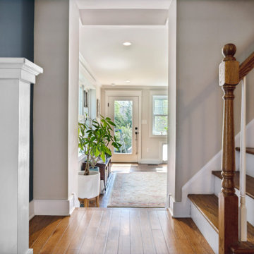
These clients reached out to Hillcrest Construction when their family began out-growing their Phoenixville-area home. Through a comprehensive design phase, opportunities to add square footage were identified along with a reorganization of the typical traffic flow throughout the house.
All household traffic into the hastily-designed, existing family room bump-out addition was funneled through a 3’ berth within the kitchen making meal prep and other kitchen activities somewhat similar to a shift at a PA turnpike toll booth. In the existing bump-out addition, the family room was relatively tight and the dining room barely fit the 6-person dining table. Access to the backyard was somewhat obstructed by the necessary furniture and the kitchen alone didn’t satisfy storage needs beyond a quick trip to the grocery store. The home’s existing front door was the only front entrance, and without a foyer or mudroom, the front formal room often doubled as a drop-zone for groceries, bookbags, and other on-the-go items.
Hillcrest Construction designed a remedy to both address the function and flow issues along with adding square footage via a 150 sq ft addition to the family room and converting the garage into a mudroom entry and walk-through pantry.
-
The project’s addition was not especially large but was able to facilitate a new pathway to the home’s rear family room. The existing brick wall at the bottom of the second-floor staircase was opened up and created a new, natural flow from the second-floor bedrooms to the front formal room, and into the rear family hang-out space- all without having to cut through the often busy kitchen. The dining room area was relocated to remove it from the pathway to the door to the backyard. Additionally, free and clear access to the rear yard was established for both two-legged and four-legged friends.
The existing chunky slider door was removed and in its place was fabricated and installed a custom centerpiece that included a new gas fireplace insert with custom brick surround, two side towers for display items and choice vinyl, and two base cabinets with metal-grated doors to house a subwoofer, wifi equipment, and other stow-away items. The black walnut countertops and mantle pop from the white cabinetry, and the wall-mounted TV with soundbar complete the central A/V hub. The custom cabs and tops were designed and built at Hillcrest’s custom shop.
The farmhouse appeal was completed with distressed engineered hardwood floors and craftsman-style window and door trim throughout.
-
Another major component of the project was the conversion of the garage into a pantry+mudroom+everyday entry.
The clients had used their smallish garage for storage of outdoor yard and recreational equipment. With those storage needs being addressed at the exterior, the space was transformed into a custom pantry and mudroom. The floor level within the space was raised to meet the rest of the house and insulated appropriately. A newly installed pocket door divided the dining room area from the designed-to-spec pantry/beverage center. The pantry was designed to house dry storage, cleaning supplies, and dry bar supplies when the cleaning and shopping are complete. A window seat with doggie supply storage below was worked into the design to accommodate the existing elevation of the original garage window.
A coat closet and a small set of steps divide the pantry from the mudroom entry. The mudroom entry is marked with a striking combo of the herringbone thin-brick flooring and a custom hutch. Kids returning home from school have a designated spot to hang their coats and bookbags with two deep drawers for shoes. A custom cherry bench top adds a punctuation of warmth. The entry door and window replaced the old overhead garage doors to create the daily-used informal entry off the driveway.
With the house being such a favorable area, and the clients not looking to pull up roots, Hillcrest Construction facilitated a collaborative experience and comprehensive plan to change the house for the better and make it a home to grow within.
 Baseboarders
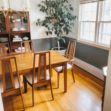
When Carrie Waller, founder of Dream Green DIY, set out to refresh her 1960s ranch-style home in Waynesboro, Virginia, she embraced what she calls the “gentle renovation” — thoughtful upgrades that enhance a space without major construction or chaos.
One of her favorite transformations? Swapping out her outdated, rusted baseboard heaters for clean, modern covers from Baseboarders. The Premium Series in White brought instant cohesion to her freshly painted walls and brightened the entire room. With their powder-coated, galvanized steel and tool-free installation, the covers delivered high design with low effort — a perfect match for Carrie’s refined, approachable style.
This project proves that even the simplest updates can dramatically shift the feel of a space. It’s modern warmth with a timeless finish — all without tearing out the baseboards.
Location: Waynesboro, VA
Homeowner: Carrie Waller | @dreamgreendiy
Product: Baseboarders Premium Series
Finish: White
Install: DIY, no tools required
Find the right local pro for your project
 Baseboarders
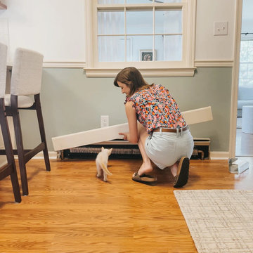
When Carrie Waller, founder of Dream Green DIY, set out to refresh her 1960s ranch-style home in Waynesboro, Virginia, she embraced what she calls the “gentle renovation” — thoughtful upgrades that enhance a space without major construction or chaos.
One of her favorite transformations? Swapping out her outdated, rusted baseboard heaters for clean, modern covers from Baseboarders. The Premium Series in White brought instant cohesion to her freshly painted walls and brightened the entire room. With their powder-coated, galvanized steel and tool-free installation, the covers delivered high design with low effort — a perfect match for Carrie’s refined, approachable style.
This project proves that even the simplest updates can dramatically shift the feel of a space. It’s modern warmth with a timeless finish — all without tearing out the baseboards.
Location: Waynesboro, VA
Homeowner: Carrie Waller | @dreamgreendiy
Product: Baseboarders Premium Series
Finish: White
Install: DIY, no tools required
 Baseboarders
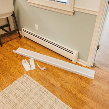
When Carrie Waller, founder of Dream Green DIY, set out to refresh her 1960s ranch-style home in Waynesboro, Virginia, she embraced what she calls the “gentle renovation” — thoughtful upgrades that enhance a space without major construction or chaos.
One of her favorite transformations? Swapping out her outdated, rusted baseboard heaters for clean, modern covers from Baseboarders. The Premium Series in White brought instant cohesion to her freshly painted walls and brightened the entire room. With their powder-coated, galvanized steel and tool-free installation, the covers delivered high design with low effort — a perfect match for Carrie’s refined, approachable style.
This project proves that even the simplest updates can dramatically shift the feel of a space. It’s modern warmth with a timeless finish — all without tearing out the baseboards.
Location: Waynesboro, VA
Homeowner: Carrie Waller | @dreamgreendiy
Product: Baseboarders Premium Series
Finish: White
Install: DIY, no tools required
 Baseboarders
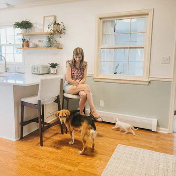
When Carrie Waller, founder of Dream Green DIY, set out to refresh her 1960s ranch-style home in Waynesboro, Virginia, she embraced what she calls the “gentle renovation” — thoughtful upgrades that enhance a space without major construction or chaos.
One of her favorite transformations? Swapping out her outdated, rusted baseboard heaters for clean, modern covers from Baseboarders. The Premium Series in White brought instant cohesion to her freshly painted walls and brightened the entire room. With their powder-coated, galvanized steel and tool-free installation, the covers delivered high design with low effort — a perfect match for Carrie’s refined, approachable style.
This project proves that even the simplest updates can dramatically shift the feel of a space. It’s modern warmth with a timeless finish — all without tearing out the baseboards.
Location: Waynesboro, VA
Homeowner: Carrie Waller | @dreamgreendiy
Product: Baseboarders Premium Series
Finish: White
Install: DIY, no tools required
 Venture Pacific Construction Management Ltd
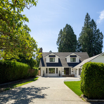
This renovation began with a different plan. The original idea was to lift the existing home and build a new basement with added living space. Through early feasibility analysis and pre-construction planning, it became clear that the structural complexity and cost of that approach would be significant. With that clarity, the project shifted to a full house renovation that better aligned with the homeowners’ goals and investment. The scope included a full kitchen renovation, updates to the living areas, new flooring throughout, staircase upgrades, and fully renovated bathrooms. The project was recognized for its quality and execution as a Georgie Awards Finalist for Best Single Family Residential Renovation $450,000–$750,000, and a HAVAN Awards Finalist for Best Renovation $400,000–$700,000 and Best Kitchen Renovation $150,000–$175,000.

 Trendy Blinds & Closets
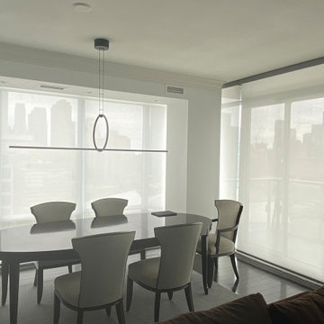
Condo Window Solutions using Combi and Rollers
There are blinds that best fit for condo windows. Usually, its designed with a large or floor-ceiling windows.Here’s the top 4:
SOLAR SHADES
For spectacular views, solar shades are your best solution. Sunscreen / Solar shades are great options for applications where the need for outside view and UV protection is required at the same time. As condos are notorious for building up solar heat, this is a major way to save energy with window coverings.
ROLLER BLINDS
While solar shades are great if you don’t have high light-control needs, roller blinds excel at giving you that adjustment precision. With roller blinds, you get the full spectrum of options from complete openness to complete darkness. They also help you reduce solar heat in the condo if you get the ones with highly reflective backings.
Combi or Zebra Shades
Zebra shades move up and down and are adjustable in terms of privacy preference. If you want more privacy you can retract the blind to prevent any light from coming in and block your ability to see outside, or you can expand the shade so you can see out completely.
Motorized Blinds
Motorized roller blinds are perfect because they offer convenience and give off a modern, high-tech vibe. There are also blackout options available for those who work night shifts or simply like to sleep in.
Check us out for more selection, www.trendyblinds.ca and www.trendyplusdesign.com
Contact us for more info and consultation.
Email: Info@trendyblinds.com
Phone: 905-604-1222 ext. 1
 Baseboarders
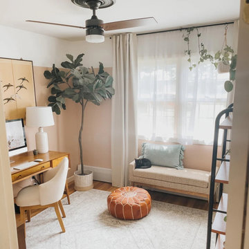
When Carrie Waller, founder of Dream Green DIY, set out to refresh her 1960s ranch-style home in Waynesboro, Virginia, she embraced what she calls the “gentle renovation” — thoughtful upgrades that enhance a space without major construction or chaos.
One of her favorite transformations? Swapping out her outdated, rusted baseboard heaters for clean, modern covers from Baseboarders. The Premium Series in White brought instant cohesion to her freshly painted walls and brightened the entire room. With their powder-coated, galvanized steel and tool-free installation, the covers delivered high design with low effort — a perfect match for Carrie’s refined, approachable style.
This project proves that even the simplest updates can dramatically shift the feel of a space. It’s modern warmth with a timeless finish — all without tearing out the baseboards.
Location: Waynesboro, VA
Homeowner: Carrie Waller | @dreamgreendiy
Product: Baseboarders Premium Series
Finish: White
Install: DIY, no tools required
 Baseboarders
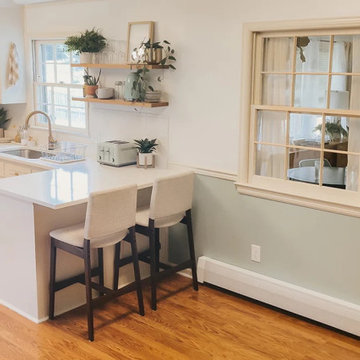
When Carrie Waller, founder of Dream Green DIY, set out to refresh her 1960s ranch-style home in Waynesboro, Virginia, she embraced what she calls the “gentle renovation” — thoughtful upgrades that enhance a space without major construction or chaos.
One of her favorite transformations? Swapping out her outdated, rusted baseboard heaters for clean, modern covers from Baseboarders. The Premium Series in White brought instant cohesion to her freshly painted walls and brightened the entire room. With their powder-coated, galvanized steel and tool-free installation, the covers delivered high design with low effort — a perfect match for Carrie’s refined, approachable style.
This project proves that even the simplest updates can dramatically shift the feel of a space. It’s modern warmth with a timeless finish — all without tearing out the baseboards.
Location: Waynesboro, VA
Homeowner: Carrie Waller | @dreamgreendiy
Product: Baseboarders Premium Series
Finish: White
Install: DIY, no tools required
 Klopf Architecture
From Mid-Century Classic to the Present
An iconic design updated with comfort, function, and flow for today.
A Remodel That Balances Past and Present
What started as a desire to update a classic Eichler soon became an exploration of how Mid-Century Modern design can successfully evolve for today. The client, a tech professional with a passion for scuba diving and underwater photography, wanted a home that would both honor its original character and feel tailored to his daily life. A lifelong technology enthusiast, he still owns the very first Mac desktop he saved up for as a teenager working at Radio Shack, a detail that underscores his appreciation for design that melds function and form.
Honoring Separation While Expanding Possibility
Unlike many contemporary remodels where walls are opened up to create expansive living spaces, this project took a more restrained approach. The client valued the defined rooms of the original plan and wanted to preserve as much wall space as possible for displaying his large-format underwater photography. The emphasis was not on dramatic spatial reinvention, but on thoughtful refinements. Klopf Architecture shaped a gallery-like backdrop while also expanding the primary suite, modernizing materials and fixtures throughout the home, and improving the functionality and layout of the kitchen. The finished home feels at once timeless and renewed, an Eichler that continues to inspire while fully supporting the lifestyle of its present-day owner.
A major turning point came mid-design. The original project brief had not included an addition, but as the reconfiguration of the primary bedroom and bath unfolded, it became clear that an expansion was the best approach to achieve the client’s vision of a more spacious suite. Fortunately, the adjustment came at a stage when revisions were still manageable and was integrated seamlessly, showing how thoughtful course corrections can strengthen a project rather than hinder it.
Navigating Challenges With Precision
The design development included multiple conceptual rounds, balancing preservation with subtle expansion. During construction, an existing post previously thought to be load-bearing turned out not to be. The structural engineer was able to pivot quickly, and both the post and the cross beam that had been intended to replace it could be omitted, allowing the original rhythm of the Eichler beam bays to be preserved.
Sustainability was not just a checklist item, but a way to align the home with the client’s values of simplicity, efficiency, and long-term functionality. R-38 roof insulation reduced energy usage, solar panels with battery storage provided independence and resilience, and passive comfort strategies eliminated the need forenergy-intensive air conditioning. An electric vehicle charger and an on-demand hot water recirculation system (with call buttons as opposed to having constant circulation) add to the home’s long-term efficiency factors. Together, these moves created a home that is quieter, more comfortable, and better equipped for the future, qualities that supported the client’s pragmatic approach to design and living lightly.
Details That Respect the Eichler DNA
The remodel carries forward the Eichler’s original spirit while introducing new layers of modern livability. Originally, the house was approached along a deep, narrow walk, with the garage on one side and the house on the other, leaving the front door tucked far back within this chasm-like space. By pulling the entry forward, the design reshaped the arrival experience, creating a clearer threshold and a natural drop-off zone for bags, shoes, and keys. This shift also made room for a custom bench at the entry that extends seamlessly through the glass sidelight. The bench and drop-off zone now work together as a single, integrated sequence that supports everyday living while offering a tactile reminder of Eichler’s philosophy of connectedness.
At the client’s request, Klopf reintroduced a classic Eichler gesture by extending the exterior siding into the entry and living room. The detail reinforces a sense of indoor/outdoor continuity while providing a subtle architectural surface that allows the client’s photography to take visual precedence.
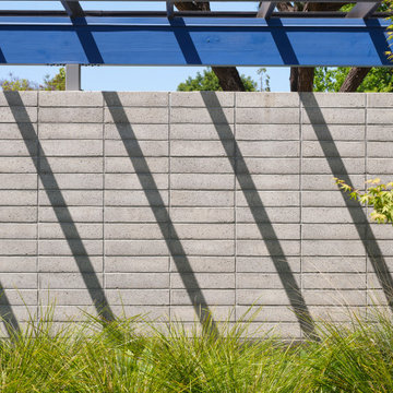
The signature concrete masonry wall at the front was reconstructed using blocks sourced to match the originals, now strengthened with rebar for seismic resilience while maintaining a private outdoor courtyard, visually extending the kitchen outward. A decorative trellis element, a detail borrowed from a neighboring Eichler, restores a familiar mid-century modern architectural motif. At the courtyard entry door, a custom etched glass sidelight with an ocean-themed design featuring kelp and jellyfish serves as a subtle homage to the client’s passion for deep-sea diving.
Landscaping became an integral part of the overall transformation. The homeowner engaged landscape architect Randi Johnsen of Third Nature Studio to shape a series of calm, inviting outdoor rooms that read as a natural extension of the interiors. While technically outside of the core construction scope, the landscape design proved central to achieving a sense of completeness and connectedness across the property. Such whole-property considerations often emerge as design ideas take shape, underscoring the importance of flexibility in planning and budgeting, as well as close collaboration among the design team starting early in the process.
The Value of Evolving Scope
As with many custom residential projects, the scope evolved during the design process. What began as a targeted remodel grew to include a new/expanded primary suite, a rebuilt CMU patio wall for strength and longevity, and a solar panel array and battery storage for energy resilience and carbon-reduction. Each thoughtful decision represented a conscious investment in the home’s performance and character, rather than a cost overrun.
The result was a project delivered on schedule, tailored precisely to the client’s lifestyle, and positioned to add long-term value both functionally and aesthetically. By embracing scope evolution as an opportunity rather than a challenge, and relying on good design paired with transparent communication, this remodel demonstrates how Eichler homes can be adapted for contemporary living without erasing their DNA.
Klopf Architecture project team: John Klopf, AIA, and Klara Kevane, Elise Webb and Nicholas LaNasa.
Contractor: Golden Cove Construction
Landscape Design: Third Nature Studio
Structural Engineer: Daniel Bastiao Design
Photography: ©2025 Mariko Reed
Year Completed: 2024
Location: Sunnyvale, CA
 Vision Design
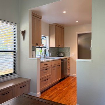
Although the majority of the kitchen stayed the same, slight shifts in appliances and all new finished provided a lot more storage and an updated look.
 Klopf Architecture
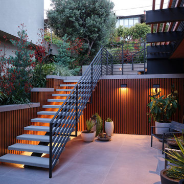
Set on a narrow hillside lot overlooking the San Francisco Bay in Point Richmond, California, Bay Heirloom is a Mid-Century Modern family home restored, modernized and adapted for contemporary living. Oriented south-southwest toward the Marin Headlands, with views of the Golden Gate Bridge, the residence captures shifting Bay light throughout the day, from fog-muted mornings to vivid, glowing sunsets.
The home was built by Karlyn Neel’s grandfather, the owner of the construction company Flo-Crete, one of the Bay Area’s early concrete pumping firms. Flo-Crete completed the foundation and structural concrete work, with family photographs documenting the original cinderblock walls and pours. The firm also contributed to major regional infrastructure projects, including the Transbay BART tube and Candlestick Park, situating the house within a broader legacy of Bay Area construction. Growing up, Neel spent considerable time in the home, developing an early appreciation for mid-century modern principles. Instead of parting with this family heirloom, she purchased the home from her grandfather’s estate.
While her grandfather continued to live in the Point Richmond house, Neel purchased a Mid-Century Modern residence in Palm Desert. In contrast to the Bay Area’s cool temperatures, salt air, and persistent winds, the desert home is shaped by heat and sun and requires a different material response. A substantial renovation she led there emphasized thermal performance, filtered light, and restrained detailing. The experience later informed the restoration of her Bay Area family home.
What began as a modest Mid-Century Modern update expanded when decades of exposure to marine conditions revealed leaks and significant structural and seismic deficiencies. Neel was determined to honor her grandfather’s perseverance and without hesitation pivoted to a much more intensive project. Addressing these challenges required close coordination between Neel, Klopf Architecture and Kasten Builders, with architectural restraint and construction precision guiding each intervention. Rather than alter the home’s defining features, the project focused on reinforcing the structure from within. Discreet beams were embedded along the rear facade and in an upstairs wall, strengthening the building while maximizing the wall of glass facing the Bay and opening the wall between the kitchen and the living space. These structural interventions allowed the space to open fully to the Bay without visual interruption, with the kitchen repositioned as the social and functional core of an open, continuous living space. The building envelope was updated using weather- and corrosion-resistant materials appropriate to the marine environment.
The house unfolds vertically from the street, beginning with a modest garage level and workshop, with the main living spaces located below. Original slate flooring at the entry was preserved, along with select furnishings and artwork collected by Neel’s grandfather, anchoring the restored interior in its past. A restrained palette of black accents and pale, natural finishes replaces darker wood tones, reinforcing openness and calm. A naturally illuminated stair connects to the lowest level, where a former basement was transformed into a guest suite and family room opening onto a deck. From there, steps lead directly to a small concrete boat ramp at the water’s edge.
Throughout the project, decisions were guided by continuity rather than transformation for its own sake. Lessons drawn from both desert and coastal climates informed a material strategy rooted in performance and restraint. Bay Heirloom stands as a measured evolution of a family house, structurally renewed and carefully modernized, grounded in the discipline and care that first shaped it.
Klopf Architecture Project Team: John Klopf, AIA, Angela Todorova and Fernanda Bernardes
Landscape Architect: Huettl Landscape Architecture
General Contractor: Kasten Builders
Photography: ©2025 Mariko Reed
Year Completed: 2022
Location: Point Richmond, CA

 consTRUSTY Carpentry
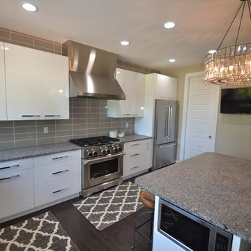
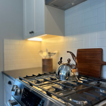
Kitchen renovation with sink and dishwasher shifting, patio door replacement, pendant replacement, hood vent duct adding. New flooring, cabinets, countertops, backsplash, and painting.
 Hillcrest Construction
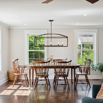
These clients reached out to Hillcrest Construction when their family began out-growing their Phoenixville-area home. Through a comprehensive design phase, opportunities to add square footage were identified along with a reorganization of the typical traffic flow throughout the house.
All household traffic into the hastily-designed, existing family room bump-out addition was funneled through a 3’ berth within the kitchen making meal prep and other kitchen activities somewhat similar to a shift at a PA turnpike toll booth. In the existing bump-out addition, the family room was relatively tight and the dining room barely fit the 6-person dining table. Access to the backyard was somewhat obstructed by the necessary furniture and the kitchen alone didn’t satisfy storage needs beyond a quick trip to the grocery store. The home’s existing front door was the only front entrance, and without a foyer or mudroom, the front formal room often doubled as a drop-zone for groceries, bookbags, and other on-the-go items.
Hillcrest Construction designed a remedy to both address the function and flow issues along with adding square footage via a 150 sq ft addition to the family room and converting the garage into a mudroom entry and walk-through pantry.
-
The project’s addition was not especially large but was able to facilitate a new pathway to the home’s rear family room. The existing brick wall at the bottom of the second-floor staircase was opened up and created a new, natural flow from the second-floor bedrooms to the front formal room, and into the rear family hang-out space- all without having to cut through the often busy kitchen. The dining room area was relocated to remove it from the pathway to the door to the backyard. Additionally, free and clear access to the rear yard was established for both two-legged and four-legged friends.
The existing chunky slider door was removed and in its place was fabricated and installed a custom centerpiece that included a new gas fireplace insert with custom brick surround, two side towers for display items and choice vinyl, and two base cabinets with metal-grated doors to house a subwoofer, wifi equipment, and other stow-away items. The black walnut countertops and mantle pop from the white cabinetry, and the wall-mounted TV with soundbar complete the central A/V hub. The custom cabs and tops were designed and built at Hillcrest’s custom shop.
The farmhouse appeal was completed with distressed engineered hardwood floors and craftsman-style window and door trim throughout.
-
Another major component of the project was the conversion of the garage into a pantry+mudroom+everyday entry.
The clients had used their smallish garage for storage of outdoor yard and recreational equipment. With those storage needs being addressed at the exterior, the space was transformed into a custom pantry and mudroom. The floor level within the space was raised to meet the rest of the house and insulated appropriately. A newly installed pocket door divided the dining room area from the designed-to-spec pantry/beverage center. The pantry was designed to house dry storage, cleaning supplies, and dry bar supplies when the cleaning and shopping are complete. A window seat with doggie supply storage below was worked into the design to accommodate the existing elevation of the original garage window.
A coat closet and a small set of steps divide the pantry from the mudroom entry. The mudroom entry is marked with a striking combo of the herringbone thin-brick flooring and a custom hutch. Kids returning home from school have a designated spot to hang their coats and bookbags with two deep drawers for shoes. A custom cherry bench top adds a punctuation of warmth. The entry door and window replaced the old overhead garage doors to create the daily-used informal entry off the driveway.
With the house being such a favorable area, and the clients not looking to pull up roots, Hillcrest Construction facilitated a collaborative experience and comprehensive plan to change the house for the better and make it a home to grow within.

 Alair Homes Lorne Park
Hate it when your knifes and utensils shift around when opening and closing drawers? Keep everything tidy with built-in compartments and drawer dividers. Not only is it the safer solution, it might save you time the next time you're looking for that bottle opener!
 Vision Design
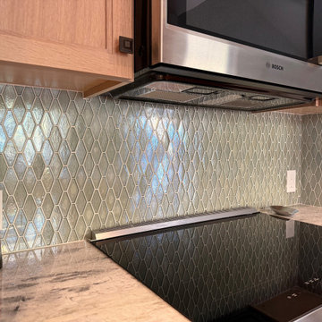
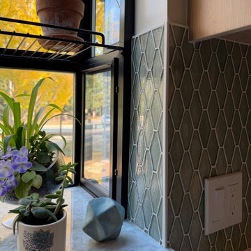
Although the majority of the kitchen stayed the same, slight shifts in appliances and all new finished provided a lot more storage and an updated look.
 Vision Design
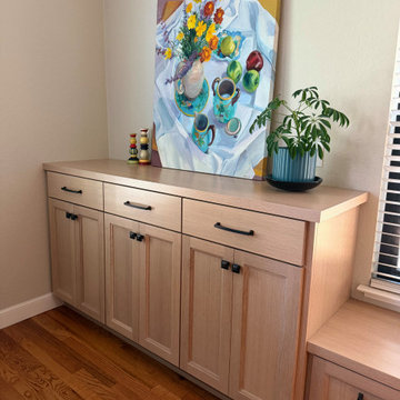
Although the majority of the kitchen stayed the same, slight shifts in appliances and all new finished provided a lot more storage and an updated look.
 Vision Design
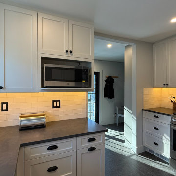
Although the majority of the kitchen stayed the same, slight shifts in appliances and all new finished provided a lot more storage and an updated look.
 consTRUSTY Carpentry
Kitchen renovation with sink and dishwasher shifting, patio door replacement, pendant replacement, hood vent duct adding. New flooring, cabinets, countertops, backsplash, and painting.
8