
Search results for "Master achieve" in Home Design Ideas

 Phi Design Inc.
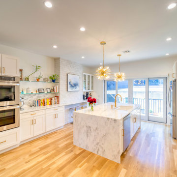
From the beginning, the homeowners had a clear vision for this kitchen renovation: classic & elegant, yet with a modern, contemporary touch. The goal of this kitchen renovation was to maximize function and storage. To achieve this, custom cabinetry layout & careful planning was essential. Kitchen features: MDF transitional kitchen door style painted in serene Spanish Olive colour; Pantry with Mirrored Doors and Custom Mullion Inserts; Built-in appliences; a Large Island great for entertaining; Light surfaces and airy floating shelves & desk, allows the eye to be drawn to the great window view. Let the Photo Speak for Itself... #transitional #customkitchen #olivecolour #pantry #mirroreddoors #mullioninsterts #largeisland #floatingshelves #floatingdesk #quartzcountertop #contemporary #chickitchen manufactured by #phidesigninc, designed by #bedodesign

 Axis Mundi Design
When the Gimbels department store chain closed in 1986, many of its selling floors were converted into luxury apartments, including those of this branch at 86th Street and Lexington Avenue. The retailer’s soaring ceilings allowed Axis Mundi to create bedroom mezzanine spaces overlooking the living and dining rooms. Defining them with translucent glass welcomed natural light while retaining privacy. Downstairs, spaces bleed one into another, their basic monochromatic black-and-white palette acting as a unifying leitmotif. Yet each space feels distinct, with its own programmatic purpose, a feat largely achieved by varying floor and wall treatments—a graphic tile pattern in the entry, a red wall in the hall leading to the master suite, a colorful area rug in the living room. In the retailer’s heyday, the then-common saying, “Would Macy’s tell Gimbels?” implied the strategies the competitors kept from each other to gain the upper hand. Here, a structure iconic in its day also conceals something: a handsome, wholly contemporary repurposing that represents just the sort of innovation that made Gimbels the celebrated name that it was.
Project Team: John Beckmann, Nick Messerlian and Kitchen by Minimal USA
Photography: Federica Carlet
© Axis Mundi Design LLC

 Chapman Design Group, Inc.
This rustic style home on Hartwell Lake was designed and built for the owners to enjoy with family and friends during their active weekend lifestyle. The home was built on a narrow, deep lot that was semi-level on the roadside and steep on the lakeside. The back half of the lot heavily wooded with mature oak and poplar trees reducing the harsh sun’s heat gain on the home.
The exterior utilizes fiber cement cedar shake and lap siding complimented by deep brown colors for the windows, soffit, trim and the large square columns. A nice balance of natural earth toned stacked stone rounds out the exterior materials completing the rustic casual lake living.
The home 5400 SF is designed and built on thee levels each having a primary focus. The main level creates primary daily living for the owners. This level features an open plan with an entry, stair, dining, kitchen and living areas leading to a large lakeside screened porch. A master suite is privately tucked off its own hallway and allowing it to enjoy the lakeside as well with its own private deck. On the opposite side are two bedrooms, a study and a shared bathroom for each to utilize. An open carport for two vehicles was created with the motor court and connects to the mudroom/utility room giving the owners direct entry into their home.
The upper level is for the grand children with an oversized bedroom, bathroom and loft area for play.
The lower level is the considered the party level. Its primary feature is an elevated stage for the owner’s band opened to a large seating area, dining and kitchen for viewing and listening with direct access to another screened porch. Flanking each side is a theater and two additional bedrooms and bathrooms.
Energy Efficient features include:
• The majority of the lower level sunk into the site below grade
• 6” thick walls utilizing advanced framing techniques
• Foil covered roof sheathing
• Extensive use of blown in cellulous
• All windows & doors are double paned low E argon filed glass
• Tank-less water heaters
• Three separate high efficiency HVAC units with programmable thermostats and a fresh air ERV.
Lastly the owner requested we make every effort to sound proof the home. Many materials and techniques gave a duel purpose and added to the energy efficiency.
These items include:
• 2x6 walls with staggered studs
• Extensive use if rock wool acoustic batting
• Tempered glass in all exterior doors and windows
• ¼ thick Mass Loaded Vinyl (MLV) was installed on the top and bottom of the floor trusses and on all lower level walls.
The combination of the design and detailing utilizing these specific materials enabled us to achieve a 5 Star Plus Energy Star Certification with a HERS Index Score of 50. This home received a the 2015 Pinnacle Award from the SC Home Builders Association for the “Best Achievement in Energy Efficiency” sponsored by the SC Department Commerce.
Find the right local pro for your project
 KED Interiors
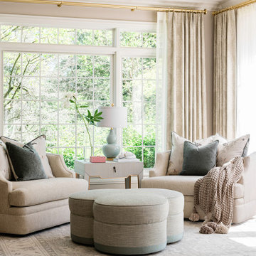
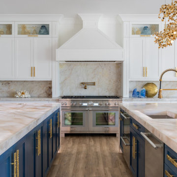
The recent redesign of the kitchen and dining nook skillfully fuses timeless French country aesthetics with modern design principles, tailored for a young couple who cherish both art and architecture. This transformation emphasizes an inviting, comfortable atmosphere without compromising on sophistication. The space uses a palette of muted colors and aged materials to achieve a subtle elegance that integrates seamlessly with the home’s intrinsic architectural charm.
Central to the kitchen are two islands, designed to facilitate both everyday living and grand entertaining. These islands not only offer extensive preparation surfaces but also serve as social hubs, making the kitchen the heart of the home. Adjacent to this area, a well-equipped scullery and a butler’s pantry enhance functionality, providing ample space for storage and meal prep without cluttering the main kitchen area.
The dining area is designed to host intimate dinners or family gatherings, while views of the stunning chandelier, sculpted ceilings and detailed millwork float above, echoing the home’s French influences. Similarly, the sitting area adjacent to the kitchen features comfortable seating and abundant natural light, creating a perfect spot for relaxation or casual conversation.
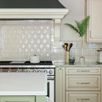
Attention to detail is evident in the decorative grates on the pantry doors, and the arched glass elements in cabinetry, all nodding to classic French design. This project masterfully balances historical reverence with modern functionality, making it an ideal setting for both lively social gatherings and serene everyday living.
 KED Interiors
The recent redesign of the kitchen and dining nook skillfully fuses timeless French country aesthetics with modern design principles, tailored for a young couple who cherish both art and architecture. This transformation emphasizes an inviting, comfortable atmosphere without compromising on sophistication. The space uses a palette of muted colors and aged materials to achieve a subtle elegance that integrates seamlessly with the home’s intrinsic architectural charm.
Central to the kitchen are two islands, designed to facilitate both everyday living and grand entertaining. These islands not only offer extensive preparation surfaces but also serve as social hubs, making the kitchen the heart of the home. Adjacent to this area, a well-equipped scullery and a butler’s pantry enhance functionality, providing ample space for storage and meal prep without cluttering the main kitchen area.
The dining area is designed to host intimate dinners or family gatherings, while views of the stunning chandelier, sculpted ceilings and detailed millwork float above, echoing the home’s French influences. Similarly, the sitting area adjacent to the kitchen features comfortable seating and abundant natural light, creating a perfect spot for relaxation or casual conversation.
Attention to detail is evident in the decorative grates on the pantry doors, and the arched glass elements in cabinetry, all nodding to classic French design. This project masterfully balances historical reverence with modern functionality, making it an ideal setting for both lively social gatherings and serene everyday living.
 Chapman Design Group, Inc.
This rustic style home on Hartwell Lake was designed and built for the owners to enjoy with family and friends during their active weekend lifestyle. The home was built on a narrow, deep lot that was semi-level on the roadside and steep on the lakeside. The back half of the lot heavily wooded with mature oak and poplar trees reducing the harsh sun’s heat gain on the home.
The exterior utilizes fiber cement cedar shake and lap siding complimented by deep brown colors for the windows, soffit, trim and the large square columns. A nice balance of natural earth toned stacked stone rounds out the exterior materials completing the rustic casual lake living.
The home 5400 SF is designed and built on thee levels each having a primary focus. The main level creates primary daily living for the owners. This level features an open plan with an entry, stair, dining, kitchen and living areas leading to a large lakeside screened porch. A master suite is privately tucked off its own hallway and allowing it to enjoy the lakeside as well with its own private deck. On the opposite side are two bedrooms, a study and a shared bathroom for each to utilize. An open carport for two vehicles was created with the motor court and connects to the mudroom/utility room giving the owners direct entry into their home.
The upper level is for the grand children with an oversized bedroom, bathroom and loft area for play.
The lower level is the considered the party level. Its primary feature is an elevated stage for the owner’s band opened to a large seating area, dining and kitchen for viewing and listening with direct access to another screened porch. Flanking each side is a theater and two additional bedrooms and bathrooms.
Energy Efficient features include:
• The majority of the lower level sunk into the site below grade
• 6” thick walls utilizing advanced framing techniques
• Foil covered roof sheathing
• Extensive use of blown in cellulous
• All windows & doors are double paned low E argon filed glass
• Tank-less water heaters
• Three separate high efficiency HVAC units with programmable thermostats and a fresh air ERV.
Lastly the owner requested we make every effort to sound proof the home. Many materials and techniques gave a duel purpose and added to the energy efficiency.
These items include:
• 2x6 walls with staggered studs
• Extensive use if rock wool acoustic batting
• Tempered glass in all exterior doors and windows
• ¼ thick Mass Loaded Vinyl (MLV) was installed on the top and bottom of the floor trusses and on all lower level walls.
The combination of the design and detailing utilizing these specific materials enabled us to achieve a 5 Star Plus Energy Star Certification with a HERS Index Score of 50. This home received a the 2015 Pinnacle Award from the SC Home Builders Association for the “Best Achievement in Energy Efficiency” sponsored by the SC Department Commerce.
 Frederick Cooke Architecture, LLC
Welcome home to this luxe, modern, and inviting townhome in the heart of downtown Jersey City! We are ecstatic to see this project completed.
This 4-story multifamily underwent a major renovation and was transformed into a spacious and functional family home for our clients. Careful consideration of our client’s lifestyle and plans for the future dictated every design decision. They needed a space that would function well now that they are a young professional couple and a space that would nicely accommodate a growing family in the future. Greater emphasis was placed on common family spaces and bedrooms were designed exclusively for sleep with minimal room for work or study and without TV connections to discourage those activities from taking place in these spaces. Instead, common places such as the family room and the kitchen are inviting and foster those activities.
Due to sagging floors in need of extensive repair, it made more financial sense to replace them entirely. We took this historic house and by re-pitching the roof in an inverted form we were able to gain an overall 36” which we used for raising the floors. This, in turn, allowed us to bring the ground level up to code and be suitable for living space and gave us additional ceiling room on the upper floors. The ground floor was designed to be used as a rental unit and can be reincorporated into the home later when more space is needed.
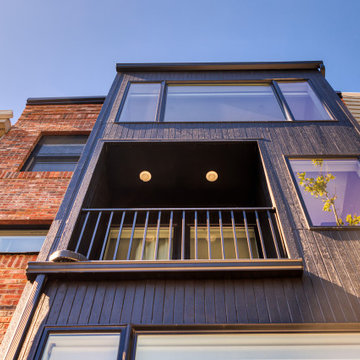
Both front and back facades were replaced with timeless brick and vertical wood siding and all windows and front doors were replaced. The ground floor features a one-bedroom suite, living room, and open kitchen-dining area. On the first floor, we achieved a more effective entry sequence to the living room, an open-concept design leading to the kitchen. The interior is bright and airy, and the kitchen opens up to the deck in the back and the patio, making entertaining indoors and outdoors seamless. The design works in a way to accommodate the addition of a stair leading to the ground level when the rental unit is incorporated back into the house.
Up on the second floor, a suite with a bathroom was designed with grandparents or guests in mind. Also, two additional bedrooms are now being used as an exercise room and a zoom-worthy office but can later be used as kids’ rooms.
Last but not least, the third floor features the master suite with his and hers walk-in closets, a master bath, and a library.
Sponsored
Columbus, OH
Free consultation for landscape design!

Peabody Landscape Group
Franklin County's Reliable Landscape Design & Contracting
 Annie Santulli Designs
This extraordinary home was so much fun to design. We have previously worked on three of our client’s homes and by now, we spoke the same design language resulting in conversations, ideas, and decisions that came easy.
The colorful outdoors surrounding this Intracoastal residence inspired our choices throughout the design. Bold deep blues live harmoniously beside aquas, pinks, and soft metallics expressed in large artworks, dramatic art glass, and luxuriously upholstered chairs.
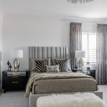
The monochromatic master bedroom, however, is a study in textures. Soft taupe-hued furnishings appear to float on a luxurious cloud of creamy white achieved with a wall-to-wall fur rug while a bold oversized chandelier made of a single ring of clear blown glass illuminates and sparkles against two large and dramatic beveled mirrors. Translucent lucite lamps and the room’s generous nightstand’s chrome legs round out this elegant bedroom’s glamorous finishes.
Implementing innovative use of secondary spaces including the home’s hallways, walkthrough, and closets, we cleverly installed a floor-to-ceiling illuminated wine cellar that is as much a design element as it is a lifestyle feature for our client’s extensive wine collection. An extra-wide, low, narrow blue flame glass wall fire feature is unexpected and holds its own underneath bold oversized artwork.
The home’s two expansive outdoor living spaces are designed for entertaining with generously furnished spaces for cooking and dining or just lounging poolside with your favorite people while enjoying the beautiful vistas that make this luxury home a dreamy one.
 Axis Mundi Design
When the Gimbels department store chain closed in 1986, many of its selling floors were converted into luxury apartments, including those of this branch at 86th Street and Lexington Avenue. The retailer’s soaring ceilings allowed Axis Mundi to create bedroom mezzanine spaces overlooking the living and dining rooms. Defining them with translucent glass welcomed natural light while retaining privacy. Downstairs, spaces bleed one into another, their basic monochromatic black-and-white palette acting as a unifying leitmotif. Yet each space feels distinct, with its own programmatic purpose, a feat largely achieved by varying floor and wall treatments—a graphic tile pattern in the entry, a red wall in the hall leading to the master suite, a colorful area rug in the living room. In the retailer’s heyday, the then-common saying, “Would Macy’s tell Gimbels?” implied the strategies the competitors kept from each other to gain the upper hand. Here, a structure iconic in its day also conceals something: a handsome, wholly contemporary repurposing that represents just the sort of innovation that made Gimbels the celebrated name that it was.
Project Team: John Beckmann, Nick Messerlian and Richard Rosenbloom
Kitchen by Minimal USA
Photography: Federica Carlet
© Axis Mundi Design LLC
 Axis Mundi Design
When the Gimbels department store chain closed in 1986, many of its selling floors were converted into luxury apartments, including those of this branch at 86th Street and Lexington Avenue. The retailer’s soaring ceilings allowed Axis Mundi to create bedroom mezzanine spaces overlooking the living and dining rooms. Defining them with translucent glass welcomed natural light while retaining privacy. Downstairs, spaces bleed one into another, their basic monochromatic black-and-white palette acting as a unifying leitmotif. Yet each space feels distinct, with its own programmatic purpose, a feat largely achieved by varying floor and wall treatments—a graphic tile pattern in the entry, a red wall in the hall leading to the master suite, a colorful area rug in the living room. In the retailer’s heyday, the then-common saying, “Would Macy’s tell Gimbels?” implied the strategies the competitors kept from each other to gain the upper hand. Here, a structure iconic in its day also conceals something: a handsome, wholly contemporary repurposing that represents just the sort of innovation that made Gimbels the celebrated name that it was.
Project Team: John Beckmann, Nick Messerlian and Richard Rosenbloom
Kitchen by Minimal USA
Photography: Federica Carlet
© Axis Mundi Design LLC

 Cure Design Group
a classic city home, built in the 50’s. Her family moved in August of ’18, and in less than a year, she’s already completed a number of remodel projects including additions to the master bedroom and 2-bedroom + bath “kids’ wing.” She’s opened walls from the kitchen to the living and dining rooms creating a massive open floor plan and refinished all the original hardwood floors. After seeing her beautifully furnished space and hearing her listing everything she’s done to get her house the way it looks today, I had so many exciting ideas to help her add the finishing touches she was needing and to give her the look she was going for.
Referencing her inspiration pics saved to Houzz and Pinterest, the first item on the list was to add window treatments. These were presented in a soft, crisp white fabric which maintains the brightness for each room, diffusing the sunlight throughout, keeping each space light and airy. The simple functional panels give her the privacy she wanted from all the passersby walking the park, which are lined to help regulate the temperature differences she needed. The hardware for these panels is something to mention –simple, modern, matte black rods and brackets, highlighted with acrylic finials and gold rings. This combination is an exclamation point showcasing what custom window treatments can really do for a room. The main dining room window boasts a striking contrast of rich black wide leather tape, drawing your eye right to the beautiful picture window, which in and of itself is a perfect accent to this space.
From there, adding the right wall hangings and artwork, task lighting, accessories, and accents layered throughout, mixing lots of textures, metal finishes, and varying shades of color synchronizes one room to the next buttoning up the entire design concept she was striving to achieve.
 Frederick Cooke Architecture, LLC
Welcome home to this luxe, modern, and inviting townhome in the heart of downtown Jersey City! We are ecstatic to see this project completed.
This 4-story multifamily underwent a major renovation and was transformed into a spacious and functional family home for our clients. Careful consideration of our client’s lifestyle and plans for the future dictated every design decision. They needed a space that would function well now that they are a young professional couple and a space that would nicely accommodate a growing family in the future. Greater emphasis was placed on common family spaces and bedrooms were designed exclusively for sleep with minimal room for work or study and without TV connections to discourage those activities from taking place in these spaces. Instead, common places such as the family room and the kitchen are inviting and foster those activities.
Due to sagging floors in need of extensive repair, it made more financial sense to replace them entirely. We took this historic house and by re-pitching the roof in an inverted form we were able to gain an overall 36” which we used for raising the floors. This, in turn, allowed us to bring the ground level up to code and be suitable for living space and gave us additional ceiling room on the upper floors. The ground floor was designed to be used as a rental unit and can be reincorporated into the home later when more space is needed.
Both front and back facades were replaced with timeless brick and vertical wood siding and all windows and front doors were replaced. The ground floor features a one-bedroom suite, living room, and open kitchen-dining area. On the first floor, we achieved a more effective entry sequence to the living room, an open-concept design leading to the kitchen. The interior is bright and airy, and the kitchen opens up to the deck in the back and the patio, making entertaining indoors and outdoors seamless. The design works in a way to accommodate the addition of a stair leading to the ground level when the rental unit is incorporated back into the house.
Up on the second floor, a suite with a bathroom was designed with grandparents or guests in mind. Also, two additional bedrooms are now being used as an exercise room and a zoom-worthy office but can later be used as kids’ rooms.
Last but not least, the third floor features the master suite with his and hers walk-in closets, a master bath, and a library.
 Annie Santulli Designs
This extraordinary home was so much fun to design. We have previously worked on three of our client’s homes and by now, we spoke the same design language resulting in conversations, ideas, and decisions that came easy.
The colorful outdoors surrounding this Intracoastal residence inspired our choices throughout the design. Bold deep blues live harmoniously beside aquas, pinks, and soft metallics expressed in large artworks, dramatic art glass, and luxuriously upholstered chairs.
The monochromatic master bedroom, however, is a study in textures. Soft taupe-hued furnishings appear to float on a luxurious cloud of creamy white achieved with a wall-to-wall fur rug while a bold oversized chandelier made of a single ring of clear blown glass illuminates and sparkles against two large and dramatic beveled mirrors. Translucent lucite lamps and the room’s generous nightstand’s chrome legs round out this elegant bedroom’s glamorous finishes.
Implementing innovative use of secondary spaces including the home’s hallways, walkthrough, and closets, we cleverly installed a floor-to-ceiling illuminated wine cellar that is as much a design element as it is a lifestyle feature for our client’s extensive wine collection. An extra-wide, low, narrow blue flame glass wall fire feature is unexpected and holds its own underneath bold oversized artwork.
The home’s two expansive outdoor living spaces are designed for entertaining with generously furnished spaces for cooking and dining or just lounging poolside with your favorite people while enjoying the beautiful vistas that make this luxury home a dreamy one.

Sponsored
Sunbury, OH

J.Holderby - Renovations
Franklin County's Leading General Contractors - 2X Best of Houzz!

 California Closets of Michigan
After remodeling and living in a 1920s Colonial for years, creative consultant and editor Michelle Adams set out on a new project: the complete renovation of a new mid-century modern home. Though big on character and open space, the house needed work—especially in terms of functional storage in the master bedroom. Wanting a solution that neatly organized and hid everything from sight while staying true to the home’s aesthetic, Michelle called California Closets Michigan to create a custom design that achieved the style and functionality she desired.
Michelle started the process by sharing an inspiration photo with design consultant Janice Fisher, which highlighted her vision for long, clean lines and feature lighting. Janice translated this desire into a wall-to-wall, floor-to-ceiling custom unit that stored Michelle’s wardrobe to a T. Multiple hanging sections of varying heights corral dresses, skirts, shirts, and pants, while pull-out shoe shelves keep her collection protected and accessible. In the center, drawers provide concealed storage, and shelves above offer a chic display space. Custom lighting throughout spotlights her entire wardrobe.
A streamlined storage solution that blends seamlessly with her home’s mid-century style. Plus, push-to-open doors remove the need for handles, resulting into a clean-lined solution from inside to out.
 Axis Mundi Design
When the Gimbels department store chain closed in 1986, many of its selling floors were converted into luxury apartments, including those of this branch at 86th Street and Lexington Avenue. The retailer’s soaring ceilings allowed Axis Mundi to create bedroom mezzanine spaces overlooking the living and dining rooms. Defining them with translucent glass welcomed natural light while retaining privacy. Downstairs, spaces bleed one into another, their basic monochromatic black-and-white palette acting as a unifying leitmotif. Yet each space feels distinct, with its own programmatic purpose, a feat largely achieved by varying floor and wall treatments—a graphic tile pattern in the entry, a red wall in the hall leading to the master suite, a colorful area rug in the living room. In the retailer’s heyday, the then-common saying, “Would Macy’s tell Gimbels?” implied the strategies the competitors kept from each other to gain the upper hand. Here, a structure iconic in its day also conceals something: a handsome, wholly contemporary repurposing that represents just the sort of innovation that made Gimbels the celebrated name that it was.
Project Team: John Beckmann, Nick Messerlian and Richard Rosenbloom
Kitchen by Minimal USA
Photography: Federica Carlet
© Axis Mundi Design LLC
 Frederick Cooke Architecture, LLC
Welcome home to this luxe, modern, and inviting townhome in the heart of downtown Jersey City! We are ecstatic to see this project completed.
This 4-story multifamily underwent a major renovation and was transformed into a spacious and functional family home for our clients. Careful consideration of our client’s lifestyle and plans for the future dictated every design decision. They needed a space that would function well now that they are a young professional couple and a space that would nicely accommodate a growing family in the future. Greater emphasis was placed on common family spaces and bedrooms were designed exclusively for sleep with minimal room for work or study and without TV connections to discourage those activities from taking place in these spaces. Instead, common places such as the family room and the kitchen are inviting and foster those activities.
Due to sagging floors in need of extensive repair, it made more financial sense to replace them entirely. We took this historic house and by re-pitching the roof in an inverted form we were able to gain an overall 36” which we used for raising the floors. This, in turn, allowed us to bring the ground level up to code and be suitable for living space and gave us additional ceiling room on the upper floors. The ground floor was designed to be used as a rental unit and can be reincorporated into the home later when more space is needed.
Both front and back facades were replaced with timeless brick and vertical wood siding and all windows and front doors were replaced. The ground floor features a one-bedroom suite, living room, and open kitchen-dining area. On the first floor, we achieved a more effective entry sequence to the living room, an open-concept design leading to the kitchen. The interior is bright and airy, and the kitchen opens up to the deck in the back and the patio, making entertaining indoors and outdoors seamless. The design works in a way to accommodate the addition of a stair leading to the ground level when the rental unit is incorporated back into the house.
Up on the second floor, a suite with a bathroom was designed with grandparents or guests in mind. Also, two additional bedrooms are now being used as an exercise room and a zoom-worthy office but can later be used as kids’ rooms.
Last but not least, the third floor features the master suite with his and hers walk-in closets, a master bath, and a library.
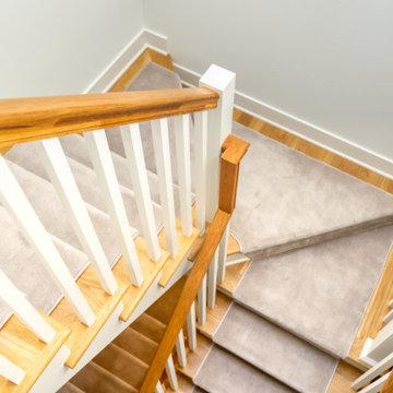 Frederick Cooke Architecture, LLC
Welcome home to this luxe, modern, and inviting townhome in the heart of downtown Jersey City! We are ecstatic to see this project completed.
This 4-story multifamily underwent a major renovation and was transformed into a spacious and functional family home for our clients. Careful consideration of our client’s lifestyle and plans for the future dictated every design decision. They needed a space that would function well now that they are a young professional couple and a space that would nicely accommodate a growing family in the future. Greater emphasis was placed on common family spaces and bedrooms were designed exclusively for sleep with minimal room for work or study and without TV connections to discourage those activities from taking place in these spaces. Instead, common places such as the family room and the kitchen are inviting and foster those activities.
Due to sagging floors in need of extensive repair, it made more financial sense to replace them entirely. We took this historic house and by re-pitching the roof in an inverted form we were able to gain an overall 36” which we used for raising the floors. This, in turn, allowed us to bring the ground level up to code and be suitable for living space and gave us additional ceiling room on the upper floors. The ground floor was designed to be used as a rental unit and can be reincorporated into the home later when more space is needed.
Both front and back facades were replaced with timeless brick and vertical wood siding and all windows and front doors were replaced. The ground floor features a one-bedroom suite, living room, and open kitchen-dining area. On the first floor, we achieved a more effective entry sequence to the living room, an open-concept design leading to the kitchen. The interior is bright and airy, and the kitchen opens up to the deck in the back and the patio, making entertaining indoors and outdoors seamless. The design works in a way to accommodate the addition of a stair leading to the ground level when the rental unit is incorporated back into the house.
Up on the second floor, a suite with a bathroom was designed with grandparents or guests in mind. Also, two additional bedrooms are now being used as an exercise room and a zoom-worthy office but can later be used as kids’ rooms.
Last but not least, the third floor features the master suite with his and hers walk-in closets, a master bath, and a library.
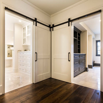

 Annie Santulli Designs
This extraordinary home was so much fun to design. We have previously worked on three of our client’s homes and by now, we spoke the same design language resulting in conversations, ideas, and decisions that came easy.
The colorful outdoors surrounding this Intracoastal residence inspired our choices throughout the design. Bold deep blues live harmoniously beside aquas, pinks, and soft metallics expressed in large artworks, dramatic art glass, and luxuriously upholstered chairs.
The monochromatic master bedroom, however, is a study in textures. Soft taupe-hued furnishings appear to float on a luxurious cloud of creamy white achieved with a wall-to-wall fur rug while a bold oversized chandelier made of a single ring of clear blown glass illuminates and sparkles against two large and dramatic beveled mirrors. Translucent lucite lamps and the room’s generous nightstand’s chrome legs round out this elegant bedroom’s glamorous finishes.
Implementing innovative use of secondary spaces including the home’s hallways, walkthrough, and closets, we cleverly installed a floor-to-ceiling illuminated wine cellar that is as much a design element as it is a lifestyle feature for our client’s extensive wine collection. An extra-wide, low, narrow blue flame glass wall fire feature is unexpected and holds its own underneath bold oversized artwork.
The home’s two expansive outdoor living spaces are designed for entertaining with generously furnished spaces for cooking and dining or just lounging poolside with your favorite people while enjoying the beautiful vistas that make this luxury home a dreamy one.
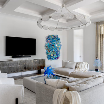 Annie Santulli Designs
This extraordinary home was so much fun to design. We have previously worked on three of our client’s homes and by now, we spoke the same design language resulting in conversations, ideas, and decisions that came easy.
The colorful outdoors surrounding this Intracoastal residence inspired our choices throughout the design. Bold deep blues live harmoniously beside aquas, pinks, and soft metallics expressed in large artworks, dramatic art glass, and luxuriously upholstered chairs.
The monochromatic master bedroom, however, is a study in textures. Soft taupe-hued furnishings appear to float on a luxurious cloud of creamy white achieved with a wall-to-wall fur rug while a bold oversized chandelier made of a single ring of clear blown glass illuminates and sparkles against two large and dramatic beveled mirrors. Translucent lucite lamps and the room’s generous nightstand’s chrome legs round out this elegant bedroom’s glamorous finishes.
Implementing innovative use of secondary spaces including the home’s hallways, walkthrough, and closets, we cleverly installed a floor-to-ceiling illuminated wine cellar that is as much a design element as it is a lifestyle feature for our client’s extensive wine collection. An extra-wide, low, narrow blue flame glass wall fire feature is unexpected and holds its own underneath bold oversized artwork.
The home’s two expansive outdoor living spaces are designed for entertaining with generously furnished spaces for cooking and dining or just lounging poolside with your favorite people while enjoying the beautiful vistas that make this luxury home a dreamy one.

 Design Fixation [Faith Provencher]
Photo: Faith Towers © 2018 Houzz
Inspiration for an eclectic kitchen remodel in Providence
Inspiration for an eclectic kitchen remodel in Providence
180