
Search results for "Master compared" in Home Design Ideas

 Drury Design
THE SETUP
This client lives in a great high-rise condo in downtown Chicago. Alicia has already remodeled a few areas of her home, including her kitchen and home office. The bathroom is one of the last big places the client wanted to update. The existing bathroom had a large, outdated whirlpool tub in the corner. It was a darker space that had a lack of natural light. There are no windows (due to the bathroom’s location within the high-rise building). So, the idea was to brighten up the space and give the client an updated, elegant primary bathroom that is more her style and tailor-made for her routines.
Design Objectives:
- Make the space brighter.
- Create different daily routine stations to maximize functionality while keeping things clutter-free – a makeup station, a blow-dry station, and a sink-needs station.
- Achieve the client’s specific style and function needs while also keeping the look and design open to future possibilities: different users of the space/resale clients.
Design Challenges:
- Toilet cannot be moved. (In a high-rise, you can’t really move plumbing around too much when reimagining a space)
- Existing bathroom had a soffit that hid a lot of electrical wiring, so completely removing the soffit wasn’t an option.
- The blow-dry station needs to accommodate the client’s preference for standing up.
- Finding a place for the make-up station, which the client wants oriented for sitting.
- Create storage within the shower that can eliminate the clutter of personal care products that are actually needed every day. Do this, while keeping the client’s favorite things about the existing shower: the shower bench, a tub filler faucet (for rinsing shaving cream when shaving legs) and a low niche for placing her foot when shaving her legs.
THE RENEWED SPACE
Design Solutions:
- Extended a bit of wall near the toilet to give the commode its own area within the space, but without closing it off into a claustrophobic WC.
- Worked within the reality of the existing soffit situation, reshaping it to align with the new shower. Can lights were also added. Installed a beautiful ceiling light fixture that works within the new soffit shape, commanding attention and adding light, as if the sofit shape was chosen for it.
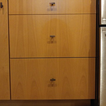
- Created a nice, furniture-looking 42”-high cabinet with pullout drawers to be the blow-dry station, complete with a mirror and a nice top. The pullout drawers are all powered, concealing a Dyson dryer and curling iron (and all the accoutrements) while keeping them plugged in, which is ideal for easy usage and put away. A stylish mirror on the wall above the cabinet, and proper lighting, make this the perfect blow-dry station. The top has a grommet that can accommodate a power cord should the client ever want to have a powered device on top of the cabinet.
- Put the sit-down makeup station where the tub used to be, putting the mirror back into a new recessed wall just a bit, allowing the area to have more room.
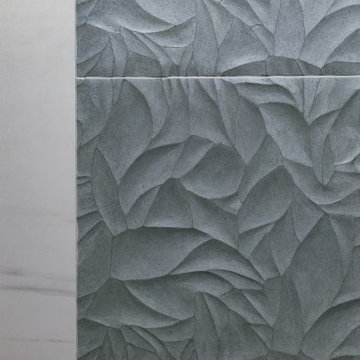
- Created a niche in the shower’s inner wall so that you can’t see it unless you are literally inside the shower. At the client’s request, it also has a hook so she can hang her loofa. Hiding the utility niche in this way allowed us to use the full main wall of the shower as a canvas for a beautiful accent stripe of raised decorative tile. The new shower has her old favorites, too: the tub filler, foot niche and bench.
Alicia’s client loves her new primary bathroom, especially the blow dry area. It is very accommodating for her, as a tall lady, while being very easy to use. The drawers store everything. Being powered, they make using already-plugged in appliances very easy to use and put away.
Her previous makeup station was a freestanding vanity with a single drawer, so beauty products were all over the surface top. With her new makeup station, everything is nicely tucked away and organized in drawers.
The new lighting is fantastic and the colors are light and soft. The clients loves the overall look and feel of her new bathroom and raves about how well the functionality-minded design makes her morning routine – and her life – easier and enjoyable!

Find the right local pro for your project




 menakaimai architects
Project Type : Residential
Location : Ethul Kotte
Land Area :3267 sqft ( 12 p )
Architects : Archt. Sameera Dharmasena (menakaimai design studio)
: Archt. Menaka Karunarathna (menakaimai design studio)
Structural Engineering : Eng Sajeewa Edirrisingha
Write-up : Archt. Navoda Rthnayaka
Photographs : Amila Rathnayaka (Amila Rathnayaka photography)
Just as the eyes are the windows to a person’s soul, a house is a window to its architect’s aspirations. The residence for Mr. Alex and family at Ethul Kotte is a perfect example for this, which is an open book with multiple layers. From the entrance to the rooftop, each space creates a specific impression and reveals a little more about the users, as it has been perfectly captured by the architect.
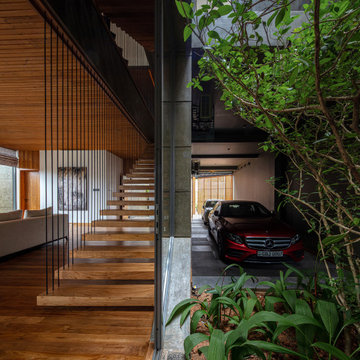
The house is located at the further end of a narrow drive-way, almost hidden from view with its dark façade and greenery, and sits in a compact lot that opens to a marsh at its rear end. With its cladded wall of cement blocks with a unique imprint and the line of bamboo covering the length of the front wall, the boundaries are defined effortlessly while drawing focus to the main entrance. Earthy feeling created at this point heavily dwells on the solidity of the materials and the muted color palette, which is juxtaposed by the lightness of the timber gate, perforated external façade and screen of vines flowing down from the rooftop. Upon entering, the ambiance of the house changes from its somber guarded exterior to a bright and spacious interior that completely opens to its surroundings.
The floating staircase that climbs along the dark titanium wall and the adjoining courtyard run through the full height of the building, merging the solids and the voids at all levels.
Spatial organization in the house is predominantly in three layers and each section of a floor has a clear demarcation between the public and private spaces. Spaciousness is achieved through the simplicity of the spaces, minimalistic furniture and muted tones that are complemented by the complete openness created by the glass facades covering the full height of the spaces. Another noticeable feature is the landscaping where thick low hedges are broken by thin trees to mimic a rampart that characterizes the intermediate space between the interior and boundary of the site, which is demarcated by the alternating solids and voids of the boundary fence.
The ground level creates a warm, welcoming ambiance that is ideal for entertaining guests. From the lines of textures and materials used, to heights and orientations of furniture, each element complements each other to add volume and composure to the space. A peculiar feature is a subtle inspiration from Japanese architecture that is visible in the sharp lines and several decorative features, which enhance the ambiance with splashes of vibrancy created by the simple, yet colorful elements. While the open living-dining space is a subtle fusion between a modern western living space and the Sri Lankan lifestyle that welcomes nature and social interactions, privacy of adjoining spaces such as the kitchen and bedroom is ensured by isolation made pleasant by their private courtyards.
Gradually gracing a visitor at the extended landing of the first floor is the calming sight of the full height cross formed by light filtering through crafted gaps on the wall which becomes a feature and an open shrine. This , seamless flows to the rest of the floor with its vibrant, spacious family living room and TV lobby a that connects all these well as the custom-designed bedrooms
The ambiance of each room voices the unique needs and tastes of its user, while the private balcony screened from the outside by a perforated aluminum façade and a screen of vines, creates an intimate niche. A significant feature is the glazed walls of the master bedroom, which are only screened by thick canvas shades that open to a mesmerizing sunset and a view of the marsh. This makes one question the concepts of privacy traditionally Sri Lankans, whereas the user appears to be embracing the vulnerability in openness and enjoying the soothing beauty in nature through the same.
The second floor is mostly the rooftop garden and bar, which is a multi-functional space ideal for a small gathering. The curtain of creepers covering the full height glass façade separating the bar and open terrace creates a significant change in ambiance by defining the cozy, timber interior of the bar, against the outdoor-, where the monotonous greenery is only broken by a splash of red from the punctured cover of a service staircase running to the upper rooftop level. The uniqueness is in how each space caters for contrast in transition between ambiances spanning from an intimate, mystic bar area ideal for isolation, to a lively social space creates a unique mood compared to the rest of the house. The rooftop thus completes the transition of spaces from open and interactive interior to a mind-palace and a garden that inspires the soul.
“I think that my job is to observe people and the world, and not to judge them; I always hope
To position myself away from so-called conclusions; I would like to leave everything wide open
To all the possibilities in the world.”
-Haruki Murakami-
Layering is a key feature in this design, which is evident in how the façade filters inwards from the curtain of greenery, permeable panel and the external wall, as well as the spatial structure of the interior. The linear form of the building, where the living spaces completely open-out through the glazed facades at the rear end of each floor merges these family-spaces with the neighborhood, which avoids complete isolation of the family. Thus, the design is inspired by the need for a sense of freedom in the residents, while allowing the house to become a place for escape when desired.
Sponsored
Delaware, OH

Buckeye Basements, Inc.
Central Ohio's Basement Finishing ExpertsBest Of Houzz '13-'21

131