
Search results for "Master draft" in Home Design Ideas

 Metropolis Drafting and Construction Inc
The adorable and bright transitional kitchen is a statment in every home.
the open floorplan with the same flooring matirial flowing in the kitchen and throughout the house, the white cabinets and the contrasting dark island makes the kitchen feel large and airy.
A larg built-in pantry wall floor to ceiling with a perfectly designed opening for the fridge gives you the expensive "sub zero" fridge look without spending the extra cash for it.
a neat trick we use for people who use the microwave a lot is the utilization of a 30" microwave-hood unit but in a regular upper cabinet and not above a range.
The center peice of this kitchen is the counter top, the matirial is Quartzite and the model is Snow white.
We recived 2 slabs of this awsome natural stone and imidiatly noticed the section of it that had "tiger" strips.
That unique design of the stone was special and we used that part only for the island leaving the rest of the more cleaner and whitter parts of the slab for the rest of the kitchen.
 Metropolis Drafting and Construction Inc
The adorable and bright transitional kitchen is a statment in every home.
the open floorplan with the same flooring matirial flowing in the kitchen and throughout the house, the white cabinets and the contrasting dark island makes the kitchen feel large and airy.
A larg built-in pantry wall floor to ceiling with a perfectly designed opening for the fridge gives you the expensive "sub zero" fridge look without spending the extra cash for it.
a neat trick we use for people who use the microwave a lot is the utilization of a 30" microwave-hood unit but in a regular upper cabinet and not above a range.
The center peice of this kitchen is the counter top, the matirial is Quartzite and the model is Snow white.
We recived 2 slabs of this awsome natural stone and imidiatly noticed the section of it that had "tiger" strips.
That unique design of the stone was special and we used that part only for the island leaving the rest of the more cleaner and whitter parts of the slab for the rest of the kitchen.
 Metropolis Drafting and Construction Inc
When our client bought this house, it was stuck in limbo between the traditional interior and a 90's modern structure.
The direction we took was a combination of calm beige color scheme with clean lines and smooth surfaces.
The continuation of the same materials throughout the house finally bonded all the different spaces into a singular home.
The two guest bathrooms were made with Cloe zellige style tiles and custom floating vanities made from white oak.
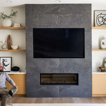
The same oak was used also for the built-in TV wall as floating shelves and base cabinets with a large, tiled center piece for the recessed TV and the electric fireplace.
The kitchen also received some of the white oak love in the form of the Island and the recessed cooking area.
The biggest issue with the kitchen space was the lack of proportions between the width and its length vs. the extreme height of the vaulted ceiling.
The solution I came up with was a secondary line of wall cabinets to be the same depth as the full height units to create a wrap around and make the space more proportionate.
Continuing to the master bathroom, here we have a true walk-in master bath suite, no door needed with this size of space.
All the walls received porcelain semi slab treatment. (72x36 porcelain tile) a lot of work went into selecting the correct tile pieces to give it the effect of a single slab installation but without the added cost.
All fixtures are by Kohler with their fantastic modern gold finish.
The result was a perfect flow of calm beige colors and warmth of natural wood throughout.
Find the right local pro for your project

 Zola European Windows
Zola Windows played a crucial role in helping to embrace and engender the “Passive House” construction standard, allowing a landmark protected large commercial building to be transformed into an architecturally precise, low energy, high performance masterpiece. For 60 White Street, a brand new class of window was developed that pushes the technological envelope while faithfully replicating the look appropriate for a 146 year-old historic edifice. Zola’s American Heritage SDH (Simulated Double Hung) window helped create a well-insulated, draft free building envelope akin to a thermos bottle. This award-winning, replica-quality window boasts industry-leading airtightness and thermal performance, coupled with craftsmanship that is befitting of even the most detailed historic restorations.
Photographer: Nico Arellano
 Metropolis Drafting and Construction Inc
Contemporary interpolation to a classical bathroom.
The materials used here is Marble... yes Marble! we have gray sandblasted marble on the floor in Versailles pattern to give the bathroom floor depth and sensation of space, we used pure high grade Thasos marble cut to 18x6 too be placed in a staggered pattern (brick pattern)
Just look at that pure white marble look. To finish the edges installation of a pencil liner from same material and to add some trim a gray marble linear trim line was installed with same color pencil liner to border it.
The classical furniture vanity comes in dark gray to compliment the flooring and the top is the classical Carrara marble material.
Notice the bi-fold doors on the right, looks like a linen cabinet but it’s not.
Due to lack of space in the house (this is a small craftsman home in the hills of Glendale) we were requested to bring the laundry from the basement to the house and so we did. Those bi-fold doors you are looking at are hiding the stackable washer and dryer.
To finish everything off all the fixtures are in a great Kohler vibrant polished nickel finish.

 AMR Interior Design & Drafting Ltd.
Ryan Patrick Kelly
Example of a large transitional master carpeted bedroom design in Edmonton with gray walls
Example of a large transitional master carpeted bedroom design in Edmonton with gray walls
 Metropolis Drafting and Construction Inc
An original 1930’s English Tudor with only 2 bedrooms and 1 bath spanning about 1730 sq.ft. was purchased by a family with 2 amazing young kids, we saw the potential of this property to become a wonderful nest for the family to grow.
The plan was to reach a 2550 sq. ft. home with 4 bedroom and 4 baths spanning over 2 stories.
With continuation of the exiting architectural style of the existing home.
A large 1000sq. ft. addition was constructed at the back portion of the house to include the expended master bedroom and a second-floor guest suite with a large observation balcony overlooking the mountains of Angeles Forest.
An L shape staircase leading to the upstairs creates a moment of modern art with an all white walls and ceilings of this vaulted space act as a picture frame for a tall window facing the northern mountains almost as a live landscape painting that changes throughout the different times of day.
Tall high sloped roof created an amazing, vaulted space in the guest suite with 4 uniquely designed windows extruding out with separate gable roof above.
The downstairs bedroom boasts 9’ ceilings, extremely tall windows to enjoy the greenery of the backyard, vertical wood paneling on the walls add a warmth that is not seen very often in today’s new build.
The master bathroom has a showcase 42sq. walk-in shower with its own private south facing window to illuminate the space with natural morning light. A larger format wood siding was using for the vanity backsplash wall and a private water closet for privacy.
In the interior reconfiguration and remodel portion of the project the area serving as a family room was transformed to an additional bedroom with a private bath, a laundry room and hallway.
The old bathroom was divided with a wall and a pocket door into a powder room the leads to a tub room.
The biggest change was the kitchen area, as befitting to the 1930’s the dining room, kitchen, utility room and laundry room were all compartmentalized and enclosed.
We eliminated all these partitions and walls to create a large open kitchen area that is completely open to the vaulted dining room. This way the natural light the washes the kitchen in the morning and the rays of sun that hit the dining room in the afternoon can be shared by the two areas.
The opening to the living room remained only at 8’ to keep a division of space.
Sponsored
Columbus, OH

Wannemacher Interiors
Customized Award-Winning Interior Design Solutions in Franklin Cnty OH

 Cynthia B. Wilson Interior Design
The 3 bathrooms in this 1970's house were in serious need of remodeling - as in gut and re-build - so the owners decided to have them all done at once and while at it, refinish the floors, refurnish the living room and furnish the new screen porch addition.
As a designer in a seasonal resort area, I am accustomed to working with my customers long distance. Using (and e-mailing) computer drafted renderings, product layout pages very professional builders, suppliers and steady communication, my client and I moved flawlessly through the challenges all remodel projects present.
My goal was to find fabrics and furnishings that reflected the home's original architectural Mid Century Modern integrity The house has very strong horizontal lines that I wanted to repeat in the furniture, bathroom fixtures, tile and light fixture selections.
Victoria McHugh Photography
 Metropolis Drafting and Construction Inc
On a hillside property in Santa Monica hidden behind trees stands our brand new constructed from the grounds up guest unit. This unit is only 300sq. but the layout makes it feel as large as a small apartment.
Vaulted 12' ceilings and lots of natural light makes the space feel light and airy.
A small kitchenette gives you all you would need for cooking something for yourself, notice the baby blue color of the appliances contrasting against the clean white cabinets and counter top.
The wood flooring give warmth to the neutral white colored walls and ceilings.
A nice sized bathroom bosting a 3'x3' shower with a corner double door entrance with all the high quality finishes you would expect in a master bathroom.
The exterior of the unit was perfectly matched to the existing main house.
These ADU (accessory dwelling unit) also called guest units and the famous term "Mother in law unit" are becoming more and more popular in California and in LA in particular.

 Final Draft Cabinetry
Cabinets: Merit
By Final Draft Cabinetry
www.finaldraftcabinetry.com - 604-293-1020
Design: Beyond Beige Interior Design
Photos: Provoke Studios
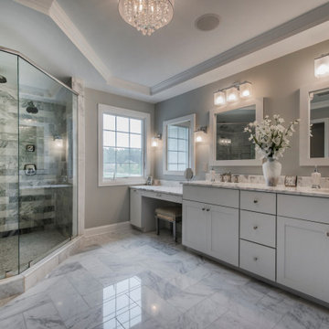
Example of a mid-sized classic master multicolored tile and ceramic tile gray floor doorless shower design in Vancouver with raised-panel cabinets, white cabinets, white walls, an undermount sink, quartzite countertops and a hinged shower door
Example of a mid-sized classic master multicolored tile and ceramic tile gray floor doorless shower design in Vancouver with raised-panel cabinets, white cabinets, white walls, an undermount sink, quartzite countertops and a hinged shower door
 Metropolis Drafting and Construction Inc
When our client bought this house, it was stuck in limbo between the traditional interior and a 90's modern structure.
The direction we took was a combination of calm beige color scheme with clean lines and smooth surfaces.
The continuation of the same materials throughout the house finally bonded all the different spaces into a singular home.
The two guest bathrooms were made with Cloe zellige style tiles and custom floating vanities made from white oak.
The same oak was used also for the built-in TV wall as floating shelves and base cabinets with a large, tiled center piece for the recessed TV and the electric fireplace.
The kitchen also received some of the white oak love in the form of the Island and the recessed cooking area.
The biggest issue with the kitchen space was the lack of proportions between the width and its length vs. the extreme height of the vaulted ceiling.
The solution I came up with was a secondary line of wall cabinets to be the same depth as the full height units to create a wrap around and make the space more proportionate.
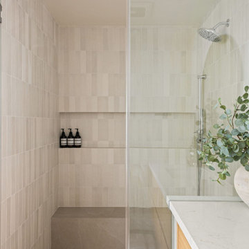
Continuing to the master bathroom, here we have a true walk-in master bath suite, no door needed with this size of space.
All the walls received porcelain semi slab treatment. (72x36 porcelain tile) a lot of work went into selecting the correct tile pieces to give it the effect of a single slab installation but without the added cost.
All fixtures are by Kohler with their fantastic modern gold finish.
The result was a perfect flow of calm beige colors and warmth of natural wood throughout.
 Metropolis Drafting and Construction Inc
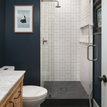
Facelift to this bathroom included removal of an internal wall that was dividing the vanity area from the toilet \ shower area. A huge shower was constructed instead (4.5' by 6.5') the vanity was slightly moved to allow enough space for a wall mounted toilet to be constructed.
1920's hand painted concrete tiles were used for the floor to give the contrast to the modern look of the toilet and shower, black hexagon tiles for the shower pan and the interior of the shampoo niche and large white subway tiles for the shower wall.
The bench and the base of the niche are done with a 1 piece of Quartz material for a sleek and clean look.
The vanity is a furniture style with storage underneath and Carrera marble on top.
All the plumbing fixtures are by Kohler with a vibrant modern gold finish.
 Metropolis Drafting and Construction Inc
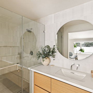
When our client bought this house, it was stuck in limbo between the traditional interior and a 90's modern structure.
The direction we took was a combination of calm beige color scheme with clean lines and smooth surfaces.
The continuation of the same materials throughout the house finally bonded all the different spaces into a singular home.
The two guest bathrooms were made with Cloe zellige style tiles and custom floating vanities made from white oak.
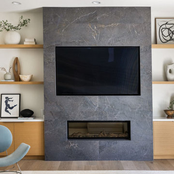
The same oak was used also for the built-in TV wall as floating shelves and base cabinets with a large, tiled center piece for the recessed TV and the electric fireplace.
The kitchen also received some of the white oak love in the form of the Island and the recessed cooking area.
The biggest issue with the kitchen space was the lack of proportions between the width and its length vs. the extreme height of the vaulted ceiling.
The solution I came up with was a secondary line of wall cabinets to be the same depth as the full height units to create a wrap around and make the space more proportionate.
Continuing to the master bathroom, here we have a true walk-in master bath suite, no door needed with this size of space.
All the walls received porcelain semi slab treatment. (72x36 porcelain tile) a lot of work went into selecting the correct tile pieces to give it the effect of a single slab installation but without the added cost.
All fixtures are by Kohler with their fantastic modern gold finish.
The result was a perfect flow of calm beige colors and warmth of natural wood throughout.
Sponsored
Sunbury, OH

J.Holderby - Renovations
Franklin County's Leading General Contractors - 2X Best of Houzz!
 Metropolis Drafting and Construction Inc
Facelift to this bathroom included removal of an internal wall that was dividing the vanity area from the toilet \ shower area. A huge shower was constructed instead (4.5' by 6.5') the vanity was slightly moved to allow enough space for a wall mounted toilet to be constructed.
1920's hand painted concrete tiles were used for the floor to give the contrast to the modern look of the toilet and shower, black hexagon tiles for the shower pan and the interior of the shampoo niche and large white subway tiles for the shower wall.
The bench and the base of the niche are done with a 1 piece of Quartz material for a sleek and clean look.
The vanity is a furniture style with storage underneath and Carrera marble on top.
All the plumbing fixtures are by Kohler with a vibrant modern gold finish.
 Metropolis Drafting and Construction Inc
When our client bought this house, it was stuck in limbo between the traditional interior and a 90's modern structure.
The direction we took was a combination of calm beige color scheme with clean lines and smooth surfaces.
The continuation of the same materials throughout the house finally bonded all the different spaces into a singular home.
The two guest bathrooms were made with Cloe zellige style tiles and custom floating vanities made from white oak.
The same oak was used also for the built-in TV wall as floating shelves and base cabinets with a large, tiled center piece for the recessed TV and the electric fireplace.
The kitchen also received some of the white oak love in the form of the Island and the recessed cooking area.
The biggest issue with the kitchen space was the lack of proportions between the width and its length vs. the extreme height of the vaulted ceiling.
The solution I came up with was a secondary line of wall cabinets to be the same depth as the full height units to create a wrap around and make the space more proportionate.
Continuing to the master bathroom, here we have a true walk-in master bath suite, no door needed with this size of space.
All the walls received porcelain semi slab treatment. (72x36 porcelain tile) a lot of work went into selecting the correct tile pieces to give it the effect of a single slab installation but without the added cost.
All fixtures are by Kohler with their fantastic modern gold finish.
The result was a perfect flow of calm beige colors and warmth of natural wood throughout.
 Metropolis Drafting and Construction Inc
Contemporary interpolation to a classical bathroom.
The materials used here is Marble... yes Marble! we have gray sandblasted marble on the floor in Versailles pattern to give the bathroom floor depth and sensation of space, we used pure high grade Thasos marble cut to 18x6 too be placed in a staggered pattern (brick pattern)
Just look at that pure white marble look. To finish the edges installation of a pencil liner from same material and to add some trim a gray marble linear trim line was installed with same color pencil liner to border it.
The classical furniture vanity comes in dark gray to compliment the flooring and the top is the classical Carrara marble material.
Notice the bi-fold doors on the right, looks like a linen cabinet but it’s not.
Due to lack of space in the house (this is a small craftsman home in the hills of Glendale) we were requested to bring the laundry from the basement to the house and so we did. Those bi-fold doors you are looking at are hiding the stackable washer and dryer.
To finish everything off all the fixtures are in a great Kohler vibrant polished nickel finish.
 Metropolis Drafting and Construction Inc
When our client bought this house, it was stuck in limbo between the traditional interior and a 90's modern structure.
The direction we took was a combination of calm beige color scheme with clean lines and smooth surfaces.
The continuation of the same materials throughout the house finally bonded all the different spaces into a singular home.
The two guest bathrooms were made with Cloe zellige style tiles and custom floating vanities made from white oak.
The same oak was used also for the built-in TV wall as floating shelves and base cabinets with a large, tiled center piece for the recessed TV and the electric fireplace.
The kitchen also received some of the white oak love in the form of the Island and the recessed cooking area.
The biggest issue with the kitchen space was the lack of proportions between the width and its length vs. the extreme height of the vaulted ceiling.
The solution I came up with was a secondary line of wall cabinets to be the same depth as the full height units to create a wrap around and make the space more proportionate.
Continuing to the master bathroom, here we have a true walk-in master bath suite, no door needed with this size of space.
All the walls received porcelain semi slab treatment. (72x36 porcelain tile) a lot of work went into selecting the correct tile pieces to give it the effect of a single slab installation but without the added cost.
All fixtures are by Kohler with their fantastic modern gold finish.
The result was a perfect flow of calm beige colors and warmth of natural wood throughout.
Sponsored
Delaware, OH

Buckeye Basements, Inc.
Central Ohio's Basement Finishing ExpertsBest Of Houzz '13-'21
 Metropolis Drafting and Construction Inc
When our client bought this house, it was stuck in limbo between the traditional interior and a 90's modern structure.
The direction we took was a combination of calm beige color scheme with clean lines and smooth surfaces.
The continuation of the same materials throughout the house finally bonded all the different spaces into a singular home.
The two guest bathrooms were made with Cloe zellige style tiles and custom floating vanities made from white oak.
The same oak was used also for the built-in TV wall as floating shelves and base cabinets with a large, tiled center piece for the recessed TV and the electric fireplace.
The kitchen also received some of the white oak love in the form of the Island and the recessed cooking area.
The biggest issue with the kitchen space was the lack of proportions between the width and its length vs. the extreme height of the vaulted ceiling.
The solution I came up with was a secondary line of wall cabinets to be the same depth as the full height units to create a wrap around and make the space more proportionate.
Continuing to the master bathroom, here we have a true walk-in master bath suite, no door needed with this size of space.
All the walls received porcelain semi slab treatment. (72x36 porcelain tile) a lot of work went into selecting the correct tile pieces to give it the effect of a single slab installation but without the added cost.
All fixtures are by Kohler with their fantastic modern gold finish.
The result was a perfect flow of calm beige colors and warmth of natural wood throughout.

 ZeroEnergy Design
This modern green home offers both a vacation destination on Cape Cod near local family members and an opportunity for rental income.
FAMILY ROOTS. A West Coast couple living in the San Francisco Bay Area sought a permanent East Coast vacation home near family members living on Cape Cod. As academic professionals focused on sustainability, they sought a green, energy efficient home that was well-aligned with their values. With no green homes available for sale on Cape Cod, they decided to purchase land near their family and build their own.
SLOPED SITE. Comprised of a 3/4 acre lot nestled in the pines, the steeply sloping terrain called for a plan that embraced and took advantage of the slope. Of equal priority was optimizing solar exposure, preserving privacy from abutters, and creating outdoor living space. The design accomplished these goals with a simple, rectilinear form, offering living space on the both entry and lower/basement levels. The stepped foundation allows for a walk-out basement level with light-filled living space on the down-hill side of the home. The traditional basement on the eastern, up-hill side houses mechanical equipment and a home gym. The house welcomes natural light throughout, captures views of the forest, and delivers entertainment space that connects indoor living space to outdoor deck and dining patio.
MODERN VISION. The clean building form and uncomplicated finishes pay homage to the modern architectural legacy on the outer Cape. Durable and economical fiber cement panels, fixed with aluminum channels, clad the primary form. Cedar clapboards provide a visual accent at the south-facing living room, which extends a single roof plane to cover the entry porch.
SMART USE OF SPACE. On the entry level, the “L”-shaped living, dining, and kitchen space connects to the exterior living, dining, and grilling spaces to effectively double the home’s summertime entertainment area. Placed at the western end of the entry level (where it can retain privacy but still claim expansive downhill views) is the master suite with a built-in study. The lower level has two guest bedrooms, a second full bathroom, and laundry. The flexibility of the space—crucial in a house with a modest footprint—emerges in one of the guest bedrooms, which doubles as home office by opening the barn-style double doors to connect it to the bright, airy open stair leading up to the entry level. Thoughtful design, generous ceiling heights and large windows transform the modest 1,100 sf* footprint into a well-lit, spacious home. *(total finished space is 1800 sf)
RENTAL INCOME. The property works for its owners by netting rental income when the owners are home in San Francisco. The house especially caters to vacationers bound for nearby Mayo Beach and includes an outdoor shower adjacent to the lower level entry door. In contrast to the bare bones cottages that are typically available on the Cape, this home offers prospective tenants a modern aesthetic, paired with luxurious and green features. Durable finishes inside and out will ensure longevity with the heavier use that comes with a rental property.
COMFORT YEAR-ROUND. The home is super-insulated and air-tight, with mechanical ventilation to provide continuous fresh air from the outside. High performance triple-paned windows complement the building enclosure and maximize passive solar gain while ensuring a warm, draft-free winter, even when sitting close to the glass. A properly sized air source heat pump offers efficient heating & cooling, and includes a carefully designed the duct distribution system to provide even comfort throughout the house. The super-insulated envelope allows us to significantly reduce the equipment capacity, duct size, and airflow quantities, while maintaining unparalleled thermal comfort.
ENERGY EFFICIENT. The building’s shell and mechanical systems play instrumental roles in the home’s exceptional performance. The building enclosure reduces the most significant energy glutton: heating. Continuous super-insulation, thorough air sealing, triple-pane windows, and passive solar gain work together to yield a miniscule heating load. All active energy consumers are extremely efficient: an air source heat pump for heating and cooling, a heat pump hot water heater, LED lighting, energy recovery ventilation (ERV), and high efficiency appliances. The result is a home that uses 70% less energy than a similar new home built to code requirements.
OVERALL. The home embodies the owners’ goals and values while comprehensively enabling thermal comfort, energy efficiency, a vacation respite, and supplementary income.
PROJECT TEAM
ZeroEnergy Design - Architect & Mechanical Designer
A.F. Hultin & Co. - Contractor
Pamet Valley Landscape Design - Landscape & Masonry
Lisa Finch - Original Artwork
European Architectural Supply - Windows
Eric Roth Photography - Photography
 Metropolis Drafting and Construction Inc
If the exterior of a house is its face the interior is its heart.
The house designed in the hacienda style was missing the matching interior.
We created a wonderful combination of Spanish color scheme and materials with amazing distressed wood rustic vanity and wrought iron fixtures.
The floors are made of 4 different sized chiseled edge travertine and the wall tiles are 4"x8" travertine subway tiles.
A full sized exterior shower system made out of copper is installed out the exterior of the tile to act as a center piece for the shower.
The huge double sink reclaimed wood vanity with matching mirrors and light fixtures are there to provide the "old world" look and feel.
Notice there is no dam for the shower pan, the shower is a step down, by that design you eliminate the need for the nuisance of having a step up acting as a dam.
Photography: R / G Photography
86