
Search results for "Master process" in Home Design Ideas
 Tom Brzoskwinia
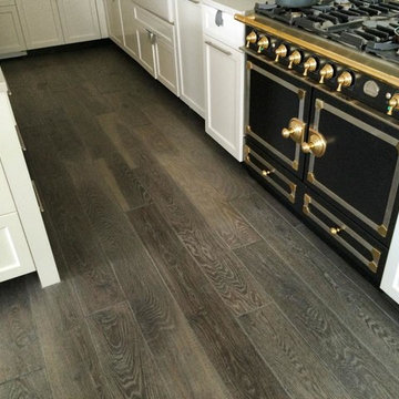
One of the most popular hardwood floor finishing which offers Tom & Peter Flooring is provided by WOCA. If you’ve decided that you want a natural looking wooden floor that is lacquer-free, then the likelihood is that you’ve chosen oil as your way of protecting your wood and making your floor look great at the same time. WOCA for wood flooring comes in various forms and is a great way of making sure that your wood is protected, but at the same time looks natural. A highly popular as well as effective way of treating wood floors, oils effectively penetrate into the wood and in some cases harden into the surface of the floor to stop damage and to maintain the wood in its optimum condition.
WOCA Oil finish hardwood flooring has taken the United States market by in 2014 and shows no signs of slowing down in 2016 and now. Here are some of the most common questions we have regarding this type of finish which we will I’m to answer in today’s my blog:
Is oil finish as durable as traditional factory urethane finishes with aluminum oxide?
When it comes to durability, oil finish flooring tackles the issue with a completely different method. The penetrating oil serves as protection from moisture and wear while allowing the user to feel the wood grains in their bare feet. If compared directly to factory finished aluminum oxide finish, the oil finish flooring will not perform as well to abrasion and impact. However, the beauty of this finish is the fact that it will camouflage any scratches which will inevitably accumulate over time.
Will this finish evaporate over time and will this be harmful for indoor air quality?
Another concern for oil finished floors its effect on indoor air quality. For on-site applications, some varieties suggest several coats which typically require the residents to be out of the home due to mild odors. However, there are factory finished UV-cured or single coat applications which lessen the downtime. Despite the odors produced during the drying process, oil finish floors rank amongst the lowest for VOC (volatile organic compound) emissions. Certain brands even boast true zero VOC. This fact alone makes oil finished floors one of the best options for green building solutions.
“WOCA products are certified by independent laboratories, the German Institute for Biological Building Materials, and are in accordance with DIN–Norm 53–160. WOCA WoodCare Denmark products meet or exceed the most stringent U.S. standards for volatile organic compounds.” –WOCA Oil Finish Manufacture
Does this type of finish require additional maintenance which I am not familiar with?
For weekly cleaning, oiled floors use a special cleaner which contains an oil and soap mixture. After a period of 12-18 months some oil may evaporate causing the wood grains to appear dry. An additional layer of oil can be reapplied to keep the floor looking fresh. Although oil finished floors require more involvement in periodic maintenance in high traffic areas, this maintenance can be done much easier than the equivalent of an onsite sand and refinish.
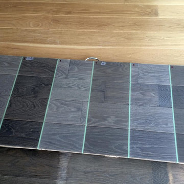
WOCA Master Color Oil contains pigment, which provides a single-step hardwood floor staining process. Laying down the stain and the finish in one step.
This product comes 14 different colors, from Black to Extra White, and you can mix them freely to create various color palettes that will meet the demands of any job.
Below are some pictures of the finished job…
 Aloha Kitchen, Bath & Design
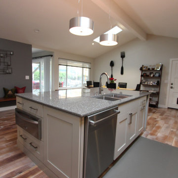
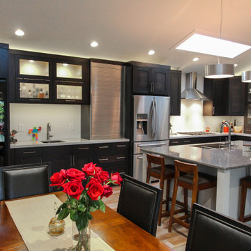
California modern rancher. Blend of warm and cool tones and material balance this space. Outdoor environment is low water use and drought resistant but still has greenery and inviting to hang out.
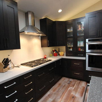
In the kitchen we removed the walls that made up the tiny closet of a kitchen that was in the corner under the skylight and was able to hide the ceiling height differences at the small desk area and oven cabinets and keep the skylight. The effect is a wide-open concept with the least amount of construction possible.
For the kitchen layout, we created a cozy zone for the chef to work in the corner without any cross traffic, seating area around the outside of the island keeps guest out of the work area but still close and part of the process. The warming drawer in the island positioned for proximity to the "buffet line" at the island when entertaining. On the dining end of the kitchen there is a coffee and wine bar. Coffee bar is hidden behind the metal roll up door, and the wine and liquor bar are to the left and both share the sink in the middle, making it a functional and useful space from the morning until the evening. I like to call this bar "Start and Stop" ha-ha. Even though this space is very open and airy, it has a ton of storage including underneath the seating area at the island and the little workstation, which is open and uncluttered, has lots of storage nestled in the wall and underneath the counter and hides any CPU and wires neatly.
In the master bath, we updated all the colors and finishes in a clean modern European style with large format porcelain tiles and repurposed a small useless closet (with a window in it) to a second vanity for extra counter space and linen storage. Plus, we added storage over the toilet in the water closet and an updated door and casing into the walk-in closet with frosted glass panels so that at night the light in the closet glowing in those panels can act as a night light. (Photo credit; Kitchens of Diablo)
 Drury Design
The original idea was to update the tile floor and the tub. That’s it.
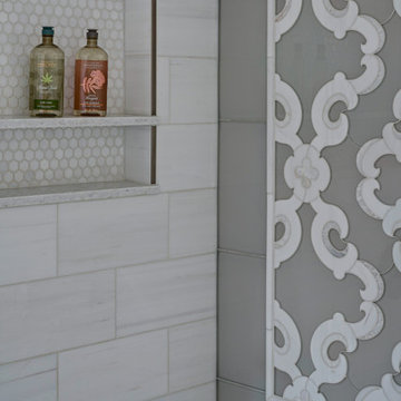
A further discussion of wants and needs revealed intentions for an eventual larger shower and an improved vanity storage. It made sense to map out the possibilities and design our update with potential next steps in mind. The process was exciting, ultimately leading to the decision to do a full primary bath remodel.
Design Objectives:
-Maintain existing locations for all major bathroom functions
-Make the shower larger and more open
-Use luxurious materials throughout
-Improve vanity storage and define accessories for specific items
-Incorporate luxury shower fixtures
-Include the latest technology
Design Challenges
-Enlarging the shower in a typical rectangular shape would block the view and light from the alcove windows behind the tub
-Logical placement of the built-in shower caddy and all shower components in accordance with how and where they were to be used
-Keeping the long, back wall free from any shower modules to maintain the decorative tile design
-Combining the owner’s existing smart home system with a comprehensive shower system
-Planning cabinetry for hidden storage and use for various small appliances and make-up
-Integrating expensive shower wall tile with less expensive wall tile for aesthetic and budget purposes
-Incorporating special design features to balance the highly decorative shower tile
Design solutions:
-A clipped corner was planned for the shower bench seat – this allowed for a larger glass wall. The glass wall at the angled bench also brought more natural light into the shower
-Thoughtful shower space design prevented the crowding of features – the shower caddy and handheld shower head were placed on the full-height wall by the shower bench, the regular shower head and body sprays remained on the opposite wall, and the rain head was placed in the center of the shower
-A multi-port DTV system was installed, providing control of all shower components, including chromotherapy and music inside and outside the shower
-The lavish water-jet stone and glass decorative tile was paired with a less-expensive glass tile found in the mosaic
-Pull-out grooming organizers and electrical docking stations were incorporated into the cabinetry
Additional storage was created in the lower corner cabinet
The homeowners are thrilled with their new primary bathroom. Clear goals and carefully evaluated materials informed a fun and functional design that is both thoughtful and sumptuous!
Find the right local pro for your project
 Tom Brzoskwinia
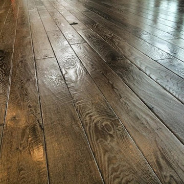
One of the most popular hardwood floor finishing which offers Tom & Peter Flooring is provided by WOCA. If you’ve decided that you want a natural looking wooden floor that is lacquer-free, then the likelihood is that you’ve chosen oil as your way of protecting your wood and making your floor look great at the same time. WOCA for wood flooring comes in various forms and is a great way of making sure that your wood is protected, but at the same time looks natural. A highly popular as well as effective way of treating wood floors, oils effectively penetrate into the wood and in some cases harden into the surface of the floor to stop damage and to maintain the wood in its optimum condition.
WOCA Oil finish hardwood flooring has taken the United States market by in 2014 and shows no signs of slowing down in 2016 and now. Here are some of the most common questions we have regarding this type of finish which we will I’m to answer in today’s my blog:
Is oil finish as durable as traditional factory urethane finishes with aluminum oxide?
When it comes to durability, oil finish flooring tackles the issue with a completely different method. The penetrating oil serves as protection from moisture and wear while allowing the user to feel the wood grains in their bare feet. If compared directly to factory finished aluminum oxide finish, the oil finish flooring will not perform as well to abrasion and impact. However, the beauty of this finish is the fact that it will camouflage any scratches which will inevitably accumulate over time.
Will this finish evaporate over time and will this be harmful for indoor air quality?
Another concern for oil finished floors its effect on indoor air quality. For on-site applications, some varieties suggest several coats which typically require the residents to be out of the home due to mild odors. However, there are factory finished UV-cured or single coat applications which lessen the downtime. Despite the odors produced during the drying process, oil finish floors rank amongst the lowest for VOC (volatile organic compound) emissions. Certain brands even boast true zero VOC. This fact alone makes oil finished floors one of the best options for green building solutions.
“WOCA products are certified by independent laboratories, the German Institute for Biological Building Materials, and are in accordance with DIN–Norm 53–160. WOCA WoodCare Denmark products meet or exceed the most stringent U.S. standards for volatile organic compounds.” –WOCA Oil Finish Manufacture
Does this type of finish require additional maintenance which I am not familiar with?
For weekly cleaning, oiled floors use a special cleaner which contains an oil and soap mixture. After a period of 12-18 months some oil may evaporate causing the wood grains to appear dry. An additional layer of oil can be reapplied to keep the floor looking fresh. Although oil finished floors require more involvement in periodic maintenance in high traffic areas, this maintenance can be done much easier than the equivalent of an onsite sand and refinish.
WOCA Master Color Oil contains pigment, which provides a single-step hardwood floor staining process. Laying down the stain and the finish in one step.
This product comes 14 different colors, from Black to Extra White, and you can mix them freely to create various color palettes that will meet the demands of any job.
Below are some pictures of the finished job…
 Aloha Kitchen, Bath & Design
California modern rancher. Blend of warm and cool tones and material balance this space. Outdoor environment is low water use and drought resistant but still has greenery and inviting to hang out.
In the kitchen we removed the walls that made up the tiny closet of a kitchen that was in the corner under the skylight and was able to hide the ceiling height differences at the small desk area and oven cabinets and keep the skylight. The effect is a wide-open concept with the least amount of construction possible.
For the kitchen layout, we created a cozy zone for the chef to work in the corner without any cross traffic, seating area around the outside of the island keeps guest out of the work area but still close and part of the process. The warming drawer in the island positioned for proximity to the "buffet line" at the island when entertaining. On the dining end of the kitchen there is a coffee and wine bar. Coffee bar is hidden behind the metal roll up door, and the wine and liquor bar are to the left and both share the sink in the middle, making it a functional and useful space from the morning until the evening. I like to call this bar "Start and Stop" ha-ha. Even though this space is very open and airy, it has a ton of storage including underneath the seating area at the island and the little workstation, which is open and uncluttered, has lots of storage nestled in the wall and underneath the counter and hides any CPU and wires neatly.
In the master bath, we updated all the colors and finishes in a clean modern European style with large format porcelain tiles and repurposed a small useless closet (with a window in it) to a second vanity for extra counter space and linen storage. Plus, we added storage over the toilet in the water closet and an updated door and casing into the walk-in closet with frosted glass panels so that at night the light in the closet glowing in those panels can act as a night light. (Photo credit; Kitchens of Diablo)

 User
This hillside home in Piedmont, CA was remodeled to change the style from a 1940's rancher with eight foot ceilings and dark interiors, into a modern geometric composition with vast white interiors for casual living and generous daylighting for displaying the artist-owner's works.
In a city known for rigorous and difficult design review, an addition, two variances, and a full stylistic change were unanimously approved on the first round. All sloped roofs and attics were eliminated and replaced by a series of stacked and overlapping flat roofs. This made the house taller on the inside and shorter on the outside, which helped earn design review cooperation in the community. Windows were concentrated toward the rear yard views or moved up high on the side walls for daylight and privacy, benefitting the owners as well as the neighbors.
At the start, the owner husband was so enthusiastic and engaged in transforming his house into something modern that he presented the architect with a scaled foamcore model, rather than the usual magazine clippings and wish list. He participated in the design decisions throughout the process. The owner wife is the artist who did all the artwork in the house. She had been craving a display space with large walls and good natural light. Both of them loved the location and great views.
The project was an opportunity to transform the style of an older traditional home into a modern one, while solving numerous problems. By rebuilding the 1800 ft2 top of the 3-story home it was possible to change the style of the whole building, since the lower floors were a neutral base, and also to change the lifestyle of the owners, who wanted to move their master suite upstairs and live primarily on the top floor as empty nesters.
Going into the project, the architect knew there were multiple encroachments into the setbacks and potential privacy issues with close by neighbors. He approached this as a complex puzzle made up of architectural and political pieces which all had to fit together elegantly. It took many careful moves, small and large, to arrive at a serene and cohesive result that tied old and new together seamlessly.
The design-build contractor worked closely with the owners and handled all of the construction phase documents and design adjustments, adding ideas of their own to make the project really sing.
The project was a collaboration in three acts. The owner had a strong design concept from the start. The architect developed it into a realistic project and garnered the design approvals. Then the contractor executed brilliantly.

 Truitt and White Window and Door Showroom
This hillside home in Piedmont, CA was remodeled to change the style from a 1940's rancher with eight foot ceilings and dark interiors, into a modern geometric composition with vast white interiors for casual living and generous daylighting for displaying the artist-owner's works.
In a city known for rigorous and difficult design review, an addition, two variances, and a full stylistic change were unanimously approved on the first round. All sloped roofs and attics were eliminated and replaced by a series of stacked and overlapping flat roofs. This made the house taller on the inside and shorter on the outside, which helped earn design review cooperation in the community. Windows were concentrated toward the rear yard views or moved up high on the side walls for daylight and privacy, benefitting the owners as well as the neighbors.
At the start, the owner husband was so enthusiastic and engaged in transforming his house into something modern that he presented the architect with a scaled foamcore model, rather than the usual magazine clippings and wish list. He participated in the design decisions throughout the process. The owner wife is the artist who did all the artwork in the house. She had been craving a display space with large walls and good natural light. Both of them loved the location and great views.
The project was an opportunity to transform the style of an older traditional home into a modern one, while solving numerous problems. By rebuilding the 1800 ft2 top of the 3-story home it was possible to change the style of the whole building, since the lower floors were a neutral base, and also to change the lifestyle of the owners, who wanted to move their master suite upstairs and live primarily on the top floor as empty nesters.
Going into the project, the architect knew there were multiple encroachments into the setbacks and potential privacy issues with close by neighbors. He approached this as a complex puzzle made up of architectural and political pieces which all had to fit together elegantly. It took many careful moves, small and large, to arrive at a serene and cohesive result that tied old and new together seamlessly.
The design-build contractor worked closely with the owners and handled all of the construction phase documents and design adjustments, adding ideas of their own to make the project really sing.
The project was a collaboration in three acts. The owner had a strong design concept from the start. The architect developed it into a realistic project and garnered the design approvals. Then the contractor executed brilliantly
Sponsored
Columbus, OH

Wannemacher Interiors
Customized Award-Winning Interior Design Solutions in Franklin Cnty OH
 Aloha Kitchen, Bath & Design
California modern rancher. Blend of warm and cool tones and material balance this space. Outdoor environment is low water use and drought resistant but still has greenery and inviting to hang out.
In the kitchen we removed the walls that made up the tiny closet of a kitchen that was in the corner under the skylight and was able to hide the ceiling height differences at the small desk area and oven cabinets and keep the skylight. The effect is a wide-open concept with the least amount of construction possible.
For the kitchen layout, we created a cozy zone for the chef to work in the corner without any cross traffic, seating area around the outside of the island keeps guest out of the work area but still close and part of the process. The warming drawer in the island positioned for proximity to the "buffet line" at the island when entertaining. On the dining end of the kitchen there is a coffee and wine bar. Coffee bar is hidden behind the metal roll up door, and the wine and liquor bar are to the left and both share the sink in the middle, making it a functional and useful space from the morning until the evening. I like to call this bar "Start and Stop" ha-ha. Even though this space is very open and airy, it has a ton of storage including underneath the seating area at the island and the little workstation, which is open and uncluttered, has lots of storage nestled in the wall and underneath the counter and hides any CPU and wires neatly.
In the master bath, we updated all the colors and finishes in a clean modern European style with large format porcelain tiles and repurposed a small useless closet (with a window in it) to a second vanity for extra counter space and linen storage. Plus, we added storage over the toilet in the water closet and an updated door and casing into the walk-in closet with frosted glass panels so that at night the light in the closet glowing in those panels can act as a night light. (Photo credit; Kitchens of Diablo)
 Tom Brzoskwinia
One of the most popular hardwood floor finishing which offers Tom & Peter Flooring is provided by WOCA. If you’ve decided that you want a natural looking wooden floor that is lacquer-free, then the likelihood is that you’ve chosen oil as your way of protecting your wood and making your floor look great at the same time. WOCA for wood flooring comes in various forms and is a great way of making sure that your wood is protected, but at the same time looks natural. A highly popular as well as effective way of treating wood floors, oils effectively penetrate into the wood and in some cases harden into the surface of the floor to stop damage and to maintain the wood in its optimum condition.
WOCA Oil finish hardwood flooring has taken the United States market by in 2014 and shows no signs of slowing down in 2016 and now. Here are some of the most common questions we have regarding this type of finish which we will I’m to answer in today’s my blog:
Is oil finish as durable as traditional factory urethane finishes with aluminum oxide?
When it comes to durability, oil finish flooring tackles the issue with a completely different method. The penetrating oil serves as protection from moisture and wear while allowing the user to feel the wood grains in their bare feet. If compared directly to factory finished aluminum oxide finish, the oil finish flooring will not perform as well to abrasion and impact. However, the beauty of this finish is the fact that it will camouflage any scratches which will inevitably accumulate over time.
Will this finish evaporate over time and will this be harmful for indoor air quality?
Another concern for oil finished floors its effect on indoor air quality. For on-site applications, some varieties suggest several coats which typically require the residents to be out of the home due to mild odors. However, there are factory finished UV-cured or single coat applications which lessen the downtime. Despite the odors produced during the drying process, oil finish floors rank amongst the lowest for VOC (volatile organic compound) emissions. Certain brands even boast true zero VOC. This fact alone makes oil finished floors one of the best options for green building solutions.
“WOCA products are certified by independent laboratories, the German Institute for Biological Building Materials, and are in accordance with DIN–Norm 53–160. WOCA WoodCare Denmark products meet or exceed the most stringent U.S. standards for volatile organic compounds.” –WOCA Oil Finish Manufacture
Does this type of finish require additional maintenance which I am not familiar with?
For weekly cleaning, oiled floors use a special cleaner which contains an oil and soap mixture. After a period of 12-18 months some oil may evaporate causing the wood grains to appear dry. An additional layer of oil can be reapplied to keep the floor looking fresh. Although oil finished floors require more involvement in periodic maintenance in high traffic areas, this maintenance can be done much easier than the equivalent of an onsite sand and refinish.
WOCA Master Color Oil contains pigment, which provides a single-step hardwood floor staining process. Laying down the stain and the finish in one step.
This product comes 14 different colors, from Black to Extra White, and you can mix them freely to create various color palettes that will meet the demands of any job.
Below are some pictures of the finished job…
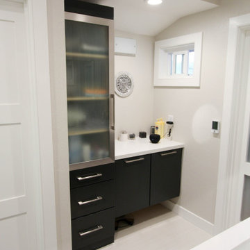 Aloha Kitchen, Bath & Design
California modern rancher. Blend of warm and cool tones and material balance this space. Outdoor environment is low water use and drought resistant but still has greenery and inviting to hang out.
In the kitchen we removed the walls that made up the tiny closet of a kitchen that was in the corner under the skylight and was able to hide the ceiling height differences at the small desk area and oven cabinets and keep the skylight. The effect is a wide-open concept with the least amount of construction possible.
For the kitchen layout, we created a cozy zone for the chef to work in the corner without any cross traffic, seating area around the outside of the island keeps guest out of the work area but still close and part of the process. The warming drawer in the island positioned for proximity to the "buffet line" at the island when entertaining. On the dining end of the kitchen there is a coffee and wine bar. Coffee bar is hidden behind the metal roll up door, and the wine and liquor bar are to the left and both share the sink in the middle, making it a functional and useful space from the morning until the evening. I like to call this bar "Start and Stop" ha-ha. Even though this space is very open and airy, it has a ton of storage including underneath the seating area at the island and the little workstation, which is open and uncluttered, has lots of storage nestled in the wall and underneath the counter and hides any CPU and wires neatly.
In the master bath, we updated all the colors and finishes in a clean modern European style with large format porcelain tiles and repurposed a small useless closet (with a window in it) to a second vanity for extra counter space and linen storage. Plus, we added storage over the toilet in the water closet and an updated door and casing into the walk-in closet with frosted glass panels so that at night the light in the closet glowing in those panels can act as a night light. (Photo credit; Kitchens of Diablo)
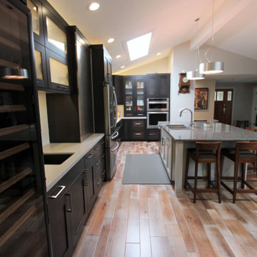 Aloha Kitchen, Bath & Design
California modern rancher. Blend of warm and cool tones and material balance this space. Outdoor environment is low water use and drought resistant but still has greenery and inviting to hang out.
In the kitchen we removed the walls that made up the tiny closet of a kitchen that was in the corner under the skylight and was able to hide the ceiling height differences at the small desk area and oven cabinets and keep the skylight. The effect is a wide-open concept with the least amount of construction possible.
For the kitchen layout, we created a cozy zone for the chef to work in the corner without any cross traffic, seating area around the outside of the island keeps guest out of the work area but still close and part of the process. The warming drawer in the island positioned for proximity to the "buffet line" at the island when entertaining. On the dining end of the kitchen there is a coffee and wine bar. Coffee bar is hidden behind the metal roll up door, and the wine and liquor bar are to the left and both share the sink in the middle, making it a functional and useful space from the morning until the evening. I like to call this bar "Start and Stop" ha-ha. Even though this space is very open and airy, it has a ton of storage including underneath the seating area at the island and the little workstation, which is open and uncluttered, has lots of storage nestled in the wall and underneath the counter and hides any CPU and wires neatly.
In the master bath, we updated all the colors and finishes in a clean modern European style with large format porcelain tiles and repurposed a small useless closet (with a window in it) to a second vanity for extra counter space and linen storage. Plus, we added storage over the toilet in the water closet and an updated door and casing into the walk-in closet with frosted glass panels so that at night the light in the closet glowing in those panels can act as a night light. (Photo credit; Kitchens of Diablo)
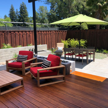 Aloha Kitchen, Bath & Design
California modern rancher. Blend of warm and cool tones and material balance this space. Outdoor environment is low water use and drought resistant but still has greenery and inviting to hang out.
In the kitchen we removed the walls that made up the tiny closet of a kitchen that was in the corner under the skylight and was able to hide the ceiling height differences at the small desk area and oven cabinets and keep the skylight. The effect is a wide-open concept with the least amount of construction possible.
For the kitchen layout, we created a cozy zone for the chef to work in the corner without any cross traffic, seating area around the outside of the island keeps guest out of the work area but still close and part of the process. The warming drawer in the island positioned for proximity to the "buffet line" at the island when entertaining. On the dining end of the kitchen there is a coffee and wine bar. Coffee bar is hidden behind the metal roll up door, and the wine and liquor bar are to the left and both share the sink in the middle, making it a functional and useful space from the morning until the evening. I like to call this bar "Start and Stop" ha-ha. Even though this space is very open and airy, it has a ton of storage including underneath the seating area at the island and the little workstation, which is open and uncluttered, has lots of storage nestled in the wall and underneath the counter and hides any CPU and wires neatly.
In the master bath, we updated all the colors and finishes in a clean modern European style with large format porcelain tiles and repurposed a small useless closet (with a window in it) to a second vanity for extra counter space and linen storage. Plus, we added storage over the toilet in the water closet and an updated door and casing into the walk-in closet with frosted glass panels so that at night the light in the closet glowing in those panels can act as a night light.
 User
This hillside home in Piedmont, CA was remodeled to change the style from a 1940's rancher with eight foot ceilings and dark interiors, into a modern geometric composition with vast white interiors for casual living and generous daylighting for displaying the artist-owner's works.
In a city known for rigorous and difficult design review, an addition, two variances, and a full stylistic change were unanimously approved on the first round. All sloped roofs and attics were eliminated and replaced by a series of stacked and overlapping flat roofs. This made the house taller on the inside and shorter on the outside, which helped earn design review cooperation in the community. Windows were concentrated toward the rear yard views or moved up high on the side walls for daylight and privacy, benefitting the owners as well as the neighbors.
At the start, the owner husband was so enthusiastic and engaged in transforming his house into something modern that he presented the architect with a scaled foamcore model, rather than the usual magazine clippings and wish list. He participated in the design decisions throughout the process. The owner wife is the artist who did all the artwork in the house. She had been craving a display space with large walls and good natural light. Both of them loved the location and great views.
The project was an opportunity to transform the style of an older traditional home into a modern one, while solving numerous problems. By rebuilding the 1800 ft2 top of the 3-story home it was possible to change the style of the whole building, since the lower floors were a neutral base, and also to change the lifestyle of the owners, who wanted to move their master suite upstairs and live primarily on the top floor as empty nesters.
Going into the project, the architect knew there were multiple encroachments into the setbacks and potential privacy issues with close by neighbors. He approached this as a complex puzzle made up of architectural and political pieces which all had to fit together elegantly. It took many careful moves, small and large, to arrive at a serene and cohesive result that tied old and new together seamlessly.
The design-build contractor worked closely with the owners and handled all of the construction phase documents and design adjustments, adding ideas of their own to make the project really sing.
The project was a collaboration in three acts. The owner had a strong design concept from the start. The architect developed it into a realistic project and garnered the design approvals. Then the contractor executed brilliantly.
Sponsored
Delaware, OH

Buckeye Basements, Inc.
Central Ohio's Basement Finishing ExpertsBest Of Houzz '13-'21
 Tom Brzoskwinia
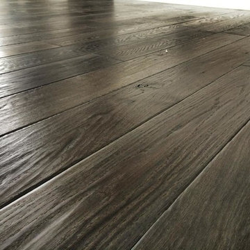
One of the most popular hardwood floor finishing which offers Tom & Peter Flooring is provided by WOCA. If you’ve decided that you want a natural looking wooden floor that is lacquer-free, then the likelihood is that you’ve chosen oil as your way of protecting your wood and making your floor look great at the same time. WOCA for wood flooring comes in various forms and is a great way of making sure that your wood is protected, but at the same time looks natural. A highly popular as well as effective way of treating wood floors, oils effectively penetrate into the wood and in some cases harden into the surface of the floor to stop damage and to maintain the wood in its optimum condition.
WOCA Oil finish hardwood flooring has taken the United States market by in 2014 and shows no signs of slowing down in 2016 and now. Here are some of the most common questions we have regarding this type of finish which we will I’m to answer in today’s my blog:
Is oil finish as durable as traditional factory urethane finishes with aluminum oxide?
When it comes to durability, oil finish flooring tackles the issue with a completely different method. The penetrating oil serves as protection from moisture and wear while allowing the user to feel the wood grains in their bare feet. If compared directly to factory finished aluminum oxide finish, the oil finish flooring will not perform as well to abrasion and impact. However, the beauty of this finish is the fact that it will camouflage any scratches which will inevitably accumulate over time.
Will this finish evaporate over time and will this be harmful for indoor air quality?
Another concern for oil finished floors its effect on indoor air quality. For on-site applications, some varieties suggest several coats which typically require the residents to be out of the home due to mild odors. However, there are factory finished UV-cured or single coat applications which lessen the downtime. Despite the odors produced during the drying process, oil finish floors rank amongst the lowest for VOC (volatile organic compound) emissions. Certain brands even boast true zero VOC. This fact alone makes oil finished floors one of the best options for green building solutions.
“WOCA products are certified by independent laboratories, the German Institute for Biological Building Materials, and are in accordance with DIN–Norm 53–160. WOCA WoodCare Denmark products meet or exceed the most stringent U.S. standards for volatile organic compounds.” –WOCA Oil Finish Manufacture
Does this type of finish require additional maintenance which I am not familiar with?
For weekly cleaning, oiled floors use a special cleaner which contains an oil and soap mixture. After a period of 12-18 months some oil may evaporate causing the wood grains to appear dry. An additional layer of oil can be reapplied to keep the floor looking fresh. Although oil finished floors require more involvement in periodic maintenance in high traffic areas, this maintenance can be done much easier than the equivalent of an onsite sand and refinish.
WOCA Master Color Oil contains pigment, which provides a single-step hardwood floor staining process. Laying down the stain and the finish in one step.
This product comes 14 different colors, from Black to Extra White, and you can mix them freely to create various color palettes that will meet the demands of any job.
Below are some pictures of the finished job…
 Drury Design
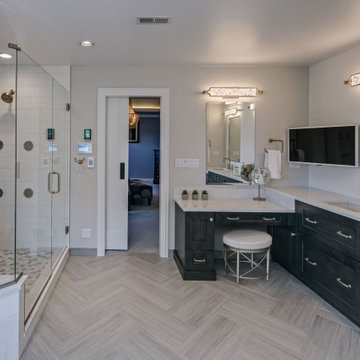
The original idea was to update the tile floor and the tub. That’s it.
A further discussion of wants and needs revealed intentions for an eventual larger shower and an improved vanity storage. It made sense to map out the possibilities and design our update with potential next steps in mind. The process was exciting, ultimately leading to the decision to do a full primary bath remodel.
Design Objectives:
-Maintain existing locations for all major bathroom functions
-Make the shower larger and more open
-Use luxurious materials throughout
-Improve vanity storage and define accessories for specific items
-Incorporate luxury shower fixtures
-Include the latest technology
Design Challenges
-Enlarging the shower in a typical rectangular shape would block the view and light from the alcove windows behind the tub
-Logical placement of the built-in shower caddy and all shower components in accordance with how and where they were to be used
-Keeping the long, back wall free from any shower modules to maintain the decorative tile design
-Combining the owner’s existing smart home system with a comprehensive shower system
-Planning cabinetry for hidden storage and use for various small appliances and make-up
-Integrating expensive shower wall tile with less expensive wall tile for aesthetic and budget purposes
-Incorporating special design features to balance the highly decorative shower tile
Design solutions:
-A clipped corner was planned for the shower bench seat – this allowed for a larger glass wall. The glass wall at the angled bench also brought more natural light into the shower
-Thoughtful shower space design prevented the crowding of features – the shower caddy and handheld shower head were placed on the full-height wall by the shower bench, the regular shower head and body sprays remained on the opposite wall, and the rain head was placed in the center of the shower
-A multi-port DTV system was installed, providing control of all shower components, including chromotherapy and music inside and outside the shower
-The lavish water-jet stone and glass decorative tile was paired with a less-expensive glass tile found in the mosaic
-Pull-out grooming organizers and electrical docking stations were incorporated into the cabinetry
Additional storage was created in the lower corner cabinet
The homeowners are thrilled with their new primary bathroom. Clear goals and carefully evaluated materials informed a fun and functional design that is both thoughtful and sumptuous!
 Aloha Kitchen, Bath & Design
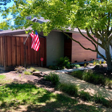
California modern rancher. Blend of warm and cool tones and material balance this space. Outdoor environment is low water use and drought resistant but still has greenery and inviting to hang out.
In the kitchen we removed the walls that made up the tiny closet of a kitchen that was in the corner under the skylight and was able to hide the ceiling height differences at the small desk area and oven cabinets and keep the skylight. The effect is a wide-open concept with the least amount of construction possible.
For the kitchen layout, we created a cozy zone for the chef to work in the corner without any cross traffic, seating area around the outside of the island keeps guest out of the work area but still close and part of the process. The warming drawer in the island positioned for proximity to the "buffet line" at the island when entertaining. On the dining end of the kitchen there is a coffee and wine bar. Coffee bar is hidden behind the metal roll up door, and the wine and liquor bar are to the left and both share the sink in the middle, making it a functional and useful space from the morning until the evening. I like to call this bar "Start and Stop" ha-ha. Even though this space is very open and airy, it has a ton of storage including underneath the seating area at the island and the little workstation, which is open and uncluttered, has lots of storage nestled in the wall and underneath the counter and hides any CPU and wires neatly.
In the master bath, we updated all the colors and finishes in a clean modern European style with large format porcelain tiles and repurposed a small useless closet (with a window in it) to a second vanity for extra counter space and linen storage. Plus, we added storage over the toilet in the water closet and an updated door and casing into the walk-in closet with frosted glass panels so that at night the light in the closet glowing in those panels can act as a night light.

 Ronnette Riley Architect
This 10,000 sf townhouse sits on one of Manhattan’s most beautiful Upper East Side streets and so the goal of the project was to return the house to its original grandeur. Previously a Kips Bay designer showcase house, the rooms were each designed in a differing style and therefore the lack of cohesion and flow made the house seem choppy. In addition, much of the interior was superficial in the sense that plumbing fixtures were not all connected, walls were “false walls” built in front of existing and much of the construction had to be rebuilt.
The scope included creating a large gourmet kitchen in the rear of the ground floor by closing off the winding corridor and creating a new door opening centered on the main entry hall with a paneled arched pocket door mimicking the original detailing of the parlor floor. The kitchen has a Calacatta Gold stone center island and dinning area flanked by counters that run the length of the east and west walls with glass front upper cabinets. A built-in buffet on the south wall anchors the space. A mud room, with access to the delivery entrance and additional storage space was added off the kitchen. A new slim profile steel and glass French door provides access to a new steel rear deck and stairs to the rear yard. On the second floor, a new tile floor was added throughout and RRA designed new stone mantle pieces fabricated from England in the living and dining rooms.
On the 3rd floor, a new wall was constructed in the 11’ wide central hallway to allow a new 135 sf master closet with custom designed built-in storage units and accessories. This concept was carried through to the 4th floor on a smaller scale and 4 new storage closets were added in the hallway. The existing bathroom on the 4th Floor was gutted and redesigned including a new 5’x5’ extra deep soaking tub and new fixtures. Silver travertine tiles were used throughout to give the room a durable, waterproof finish while also providing a warm, luxurious feel.
The 5th floor was converted into a playroom and TV room for the family’s two young children and was outfitted with chalkboard paint along the entire east wall in the play area and a bold color block wall treatment in the TV room. A new cork floor was installed for durability and resilience to lots of activity yet providing a soft and sustainable floor treatment for its intended user. A full laundry room was also created floor with new cabinetry, plumbing, and floor and wall tile. Additionally, 3 full baths and a powder room were refitted with tumbled travertine tiles on the top two floors. The exterior of the building was refurbished and new lighting and painted doors and frames were installed in accordance with Landmark designation. An additional challenge on the project was that a previously built extension on the PH level was illegally overbuilt and the property had received a violation. A 9 month process of filing drawings, completing zoning analyses and meetings with the DOB Commissioners ensued to get the extension approved allowing us to obtain a permit for the remainder of the work and complete the Certificate of Occupancy.
In spite of the complex process and scattered program, the completed townhouse has a cohesive aesthetic throughout, with upgraded amenities befitting this grand representation of elite New York living.
Sponsored
Columbus, OH
Wannemacher Interiors
Customized Award-Winning Interior Design Solutions in Franklin Cnty OH

 Design Vision Studio
James Latta Photography -
As an interior designer, I liked my home but was not "in love" with it. I didn't feel in sync with the style and architecture despite compliments from friends and family. It was time for a change. I sold my Floating Home (see Sleepless in Portland: Houseboat Diary) and my La Quinta home (see Transitional Living, La Quinta) and downsized to a house that's a better fit.
The home was lacking sufficient storage so I added a beverage center with storage cabinets and a butcher block countertop to the dining room. An Ikea table frame was powder coated in dark grey and fitted with a Cambria Quartz dining top. A matching quartz piece was added to create a kitchen bar seating area and includes a beautiful waterfall edge. Reclaimed wood square tiles were added to the kitchen pop up ceiling and the living room fireplace to add warmth and texture. Black and white photography of the local desert landscape frame the fireplace. Although the home is mainly grey, black and white, pops of red are a recurring theme thought the interior and exterior, including a red barn door at the kitchen pantry.
I broke design rules and didnt take the "safe" route. Quirky accent items can be found throughout the home. These include a wall-mounted family accordion, framed movie quotes in one of the guest rooms, a custom canvas photo of my miniature schnauzer, and dragon print accent pillows throughout. A Tongue and Groove (T&G) wood ceiling transformed the master bedroom and a beautiful red area rug adds color and warmth. The result is DARING and yet comfortable.
The backyard was completely renovated. Tons of white rock were removed and beautiful landscaping and lighting were added as well as an additional 500 square feet of pavers. A sun shade, red umbrellas, and patio misters create inviting seating areas for friends and family. Tongue and Groove wood was also added to the outdoor patio ceilings. A high end surround sound system and built in BBQ with patterned cement tiles complete this outdoor living space.
The process was exhausting and time consuming but now that it is over, I am thrilled with the results.
I now live in a home that nourishes my soul and better represents my style and tastes.
 User
This hillside home in Piedmont, CA was remodeled to change the style from a 1940's rancher with eight foot ceilings and dark interiors, into a modern geometric composition with vast white interiors for casual living and generous daylighting for displaying the artist-owner's works.
In a city known for rigorous and difficult design review, an addition, two variances, and a full stylistic change were unanimously approved on the first round. All sloped roofs and attics were eliminated and replaced by a series of stacked and overlapping flat roofs. This made the house taller on the inside and shorter on the outside, which helped earn design review cooperation in the community. Windows were concentrated toward the rear yard views or moved up high on the side walls for daylight and privacy, benefitting the owners as well as the neighbors.
At the start, the owner husband was so enthusiastic and engaged in transforming his house into something modern that he presented the architect with a scaled foamcore model, rather than the usual magazine clippings and wish list. He participated in the design decisions throughout the process. The owner wife is the artist who did all the artwork in the house. She had been craving a display space with large walls and good natural light. Both of them loved the location and great views.
The project was an opportunity to transform the style of an older traditional home into a modern one, while solving numerous problems. By rebuilding the 1800 ft2 top of the 3-story home it was possible to change the style of the whole building, since the lower floors were a neutral base, and also to change the lifestyle of the owners, who wanted to move their master suite upstairs and live primarily on the top floor as empty nesters.
Going into the project, the architect knew there were multiple encroachments into the setbacks and potential privacy issues with close by neighbors. He approached this as a complex puzzle made up of architectural and political pieces which all had to fit together elegantly. It took many careful moves, small and large, to arrive at a serene and cohesive result that tied old and new together seamlessly.
The design-build contractor worked closely with the owners and handled all of the construction phase documents and design adjustments, adding ideas of their own to make the project really sing.
The project was a collaboration in three acts. The owner had a strong design concept from the start. The architect developed it into a realistic project and garnered the design approvals. Then the contractor executed brilliantly.
 User
This hillside home in Piedmont, CA was remodeled to change the style from a 1940's rancher with eight foot ceilings and dark interiors, into a modern geometric composition with vast white interiors for casual living and generous daylighting for displaying the artist-owner's works.
In a city known for rigorous and difficult design review, an addition, two variances, and a full stylistic change were unanimously approved on the first round. All sloped roofs and attics were eliminated and replaced by a series of stacked and overlapping flat roofs. This made the house taller on the inside and shorter on the outside, which helped earn design review cooperation in the community. Windows were concentrated toward the rear yard views or moved up high on the side walls for daylight and privacy, benefitting the owners as well as the neighbors.
At the start, the owner husband was so enthusiastic and engaged in transforming his house into something modern that he presented the architect with a scaled foamcore model, rather than the usual magazine clippings and wish list. He participated in the design decisions throughout the process. The owner wife is the artist who did all the artwork in the house. She had been craving a display space with large walls and good natural light. Both of them loved the location and great views.
The project was an opportunity to transform the style of an older traditional home into a modern one, while solving numerous problems. By rebuilding the 1800 ft2 top of the 3-story home it was possible to change the style of the whole building, since the lower floors were a neutral base, and also to change the lifestyle of the owners, who wanted to move their master suite upstairs and live primarily on the top floor as empty nesters.
Going into the project, the architect knew there were multiple encroachments into the setbacks and potential privacy issues with close by neighbors. He approached this as a complex puzzle made up of architectural and political pieces which all had to fit together elegantly. It took many careful moves, small and large, to arrive at a serene and cohesive result that tied old and new together seamlessly.
The design-build contractor worked closely with the owners and handled all of the construction phase documents and design adjustments, adding ideas of their own to make the project really sing.
The project was a collaboration in three acts. The owner had a strong design concept from the start. The architect developed it into a realistic project and garnered the design approvals. Then the contractor executed brilliantly.
161