
Search results for "Mindset" in Home Design Ideas
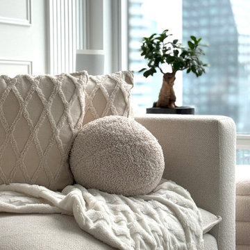
 Paradox Interior Design Inc.
Challenge: Our client needed their downtown Toronto condo to serve as a peaceful retreat from the demanding pace of urban professional life. The space suffered from the sterile, impersonal aesthetic typical of many Toronto condos, lacking the warmth and tranquility needed to truly unwind after busy workdays in the city's core.
Solution: We approached this project in thoughtful stages, transforming the condo into a serene sanctuary that promotes relaxation and rejuvenation. By incorporating a palette of light, calming colors and introducing rich textural elements throughout the space, we elevated the sterile interior into a sophisticated retreat. Each design decision was made with the goal of creating visual and tactile interest that would engage the senses and promote a sense of calm.
Highlights: • Staged design approach that allowed for thoughtful evolution of the space • Light color palette that enhances natural light and creates an airy, peaceful atmosphere • Rich variety of textures that add warmth and visual interest to combat sterile condo interiors • Strategic material selection that transforms typical condo finishes into sophisticated design elements
Results: The transformed Downtown Zen condo now serves as the perfect urban escape—a space that immediately shifts the client's mindset from work mode to relaxation. This project demonstrates how thoughtful design can overcome the limitations of typical Toronto condo interiors, creating a personalized sanctuary that enhances daily life and well-being.

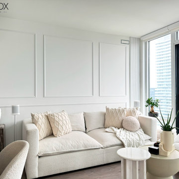 Paradox Interior Design Inc.
Challenge: Our client needed their downtown Toronto condo to serve as a peaceful retreat from the demanding pace of urban professional life. The space suffered from the sterile, impersonal aesthetic typical of many Toronto condos, lacking the warmth and tranquility needed to truly unwind after busy workdays in the city's core.
Solution: We approached this project in thoughtful stages, transforming the condo into a serene sanctuary that promotes relaxation and rejuvenation. By incorporating a palette of light, calming colors and introducing rich textural elements throughout the space, we elevated the sterile interior into a sophisticated retreat. Each design decision was made with the goal of creating visual and tactile interest that would engage the senses and promote a sense of calm.
Highlights: • Staged design approach that allowed for thoughtful evolution of the space • Light color palette that enhances natural light and creates an airy, peaceful atmosphere • Rich variety of textures that add warmth and visual interest to combat sterile condo interiors • Strategic material selection that transforms typical condo finishes into sophisticated design elements
Results: The transformed Downtown Zen condo now serves as the perfect urban escape—a space that immediately shifts the client's mindset from work mode to relaxation. This project demonstrates how thoughtful design can overcome the limitations of typical Toronto condo interiors, creating a personalized sanctuary that enhances daily life and well-being.
Find the right local pro for your project
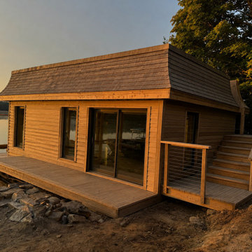
 MVS Construction
This custom lakeside cabin was built from the ground up with precision and attention to every detail. The structure features cedar lap siding, a hand-laid cedar shake roof, and oversized sliding glass doors that open the interior to panoramic water views.
The wrap-around deck extends the living space outdoors, with clean cable railings that keep sightlines unobstructed. A dedicated staircase with matching cedar and cable rail connects the upper grade to the waterfront level.
Every cut, joint, and transition on this project was handled with the finish carpentry mindset that defines our work — because the details are what separate a build that looks good from one that feels right.
Keywords: lakeside cabin, cedar siding, cedar shake roof, custom cabin build, waterfront construction, wrap-around deck, cable railing, sliding glass doors, finish carpentry, lakefront property, outdoor living, deck builder, custom woodwork, lake house, boathouse, Connecticut contractor, New Fairfield CT, Lake Candlewood, rustic modern cabin, cedar deck
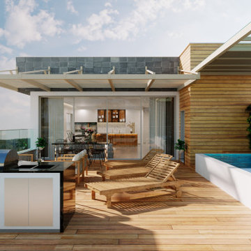
 Ferriss - Architectural Renderings
Why do you need 3D visualization of the project?
3D visualization is a photorealistic image of the future home, made in special graphic editors. Not every customer has a 3D mindset. And thanks to realistic visualizations, the client can see his house as it really will be.
Visualization helps to capture the volume, taking into account all the stylistic selections, finishing materials, fabrics and decor.
Who else, besides the customer, needs 3D visualization?
Visualization is also important for builders. This helps them understand what the final should look like after the project is completed. High-quality 3D visualization displays texture, color, texture, which greatly facilitates the elaboration of details.
Does this help to eliminate errors?
Yes, it helps.
At the design stage, certain interior items and decor fit into the space of the room. It is very important to take into account the dimensions and enter the parts correctly and ergonomically. Flat drawings, unlike 3D, often do not allow you to feel the true scale of furniture.
Ferriss develops designs of any complexity, contact us and we will help you make all your dreams come true.
https://www.ferriss.co/
Join to our telegram channel - https://lnkd.in/dZam-YY
 Donald Lococo Architects
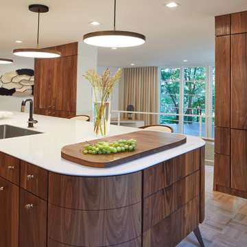
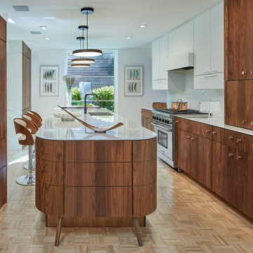
The kitchen was designed two years ago and was then erased and redesigned when the world became a different place a year later. As everyone attempted to flatten the curve, our goal in this regard was to create a kitchen that looked forward to a sharp curve down and of a happier time To that promise for happier times, the redesign, a goal was to make the kitchen brighter and more optimistic. This was done by using simple, primary shapes and circular pendants and emphasizing them in contrast, adding a playful countenance. The selection of a dynamic grain of figured walnut also contributes as this once-living material and its sinuous grain adds motion, rhythm, and scale.
Proud of their 1970s home, one challenge of the design was to balance a 1970's feel and stay current. However, many ‘70s references looked and felt outdated. The first step was a changed mindset. Just like the return of the ‘40s bath and the retro movement a few years ago, every era returns in some way. Chronologically, the '70s will soon be here. Our design looked to era-specific furniture and materials of the decade. Figured walnut was so pervasive in the era: this motif was used on car exteriors such as the 1970 Town and Country Station Wagon, which debuted the same year the existing home was built. We also looked at furniture specific to the decade. The console stereo is referenced not only by high legs on the island but also by the knurled metal cabinet knobs reminiscent of often-used stereo dials. Knurled metalwork is also used on the kitchen faucet. The design references the second piece of '70s furniture in our modern TV tray, which is angled to face the television in the family room. Its round pencil and mug holder cutouts follow the design of walnut consoles and dashboard of the station wagon and other elements of the time.
 Jack Calderone
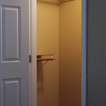
This bedroom and full bathroom are part of an adventuresome project my wife and I embarked upon to create a complete apartment in the basement of our townhouse. We designed a floor plan that creatively and efficiently used all of the 385-square-foot-space, without sacrificing beauty, comfort or function – and all without breaking the bank! To maximize our budget, we did the work ourselves and added everything from thrift store finds to DIY wall art to bring it all together.
A partial double closet bar adds a little extra space while still leaving room for longer hanging clothes.

 Donald Lococo Architects
The kitchen was designed two years ago and was then erased and redesigned when the world became a different place a year later. As everyone attempted to flatten the curve, our goal in this regard was to create a kitchen that looked forward to a sharp curve down and of a happier time To that promise for happier times, the redesign, a goal was to make the kitchen brighter and more optimistic. This was done by using simple, primary shapes and circular pendants and emphasizing them in contrast, adding a playful countenance. The selection of a dynamic grain of figured walnut also contributes as this once-living material and its sinuous grain adds motion, rhythm, and scale.
Proud of their 1970s home, one challenge of the design was to balance a 1970's feel and stay current. However, many ‘70s references looked and felt outdated. The first step was a changed mindset. Just like the return of the ‘40s bath and the retro movement a few years ago, every era returns in some way. Chronologically, the '70s will soon be here. Our design looked to era-specific furniture and materials of the decade. Figured walnut was so pervasive in the era: this motif was used on car exteriors such as the 1970 Town and Country Station Wagon, which debuted the same year the existing home was built. We also looked at furniture specific to the decade. The console stereo is referenced not only by high legs on the island but also by the knurled metal cabinet knobs reminiscent of often-used stereo dials. Knurled metalwork is also used on the kitchen faucet. The design references the second piece of '70s furniture in our modern TV tray, which is angled to face the television in the family room. Its round pencil and mug holder cutouts follow the design of walnut consoles and dashboard of the station wagon and other elements of the time.
 Davis Home Pros
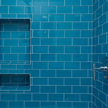
Inspiration for a mid-sized 1960s 3/4 blue tile and subway tile home design remodel in San Francisco with shaker cabinets, medium tone wood cabinets, a two-piece toilet, white walls, an undermount sink and quartz countertops

 Donald Lococo Architects
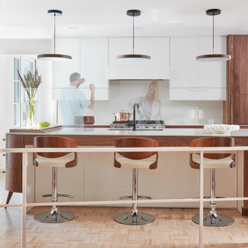
The kitchen was designed two years ago and was then erased and redesigned when the world became a different place a year later. As everyone attempted to flatten the curve, our goal in this regard was to create a kitchen that looked forward to a sharp curve down and of a happier time To that promise for happier times, the redesign, a goal was to make the kitchen brighter and more optimistic. This was done by using simple, primary shapes and circular pendants and emphasizing them in contrast, adding a playful countenance. The selection of a dynamic grain of figured walnut also contributes as this once-living material and its sinuous grain adds motion, rhythm, and scale.
Proud of their 1970s home, one challenge of the design was to balance a 1970's feel and stay current. However, many ‘70s references looked and felt outdated. The first step was a changed mindset. Just like the return of the ‘40s bath and the retro movement a few years ago, every era returns in some way. Chronologically, the '70s will soon be here. Our design looked to era-specific furniture and materials of the decade. Figured walnut was so pervasive in the era: this motif was used on car exteriors such as the 1970 Town and Country Station Wagon, which debuted the same year the existing home was built. We also looked at furniture specific to the decade. The console stereo is referenced not only by high legs on the island but also by the knurled metal cabinet knobs reminiscent of often-used stereo dials. Knurled metalwork is also used on the kitchen faucet. The design references the second piece of '70s furniture in our modern TV tray, which is angled to face the television in the family room. Its round pencil and mug holder cutouts follow the design of walnut consoles and dashboard of the station wagon and other elements of the time.
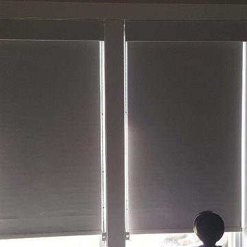
 Budget Blinds of Cedar Falls / Waterloo, IA
Budget Blinds blackout roller shades, photo credit installer Adam Brannick
Example of a mid-sized transitional guest bedroom design in Cedar Rapids with gray walls and no fireplace
Example of a mid-sized transitional guest bedroom design in Cedar Rapids with gray walls and no fireplace
 Donald Lococo Architects
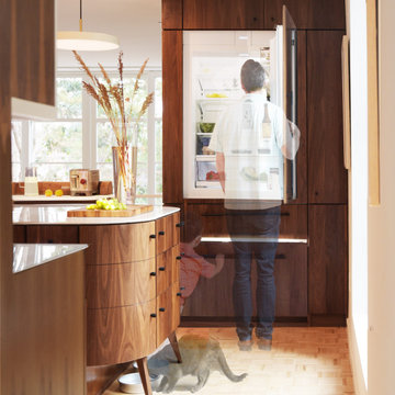
The kitchen was designed two years ago and was then erased and redesigned when the world became a different place a year later. As everyone attempted to flatten the curve, our goal in this regard was to create a kitchen that looked forward to a sharp curve down and of a happier time To that promise for happier times, the redesign, a goal was to make the kitchen brighter and more optimistic. This was done by using simple, primary shapes and circular pendants and emphasizing them in contrast, adding a playful countenance. The selection of a dynamic grain of figured walnut also contributes as this once-living material and its sinuous grain adds motion, rhythm, and scale.
Proud of their 1970s home, one challenge of the design was to balance a 1970's feel and stay current. However, many ‘70s references looked and felt outdated. The first step was a changed mindset. Just like the return of the ‘40s bath and the retro movement a few years ago, every era returns in some way. Chronologically, the '70s will soon be here. Our design looked to era-specific furniture and materials of the decade. Figured walnut was so pervasive in the era: this motif was used on car exteriors such as the 1970 Town and Country Station Wagon, which debuted the same year the existing home was built. We also looked at furniture specific to the decade. The console stereo is referenced not only by high legs on the island but also by the knurled metal cabinet knobs reminiscent of often-used stereo dials. Knurled metalwork is also used on the kitchen faucet. The design references the second piece of '70s furniture in our modern TV tray, which is angled to face the television in the family room. Its round pencil and mug holder cutouts follow the design of walnut consoles and dashboard of the station wagon and other elements of the time.
 Donald Lococo Architects
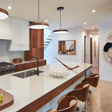
The kitchen was designed two years ago and was then erased and redesigned when the world became a different place a year later. As everyone attempted to flatten the curve, our goal in this regard was to create a kitchen that looked forward to a sharp curve down and of a happier time To that promise for happier times, the redesign, a goal was to make the kitchen brighter and more optimistic. This was done by using simple, primary shapes and circular pendants and emphasizing them in contrast, adding a playful countenance. The selection of a dynamic grain of figured walnut also contributes as this once-living material and its sinuous grain adds motion, rhythm, and scale.
Proud of their 1970s home, one challenge of the design was to balance a 1970's feel and stay current. However, many ‘70s references looked and felt outdated. The first step was a changed mindset. Just like the return of the ‘40s bath and the retro movement a few years ago, every era returns in some way. Chronologically, the '70s will soon be here. Our design looked to era-specific furniture and materials of the decade. Figured walnut was so pervasive in the era: this motif was used on car exteriors such as the 1970 Town and Country Station Wagon, which debuted the same year the existing home was built. We also looked at furniture specific to the decade. The console stereo is referenced not only by high legs on the island but also by the knurled metal cabinet knobs reminiscent of often-used stereo dials. Knurled metalwork is also used on the kitchen faucet. The design references the second piece of '70s furniture in our modern TV tray, which is angled to face the television in the family room. Its round pencil and mug holder cutouts follow the design of walnut consoles and dashboard of the station wagon and other elements of the time.
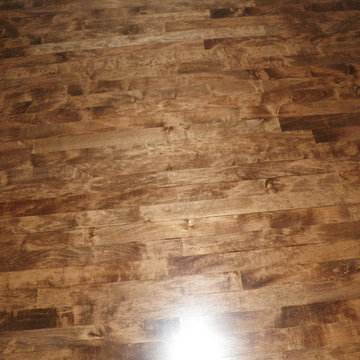
 Elegant Hardwood Floors
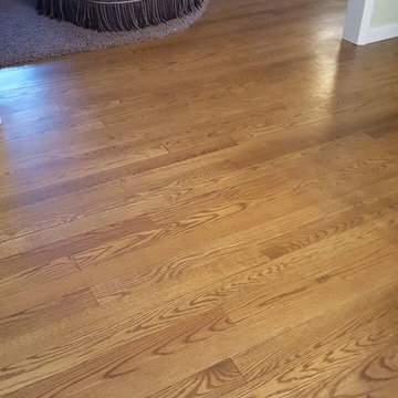
maple hardwood floor, water-popped, and stained with 50% rosewood and 50% neutral stains.
Inspiration for a timeless medium tone wood floor living room remodel in Salt Lake City
Inspiration for a timeless medium tone wood floor living room remodel in Salt Lake City

 JM Carpets
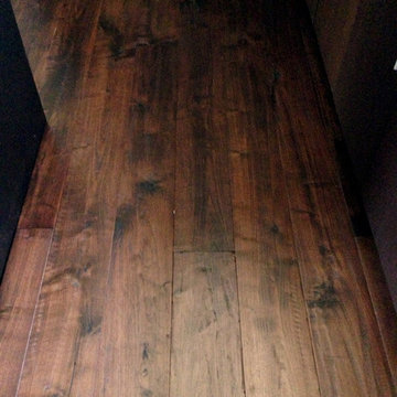
Large country u-shaped medium tone wood floor kitchen photo in Milwaukee with white cabinets and a peninsula

 In Your Space Interior Design
Designed By Runa Novak
In Your space Interior Design
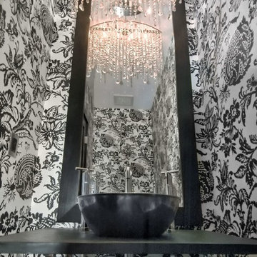
Example of a small minimalist medium tone wood floor powder room design in Chicago with a wall-mount sink
Example of a small minimalist medium tone wood floor powder room design in Chicago with a wall-mount sink
8