
Search results for "Moving intended" in Home Design Ideas
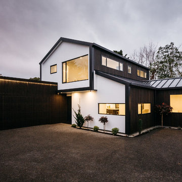
 242am Architects Ltd.
Siting on a rear section of 450sqm the residence was designed to suit the conservative palmerston north residential market. The house draws its contemporary form from the surrounding traditional gable residences while the colour palette intended to compliment the native trees on site.The cedar screen over the garage wall at the entrance both conceal the garage door and enhance the woody texture of the site.
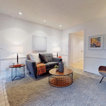
 Lori Pedersen Home
Photo Credit Winsold.com
Home Staging+Styling-For Selling or Dwelling! Specializing in York Region +the GTA.
When selling, we work together with HomeOwners and Realtors to ensure your property is presented at its very best - to secure the maximum selling price, in the shortest time on the market.
When Dwelling, the focus is on YOU, what you love, how you want your home to feel, and how you intend to enjoy your living space to the fullest!
 Truitt and White Window and Door Showroom
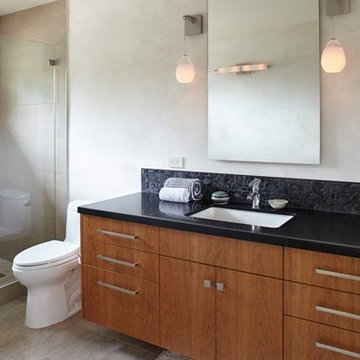
Mackey Builders: Located just north of Highway 24, the neighborhood of Hiller Highlands was rebuilt shortly after being ravaged by the 1991 Oakland fires. The client, who is an artist, recently purchased her two-bedroom, 2-1/2 bath townhouse on Treasure Hill intending to completely renovate the interior before moving in. Her goal was to have a home that reflected her eclectic and modern aesthetics; working with Mackey Builders, Inc., she was able to realize her vision.
Updating the kitchen was a top priority for the owner, as she is a gourmet cook. Collaborating with Stacey to create a design that was streamlined and functional, she chose quartz countertops and a natural stone backsplash to replace the ceramic counters and backsplash original to the home. She exchanged contractor-grade appliances for a Miele double oven, cooktop, and dishwasher, and purchased a Sub-Zero refrigerator with a glass door. Open shelving was integrated into the design so that the owner could display her beautiful ceramic collection. When designing the kitchen's custom cabinetry, Stacey chose a horizontal wood grain to balance the room's high ceilings. He also suggested removing a small bar area in order to expand the kitchen.
Amber Flooring was brought in to resurface the hardwood floors and the Mackey Builders team replaced windows and doors, upgraded the lighting, painted all interior walls, and installed more modern trim details. In the master bath, guest bather, and powder room, they installed new quartz countertops, sinks, and custom cabinets. Bathroom walls were hand-plastered in neutral tones that show subtle variations in color.
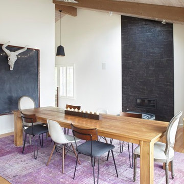
In the living room, the wood-burning fireplace, mantel, and built-in shelving were removed and replaced with a sleek high efficiency gas fireplace set into a wall of black large format tile. In keeping the owner's eclectic taste, a new stair railing made of custom-milled maple, wire rope, and acid-etched steel was designed and built. Because the owner loves to draw, Stacey came up with the idea of painting a wall in the dining area with blackboard paint and framing it. He then added a ceramic skull and lights; the finished product is a unique and changeable art installation that is also a focal point for the room.
While this project began as an interior remodel, it expanded to include a fence and siding replacement.
About Mackey Builders, Inc.
Mackey Builders, an award-winning contracting firm, has been in business for over 30 years and is proud to have completed hundreds of remodeling projects in the East Bay, San Francisco, and Marin County. An artist by nature, Stacey has an exquisite eye for detail and creates designs that are as beautiful as they are functional. Client satisfaction is paramount; he is always willing to "go the extra mile" to ensure the finished product meets both the client's and his own exacting standards.
Find the right local pro for your project
 Truitt and White Window and Door Showroom
Mackey Builders- Located just north of Highway 24, the neighborhood of Hiller Highlands was rebuilt shortly after being ravaged by the 1991 Oakland fires. The client, who is an artist, recently purchased her two-bedroom, 2-1/2 bath townhouse on Treasure Hill intending to completely renovate the interior before moving in. Her goal was to have a home that reflected her eclectic and modern aesthetics; working with Mackey Builders, Inc., she was able to realize her vision.
Updating the kitchen was a top priority for the owner, as she is a gourmet cook. Collaborating with Stacey to create a design that was streamlined and functional, she chose quartz countertops and a natural stone backsplash to replace the ceramic counters and backsplash original to the home. She exchanged contractor-grade appliances for a Miele double oven, cooktop, and dishwasher, and purchased a Sub-Zero refrigerator with a glass door. Open shelving was integrated into the design so that the owner could display her beautiful ceramic collection. When designing the kitchen's custom cabinetry, Stacey chose a horizontal wood grain to balance the room's high ceilings. He also suggested removing a small bar area in order to expand the kitchen.
Amber Flooring was brought in to resurface the hardwood floors and the Mackey Builders team replaced windows and doors, upgraded the lighting, painted all interior walls, and installed more modern trim details. In the master bath, guest bather, and powder room, they installed new quartz countertops, sinks, and custom cabinets. Bathroom walls were hand-plastered in neutral tones that show subtle variations in color.
In the living room, the wood-burning fireplace, mantel, and built-in shelving were removed and replaced with a sleek high efficiency gas fireplace set into a wall of black large format tile. In keeping the owner's eclectic taste, a new stair railing made of custom-milled maple, wire rope, and acid-etched steel was designed and built. Because the owner loves to draw, Stacey came up with the idea of painting a wall in the dining area with blackboard paint and framing it. He then added a ceramic skull and lights; the finished product is a unique and changeable art installation that is also a focal point for the room.
While this project began as an interior remodel, it expanded to include a fence and siding replacement.
About Mackey Builders, Inc.
Mackey Builders, an award-winning contracting firm, has been in business for over 30 years and is proud to have completed hundreds of remodeling projects in the East Bay, San Francisco, and Marin County. An artist by nature, Stacey has an exquisite eye for detail and creates designs that are as beautiful as they are functional. Client satisfaction is paramount; he is always willing to "go the extra mile" to ensure the finished product meets both the client's and his own exacting standards.
 Housewright Construction Inc.
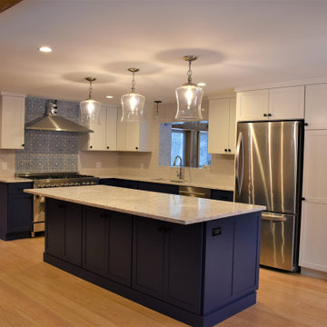
Housewright took this client's second home, a log cabin, and turned it into a suitable place for big family gatherings. The home is a retirement plan for the client, where they intend to live full-time eventually. Before they move in full-time they asked us to create more space for entertainment, with a more modern and inviting look and feel.
 The Anderson Studio of Architecture & Design
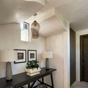
Serving as a winter retreat for a family of world travelers, a thoughtfully composed program of calm, comforting spaces imbuing casual elegance is presented effortlessly in the landscape. Oriented around a central grand oak and its adjacent loblolly pine, the home wraps around them, celebrating the engagement of nature while maintaining privacy from neighboring homes. Working within height restrictions intended to keep massing as low to the ground as possible, we moved the ground plane up and the expression down to present an appearance of a home that lives low. Calculated plays on scale and proportion intentionally have different effects from different vantage points, ensuring the viewer perceives the architecture as humanly scaled from each important introduction to the home. Ascending a landscape stair that winds around the central oak and extends into the entry vitrine sitting at base flood, the entry foyer operates at two scales as limestone stairs matching the exterior ascend between walls passing portals that reveal limited views of activity within.
2022 Design + Service Awards Jury Citation for Residential New Construction, AIA Charleston
 The Anderson Studio of Architecture & Design
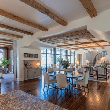
Serving as a winter retreat for a family of world travelers, a thoughtfully composed program of calm, comforting spaces imbuing casual elegance is presented effortlessly in the landscape. Oriented around a central grand oak and its adjacent loblolly pine, the home wraps around them, celebrating the engagement of nature while maintaining privacy from neighboring homes. Working within height restrictions intended to keep massing as low to the ground as possible, we moved the ground plane up and the expression down to present an appearance of a home that lives low. Calculated plays on scale and proportion intentionally have different effects from different vantage points, ensuring the viewer perceives the architecture as humanly scaled from each important introduction to the home. Ascending a landscape stair that winds around the central oak and extends into the entry vitrine sitting at base flood, the entry foyer operates at two scales as limestone stairs matching the exterior ascend between walls passing portals that reveal limited views of activity within.
2022 Design + Service Awards Jury Citation for Residential New Construction, AIA Charleston

Sponsored
Columbus, OH

Wannemacher Interiors
Customized Award-Winning Interior Design Solutions in Franklin Cnty OH
 All-Craft Decks & Sunrooms
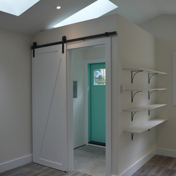
The she shed was intended for a combination art studio and a place to relax for the homeowner who was elderly and suffered with a severe medical condition. We needed to maximize the space to it’s potential, especially since it’s a small space. Included was higher-end pieces such as a stunning chandelier and a stunning Anderson door entrance system. For a more tranquil environment, we incorporated space for comfortable furniture and a propane fireplace. Space was used to the max with built in shelving and cabinetry for the art work and supplies.
This she-shed was built with custom features consisting of:
Cathedral ceiling with skylights for abundance of natural light
Propane fireplace
Built in cabinets and shelving for art studio supplies
Barn door entrance to small garden tool storage area
 M Atelier
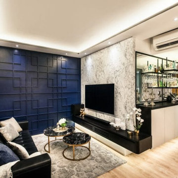
Using the right furniture is an essential element of living room design. Interior designers take this into substantial consideration when planning a home design as it consumes the most space in the living room area. These furniture pieces are treated as “constants,” as once they are positioned in the room, other installments will adjust based on how and where they are placed.
You may not realise it right away, but there are things to consider when buying new living room furniture. If you happen to be thinking about changing your current living room design by purchasing new furniture pieces, then below are a few factors to look at:
1. Size of the home.
The furniture you intend to buy should not only fit in your home but leave enough room for you to move freely. You may want to look at the floor space of the living room first and then inquire about furniture sets that will fit in your allocated space.
A bulky 7-seater may eat up most of your living room space, and this will limit your freedom of movement. Perhaps it would be better to settle with a three or five-seater at the most whose make and structure do not impede your mobility.
2. Durability of the furniture.
Another reason interior designers have high regard for furniture when designing home interiors is that sofas and couches are intended to be used for several years. Hence, you should look for a set that can last for a long time.
You may want to check out furniture sets and compare their form, structure, and material. It is also great to look into the background of their makers, so you have an idea that your sofa is done by a reputable brand.
3. Comfortability.
Not all fluffy cushioned sofas are comfortable. Some of them can be stiff and may cause you pain the long run. Thus, when shopping for a couch, better test its comfortability before purchasing it.
You can check the ergonomics of the sofa or couch to see whether it accommodates your need for comfort without putting your posture at risk. Also, you should know the type of cushion used on the furniture. This way, you know when and how to have your sofa reupholstered or when it is time to dispose it.
4. Form and style.
It is also right that you look into the aesthetics of the furniture. You may have to go through several renovations in your home, and the style you will go for might not always adhere to the style of your sofa.
Hence, you may want to invest in living room furniture that can keep up with the sign of the times, or one that is not difficult to dress up. Some homeowners opt for a sofa set that is made of wood or minimalist steel due to their durability and flexibility to blend in with different home interior trends.
The living room often serves as a witness to your life as a homeowner. With the right choice of furniture, you can enjoy every memory you make in your home.
 Nili Interior Designers
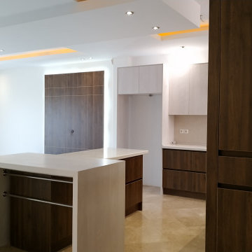
This was the state of the project after we finished the renovation. The client intended to buy the kitchen appliances later when moving in the new house. The finished photos will be uploaded later
 M Atelier
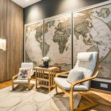
If there is one big mistake that homeowners make when carrying out the decoration tasks of their interior design project, that would be over-accessorising. Indeed, experts in interior design in Singapore agree that there are styles where “more is more,” and there are also those where “less is more.”
While as a homeowner you may choose either of these two style directions, you should first think about the different aspects of interior design and make sure that your style choice fits with these elements. Not doing so may not only result to a poorly executed renovation, but a home that you will find uncomfortable to live in.
So how do you avoid the tendency of over-accessorising? You may want to follow these pieces of advice coming from professionals in interior design in Singapore:
Mistake #1: Using the same fabric on almost all surfaces.
It is common practice among most homeowners to use almost the same fabric on all table surfaces, and sometimes even on sofa covers and drapes. Indeed, this can be cost effective, but it does not contribute to the development of the home’s overall design.
This is because there are fabrics are created to meet specific purposes. For example, lace is often used as table runners, as they give more definition and style to these specific furniture pieces. However, they do not do your windows any favours when used as curtains.
Opaque and heavy fabrics are often intended for curtains and drapes for rooms that require more privacy; in contrast, sheer and fabric materials are more suited for living room windows as they allow natural light and ventilation to move around the house.
Mistake #2: Placing more accents than you actually need.
Another mistake which homeowners are prone to make when decorating their home is placing more accents than needed. There are homes you can see side tables that are overpopulated with picture frames, trinkets, and fancy souvenirs that do not have any connection to each other. Sometimes, you can find numerous throw pillows occupying almost the entire sofa, to the point that all the seats are already occupied.
These are classic examples of “fear of empty spaces,” which is prevalent in most Asian societies, and even in some Western countries. But while it is common practice to occupy empty spaces, you may also want to think about what to do with the space first.
Instead of piling up all your memorabilia in the side tables of your bedroom or living room, why not use a tiered stand so that they can be presented in an organised manner? You may also want to choose a designated area for your trinkets, such as a wall or an unoccupied corner in your room.
Mistake #3: Overdoing the lighting fixtures.
Some homeowners want to imitate the homes of the celebrities they see on TV, and apart from following the same colour schemes and choice of furniture, they also choose to add more lights in their rooms than necessary.
Well, you should understand that the purpose of lighting fixtures is to illuminate the rooms of the house, but this doesn’t mean that you have to brighten up your home all the time. You may want to use lamps that spread the light across the room, rather than several smaller bulbs. The latter only lights up specific parts of the room, and when all these bulbs are lit simultaneously, they only spike up your electric bill.
It would be better to choose lighting fixtures according to your need and the function of the room. Doing so not only illuminates your home properly, but also creates an ambiance that gives you the comfort you are looking for in a dwelling space.
 Nili Interior Designers
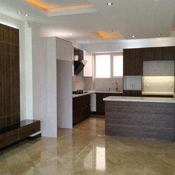
This was the state of the project after we finished the renovation. The client intended to buy the kitchen appliances later when moving in the new house. The finished photos will be uploaded later
 Just the Thing
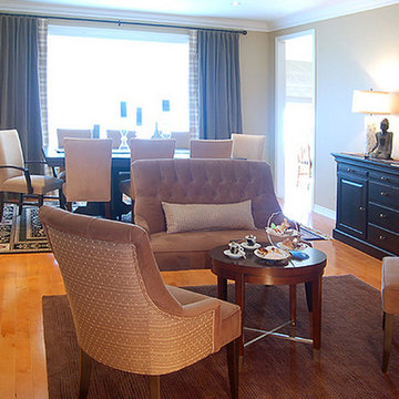
This large open space was originally intended as a living room. With the couple's extended family often stopping by to share a meal, they wisely decided to use it as a dining room instead. Given the width of the space, their dining furniture looked puny, even when the table was fully extended. By turning the table sideways, we left enough space for a petite seating area -- perfect for cocktails or coffee clatches. The tufted settee and occasional chairs can easily be moved out of the way or pulled up to the dining table for bigger crowds.


 User
UserLocated just north of Highway 24, the neighborhood of Hiller Highlands was rebuilt shortly after being ravaged by the 1991 Oakland fires. The client, who is an artist, recently purchased her two-bedroom, 2-1/2 bath townhouse on Treasure Hill intending to completely renovate the interior before moving in. Her goal was to have a home that reflected her eclectic and modern aesthetics; working with Mackey Builders, Inc., she was able to realize her vision.
Updating the kitchen was a top priority for the owner, as she is a gourmet cook. Collaborating with Stacey to create a design that was streamlined and functional, she chose quartz countertops and a natural stone backsplash to replace the ceramic counters and backsplash original to the home. She exchanged contractor-grade appliances for a Miele double oven, cooktop, and dishwasher, and purchased a Sub-Zero refrigerator with a glass door. Open shelving was integrated into the design so that the owner could display her beautiful ceramic collection. When designing the kitchen's custom cabinetry, Stacey chose a horizontal wood grain to balance the room's high ceilings. He also suggested removing a small bar area in order to expand the kitchen.
Amber Flooring was brought in to resurface the hardwood floors and the Mackey Builders team replaced windows and doors, upgraded the lighting, painted all interior walls, and installed more modern trim details. In the master bath, guest bather, and powder room, they installed new quartz countertops, sinks, and custom cabinets. Bathroom walls were hand-plastered in neutral tones that show subtle variations in color.
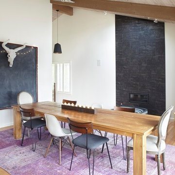
In the living room, the wood-burning fireplace, mantel, and built-in shelving were removed and replaced with a sleek high efficiency gas fireplace set into a wall of black large format tile. In keeping the owner's eclectic taste, a new stair railing made of custom-milled maple, wire rope, and acid-etched steel was designed and built. Because the owner loves to draw, Stacey came up with the idea of painting a wall in the dining area with blackboard paint and framing it. He then added a ceramic skull and lights; the finished product is a unique and changeable art installation that is also a focal point for the room.
While this project began as an interior remodel, it expanded to include a fence and siding replacement.
About Mackey Builders, Inc.
Mackey Builders, an award-winning contracting firm, has been in business for over 30 years and is proud to have completed hundreds of remodeling projects in the East Bay, San Francisco, and Marin County. An artist by nature, Stacey has an exquisite eye for detail and creates designs that are as beautiful as they are functional. Client satisfaction is paramount; he is always willing to "go the extra mile" to ensure the finished product meets both the client's and his own exacting standards.

 IQnewswire
The End of the Ultra-Slim Wedding Suit
For several years, men’s formalwear was dominated by narrow lapels, short jackets and trousers cut close to the leg. The style created a sharp outline, but it often left little room for sitting, dancing or eating comfortably. Current tailoring is moving towards a more balanced shape, with cleaner shoulders, a defined waist and trousers that follow the leg without gripping it.This change does not mean that wedding suits have become oversized. The newer approach sits between skinny and loose. It keeps the structure expected of formal clothing while allowing the cloth to hang properly. For grooms, that balance is useful during a day that may involve a ceremony, photographs, dinner and several hours on the dance floor.
Look For Shape Rather Than Tightness
A well-fitted suit should create a clear outline without relying on tension. Collections of Marc Darcy suits include tailored three-piece designs, checks and textured fabrics that suit the current preference for visible structure and considered proportions.
The jacket should sit close enough to define the waist, but the front button should fasten without pulling the cloth into an X-shaped crease. At the shoulders, the seam should finish close to the natural shoulder point. Extra width can make the jacket look borrowed, while a shoulder that is too narrow may cause the upper sleeve to collapse.
Fit should be assessed while moving as well as standing. Reach forward, sit down and raise both arms. A tailored jacket will never feel like casual sportswear, but it should allow the groom to carry out ordinary movements without sharp restriction across the back or chest.
Give The Jacket Enough Length
Very short suit jackets became common alongside skinny trousers, but they can disrupt the proportions of a three-piece outfit. If the jacket finishes too high, the waistcoat may appear longer than the outer layer and the trousers may look as though they begin too low.
A more traditional jacket length usually covers most of the seat and divides the body more evenly. This can make the legs appear longer without shortening the jacket excessively. The correct length depends on height and body proportions, so two men wearing the same chest size may still need different jacket lengths.
View the suit from the back and side rather than relying on a front-facing mirror. The vents should lie flat, and the hem should not lift away from the body. A side photograph can reveal an unbalanced jacket more clearly than the changing-room mirror.
Choose Trousers That Fall Cleanly
The move away from very tight tailoring is most noticeable in suit trousers. A modern tailored leg can still be neat at the ankle, but it should provide enough room through the seat and thigh for the fabric to fall without horizontal lines.
Trouser pockets offer a useful fit check. If they pull open while standing, the waist or hips may be too tight. The fly should lie flat, and the waistband should remain in place without depending on an overtightened belt. Higher-rise trousers can work particularly well with a waistcoat because they reduce the chance of shirt fabric appearing between the two pieces.
The hem should make gentle contact with the shoe rather than gathering heavily around it. A short hem can work with narrow trousers but taking it too far may make the suit look dated once the current cropped style moves on. A slight break is easier to wear with different formal shoes and tends to look balanced in full-length wedding photographs.
Let The Waistcoat Support the Silhouette
A waistcoat adds structure through the centre of the outfit, but only when it fits correctly. It should lie flat against the shirt and cover the trouser waistband. Tightening the back strap cannot correct a waistcoat that is the wrong size or too short.
Current three-piece styling often places greater emphasis on the waistcoat. Double-breasted designs, contrasting fabrics and wider openings can distinguish the groom without requiring a brightly coloured jacket. When the groom removes the jacket later, the waistcoat keeps the outfit looking complete.
Allow room for a full meal and several hours of wear. A waistcoat that feels acceptably close during a brief fitting may become uncomfortable at dinner. Sit down with every button fastened and check whether the lower edge presses into the waist or causes the front to bow.
Use Stronger Lapels Carefully
Wider notch and peak lapels are returning after years of extremely narrow designs. A broader lapel can frame the shirt and tie, balance the shoulders and give the jacket a more formal character. Peak lapels create a particularly strong line on double-breasted jackets and evening suits.
The lapel width should still suit the wearer. A very broad lapel can overwhelm a smaller frame, while an extremely narrow one may look out of proportion on a broad chest. The shirt collar, tie width and lapel should relate to one another without matching exactly.
A wider lapel also leaves less need for decorative extras. A simple buttonhole flower or plain pocket square may be enough. Large lapel pins can crowd the upper part of the jacket, especially when the cloth already contains a check.
Avoid Buying According to the Size Label Alone
The same labelled size can fit differently across designs because cut, fabric and construction affect the garment. Begin with accurate chest, waist, inside-leg and approximate jacket-length measurements. Compare those figures with the retailer’s size information rather than ordering the size worn in another brand without checking.
If the jacket fits at the shoulders but needs slight shaping through the waist, a tailor can often make the adjustment. Sleeves and trouser hems are also commonly altered. Major changes to the shoulder line or jacket length are more difficult and may not be economical.
Do not choose the smallest size that can be fastened. A suit that looks tight in the fitting room is unlikely to become more comfortable during a long wedding day. Cloth should skim the body and return to a clean position after movement.
Balance a checked suit with simple styling
Texture and checks remain popular in wedding tailoring, particularly for country houses, converted barns and traditional venues. These fabrics already add depth to the outfit, so the cut should remain controlled and the accessories relatively quiet.
A plain white, pale blue or cream shirt gives a checked suit a clear foundation. Choose a tie from one of the secondary colours in the cloth rather than introducing another strong pattern. A white pocket square works when the suit contains several shades and does not need further decoration.
Shoes should support the proportions of the trousers. A very slim shoe may appear too small beneath a fuller hem, while a heavy casual sole can pull attention away from the tailoring. Oxfords, Derbies and refined brogues usually provide enough visual weight without looking bulky.
Coordinate the wedding party without forcing one fit
Matching groomsmen suits can become difficult when every member of the party has a different build. Insisting on an identical close fit may leave some men comfortable and others visibly restricted. A better approach is to keep the cloth, colour and main design consistent while adjusting jacket and trouser sizes for each person.
The groom can stand apart through a waistcoat, lapel shape or accessory rather than wearing a suit cut much tighter than everyone else. This creates a connection across the group without treating one silhouette as suitable for every body.
Arrange fittings early enough to identify size and alteration issues. Group orders should be checked well before the wedding, particularly when trousers need hemming or jackets require sleeve adjustments. Each person should try the complete outfit with the intended shirt and shoes.
Judge the suit by the whole day
A wedding fitting often lasts less than half an hour, while the suit may be worn for twelve hours or more. Comfort should therefore be tested under realistic conditions. Sit for several minutes, walk upstairs and check the waistband after moving around.
Pay attention to the parts that cannot be seen clearly in a mirror. The collar should remain close to the shirt at the back of the neck. Jacket vents should not pull apart, and the trouser seat should follow the body without sagging or strain.
The current move towards balanced tailoring gives grooms more room to choose clothes that look formal without feeling restrictive. Clean shoulders, a shaped jacket and trousers with a natural fall will outlast extreme proportions. A suit that allows the groom to stand, sit and celebrate comfortably is also more likely to look composed in photographs taken throughout the day.
 TELFORD+BROWN STUDIO ARCHITECTURE
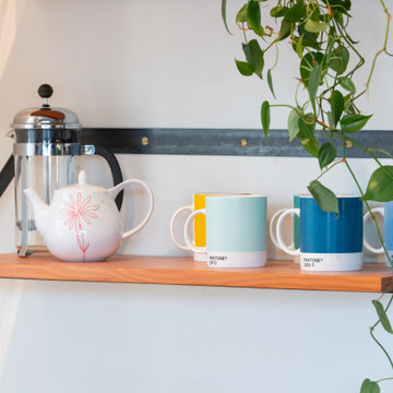
At exactly 400sf, this Accessory Dwelling Unit was originally an alley garage crammed with junk, and nearly falling over. Intended as a short- or long-term rental, a family guest house, summer party spot, and a potential future home for the clients, this ADU had to live larger than its actual square footage. Because of this, there needed to be a full kitchen, dining, living space, and limited long-term storage, as well as have the ability to fully open up to a landscaped patio. The clients also wanted to be sure that the space was extremely energy efficient, as well as budget-conscious.
Using the existing footprint, and a small portion of the garage to construct the new ADU enabled the homeowners keep the structure very close to the property lines, way within current setback requirements. This one move, although it ended up being a more expensive option than building completely new, saved the small back yard from being fully overtaken.
The plan of this unit is very simple, and we used a slim palette of finishes; both moves make it seem larger than it is. White walls and cabinets are punctuated by black stained wood doors and windows, and vertical grain Douglas Fir was used for window sills, shelving, and wall base. We used a mixture of the clients’ vintage door hardware and kitchen pulls with some new fixtures for the build-out to make it somewhat eclectic and personal.
Photographer: Matt Swain Photography
 Grossmueller's Design Consultants
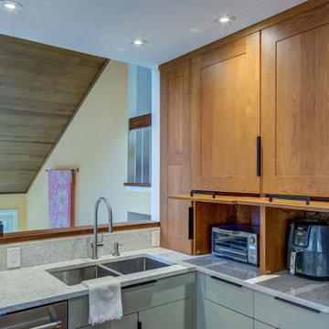
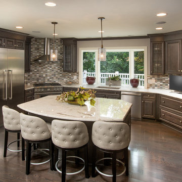
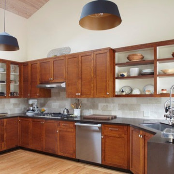
This kitchen is outfitted with custom cabinetry to keep the countertops clear, honoring a client need. For ease of appliance use, electrical outlets were installed inside of the appliance "garages" so they do not need to be moved from their intended locations.

 User
UserLocated just north of Highway 24, the neighborhood of Hiller Highlands was rebuilt shortly after being ravaged by the 1991 Oakland fires. The client, who is an artist, recently purchased her two-bedroom, 2-1/2 bath townhouse on Treasure Hill intending to completely renovate the interior before moving in. Her goal was to have a home that reflected her eclectic and modern aesthetics; working with Mackey Builders, Inc., she was able to realize her vision.
Updating the kitchen was a top priority for the owner, as she is a gourmet cook. Collaborating with Stacey to create a design that was streamlined and functional, she chose quartz countertops and a natural stone backsplash to replace the ceramic counters and backsplash original to the home. She exchanged contractor-grade appliances for a Miele double oven, cooktop, and dishwasher, and purchased a Sub-Zero refrigerator with a glass door. Open shelving was integrated into the design so that the owner could display her beautiful ceramic collection. When designing the kitchen's custom cabinetry, Stacey chose a horizontal wood grain to balance the room's high ceilings. He also suggested removing a small bar area in order to expand the kitchen.
Amber Flooring was brought in to resurface the hardwood floors and the Mackey Builders team replaced windows and doors, upgraded the lighting, painted all interior walls, and installed more modern trim details. In the master bath, guest bather, and powder room, they installed new quartz countertops, sinks, and custom cabinets. Bathroom walls were hand-plastered in neutral tones that show subtle variations in color.
In the living room, the wood-burning fireplace, mantel, and built-in shelving were removed and replaced with a sleek high efficiency gas fireplace set into a wall of black large format tile. In keeping the owner's eclectic taste, a new stair railing made of custom-milled maple, wire rope, and acid-etched steel was designed and built. Because the owner loves to draw, Stacey came up with the idea of painting a wall in the dining area with blackboard paint and framing it. He then added a ceramic skull and lights; the finished product is a unique and changeable art installation that is also a focal point for the room.
While this project began as an interior remodel, it expanded to include a fence and siding replacement.
About Mackey Builders, Inc.
Mackey Builders, an award-winning contracting firm, has been in business for over 30 years and is proud to have completed hundreds of remodeling projects in the East Bay, San Francisco, and Marin County. An artist by nature, Stacey has an exquisite eye for detail and creates designs that are as beautiful as they are functional. Client satisfaction is paramount; he is always willing to "go the extra mile" to ensure the finished product meets both the client's and his own exacting standards.
 TELFORD+BROWN STUDIO ARCHITECTURE
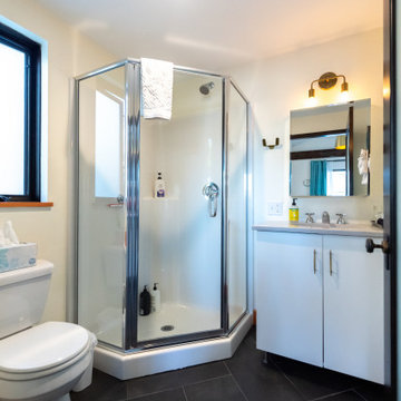
At exactly 400sf, this Accessory Dwelling Unit was originally an alley garage crammed with junk, and nearly falling over. Intended as a short- or long-term rental, a family guest house, summer party spot, and a potential future home for the clients, this ADU had to live larger than its actual square footage. Because of this, there needed to be a full kitchen, dining, living space, and limited long-term storage, as well as have the ability to fully open up to a landscaped patio. The clients also wanted to be sure that the space was extremely energy efficient, as well as budget-conscious.
Using the existing footprint, and a small portion of the garage to construct the new ADU enabled the homeowners keep the structure very close to the property lines, way within current setback requirements. This one move, although it ended up being a more expensive option than building completely new, saved the small back yard from being fully overtaken.
The plan of this unit is very simple, and we used a slim palette of finishes; both moves make it seem larger than it is. White walls and cabinets are punctuated by black stained wood doors and windows, and vertical grain Douglas Fir was used for window sills, shelving, and wall base. We used a mixture of the clients’ vintage door hardware and kitchen pulls with some new fixtures for the build-out to make it somewhat eclectic and personal.
Photographer: Matt Swain Photography
 Woodwright Custom Builders LLC
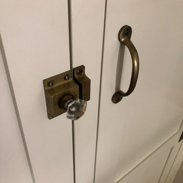
This vintage hex glass and brass cabinet latch was purchased from Ebay. It is estimated to be 100-years-old and perfectly suited for the time period our home was built. The brass "bow" pull is a modern reproduction of a "penny" pull that we obtained from Van Dyke Restorers, again, perfect for the period the home was built. We had intended to use the chrome art deco pulls that were part of the original (to us) decor of the kitchen, and I succeeded in finding enough matches for the upper cabinets through various sources on Ebay, but as the project progressed, we could see that the finish and style were less compatible with the direction the kitchen was moving. It was not possible to locate exact matches for the lower, red and chrome pulls, so these simple penny pulls became our choice. We used brushed silver finish for the kitchen, and brass for the panty, since the cabinet hinges were brass (painted silver at one point).
9