
Search results for "Never before seen" in Home Design Ideas

 Sofia Suri Design Office
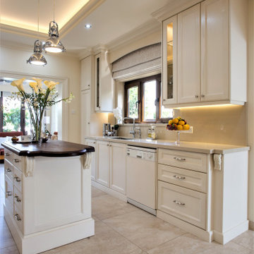
A depressing dark wooden kitchen gets a major face lift! As you can see from the before pictures, the kitchen was quite dark. Even during the daytime the lady of the house had to turn on the lights to work there. An exterior pergola on a much lower level prevented light from coming in the house and though the pergola was a favourite spot to seat in the summer the humidity in the air made it unbearable and the access to it was not very practical. So in essence the family had no real seating room either. My goal... to create a functional kitchen filled with light and an adjacent seating area. My challenges...the pergola was very low and, not enough space for a seating room...... So.....I came up with something I have never done before nor did I think possible. Using specialised equipment I lifted the existing pergola up all in one piece, without breaking it apart, then I raised the floor covered by the pergola to the level of the house and made an opening from the house to the pergola...Mission accomplished! Lots of light now coming in and more than enough space for the family seating area
 Sofia Suri Design Office
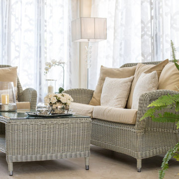
A depressing dark wooden kitchen gets a major face lift! As you can see from the before pictures, the kitchen was quite dark. Even during the daytime the lady of the house had to turn on the lights to work there. An exterior pergola on a much lower level prevented light from coming in the house and though the pergola was a favourite spot to seat in the summer the humidity in the air made it unbearable and the access to it was not very practical. So in essence the family had no real seating room either. My goal... to create a functional kitchen filled with light and an adjacent seating area. My challenges...the pergola was very low and, not enough space for a seating room...... So.....I came up with something I have never done before nor did I think possible. Using specialised equipment I lifted the existing pergola up all in one piece, without breaking it apart, then I raised the floor covered by the pergola to the level of the house and made an opening from the house to the pergola...Mission accomplished! Lots of light now coming in and more than enough space for the family seating area
 Sofia Suri Design Office
A depressing dark wooden kitchen gets a major face lift! As you can see from the before pictures, the kitchen was quite dark. Even during the daytime the lady of the house had to turn on the lights to work there. An exterior pergola on a much lower level prevented light from coming in the house and though the pergola was a favourite spot to seat in the summer the humidity in the air made it unbearable and the access to it was not very practical. So in essence the family had no real seating room either. My goal... to create a functional kitchen filled with light and an adjacent seating area. My challenges...the pergola was very low and, not enough space for a seating room...... So.....I came up with something I have never done before nor did I think possible. Using specialised equipment I lifted the existing pergola up all in one piece, without breaking it apart, then I raised the floor covered by the pergola to the level of the house and made an opening from the house to the pergola...Mission accomplished! Lots of light now coming in and more than enough space for the family seating area
Find the right local pro for your project
 Edgewater Design Group
As written in Northern Home & Cottage by Elizabeth Edwards
Sara and Paul Matthews call their head-turning home, located in a sweet neighborhood just up the hill from downtown Petoskey, “a very human story.” Indeed it is. Sara and her husband, Paul, have a special-needs son as well as an energetic middle-school daughter. This home has an answer for everyone. Located down the street from the school, it is ideally situated for their daughter and a self-contained apartment off the great room accommodates all their son’s needs while giving his caretakers privacy—and the family theirs. The Matthews began the building process by taking their thoughts and
needs to Stephanie Baldwin and her team at Edgewater Design Group. Beyond the above considerations, they wanted their new home to be low maintenance and to stand out architecturally, “But not so much that anyone would complain that it didn’t work in our neighborhood,” says Sara. “We
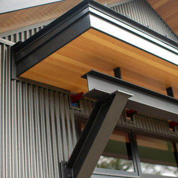
were thrilled that Edgewater listened to us and were able to give us a unique-looking house that is meeting all our needs.” Lombardy LLC built this handsome home with Paul working alongside the construction crew throughout the project. The low maintenance exterior is a cutting-edge blend of stacked stone, black corrugated steel, black framed windows and Douglas fir soffits—elements that add up to an organic contemporary look. The use of black steel, including interior beams and the staircase system, lend an industrial vibe that is courtesy of the Matthews’ friend Dan Mello of Trimet Industries in Traverse City. The couple first met Dan, a metal fabricator, a number of years ago, right around the time they found out that their then two-year-old son would never be able to walk. After the couple explained to Dan that they couldn’t find a solution for a child who wasn’t big enough for a wheelchair, he designed a comfortable, rolling chair that was just perfect. They still use it. The couple’s gratitude for the chair resulted in a trusting relationship with Dan, so it was natural for them to welcome his talents into their home-building process. A maple floor finished to bring out all of its color-tones envelops the room in warmth. Alder doors and trim and a Doug fir ceiling reflect that warmth. Clearstory windows and floor-to-ceiling window banks fill the space with light—and with views of the spacious grounds that will
become a canvas for Paul, a retired landscaper. The couple’s vibrant art pieces play off against modernist furniture and lighting that is due to an inspired collaboration between Sara and interior designer Kelly Paulsen. “She was absolutely instrumental to the project,” Sara says. “I went through
two designers before I finally found Kelly.” The open clean-lined kitchen, butler’s pantry outfitted with a beverage center and Miele coffee machine (that allows guests to wait on themselves when Sara is cooking), and an outdoor room that centers around a wood-burning fireplace, all make for easy,
fabulous entertaining. A den just off the great room houses the big-screen television and Sara’s loom—
making for relaxing evenings of weaving, game watching and togetherness. Tourgoers will leave understanding that this house is everything great design should be. Form following function—and solving very human issues with soul-soothing style.
 Kathleen Jennison
An Arts & Crafts Bungalow is one of my favorite styles of homes. We have quite a few of them in our Stockton Mid-Town area. And when C&L called us to help them remodel their 1923 American Bungalow, I was beyond thrilled.
As per usual, when we get a new inquiry, we quickly Google the project location while we are talking to you on the phone. My excitement escalated when I saw the Google Earth Image of the sweet Sage Green bungalow in Mid-Town Stockton. "Yes, we would be interested in working with you," I said trying to keep my cool.
But what made it even better was meeting C&L and touring their home, because they are the nicest young couple, eager to make their home period perfect. Unfortunately, it had been slightly molested by some bad house-flippers, and we needed to bring the bathroom back to it "roots."
We knew we had to banish the hideous brown tile and cheap vanity quickly. But C&L complained about the condensation problems and the constant fight with mold. This immediately told me that improper remodeling had occurred and we needed to remedy that right away.
The Before: Frustrations with a Botched Remodel
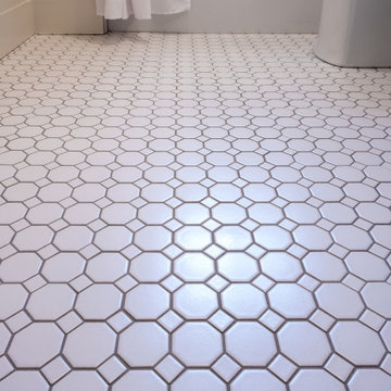
The bathroom needed to be brought back to period appropriate design with all the functionality of a modern bathroom. We thought of things like marble countertop, white mosaic floor tiles, white subway tile, board and batten molding, and of course a fabulous wallpaper.
This small (and only) bathroom on a tight budget required a little bit of design sleuthing to figure out how we could get the proper look and feel. Our goal was to determine where to splurge and where to economize and how to complete the remodel as quickly as possible because C&L would have to move out while construction was going on.
The Process: Hard Work to Remedy Design and Function
During our initial design study, (which included 2 hours in the owners’ home), we noticed framed images of William Morris Arts and Crafts textile patterns and knew this would be our design inspiration. We presented C&L with three options and they quickly selected the Pimpernel Design Concept.
We had originally selected the Black and Olive colors with a black vanity, mirror, and black and white floor tile. C&L liked it but weren’t quite sure about the black, We went back to the drawing board and decided the William & Co Pimpernel Wallpaper in Bayleaf and Manilla color with a softer gray painted vanity and mirror and white floor tile was more to their liking.
After the Design Concept was approved, we went to work securing the building permit, procuring all the elements, and scheduling our trusted tradesmen to perform the work.
We did uncover some shoddy work by the flippers such as live electrical wires hidden behind the wall, plumbing venting cut-off and buried in the walls (hence the constant dampness), the tub barely balancing on two fence boards across the floor joist, and no insulation on the exterior wall.
All of the previous blunders were fixed and the bathroom put back to its previous glory. We could feel the house thanking us for making it pretty again.
The After Reveal: Cohesive Design Decisions
We selected a simple white subway tile for the tub/shower. This is always classic and in keeping with the style of the house.
We selected a pre-fab vanity and mirror, but they look rich with the quartz countertop. There is much more storage in this small vanity than you would think.
The Transformation: A Period Perfect Refresh
We began the remodel just as the pandemic reared and stay-in-place orders went into effect. As C&L were already moved out and living with relatives, we got the go-ahead from city officials to get the work done (after all, how can you shelter in place without a bathroom?).
All our tradesmen were scheduled to work so that only one crew was on the job site at a time. We stayed on the original schedule with only a one week delay.
The end result is the sweetest little bathroom I've ever seen (and I can't wait to start work on C&L's kitchen next).
Thank you for joining me in this project transformation. I hope this inspired you to think about being creative with your design projects, determining what works best in keeping with the architecture of your space, and carefully assessing how you can have the best life in your home.
 Pinnacle Design & Remodeling
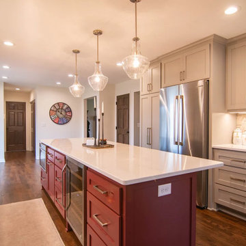
This kitchen went from cramped and dark to bright and open! Knocking down the wall between the old dining room and kitchen made a huge difference. We were able to create a larger kitchen and with an island but most importantly, a red island. Having the red island was important to the home owner and to compliment it we did a geometric architecture backsplash to help bringing in dimension. We tied in their existing floors and re stained the main floor. Surprisingly after the renovation the dining room table never moved from its original spot! All this space needed was to remove the existing wall to a now endless amount of memories this open concept will create.
 Pinnacle Design & Remodeling
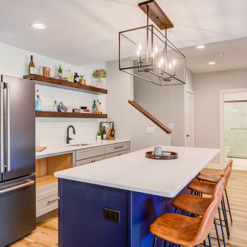
The basement is finished and it's beautiful! A farmhouse theme was used to create a homey feel with rustic touches while still staying a touch modern to keep the design on trend for the next for years. Shiplap walls, hardwood flooring, updated lighting, modern kitchen, and more are seen all throughout the space!

 Pinnacle Design & Remodeling
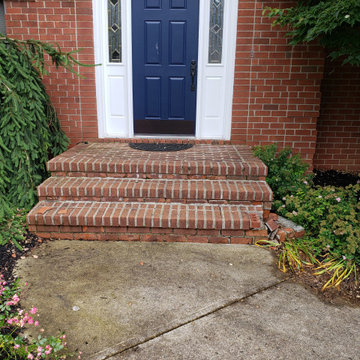
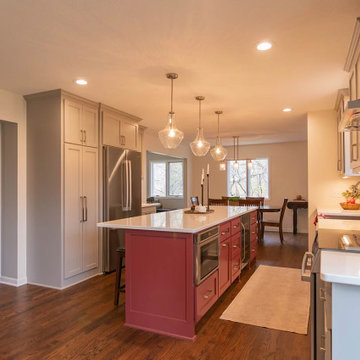
This kitchen went from cramped and dark to bright and open! Knocking down the wall between the old dining room and kitchen made a huge difference. We were able to create a larger kitchen and with an island but most importantly, a red island. Having the red island was important to the home owner and to compliment it we did a geometric architecture backsplash to help bringing in dimension. We tied in their existing floors and re stained the main floor. Surprisingly after the renovation the dining room table never moved from its original spot! All this space needed was to remove the existing wall to a now endless amount of memories this open concept will create.
 Pinnacle Design & Remodeling
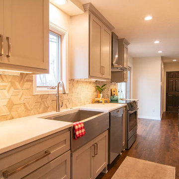
This kitchen went from cramped and dark to bright and open! Knocking down the wall between the old dining room and kitchen made a huge difference. We were able to create a larger kitchen and with an island but most importantly, a red island. Having the red island was important to the home owner and to compliment it we did a geometric architecture backsplash to help bringing in dimension. We tied in their existing floors and re stained the main floor. Surprisingly after the renovation the dining room table never moved from its original spot! All this space needed was to remove the existing wall to a now endless amount of memories this open concept will create.
 Neil Kelly Company
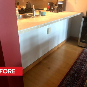
Before remodeling, this kitchen had worn out builder-grade materials, like tile and grout counters, old oak cabinets and a double-bowl stainless steel sink that had seen it's day. The space also suffered from this half wall that closed off the kitchen from the rest of the apartment and hampered the lighting in the entire room.
 Norris Architects, Inc.
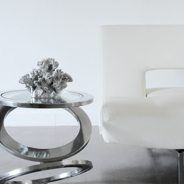
Seen by many and understood by few; The mixing of the obscure with the familiar in this living room evokes an exclusively esoteric feeling.
Mid-sized trendy open concept concrete floor family room photo in Phoenix with yellow walls and a media wall
Mid-sized trendy open concept concrete floor family room photo in Phoenix with yellow walls and a media wall
 FabricSeen
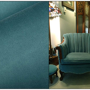
Thanks to FabricSeen customer Cheryl V. for sharing her story with us:
“My husband and I inherited a 75 year old chair from my husband’s father –which was beautiful but very tired. Additionally, the green color did not fit our décor. After several years considering what to do with the chair, I decided to search upholstery fabric online. The FabricSeen website was the first website I searched. Of course, I spent several hours searching other websites before I decided that the Princess in Peacock blue was the perfect fabric and color for our fabulous chair. The Princess in Peacock blue not only fits our décor but is a period color. It is perfect! I was skeptical of ordering upholstery fabric online but your service could not have been better and my fears were immediately abated. Thank you…we are delighted with our “new” chair!”
 Ventures Design
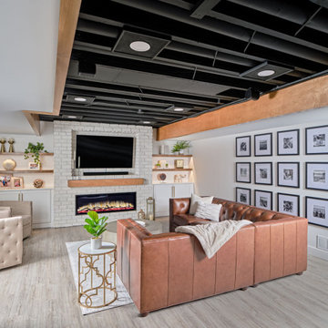
Below Buchanan is a basement renovation that feels as light and welcoming as one of our outdoor living spaces. The project is full of unique details, custom woodworking, built-in storage, and gorgeous fixtures. Custom carpentry is everywhere, from the built-in storage cabinets and molding to the private booth, the bar cabinetry, and the fireplace lounge.
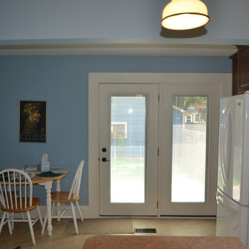
Creating this bright, airy atmosphere was no small challenge, considering the lack of natural light and spatial restrictions. A color pallet of white opened up the space with wood, leather, and brass accents bringing warmth and balance. The finished basement features three primary spaces: the bar and lounge, a home gym, and a bathroom, as well as additional storage space. As seen in the before image, a double row of support pillars runs through the center of the space dictating the long, narrow design of the bar and lounge. Building a custom dining area with booth seating was a clever way to save space. The booth is built into the dividing wall, nestled between the support beams. The same is true for the built-in storage cabinet. It utilizes a space between the support pillars that would otherwise have been wasted.
The small details are as significant as the larger ones in this design. The built-in storage and bar cabinetry are all finished with brass handle pulls, to match the light fixtures, faucets, and bar shelving. White marble counters for the bar, bathroom, and dining table bring a hint of Hollywood glamour. White brick appears in the fireplace and back bar. To keep the space feeling as lofty as possible, the exposed ceilings are painted black with segments of drop ceilings accented by a wide wood molding, a nod to the appearance of exposed beams. Every detail is thoughtfully chosen right down from the cable railing on the staircase to the wood paneling behind the booth, and wrapping the bar.

 Jill Davis Design
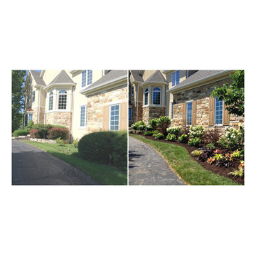
Hawthorn Woods- Before and After. Classic old school landscape design (before) hiding the house with lots of evergreens all overgrown at the foundation. We removed and added a full year of interest. Improved curb appeal and allowed the gorgeous home to be seen and all the beautiful stone to show.
There are 6 different hydrangea in this plan.
Photo-Jill Davis
 Pinnacle Design & Remodeling
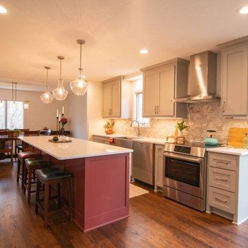
This kitchen went from cramped and dark to bright and open! Knocking down the wall between the old dining room and kitchen made a huge difference. We were able to create a larger kitchen and with an island but most importantly, a red island. Having the red island was important to the home owner and to compliment it we did a geometric architecture backsplash to help bringing in dimension. We tied in their existing floors and re stained the main floor. Surprisingly after the renovation the dining room table never moved from its original spot! All this space needed was to remove the existing wall to a now endless amount of memories this open concept will create.
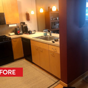 Neil Kelly Company
Before remodeling, this kitchen had worn out builder-grade materials, like tile and grout counters, old oak cabinets and a double-bowl stainless steel sink that had seen it's day. The space also suffered from this half wall that closed off the kitchen from the rest of the apartment and hampered the lighting in the entire room.
 Five Star Tree Care
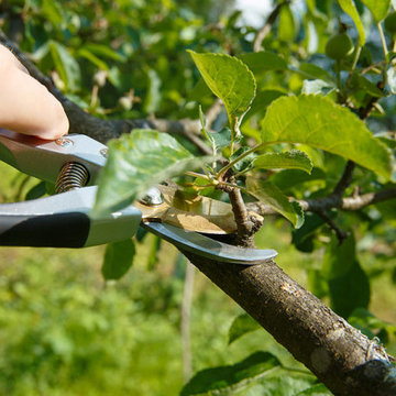
There are a few reasons why it is critical that your trees have a regular schedule for pruning and maintenance. Pruning helps trees to maintain a tree’s health as well as form it to a pleasing aesthetic shape. Furthermore, pests and diseases are also controlled by regular pruning and care. When pruning is properly performed, your trees will be healthy and attractive all year long. Five Star Tree Services has put together a list of seven things you should keep in mind regarding your tree pruning.
Tree Inspection
Before any tree pruning job, the tree should be properly inspected. This will allow you or our tree care service team to determine which branches should be cut. It will also allow any diseases or pests to be identified and dealt with.
Remove Dead, Weak & Crossed Branches
Dead and weak branches are a hazard to your property and those who happen to walk or lounge under the tree. They also suck vital nutrients away from healthy branches and the tree trunk. Removing them will prevent accidents and allow your tree to thrive. Crossed branches can also cause problems later down the line. They affect the airflow to the crown and can also prevent sunlight from passing through the tree.
Pay Attention to Spacing
It’s important to pay attention to branch spacing when pruning your tree. Lateral branches should be spaced evenly, especially when pruning trees that have yet to mature.
Follow the Basic Pruning Rules
It’s important that the 1/4th and 1/3rd rules of pruning are followed. This means that you should never cut more than a third of the total height of the tree. This length is measured from the bottom up. You should also only cut 1/4th or less of a tree’s crown when you prune at any one time.
Get Your Tools Ready
The tools you use to prune should be ready well before you make the first cut. You should start your project equipped with a pole pruner, pruning saws, hedge shears, loppers, and pruning shears. They also need to be properly sharpened before you start your pruning project. Each of these tools will allow you to reach different parts of the tree and prune them in a safe manner. If your tools are dull, they can damage the tree or even cause accidents when you attempt to cut.
Prune on Schedule
There are schedules for pruning that should be followed according to the type of tree you are caring for. Summer blooming trees should be pruned in early spring while evergreens and hedges should be taken care of in the early part of summer. Fruit-bearing trees should be pruned late in winter ahead of the frost. If there is damage to your tree, it doesn’t matter what time of year it may be, correct the problem as soon as possible.
Avoid Protecting Post-Pruning
Pruning leaves behind wounds, but they will heal. Though they may be unsightly for a while, the marks will heal and return back to its natural beauty. Don’t paint the pruning wounds to protect the tree, it actually has no effect on decay prevention. Painting may even trigger diseases or encourage pests to take up residence.
How We Can Help
Tree pruning is a complication job, but with our tips, you can do it right. It is always a good idea to leave the job to the professionals here at Five Star Tree Services instead. Our Toronto tree care experts have the tools, experience, and skills to get the job done right the first time. Get in touch with us at (416) 990-3355 today for more information.
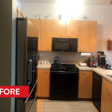 Neil Kelly Company
Before remodeling, this kitchen had worn out builder-grade materials, like tile and grout counters, old oak cabinets and a double-bowl stainless steel sink that had seen it's day. The space also suffered from this half wall that closed off the kitchen from the rest of the apartment and hampered the lighting in the entire room.
 Pinnacle Design & Remodeling
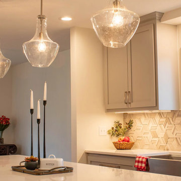
This kitchen went from cramped and dark to bright and open! Knocking down the wall between the old dining room and kitchen made a huge difference. We were able to create a larger kitchen and with an island but most importantly, a red island. Having the red island was important to the home owner and to compliment it we did a geometric architecture backsplash to help bringing in dimension. We tied in their existing floors and re stained the main floor. Surprisingly after the renovation the dining room table never moved from its original spot! All this space needed was to remove the existing wall to a now endless amount of memories this open concept will create.
 Momo Interior Design
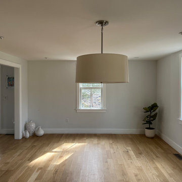
This before photo shows the dining room prior to the redesign. The space features the home’s original layout and finishes before we introduced modern touches, layered textures, and a warm, cohesive palette for the completed Modern Heritage Residence.
33