
Search results for "Observations" in Home Design Ideas
 Black + Vernooy Architects
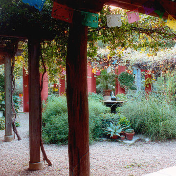
Inspired by the owners' travels in the Mediterranean region yet rooted firmly in Texas soil, this single family residence is designed to provide a secluded, comfortable environment for observing nature, relaxing, entertaining, living, and working. The oddly shaped site determined a house that is removed from the street, resulting in a long drive through a wooded area that leads to the gently sloping house site. The house is designed around a large, central public living area. The basic "H" shaped plan reaches out to define the entry court as well as the rear yard area. The building can only be seen in small vignettes as one moves around and through it, and is finally understood from inside the main room. The public space is central to the plan, where rooms overlay and flow through and into one another. Private rooms are tucked away in more remote parts of the site. The guest bedrooms are located at a slightly lower level, and a remote study, reached by a ship's ladder, overlooks the main living area and enjoys its own roof terrace. The central part of the house is designed as a solid, strong, "original" building to which other wings are added as if built over time. The client desired that the house appear to be of no discernible style or period, and seem older rather than newer.
Built By: Dalgleish Construction Co.
Photography By: Paul Bardagjy
 Greey Pickett
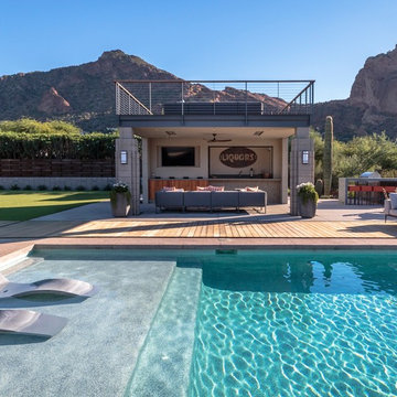
This “Arizona Inspired” home draws on some of the couples’ favorite desert inspirations. The architecture honors the Wrightian design of The Arizona Biltmore, the courtyard raised planter beds feature labeled specimen cactus in the style of the Desert Botanical Gardens, and the expansive backyard offers a resort-style pool and cabana with plenty of entertainment space. Additional focal areas of landscape design include an outdoor living room in the front courtyard with custom steel fire trough, a shallow negative-edge fountain, and a rare “nurse tree” that was salvaged from a nearby site, sits in the corner of the courtyard – a unique conversation starter. The wash that runs on either side of the museum-glass hallway is filled with aloes, agaves and cactus. On the far end of the lot, a fire pit surrounded by desert planting offers stunning views both day and night of the Praying Monk rock formation on Camelback Mountain.
Project Details:
Landscape Architect: Greey|Pickett
Architect: Higgins Architects
Builder: GM Hunt Builders
Landscape Contractor: Benhart Landscaping
Interior Designer: Kitchell Brusnighan Interior Design
Photography: Ian Denker
 Christiane Holmquist Landscape Design
With this client who has been passionate about plants all his life, there was naturally a close collaboration and a lot of input from him. Upon closer inspection you'd find some very exceptional plants that are sort of experimental but "all worth the try" in Gordon's eyes. And he is right! I relished the opportunity to use Star Magnolia stellata, Redbud Cercis 'Avondale' and 'Silver Cloud', Arabian Lilac 'Grand Duke of Tuscany', Royal Bromeliad Vriesea imperialis, also many unusual bulbs such as Scilla.
Besides structure providing shrubs and trees (Tecoma, existing Indian Hawthorne with beautiful structures, Sweet Pea Bush, Golden Breath of Heaven, Ilex, Ginkgo, Bronze Loquat etc.) you'll see here also my favorite perennials, succulents and grasses, all as low care and undemanding as well as low-water as possible, to keep the landscape colorful and interesting year round.
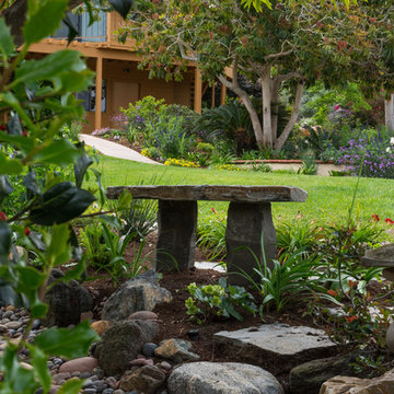
One of the highlights of this garden are the dry stream beds, bird bath and garden bench that we added. Built originally by himself and his wife, the dry stream beds were overgrown, mostly hidden by plant debris, or half rolling down hill. We had fun selecting a mixed collection of colorful and richly textured boulders of various sizes over, and with the input from 7 team members: Gordon, me, the contractor, the supervisor and three workers, we re-created the stream beds, making sure that anchor stones on the sides were well embedded in the slope, and that stone shelves and “top dressing” with smaller pebbles would add to the visual interest. Now these beds form very pleasing architectural features that look like they have always been there.
We were all surprised how quickly all plants adapted to the site and started growing and putting out bloom. Now the old birdbath, a traditional white thing with dove figurines resting on the scalloped bowl, looked out of place, and I suggested to replace it with a stone bowl. And that part of the garden just called for a bench under the Macademia nut tree, to observe the birds and contemplate the whole creation. Only stone would do, but not any stone! Gordon picked a Basalt boulder that was naturally bowl shaped. It’s so heavy that it took 8 men to heave it into place! The Basalt bench was not much lighter, and together they make a very inviting scene. This job should last for a while.
Photographed by Emma Almendarez at http://www.emmatheodoraphotography.com/
Find the right local pro for your project
 Metropolis Drafting and Construction Inc
An original 1930’s English Tudor with only 2 bedrooms and 1 bath spanning about 1730 sq.ft. was purchased by a family with 2 amazing young kids, we saw the potential of this property to become a wonderful nest for the family to grow.
The plan was to reach a 2550 sq. ft. home with 4 bedroom and 4 baths spanning over 2 stories.
With continuation of the exiting architectural style of the existing home.
A large 1000sq. ft. addition was constructed at the back portion of the house to include the expended master bedroom and a second-floor guest suite with a large observation balcony overlooking the mountains of Angeles Forest.
An L shape staircase leading to the upstairs creates a moment of modern art with an all white walls and ceilings of this vaulted space act as a picture frame for a tall window facing the northern mountains almost as a live landscape painting that changes throughout the different times of day.
Tall high sloped roof created an amazing, vaulted space in the guest suite with 4 uniquely designed windows extruding out with separate gable roof above.
The downstairs bedroom boasts 9’ ceilings, extremely tall windows to enjoy the greenery of the backyard, vertical wood paneling on the walls add a warmth that is not seen very often in today’s new build.
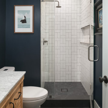
The master bathroom has a showcase 42sq. walk-in shower with its own private south facing window to illuminate the space with natural morning light. A larger format wood siding was using for the vanity backsplash wall and a private water closet for privacy.
In the interior reconfiguration and remodel portion of the project the area serving as a family room was transformed to an additional bedroom with a private bath, a laundry room and hallway.
The old bathroom was divided with a wall and a pocket door into a powder room the leads to a tub room.
The biggest change was the kitchen area, as befitting to the 1930’s the dining room, kitchen, utility room and laundry room were all compartmentalized and enclosed.
We eliminated all these partitions and walls to create a large open kitchen area that is completely open to the vaulted dining room. This way the natural light the washes the kitchen in the morning and the rays of sun that hit the dining room in the afternoon can be shared by the two areas.
The opening to the living room remained only at 8’ to keep a division of space.
 Black + Vernooy Architects
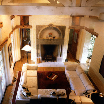
Inspired by the owners' travels in the Mediterranean region yet rooted firmly in Texas soil, this single family residence is designed to provide a secluded, comfortable environment for observing nature, relaxing, entertaining, living, and working. The oddly shaped site determined a house that is removed from the street, resulting in a long drive through a wooded area that leads to the gently sloping house site. The house is designed around a large, central public living area. The basic "H" shaped plan reaches out to define the entry court as well as the rear yard area. The building can only be seen in small vignettes as one moves around and through it, and is finally understood from inside the main room. The public space is central to the plan, where rooms overlay and flow through and into one another. Private rooms are tucked away in more remote parts of the site. The guest bedrooms are located at a slightly lower level, and a remote study, reached by a ship's ladder, overlooks the main living area and enjoys its own roof terrace. The central part of the house is designed as a solid, strong, "original" building to which other wings are added as if built over time. The client desired that the house appear to be of no discernible style or period, and seem older rather than newer.
Built By: Dalgleish Construction Co.
Photography By: Paul Bardagjy
 Klopf Architecture
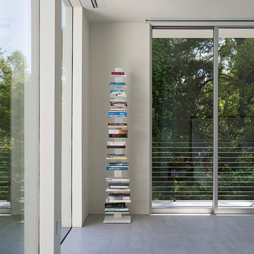
Sebastian and Tanja DiGrande's quest for natural light and open, modern design led them to Klopf Architecture in San Francisco. Working hand-in-hand with homeowner/designer Tanja DiGrande, Klopf collaborated on a modern addition to the rear of a traditional-style home. The idea was to depart from the original style completely to draw a distinction between the original house and any later additions, as well as observe a very minimal, clean, gallery-like modern style against which changing daylight, art, furniture, and of course the people provide the color and motion.
With its dark gray stuccoed walls, dark steel railing, and floor-to-ceiling windows, the exterior of the addition is at the same time an open, modern box as well as a receding volume that acts almost as a backdrop for the house, receding visually out of respect for the original home. From the interior, windows bring in nature and views from all around the lush property. They also allow views of the original house. Up on the roof deck the views magnify. The owners use a boom and crank to bring up food and drinks when entertaining!
Inside, the simple clean-lined spaces showcase the couple’s minimal, modern taste. The open bathroom epitomizes the clean, minimal style of the addition. On the exterior, steel elements bring a more industrial modern feeling to the addition from the rear.
Klopf Architecture Project Team: John Klopf, AIA, Geoff Campen, and Angela Todorova
Co-Designer: Tanja DiGrande
Contractor: Jose Ramirez & J-C General Contractors Inc.
Photography ©2015 Mariko Reed
Location: Orinda, CA
Year completed: 2014
 Klopf Architecture
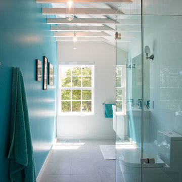
Sebastian and Tanja DiGrande's quest for natural light and open, modern design led them to Klopf Architecture in San Francisco. Working hand-in-hand with homeowner/designer Tanja DiGrande, Klopf collaborated on a modern addition to the rear of a traditional-style home. The idea was to depart from the original style completely to draw a distinction between the original house and any later additions, as well as observe a very minimal, clean, gallery-like modern style against which changing daylight, art, furniture, and of course the people provide the color and motion.
With its dark gray stuccoed walls, dark steel railing, and floor-to-ceiling windows, the exterior of the addition is at the same time an open, modern box as well as a receding volume that acts almost as a backdrop for the house, receding visually out of respect for the original home. From the interior, windows bring in nature and views from all around the lush property. They also allow views of the original house. Up on the roof deck the views magnify. The owners use a boom and crank to bring up food and drinks when entertaining!
Inside, the simple clean-lined spaces showcase the couple’s minimal, modern taste. The open bathroom epitomizes the clean, minimal style of the addition. On the exterior, steel elements bring a more industrial modern feeling to the addition from the rear.
Klopf Architecture Project Team: John Klopf, AIA, Geoff Campen, and Angela Todorova
Co-Designer: Tanja DiGrande
Contractor: Jose Ramirez & J-C General Contractors Inc.
Photography ©2015 Mariko Reed
Location: Orinda, CA
Year completed: 2014
 Renovisions
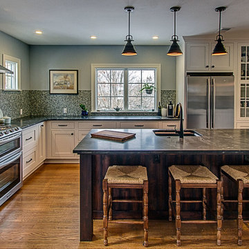
This kitchen had not been renovated since the salt box colonial house was built in the 1960’s. The new owner felt it was time for a complete refresh with some traditional details and adding in the owner’s contemporary tastes.
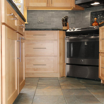
At initial observation, we determined the house had good bones; including high ceilings and abundant natural light from a double-hung window and three skylights overhead recently installed by our client. Mixing the homeowners desires required the skillful eyes of Cathy and Ed from Renovisions. The original kitchen had dark stained, worn cabinets, in-adequate lighting and a non-functional coat closet off the kitchen space. In order to achieve a true transitional look, Renovisions incorporated classic details with subtle, simple and cleaner line touches. For example, the backsplash mix of honed and polished 2” x 3” stone-look subway tile is outlined in brushed stainless steel strips creating an edgy feel, especially at the niche above the range. Removing the existing wall that shared the coat closet opened up the kitchen to allow adding an island for seating and entertaining guests.
We chose natural maple, shaker style flat panel cabinetry with longer stainless steel pulls instead of knobs, keeping in line with the clients desire for a sleeker design. This kitchen had to be gutted to accommodate the new layout featuring an island with pull-out trash and recycling and deeper drawers for utensils. Spatial constraints were top of mind and incorporating a convection microwave above the slide-in range made the most sense. Our client was thrilled with the ability to bake, broil and microwave from GE’s advantium oven – how convenient! A custom pull-out cabinet was built for his extensive array of spices and oils. The sink base cabinet provides plenty of area for the large rectangular stainless steel sink, single-lever multi-sprayer faucet and matching filtered water dispenser faucet. The natural, yet sleek green soapstone countertop with distinct white veining created a dynamic visual and principal focal point for the now open space.
While oak wood flooring existed in the entire first floor, as an added element of color and interest we installed multi-color slate-look porcelain tiles in the kitchen area. We also installed a fully programmable floor heating system for those chilly New England days. Overall, out client was thrilled with his Mission Transition.
 Black + Vernooy Architects
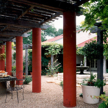
Inspired by the owners' travels in the Mediterranean region yet rooted firmly in Texas soil, this single family residence is designed to provide a secluded, comfortable environment for observing nature, relaxing, entertaining, living, and working. The oddly shaped site determined a house that is removed from the street, resulting in a long drive through a wooded area that leads to the gently sloping house site. The house is designed around a large, central public living area. The basic "H" shaped plan reaches out to define the entry court as well as the rear yard area. The building can only be seen in small vignettes as one moves around and through it, and is finally understood from inside the main room. The public space is central to the plan, where rooms overlay and flow through and into one another. Private rooms are tucked away in more remote parts of the site. The guest bedrooms are located at a slightly lower level, and a remote study, reached by a ship's ladder, overlooks the main living area and enjoys its own roof terrace. The central part of the house is designed as a solid, strong, "original" building to which other wings are added as if built over time. The client desired that the house appear to be of no discernible style or period, and seem older rather than newer.
Built By: Dalgleish Construction Co.
Photography By: Paul Bardagjy
 Klopf Architecture
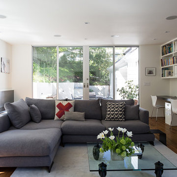
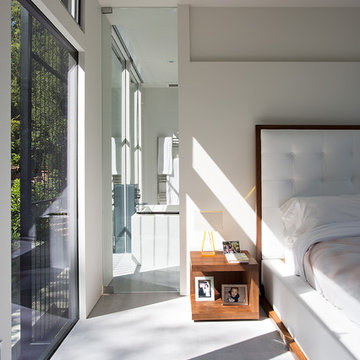
Sebastian and Tanja DiGrande's quest for natural light and open, modern design led them to Klopf Architecture in San Francisco. Working hand-in-hand with homeowner/designer Tanja DiGrande, Klopf collaborated on a modern addition to the rear of a traditional-style home. The idea was to depart from the original style completely to draw a distinction between the original house and any later additions, as well as observe a very minimal, clean, gallery-like modern style against which changing daylight, art, furniture, and of course the people provide the color and motion.
With its dark gray stuccoed walls, dark steel railing, and floor-to-ceiling windows, the exterior of the addition is at the same time an open, modern box as well as a receding volume that acts almost as a backdrop for the house, receding visually out of respect for the original home. From the interior, windows bring in nature and views from all around the lush property. They also allow views of the original house. Up on the roof deck the views magnify. The owners use a boom and crank to bring up food and drinks when entertaining!
Inside, the simple clean-lined spaces showcase the couple’s minimal, modern taste. The open bathroom epitomizes the clean, minimal style of the addition. On the exterior, steel elements bring a more industrial modern feeling to the addition from the rear.
Klopf Architecture Project Team: John Klopf, AIA, Geoff Campen, and Angela Todorova
Co-Designer: Tanja DiGrande
Contractor: Jose Ramirez & J-C General Contractors Inc.
Photography ©2015 Mariko Reed
Location: Orinda, CA
Year completed: 2014
 Klopf Architecture
Sebastian and Tanja DiGrande's quest for natural light and open, modern design led them to Klopf Architecture in San Francisco. Working hand-in-hand with homeowner/designer Tanja DiGrande, Klopf collaborated on a modern addition to the rear of a traditional-style home. The idea was to depart from the original style completely to draw a distinction between the original house and any later additions, as well as observe a very minimal, clean, gallery-like modern style against which changing daylight, art, furniture, and of course the people provide the color and motion.
With its dark gray stuccoed walls, dark steel railing, and floor-to-ceiling windows, the exterior of the addition is at the same time an open, modern box as well as a receding volume that acts almost as a backdrop for the house, receding visually out of respect for the original home. From the interior, windows bring in nature and views from all around the lush property. They also allow views of the original house. Up on the roof deck the views magnify. The owners use a boom and crank to bring up food and drinks when entertaining!
Inside, the simple clean-lined spaces showcase the couple’s minimal, modern taste. The open bathroom epitomizes the clean, minimal style of the addition. On the exterior, steel elements bring a more industrial modern feeling to the addition from the rear.
Klopf Architecture Project Team: John Klopf, AIA, Geoff Campen, and Angela Todorova
Co-Designer: Tanja DiGrande
Contractor: Jose Ramirez & J-C General Contractors Inc.
Photography ©2015 Mariko Reed
Location: Orinda, CA
Year completed: 2014
 Renovisions
This kitchen had not been renovated since the salt box colonial house was built in the 1960’s. The new owner felt it was time for a complete refresh with some traditional details and adding in the owner’s contemporary tastes.
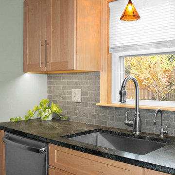
At initial observation, we determined the house had good bones; including high ceilings and abundant natural light from a double-hung window and three skylights overhead recently installed by our client. Mixing the homeowners desires required the skillful eyes of Cathy and Ed from Renovisions. The original kitchen had dark stained, worn cabinets, in-adequate lighting and a non-functional coat closet off the kitchen space. In order to achieve a true transitional look, Renovisions incorporated classic details with subtle, simple and cleaner line touches. For example, the backsplash mix of honed and polished 2” x 3” stone-look subway tile is outlined in brushed stainless steel strips creating an edgy feel, especially at the niche above the range. Removing the existing wall that shared the coat closet opened up the kitchen to allow adding an island for seating and entertaining guests.
We chose natural maple, shaker style flat panel cabinetry with longer stainless steel pulls instead of knobs, keeping in line with the clients desire for a sleeker design. This kitchen had to be gutted to accommodate the new layout featuring an island with pull-out trash and recycling and deeper drawers for utensils. Spatial constraints were top of mind and incorporating a convection microwave above the slide-in range made the most sense. Our client was thrilled with the ability to bake, broil and microwave from GE’s advantium oven – how convenient! A custom pull-out cabinet was built for his extensive array of spices and oils. The sink base cabinet provides plenty of area for the large rectangular stainless steel sink, single-lever multi-sprayer faucet and matching filtered water dispenser faucet. The natural, yet sleek green soapstone countertop with distinct white veining created a dynamic visual and principal focal point for the now open space.
While oak wood flooring existed in the entire first floor, as an added element of color and interest we installed multi-color slate-look porcelain tiles in the kitchen area. We also installed a fully programmable floor heating system for those chilly New England days. Overall, out client was thrilled with his Mission Transition.
 Klopf Architecture
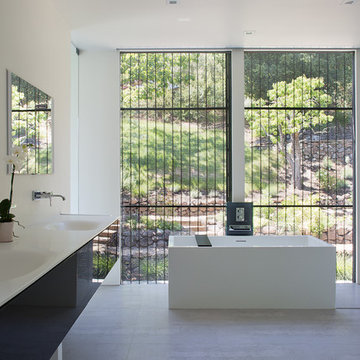
Sebastian and Tanja DiGrande's quest for natural light and open, modern design led them to Klopf Architecture in San Francisco. Working hand-in-hand with homeowner/designer Tanja DiGrande, Klopf collaborated on a modern addition to the rear of a traditional-style home. The idea was to depart from the original style completely to draw a distinction between the original house and any later additions, as well as observe a very minimal, clean, gallery-like modern style against which changing daylight, art, furniture, and of course the people provide the color and motion.
With its dark gray stuccoed walls, dark steel railing, and floor-to-ceiling windows, the exterior of the addition is at the same time an open, modern box as well as a receding volume that acts almost as a backdrop for the house, receding visually out of respect for the original home. From the interior, windows bring in nature and views from all around the lush property. They also allow views of the original house. Up on the roof deck the views magnify. The owners use a boom and crank to bring up food and drinks when entertaining!
Inside, the simple clean-lined spaces showcase the couple’s minimal, modern taste. The open bathroom epitomizes the clean, minimal style of the addition. On the exterior, steel elements bring a more industrial modern feeling to the addition from the rear.
Klopf Architecture Project Team: John Klopf, AIA, Geoff Campen, and Angela Todorova
Co-Designer: Tanja DiGrande
Contractor: Jose Ramirez & J-C General Contractors Inc.
Photography ©2015 Mariko Reed
Location: Orinda, CA
Year completed: 2014
 Klopf Architecture
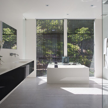
Sebastian and Tanja DiGrande's quest for natural light and open, modern design led them to Klopf Architecture in San Francisco. Working hand-in-hand with homeowner/designer Tanja DiGrande, Klopf collaborated on a modern addition to the rear of a traditional-style home. The idea was to depart from the original style completely to draw a distinction between the original house and any later additions, as well as observe a very minimal, clean, gallery-like modern style against which changing daylight, art, furniture, and of course the people provide the color and motion.
With its dark gray stuccoed walls, dark steel railing, and floor-to-ceiling windows, the exterior of the addition is at the same time an open, modern box as well as a receding volume that acts almost as a backdrop for the house, receding visually out of respect for the original home. From the interior, windows bring in nature and views from all around the lush property. They also allow views of the original house. Up on the roof deck the views magnify. The owners use a boom and crank to bring up food and drinks when entertaining!
Inside, the simple clean-lined spaces showcase the couple’s minimal, modern taste. The open bathroom epitomizes the clean, minimal style of the addition. On the exterior, steel elements bring a more industrial modern feeling to the addition from the rear.
Klopf Architecture Project Team: John Klopf, AIA, Geoff Campen, and Angela Todorova
Co-Designer: Tanja DiGrande
Contractor: Jose Ramirez & J-C General Contractors Inc.
Photography ©2015 Mariko Reed
Location: Orinda, CA
Year completed: 2014

 Amaron Folkestad GC Steamboats Builder
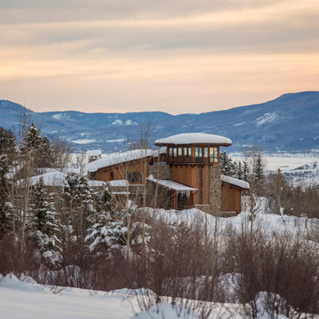
Amaron Folkestad General Contractors Steamboat Springs Custom Builder, Photo byTim Murphy Photography
Minimalist exterior home photo in Denver
Minimalist exterior home photo in Denver
 Klopf Architecture
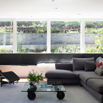
Sebastian and Tanja DiGrande's quest for natural light and open, modern design led them to Klopf Architecture in San Francisco. Working hand-in-hand with homeowner/designer Tanja DiGrande, Klopf collaborated on a modern addition to the rear of a traditional-style home. The idea was to depart from the original style completely to draw a distinction between the original house and any later additions, as well as observe a very minimal, clean, gallery-like modern style against which changing daylight, art, furniture, and of course the people provide the color and motion.
With its dark gray stuccoed walls, dark steel railing, and floor-to-ceiling windows, the exterior of the addition is at the same time an open, modern box as well as a receding volume that acts almost as a backdrop for the house, receding visually out of respect for the original home. From the interior, windows bring in nature and views from all around the lush property. They also allow views of the original house. Up on the roof deck the views magnify. The owners use a boom and crank to bring up food and drinks when entertaining!
Inside, the simple clean-lined spaces showcase the couple’s minimal, modern taste. The open bathroom epitomizes the clean, minimal style of the addition. On the exterior, steel elements bring a more industrial modern feeling to the addition from the rear.
Klopf Architecture Project Team: John Klopf, AIA, Geoff Campen, and Angela Todorova
Co-Designer: Tanja DiGrande
Contractor: Jose Ramirez & J-C General Contractors Inc.
Photography ©2015 Mariko Reed
Location: Orinda, CA
Year completed: 2014
 Catrina's Ranch Interiors
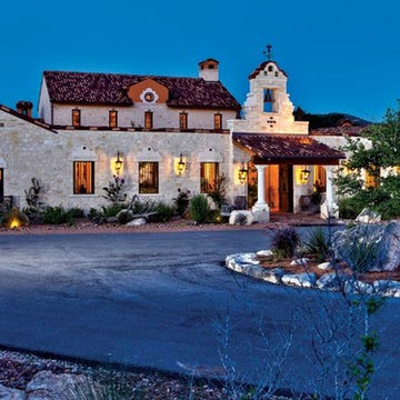
It was in every way, Ramsey says, a once-in-a-lifetime professional and personal experience. “My favorite part of this project was the glow on John and Betty’s faces upon the completion of the hacienda,” she says. “They became not only satisfied clients, but friends for life. It was very challenging but so rewarding.” Helping her and the Martins embrace the home’s challenges was Kendrick, who has been in the design business for more than 40 years. Despite her long career, Kendrick admits to being speechless when she first viewed the ranch’s blueprints and renderings. “The central courtyard had a bell tower over the front entrance gate — a real one,” she says. “The main house had an observation tower that overlooked the dammed-up river and a picturesque view of heaven on earth. There was a magnificent outdoor kitchen off of an enormous porch. This home was to have all the bells and whistles, with unimaginable details, while sparing no expense.”
All three women embraced the challenges of creating the Kemosabe Ranch abode, including designing and building 58 chandeliers and sconces, dozens of custom doors and cabinets, two fully tricked-out kitchens — one inside, one out — and myriad accessories such as candle holders. Regardless of a proposed element’s complexity, like the hammered copper panels in the cabinet doors, Kendrick’s response was the same: “No problem.”
Betty Martin is as apt to talk reverently about all of the craftsmen, contractors and suppliers who worked on her home’s features, from the 10-foot Mexican limestone fountain in the courtyard to the outdoor fossil art wall, as she is to want to bask in the grandeur of the finished project. That’s not surprising, given its scope to rival that of the Taj Mahal. But having been so intimately involved in the process has given her an even greater sense of pride in ownership of her dazzling dwelling. “It’s hard for me to pick out the part of the project that I love the most,” she says.
 Klopf Architecture
Sebastian and Tanja DiGrande's quest for natural light and open, modern design led them to Klopf Architecture in San Francisco. Working hand-in-hand with homeowner/designer Tanja DiGrande, Klopf collaborated on a modern addition to the rear of a traditional-style home. The idea was to depart from the original style completely to draw a distinction between the original house and any later additions, as well as observe a very minimal, clean, gallery-like modern style against which changing daylight, art, furniture, and of course the people provide the color and motion.
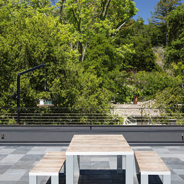
With its dark gray stuccoed walls, dark steel railing, and floor-to-ceiling windows, the exterior of the addition is at the same time an open, modern box as well as a receding volume that acts almost as a backdrop for the house, receding visually out of respect for the original home. From the interior, windows bring in nature and views from all around the lush property. They also allow views of the original house. Up on the roof deck the views magnify. The owners use a boom and crank to bring up food and drinks when entertaining!
Inside, the simple clean-lined spaces showcase the couple’s minimal, modern taste. The open bathroom epitomizes the clean, minimal style of the addition. On the exterior, steel elements bring a more industrial modern feeling to the addition from the rear.
Klopf Architecture Project Team: John Klopf, AIA, Geoff Campen, and Angela Todorova
Co-Designer: Tanja DiGrande
Contractor: Jose Ramirez & J-C General Contractors Inc.
Photography ©2015 Mariko Reed
Location: Orinda, CA
Year completed: 2014
 Klopf Architecture
Sebastian and Tanja DiGrande's quest for natural light and open, modern design led them to Klopf Architecture in San Francisco. Working hand-in-hand with homeowner/designer Tanja DiGrande, Klopf collaborated on a modern addition to the rear of a traditional-style home. The idea was to depart from the original style completely to draw a distinction between the original house and any later additions, as well as observe a very minimal, clean, gallery-like modern style against which changing daylight, art, furniture, and of course the people provide the color and motion.
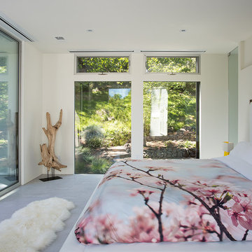
With its dark gray stuccoed walls, dark steel railing, and floor-to-ceiling windows, the exterior of the addition is at the same time an open, modern box as well as a receding volume that acts almost as a backdrop for the house, receding visually out of respect for the original home. From the interior, windows bring in nature and views from all around the lush property. They also allow views of the original house. Up on the roof deck the views magnify. The owners use a boom and crank to bring up food and drinks when entertaining!
Inside, the simple clean-lined spaces showcase the couple’s minimal, modern taste. The open bathroom epitomizes the clean, minimal style of the addition. On the exterior, steel elements bring a more industrial modern feeling to the addition from the rear.
Klopf Architecture Project Team: John Klopf, AIA, Geoff Campen, and Angela Todorova
Co-Designer: Tanja DiGrande
Contractor: Jose Ramirez & J-C General Contractors Inc.
Photography ©2015 Mariko Reed
Location: Orinda, CA
Year completed: 2014
86