
Search results for "Official" in Home Design Ideas
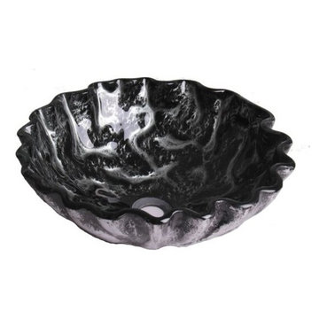
 Jano Sanitary
Enrich your bathroom vanity with this unique Jano Rocky Stone tempered glass basin. This Rocky Stone Tempered Glass basin is the masterpiece to give your bathroom décor the final touch. This is simply designed for above and partially below the counter installation and will surely be a compliment to any color and updated design for a bathroom remodel. Make the installation a lot easier with the included hole diameter template. Save your trip to the hardware store as it also includes an official Jano Popup Drain. You can finally take advantage and enjoy this easy home improvement project that can save the headache. It is also great for home, spa, hotel, restaurant or other commercial use and home use!
Features:
Features a unique design that will bring out a character to your bathroom.
Made from high quality thick tempered glass to prevent breakage
Includes stainless steel pop up drain to save the trip hassle
Includes 1.77in. drain hole template to ensure the perfect fit
Dimensions:16.5inx6.7in, Thickness:12mm, G.W 14.33lb
Item Model Number: JGV1015
Thickness: 12mm
Item Weight: 12lb
Product Dimensions: 16.5" x 16.5" x 6.7"
Assembly Diameter: 16.5"
Package Content:
1x Jano Rocky Stone Tempered Glass basin
1x Hole Diameter Template
1x Popup Drain with mounting Rings
1x User Manual

 Greenbay Northern Inc
Considering to add a Fire Pit to your outdoor living area?
What you should know….
For a built-in design Fire Pit, it’s necessary to match your design, size, style and materials with surrounding area (house, garden, pool ,…)
You can do a DYI job and assemble materials yourself but for a fully custom fire pit you need a landscape professional or contractor designing and building it.
Regardless of style you need to make sure the you are using proper stones and materials.
Do your homework before digging any hole, or consult with a landscape professional to find out the right location for your Fire pit, you might need to find out from your municipality that what is the minimum distance requirement from your home or neighbors’ yard.
You might even need a site inspection from local fire officials to help make sure proposed location is safe.
You can even enhance your enjoyment by installing outdoor lighting near the fire pit or considering a seating area like a low stone wall around the Fire pit. For best results it’s wise to consult a landscape professional regarding outdoor lighting installation and design, seating wall materials and dimensions and most importantly the proper distance between your designed Fire pit and seating wall for safety.
for more info contact us or getting your free Quote please contact us:
Tel: 416 - 873- 3356
www.greenbaynorthern.com

 Above Ground Pool and Spa BBQ & More Wholesale
Above Ground Pool and Spa
OZONE US/CDN/EU
- NO BLOWER
- SS JETTING
- US/CDN EQUIPMENT
- NO CIRC PLUMB
- GYPSUM
- PECAN PANELS
109733 COVER, 92 X 92, MOCHA, 4/3, W-COPPER BARRIER
Specification Measurement
Dimensions 91" X 91"
Depth 38"
Capacity 6
Water Capacity 420
Weight 860/4020 lbs
Total Jets 43
Feature
Pump 1: 56 Frame 2-Speed 5.0 bHP Standard
Pump 2: 56 Frame 1-Speed 5.0 bHP Standard
Hybrid Sub-Structure Standard
240V/40A/60A (4-Wire) Standard
Excel-X™ Simulated Wood Standard
Perma-Shield™ Bottom Pan Standard
Vital Energy Insulation System Standard
Halo Pro-Loc™ Stainless Steel Jets Standard
24-Hour Circulation Pump Option
Illuminated Drink Holders Standard
Dynamic LED Lighting Standard
Waterfall 1 Standard
Find the right local pro for your project
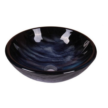 Jano Sanitary
Embrace your peaceful lifestyle with this Jano Ripples Abstract tempered glass basin. This Ripples Abstract Tempered Glass basin brings out character to give your bathroom décor the final touch. This is simply designed for above and partially below the counter installation and will surely be a compliment to any color and updated design for a bathroom remodel. Make the installation a lot easier with the included hole diameter template. Save your trip to the hardware store as it also includes an official Jano Popup Drain. You can finally take advantage and enjoy this easy home improvement project that can save the headache. It is also great for home, spa, hotel, restaurant or other commercial use and home use!
Features:
Ripples Abstract tempered glass basin is inspired by the touch of nature
Made from high quality thick tempered glass to prevent breakage
Includes stainless steel pop up drain to save the trip hassle
Includes 1.77in. drain hole template to ensure the perfect fit
Dimensions:16.5inx6.7in, Thickness:19mm, G.W 22.65lb
Item Model Number: JGV1026
Thickness: 19mm
Item Weight: 20.7lb
Product Dimensions: 16.5" x 16.5" x 6.7"
Assembly Diameter: 16.5"
Package Content:
1x Jano Ripples Abstract Tempered Glass basin
1x Hole Diameter Template
1x Popup Drain with mounting Rings
1x User Manual
 Greenbay Northern Inc
Considering to add a Fire Pit to your outdoor living area?
What you should know….
For a built-in design Fire Pit, it’s necessary to match your design, size, style and materials with surrounding area (house, garden, pool ,…)
You can do a DYI job and assemble materials yourself but for a fully custom fire pit you need a landscape professional or contractor designing and building it.
Regardless of style you need to make sure the you are using proper stones and materials.
Do your homework before digging any hole, or consult with a landscape professional to find out the right location for your Fire pit, you might need to find out from your municipality that what is the minimum distance requirement from your home or neighbors’ yard.
You might even need a site inspection from local fire officials to help make sure proposed location is safe.
You can even enhance your enjoyment by installing outdoor lighting near the fire pit or considering a seating area like a low stone wall around the Fire pit. For best results it’s wise to consult a landscape professional regarding outdoor lighting installation and design, seating wall materials and dimensions and most importantly the proper distance between your designed Fire pit and seating wall for safety.
for more info contact us or getting your free Quote please contact us:
Tel: 416 - 873- 3356
www.greenbaynorthern.com

 Liberty Homes
To create the master suite this home owner dreamed of, we moved a few walls, and a lot of doors and windows. Essentially half the house went under construction. Within the same footprint we created a larger master bathroom, walk in closet, and guest room while retaining the same number of bedrooms. The second room became smaller but officially became a bedroom with a closet and more functional layout. What you don’t see in the finished pictures is a new utility room that had to be built downstairs in the garage to service the new plumbing and heating.
All those black bathroom fixtures are Kohler and the tile is from Ann Sacks. The stunning grey tile is Andy Fleishman and the grout not only fills in the separations but defines the white design in the tile. This time-intensive process meant the tiles had to be sealed before install and twice after.
All the black framed windows are by Anderson Woodright series and have a classic 3 light over 0 light sashes.
The doors are true sealer panels with a classic trim, as well as thicker head casings and a top cap.
We moved the master bathroom to the side of the house where it could take advantage of the windows. In the master bathroom in addition to the ann sacks tile on the floor, some of the tile was laid out in a way that made it feel like one sheet with almost no space in between. We found more storage in the master by putting it in the knee wall and bench seat. The master shower also has a rain head as well as a regular shower head that can be used separately or together.
The second bathroom has a unique tub completely encased in grey quartz stone with a clever mitered edge to minimize grout lines. It also has a larger window to brighten up the bathroom and add some drama.

 Casework Inter Design
When the homeowners first purchased the 1925 house, it was compartmentalized, outdated, and completely unfunctional for their growing family. Casework designed the owner's previous kitchen and family room and was brought in to lead up the creative direction for the project. Casework teamed up with architect Paul Crowther and brother sister team Ainslie Davis on the addition and remodel of the Colonial.
The existing kitchen and powder bath were demoed and walls expanded to create a new footprint for the home. This created a much larger, more open kitchen and breakfast nook with mudroom, pantry and more private half bath. In the spacious kitchen, a large walnut island perfectly compliments the homes existing oak floors without feeling too heavy. Paired with brass accents, Calcutta Carrera marble countertops, and clean white cabinets and tile, the kitchen feels bright and open - the perfect spot for a glass of wine with friends or dinner with the whole family.
There was no official master prior to the renovations. The existing four bedrooms and one separate bathroom became two smaller bedrooms perfectly suited for the client’s two daughters, while the third became the true master complete with walk-in closet and master bath. There are future plans for a second story addition that would transform the current master into a guest suite and build out a master bedroom and bath complete with walk in shower and free standing tub.
Overall, a light, neutral palette was incorporated to draw attention to the existing colonial details of the home, like coved ceilings and leaded glass windows, that the homeowners fell in love with. Modern furnishings and art were mixed in to make this space an eclectic haven.
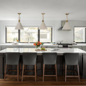
 Susan Yeley Homes
One of many contenders for the official SYH motto is "Got ranch?" Midcentury limestone ranch, to be specific. Because in Bloomington, we do! We've got lots of midcentury limestone ranches, ripe for updates.
This gut remodel and addition on the East side is a great example. The two-way fireplace sits in its original spot in the 2400 square foot home, now acting as the pivot point between the home's original wing and a 1000 square foot new addition. In the reconfiguration of space, bedrooms now flank a central public zone, kids on one end (in spaces that are close to the original bedroom footprints), and a new owner's suite on the other. Everyone meets in the middle for cooking and eating and togetherness. A portion of the full basement is finished for a guest suite and tv room, accessible from the foyer stair that is also, more or less, in its original spot.
The kitchen was always street-facing in this home, which the homeowners dug, so we kept it that way, but of course made it bigger and more open. What we didn't keep: the original green and pink toilets and tile. (Apologies to the purists; though they may still be in the basement.)
Opening spaces both to one another and to the outside help lighten and modernize this family home, which comes alive with contrast, color, natural walnut and oak, and a great collection of art, books and vintage rugs. It's definitely ready for its next 75 years.
 Liberty Homes
To create the master suite this home owner dreamed of, we moved a few walls, and a lot of doors and windows. Essentially half the house went under construction. Within the same footprint we created a larger master bathroom, walk in closet, and guest room while retaining the same number of bedrooms. The second room became smaller but officially became a bedroom with a closet and more functional layout. What you don’t see in the finished pictures is a new utility room that had to be built downstairs in the garage to service the new plumbing and heating.
All those black bathroom fixtures are Kohler and the tile is from Ann Sacks. The stunning grey tile is Andy Fleishman and the grout not only fills in the separations but defines the white design in the tile. This time-intensive process meant the tiles had to be sealed before install and twice after.
All the black framed windows are by Anderson Woodright series and have a classic 3 light over 0 light sashes.
The doors are true sealer panels with a classic trim, as well as thicker head casings and a top cap.
We moved the master bathroom to the side of the house where it could take advantage of the windows. In the master bathroom in addition to the ann sacks tile on the floor, some of the tile was laid out in a way that made it feel like one sheet with almost no space in between. We found more storage in the master by putting it in the knee wall and bench seat. The master shower also has a rain head as well as a regular shower head that can be used separately or together.
The second bathroom has a unique tub completely encased in grey quartz stone with a clever mitered edge to minimize grout lines. It also has a larger window to brighten up the bathroom and add some drama.
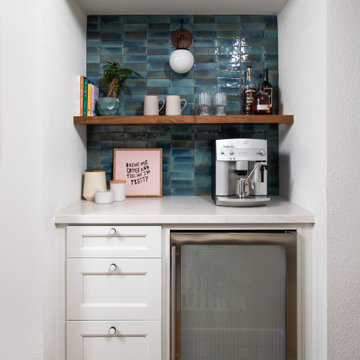
 ASR DESIGN STUDIO
Our mission was to completely update and transform their huge house into a cozy, welcoming and warm home of their own.
“When we moved in, it was such a novelty to live in a proper house. But it still felt like the in-law’s home,” our clients told us. “Our dream was to make it feel like our home.”
Our transformation skills were put to the test when we created the host-worthy kitchen space (complete with a barista bar!) that would double as the heart of their home and a place to make memories with their friends and family.
We upgraded and updated their dark and uninviting family room with fresh furnishings, flooring and lighting and turned those beautiful exposed beams into a feature point of the space.
The end result was a flow of modern, welcoming and authentic spaces that finally felt like home. And, yep … the invite was officially sent out!
Our clients had an eclectic style rich in history, culture and a lifetime of adventures. We wanted to highlight these stories in their home and give their memorabilia places to be seen and appreciated.
The at-home office was crafted to blend subtle elegance with a calming, casual atmosphere that would make it easy for our clients to enjoy spending time in the space (without it feeling like they were working!)
We carefully selected a pop of color as the feature wall in the primary suite and installed a gorgeous shiplap ledge wall for our clients to display their meaningful art and memorabilia.
Then, we carried the theme all the way into the ensuite to create a retreat that felt complete.

 Zelaya Properties LLC
We used: Custom cherry cabinetry in Arts & Crafts Shaker style by Kabinart in Boulder and Espresso stains. Liberty Hardware Venetian bronze 1-1/2" cabinet knobs. KitchenAid Architect II Series 22 CF counter-depth French door refrigerator. KitchenAid Architect Series II 27" convection single wall oven. KitchenAid 36" 6-burner dual fuel freestanding commercial-style range. KitchenAid Architect II Series 24" dishwasher. Sharp Insight Pro Series 24" built-in microwave drawer (Model #KB6524PS). Crystorama Solaris 12" wide pendant lights in English bronze. Granite countertops in Brown Fantasy. 3"x6" polished marble backsplash.
Paint colors:
Walls: Glidden Silver Cloud 30YY 63/024
Ceilings/Trims/Doors: Glidden Swan White GLC23
Robert B. Narod Photography

 Story Homes
This 1995 contemporary Tudor is a spacious home with large rooms, multiple fireplaces, vaulted ceilings, and spectacular views. It sat vacant for two years until the right buyer came along. The new owners were excited, and ready to dive into remodeling. First project: A totally new Master Bath.
The original bath had vaulted ceilings with popcorn texture. It also had a dated Jacuzzi as its centerpiece. Removing the Jacuzzi became a priority that would free up the space and offer all kinds of interior design possibilities.
The owners chose Rick Jacobson for the project. After removing the Jacuzzi, Rick removed the existing popcorn ceiling texture and replaced it with a knock-down finish. He added adjustable dimmers and additional can lighting for the right blend of lighting.
The new plan began from the ground up, with in-floor heating. The new floor is constructed with 6” X 24” Porcelain planks that look great. The walk-in shower walls are constructed with 12” x 18” Travertine Porcelain tiles. The shower floor, niche, and border were crafted using 2” x 2” slate Porcelain with Travertine pencils (the border treatment).
The shower features a Kohler rubbed oil shower control valve, and ceiling-mounted 11-inch rubbed oil rain shower head. It’s a great combination for this beautiful shower.
 Liberty Homes
To create the master suite this home owner dreamed of, we moved a few walls, and a lot of doors and windows. Essentially half the house went under construction. Within the same footprint we created a larger master bathroom, walk in closet, and guest room while retaining the same number of bedrooms. The second room became smaller but officially became a bedroom with a closet and more functional layout. What you don’t see in the finished pictures is a new utility room that had to be built downstairs in the garage to service the new plumbing and heating.
All those black bathroom fixtures are Kohler and the tile is from Ann Sacks. The stunning grey tile is Andy Fleishman and the grout not only fills in the separations but defines the white design in the tile. This time-intensive process meant the tiles had to be sealed before install and twice after.
All the black framed windows are by Anderson Woodright series and have a classic 3 light over 0 light sashes.
The doors are true sealer panels with a classic trim, as well as thicker head casings and a top cap.
We moved the master bathroom to the side of the house where it could take advantage of the windows. In the master bathroom in addition to the ann sacks tile on the floor, some of the tile was laid out in a way that made it feel like one sheet with almost no space in between. We found more storage in the master by putting it in the knee wall and bench seat. The master shower also has a rain head as well as a regular shower head that can be used separately or together.
The second bathroom has a unique tub completely encased in grey quartz stone with a clever mitered edge to minimize grout lines. It also has a larger window to brighten up the bathroom and add some drama.
 Story Homes
This 1995 contemporary Tudor is a spacious home with large rooms, multiple fireplaces, vaulted ceilings, and spectacular views. It sat vacant for two years until the right buyer came along. The new owners were excited, and ready to dive into remodeling. First project: A totally new Master Bath.
The original bath had vaulted ceilings with popcorn texture. It also had a dated Jacuzzi as its centerpiece. Removing the Jacuzzi became a priority that would free up the space and offer all kinds of interior design possibilities.
The owners chose Rick Jacobson for the project. After removing the Jacuzzi, Rick removed the existing popcorn ceiling texture and replaced it with a knock-down finish. He added adjustable dimmers and additional can lighting for the right blend of lighting.
The new plan began from the ground up, with in-floor heating. The new floor is constructed with 6” X 24” Porcelain planks that look great. The walk-in shower walls are constructed with 12” x 18” Travertine Porcelain tiles. The shower floor, niche, and border were crafted using 2” x 2” slate Porcelain with Travertine pencils (the border treatment).
The shower features a Kohler rubbed oil shower control valve, and ceiling-mounted 11-inch rubbed oil rain shower head. It’s a great combination for this beautiful shower.
 Liberty Homes
To create the master suite this home owner dreamed of, we moved a few walls, and a lot of doors and windows. Essentially half the house went under construction. Within the same footprint we created a larger master bathroom, walk in closet, and guest room while retaining the same number of bedrooms. The second room became smaller but officially became a bedroom with a closet and more functional layout. What you don’t see in the finished pictures is a new utility room that had to be built downstairs in the garage to service the new plumbing and heating.
All those black bathroom fixtures are Kohler and the tile is from Ann Sacks. The stunning grey tile is Andy Fleishman and the grout not only fills in the separations but defines the white design in the tile. This time-intensive process meant the tiles had to be sealed before install and twice after.
All the black framed windows are by Anderson Woodright series and have a classic 3 light over 0 light sashes.
The doors are true sealer panels with a classic trim, as well as thicker head casings and a top cap.
We moved the master bathroom to the side of the house where it could take advantage of the windows. In the master bathroom in addition to the ann sacks tile on the floor, some of the tile was laid out in a way that made it feel like one sheet with almost no space in between. We found more storage in the master by putting it in the knee wall and bench seat. The master shower also has a rain head as well as a regular shower head that can be used separately or together.
The second bathroom has a unique tub completely encased in grey quartz stone with a clever mitered edge to minimize grout lines. It also has a larger window to brighten up the bathroom and add some drama.
 Susan Yeley Homes
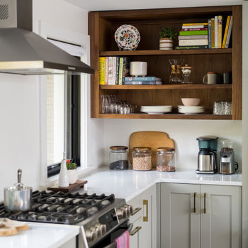
One of many contenders for the official SYH motto is "Got ranch?" Midcentury limestone ranch, to be specific. Because in Bloomington, we do! We've got lots of midcentury limestone ranches, ripe for updates.
This gut remodel and addition on the East side is a great example. The two-way fireplace sits in its original spot in the 2400 square foot home, now acting as the pivot point between the home's original wing and a 1000 square foot new addition. In the reconfiguration of space, bedrooms now flank a central public zone, kids on one end (in spaces that are close to the original bedroom footprints), and a new owner's suite on the other. Everyone meets in the middle for cooking and eating and togetherness. A portion of the full basement is finished for a guest suite and tv room, accessible from the foyer stair that is also, more or less, in its original spot.
The kitchen was always street-facing in this home, which the homeowners dug, so we kept it that way, but of course made it bigger and more open. What we didn't keep: the original green and pink toilets and tile. (Apologies to the purists; though they may still be in the basement.)
Opening spaces both to one another and to the outside help lighten and modernize this family home, which comes alive with contrast, color, natural walnut and oak, and a great collection of art, books and vintage rugs. It's definitely ready for its next 75 years.
 Liberty Homes
To create the master suite this home owner dreamed of, we moved a few walls, and a lot of doors and windows. Essentially half the house went under construction. Within the same footprint we created a larger master bathroom, walk in closet, and guest room while retaining the same number of bedrooms. The second room became smaller but officially became a bedroom with a closet and more functional layout. What you don’t see in the finished pictures is a new utility room that had to be built downstairs in the garage to service the new plumbing and heating.
All those black bathroom fixtures are Kohler and the tile is from Ann Sacks. The stunning grey tile is Andy Fleishman and the grout not only fills in the separations but defines the white design in the tile. This time-intensive process meant the tiles had to be sealed before install and twice after.
All the black framed windows are by Anderson Woodright series and have a classic 3 light over 0 light sashes.
The doors are true sealer panels with a classic trim, as well as thicker head casings and a top cap.
We moved the master bathroom to the side of the house where it could take advantage of the windows. In the master bathroom in addition to the ann sacks tile on the floor, some of the tile was laid out in a way that made it feel like one sheet with almost no space in between. We found more storage in the master by putting it in the knee wall and bench seat. The master shower also has a rain head as well as a regular shower head that can be used separately or together.
The second bathroom has a unique tub completely encased in grey quartz stone with a clever mitered edge to minimize grout lines. It also has a larger window to brighten up the bathroom and add some drama.

 Jessica Cain
Photo: Jessica Cain © 2017 Houzz
Inspiration for a 1950s open concept family room remodel in Kansas City with white walls and no tv
Inspiration for a 1950s open concept family room remodel in Kansas City with white walls and no tv
 Liberty Homes
To create the master suite this home owner dreamed of, we moved a few walls, and a lot of doors and windows. Essentially half the house went under construction. Within the same footprint we created a larger master bathroom, walk in closet, and guest room while retaining the same number of bedrooms. The second room became smaller but officially became a bedroom with a closet and more functional layout. What you don’t see in the finished pictures is a new utility room that had to be built downstairs in the garage to service the new plumbing and heating.
All those black bathroom fixtures are Kohler and the tile is from Ann Sacks. The stunning grey tile is Andy Fleishman and the grout not only fills in the separations but defines the white design in the tile. This time-intensive process meant the tiles had to be sealed before install and twice after.
All the black framed windows are by Anderson Woodright series and have a classic 3 light over 0 light sashes.
The doors are true sealer panels with a classic trim, as well as thicker head casings and a top cap.
We moved the master bathroom to the side of the house where it could take advantage of the windows. In the master bathroom in addition to the ann sacks tile on the floor, some of the tile was laid out in a way that made it feel like one sheet with almost no space in between. We found more storage in the master by putting it in the knee wall and bench seat. The master shower also has a rain head as well as a regular shower head that can be used separately or together.
The second bathroom has a unique tub completely encased in grey quartz stone with a clever mitered edge to minimize grout lines. It also has a larger window to brighten up the bathroom and add some drama.
 ASR DESIGN STUDIO
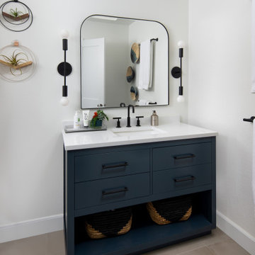
Our mission was to completely update and transform their huge house into a cozy, welcoming and warm home of their own.
“When we moved in, it was such a novelty to live in a proper house. But it still felt like the in-law’s home,” our clients told us. “Our dream was to make it feel like our home.”
Our transformation skills were put to the test when we created the host-worthy kitchen space (complete with a barista bar!) that would double as the heart of their home and a place to make memories with their friends and family.
We upgraded and updated their dark and uninviting family room with fresh furnishings, flooring and lighting and turned those beautiful exposed beams into a feature point of the space.
The end result was a flow of modern, welcoming and authentic spaces that finally felt like home. And, yep … the invite was officially sent out!
Our clients had an eclectic style rich in history, culture and a lifetime of adventures. We wanted to highlight these stories in their home and give their memorabilia places to be seen and appreciated.
The at-home office was crafted to blend subtle elegance with a calming, casual atmosphere that would make it easy for our clients to enjoy spending time in the space (without it feeling like they were working!)
We carefully selected a pop of color as the feature wall in the primary suite and installed a gorgeous shiplap ledge wall for our clients to display their meaningful art and memorabilia.
Then, we carried the theme all the way into the ensuite to create a retreat that felt complete.
94