
Search results for "Over borrowing" in Home Design Ideas

 Jon Allen Fine Metal Art
Premonition by Jon Allen - JAC 195
The Jon Allen Collection is an exclusive, hand-selected group of my most personal work to date. Each piece is hand-painted on aluminum. My art itself and my chosen medium, aluminum, are blissfully married. You may not think of the word organic when you hear the word metal, but this is some of my most organic art and that’s simply because metal allows my work to achieve true sentience. Aluminum’s naturally reflective nature enables each color, shape, and stroke to reach its full potential. A new aspect of the painting will reveal itself to you as it basks in the light that surrounds, evades, or envelops it in that moment. When you see the piece from different angles, you will appreciate how vibrant, dynamic, and environmentally influenced these pieces are. What you may see and feel by morning is not what you’ll see or feel by dusk and in many ways, and as such I feel these pieces capture the ever-ebbing and complex nature of human emotion and perception.
Some of these pieces are truly abstract while others are modern takes on traditional landscapes, marine life, and portraits. I hope you enjoy them a fraction of how much I enjoyed creating them. If you have any questions, please don’t hesitate to reach out.
Number of Pieces: 1
Dimensions: 48" x 24" x 2" off the wall
Care & Cleaning: Clean with a soft cloth and plain soap & water
Other Features: Hardware is pre-installed for simple hanging and art will “float” 2” off the wall


Find the right local pro for your project
 TK Building & Design
Small elegant underground cork floor and brown floor home design photo with beige walls and no fireplace


 Vision Design
What had been a very cramped, awkward master bathroom layout that barely accommodated one person became a spacious double vanity, double shower and master closet.


Sponsored
Sunbury, OH

J.Holderby - Renovations
Franklin County's Leading General Contractors - 2X Best of Houzz!

 Kitchen Masters, Inc.
Staircase - contemporary wooden u-shaped mixed material railing staircase idea in Denver


 User
Photography by CWC (Peter Atkins)
Mid-sized trendy master dark wood floor bedroom photo in Minneapolis with brown walls and no fireplace
Mid-sized trendy master dark wood floor bedroom photo in Minneapolis with brown walls and no fireplace




 S / Wiley Interior Photography
Stephanie Wiley Photography
Example of a trendy dark wood floor living room design with gray walls, a standard fireplace, a metal fireplace and a wall-mounted tv
Example of a trendy dark wood floor living room design with gray walls, a standard fireplace, a metal fireplace and a wall-mounted tv
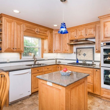


 Skill Construction & Design, LLC
There are so many design elements to this kitchen, I almost don’t know where to start. Bright and airy with crisp clean white cabinets, the kitchen is open and welcoming. Still crisp but gently contrasting, the stainless steel appliance add depth amid the white. To keep this kitchen warm, natural oak covers the floors and a toasted wheat color washes the walls. And then there is the architectural elements. You know. That post and beam in the middle of the room. It’s the center of attention.
When you walk into a room your eyes roam around, establishing the size and shape of the room as your feet take you forward. From the front door of this home straight ahead you encountered this wall. The dining area to the right gives you a glimpse of things to come. Where there is a dining room you will usually find a kitchen.
The architecture of years gone by consistently hides the kitchen, the heart of the home, behind walls. I sympathize with my Mom, and all the other Moms, who have had to spend so much time tucked into a tight kitchen, away from the family. This wall had to go, but it was structural. We needed its support but not its bulk.
So we got rid of the bulk and only the bulk. Instead of a wall we have a post and beam, offering all of the structure we need. We could have installed a huge steel beam and reconfigure the joists to upset the beam, but why? The small beam and post add an incredible architectural element. It’s turning lemons into lemon, we simply made the most of what we had. It may be functional but it’s so fantastic. It looks like we created the effect just for the drama.
The original kitchen may have had a working triangle and some counter space, but it was fairly small, with each area only a step or two away. The dark cabinets made the space feel even smaller and the butcher block patterned laminate counter tops were very dated. The appliances were feeling their age as well, from a coil burner electric stove to a top freezer refrigerator. To keep this kitchen within its space, a half wall separated it from the dining area.
With the wall gone we borrowed some space from the living room and extended what was a U shaped kitchen into an L. At the living room window we start our new kitchen. We kept a small part of the wall to support the other end of our decorative beam. Sandwiched between a large pantry and our new French door refrigerator, the wall disappears. With our new open floor plan a sizable island was in order.
We split our cooking areas and installed a continuous grill gas cooktop into the island. A sleek island hood takes care of exhaust and adds an extra element to our architectural feature. Under the cooktop we added over-sized drawers for pots and pan storage. The frameless cabinets from New River Cabinetry are maple, painted white, with the Herndon door style. With the cooktop safely nestled into our island, we still had to add an oven.
We used the space where the old range sat for a large single oven of stainless steel and glass. If it worked for one, why not two? We created a home for a microwave in the wall cabinets. It’s perfect for heating leftovers so close to the refrigerator.
An important consideration for hot spots in your kitchen is landing zones. Each of our cooking areas have generous landing zones, one on each side of the cooktop and an entire counter area above or below the ovens, depending on which one you’re using.
We wanted to give the sink area more room so the half wall had to come out. We moved the trash and recycle cans into a cabinet, removed the heavy soffits and kept the sink under the window.
With that little bit of extra space we were able to add a larger cabinet above the dishwasher and slide it all down. This used to be where the carpeting met the vinyl floor, but all of it is gone. Long oak planks eliminate that final divide between the kitchen and the dining area, while adding visual length to the area. White wall cabinets on each side of the window reflect the sunlight for a brighter view.
With all of the darker cabinetry the backsplash walls had been painted white. Even still, there was a darkness in the corners and it wasn’t very exciting. We wanted to add visual interest and reflect the new under-cabinet lighting, eliminating the shadows in this corner.
With 1″x 2″ Arabescato Honed marble mosaics and those under-cabinet lights, we achieved the perfect balance. The marble has subtle swirls in gray and beige on a clean white background, but with the honed finish the light is softly reflected instead of glaring. For granite, we chose the soft gray tones of Luna Pearl. The speckles of gray and beige are a gentle contrast to the white cabinets and emulate the color of the stainless steel.
Between the carpet, red half wall, dark railing and dated light fixture, the dining area felt tired. Since the kitchen lacked sufficient storage, a large utility cabinet crowded the table space without adding any decorate elements.
Although it didn’t get any bigger, our dining area feels fresher and more open too. With the oak flooring joining the area to the rest of our space and the toasted wheat on the walls, the white table and chairs compliment the cabinetry while contrasting the warmer colors. We replaced the chandelier with recessed lighting and changed that railing too.
With our new open floor plan, we ended up with a fairly open area in between our foyer closet and the living room window. Not one to miss an opportunity, we filled the space with a multi-functional work space.
With the sunlight streaming in this bright corner works for anything this family needs.
There’s plenty of space for a chair under this large desk drawer. A closed cabinet below, glass doors above and lots of open shelving let you store and or showcase your belongings. We added a lite area at the top to keep away the darker corners.
The transformation is complete. This kitchen and all of its features are truly the center of attention in this home.
http://www.designsbyskill.com/
http://www.rjkconstructioninc.com/


 Deborah Kipp's Decorative Painting (Austin Texas)
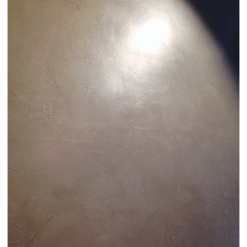
CLOSE-UP VIEW
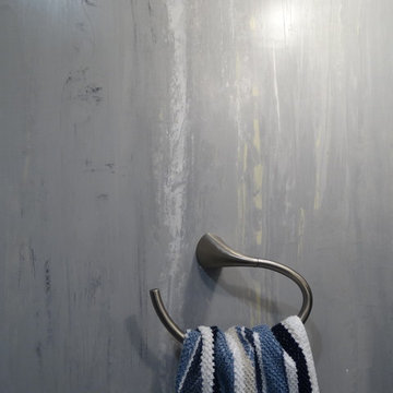
This master bath makeover starts with bare walls that have been floated out smooth over the sheetrock. Then we hand applied a beautiful custom tinted, soft grey Venetian plaster. After two coats of plaster, the walls were waxed and buffed. This process seals the plaster, leaving a long-lasting finish. The finished product is subtle and undeniably beautiful! I’ve included a close-up view of the finish below.

Sponsored
Sunbury, OH
J.Holderby - Renovations
Franklin County's Leading General Contractors - 2X Best of Houzz!
 User
Emily Kolaczek
Large elegant walk-out medium tone wood floor home design photo in Calgary with beige walls, a standard fireplace and a metal fireplace
Large elegant walk-out medium tone wood floor home design photo in Calgary with beige walls, a standard fireplace and a metal fireplace
 Skill Construction & Design, LLC
There are so many design elements to this kitchen, I almost don’t know where to start. Bright and airy with crisp clean white cabinets, the kitchen is open and welcoming. Still crisp but gently contrasting, the stainless steel appliance add depth amid the white. To keep this kitchen warm, natural oak covers the floors and a toasted wheat color washes the walls. And then there is the architectural elements. You know. That post and beam in the middle of the room. It’s the center of attention.
When you walk into a room your eyes roam around, establishing the size and shape of the room as your feet take you forward. From the front door of this home straight ahead you encountered this wall. The dining area to the right gives you a glimpse of things to come. Where there is a dining room you will usually find a kitchen.
The architecture of years gone by consistently hides the kitchen, the heart of the home, behind walls. I sympathize with my Mom, and all the other Moms, who have had to spend so much time tucked into a tight kitchen, away from the family. This wall had to go, but it was structural. We needed its support but not its bulk.
So we got rid of the bulk and only the bulk. Instead of a wall we have a post and beam, offering all of the structure we need. We could have installed a huge steel beam and reconfigure the joists to upset the beam, but why? The small beam and post add an incredible architectural element. It’s turning lemons into lemon, we simply made the most of what we had. It may be functional but it’s so fantastic. It looks like we created the effect just for the drama.
The original kitchen may have had a working triangle and some counter space, but it was fairly small, with each area only a step or two away. The dark cabinets made the space feel even smaller and the butcher block patterned laminate counter tops were very dated. The appliances were feeling their age as well, from a coil burner electric stove to a top freezer refrigerator. To keep this kitchen within its space, a half wall separated it from the dining area.
With the wall gone we borrowed some space from the living room and extended what was a U shaped kitchen into an L. At the living room window we start our new kitchen. We kept a small part of the wall to support the other end of our decorative beam. Sandwiched between a large pantry and our new French door refrigerator, the wall disappears. With our new open floor plan a sizable island was in order.
We split our cooking areas and installed a continuous grill gas cooktop into the island. A sleek island hood takes care of exhaust and adds an extra element to our architectural feature. Under the cooktop we added over-sized drawers for pots and pan storage. The frameless cabinets from New River Cabinetry are maple, painted white, with the Herndon door style. With the cooktop safely nestled into our island, we still had to add an oven.
We used the space where the old range sat for a large single oven of stainless steel and glass. If it worked for one, why not two? We created a home for a microwave in the wall cabinets. It’s perfect for heating leftovers so close to the refrigerator.
An important consideration for hot spots in your kitchen is landing zones. Each of our cooking areas have generous landing zones, one on each side of the cooktop and an entire counter area above or below the ovens, depending on which one you’re using.
We wanted to give the sink area more room so the half wall had to come out. We moved the trash and recycle cans into a cabinet, removed the heavy soffits and kept the sink under the window.
With that little bit of extra space we were able to add a larger cabinet above the dishwasher and slide it all down. This used to be where the carpeting met the vinyl floor, but all of it is gone. Long oak planks eliminate that final divide between the kitchen and the dining area, while adding visual length to the area. White wall cabinets on each side of the window reflect the sunlight for a brighter view.
With all of the darker cabinetry the backsplash walls had been painted white. Even still, there was a darkness in the corners and it wasn’t very exciting. We wanted to add visual interest and reflect the new under-cabinet lighting, eliminating the shadows in this corner.
With 1″x 2″ Arabescato Honed marble mosaics and those under-cabinet lights, we achieved the perfect balance. The marble has subtle swirls in gray and beige on a clean white background, but with the honed finish the light is softly reflected instead of glaring. For granite, we chose the soft gray tones of Luna Pearl. The speckles of gray and beige are a gentle contrast to the white cabinets and emulate the color of the stainless steel.
Between the carpet, red half wall, dark railing and dated light fixture, the dining area felt tired. Since the kitchen lacked sufficient storage, a large utility cabinet crowded the table space without adding any decorate elements.
Although it didn’t get any bigger, our dining area feels fresher and more open too. With the oak flooring joining the area to the rest of our space and the toasted wheat on the walls, the white table and chairs compliment the cabinetry while contrasting the warmer colors. We replaced the chandelier with recessed lighting and changed that railing too.
With our new open floor plan, we ended up with a fairly open area in between our foyer closet and the living room window. Not one to miss an opportunity, we filled the space with a multi-functional work space.
With the sunlight streaming in this bright corner works for anything this family needs.
There’s plenty of space for a chair under this large desk drawer. A closed cabinet below, glass doors above and lots of open shelving let you store and or showcase your belongings. We added a lite area at the top to keep away the darker corners.
The transformation is complete. This kitchen and all of its features are truly the center of attention in this home.
http://www.designsbyskill.com/
http://www.rjkconstructioninc.com/
 ESF Home Textile LLC.
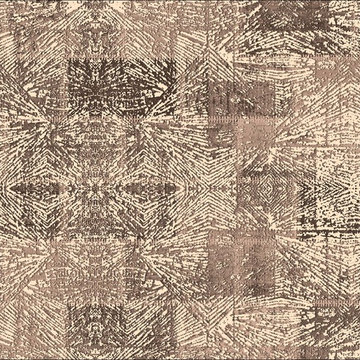
Area Rug with Non-skid Rubber Backing, Decorative Modern Carpet for Living, Dining & Children’s Rooms, Bedroom Anti-slip Throw Runner for Kitchen, Bathroom, Hallway & Entry
High quality Turkish area rugs for your home decor. You can easily pick a beautiful rug for your decoration from our wisely patterned, colorful prints. No matter you like country, traditional, retro, western, rustic, asian, oriental, bohemian or vintage style. We have unique geometric, checkered, striped, solid, distressed, floral, classic, tribal, braided and fringed designs. Besides we have variety of nice color options including but not limited to neutral, earth, natural and brilliant colors.
Chiara Rose area rugs are brand new alternatives of traditional hand-made silk rugs. They are far inexpensive with respect to luxury antique Iranian kilim’s. However they are as soft, shiny and decorative as Tabriz carpets. Unlike tufted, polypropylene rugs it is lightweight yet soft enough. We try to offer you best carpets ever with affordable prices.
Great rugs with multiple usage areas. You can use large sizes in your living room, dining room, bedroom, nursery, kids’ and teenagers’ room or guest room in your house. You can use runners in your bathroom, kitchen, hallway and entry. Thanks to its slip resistant leather backing you can safely lay it over all kind of floor like; wood, hardwood, laminate, vinyl, tiles, ceramic and stairs. You can choose it flooring your office. It is suitable for indoor and outdoor use.
Thanks to its unique woven fiber technology, Chiara Rose Area Rugs are not heavy and thick like traditional rugs. They don’t cause problems under your doors. Still because they firmly grip floor, you can safely vacuum clean. Extra durable & easy-care. They are machine washable. You can wash it in any washing machine at home by yourself at max 30C or 65F. Please don’t tumble dry. Hang dry in shadow.
Product Sizes:
2'7"X5'; 2'7"X6'6"; 2'7"X6'6".
28