
Search results for "Penetrating" in Home Design Ideas
 KURV Architecture DPC (Alex Hughes Architects)
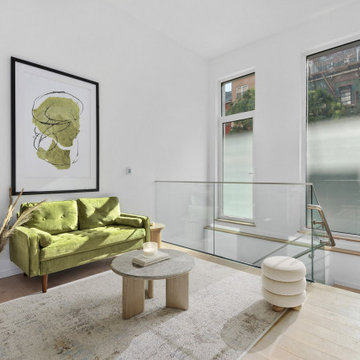
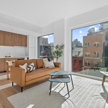
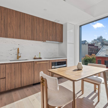
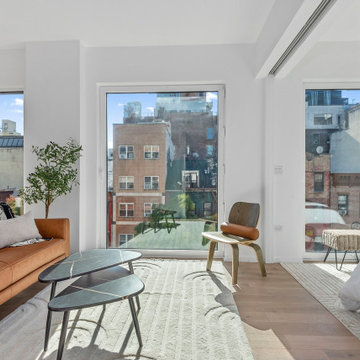
Located in the heart of Manhattan’s Lower East Side, the building was erected on a shallow commercial lot between two 120 year old masonry buildings and a new residential rental building. 330 Grand Street is a mix of 725 SF 1BRs and 1050 SF 2BR apartments. It also contains a 1100 SF two story duplex as well as private and public rooftop space, large private balconies for most units and two large private terraces for the ground floor units.
330 Grand Street was originally designed and approved at the NYC DOB as a prefabricated modular building. During the pandemic, as shipping costs skyrocketed putting the project at risk, we suggested redesigning the building as a reinforced cast-in-place concrete structure. Concrete was readily available and prices had not been affected by the demand increase that many other materials suffered in the pandemic. We took this opportunity to raise floor to ceiling heights, enlarge high performance windows and redistribute the buildings MEPFS and Structural Systems to create very open floor plans.
The challenge was to create a luxurious sensorial living experience with very limited means. In a city with very high construction costs, low cost residential buildings in the area are usually devoid of good quality, design and character. Our approach was to aim high for the end user, prioritizing natural light, open space with long visual perspectives, high ceilings and as always, rejecting the use of predefined building templates.
Our biggest challenge was to ensure that the small spaces feel as clean cut, large and bright as possible. Several unique design decisions were made to ensure low cost and high quality;
Floor plans were laid out so that spaces were wide open and free of clutter from mechanical or structural interruptions. Therefore all infrastructure was placed in lateral demising walls, which in turn act as the unit’s storage and kitchen. The apartments feel wide open, are super quiet and have more storage space than any other comparable apartment in the city.
To solve the problem of the site’s shallow commercial lot which is typically prone to dark interior spaces we focused our attention on the building’s envelope. Instead of the usual small punched window openings, oversized high performance windows were designed to ensure that light penetrated as far as possible into the units. In the smaller 1BR units, the full 50’ depth of the lot is perceived by partitioning spaces with sliding pocket doors that can be retracted to allow deep visual perspectives, making the sight lines in the space feel longer, larger, more ample than normal. In addition to the full height glazing, each unit above the 2nd floor receives a 7 foot covered balcony, adding 120 to 240 sf to each apartment, something unusual in New York City buildings. The space is large enough for a full size dining table, when the weather permits being outside.
We also worked hard to ensure modularity. For example, all kitchen units are all identical throughout the building. The idea of modularity and the economy of the repetitive unit is exercised to the maximum through the building.
Hardware, appliances, flooring, wall coverings and material finishes are all carefully selected to feel bespoke, high quality and unique.
It was important to KURV that the result of this work manifest into something that would deeply connect with the end user and sustain relationships with the consumers of this space.
All images by KURV Architecture ©
 KURV Architecture DPC (Alex Hughes Architects)
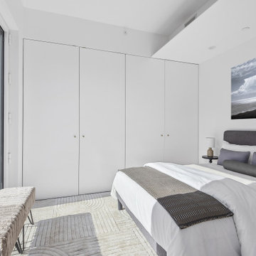
Located in the heart of Manhattan’s Lower East Side, the building was erected on a shallow commercial lot between two 120 year old masonry buildings and a new residential rental building. 330 Grand Street is a mix of 725 SF 1BRs and 1050 SF 2BR apartments. It also contains a 1100 SF two story duplex as well as private and public rooftop space, large private balconies for most units and two large private terraces for the ground floor units.
330 Grand Street was originally designed and approved at the NYC DOB as a prefabricated modular building. During the pandemic, as shipping costs skyrocketed putting the project at risk, we suggested redesigning the building as a reinforced cast-in-place concrete structure. Concrete was readily available and prices had not been affected by the demand increase that many other materials suffered in the pandemic. We took this opportunity to raise floor to ceiling heights, enlarge high performance windows and redistribute the buildings MEPFS and Structural Systems to create very open floor plans.
The challenge was to create a luxurious sensorial living experience with very limited means. In a city with very high construction costs, low cost residential buildings in the area are usually devoid of good quality, design and character. Our approach was to aim high for the end user, prioritizing natural light, open space with long visual perspectives, high ceilings and as always, rejecting the use of predefined building templates.
Our biggest challenge was to ensure that the small spaces feel as clean cut, large and bright as possible. Several unique design decisions were made to ensure low cost and high quality;
Floor plans were laid out so that spaces were wide open and free of clutter from mechanical or structural interruptions. Therefore all infrastructure was placed in lateral demising walls, which in turn act as the unit’s storage and kitchen. The apartments feel wide open, are super quiet and have more storage space than any other comparable apartment in the city.
To solve the problem of the site’s shallow commercial lot which is typically prone to dark interior spaces we focused our attention on the building’s envelope. Instead of the usual small punched window openings, oversized high performance windows were designed to ensure that light penetrated as far as possible into the units. In the smaller 1BR units, the full 50’ depth of the lot is perceived by partitioning spaces with sliding pocket doors that can be retracted to allow deep visual perspectives, making the sight lines in the space feel longer, larger, more ample than normal. In addition to the full height glazing, each unit above the 2nd floor receives a 7 foot covered balcony, adding 120 to 240 sf to each apartment, something unusual in New York City buildings. The space is large enough for a full size dining table, when the weather permits being outside.
We also worked hard to ensure modularity. For example, all kitchen units are all identical throughout the building. The idea of modularity and the economy of the repetitive unit is exercised to the maximum through the building.
Hardware, appliances, flooring, wall coverings and material finishes are all carefully selected to feel bespoke, high quality and unique.
It was important to KURV that the result of this work manifest into something that would deeply connect with the end user and sustain relationships with the consumers of this space.
All images by KURV Architecture ©
 KURV Architecture DPC (Alex Hughes Architects)
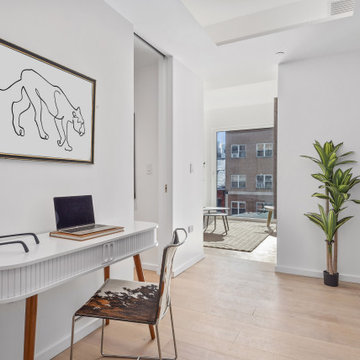
Located in the heart of Manhattan’s Lower East Side, the building was erected on a shallow commercial lot between two 120 year old masonry buildings and a new residential rental building. 330 Grand Street is a mix of 725 SF 1BRs and 1050 SF 2BR apartments. It also contains a 1100 SF two story duplex as well as private and public rooftop space, large private balconies for most units and two large private terraces for the ground floor units.
330 Grand Street was originally designed and approved at the NYC DOB as a prefabricated modular building. During the pandemic, as shipping costs skyrocketed putting the project at risk, we suggested redesigning the building as a reinforced cast-in-place concrete structure. Concrete was readily available and prices had not been affected by the demand increase that many other materials suffered in the pandemic. We took this opportunity to raise floor to ceiling heights, enlarge high performance windows and redistribute the buildings MEPFS and Structural Systems to create very open floor plans.
The challenge was to create a luxurious sensorial living experience with very limited means. In a city with very high construction costs, low cost residential buildings in the area are usually devoid of good quality, design and character. Our approach was to aim high for the end user, prioritizing natural light, open space with long visual perspectives, high ceilings and as always, rejecting the use of predefined building templates.
Our biggest challenge was to ensure that the small spaces feel as clean cut, large and bright as possible. Several unique design decisions were made to ensure low cost and high quality;
Floor plans were laid out so that spaces were wide open and free of clutter from mechanical or structural interruptions. Therefore all infrastructure was placed in lateral demising walls, which in turn act as the unit’s storage and kitchen. The apartments feel wide open, are super quiet and have more storage space than any other comparable apartment in the city.
To solve the problem of the site’s shallow commercial lot which is typically prone to dark interior spaces we focused our attention on the building’s envelope. Instead of the usual small punched window openings, oversized high performance windows were designed to ensure that light penetrated as far as possible into the units. In the smaller 1BR units, the full 50’ depth of the lot is perceived by partitioning spaces with sliding pocket doors that can be retracted to allow deep visual perspectives, making the sight lines in the space feel longer, larger, more ample than normal. In addition to the full height glazing, each unit above the 2nd floor receives a 7 foot covered balcony, adding 120 to 240 sf to each apartment, something unusual in New York City buildings. The space is large enough for a full size dining table, when the weather permits being outside.
We also worked hard to ensure modularity. For example, all kitchen units are all identical throughout the building. The idea of modularity and the economy of the repetitive unit is exercised to the maximum through the building.
Hardware, appliances, flooring, wall coverings and material finishes are all carefully selected to feel bespoke, high quality and unique.
It was important to KURV that the result of this work manifest into something that would deeply connect with the end user and sustain relationships with the consumers of this space.
All images by KURV Architecture ©
Find the right local pro for your project
 KURV Architecture DPC (Alex Hughes Architects)
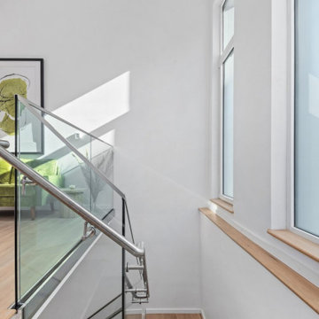
Located in the heart of Manhattan’s Lower East Side, the building was erected on a shallow commercial lot between two 120 year old masonry buildings and a new residential rental building. 330 Grand Street is a mix of 725 SF 1BRs and 1050 SF 2BR apartments. It also contains a 1100 SF two story duplex as well as private and public rooftop space, large private balconies for most units and two large private terraces for the ground floor units.
330 Grand Street was originally designed and approved at the NYC DOB as a prefabricated modular building. During the pandemic, as shipping costs skyrocketed putting the project at risk, we suggested redesigning the building as a reinforced cast-in-place concrete structure. Concrete was readily available and prices had not been affected by the demand increase that many other materials suffered in the pandemic. We took this opportunity to raise floor to ceiling heights, enlarge high performance windows and redistribute the buildings MEPFS and Structural Systems to create very open floor plans.
The challenge was to create a luxurious sensorial living experience with very limited means. In a city with very high construction costs, low cost residential buildings in the area are usually devoid of good quality, design and character. Our approach was to aim high for the end user, prioritizing natural light, open space with long visual perspectives, high ceilings and as always, rejecting the use of predefined building templates.
Our biggest challenge was to ensure that the small spaces feel as clean cut, large and bright as possible. Several unique design decisions were made to ensure low cost and high quality;
Floor plans were laid out so that spaces were wide open and free of clutter from mechanical or structural interruptions. Therefore all infrastructure was placed in lateral demising walls, which in turn act as the unit’s storage and kitchen. The apartments feel wide open, are super quiet and have more storage space than any other comparable apartment in the city.
To solve the problem of the site’s shallow commercial lot which is typically prone to dark interior spaces we focused our attention on the building’s envelope. Instead of the usual small punched window openings, oversized high performance windows were designed to ensure that light penetrated as far as possible into the units. In the smaller 1BR units, the full 50’ depth of the lot is perceived by partitioning spaces with sliding pocket doors that can be retracted to allow deep visual perspectives, making the sight lines in the space feel longer, larger, more ample than normal. In addition to the full height glazing, each unit above the 2nd floor receives a 7 foot covered balcony, adding 120 to 240 sf to each apartment, something unusual in New York City buildings. The space is large enough for a full size dining table, when the weather permits being outside.
We also worked hard to ensure modularity. For example, all kitchen units are all identical throughout the building. The idea of modularity and the economy of the repetitive unit is exercised to the maximum through the building.
Hardware, appliances, flooring, wall coverings and material finishes are all carefully selected to feel bespoke, high quality and unique.
It was important to KURV that the result of this work manifest into something that would deeply connect with the end user and sustain relationships with the consumers of this space.
All images by KURV Architecture ©
 KURV Architecture DPC (Alex Hughes Architects)
Located in the heart of Manhattan’s Lower East Side, the building was erected on a shallow commercial lot between two 120 year old masonry buildings and a new residential rental building. 330 Grand Street is a mix of 725 SF 1BRs and 1050 SF 2BR apartments. It also contains a 1100 SF two story duplex as well as private and public rooftop space, large private balconies for most units and two large private terraces for the ground floor units.
330 Grand Street was originally designed and approved at the NYC DOB as a prefabricated modular building. During the pandemic, as shipping costs skyrocketed putting the project at risk, we suggested redesigning the building as a reinforced cast-in-place concrete structure. Concrete was readily available and prices had not been affected by the demand increase that many other materials suffered in the pandemic. We took this opportunity to raise floor to ceiling heights, enlarge high performance windows and redistribute the buildings MEPFS and Structural Systems to create very open floor plans.
The challenge was to create a luxurious sensorial living experience with very limited means. In a city with very high construction costs, low cost residential buildings in the area are usually devoid of good quality, design and character. Our approach was to aim high for the end user, prioritizing natural light, open space with long visual perspectives, high ceilings and as always, rejecting the use of predefined building templates.
Our biggest challenge was to ensure that the small spaces feel as clean cut, large and bright as possible. Several unique design decisions were made to ensure low cost and high quality;
Floor plans were laid out so that spaces were wide open and free of clutter from mechanical or structural interruptions. Therefore all infrastructure was placed in lateral demising walls, which in turn act as the unit’s storage and kitchen. The apartments feel wide open, are super quiet and have more storage space than any other comparable apartment in the city.
To solve the problem of the site’s shallow commercial lot which is typically prone to dark interior spaces we focused our attention on the building’s envelope. Instead of the usual small punched window openings, oversized high performance windows were designed to ensure that light penetrated as far as possible into the units. In the smaller 1BR units, the full 50’ depth of the lot is perceived by partitioning spaces with sliding pocket doors that can be retracted to allow deep visual perspectives, making the sight lines in the space feel longer, larger, more ample than normal. In addition to the full height glazing, each unit above the 2nd floor receives a 7 foot covered balcony, adding 120 to 240 sf to each apartment, something unusual in New York City buildings. The space is large enough for a full size dining table, when the weather permits being outside.
We also worked hard to ensure modularity. For example, all kitchen units are all identical throughout the building. The idea of modularity and the economy of the repetitive unit is exercised to the maximum through the building.
Hardware, appliances, flooring, wall coverings and material finishes are all carefully selected to feel bespoke, high quality and unique.
It was important to KURV that the result of this work manifest into something that would deeply connect with the end user and sustain relationships with the consumers of this space.
All images by KURV Architecture ©
 Tile Doctor Ltd
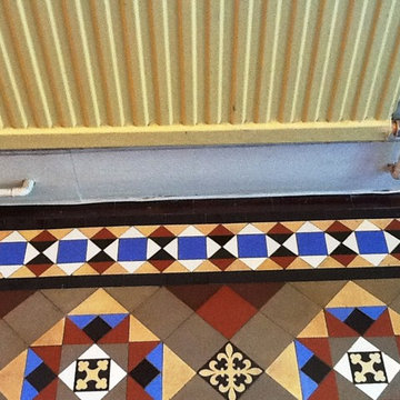
This customer from Bedford, the county town of one of England’s smallest counties Bedfordshire, called me out because they have bought a house and, upon lifting the glued down carpet, had discovered a beautiful Victorian tiled floor. They decided to call me in to see if this original feature could be restored to its former glory having already tried household products to remove the glue and clean the tiles with limited success.
We often find customers who discover old tiles under carpet or linoleum struggle with the standard cleaning products available in supermarket which are only designed for everyday cleaning. The products Tile Doctor sells are far stronger; naturally however to achieve the best results it also helps if you have the right equipment, knowledge and experience and that where we come in.
I popped round to take a look at the floor and having tackled quite a few of these restorations before was confident we could restore the floor so a quote was given and the work was booked in for the next week.
My first course of action was to vacuum the floor to remove any loose debris. This gave me a better picture of the condition of the floor overall, and so I could assess how best to proceed. I opted for our tried and trusted method of applying a diluted solution of Tile Doctor Pro-Clean, which is a very reliable high alkaline cleaner suitable for all types of natural stone and tile. The solution was applied with a pump-up sprayer and left to dwell for 20 minutes to seep into the pores of the tile.
Next, I worked the solution into the tiles using a black scrubbing pad fitted to a rotary machine and hand brushes. The resulting cleaning slurry was then rinsed off – and I found that this had removed most of the glue and surface dirt. There were a few stubborn deposits of glue remaining, but I was able to remove them by using hand brushes and scrapers in combination with Tile Doctor Remove and Go, which is as its name suggest can remove most things including old sealers, epoxy grout haze, urethane coatings, synthetic finishes, adhesives and event paint.
Even after this there were still some patches of glue, so I decided to spray the whole floor with Remove and Go and worked it into the stubborn areas with brushes. I left it to dwell for 15 minutes and then rinsed the floor with a wet pick-up extraction machine. This did the job and the floor was left fresh and clean, ready to be sealed once it had dried.
The floor was left to dry for several days, which is typically necessary for old tiled floors that don’t have a damp proof membrane installed. The customer wanted the floor to look traditional and therefore requested a matt finish. This was achieved by applying two coats of Tile Doctor Colour Grow, which is also breathable thereby allowing any damp to evaporate as gases through the sealer, without affecting the finish.
As I previously mentioned, floors of this age can sometimes have damp issues, so this sealer is ideal for these older floors. Colour Grow is an impregnating sealer, meaning it penetrates the pores of the stone to fill them and prevent trapped dirt. It also intensifies the colours in the tiles to really bring them to life.
The customer was shocked and amazed by the great results as she thought nothing could be done to restore such an old floor. Before leaving the property, I gave her some maintenance instructions to help her keep the floor looking its best in the future. Another satisfied customer!
David Vissian
Bedfordshire Tile Doctor
 KURV Architecture DPC (Alex Hughes Architects)
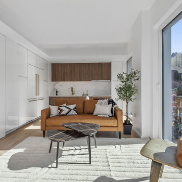
Located in the heart of Manhattan’s Lower East Side, the building was erected on a shallow commercial lot between two 120 year old masonry buildings and a new residential rental building. 330 Grand Street is a mix of 725 SF 1BRs and 1050 SF 2BR apartments. It also contains a 1100 SF two story duplex as well as private and public rooftop space, large private balconies for most units and two large private terraces for the ground floor units.
330 Grand Street was originally designed and approved at the NYC DOB as a prefabricated modular building. During the pandemic, as shipping costs skyrocketed putting the project at risk, we suggested redesigning the building as a reinforced cast-in-place concrete structure. Concrete was readily available and prices had not been affected by the demand increase that many other materials suffered in the pandemic. We took this opportunity to raise floor to ceiling heights, enlarge high performance windows and redistribute the buildings MEPFS and Structural Systems to create very open floor plans.
The challenge was to create a luxurious sensorial living experience with very limited means. In a city with very high construction costs, low cost residential buildings in the area are usually devoid of good quality, design and character. Our approach was to aim high for the end user, prioritizing natural light, open space with long visual perspectives, high ceilings and as always, rejecting the use of predefined building templates.
Our biggest challenge was to ensure that the small spaces feel as clean cut, large and bright as possible. Several unique design decisions were made to ensure low cost and high quality;
Floor plans were laid out so that spaces were wide open and free of clutter from mechanical or structural interruptions. Therefore all infrastructure was placed in lateral demising walls, which in turn act as the unit’s storage and kitchen. The apartments feel wide open, are super quiet and have more storage space than any other comparable apartment in the city.
To solve the problem of the site’s shallow commercial lot which is typically prone to dark interior spaces we focused our attention on the building’s envelope. Instead of the usual small punched window openings, oversized high performance windows were designed to ensure that light penetrated as far as possible into the units. In the smaller 1BR units, the full 50’ depth of the lot is perceived by partitioning spaces with sliding pocket doors that can be retracted to allow deep visual perspectives, making the sight lines in the space feel longer, larger, more ample than normal. In addition to the full height glazing, each unit above the 2nd floor receives a 7 foot covered balcony, adding 120 to 240 sf to each apartment, something unusual in New York City buildings. The space is large enough for a full size dining table, when the weather permits being outside.
We also worked hard to ensure modularity. For example, all kitchen units are all identical throughout the building. The idea of modularity and the economy of the repetitive unit is exercised to the maximum through the building.
Hardware, appliances, flooring, wall coverings and material finishes are all carefully selected to feel bespoke, high quality and unique.
It was important to KURV that the result of this work manifest into something that would deeply connect with the end user and sustain relationships with the consumers of this space.
All images by KURV Architecture ©
 KURV Architecture DPC (Alex Hughes Architects)
Located in the heart of Manhattan’s Lower East Side, the building was erected on a shallow commercial lot between two 120 year old masonry buildings and a new residential rental building. 330 Grand Street is a mix of 725 SF 1BRs and 1050 SF 2BR apartments. It also contains a 1100 SF two story duplex as well as private and public rooftop space, large private balconies for most units and two large private terraces for the ground floor units.
330 Grand Street was originally designed and approved at the NYC DOB as a prefabricated modular building. During the pandemic, as shipping costs skyrocketed putting the project at risk, we suggested redesigning the building as a reinforced cast-in-place concrete structure. Concrete was readily available and prices had not been affected by the demand increase that many other materials suffered in the pandemic. We took this opportunity to raise floor to ceiling heights, enlarge high performance windows and redistribute the buildings MEPFS and Structural Systems to create very open floor plans.
The challenge was to create a luxurious sensorial living experience with very limited means. In a city with very high construction costs, low cost residential buildings in the area are usually devoid of good quality, design and character. Our approach was to aim high for the end user, prioritizing natural light, open space with long visual perspectives, high ceilings and as always, rejecting the use of predefined building templates.
Our biggest challenge was to ensure that the small spaces feel as clean cut, large and bright as possible. Several unique design decisions were made to ensure low cost and high quality;
Floor plans were laid out so that spaces were wide open and free of clutter from mechanical or structural interruptions. Therefore all infrastructure was placed in lateral demising walls, which in turn act as the unit’s storage and kitchen. The apartments feel wide open, are super quiet and have more storage space than any other comparable apartment in the city.
To solve the problem of the site’s shallow commercial lot which is typically prone to dark interior spaces we focused our attention on the building’s envelope. Instead of the usual small punched window openings, oversized high performance windows were designed to ensure that light penetrated as far as possible into the units. In the smaller 1BR units, the full 50’ depth of the lot is perceived by partitioning spaces with sliding pocket doors that can be retracted to allow deep visual perspectives, making the sight lines in the space feel longer, larger, more ample than normal. In addition to the full height glazing, each unit above the 2nd floor receives a 7 foot covered balcony, adding 120 to 240 sf to each apartment, something unusual in New York City buildings. The space is large enough for a full size dining table, when the weather permits being outside.
We also worked hard to ensure modularity. For example, all kitchen units are all identical throughout the building. The idea of modularity and the economy of the repetitive unit is exercised to the maximum through the building.
Hardware, appliances, flooring, wall coverings and material finishes are all carefully selected to feel bespoke, high quality and unique.
It was important to KURV that the result of this work manifest into something that would deeply connect with the end user and sustain relationships with the consumers of this space.
All images by KURV Architecture ©
 KURV Architecture DPC (Alex Hughes Architects)
Located in the heart of Manhattan’s Lower East Side, the building was erected on a shallow commercial lot between two 120 year old masonry buildings and a new residential rental building. 330 Grand Street is a mix of 725 SF 1BRs and 1050 SF 2BR apartments. It also contains a 1100 SF two story duplex as well as private and public rooftop space, large private balconies for most units and two large private terraces for the ground floor units.
330 Grand Street was originally designed and approved at the NYC DOB as a prefabricated modular building. During the pandemic, as shipping costs skyrocketed putting the project at risk, we suggested redesigning the building as a reinforced cast-in-place concrete structure. Concrete was readily available and prices had not been affected by the demand increase that many other materials suffered in the pandemic. We took this opportunity to raise floor to ceiling heights, enlarge high performance windows and redistribute the buildings MEPFS and Structural Systems to create very open floor plans.
The challenge was to create a luxurious sensorial living experience with very limited means. In a city with very high construction costs, low cost residential buildings in the area are usually devoid of good quality, design and character. Our approach was to aim high for the end user, prioritizing natural light, open space with long visual perspectives, high ceilings and as always, rejecting the use of predefined building templates.
Our biggest challenge was to ensure that the small spaces feel as clean cut, large and bright as possible. Several unique design decisions were made to ensure low cost and high quality;
Floor plans were laid out so that spaces were wide open and free of clutter from mechanical or structural interruptions. Therefore all infrastructure was placed in lateral demising walls, which in turn act as the unit’s storage and kitchen. The apartments feel wide open, are super quiet and have more storage space than any other comparable apartment in the city.
To solve the problem of the site’s shallow commercial lot which is typically prone to dark interior spaces we focused our attention on the building’s envelope. Instead of the usual small punched window openings, oversized high performance windows were designed to ensure that light penetrated as far as possible into the units. In the smaller 1BR units, the full 50’ depth of the lot is perceived by partitioning spaces with sliding pocket doors that can be retracted to allow deep visual perspectives, making the sight lines in the space feel longer, larger, more ample than normal. In addition to the full height glazing, each unit above the 2nd floor receives a 7 foot covered balcony, adding 120 to 240 sf to each apartment, something unusual in New York City buildings. The space is large enough for a full size dining table, when the weather permits being outside.
We also worked hard to ensure modularity. For example, all kitchen units are all identical throughout the building. The idea of modularity and the economy of the repetitive unit is exercised to the maximum through the building.
Hardware, appliances, flooring, wall coverings and material finishes are all carefully selected to feel bespoke, high quality and unique.
It was important to KURV that the result of this work manifest into something that would deeply connect with the end user and sustain relationships with the consumers of this space.
All images by KURV Architecture ©
 KURV Architecture DPC (Alex Hughes Architects)
Located in the heart of Manhattan’s Lower East Side, the building was erected on a shallow commercial lot between two 120 year old masonry buildings and a new residential rental building. 330 Grand Street is a mix of 725 SF 1BRs and 1050 SF 2BR apartments. It also contains a 1100 SF two story duplex as well as private and public rooftop space, large private balconies for most units and two large private terraces for the ground floor units.
330 Grand Street was originally designed and approved at the NYC DOB as a prefabricated modular building. During the pandemic, as shipping costs skyrocketed putting the project at risk, we suggested redesigning the building as a reinforced cast-in-place concrete structure. Concrete was readily available and prices had not been affected by the demand increase that many other materials suffered in the pandemic. We took this opportunity to raise floor to ceiling heights, enlarge high performance windows and redistribute the buildings MEPFS and Structural Systems to create very open floor plans.
The challenge was to create a luxurious sensorial living experience with very limited means. In a city with very high construction costs, low cost residential buildings in the area are usually devoid of good quality, design and character. Our approach was to aim high for the end user, prioritizing natural light, open space with long visual perspectives, high ceilings and as always, rejecting the use of predefined building templates.
Our biggest challenge was to ensure that the small spaces feel as clean cut, large and bright as possible. Several unique design decisions were made to ensure low cost and high quality;
Floor plans were laid out so that spaces were wide open and free of clutter from mechanical or structural interruptions. Therefore all infrastructure was placed in lateral demising walls, which in turn act as the unit’s storage and kitchen. The apartments feel wide open, are super quiet and have more storage space than any other comparable apartment in the city.
To solve the problem of the site’s shallow commercial lot which is typically prone to dark interior spaces we focused our attention on the building’s envelope. Instead of the usual small punched window openings, oversized high performance windows were designed to ensure that light penetrated as far as possible into the units. In the smaller 1BR units, the full 50’ depth of the lot is perceived by partitioning spaces with sliding pocket doors that can be retracted to allow deep visual perspectives, making the sight lines in the space feel longer, larger, more ample than normal. In addition to the full height glazing, each unit above the 2nd floor receives a 7 foot covered balcony, adding 120 to 240 sf to each apartment, something unusual in New York City buildings. The space is large enough for a full size dining table, when the weather permits being outside.
We also worked hard to ensure modularity. For example, all kitchen units are all identical throughout the building. The idea of modularity and the economy of the repetitive unit is exercised to the maximum through the building.
Hardware, appliances, flooring, wall coverings and material finishes are all carefully selected to feel bespoke, high quality and unique.
It was important to KURV that the result of this work manifest into something that would deeply connect with the end user and sustain relationships with the consumers of this space.
All images by KURV Architecture ©

 Taylor Knights
Peter Clarke
Staircase - small contemporary metal straight metal railing staircase idea in Melbourne with metal risers
Staircase - small contemporary metal straight metal railing staircase idea in Melbourne with metal risers

 DISC Interiors
Inspiration for a modern kitchen remodel in Los Angeles with flat-panel cabinets and light wood cabinets


 Tile Doctor Ltd
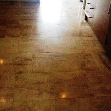
This customer from the historic city of Cardiff was keen to see what Tile Doctor could do to put some life back into their treasured Limestone kitchen floor that was laid in 2008. My first observations were mainly centred on the horrific condition of the surface which although adequately sealed initially the floor had not received any subsequent maintenance and its condition had deteriorated over time. The light shining in from the patio doors highlighted all the imperfections in the floor caused by surface wear and tear commonly seen in high traffic areas such as a kitchen.
Upon closer inspection, there were further problems: the floor was stained and scuffed, and in most places the sealer had worn off completely allowing the dirt to become ingrained into the pores of the Limestone. Additionally the grout was recessed but was now flush with the tile surface due to dirt build-up. There were also areas contaminated with grease and kitchen cooking oil.
The Limestone floor tiles were 20mm thick French Limestone, and had been laid very well so there was no requirement to do any tile or grout repairs however to get this floor back to its original condition the surface would need to be reconditioned using the Tile Doctor four stage burnishing system.
I started by giving the floor a wash with a medium dilution of Tile Doctor Pro-Clean, focusing mainly on the grout lines in order to remove the muck that had built-up there. I used a special stiff grout brush for this activity; it’s quite narrow and ideal for grout scrubbing.
This worked well, but the significant build-up of dirt along some of the grout lines meant more work was required. I tackled this problem with a hand scraper assisted with steam. At the end of this process, the whole floor was then rinsed down with water to remove any soil and the resulting slurry was then extracted using a wet vacuum.
The next step was to start the burnishing process, which basically involves applying four diamond encrusted floor pads in sequence over the floor. Each pad is a different grade, starting with the most abrasive coarse pad and moving through to the finer grades using a little water to lubricate and rinsing away any slurry between each pad.
I eventually finished with the extra fine pad which builds up shine and lustre on the tile; it had taken two days to clean the grout and burnish the Limestone but the floor was much improved and so after a final rinse down I left the floor to dry off overnight with the aid of the underfloor heating.
During this time, I also addressed the stained Limestone in the area of the kitchen where the dustbin was situated. This had been a major upset for the customer and I’m happy to report I managed to deal with it. However, it was quite an involved process, so I’ll write about this in a separate post.
On the third day I came back to seal the floor, checking first that it had dried sufficiently with a damp meter. Fortunately, the underfloor heating had done a great job of drying the stone and I was able to seal the floor using three coats of Tile Doctor Colour Grow sealant. This sealant not only provides a durable seal but also penetrates deep into the pores of the stone protecting it from within and enhancing the natural colours of the Limestone in the process.
After the final layer of sealant, I worked over the floor again with the extra fine burnishing pad both to add shine again following sealing, and to ensure that no smear marks were visible as the lighting conditions were unforgiving and highlighted any imperfections.
The customer was delighted with the results: so much so, in fact, that they booked me in to restore their Victorian hallway floor as well but that’s a story for another time!
Julian Iancono
SE Wales Tile Doctor
 Tile Doctor Ltd
Having an effective sealer in place is essential for ensuring the long term condition of tiled floors in fact a lack of sealer can make cleaning the tiles exceptionally difficult as the sealer prevents dirt becoming ingrained in the tile.
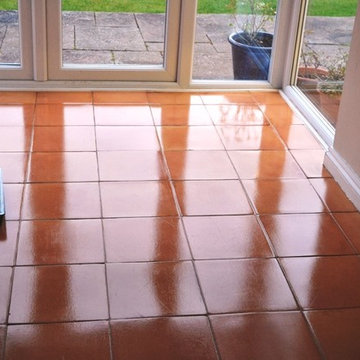
This property owner, living in the former spa town of Matlock in Derbyshire, was experiencing problems with their Terracotta tiled kitchen floor since they had applied some kind of wax to act as a sealer, and this had worn off within a few weeks. After this happened the tiles were not sealed again, making cleaning a big problem. Terracotta is a highly porous stone and thus easily soaks in spillages and stains, and allows dirt to become very easily trapped.
In this situation, the property owner resolved to contact me about some professional maintenance. I suggested that the tiles would need a deep clean followed by the application of a fresh, high quality sealer. The work was agreed on and I made my way down to the property the following week.
When I arrived at the property and saw the tiles first hand it became clear that a professional clean had been in need for a long time: greasy looking stains were particularly prevalent and covered large areas of the kitchen floor.
To remove I mixed a strong solution of Tile Doctor Pro Clean, which is a multi-purpose, high-alkaline cleaner, stripper and degreaser, and, working in small areas, applied it to the floor. Working in small sections was important because the stone is very porous and quickly soaked in any product laid down. I scrubbed the cleaner into the stone using a rotary machine fitted with a black scrubbing pad, with the dirt and stains coming away nicely. Pro Clean is highly versatile and can be used for similar cleaning purposes on most types of natural stone floor.
After cleaning each section, I quickly removed the excess dirty water and chemicals with my wet vax machine. Once the whole floor had been cleaned I rinsed it several times with fresh water just to make sure all cleaning chemicals were gone. I then left the floor to dry completely for 36 hours.
When I returned to the property, I conducted several damp tests to check for any areas of the floor that needed further drying. As is almost always the case, there were a few areas that remained slightly damp, and I set about speeding the drying process along using my heat gun. In fact, it actually took me more than three hours to get the floor completely dry, but this was worth the effort as even the slightest excess moisture can damage the performance of the sealer.
Once the floor was finally dried I began sealing the floor with one coat of Tile a Doctor Colour Grow sealer. Colour Grow is an impregnating sealer that penetrates deep into the pores of the stone, thus acting as a shield against ingrained dirt, and also raises the colour of the tiles to provide an aesthetically appealing appearance. sealer. After sealing with Colour Grow, I left the floor to dry for couple of hours and then applied six coats of Tile Doctor Seal & Go, which is a topical sealer that builds up durable protection on the surface of the tiles.
The combination of through cleaning and the application of not one, but two high quality sealers really did wonders for the appearance of these Terracotta tiles. Looking at the final results you wouldn’t have believed they had been without a proper clean and seal for so long! Needless to say the customer was exceptionally pleased and will surely be able to keep her floor looking great for a long time to come.
Tony Olmet
Derbyshire Tile Doctor
 ReVision Design + Build
© Ascendant Imaging
Inspiration for a large transitional master white tile and porcelain tile porcelain tile, beige floor, double-sink and wallpaper freestanding bathtub remodel in Charlotte with furniture-like cabinets, green cabinets, a two-piece toilet, white walls, an undermount sink, quartz countertops, a hinged shower door, white countertops, a niche and a built-in vanity
Inspiration for a large transitional master white tile and porcelain tile porcelain tile, beige floor, double-sink and wallpaper freestanding bathtub remodel in Charlotte with furniture-like cabinets, green cabinets, a two-piece toilet, white walls, an undermount sink, quartz countertops, a hinged shower door, white countertops, a niche and a built-in vanity

 Custom Surface Solutions
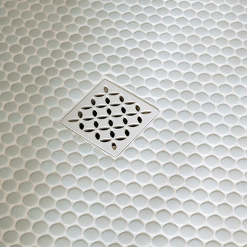
 (www.css-tile.com) - Owner Craig Thompson (512) 430-1215. This project shows new 12 x 24 tile installed vertically with offset layout pattern on wall and floor. Includes shower box with linear glass accent tile back and vertical glass accent band. Tile edges are finished with Schluter Jolly satin aluminum profile edge trim.
 Tile Doctor Ltd
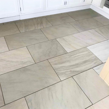
I received an enquiry from a property in Crowthorne to come and survey an unknown Flagstone Floor in a converted barn that was ready to be rented out. The owners where concerned the stone was letting the rest of the property down due to it being dirty and heavily stained, particularly around the kitchen and entrance areas. If your selling or renting out a property it really needs to look its best if you want to achieve a good price. Having spoken over the phone we agreed a date for me to pop over to complete a survey.
From further inspection I confirmed the stone was in fact a Sandstone, it was also clear that the sealer protecting the stone from ingrained dirt had worn away and was now allowing dirt and staining to ruin the appearance of the flagstones. It was a large floor so I measured up so I could work out the quantities of cleaning and sealing products needed and then walked the customer through the cleaning process. Later that day I sent over a detailed quotation which was accepted, and a date agreed for my return.
I should mention this work took place during the Covid restrictions, fortunately being a rental property, I was able to work in the property alone.
To deep clean the floor and remove the ingrained dirt and staining I used a strong dilution of Tile Doctor Pro-Clean. It is sprayed onto the floor and left to soak in for five minutes before agitating with a Black scrubbing pad fitted to a weighted buffing machine. The resultant slurry was then wet extracted away using a powerful high-pressure van mounted extracting system.
This action cleaned up most of the stone nicely however certain areas where heavily stained, particularly in the kitchen area where food and drink stains were more apparent. To tackle this, I applied a stronger cleaner/stripper product called Tile Doctor Remove and Go this time allowing ten minutes for it to soak in before scrubbing the surface with a very coarse 100-grit soft milling pad. This took quite a few attempts each time extracting the slurry away and then inspecting the floor to see if more work was needed.
Happy the stains have been removed, I then focused on renovating the surface Sandstone after the application of the coarse pad. This involves the application of several finer grit burnishing pads which close the pores and adds a subtle polish to the Sandstone. As I started with 100-grit pad it was necessary to gradually refine the surface with an incremental series of pads that included 200, 400 and finally 800-grit pads. Then to ensure a uniform finish across the floor I continued the 400 and 800 grit pads throughout the property. Water is used to lubricate the process and this turns into a fine slurry that is rinse extracted as before.
The cleaning process took up the whole of the first day and I am pleased to say the Sandstone floor looked very clean after I had finished.
The stone was then allowed dry off overnight with the aid of an industrial air mover and I returned later the next day to apply a new protective seal. In the meantime, my customer had been over to check out the floor and were over the moon with how it looked and wanted to keep the finish as natural as possible.
With this in mind, I applied Tile Doctor Ultra-Seal sealer to the Sandstone throughout, only two coats were needed. This is a premium sealer that is almost invisible and works by penetrating the stone thus preventing dirt from becoming ingrained. Once done the floor looked very clean and much brighter than before, it now had that wow factor which will help it attract a good yield in the rental market.
The trouble with rental properties of course is making sure the tenant uses the right product to maintain the floor and not a typical supermarket tile cleaner that are only designed for use on Ceramic and Porcelain tiles. In fact, these types of cleaning product can slowly strip the sealer off the floor so it’s always worth checking the label before purchasing. Fortunately Tile Doctor sells a product called Neutral Cleaner that is ideal for maintaining sealed stone floors, so I left them with a complimentary bottle and recommended they get some more to leave under the sink for the new tenant.
Dennis Buckland
Berkshire Tile Doctor

 Village Home Stores
Full-overlay Rustic Beech cabinets in the "Charleston" door style and "Briarwood" finish.
Village Home Stores
Example of a large mountain style kitchen design in Chicago
Example of a large mountain style kitchen design in Chicago
 Nextoffice
Sharifi-ha House
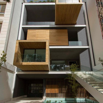
Uncertainty and flexibility lie at the heart of the design concept in Sharifi-ha House. The sensational, spatial qualities of the interiors, as well as the formal configuration of its exterior, directly respond to the displacement of turning boxes that lead the building volume to become open or closed, obtaining introverted or extroverted character. These changes may occur according to changing seasons or functional scenarios of floor plans.
Like many other urban plots, the land for this project had a noticeably narrow façade-width compared with its length. Consequently, our expertise in transforming a two-dimensional façade to a three-dimensional one became indispensable. Here, the openness /closure of the building volume is a reference to traditional Iranian houses, which would dynamically serve as seasonal modes of habitation by offering both a Zemestan-Neshin (winter living room) and Taabestan-Neshin (summer living room) to their residents. In summertime, Sharifi-ha House offers an open /transparent /perforated volume with wide, large terraces. In contrast, during Tehran’s cold, snowy winters the volume closes itself, offering minimal openings in total absence of those wide summer terraces. In this project, the challenges to the concepts of open/closed typology (introverted/extroverted character) led to an exciting spatial transformation of an ever-changing residential building.
The House is distributed over seven floors: the two basement floors are allocated to family conviviality, fitness facilities, and wellness areas, while the ground floor hosts parking and housekeeping rooms. Public activities all happen on the first and second floors, and the family’s private life takes place on the third and fourth floors.
The project consisted of four major parts; the fixed volume of the structure, the void, and the fixed volume and the mobile volume, respectively. When the turning boxes are closed, the building captures sunlight throughout the space of the central void, which also connects the two fixed volumes by suspended bridges.
The house adapts to the functional needs of its residents. For instance, depending on whether there is a guest or not, the guest room (located on the second floor) can be reconfigured for different purposes. Similarly, home office and breakfast room (turning rooms on the first and third floors) can change the formality of their appearance according to their residents’ desire. In other words, there is always the possibility of having different seasonal or lighting scenarios, some of which have been already considered in the BMS program of the project.
From the initial design steps, we noticed that three pine trees outside could be incorporated into the spaces of the interior. Now, in the open mode of the house, the trees are pleasantly captured by the window frames.
Stepping back for about three meters from the permitted construction boundary line allowed us to provide splendid daylight for the basement floors by inserting a glass fountain. The fitness and wellness areas are accommodated between this fountain and the basement pool where reflective installations reverberate the water’s radiance all over the space.
The applied manufacturing technique for the turning mechanism was in fact a simple one; the same method which is currently employed in turning theatrical scenes, turning the floor of car exhibitions, steel companies and the shipping industry in Iran. But as our client himself was into importing CNC and other similar industrial German machines, he preferred the structural system to be fabricated in Germany. In doing so, he could engage his employees in the manufacturing process and thus train them for future maintenance purposes.
Details of the handrails and air-penetration controlling methods were major issues considered in developing the design of the turning boxes. Designing foldable handrails and refining the edges of the boxes happened to be our feasible solutions.
Considering the specialties of this kind of architecture, the structural system was inevitably a customized one. After digitally modeling the structure, a series of SAP2000 analysis were undertaken to examine static/dynamic performance of the proposed system. Being partially moveable is the dominant feature of this structural assembly, which was contemplated throughout the fabrication process by the German manufacturer company. The main loads all rest on the beams of the living rooms.
Due to the various configurations the turning boxes may take, the loading calculation has been estimated based on the largest possible loading value applied to the system. Additionally, in order to prevent structural deformation controlling the probable vibrations in the turning boxes was taken into account during the design/calculations of the structure.
The house was titled Sharifi-ha House, in honor of traditional Iranian mansions.
102