
Search results for "Personal reference" in Home Design Ideas
 LandFluent Landscape Architecture
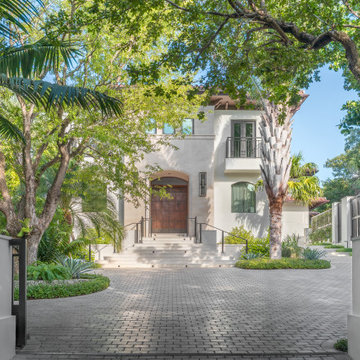
Everfall is set within a pristine 20,000-square-foot property in one of Coral Gables’ oldest and most storied neighborhoods. Here, mature canopy trees, towering palms, and historic architecture define a sense of place often referred to as the “real Miami.”
While the residence showcases exquisitely modernized architecture and unobstructed views of Biscayne Bay, the pre-existing garden fell short of its potential. Our design challenge is twofold: to reimagine vehicular and pedestrian circulation in harmony with the site’s topography, and to create a garden that respects and reinforces the character of its historic setting.
Circulation was addressed first. The driveway was redesigned to ease steep slopes and form a welcoming motor court that blends hardscape and planting. Pedestrian access was reoriented to highlight the east–west axis, and the former unsightly pedestrian ramp was replaced with platform steps, expansive landings, and lush planting; establishing a tranquil and clearly defined entry sequence.
The planting design emphasizes native species along the perimeter and public right-of-way, aligning with the evolving character of surrounding gardens. Within the property, sculptural specimen trees, epiphytes, and lithophytes evoke the feeling of a long-established landscape. A palette of Mediterranean textures and cliff-dwelling Date Palm species were integrated as elegant accents. Color plays a vital role in the sensory experience, introduced through climbing vines and profusely flowering shrubs and groundcovers in shades of pink, purple, and white.
Above all, the garden is designed as a reflection of our clients—their personalities, passions, and way of life. It is a living extension of their home, offering beauty, comfort, and an immersive connection to the natural world.
We are honored to shape the vision for the Everfall. This landscape is essential to the experience of the property, and our design seeks to honor its rich context, architectural sophistication, and breathtaking views of the Miami skyline.
Scale
0.47 ACRES
Scope
HARDSCAPE + PLANTING DESIGN
Year
2025
Photography
Studio PYG
Architecture Renovation
Bravo Architecture
Interior Design
Miriam Moore Design Studio
Landscape Architecture
LandFluent
General Contractor
Artisan Custom Homes of South Florida
Landscape Contractor
Signature Trees & Palms
Lighting Design / Contractor
PCL Lighting
 LandFluent Landscape Architecture
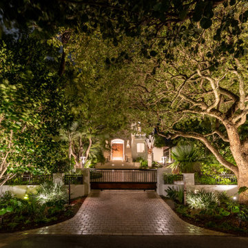
Everfall is set within a pristine 20,000-square-foot property in one of Coral Gables’ oldest and most storied neighborhoods. Here, mature canopy trees, towering palms, and historic architecture define a sense of place often referred to as the “real Miami.”
While the residence showcases exquisitely modernized architecture and unobstructed views of Biscayne Bay, the pre-existing garden fell short of its potential. Our design challenge is twofold: to reimagine vehicular and pedestrian circulation in harmony with the site’s topography, and to create a garden that respects and reinforces the character of its historic setting.
Circulation was addressed first. The driveway was redesigned to ease steep slopes and form a welcoming motor court that blends hardscape and planting. Pedestrian access was reoriented to highlight the east–west axis, and the former unsightly pedestrian ramp was replaced with platform steps, expansive landings, and lush planting; establishing a tranquil and clearly defined entry sequence.
The planting design emphasizes native species along the perimeter and public right-of-way, aligning with the evolving character of surrounding gardens. Within the property, sculptural specimen trees, epiphytes, and lithophytes evoke the feeling of a long-established landscape. A palette of Mediterranean textures and cliff-dwelling Date Palm species were integrated as elegant accents. Color plays a vital role in the sensory experience, introduced through climbing vines and profusely flowering shrubs and groundcovers in shades of pink, purple, and white.
Above all, the garden is designed as a reflection of our clients—their personalities, passions, and way of life. It is a living extension of their home, offering beauty, comfort, and an immersive connection to the natural world.
We are honored to shape the vision for the Everfall. This landscape is essential to the experience of the property, and our design seeks to honor its rich context, architectural sophistication, and breathtaking views of the Miami skyline.
Scale
0.47 ACRES
Scope
HARDSCAPE + PLANTING DESIGN
Year
2025
Photography
Studio PYG
Architecture Renovation
Bravo Architecture
Interior Design
Miriam Moore Design Studio
Landscape Architecture
LandFluent
General Contractor
Artisan Custom Homes of South Florida
Landscape Contractor
Signature Trees & Palms
Lighting Design / Contractor
PCL Lighting
 JRP Design & Remodel
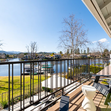
Our client had been living in her beautiful lakeside retreat for about 3 years. All around were stunning views of the lake and mountains, but the view from inside was minimal. It felt dark and closed off from the gorgeous waterfront mere feet away. She desired a bigger kitchen, natural light, and a contemporary look. Referred to JRP by a subcontractor our client walked into the showroom one day, took one look at the modern kitchen in our design center, and was inspired!
After talking about the frustrations of dark spaces and limitations when entertaining groups of friends, the homeowner and the JRP design team emerged with a new vision. Two walls between the living room and kitchen would be eliminated and structural revisions were needed for a common wall shared a wall with a neighbor. With the wall removals and the addition of multiple slider doors, the main level now has an open layout.
Everything in the home went from dark to luminous as sunlight could now bounce off white walls to illuminate both spaces. Our aim was to create a beautiful modern kitchen which fused the necessities of a functional space with the elegant form of the contemporary aesthetic. The kitchen playfully mixes frameless white upper with horizontal grain oak lower cabinets and a fun diagonal white tile backsplash. Gorgeous grey Cambria quartz with white veining meets them both in the middle. The large island with integrated barstool area makes it functional and a great entertaining space.
The master bedroom received a mini facelift as well. White never fails to give your bedroom a timeless look. The beautiful, bright marble shower shows what's possible when mixing tile shape, size, and color. The marble mosaic tiles in the shower pan are especially bold paired with black matte plumbing fixtures and gives the shower a striking visual.
Layers, light, consistent intention, and fun! - paired with beautiful, unique designs and a personal touch created this beautiful home that does not go unnoticed.
PROJECT DETAILS:
• Style: Contemporary
• Colors: Neutrals
• Countertops: Cambria Quartz, Luxury Series, Queen Anne
• Kitchen Cabinets: Slab, Overlay Frameless
Uppers: Blanco
Base: Horizontal Grain Oak
• Hardware/Plumbing Fixture Finish: Kitchen – Stainless Steel
• Lighting Fixtures:
• Flooring:
Hardwood: Siberian Oak with Fossil Stone finish
• Tile/Backsplash:
Kitchen Backsplash: White/Clear Glass
Master Bath Floor: Ann Sacks Benton Mosaics Marble
Master Bath Surround: Ann Sacks White Thassos Marble
Photographer: Andrew – Open House VC
Find the right local pro for your project
 DFW StoneWorks
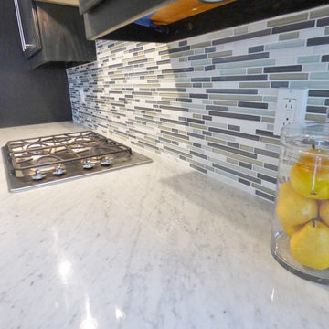
Inspiration for a large modern u-shaped medium tone wood floor eat-in kitchen remodel in Dallas with a double-bowl sink, shaker cabinets, black cabinets, marble countertops, multicolored backsplash, matchstick tile backsplash, stainless steel appliances and an island
 User
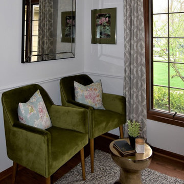
UserDuring this quarantined life period of Coronavirus, I finally got the time to renovate our dining room into my new home office space. I implemented Benjamin Moore's Decorators white paint color, new lighting, and hardwood floors, Pottery Barn window panels with their area rug and antique mirror with Pier One chairs and added a personal touch of framed photography from my (late) uncle. I love the adorable champagne table (that I refer to as a mushroom) that I snagged from Art Van's closing sale.
 Designs by KS
Project: Pelton Avenue - Coquitlam
Builder: Furtado Contracting
About this Project
We partnered up with Furtado Contracting to transform the main floor and foyer of this Greater Vancouver classic home. Also referred to as the “Vancouver Special” this style of home was popular in the 60’s-80’s and has been re-decorated and renovated ever since.
Layout Details:
By eliminating the wall between the dining room and kitchen, and reducing the length of the hallway wall, we were able to create a large open concept space.
The previous u-shape kitchen turned into a large galley kitchen, which allowed us to incorporate an island with seating for four.
With the major appliances being housed on the window wall, we designed a large pantry space spanning from wall-to-wall to store all the necessities from food to cleaning supplies. Its niche not only breaks up the cabinets to add some personality but can be used as a wine/coffee area. On the far end of the kitchen, the pantry wall extends to a narrow cabinet that has been designed to act as a mudroom; a place for shoes and jackets near the back door. At the back of the kitchen you will also find a working space, that has been tied into the fridge area with some careful space planning.
Material Details:
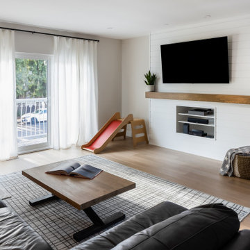
The living room and foyer received an upgrade with new flooring, light fixtures, paint, and a converted fireplace to A/V wall with a rustic wooden mantle.
In the kitchen, woodgrain cabinets made from durable laminate are paired with painted materials. A 1” shaker door painted in our favourite Benjamin Moore “Silver Satin” is seen on the upper cabinets only. This special detail is complimented with bronze knobs by Marathon Hardware. The same colour is seen on the pantry wall in a slab door, making it sleeker. The island is painted in Benjamin Moore “Black Pepper”, is paired with bronze hardware by Marathon Hardware and is clad in quartz, Silestone’s “Calcatta Gold” to be specific. Quartz is a go-to material if maintenance is not your thing!
Special Mentions:
There are so many amazing things about this project. All the light fixtures were supplied by Robinson Lighting, and include Canadian company Kuzco Lighting, as seen in the kitchen, entry and foyer. The black accents on the sink by Blanco and faucet by Grohe added some contrast against the backsplash by Julian Tile.
 Shuler Architecture
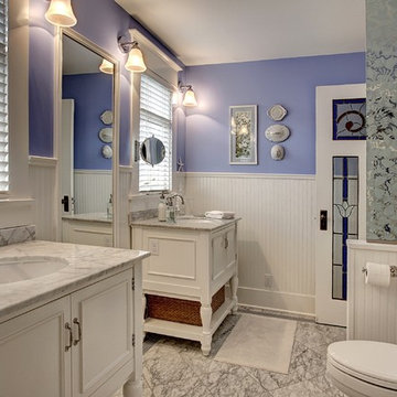
In the summer of 2012 we embarked on a remodel of our 1912 Craftsman. We wanted to redo the kitchen and the upper floor which contained the master bedroom, bathroom, guest room and office. We interviewed approximately 5 other architects prior to finding Mark. We knew right away he was the right person for the job. He was patient, thorough and we could tell he truly loved our home and wanted to work with us to make it even better. His vast experience showed through during the interview process which validated his portfolio.
Mark truly became a trusted advisor who would guide us through this remodel process from beginning to end. His planning was precise and he came by many times to re-measure to get every detail accounted for. He was patient and helpful as we made decisions and then changed our minds! He was with us every week of the 10 weeks of the remodel. He attended each weekly meeting with the General Contractor and was at the house numerous other times guiding and really looking out for our best interests. I came to trust him enough to ask his opinion on almost everything from layout to colors and decorating tips! He consistently threw out ideas....many of which we took.
Additionally Mark was a tremendous help in referring us to contractors, designers, and retailers to help us along the way. I am ecstatic over the results of the remodel. The kitchen and bath are truly beautiful and full of modern conveniences while maintaining the integrity of the 1912 structure. We were right about our decision to hire Mark and we wholehearted recommend him as an outstanding architect, and more!!

Sponsored
Columbus, OH

Hope Restoration & General Contracting
Columbus Design-Build, Kitchen & Bath Remodeling, Historic Renovations
 Thomas J. Pearson, Inc.
This spacious, yet extremely friendly and inviting home lacked a kitchen with personality and functionality for this growing family and their desire to entertain others. The goal for this renovation was to provide for new and larger appliances, maintain views to the rear yard, and provide family seating space within the kitchen.
The home’s existing exterior architecture provides references reminiscent Italian villas with terra cotta clay tile roofing, half-round steel windows and ornate stonework. The interior evokes similar images through the use of warm earth tone wall colors, hardwood floors, wrought-iron railings and plastered walls.
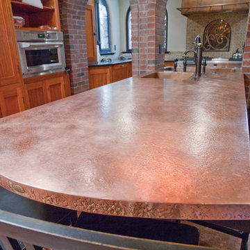
The home’s existing pallet of aged materials and their warm earth tones was reinforced with the selection of new finish materials such as: red brick, limestone veneer, linoleum flooring, African-mahogany cabinets, quartz perimeter countertops, copper sinks, exhaust hood and island counter, and oil-rubbed bronze hardware and fixtures. Because matching the exterior brick veneer was no longer a possibility, the combination of limestone veneer and copper sheet metal was selected for the new exterior; both being chosen for their warmth and timeless character. In addition, new hand-crafted wrought-iron doors and windows with energy-efficient insulated glass and ornate scrollwork were chosen in lieu of wood or clad-wood windows to replicate the home’s original steel and leaded-glass windows.
With time (and some patina), this inviting kitchen addition will blur the lines between “old” and “new.”
Project description written by Lee Constantine, Constantine Design Group.
 Designs by KS
Project: Pelton Avenue - Coquitlam
Builder: Furtado Contracting
About this Project
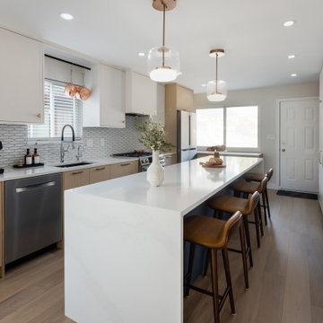
We partnered up with Furtado Contracting to transform the main floor and foyer of this Greater Vancouver classic home. Also referred to as the “Vancouver Special” this style of home was popular in the 60’s-80’s and has been re-decorated and renovated ever since.
Layout Details:
By eliminating the wall between the dining room and kitchen, and reducing the length of the hallway wall, we were able to create a large open concept space.
The previous u-shape kitchen turned into a large galley kitchen, which allowed us to incorporate an island with seating for four.
With the major appliances being housed on the window wall, we designed a large pantry space spanning from wall-to-wall to store all the necessities from food to cleaning supplies. Its niche not only breaks up the cabinets to add some personality but can be used as a wine/coffee area. On the far end of the kitchen, the pantry wall extends to a narrow cabinet that has been designed to act as a mudroom; a place for shoes and jackets near the back door. At the back of the kitchen you will also find a working space, that has been tied into the fridge area with some careful space planning.
Material Details:
The living room and foyer received an upgrade with new flooring, light fixtures, paint, and a converted fireplace to A/V wall with a rustic wooden mantle.
In the kitchen, woodgrain cabinets made from durable laminate are paired with painted materials. A 1” shaker door painted in our favourite Benjamin Moore “Silver Satin” is seen on the upper cabinets only. This special detail is complimented with bronze knobs by Marathon Hardware. The same colour is seen on the pantry wall in a slab door, making it sleeker. The island is painted in Benjamin Moore “Black Pepper”, is paired with bronze hardware by Marathon Hardware and is clad in quartz, Silestone’s “Calcatta Gold” to be specific. Quartz is a go-to material if maintenance is not your thing!
Special Mentions:
There are so many amazing things about this project. All the light fixtures were supplied by Robinson Lighting, and include Canadian company Kuzco Lighting, as seen in the kitchen, entry and foyer. The black accents on the sink by Blanco and faucet by Grohe added some contrast against the backsplash by Julian Tile.
 The Brooklyn Studio
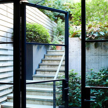
This residence was a complete gut renovation of a 4-story row house in Park Slope, and included a new rear extension and penthouse addition. The owners wished to create a warm, family home using a modern language that would act as a clean canvas to feature rich textiles and items from their world travels. As with most Brooklyn row houses, the existing house suffered from a lack of natural light and connection to exterior spaces, an issue that Principal Brendan Coburn is acutely aware of from his experience re-imagining historic structures in the New York area. The resulting architecture is designed around moments featuring natural light and views to the exterior, of both the private garden and the sky, throughout the house, and a stripped-down language of detailing and finishes allows for the concept of the modern-natural to shine.
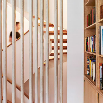
Upon entering the home, the kitchen and dining space draw you in with views beyond through the large glazed opening at the rear of the house. An extension was built to allow for a large sunken living room that provides a family gathering space connected to the kitchen and dining room, but remains distinctly separate, with a strong visual connection to the rear garden. The open sculptural stair tower was designed to function like that of a traditional row house stair, but with a smaller footprint. By extending it up past the original roof level into the new penthouse, the stair becomes an atmospheric shaft for the spaces surrounding the core. All types of weather – sunshine, rain, lightning, can be sensed throughout the home through this unifying vertical environment. The stair space also strives to foster family communication, making open living spaces visible between floors. At the upper-most level, a free-form bench sits suspended over the stair, just by the new roof deck, which provides at-ease entertaining. Oak was used throughout the home as a unifying material element. As one travels upwards within the house, the oak finishes are bleached to further degrees as a nod to how light enters the home.
The owners worked with CWB to add their own personality to the project. The meter of a white oak and blackened steel stair screen was designed by the family to read “I love you” in Morse Code, and tile was selected throughout to reference places that hold special significance to the family. To support the owners’ comfort, the architectural design engages passive house technologies to reduce energy use, while increasing air quality within the home – a strategy which aims to respect the environment while providing a refuge from the harsh elements of urban living.
This project was published by Wendy Goodman as her Space of the Week, part of New York Magazine’s Design Hunting on The Cut.
Photography by Kevin Kunstadt
 The Brooklyn Studio
This residence was a complete gut renovation of a 4-story row house in Park Slope, and included a new rear extension and penthouse addition. The owners wished to create a warm, family home using a modern language that would act as a clean canvas to feature rich textiles and items from their world travels. As with most Brooklyn row houses, the existing house suffered from a lack of natural light and connection to exterior spaces, an issue that Principal Brendan Coburn is acutely aware of from his experience re-imagining historic structures in the New York area. The resulting architecture is designed around moments featuring natural light and views to the exterior, of both the private garden and the sky, throughout the house, and a stripped-down language of detailing and finishes allows for the concept of the modern-natural to shine.
Upon entering the home, the kitchen and dining space draw you in with views beyond through the large glazed opening at the rear of the house. An extension was built to allow for a large sunken living room that provides a family gathering space connected to the kitchen and dining room, but remains distinctly separate, with a strong visual connection to the rear garden. The open sculptural stair tower was designed to function like that of a traditional row house stair, but with a smaller footprint. By extending it up past the original roof level into the new penthouse, the stair becomes an atmospheric shaft for the spaces surrounding the core. All types of weather – sunshine, rain, lightning, can be sensed throughout the home through this unifying vertical environment. The stair space also strives to foster family communication, making open living spaces visible between floors. At the upper-most level, a free-form bench sits suspended over the stair, just by the new roof deck, which provides at-ease entertaining. Oak was used throughout the home as a unifying material element. As one travels upwards within the house, the oak finishes are bleached to further degrees as a nod to how light enters the home.
The owners worked with CWB to add their own personality to the project. The meter of a white oak and blackened steel stair screen was designed by the family to read “I love you” in Morse Code, and tile was selected throughout to reference places that hold special significance to the family. To support the owners’ comfort, the architectural design engages passive house technologies to reduce energy use, while increasing air quality within the home – a strategy which aims to respect the environment while providing a refuge from the harsh elements of urban living.
This project was published by Wendy Goodman as her Space of the Week, part of New York Magazine’s Design Hunting on The Cut.
Photography by Kevin Kunstadt
 Thomas J. Pearson, Inc.
This spacious, yet extremely friendly and inviting home lacked a kitchen with personality and functionality for this growing family and their desire to entertain others. The goal for this renovation was to provide for new and larger appliances, maintain views to the rear yard, and provide family seating space within the kitchen.
The home’s existing exterior architecture provides references reminiscent Italian villas with terra cotta clay tile roofing, half-round steel windows and ornate stonework. The interior evokes similar images through the use of warm earth tone wall colors, hardwood floors, wrought-iron railings and plastered walls.
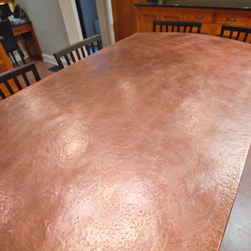
The home’s existing pallet of aged materials and their warm earth tones was reinforced with the selection of new finish materials such as: red brick, limestone veneer, linoleum flooring, African-mahogany cabinets, quartz perimeter countertops, copper sinks, exhaust hood and island counter, and oil-rubbed bronze hardware and fixtures. Because matching the exterior brick veneer was no longer a possibility, the combination of limestone veneer and copper sheet metal was selected for the new exterior; both being chosen for their warmth and timeless character. In addition, new hand-crafted wrought-iron doors and windows with energy-efficient insulated glass and ornate scrollwork were chosen in lieu of wood or clad-wood windows to replicate the home’s original steel and leaded-glass windows.
With time (and some patina), this inviting kitchen addition will blur the lines between “old” and “new.”
Project description written by Lee Constantine, Constantine Design Group.
 Simply Perfect
In our work, we see lots of big homes with big spaces. We also see small homes. And we’ll be the first to tell you that size isn’t what matters.
What’s important is scale.
Through design, we can make a small space look big—or make a big space look small. But more important, we can use scale to make your home interiors meet your functional needs while reflecting your personality, values and style.
The Eyes Have It.
When you step into a room, where do you look?
Directing the eye is one of the magic tricks that designers use to create a particular effect.
Bright red apples in a simple glass bowl immediately draws the eye to a kitchen counter. The hefty wood trivet and rounded concrete planter containing succulents echo the shape of the apples and the bowl, while adding new materials. A wood and metal stand holds an iPad or book for easy recipe reference, all atop an elegant light granite counter.
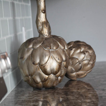
In a separate arrangement, ceramic artichokes create shape and shine but maintain the neutral color for continuity.
In this context, the eye is drawn immediately to the bright red color. That’s why sparse seasonal decorations can be more effective than heavy ornamentation. We can actually take in more when there are fewer items to focus on.
Sponsored
Columbus, OH
Hope Restoration & General Contracting
Columbus Design-Build, Kitchen & Bath Remodeling, Historic Renovations
 Thomas J. Pearson, Inc.
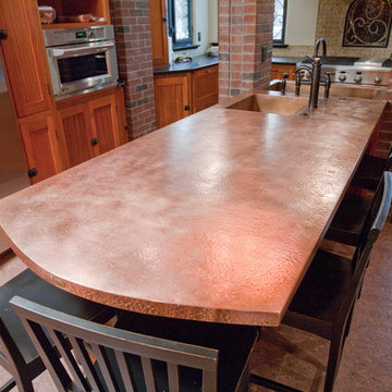
This spacious, yet extremely friendly and inviting home lacked a kitchen with personality and functionality for this growing family and their desire to entertain others. The goal for this renovation was to provide for new and larger appliances, maintain views to the rear yard, and provide family seating space within the kitchen.
The home’s existing exterior architecture provides references reminiscent Italian villas with terra cotta clay tile roofing, half-round steel windows and ornate stonework. The interior evokes similar images through the use of warm earth tone wall colors, hardwood floors, wrought-iron railings and plastered walls.
The home’s existing pallet of aged materials and their warm earth tones was reinforced with the selection of new finish materials such as: red brick, limestone veneer, linoleum flooring, African-mahogany cabinets, quartz perimeter countertops, copper sinks, exhaust hood and island counter, and oil-rubbed bronze hardware and fixtures. Because matching the exterior brick veneer was no longer a possibility, the combination of limestone veneer and copper sheet metal was selected for the new exterior; both being chosen for their warmth and timeless character. In addition, new hand-crafted wrought-iron doors and windows with energy-efficient insulated glass and ornate scrollwork were chosen in lieu of wood or clad-wood windows to replicate the home’s original steel and leaded-glass windows.
With time (and some patina), this inviting kitchen addition will blur the lines between “old” and “new.”
Project description written by Lee Constantine, Constantine Design Group.
 User
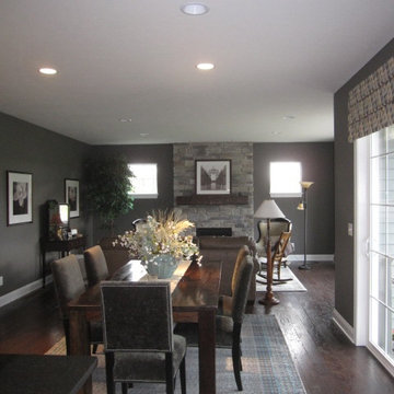
UserSeries of "progress" photos with much-needed finishing touches to make newly-purchased furnished model reflective of its new well-traveled homeowner/clients. So far, we have added several new rugs with subtle teal references, some accent pieces and installed client artwork and personal photos. Client has selectively-integrated favorite pieces from their former homes.
 User
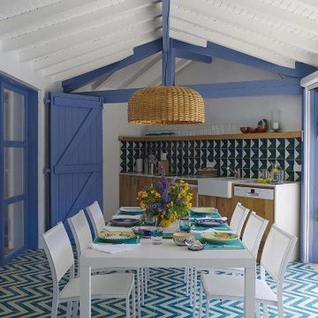
UserColour, balance of shapes and volumes, functionality and a small touch of measured eccentricity are the key elements that characterize the Melián Randolph style. A personal signature based on a taste for visual aesthetics that recreates the Mediterranean atmosphere, transmitting the love and joy of art, traveling and life.
For this emblematic “Biarritz” project they chose our reference nº 10435 in colours B and B2 to harmonise with the proximity of the ocean and the blue sky of the south of France.
http://www.melianrandolph.com/
 Designs by KS
Project: Pelton Avenue - Coquitlam
Builder: Furtado Contracting
About this Project
We partnered up with Furtado Contracting to transform the main floor and foyer of this Greater Vancouver classic home. Also referred to as the “Vancouver Special” this style of home was popular in the 60’s-80’s and has been re-decorated and renovated ever since.
Layout Details:
By eliminating the wall between the dining room and kitchen, and reducing the length of the hallway wall, we were able to create a large open concept space.
The previous u-shape kitchen turned into a large galley kitchen, which allowed us to incorporate an island with seating for four.
With the major appliances being housed on the window wall, we designed a large pantry space spanning from wall-to-wall to store all the necessities from food to cleaning supplies. Its niche not only breaks up the cabinets to add some personality but can be used as a wine/coffee area. On the far end of the kitchen, the pantry wall extends to a narrow cabinet that has been designed to act as a mudroom; a place for shoes and jackets near the back door. At the back of the kitchen you will also find a working space, that has been tied into the fridge area with some careful space planning.
Material Details:
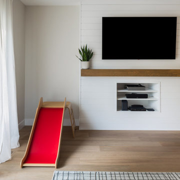
The living room and foyer received an upgrade with new flooring, light fixtures, paint, and a converted fireplace to A/V wall with a rustic wooden mantle.
In the kitchen, woodgrain cabinets made from durable laminate are paired with painted materials. A 1” shaker door painted in our favourite Benjamin Moore “Silver Satin” is seen on the upper cabinets only. This special detail is complimented with bronze knobs by Marathon Hardware. The same colour is seen on the pantry wall in a slab door, making it sleeker. The island is painted in Benjamin Moore “Black Pepper”, is paired with bronze hardware by Marathon Hardware and is clad in quartz, Silestone’s “Calcatta Gold” to be specific. Quartz is a go-to material if maintenance is not your thing!
Special Mentions:
There are so many amazing things about this project. All the light fixtures were supplied by Robinson Lighting, and include Canadian company Kuzco Lighting, as seen in the kitchen, entry and foyer. The black accents on the sink by Blanco and faucet by Grohe added some contrast against the backsplash by Julian Tile.

Sponsored
Delaware, OH

Buckeye Basements, Inc.
Central Ohio's Basement Finishing ExpertsBest Of Houzz '13-'21
 Exclusive Home Interiors
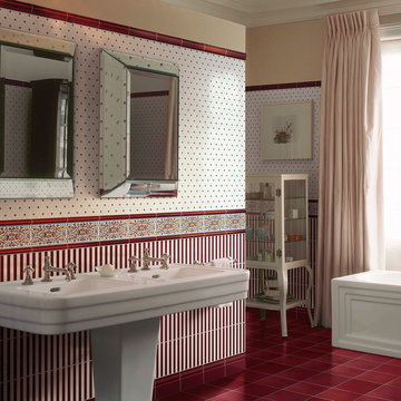
Passion, character, nostalgia
Think of a style that resembles you.
Of a meeting with elegance as an expression of personality Chose your dimension in each detail.
Key-words for Grand Elegance and main issues leading our philosophy from the very early steps.
Our basic idea consists of shifting to ceramics all the living passions so that ceramics itself rises as metaphorical reference for life styles and little daily fads. So the sea and sailing, flowers, gardens, animals, classic sport, country-side and leisure time become all bricks of our imagination. Just like a classic novel, Grand Elegance collection describes our tradition that emphasizes individual attitudes and choices.
 Juliettes Interiors Ltd
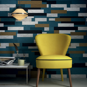
A fabulous accent chair using a bright sunshine yellow to get your attention. Full of cheeky personality, the two back legs are also painted yellow to throw you off guard. Beautiful upholstery and attention to detail sets this little chair apart. This funky little chair is also available in a beautiful pink velvet as shown on our website. Perfect for girls bedroom. Please refer to our website for further details and options..
 TOC design & construction inc.
Beautiful Design, Practical, Gathering Space. By Tania Scadellato at TOC design
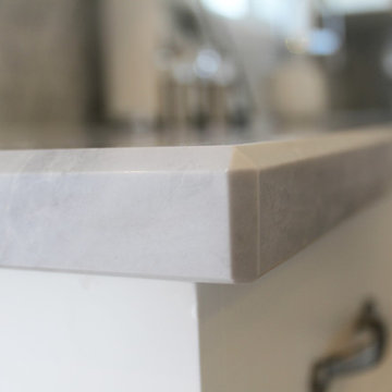
Contemporary and practical kitchen is today’s hottest trend, but if we look back in time the all white shaker style is a classic. Going with all white cabinetry and a carrera marble look-alike counter, is clean and fresh and will always be a timeless classic
Function and Beauty
You can choose the best value, the most beautiful, the highest quality cabinets, but without functionality they simply aren't going to work for you. It's important to design your kitchen with freedom for your personal needs and tastes.
Well proportioned and organized base cabinets , drawer base cabinet, specialty cabinets like trash pullouts, tray dividers, spice cabinets and wall cabinetry for varying kitchen heights. allowing you to create a kitchen that will work for you. We strive to give you the right kitchen design for your needs and lifestyle .
3D Rendering of Your Virtual Kitchen
TOC design uses state-of-the-art communication and design software so that you can see a 3D virtual plan of your dream kitchen. we give our customers the highest quality products, service and value at an affordable price. That is why our clients refer us to their friends and family.
The kitchen is a place where the whole family gets together; it has to be both pleasant and functional. A renovated kitchen is a major asset to the resale value of the house and should be considered an investment rather than an expense. It is especially important to choose a designer and contractor who knows kitchens! TOC design & Construction inc.. has worked in the field for 25 years and has great kitchen renovation experience.
27