
Search results for "Potential clients" in Home Design Ideas

 Bret Achtenhagen's Seasonal Services
When we first met, this client was extremely frustrated. A current contractor had left her with a yard in disarray, a project incomplete and the loss of an entire season of swimming pool use. Additionally, years of accumulated DIY projects left other potential landscape contractors overwhelmed and unwilling to take this project on.
Picking up the pieces, we put together a design that would meet the client’s goals and our team set to work. We completed the retaining wall, laid a modular paver pool deck, updated the cedar deck, added privacy screening, solved drainage issues, installed LED lighting, overhauled plantings to maximize color and brought the lawn back to life.
The re-defined space is a dream-come-true for our client. A yard which two years ago was a jungle of debris, is now the “go-to” gathering place for family & friends to relax and have fun.
 Gallery KBNY
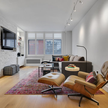
In this Manhattan pied-à-terre renovation, Gallery tackled the entire apartment. A true full renovation, we updated the kitchen, master bathroom, and powder room, installed new flooring throughout the entire space, and built the entertainment center in the living room.
DESIGN DETAILS
The clients wanted their pied-à-terre to have some modern touches, but not too sleek or contemporary. Since it combines a number of styles and elements, transitional turned out to be their ideal aesthetic. Whites, grays, and earthy tones carried this color theme throughout the apartment.
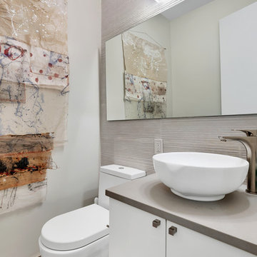
One of the clients is an artist and wanted wall space to display their original work, visible in the dining area and powder room in the photos below. The entertainment center is another highlight, with its white mosaic brick tile accent wall and glass open shelves to display family photos on both sides.
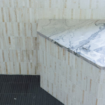
Instead of tiles, the new powder room walls received a textured concrete application, resulting in an almost industrial vibe. In the master bathroom renovation, glass mosaic tile accent walls bring a touch of personality to both the shower and a storage nook opposite the vanity.
UNIQUELY-SHAPED ROOMS
We specialize in adapting to every potential challenge, including uniquely-shaped rooms like the nearly-triangular kitchen in this Manhattan pied-à-terre renovation.
It’s important to design an uncommonly-shaped space as practically as possible, including specs seemingly as small as sink positioning. Every little detail counts tenfold in a room that’s not rectangular!
Other design details in the kitchen renovation include the classic combination of Shaker-style cabinets and quartz countertops, with a glass mosaic backsplash that matches the one used in the bathroom.
VISIBILITY = TRUST
Communication is always a core value at Gallery, but it’s even more vital when working with bi-coastal clients who were in another state throughout almost the entire process. We met with them once; everything else was done virtually thanks to JobTracker, our project management system.
The client had complete visibility into the renovation, including all design renderings, scheduled installations, and daily progress videos and photos. Even though they were 3000 miles away, they had a direct line to everyone on the team at all times.
SOME HIGHLIGHTS
- Entertainment center designed and built to serve as focal point, with white brick mosaic accent wall and open shelves made of glass
- Track lighting for ease of displaying art and to preserve ceiling height instead of the dropped ceiling that recessed lighting would necessitate
- Deliberate consideration of space in the unusually-shaped, nearly triangular kitchen
- Glass mosaic tile accent walls in the master bathroom with matching tile for the backsplash in the kitchen
Thinking about renovating your bathroom? Contact us today to find out how you can benefit from our expertise in remodeling New York City bathrooms. As a design-and-build firm with a full-scale approach, we handle every single aspect of your home renovation from start to finish.
 Bret Achtenhagen's Seasonal Services
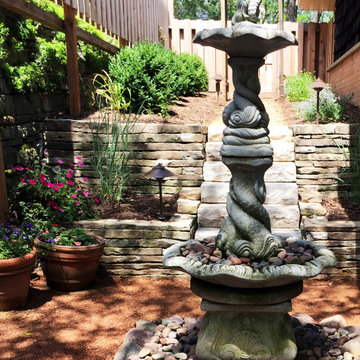
When we first met, this client was extremely frustrated. A current contractor had left her with a yard in disarray, a project incomplete and the loss of an entire season of swimming pool use. Additionally, years of accumulated DIY projects left other potential landscape contractors overwhelmed and unwilling to take this project on.
Picking up the pieces, we put together a design that would meet the client’s goals and our team set to work. We completed the retaining wall, laid a modular paver pool deck, updated the cedar deck, added privacy screening, solved drainage issues, installed LED lighting, overhauled plantings to maximize color and brought the lawn back to life.
The re-defined space is a dream-come-true for our client. A yard which two years ago was a jungle of debris, is now the “go-to” gathering place for family & friends to relax and have fun.
Find the right local pro for your project
 Tile Doctor Ltd
Recently I was called to a house in the very small town of Marton in Warwickshire which is known for its proximity to the medieval “Marton Bridge”, which lies just to the north, crossing the River Leam.
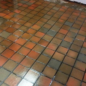
The entire downstairs flooring of my client’s house consisted of Quarry tiles apart from one room where the tiles had been covered by screed and then linoleum. Quarry tiles are a classic hard wearing tile used for both internal and external commercial and residential flooring due to its ability to withstand heavy usage. Reception areas, outdoor patios and porches, for example, are commonly tiled using Quarry.
My client wanted to restore the covered floor back to its original state so that it would match the rest of the downstairs. Realising that this would be a complex and physically demanding task, my client decided to call in Tile Doctor to carry out the restoration.
Removing the Linoleum covering was a relatively straightforward process, so I was able to do this relatively quickly. The main issue concerned removing the screed, which is far more difficult to remove, requiring a lot of physical scraping. Thus I opted to call in some extra manpower in the form of the Nottinghamshire Tile Doctor, Steve Carpenter. With the two of us armed with scrapers we set about removing the screed, taking extra care not to damage the Quarry tile underneath.
Once Steve and I had scraped off as much of the screed as physically possible, I applied a strong dilution of Tile Doctor Remove & Go, a stripper with cleaning properties that is particularly effective at breaking down coatings such as adhesives, plasters and sealers. The product was left to dwell for ten minutes before I worked it into the stone with a scrubbing pad.
After cleaning the tiles, I noticed a layer of grout haze on the surface of the exposed Quarry tiles, so I applied Tile Doctor Grout Clean-Up to remove it. Once the cleaning process was complete I gave the floor a thorough rinse with clean water, before soaking up the resulting residue with a wet-vac machine. The first day of work was a gruelling 12 hours long, but I was very pleased with the results and left the floor to dry overnight.
On day two I returned to finish the job by sealing the newly uncovered Quarry tiles, but not before using a damp meter to check that they were completely dry. Any excess moisture left on unsealed tiles can potentially effect the performance of any sealers that are applied. I sealed the tiles using Tile Doctor Colour Grow, an impregnating, colour-enhancing sealer which gave the surface an aesthetically pleasing shine, as well as durable protection against dirt and wear for the future.
After two long days of work the job was done and the transformation was fantastic and highly rewarding to see, the house now has a fantastic looking Quarry tiled floor running throughout the entirety of the lower level.
Mick Gayton
Warwickshire Tile Doctor
 Fabco Sanctuary
The architect and designer Guy Derwent was approached by his client with a clear and compelling brief: to completely transform a grand Victorian terrace house they were planning to renovate. The client envisioned something far beyond a standard renovation – this was to be a bold and dramatic reimagining of a family home that could grow with them over time.
With the property having remained largely untouched for more than fifty years, the architects saw an opportunity to unlock its potential and deliver a contemporary design that would contrast beautifully with its Victorian heritage.
The existing layout consisted of a series of small, disconnected rooms to the rear of the house. To respond to the client’s need for openness and flexibility, the architect proposed a radical restructuring of the ground floor:
The rear rooms were completely removed
Suspended timber floors were lowered by up to two metres to align with the garden
Two bold extensions were added
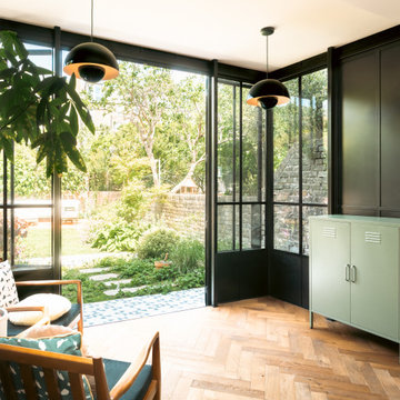
The first extension filled in the side return with a London stock brick facade and a glazed roof, while the second – a striking black steel and glass pavilion was glazed on three sides and placed along the garden elevation.
This new pavilion redefined the building’s relationship with the garden. Its steel-framed glazing created a seamless dialogue between interior and exterior, offering a sense of immersion in the surrounding landscape.
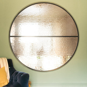
At the heart of the plan sits a dramatic, five-metre-tall dining space that acts as a transition from the original entrance hall into the new addition. A large, circular cast-glass window, framed in steel, provides a visual and spatial link between old and new, allowing light and movement to travel through the depth of the home.
Throughout the project, a series of black metal elements were introduced as sculptural interventions – each marking moments of transformation within the house. These included the bespoke steel framed circular window, a custom metal staircase, a cylindrical support column, and the striking steel and glass garden pavilion. Together, they formed a coherent architectural language that underscored the project’s bold intent.
Our steel windows and doors played a vital role in delivering the project’s vision. The architects chose steel for its refined sight lines and distinctive material character, which helped bridge the gap between the historical context of the building and the bold new additions.
The black steel frames provided a crisp contrast to the pale London stock brick and added definition to the glazed pavilion, reinforcing the sense of architectural precision. In particular, the fine steel profiles of the garden room allowed the extension to feel both lightweight and immersive, blurring the boundary between the house and its garden.
The architect drew inspiration from the Bauhaus Movement, particularly the work of Walter Gropius, whose approach to functional beauty and industrial materials informed the design of the garden pavilion.
Here, our glazing system was used not just for transparency, but as an expressive architectural element. The carefully proportioned panels help to conceal the roof thickness and reinforce the pavilion’s industrial yet abstract character – a deliberate nod to product design and modernist detailing.
Sustainability was an important factor in the selection of materials. Our steel systems, made from 99% recycled content and 100% recyclable, aligned with the project’s broader environmental goals.
The architects noted that this commitment to material longevity and circularity was central to their decision to use steel. The durability and recyclability of the windows and doors ensured the project met both aesthetic and ethical criteria.
This London terrace house now stands as a celebration of contrast – between heritage and innovation, solidity and transparency, tradition and transformation. Our steel windows and doors were not simply components; they were essential tools in crafting a home that is as bold and expressive as it is functional.
The result is a home designed for modern family life, where light, space, and materiality come together in perfect harmony.
 Jarrett Design
Our clients immediately recognized the potential of the home located in a highly sought-after section of Allentown. The dated kitchen needed significant rethinking but our clients knew it could be turned into something beautiful and inspiring. And, indeed, they were right.
Busy professionals with an active social life, our clients wanted an inviting space to host both intimate dinner parties and large social gatherings. With this in mind, we worked to reimagine the flow of traffic from one room to another. Extraneous walls and a desk inconveniently positioned in the middle of the main kitchen thoroughfare needed to be removed and tight workspace aisles and narrow passageways demanded widening to help alleviate the problem.
In addition to the kitchen’s flow concerns, the dark and dated space needed brightening. The wall between the kitchen and family room was opened up to unite the two spaces allowing more light into both rooms. Windows were also added at the sink wall so the room could be flooded with bright morning sun, while also offering a beautiful view of the park below. All-white cabinetry was selected to help reflect the additional light.
An unfortunate challenge of expanding the windows meant there were fewer wall cabinets to store dishes. We turned to the island where we installed large dish drawers featuring wood pegged interiors. We also relied on wall-to-counter cabinets for additional storage to help keep the room clutter-free as appliances were neatly tucked behind doors. A new, built-in pantry was also added.
The finished kitchen unites traditional with today and elegance with comfort to ensure perfection. We are thrilled for our clients who have an abundance of good taste, an eye for what is possible and a drive to see it accomplished.
Jacqueline Powell Photography
 Bret Achtenhagen's Seasonal Services
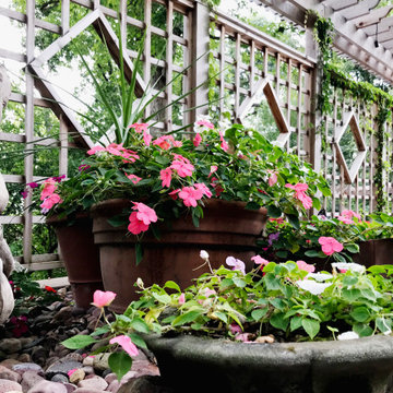
When we first met, this client was extremely frustrated. A current contractor had left her with a yard in disarray, a project incomplete and the loss of an entire season of swimming pool use. Additionally, years of accumulated DIY projects left other potential landscape contractors overwhelmed and unwilling to take this project on.
Picking up the pieces, we put together a design that would meet the client’s goals and our team set to work. We completed the retaining wall, laid a modular paver pool deck, updated the cedar deck, added privacy screening, solved drainage issues, installed LED lighting, overhauled plantings to maximize color and brought the lawn back to life.
The re-defined space is a dream-come-true for our client. A yard which two years ago was a jungle of debris, is now the “go-to” gathering place for family & friends to relax and have fun.

 Jarrett Design
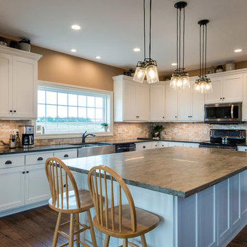
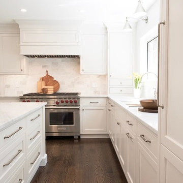
Our clients immediately recognized the potential of the home located in a highly sought-after section of Allentown. The dated kitchen needed significant rethinking but our clients knew it could be turned into something beautiful and inspiring. And, indeed, they were right.
Busy professionals with an active social life, our clients wanted an inviting space to host both intimate dinner parties and large social gatherings. With this in mind, we worked to reimagine the flow of traffic from one room to another. Extraneous walls and a desk inconveniently positioned in the middle of the main kitchen thoroughfare needed to be removed and tight workspace aisles and narrow passageways demanded widening to help alleviate the problem.
In addition to the kitchen’s flow concerns, the dark and dated space needed brightening. The wall between the kitchen and family room was opened up to unite the two spaces allowing more light into both rooms. Windows were also added at the sink wall so the room could be flooded with bright morning sun, while also offering a beautiful view of the park below. All-white cabinetry was selected to help reflect the additional light.
An unfortunate challenge of expanding the windows meant there were fewer wall cabinets to store dishes. We turned to the island where we installed large dish drawers featuring wood pegged interiors. We also relied on wall-to-counter cabinets for additional storage to help keep the room clutter-free as appliances were neatly tucked behind doors. A new, built-in pantry was also added.
The finished kitchen unites traditional with today and elegance with comfort to ensure perfection. We are thrilled for our clients who have an abundance of good taste, an eye for what is possible and a drive to see it accomplished.
Jacqueline Powell Photography
 Gallery KBNY
In this Manhattan pied-à-terre renovation, Gallery tackled the entire apartment. A true full renovation, we updated the kitchen, master bathroom, and powder room, installed new flooring throughout the entire space, and built the entertainment center in the living room.
DESIGN DETAILS
The clients wanted their pied-à-terre to have some modern touches, but not too sleek or contemporary. Since it combines a number of styles and elements, transitional turned out to be their ideal aesthetic. Whites, grays, and earthy tones carried this color theme throughout the apartment.
One of the clients is an artist and wanted wall space to display their original work, visible in the dining area and powder room in the photos below. The entertainment center is another highlight, with its white mosaic brick tile accent wall and glass open shelves to display family photos on both sides.
Instead of tiles, the new powder room walls received a textured concrete application, resulting in an almost industrial vibe. In the master bathroom renovation, glass mosaic tile accent walls bring a touch of personality to both the shower and a storage nook opposite the vanity.
UNIQUELY-SHAPED ROOMS
We specialize in adapting to every potential challenge, including uniquely-shaped rooms like the nearly-triangular kitchen in this Manhattan pied-à-terre renovation.
It’s important to design an uncommonly-shaped space as practically as possible, including specs seemingly as small as sink positioning. Every little detail counts tenfold in a room that’s not rectangular!
Other design details in the kitchen renovation include the classic combination of Shaker-style cabinets and quartz countertops, with a glass mosaic backsplash that matches the one used in the bathroom.
VISIBILITY = TRUST
Communication is always a core value at Gallery, but it’s even more vital when working with bi-coastal clients who were in another state throughout almost the entire process. We met with them once; everything else was done virtually thanks to JobTracker, our project management system.
The client had complete visibility into the renovation, including all design renderings, scheduled installations, and daily progress videos and photos. Even though they were 3000 miles away, they had a direct line to everyone on the team at all times.
SOME HIGHLIGHTS
- Entertainment center designed and built to serve as focal point, with white brick mosaic accent wall and open shelves made of glass
- Track lighting for ease of displaying art and to preserve ceiling height instead of the dropped ceiling that recessed lighting would necessitate
- Deliberate consideration of space in the unusually-shaped, nearly triangular kitchen
- Glass mosaic tile accent walls in the master bathroom with matching tile for the backsplash in the kitchen
Thinking about renovating your bathroom? Contact us today to find out how you can benefit from our expertise in remodeling New York City bathrooms. As a design-and-build firm with a full-scale approach, we handle every single aspect of your home renovation from start to finish.
 Bret Achtenhagen's Seasonal Services
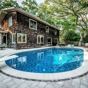
When we first met, this client was extremely frustrated. A current contractor had left her with a yard in disarray, a project incomplete and the loss of an entire season of swimming pool use. Additionally, years of accumulated DIY projects left other potential landscape contractors overwhelmed and unwilling to take this project on.
Picking up the pieces, we put together a design that would meet the client’s goals and our team set to work. We completed the retaining wall, laid a modular paver pool deck, updated the cedar deck, added privacy screening, solved drainage issues, installed LED lighting, overhauled plantings to maximize color and brought the lawn back to life.
The re-defined space is a dream-come-true for our client. A yard which two years ago was a jungle of debris, is now the “go-to” gathering place for family & friends to relax and have fun.
 Drury Design
THE SETUP
While the existing layout wasn’t inherently flawed, this primary bathroom felt outdated and lacked the desired aesthetic appeal for our client. The goal was to revitalize the space, catering to her refined taste while ensuring a bright, inviting ambiance. The client wanted a comfortable and classy gender-neutral design that would retain its updated look and have broad appeal for eventual resale.
Design Objectives:
Create a spacious, luxurious shower enclosure
Incorporate ample storage for towels, linens and an extensive hair care collection
Embrace a transitional design style that blends contemporary and classic elements
Establish a harmonious color palette that complements the home’s new black window frames
Ensure a future-proof design to maximize resale potential
Design Challenges:
Integrating a spacious shower within the existing layout
Ensuring accessible towel and robe storage near the shower and tub areas
Providing ample lighting and mirror space without cluttering the vanity area
Finding dedicated storage for hair care essentials and accessories
Maximizing linen storage while minimizing clutter
Decluttering the tub niche area
Tall angled ceiling almost too dramatic
THE RENEWED SPACE
Design Solutions:
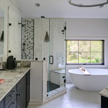
Frameless glass shower enclosure with a recessed niche (in the half wall) for body care products
Strategically placed robe/towel hooks on shower glass facing shower and tub
Illuminated, oversized mirrors with integrated lighting
Multiple large pull-out drawers with electrical outlets in the vanity
Dedicated base cabinet with countertop for towel/linen storage and decor
Single, spacious tub niche for products and decorative accents
Subtle horizontal trim lines at standard ceiling height to visually ground the space
This primary bathroom remodel seamlessly blends style and functionality, catering to the client’s discerning taste while ensuring adaptability for future needs. The harmonious fusion of contemporary and classic design elements, coupled with innovative storage solutions and thoughtful lighting choices, creates a timeless sanctuary that exudes elegance and comfort.
 Bret Achtenhagen's Seasonal Services
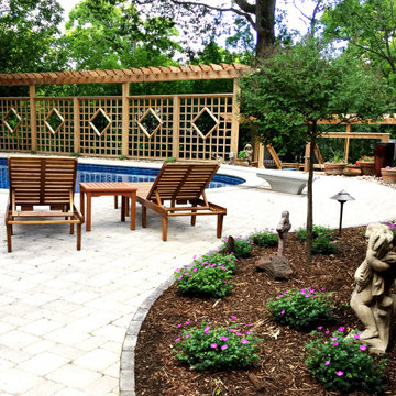
When we first met, this client was extremely frustrated. A current contractor had left her with a yard in disarray, a project incomplete and the loss of an entire season of swimming pool use. Additionally, years of accumulated DIY projects left other potential landscape contractors overwhelmed and unwilling to take this project on.
Picking up the pieces, we put together a design that would meet the client’s goals and our team set to work. We completed the retaining wall, laid a modular paver pool deck, updated the cedar deck, added privacy screening, solved drainage issues, installed LED lighting, overhauled plantings to maximize color and brought the lawn back to life.
The re-defined space is a dream-come-true for our client. A yard which two years ago was a jungle of debris, is now the “go-to” gathering place for family & friends to relax and have fun.
 Fabco Sanctuary
The architect and designer Guy Derwent was approached by his client with a clear and compelling brief: to completely transform a grand Victorian terrace house they were planning to renovate. The client envisioned something far beyond a standard renovation – this was to be a bold and dramatic reimagining of a family home that could grow with them over time.
With the property having remained largely untouched for more than fifty years, the architects saw an opportunity to unlock its potential and deliver a contemporary design that would contrast beautifully with its Victorian heritage.
The existing layout consisted of a series of small, disconnected rooms to the rear of the house. To respond to the client’s need for openness and flexibility, the architect proposed a radical restructuring of the ground floor:
The rear rooms were completely removed
Suspended timber floors were lowered by up to two metres to align with the garden
Two bold extensions were added
The first extension filled in the side return with a London stock brick facade and a glazed roof, while the second – a striking black steel and glass pavilion was glazed on three sides and placed along the garden elevation.
This new pavilion redefined the building’s relationship with the garden. Its steel-framed glazing created a seamless dialogue between interior and exterior, offering a sense of immersion in the surrounding landscape.
At the heart of the plan sits a dramatic, five-metre-tall dining space that acts as a transition from the original entrance hall into the new addition. A large, circular cast-glass window, framed in steel, provides a visual and spatial link between old and new, allowing light and movement to travel through the depth of the home.
Throughout the project, a series of black metal elements were introduced as sculptural interventions – each marking moments of transformation within the house. These included the bespoke steel framed circular window, a custom metal staircase, a cylindrical support column, and the striking steel and glass garden pavilion. Together, they formed a coherent architectural language that underscored the project’s bold intent.
Our steel windows and doors played a vital role in delivering the project’s vision. The architects chose steel for its refined sight lines and distinctive material character, which helped bridge the gap between the historical context of the building and the bold new additions.
The black steel frames provided a crisp contrast to the pale London stock brick and added definition to the glazed pavilion, reinforcing the sense of architectural precision. In particular, the fine steel profiles of the garden room allowed the extension to feel both lightweight and immersive, blurring the boundary between the house and its garden.
The architect drew inspiration from the Bauhaus Movement, particularly the work of Walter Gropius, whose approach to functional beauty and industrial materials informed the design of the garden pavilion.
Here, our glazing system was used not just for transparency, but as an expressive architectural element. The carefully proportioned panels help to conceal the roof thickness and reinforce the pavilion’s industrial yet abstract character – a deliberate nod to product design and modernist detailing.
Sustainability was an important factor in the selection of materials. Our steel systems, made from 99% recycled content and 100% recyclable, aligned with the project’s broader environmental goals.
The architects noted that this commitment to material longevity and circularity was central to their decision to use steel. The durability and recyclability of the windows and doors ensured the project met both aesthetic and ethical criteria.
This London terrace house now stands as a celebration of contrast – between heritage and innovation, solidity and transparency, tradition and transformation. Our steel windows and doors were not simply components; they were essential tools in crafting a home that is as bold and expressive as it is functional.
The result is a home designed for modern family life, where light, space, and materiality come together in perfect harmony.

Sponsored
Westerville, OH

Custom Home Works
Franklin County's Award-Winning Design, Build and Remodeling Expert
 Drury Design
THE SETUP
While the existing layout wasn’t inherently flawed, this primary bathroom felt outdated and lacked the desired aesthetic appeal for our client. The goal was to revitalize the space, catering to her refined taste while ensuring a bright, inviting ambiance. The client wanted a comfortable and classy gender-neutral design that would retain its updated look and have broad appeal for eventual resale.
Design Objectives:
Create a spacious, luxurious shower enclosure
Incorporate ample storage for towels, linens and an extensive hair care collection
Embrace a transitional design style that blends contemporary and classic elements
Establish a harmonious color palette that complements the home’s new black window frames
Ensure a future-proof design to maximize resale potential
Design Challenges:
Integrating a spacious shower within the existing layout
Ensuring accessible towel and robe storage near the shower and tub areas
Providing ample lighting and mirror space without cluttering the vanity area
Finding dedicated storage for hair care essentials and accessories
Maximizing linen storage while minimizing clutter
Decluttering the tub niche area
Tall angled ceiling almost too dramatic
THE RENEWED SPACE
Design Solutions:
Frameless glass shower enclosure with a recessed niche (in the half wall) for body care products
Strategically placed robe/towel hooks on shower glass facing shower and tub
Illuminated, oversized mirrors with integrated lighting
Multiple large pull-out drawers with electrical outlets in the vanity
Dedicated base cabinet with countertop for towel/linen storage and decor
Single, spacious tub niche for products and decorative accents
Subtle horizontal trim lines at standard ceiling height to visually ground the space
This primary bathroom remodel seamlessly blends style and functionality, catering to the client’s discerning taste while ensuring adaptability for future needs. The harmonious fusion of contemporary and classic design elements, coupled with innovative storage solutions and thoughtful lighting choices, creates a timeless sanctuary that exudes elegance and comfort.
 Jarrett Design
Our clients immediately recognized the potential of the home located in a highly sought-after section of Allentown. The dated kitchen needed significant rethinking but our clients knew it could be turned into something beautiful and inspiring. And, indeed, they were right.
Busy professionals with an active social life, our clients wanted an inviting space to host both intimate dinner parties and large social gatherings. With this in mind, we worked to reimagine the flow of traffic from one room to another. Extraneous walls and a desk inconveniently positioned in the middle of the main kitchen thoroughfare needed to be removed and tight workspace aisles and narrow passageways demanded widening to help alleviate the problem.
In addition to the kitchen’s flow concerns, the dark and dated space needed brightening. The wall between the kitchen and family room was opened up to unite the two spaces allowing more light into both rooms. Windows were also added at the sink wall so the room could be flooded with bright morning sun, while also offering a beautiful view of the park below. All-white cabinetry was selected to help reflect the additional light.
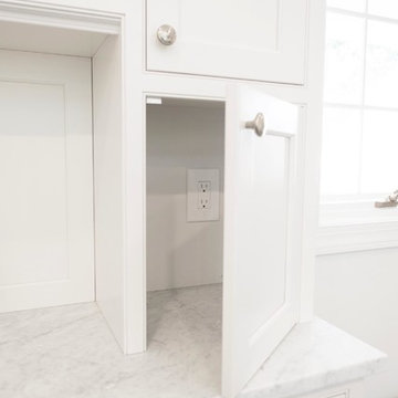
An unfortunate challenge of expanding the windows meant there were fewer wall cabinets to store dishes. We turned to the island where we installed large dish drawers featuring wood pegged interiors. We also relied on wall-to-counter cabinets for additional storage to help keep the room clutter-free as appliances were neatly tucked behind doors. A new, built-in pantry was also added.
The finished kitchen unites traditional with today and elegance with comfort to ensure perfection. We are thrilled for our clients who have an abundance of good taste, an eye for what is possible and a drive to see it accomplished.
Jacqueline Powell Photography
 SkyWindows & Aluminum Products
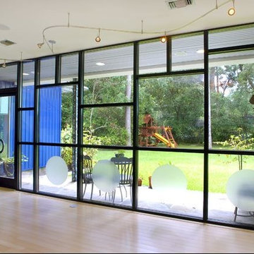
When a potential customer takes that first glimpse at a storefront, an initial impression is being formed and expectations are being set. Our work brings the added value that businesses require in order to showcase their products and increase their sales. The striking designs, that we are known for, are specifically created not only to be aesthetically pleasing, but to lure shoppers into your place of business.
Many individual business owners are unaware of the fact that creating the design that a potential customer sees from the street is an exact science when displaying products and constructing an eye catching visual presentation. We also understand that each business that we work with is unique when it comes to the way potential customers perceive that store. If a storefronts appearance is not constructed correctly, a potential customer may immediately dismiss that particular store as “unprofessional” or worse, they might not even register the presence of that store at all when it just blends into the background!
This is the main reason why we pride ourselves so highly on the work that we do for our clients. The professionals at our company understand the complex guidelines that dictate what attracts buyers with a perfect visual approach to a particular design. But, of course, the quality will also need to be superior so that fading and overall deterioration of that design will not become a detriment to the goals of a business owner. This is why we utilize only the best materials and exact construction standards that will allow a store owner’s exterior presentation to be visually pleasing to the eye for years to come.
Whether you need our assistance just to keep your store front from closing improperly or more extensive construction, we’re here to help you with all your business needs when it comes to the visual perception of your store.
 Kitchen & Bath Masters
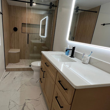
Our client came to us looking to transform their outdated bathroom into a space that felt both modern and in harmony with the rest of their home. The existing materials and layout were no longer working—visually or functionally—so we set out to reimagine the entire space.
To create a more cohesive look with the rest of the home, we installed wood-tone wall tiles, bringing warmth and a natural aesthetic to the bathroom. For contrast and a clean, elevated look, we paired them with Calacatta-style porcelain floor tiles, adding brightness and visual depth to the space.
We updated the shower area with a matte black shower system and matching hardware, introducing a sleek and modern edge. The bathtub was removed and replaced with a walk-in shower, which we enhanced with a built-in bench—offering both comfort and practicality. To add further contrast and detail, we selected a hexagon tile pattern for the shower floor, complementing the overall design while subtly standing out.
To improve daily functionality, we added drawer storage to the vanity, increasing organization potential without sacrificing style. The outdated plain glass mirror was replaced with a backlit LED mirror with an anti-fog feature, offering both better lighting and a cleaner look.
Behind the door, we built pantry-style cabinetry, maximizing storage in an often-overlooked space. At the client's request, we also removed the old heated flooring, which was no longer desired.
For water pressure and shower experience, we installed a 2.5 GPM shower system, tailored to the homeowner’s preferences. Finally, we enclosed the shower with a custom frameless glass door and tied everything together with matte black finishes throughout.
The end result is a serene, stylish, and fully modernized bathroom tailored to the client's taste—warm yet contemporary, practical yet beautiful. We’re thrilled with the transformation and wish our client many relaxing days ahead in their new space!

Sponsored
Delaware, OH

Buckeye Basements, Inc.
Central Ohio's Basement Finishing ExpertsBest Of Houzz '13-'21
 SkyWindows & Aluminum Products
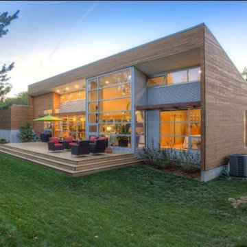
When a potential customer takes that first glimpse at a storefront, an initial impression is being formed and expectations are being set. Our work brings the added value that businesses require in order to showcase their products and increase their sales. The striking designs, that we are known for, are specifically created not only to be aesthetically pleasing, but to lure shoppers into your place of business.
Many individual business owners are unaware of the fact that creating the design that a potential customer sees from the street is an exact science when displaying products and constructing an eye catching visual presentation. We also understand that each business that we work with is unique when it comes to the way potential customers perceive that store. If a storefronts appearance is not constructed correctly, a potential customer may immediately dismiss that particular store as “unprofessional” or worse, they might not even register the presence of that store at all when it just blends into the background!
This is the main reason why we pride ourselves so highly on the work that we do for our clients. The professionals at our company understand the complex guidelines that dictate what attracts buyers with a perfect visual approach to a particular design. But, of course, the quality will also need to be superior so that fading and overall deterioration of that design will not become a detriment to the goals of a business owner. This is why we utilize only the best materials and exact construction standards that will allow a store owner’s exterior presentation to be visually pleasing to the eye for years to come.
Whether you need our assistance just to keep your store front from closing improperly or more extensive construction, we’re here to help you with all your business needs when it comes to the visual perception of your store.
 Bennett Contracting, Inc.
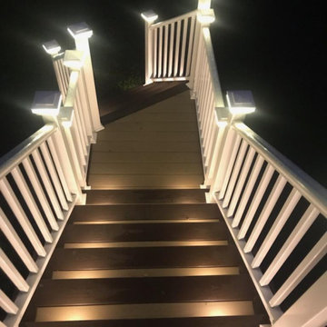
Our next project gave us an amazing opportunity to work with a delightful couple who wanted to breathe new life into their outdated and deteriorated 2-tier wooden deck. Upon assessing the space as well as the wants and needs of our clients, Project Manager, EJ Bonacker, knew it was evident that there was immense potential for improvement. He proposed to shift the deck to a single level and incorporate a Trex RainEscape system. This ingenious addition ensured the area below the deck would remain dry and usable no matter the weather conditions and would also maximize space for entertaining friends and family. Low maintenance TimberTech decking and Titan railings were used which will allow our clients to spend more time enjoying the deck rather than maintaining it. While the older deck did have some lighting, we proposed a comprehensive lighting upgrade which included lights around the perimeter as well as well-lit stairs leading to the ground level which enhanced not only the aesthetics but also the safety during evening gatherings. One of our favorite pieces of this project was designing a special nook for the grill as to not encroach on the primary entertainment area. Our clients were ecstatic we were able to complete their project just in time for the Fourth of July celebrations so they could share laughter, delicious food and create beautiful memories with their neighbors, kids and grandkids. We look forward to helping these clients with more projects for years to come!
 Drury Design
THE SETUP
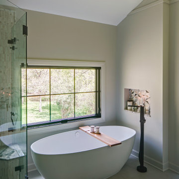
While the existing layout wasn’t inherently flawed, this primary bathroom felt outdated and lacked the desired aesthetic appeal for our client. The goal was to revitalize the space, catering to her refined taste while ensuring a bright, inviting ambiance. The client wanted a comfortable and classy gender-neutral design that would retain its updated look and have broad appeal for eventual resale.
Design Objectives:
Create a spacious, luxurious shower enclosure
Incorporate ample storage for towels, linens and an extensive hair care collection
Embrace a transitional design style that blends contemporary and classic elements
Establish a harmonious color palette that complements the home’s new black window frames
Ensure a future-proof design to maximize resale potential
Design Challenges:
Integrating a spacious shower within the existing layout
Ensuring accessible towel and robe storage near the shower and tub areas
Providing ample lighting and mirror space without cluttering the vanity area
Finding dedicated storage for hair care essentials and accessories
Maximizing linen storage while minimizing clutter
Decluttering the tub niche area
Tall angled ceiling almost too dramatic
THE RENEWED SPACE
Design Solutions:
Frameless glass shower enclosure with a recessed niche (in the half wall) for body care products
Strategically placed robe/towel hooks on shower glass facing shower and tub
Illuminated, oversized mirrors with integrated lighting
Multiple large pull-out drawers with electrical outlets in the vanity
Dedicated base cabinet with countertop for towel/linen storage and decor
Single, spacious tub niche for products and decorative accents
Subtle horizontal trim lines at standard ceiling height to visually ground the space
This primary bathroom remodel seamlessly blends style and functionality, catering to the client’s discerning taste while ensuring adaptability for future needs. The harmonious fusion of contemporary and classic design elements, coupled with innovative storage solutions and thoughtful lighting choices, creates a timeless sanctuary that exudes elegance and comfort.
33