
Search results for "Powers opportunities" in Home Design Ideas
 California Doors and Windows
The Evolution of the Bathtub Ends Here…
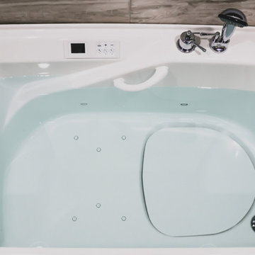
The Ultimate Healing Bathtub is a Brand-New Revolutionary Slide-In Bathtub, designed and engineered by the most brilliant minds on the Planet and in the Industry. This incredible Bathtub, took 5-long hard years, along with millions of dollars to invent, engineer and develop. No safety or ease of use features have been taken for granted or overlooked. This Amazing Bathtub will help people of all ages, ethnic cultures and backgrounds to relax and enjoy life, while they are cleansing themselves from the toxins of the world, safely along with shouting their pain and discomforts. The beautiful, sleek, aerodynamic design is not only practical, it is Gorgeous.
Can you Imagine, Owning the Safest, Most Revolutionary and Luxurious Bathtub in the World?
How would that increase the Quality of Your Life?
You Can own this Awesome Bathtub…and You Deserve To have One...or Two… Or maybe Three…
The Sky is the Limit…
It is Affordable…
And I’m going to help and assist you, on how to get this Ultra-Unique Invention into Your Home.
So, you can rest assured, that when you get home, after working a long hard day, tired, sore, stressed and confused.
Call today to learn more about the amazing features and opportunities that were offering!
The ”Ultimate Healing Bathtub”, will be waiting for you…
With Wide Open Doors… Strong, Powerful Air Jets…. along with Soft Hot Water and Chromotherapy, to help and assist you to:
Reduce the Swelling and Inflammation in your Sore Muscles, Tenons and Bones
Decrease your Muscle Tension
Improve the Circulation of your Blood
Give you Satisfying Relief of Seasonal Affective Disorder (SAD)
Increase your Ligaments Range of Motion
Release Toxins Out of your Body
Revitalize Loose and Wrinkled Skin
Enjoy a Gentle but Powerful Message
Regulate Your Mood Swings
Improve your Sleeping Patterns
Gain Tremendous Anti-Aging Benefits
Live a Higher Quality of Life
Live More Comfortable
Live Happier
Live Longer
Get all this…. and more, along with the Safest and Most Technical Bathtub on the Planet…
The Benefits and Features on this Miraculous Bathtub are Astounding.
The Ultimate Healing Bathtub comes standard with:
4-Computers (YES -I said Four CPU’s)
Drains in 10-15 Seconds
Equipped with a Catch Basin Reservoir underneath the bathtub to allow for quick drainage
The Pressurized Door Seal is the same seal the United States Air Force uses on the F-18 Fighter Jet Plane to seal the Canopy to the top of the Cockpit
Medical Grade Stainless Steel Main Frame that will stay 99% Bacterial Free
Removable Medical Grade Stainless Steel Drain Filter for easy maintenance along with access to the main floor drain
2-12 Volt Back-Up Batteries in case of a power failure
Numerous Fail -Safe Features-In case of Power Failure this bathtub automatically Drains in 10-15 seconds, then the door drops so you can get out of the bathtub
The door rises from underneath the bathtub for maximum immersion and has 3-positions (Down, Center and Top)
Weight of less that one (1) pound of force to open and close the door
Door Automatically Latches
Easy Ingress and egress from a walker or a wheelchair
The bathtub is at chair level for easy positioning
Extra foot drain so you can add more hot water without emptying the bathtub water too fast
Consumption of less than 40 Gallons of Water
Ships in 2-different pieces, that weigh 160 LBS each, for easy installation and attaches together with 4-screws
Low Voltage Heated Backrest (Low and High Heat positions)
Soft Gel Pillow
Numerous Self-Cleaning and Self-Drying Air Jets placed along the entire length of the bathtub that shoot millions of gentle massaging bubbles
No chance of contamination and residue buildup from use of soaps and oils
Upper Control Panel so you can control all of the benefits and features of the Ultimate Healing Bathtub with a push of a button
Hand Held Sprayer for simple caregiving and easy cleaning
Dual-Temperature Water Control Valve
Anti-Scald Valve so the hot water can’t burn you
Water Volume Valve
Door latches in center position for easy usage for a care giver or to bathe children and pets
Requires 1-110 -20-amp Duplex Receptacle
Water and Drain lines come equipped with quick connecting couplings for easy installation
Shell is made of Acrylic not Fiberglass for easy patching in case bathtub gets damaged
Back and Foot Message Air Jets
Grab Bar inside bathtub for Safety Access and Egress
At no point is the user standing in the Bathtub, so there is no chance of slipping or falling
Ultimate Healing Bathtub dimensions fit easily into existing bathrooms (60” X 32” X 42”)
Extra Long Ultimate Healing Bathtub Dimensions (72” X 32” X 42”)
Chromotherapy
Bring dignity, autonomy and relaxation back into the bathing experience with this remarkable Ultimate Healing Bathtub.
 Lindy Design Build
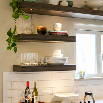
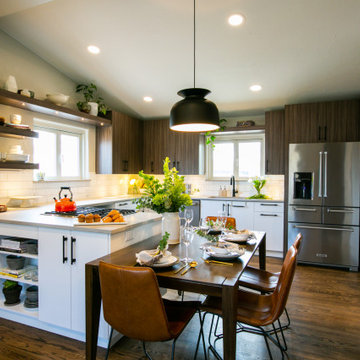
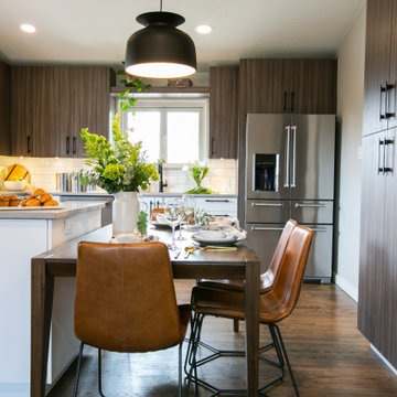
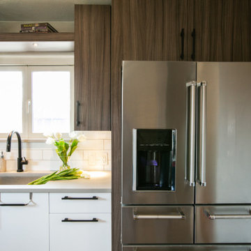
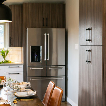
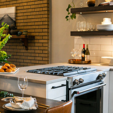
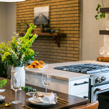
This 1950s home was sporting elements of the original kitchen and the dark space was not meeting our client’s needs. The original kitchen didn’t have much to offer in the way of functionality, so our first order of business was to create a design that would exponentially increase the usability of the kitchen. We brought in functional cabinetry, introduced uninterrupted work surfaces, and added plenty of lighting to brighten up their kitchen. They also wanted to open the new kitchen to the living room and create space for a larger dining table, so we started by removing the existing cabinetry that was visually cut the living space in two and minimized the power of the dramatic vaulted ceiling. We also extended the wood flooring into the kitchen as well to create seamless transitions between spaces.
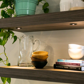
We fell in love with the idea of a two-toned cabinetry design for this kitchen and ultimately went head over heels for clean white painted base cabinets and a textured wood-look melamine on the uppers. This gave us a crisp backdrop that allowed us to bring is fun forms like the black light fixture over the table and the gorgeous silhouettes on the hardware. We played a lot with directionality in this space. The elongated open shelves and rectangular backsplash tiles give us wonderfully clean horizontal lines, but to balance those out we brought in a vertical grain pattern on the wall cabinets and added long black cabinetry pulls that emphasize the verticality of the space. The clients have a green thumb and wanted to make sure we created a home for their growing plant collection. The open shelving gives us plenty of opportunities for foliage and to showcase fun kitchen accessories. This design feels like home and brings together the clean lines and crisp finishes our clients were looking.

 User
UserSea Arches is a stunning modern architectural masterpiece, perched atop an eleven-acre peninsular promontory rising 160 feet above the Pacific Ocean on northern California’s spectacular Mendocino coast. Surrounded by the ocean on 3 sides and presiding over unparalleled vistas of sea and surf, Sea Arches includes 2,000 feet of ocean frontage, as well as beaches that extend some 1,300 feet. This one-of-a-kind property also includes one of the famous Elk Sea Stacks, a grouping of remarkable ancient rock outcroppings that tower above the Pacific, and add a powerful and dramatic element to the coastal scenery. Integrated gracefully into its spectacular setting, Sea Arches is set back 500 feet from the Pacific Coast Hwy and is completely screened from public view by more than 400 Monterey cypress trees. Approached by a winding, tree-lined drive, the main house and guesthouse include over 4,200 square feet of modern living space with four bedrooms, two mezzanines, two mini-lofts, and five full bathrooms. All rooms are spacious and the hallways are extra-wide. A cantilevered, raised deck off the living-room mezzanine provides a stunningly close approach to the ocean. Walls of glass invite views of the enchanting scenery in every direction: north to the Elk Sea Stacks, south to Point Arena and its historic lighthouse, west beyond the property’s captive sea stack to the horizon, and east to lofty wooded mountains. All of these vistas are enjoyed from Sea Arches and from the property’s mile-long groomed trails that extend along the oceanfront bluff tops overlooking the beautiful beaches on the north and south side of the home. While completely private and secluded, Sea Arches is just a two-minute drive from the charming village of Elk offering quaint and cozy restaurants and inns. A scenic seventeen-mile coastal drive north will bring you to the picturesque and historic seaside village of Mendocino which attracts tourists from near and far. One can also find many world-class wineries in nearby Anderson Valley. All of this just a three-hour drive from San Francisco or if you choose to fly, Little River Airport, with its mile long runway, is only 16 miles north of Sea Arches. Truly a special and unique property, Sea Arches commands some of the most dramatic coastal views in the world, and offers superb design, construction, and high-end finishes throughout, along with unparalleled beauty, tranquility, and privacy. Property Highlights: • Idyllically situated on a one-of-a-kind eleven-acre oceanfront parcel • Dwelling is completely screened from public view by over 400 trees • Includes 2,000 feet of ocean frontage plus over 1,300 feet of beaches • Includes one of the famous Elk Sea Stacks connected to the property by an isthmus • Main house plus private guest house totaling over 4300 sq ft of superb living space • 4 bedrooms and 5 full bathrooms • Separate His and Hers master baths • Open floor plan featuring Single Level Living (with the exception of mezzanines and lofts) • Spacious common rooms with extra wide hallways • Ample opportunities throughout the home for displaying art • Radiant heated slate floors throughout • Soaring 18 foot high ceilings in main living room with walls of glass • Cantilevered viewing deck off the mezzanine for up close ocean views • Gourmet kitchen with top of the line stainless appliances, custom cabinetry and granite counter tops • Granite window sills throughout the home • Spacious guest house including a living room, wet bar, large bedroom, an office/second bedroom, two spacious baths, sleeping loft and two mini lofts • Spectacular ocean and sunset views from most every room in the house • Gracious winding driveway offering ample parking • Large 2 car-garage with workshop • Extensive low-maintenance landscaping offering a profusion of Spring and Summer blooms • Approx. 1 mile of groomed trails • Equipped with a generator • Copper roof • Anchored in bedrock by 42 reinforced concrete piers and framed with steel girders.
2 Fireplaces
Deck
Granite Countertops
Guest House
Patio
Security System
Storage
Gardens
Find the right local pro for your project
 Lindy Design Build
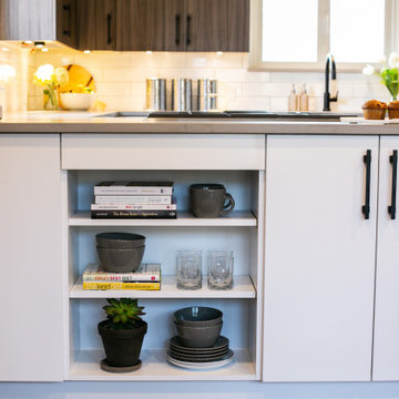
This 1950s home was sporting elements of the original kitchen and the dark space was not meeting our client’s needs. The original kitchen didn’t have much to offer in the way of functionality, so our first order of business was to create a design that would exponentially increase the usability of the kitchen. We brought in functional cabinetry, introduced uninterrupted work surfaces, and added plenty of lighting to brighten up their kitchen. They also wanted to open the new kitchen to the living room and create space for a larger dining table, so we started by removing the existing cabinetry that was visually cut the living space in two and minimized the power of the dramatic vaulted ceiling. We also extended the wood flooring into the kitchen as well to create seamless transitions between spaces.
We fell in love with the idea of a two-toned cabinetry design for this kitchen and ultimately went head over heels for clean white painted base cabinets and a textured wood-look melamine on the uppers. This gave us a crisp backdrop that allowed us to bring is fun forms like the black light fixture over the table and the gorgeous silhouettes on the hardware. We played a lot with directionality in this space. The elongated open shelves and rectangular backsplash tiles give us wonderfully clean horizontal lines, but to balance those out we brought in a vertical grain pattern on the wall cabinets and added long black cabinetry pulls that emphasize the verticality of the space. The clients have a green thumb and wanted to make sure we created a home for their growing plant collection. The open shelving gives us plenty of opportunities for foliage and to showcase fun kitchen accessories. This design feels like home and brings together the clean lines and crisp finishes our clients were looking.
 Lindy Design Build
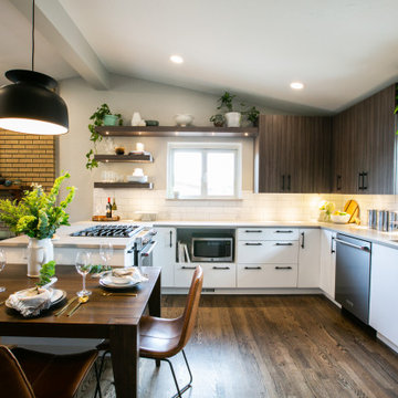
This 1950s home was sporting elements of the original kitchen and the dark space was not meeting our client’s needs. The original kitchen didn’t have much to offer in the way of functionality, so our first order of business was to create a design that would exponentially increase the usability of the kitchen. We brought in functional cabinetry, introduced uninterrupted work surfaces, and added plenty of lighting to brighten up their kitchen. They also wanted to open the new kitchen to the living room and create space for a larger dining table, so we started by removing the existing cabinetry that was visually cut the living space in two and minimized the power of the dramatic vaulted ceiling. We also extended the wood flooring into the kitchen as well to create seamless transitions between spaces.
We fell in love with the idea of a two-toned cabinetry design for this kitchen and ultimately went head over heels for clean white painted base cabinets and a textured wood-look melamine on the uppers. This gave us a crisp backdrop that allowed us to bring is fun forms like the black light fixture over the table and the gorgeous silhouettes on the hardware. We played a lot with directionality in this space. The elongated open shelves and rectangular backsplash tiles give us wonderfully clean horizontal lines, but to balance those out we brought in a vertical grain pattern on the wall cabinets and added long black cabinetry pulls that emphasize the verticality of the space. The clients have a green thumb and wanted to make sure we created a home for their growing plant collection. The open shelving gives us plenty of opportunities for foliage and to showcase fun kitchen accessories. This design feels like home and brings together the clean lines and crisp finishes our clients were looking.
 Lindy Design Build
This 1950s home was sporting elements of the original kitchen and the dark space was not meeting our client’s needs. The original kitchen didn’t have much to offer in the way of functionality, so our first order of business was to create a design that would exponentially increase the usability of the kitchen. We brought in functional cabinetry, introduced uninterrupted work surfaces, and added plenty of lighting to brighten up their kitchen. They also wanted to open the new kitchen to the living room and create space for a larger dining table, so we started by removing the existing cabinetry that was visually cut the living space in two and minimized the power of the dramatic vaulted ceiling. We also extended the wood flooring into the kitchen as well to create seamless transitions between spaces.
We fell in love with the idea of a two-toned cabinetry design for this kitchen and ultimately went head over heels for clean white painted base cabinets and a textured wood-look melamine on the uppers. This gave us a crisp backdrop that allowed us to bring is fun forms like the black light fixture over the table and the gorgeous silhouettes on the hardware. We played a lot with directionality in this space. The elongated open shelves and rectangular backsplash tiles give us wonderfully clean horizontal lines, but to balance those out we brought in a vertical grain pattern on the wall cabinets and added long black cabinetry pulls that emphasize the verticality of the space. The clients have a green thumb and wanted to make sure we created a home for their growing plant collection. The open shelving gives us plenty of opportunities for foliage and to showcase fun kitchen accessories. This design feels like home and brings together the clean lines and crisp finishes our clients were looking.
 Lindy Design Build
This 1950s home was sporting elements of the original kitchen and the dark space was not meeting our client’s needs. The original kitchen didn’t have much to offer in the way of functionality, so our first order of business was to create a design that would exponentially increase the usability of the kitchen. We brought in functional cabinetry, introduced uninterrupted work surfaces, and added plenty of lighting to brighten up their kitchen. They also wanted to open the new kitchen to the living room and create space for a larger dining table, so we started by removing the existing cabinetry that was visually cut the living space in two and minimized the power of the dramatic vaulted ceiling. We also extended the wood flooring into the kitchen as well to create seamless transitions between spaces.
We fell in love with the idea of a two-toned cabinetry design for this kitchen and ultimately went head over heels for clean white painted base cabinets and a textured wood-look melamine on the uppers. This gave us a crisp backdrop that allowed us to bring is fun forms like the black light fixture over the table and the gorgeous silhouettes on the hardware. We played a lot with directionality in this space. The elongated open shelves and rectangular backsplash tiles give us wonderfully clean horizontal lines, but to balance those out we brought in a vertical grain pattern on the wall cabinets and added long black cabinetry pulls that emphasize the verticality of the space. The clients have a green thumb and wanted to make sure we created a home for their growing plant collection. The open shelving gives us plenty of opportunities for foliage and to showcase fun kitchen accessories. This design feels like home and brings together the clean lines and crisp finishes our clients were looking.
Sponsored
Fredericksburg, OH

High Point Cabinets
Columbus' Experienced Custom Cabinet Builder | 4x Best of Houzz Winner
 Lindy Design Build
This 1950s home was sporting elements of the original kitchen and the dark space was not meeting our client’s needs. The original kitchen didn’t have much to offer in the way of functionality, so our first order of business was to create a design that would exponentially increase the usability of the kitchen. We brought in functional cabinetry, introduced uninterrupted work surfaces, and added plenty of lighting to brighten up their kitchen. They also wanted to open the new kitchen to the living room and create space for a larger dining table, so we started by removing the existing cabinetry that was visually cut the living space in two and minimized the power of the dramatic vaulted ceiling. We also extended the wood flooring into the kitchen as well to create seamless transitions between spaces.
We fell in love with the idea of a two-toned cabinetry design for this kitchen and ultimately went head over heels for clean white painted base cabinets and a textured wood-look melamine on the uppers. This gave us a crisp backdrop that allowed us to bring is fun forms like the black light fixture over the table and the gorgeous silhouettes on the hardware. We played a lot with directionality in this space. The elongated open shelves and rectangular backsplash tiles give us wonderfully clean horizontal lines, but to balance those out we brought in a vertical grain pattern on the wall cabinets and added long black cabinetry pulls that emphasize the verticality of the space. The clients have a green thumb and wanted to make sure we created a home for their growing plant collection. The open shelving gives us plenty of opportunities for foliage and to showcase fun kitchen accessories. This design feels like home and brings together the clean lines and crisp finishes our clients were looking.
 Lindy Design Build
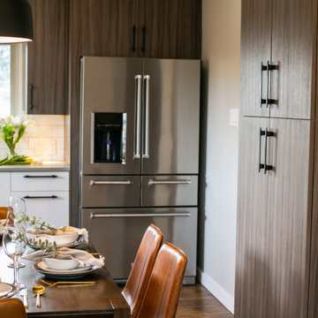
This 1950s home was sporting elements of the original kitchen and the dark space was not meeting our client’s needs. The original kitchen didn’t have much to offer in the way of functionality, so our first order of business was to create a design that would exponentially increase the usability of the kitchen. We brought in functional cabinetry, introduced uninterrupted work surfaces, and added plenty of lighting to brighten up their kitchen. They also wanted to open the new kitchen to the living room and create space for a larger dining table, so we started by removing the existing cabinetry that was visually cut the living space in two and minimized the power of the dramatic vaulted ceiling. We also extended the wood flooring into the kitchen as well to create seamless transitions between spaces.
We fell in love with the idea of a two-toned cabinetry design for this kitchen and ultimately went head over heels for clean white painted base cabinets and a textured wood-look melamine on the uppers. This gave us a crisp backdrop that allowed us to bring is fun forms like the black light fixture over the table and the gorgeous silhouettes on the hardware. We played a lot with directionality in this space. The elongated open shelves and rectangular backsplash tiles give us wonderfully clean horizontal lines, but to balance those out we brought in a vertical grain pattern on the wall cabinets and added long black cabinetry pulls that emphasize the verticality of the space. The clients have a green thumb and wanted to make sure we created a home for their growing plant collection. The open shelving gives us plenty of opportunities for foliage and to showcase fun kitchen accessories. This design feels like home and brings together the clean lines and crisp finishes our clients were looking.
 Lindy Design Build
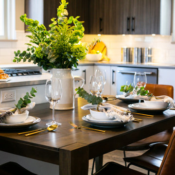
This 1950s home was sporting elements of the original kitchen and the dark space was not meeting our client’s needs. The original kitchen didn’t have much to offer in the way of functionality, so our first order of business was to create a design that would exponentially increase the usability of the kitchen. We brought in functional cabinetry, introduced uninterrupted work surfaces, and added plenty of lighting to brighten up their kitchen. They also wanted to open the new kitchen to the living room and create space for a larger dining table, so we started by removing the existing cabinetry that was visually cut the living space in two and minimized the power of the dramatic vaulted ceiling. We also extended the wood flooring into the kitchen as well to create seamless transitions between spaces.
We fell in love with the idea of a two-toned cabinetry design for this kitchen and ultimately went head over heels for clean white painted base cabinets and a textured wood-look melamine on the uppers. This gave us a crisp backdrop that allowed us to bring is fun forms like the black light fixture over the table and the gorgeous silhouettes on the hardware. We played a lot with directionality in this space. The elongated open shelves and rectangular backsplash tiles give us wonderfully clean horizontal lines, but to balance those out we brought in a vertical grain pattern on the wall cabinets and added long black cabinetry pulls that emphasize the verticality of the space. The clients have a green thumb and wanted to make sure we created a home for their growing plant collection. The open shelving gives us plenty of opportunities for foliage and to showcase fun kitchen accessories. This design feels like home and brings together the clean lines and crisp finishes our clients were looking.
 Lindy Design Build
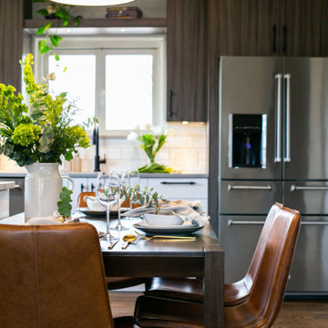
This 1950s home was sporting elements of the original kitchen and the dark space was not meeting our client’s needs. The original kitchen didn’t have much to offer in the way of functionality, so our first order of business was to create a design that would exponentially increase the usability of the kitchen. We brought in functional cabinetry, introduced uninterrupted work surfaces, and added plenty of lighting to brighten up their kitchen. They also wanted to open the new kitchen to the living room and create space for a larger dining table, so we started by removing the existing cabinetry that was visually cut the living space in two and minimized the power of the dramatic vaulted ceiling. We also extended the wood flooring into the kitchen as well to create seamless transitions between spaces.
We fell in love with the idea of a two-toned cabinetry design for this kitchen and ultimately went head over heels for clean white painted base cabinets and a textured wood-look melamine on the uppers. This gave us a crisp backdrop that allowed us to bring is fun forms like the black light fixture over the table and the gorgeous silhouettes on the hardware. We played a lot with directionality in this space. The elongated open shelves and rectangular backsplash tiles give us wonderfully clean horizontal lines, but to balance those out we brought in a vertical grain pattern on the wall cabinets and added long black cabinetry pulls that emphasize the verticality of the space. The clients have a green thumb and wanted to make sure we created a home for their growing plant collection. The open shelving gives us plenty of opportunities for foliage and to showcase fun kitchen accessories. This design feels like home and brings together the clean lines and crisp finishes our clients were looking.
 Lindy Design Build
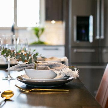
This 1950s home was sporting elements of the original kitchen and the dark space was not meeting our client’s needs. The original kitchen didn’t have much to offer in the way of functionality, so our first order of business was to create a design that would exponentially increase the usability of the kitchen. We brought in functional cabinetry, introduced uninterrupted work surfaces, and added plenty of lighting to brighten up their kitchen. They also wanted to open the new kitchen to the living room and create space for a larger dining table, so we started by removing the existing cabinetry that was visually cut the living space in two and minimized the power of the dramatic vaulted ceiling. We also extended the wood flooring into the kitchen as well to create seamless transitions between spaces.
We fell in love with the idea of a two-toned cabinetry design for this kitchen and ultimately went head over heels for clean white painted base cabinets and a textured wood-look melamine on the uppers. This gave us a crisp backdrop that allowed us to bring is fun forms like the black light fixture over the table and the gorgeous silhouettes on the hardware. We played a lot with directionality in this space. The elongated open shelves and rectangular backsplash tiles give us wonderfully clean horizontal lines, but to balance those out we brought in a vertical grain pattern on the wall cabinets and added long black cabinetry pulls that emphasize the verticality of the space. The clients have a green thumb and wanted to make sure we created a home for their growing plant collection. The open shelving gives us plenty of opportunities for foliage and to showcase fun kitchen accessories. This design feels like home and brings together the clean lines and crisp finishes our clients were looking.
 Lindy Design Build
This 1950s home was sporting elements of the original kitchen and the dark space was not meeting our client’s needs. The original kitchen didn’t have much to offer in the way of functionality, so our first order of business was to create a design that would exponentially increase the usability of the kitchen. We brought in functional cabinetry, introduced uninterrupted work surfaces, and added plenty of lighting to brighten up their kitchen. They also wanted to open the new kitchen to the living room and create space for a larger dining table, so we started by removing the existing cabinetry that was visually cut the living space in two and minimized the power of the dramatic vaulted ceiling. We also extended the wood flooring into the kitchen as well to create seamless transitions between spaces.
We fell in love with the idea of a two-toned cabinetry design for this kitchen and ultimately went head over heels for clean white painted base cabinets and a textured wood-look melamine on the uppers. This gave us a crisp backdrop that allowed us to bring is fun forms like the black light fixture over the table and the gorgeous silhouettes on the hardware. We played a lot with directionality in this space. The elongated open shelves and rectangular backsplash tiles give us wonderfully clean horizontal lines, but to balance those out we brought in a vertical grain pattern on the wall cabinets and added long black cabinetry pulls that emphasize the verticality of the space. The clients have a green thumb and wanted to make sure we created a home for their growing plant collection. The open shelving gives us plenty of opportunities for foliage and to showcase fun kitchen accessories. This design feels like home and brings together the clean lines and crisp finishes our clients were looking.
 Lindy Design Build
This 1950s home was sporting elements of the original kitchen and the dark space was not meeting our client’s needs. The original kitchen didn’t have much to offer in the way of functionality, so our first order of business was to create a design that would exponentially increase the usability of the kitchen. We brought in functional cabinetry, introduced uninterrupted work surfaces, and added plenty of lighting to brighten up their kitchen. They also wanted to open the new kitchen to the living room and create space for a larger dining table, so we started by removing the existing cabinetry that was visually cut the living space in two and minimized the power of the dramatic vaulted ceiling. We also extended the wood flooring into the kitchen as well to create seamless transitions between spaces.
We fell in love with the idea of a two-toned cabinetry design for this kitchen and ultimately went head over heels for clean white painted base cabinets and a textured wood-look melamine on the uppers. This gave us a crisp backdrop that allowed us to bring is fun forms like the black light fixture over the table and the gorgeous silhouettes on the hardware. We played a lot with directionality in this space. The elongated open shelves and rectangular backsplash tiles give us wonderfully clean horizontal lines, but to balance those out we brought in a vertical grain pattern on the wall cabinets and added long black cabinetry pulls that emphasize the verticality of the space. The clients have a green thumb and wanted to make sure we created a home for their growing plant collection. The open shelving gives us plenty of opportunities for foliage and to showcase fun kitchen accessories. This design feels like home and brings together the clean lines and crisp finishes our clients were looking.
 Lindy Design Build
This 1950s home was sporting elements of the original kitchen and the dark space was not meeting our client’s needs. The original kitchen didn’t have much to offer in the way of functionality, so our first order of business was to create a design that would exponentially increase the usability of the kitchen. We brought in functional cabinetry, introduced uninterrupted work surfaces, and added plenty of lighting to brighten up their kitchen. They also wanted to open the new kitchen to the living room and create space for a larger dining table, so we started by removing the existing cabinetry that was visually cut the living space in two and minimized the power of the dramatic vaulted ceiling. We also extended the wood flooring into the kitchen as well to create seamless transitions between spaces.
We fell in love with the idea of a two-toned cabinetry design for this kitchen and ultimately went head over heels for clean white painted base cabinets and a textured wood-look melamine on the uppers. This gave us a crisp backdrop that allowed us to bring is fun forms like the black light fixture over the table and the gorgeous silhouettes on the hardware. We played a lot with directionality in this space. The elongated open shelves and rectangular backsplash tiles give us wonderfully clean horizontal lines, but to balance those out we brought in a vertical grain pattern on the wall cabinets and added long black cabinetry pulls that emphasize the verticality of the space. The clients have a green thumb and wanted to make sure we created a home for their growing plant collection. The open shelving gives us plenty of opportunities for foliage and to showcase fun kitchen accessories. This design feels like home and brings together the clean lines and crisp finishes our clients were looking.
 Lindy Design Build
This 1950s home was sporting elements of the original kitchen and the dark space was not meeting our client’s needs. The original kitchen didn’t have much to offer in the way of functionality, so our first order of business was to create a design that would exponentially increase the usability of the kitchen. We brought in functional cabinetry, introduced uninterrupted work surfaces, and added plenty of lighting to brighten up their kitchen. They also wanted to open the new kitchen to the living room and create space for a larger dining table, so we started by removing the existing cabinetry that was visually cut the living space in two and minimized the power of the dramatic vaulted ceiling. We also extended the wood flooring into the kitchen as well to create seamless transitions between spaces.
We fell in love with the idea of a two-toned cabinetry design for this kitchen and ultimately went head over heels for clean white painted base cabinets and a textured wood-look melamine on the uppers. This gave us a crisp backdrop that allowed us to bring is fun forms like the black light fixture over the table and the gorgeous silhouettes on the hardware. We played a lot with directionality in this space. The elongated open shelves and rectangular backsplash tiles give us wonderfully clean horizontal lines, but to balance those out we brought in a vertical grain pattern on the wall cabinets and added long black cabinetry pulls that emphasize the verticality of the space. The clients have a green thumb and wanted to make sure we created a home for their growing plant collection. The open shelving gives us plenty of opportunities for foliage and to showcase fun kitchen accessories. This design feels like home and brings together the clean lines and crisp finishes our clients were looking.
 Lindy Design Build
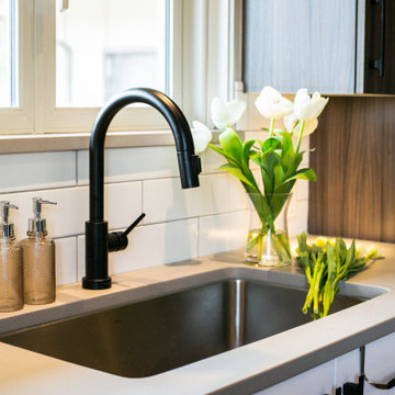
This 1950s home was sporting elements of the original kitchen and the dark space was not meeting our client’s needs. The original kitchen didn’t have much to offer in the way of functionality, so our first order of business was to create a design that would exponentially increase the usability of the kitchen. We brought in functional cabinetry, introduced uninterrupted work surfaces, and added plenty of lighting to brighten up their kitchen. They also wanted to open the new kitchen to the living room and create space for a larger dining table, so we started by removing the existing cabinetry that was visually cut the living space in two and minimized the power of the dramatic vaulted ceiling. We also extended the wood flooring into the kitchen as well to create seamless transitions between spaces.
We fell in love with the idea of a two-toned cabinetry design for this kitchen and ultimately went head over heels for clean white painted base cabinets and a textured wood-look melamine on the uppers. This gave us a crisp backdrop that allowed us to bring is fun forms like the black light fixture over the table and the gorgeous silhouettes on the hardware. We played a lot with directionality in this space. The elongated open shelves and rectangular backsplash tiles give us wonderfully clean horizontal lines, but to balance those out we brought in a vertical grain pattern on the wall cabinets and added long black cabinetry pulls that emphasize the verticality of the space. The clients have a green thumb and wanted to make sure we created a home for their growing plant collection. The open shelving gives us plenty of opportunities for foliage and to showcase fun kitchen accessories. This design feels like home and brings together the clean lines and crisp finishes our clients were looking.
 Lindy Design Build
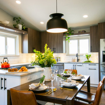
This 1950s home was sporting elements of the original kitchen and the dark space was not meeting our client’s needs. The original kitchen didn’t have much to offer in the way of functionality, so our first order of business was to create a design that would exponentially increase the usability of the kitchen. We brought in functional cabinetry, introduced uninterrupted work surfaces, and added plenty of lighting to brighten up their kitchen. They also wanted to open the new kitchen to the living room and create space for a larger dining table, so we started by removing the existing cabinetry that was visually cut the living space in two and minimized the power of the dramatic vaulted ceiling. We also extended the wood flooring into the kitchen as well to create seamless transitions between spaces.
We fell in love with the idea of a two-toned cabinetry design for this kitchen and ultimately went head over heels for clean white painted base cabinets and a textured wood-look melamine on the uppers. This gave us a crisp backdrop that allowed us to bring is fun forms like the black light fixture over the table and the gorgeous silhouettes on the hardware. We played a lot with directionality in this space. The elongated open shelves and rectangular backsplash tiles give us wonderfully clean horizontal lines, but to balance those out we brought in a vertical grain pattern on the wall cabinets and added long black cabinetry pulls that emphasize the verticality of the space. The clients have a green thumb and wanted to make sure we created a home for their growing plant collection. The open shelving gives us plenty of opportunities for foliage and to showcase fun kitchen accessories. This design feels like home and brings together the clean lines and crisp finishes our clients were looking.
 Lindy Design Build
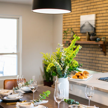
This 1950s home was sporting elements of the original kitchen and the dark space was not meeting our client’s needs. The original kitchen didn’t have much to offer in the way of functionality, so our first order of business was to create a design that would exponentially increase the usability of the kitchen. We brought in functional cabinetry, introduced uninterrupted work surfaces, and added plenty of lighting to brighten up their kitchen. They also wanted to open the new kitchen to the living room and create space for a larger dining table, so we started by removing the existing cabinetry that was visually cut the living space in two and minimized the power of the dramatic vaulted ceiling. We also extended the wood flooring into the kitchen as well to create seamless transitions between spaces.
We fell in love with the idea of a two-toned cabinetry design for this kitchen and ultimately went head over heels for clean white painted base cabinets and a textured wood-look melamine on the uppers. This gave us a crisp backdrop that allowed us to bring is fun forms like the black light fixture over the table and the gorgeous silhouettes on the hardware. We played a lot with directionality in this space. The elongated open shelves and rectangular backsplash tiles give us wonderfully clean horizontal lines, but to balance those out we brought in a vertical grain pattern on the wall cabinets and added long black cabinetry pulls that emphasize the verticality of the space. The clients have a green thumb and wanted to make sure we created a home for their growing plant collection. The open shelving gives us plenty of opportunities for foliage and to showcase fun kitchen accessories. This design feels like home and brings together the clean lines and crisp finishes our clients were looking.

 Bay Ridge Carpet and Linoleum
Inspiration for a mid-sized transitional wooden u-shaped staircase remodel in New York with painted risers
10