
Search results for "Precious" in Home Design Ideas
 Sabouri Interiors
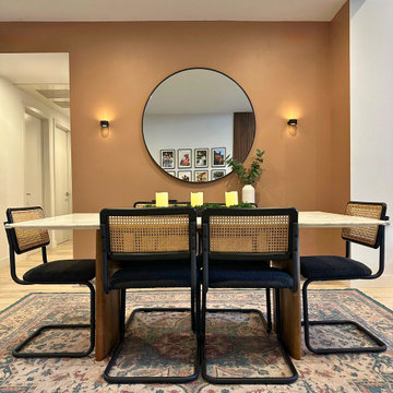
With a budget of $3,000 and a two-month timeline, we set out to breathe new life into a dining area that felt more cramped than cozy. The transformation was not just about style; it was about creating a space that feels like home, a place where every piece tells a part of our client’s story.
Table Upgrade: The original table was a quaint four-seater, perfect for the snug corners of a smaller apartment but it lost its charm in a larger space. We introduced a grand white marble table that not only made the room look more open but also blended seamlessly with the wood, stone, and rattan elements already present. This new table isn't just furniture; it's a gathering place, a spot that invites everyone to come together, share meals, and create memories.
Ambient Lighting: The standard, fixed lighting in the apartment was too harsh and did little to enhance the inviting atmosphere we wanted to cultivate. Our solution was to install chic, renter-friendly wall sconces and scatter battery-powered candles across the table. Now, the lighting is just right—soft, warm, and perfect for setting the mood, whether it’s a lively dinner party or a quiet evening meal.
Personalizing the Space: Beyond the aesthetics, it was important to our client that the space feel personal and heartfelt. We set up a gallery of family photos right across from the dining area. These aren’t just pictures; they’re windows into precious moments. We used innovative, rental-friendly magnetic frames that don't require nails, allowing our client the freedom to refresh the display as new memories are made.
This dining area makeover was all about creating a space that not only looks beautiful but feels genuinely like a part of the family—a place where every element has its purpose and every detail adds to the story. We’ve transformed an ordinary space into our client’s favorite room in the house, where style meets personal history and creates the perfect backdrop for many more cherished moments.
 Antique Taste
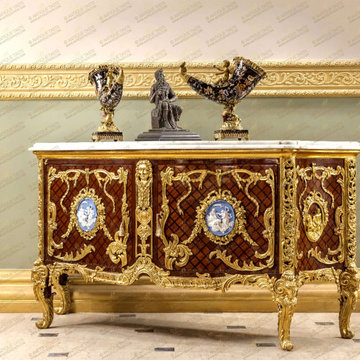
Our exquisite copy of the French late 19th century Louis XV Régence style gilt-ormolu-mounted and parquetry veneer inlaid commode a vantaux after the model Commode Médaillier Commode de Louis XV du château de Fontainebleau designed by the Slodtz brothers and executed by Antoine-Robert Gaudreaux, made for le cabinet du Roi at Versailles with a serpentine veined moulded marble top above a pair of doors with one tier inside, each door centered by an ormolu oval one with a cherub and goat, the other oval with Ariadne on a leopard, all within marvelously chiseled ribbon-tied acanthus leaves and blossoming flower swaging garlands, We produced a new version with wedgwood-jasperware-plaques as displayed; all on a diamond parquetry ground veneer inlay centered by an ormolu female mask on scrolling ormolu works and shell on a very fine ormolu scalloped shell form apron with acanthus leaves scrolls, the sides each with a further similar oval medallion within the same ormolu tied scrolling frame, and raised on astonishingly chiseled and burnished ormolu cabriole legs with scrolled ram-headed capitals. The original precious commode-médaillier was designed and created in 1739 for the king's use in Louis XV's Cabinet à Pans at Versailles. It is now in the Cabinet des Médailles at the Bibliothèque Nationale. This commode is based on the famous kingwood medal cabinet supplied by the Royal cabinet-maker Antoine-Robert Gaudreaus (1682-1746) on 10 January 1739 for the Cabinet Interieur. It was referred to at the time as 'Par les Srs Gaudreaux ébéniste et Slodtz frères, sculpteurs, pour servir dans le cabinet aux tableaux avant la petite galerie à Versailles'. The bronze mounts were modelled by the Slodtz brothers. The commode was a popular model amongst Parisian makers during the second half of the 19th century and many variants of it were made.
 Sabouri Interiors
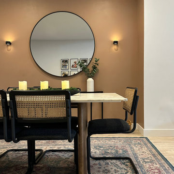
With a budget of $3,000 and a two-month timeline, we set out to breathe new life into a dining area that felt more cramped than cozy. The transformation was not just about style; it was about creating a space that feels like home, a place where every piece tells a part of our client’s story.
Table Upgrade: The original table was a quaint four-seater, perfect for the snug corners of a smaller apartment but it lost its charm in a larger space. We introduced a grand white marble table that not only made the room look more open but also blended seamlessly with the wood, stone, and rattan elements already present. This new table isn't just furniture; it's a gathering place, a spot that invites everyone to come together, share meals, and create memories.
Ambient Lighting: The standard, fixed lighting in the apartment was too harsh and did little to enhance the inviting atmosphere we wanted to cultivate. Our solution was to install chic, renter-friendly wall sconces and scatter battery-powered candles across the table. Now, the lighting is just right—soft, warm, and perfect for setting the mood, whether it’s a lively dinner party or a quiet evening meal.
Personalizing the Space: Beyond the aesthetics, it was important to our client that the space feel personal and heartfelt. We set up a gallery of family photos right across from the dining area. These aren’t just pictures; they’re windows into precious moments. We used innovative, rental-friendly magnetic frames that don't require nails, allowing our client the freedom to refresh the display as new memories are made.
This dining area makeover was all about creating a space that not only looks beautiful but feels genuinely like a part of the family—a place where every element has its purpose and every detail adds to the story. We’ve transformed an ordinary space into our client’s favorite room in the house, where style meets personal history and creates the perfect backdrop for many more cherished moments.
Find the right local pro for your project
 Sabouri Interiors
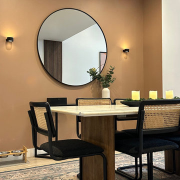
With a budget of $3,000 and a two-month timeline, we set out to breathe new life into a dining area that felt more cramped than cozy. The transformation was not just about style; it was about creating a space that feels like home, a place where every piece tells a part of our client’s story.
Table Upgrade: The original table was a quaint four-seater, perfect for the snug corners of a smaller apartment but it lost its charm in a larger space. We introduced a grand white marble table that not only made the room look more open but also blended seamlessly with the wood, stone, and rattan elements already present. This new table isn't just furniture; it's a gathering place, a spot that invites everyone to come together, share meals, and create memories.
Ambient Lighting: The standard, fixed lighting in the apartment was too harsh and did little to enhance the inviting atmosphere we wanted to cultivate. Our solution was to install chic, renter-friendly wall sconces and scatter battery-powered candles across the table. Now, the lighting is just right—soft, warm, and perfect for setting the mood, whether it’s a lively dinner party or a quiet evening meal.
Personalizing the Space: Beyond the aesthetics, it was important to our client that the space feel personal and heartfelt. We set up a gallery of family photos right across from the dining area. These aren’t just pictures; they’re windows into precious moments. We used innovative, rental-friendly magnetic frames that don't require nails, allowing our client the freedom to refresh the display as new memories are made.
This dining area makeover was all about creating a space that not only looks beautiful but feels genuinely like a part of the family—a place where every element has its purpose and every detail adds to the story. We’ve transformed an ordinary space into our client’s favorite room in the house, where style meets personal history and creates the perfect backdrop for many more cherished moments.
 Kitchen & Bath Concepts
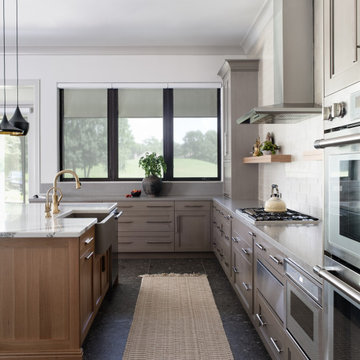
These clients are empty nesters with grown children and several grandchildren living nearby. They love hosting family gatherings for special occasions and wanted a large space with durable materials and neutral, yet interesting finishes. The large island and perimeter countertop allow space for buffet-style get-togethers, while also feeling perfectly scaled to have breakfast for two from the counter stools. They wanted everything to be of lasting quality, but not feel too precious, so their grandchildren can still have fun running on the porcelain floors and baking on the quartz counters.
The clients desired a cohesive space with the best materials, exhibiting a streamlined appeal that still felt welcoming and catered to all their storage needs. The surfaces are low maintenance for easy clean-up and sanitation. The clients wanted custom, solid-wood cabinetry with natural finishes, for an organic element and visual warmth.
The design intent for this space was to create an open, serene Kitchen utilizing a functional layout, quality materials, and organic elements. The area is grounded by dark terrazzo-looking porcelain and uplifted by contrasting light fixtures. We wanted this room to be inviting through a variety of textures and layered lighting, as it is situated at the heart of the home. With custom cabinetry, the highest caliber appliances and thoughtful hardware, this Kitchen is sure to stand the test of time.
Additionally, clients wanted to hide certain items in the kitchen, such as electronics, appliances, cookbooks, trash, and recycling. Storage for sheet trays, knifes, spices, cutlery and cooking utensils were required. Open display shelves for collectables from travels and an area for a coffee & smoothie bar were also desired.
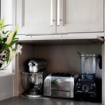
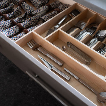
The island incorporates a hidden charging station for electronics, open shelving for cookbooks, while housing an instant hot and chilled water dispenser at the sink. The cabinetry also has a hidden trash and recycling center, specialty spice and cooking utensil pull-outs, drawers with custom inserts for knifes, cutting boards, cutlery, and tableware. An appliance garage allows room for the stand mixer and toaster to be out of sight, but within reach. A lighted coffee and smoothie bar were planned for the clients’ love of coffee and healthy nutrition. The island and floating shelves are made of oak panels with inlaid brass, adding a subtle touch of sparkle and warmth that highlights gold flecks in the island countertop.


 Kitchen & Bath Concepts
These clients are empty nesters with grown children and several grandchildren living nearby. They love hosting family gatherings for special occasions and wanted a large space with durable materials and neutral, yet interesting finishes. The large island and perimeter countertop allow space for buffet-style get-togethers, while also feeling perfectly scaled to have breakfast for two from the counter stools. They wanted everything to be of lasting quality, but not feel too precious, so their grandchildren can still have fun running on the porcelain floors and baking on the quartz counters.
The clients desired a cohesive space with the best materials, exhibiting a streamlined appeal that still felt welcoming and catered to all their storage needs. The surfaces are low maintenance for easy clean-up and sanitation. The clients wanted custom, solid-wood cabinetry with natural finishes, for an organic element and visual warmth.
The design intent for this space was to create an open, serene Kitchen utilizing a functional layout, quality materials, and organic elements. The area is grounded by dark terrazzo-looking porcelain and uplifted by contrasting light fixtures. We wanted this room to be inviting through a variety of textures and layered lighting, as it is situated at the heart of the home. With custom cabinetry, the highest caliber appliances and thoughtful hardware, this Kitchen is sure to stand the test of time.
Additionally, clients wanted to hide certain items in the kitchen, such as electronics, appliances, cookbooks, trash, and recycling. Storage for sheet trays, knifes, spices, cutlery and cooking utensils were required. Open display shelves for collectables from travels and an area for a coffee & smoothie bar were also desired.
The island incorporates a hidden charging station for electronics, open shelving for cookbooks, while housing an instant hot and chilled water dispenser at the sink. The cabinetry also has a hidden trash and recycling center, specialty spice and cooking utensil pull-outs, drawers with custom inserts for knifes, cutting boards, cutlery, and tableware. An appliance garage allows room for the stand mixer and toaster to be out of sight, but within reach. A lighted coffee and smoothie bar were planned for the clients’ love of coffee and healthy nutrition. The island and floating shelves are made of oak panels with inlaid brass, adding a subtle touch of sparkle and warmth that highlights gold flecks in the island countertop.

 Haus Of Tre Li
OpenFit continues the Shokz open-ear concept to let users enjoy all-day comfort and hear their own soundtrack while staying open to the world around them. OpenFit offers an ultra-lightweight, open-ear construction to hear both your own audio and every sound around you with crystal clarity.
DirectPitch™ technology produces a full audio experience to immerse yourself in your favorite songs, podcasts, and audiobooks. A flexible ear hook design combines stability and comfort. Moments are precious, and OpenFit gives you the freedom to hear every one of them.
Open-Ear Design for Ultimate Comfort
Incredible Audio Experience with Powerful Bass
Maintain Situational AwarenessMaintain Situational Awareness
Up to 28 Hours of Listening
Open-Ear Listening Buds
Every Sound, Uncovered
OpenFit continues the Shokz open-ear concept with a compact earbud design. OpenFit is built around the ear, leaving the inner ear open to keep you engaged with the world.
Ultra-Soft Silicone
Feel Nothing but Comfort
The ear cushion core is engineered with a dual-layered liquid silicone that gives a pliable fit for every ear shape while avoiding discomfort from even extended wear.Spend a whole day of engaged conversation and musical feasts in total contoured comfort.
Dolphin Arc Ear Hook
Made for Every Ear
A dolphin arc ear hook design with a built-in 0.7mm ultra-fine flexible memory wire provides an ergonomic fit that can gently adapt to your natural ear shape.
Light and Balanced Design
Go Unnoticed
Optimizing the design and material of open-ear earbuds, OpenFit is compact and light, weighing just 8.3 grams. The earbuds and battery compartment provide a perfect balance that makes you forget you’re even wearing them.
Bright Highs and Deep Lows
DirectPitch™ Technology
Shokz introduces DirectPitch™, a brand-new audio experience made for OpenFit. It allows for premium audio quality that perfectly balances bold highs, clear mids, and surging bass.
 Kitchen & Bath Concepts
These clients are empty nesters with grown children and several grandchildren living nearby. They love hosting family gatherings for special occasions and wanted a large space with durable materials and neutral, yet interesting finishes. The large island and perimeter countertop allow space for buffet-style get-togethers, while also feeling perfectly scaled to have breakfast for two from the counter stools. They wanted everything to be of lasting quality, but not feel too precious, so their grandchildren can still have fun running on the porcelain floors and baking on the quartz counters.
The clients desired a cohesive space with the best materials, exhibiting a streamlined appeal that still felt welcoming and catered to all their storage needs. The surfaces are low maintenance for easy clean-up and sanitation. The clients wanted custom, solid-wood cabinetry with natural finishes, for an organic element and visual warmth.
The design intent for this space was to create an open, serene Kitchen utilizing a functional layout, quality materials, and organic elements. The area is grounded by dark terrazzo-looking porcelain and uplifted by contrasting light fixtures. We wanted this room to be inviting through a variety of textures and layered lighting, as it is situated at the heart of the home. With custom cabinetry, the highest caliber appliances and thoughtful hardware, this Kitchen is sure to stand the test of time.
Additionally, clients wanted to hide certain items in the kitchen, such as electronics, appliances, cookbooks, trash, and recycling. Storage for sheet trays, knifes, spices, cutlery and cooking utensils were required. Open display shelves for collectables from travels and an area for a coffee & smoothie bar were also desired.
The island incorporates a hidden charging station for electronics, open shelving for cookbooks, while housing an instant hot and chilled water dispenser at the sink. The cabinetry also has a hidden trash and recycling center, specialty spice and cooking utensil pull-outs, drawers with custom inserts for knifes, cutting boards, cutlery, and tableware. An appliance garage allows room for the stand mixer and toaster to be out of sight, but within reach. A lighted coffee and smoothie bar were planned for the clients’ love of coffee and healthy nutrition. The island and floating shelves are made of oak panels with inlaid brass, adding a subtle touch of sparkle and warmth that highlights gold flecks in the island countertop.
 Blackdog Design Build Remodel
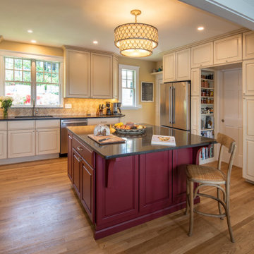
This home in Arlington was uninhabited for quite a while. The previous owner had purchased the property as a tear-down and planned to build a very large house. Their plans fell through and he put the house on the market as-is, with the utilities disconnected. The first priority was reconnecting and installing utilities, wiring, and mechanicals that had been removed from the home. The exterior was in bad shape, so the exterior was re-sided with cedar shingle, the exterior trim was repaired, and replacement wood gutters were added. Several large, fixed picture windows from the ‘70’s were replaced with modern double-hung units for fresh air. The existing kitchen and baths were vintage mid-century, which did not work with the reinvisioned flow of the home. The new spaces reflect the client’s lifestyle and personalities. The primary instruction for the kitchen was to accommodate multiple people cooking at the same time. The second instruction was to open the kitchen to the dining room, as it was always envisioned as a working kitchen, as opposed to a showplace kitchen. “Antiqued” finishes were used on the cabinetry to emphasize the casual nature of the room. The cabinetry was intentionally selected in order to not feel too “precious” so that the children and pets of the home could interact without worry. The house originally had a bathroom directly off the kitchen, which was not ideal. The decision was made to keep the bathroom where it was as a dog-washing area, and add a cabinetry-buffer to separate the bathroom door from the working area of the kitchen. Using a pocket door enabled a larger shower to be included. The dramatic wall tile needed to be in relation to a similarly dramatic yet soothing wall color, thus the deep plum wall color. The second floor bathroom originally had a cramped, awkward layout. A built-in linen cabinet that faced the wall was removed in order to create a better layout for the bathroom. As the homeowner was passionate about international travel, the floor tile was selected to reflect an exotic feel but keeping with the colors seen out the window on the lake-side of the house. The house works perfectly for the whole family!

 Bleue Design Inc.
Contemporary meets traditional in this La Cañada Study. The concept was simplicity with richness and depth, creating a calming workspace. The abundance of light and high ceilings made the perfect setting for a deep, handsome color palette. There was a focus on layering materials, including a sisal rug, woven shades, a mix of metals and different woods.
Amy Bartlam
 Lincoln Lighthill Architect
This Eichler-esque house, in a neighborhood known for its tracts of homes by the famous developer, was a little different from the rest- a one-off custom build from 1962 that had mid-century modern bones but funky, neo-traditional finishes in the worn-out, time capsule state that the new owners found it. This called for an almost-gut remodel to keep the good, upgrade the building’s envelope and MEP systems, and reimagine the home’s character. To create a home that feels of its times, both now and then- A mid-century for the 21st century.
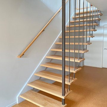
At the center of the existing home was a long, slender rectangular form that contained a fireplace, an indoor BBQ, and kitchen storage, and on the other side an original, suspended wood and steel rod stair down to the bedroom level below. Under the carpeted treads we were sure we’d find beautiful oak, as this stair was identical to one at our earlier Clarendon heights mid-century project.
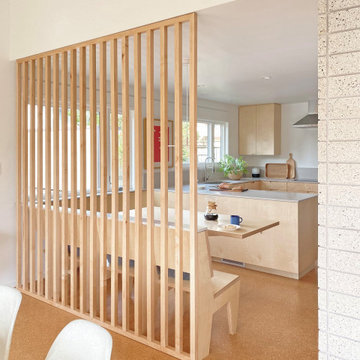
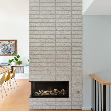
This elegant core was obscured by walls that enclosed the kitchen and breakfast areas and a jumble of aged finishes that hid the elegance of this defining element. Lincoln Lighthill Architect removed the walls and unified the core’s finishes with light grey ground-face concrete block on the upgraded fireplace and BBQ, lacquered cabinets, and chalkboard paint at the stair wall for the owners’ young children to decorate. A new skylight above the stair washes this wall with light and brightens up the formerly dark center of the house.
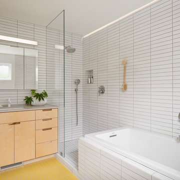
The rest of the interior is a combination of mid-century-inspired elements and modern updates. New finishes throughout- cork flooring, ground-face concrete block, Heath tile, and white birch millwork give the interior the mid-century character it never fully had, while modern, minimalist detailing gives it a timeless, serene simplicity.
New lighting throughout, mostly indirect and all warm-dim LED , subtly and efficiently lights the home. All new plumbing and fixtures similarly reduce the home’s use of precious resources. On the exterior, new windows, insulation, and roofing provide modern standards of comfort and efficiency, while a new paint job and brick stain give the house an elegant yet playful character, with the golden yellow Heath tile from the primary bathroom floor reappearing on the front door.

 Steelscape
Nestled in the picturesque mountainside close to Aspen, Colorado, sits this stunning, modern single-family home. Appropriately called ‘Black Magic’, the home features an open floorplan and large windows of varying sizes to maximize the breathtaking views of this unique location.
Seeking to make a bold statement from its heavily wooded lot and earthy surroundings, the home features the extensive use of metal cladding in a dark solid hue. Corrugated metal wall panels add texture and visual appeal to the large squared surfaces, while also providing strength and resistance against the harsh Colorado winters. The use of similarly colored flush panels for accent pieces, add additional visual distinction to the structure.
 Lincoln Lighthill Architect
This Eichler-esque house, in a neighborhood known for its tracts of homes by the famous developer, was a little different from the rest- a one-off custom build from 1962 that had mid-century modern bones but funky, neo-traditional finishes in the worn-out, time capsule state that the new owners found it. This called for an almost-gut remodel to keep the good, upgrade the building’s envelope and MEP systems, and reimagine the home’s character. To create a home that feels of its times, both now and then- A mid-century for the 21st century.
At the center of the existing home was a long, slender rectangular form that contained a fireplace, an indoor BBQ, and kitchen storage, and on the other side an original, suspended wood and steel rod stair down to the bedroom level below. Under the carpeted treads we were sure we’d find beautiful oak, as this stair was identical to one at our earlier Clarendon heights mid-century project.
This elegant core was obscured by walls that enclosed the kitchen and breakfast areas and a jumble of aged finishes that hid the elegance of this defining element. Lincoln Lighthill Architect removed the walls and unified the core’s finishes with light grey ground-face concrete block on the upgraded fireplace and BBQ, lacquered cabinets, and chalkboard paint at the stair wall for the owners’ young children to decorate. A new skylight above the stair washes this wall with light and brightens up the formerly dark center of the house.
The rest of the interior is a combination of mid-century-inspired elements and modern updates. New finishes throughout- cork flooring, ground-face concrete block, Heath tile, and white birch millwork give the interior the mid-century character it never fully had, while modern, minimalist detailing gives it a timeless, serene simplicity.
New lighting throughout, mostly indirect and all warm-dim LED , subtly and efficiently lights the home. All new plumbing and fixtures similarly reduce the home’s use of precious resources. On the exterior, new windows, insulation, and roofing provide modern standards of comfort and efficiency, while a new paint job and brick stain give the house an elegant yet playful character, with the golden yellow Heath tile from the primary bathroom floor reappearing on the front door.
 Lincoln Lighthill Architect
This Eichler-esque house, in a neighborhood known for its tracts of homes by the famous developer, was a little different from the rest- a one-off custom build from 1962 that had mid-century modern bones but funky, neo-traditional finishes in the worn-out, time capsule state that the new owners found it. This called for an almost-gut remodel to keep the good, upgrade the building’s envelope and MEP systems, and reimagine the home’s character. To create a home that feels of its times, both now and then- A mid-century for the 21st century.
At the center of the existing home was a long, slender rectangular form that contained a fireplace, an indoor BBQ, and kitchen storage, and on the other side an original, suspended wood and steel rod stair down to the bedroom level below. Under the carpeted treads we were sure we’d find beautiful oak, as this stair was identical to one at our earlier Clarendon heights mid-century project.
This elegant core was obscured by walls that enclosed the kitchen and breakfast areas and a jumble of aged finishes that hid the elegance of this defining element. Lincoln Lighthill Architect removed the walls and unified the core’s finishes with light grey ground-face concrete block on the upgraded fireplace and BBQ, lacquered cabinets, and chalkboard paint at the stair wall for the owners’ young children to decorate. A new skylight above the stair washes this wall with light and brightens up the formerly dark center of the house.
The rest of the interior is a combination of mid-century-inspired elements and modern updates. New finishes throughout- cork flooring, ground-face concrete block, Heath tile, and white birch millwork give the interior the mid-century character it never fully had, while modern, minimalist detailing gives it a timeless, serene simplicity.
New lighting throughout, mostly indirect and all warm-dim LED , subtly and efficiently lights the home. All new plumbing and fixtures similarly reduce the home’s use of precious resources. On the exterior, new windows, insulation, and roofing provide modern standards of comfort and efficiency, while a new paint job and brick stain give the house an elegant yet playful character, with the golden yellow Heath tile from the primary bathroom floor reappearing on the front door.

 User
This Greek Revival row house in Boerum Hill was previously owned by a local architect who renovated it several times, including the addition of a two-story steel and glass extension at the rear. The new owners came to us seeking to restore the house and its original formality, while adapting it to the modern needs of a family of five. The detailing of the 25 x 36 foot structure had been lost and required some sleuthing into the history of Greek Revival style in historic Brooklyn neighborhoods.
In addition to completely re-framing the interior, the house also required a new south-facing brick façade due to significant deterioration. The modern extension was replaced with a more traditionally detailed wood and copper- clad bay, still open to natural light and the garden view without sacrificing comfort. The kitchen was relocated from the first floor to the garden level with an adjacent formal dining room. Both rooms were enlarged from their previous iterations to accommodate weekly dinners with extended family. The kitchen includes a home office and breakfast nook that doubles as a homework station. The cellar level was further excavated to accommodate finished storage space and a playroom where activity can be monitored from the kitchen workspaces.
The parlor floor is now reserved for entertaining. New pocket doors can be closed to separate the formal front parlor from the more relaxed back portion, where the family plays games or watches TV together. At the end of the hall, a powder room with brass details, and a luxe bar with antique mirrored backsplash and stone tile flooring, leads to the deck and direct garden access. Because of the property width, the house is able to provide ample space for the interior program within a shorter footprint. This allows the garden to remain expansive, with a small lawn for play, an outdoor food preparation area with a cast-in-place concrete bench, and a place for entertaining towards the rear. The newly designed landscaping will continue to develop, further enhancing the yard’s feeling of escape, and filling-in the views from the kitchen and back parlor above. A less visible, but equally as conscious, addition is a rooftop PV solar array that provides nearly 100% of the daily electrical usage, with the exception of the AC system on hot summer days.
The well-appointed interiors connect the traditional backdrop of the home to a youthful take on classic design and functionality. The materials are elegant without being precious, accommodating a young, growing family. Unique colors and patterns provide a feeling of luxury while inviting inhabitants and guests to relax and enjoy this classic Brooklyn brownstone.
This project won runner-up in the architecture category for the 2017 NYC&G Innovation in Design Awards and was featured in The American House: 100 Contemporary Homes.
Photography by Francis Dzikowski / OTTO
 Lincoln Lighthill Architect
This Eichler-esque house, in a neighborhood known for its tracts of homes by the famous developer, was a little different from the rest- a one-off custom build from 1962 that had mid-century modern bones but funky, neo-traditional finishes in the worn-out, time capsule state that the new owners found it. This called for an almost-gut remodel to keep the good, upgrade the building’s envelope and MEP systems, and reimagine the home’s character. To create a home that feels of its times, both now and then- A mid-century for the 21st century.
At the center of the existing home was a long, slender rectangular form that contained a fireplace, an indoor BBQ, and kitchen storage, and on the other side an original, suspended wood and steel rod stair down to the bedroom level below. Under the carpeted treads we were sure we’d find beautiful oak, as this stair was identical to one at our earlier Clarendon heights mid-century project.
This elegant core was obscured by walls that enclosed the kitchen and breakfast areas and a jumble of aged finishes that hid the elegance of this defining element. Lincoln Lighthill Architect removed the walls and unified the core’s finishes with light grey ground-face concrete block on the upgraded fireplace and BBQ, lacquered cabinets, and chalkboard paint at the stair wall for the owners’ young children to decorate. A new skylight above the stair washes this wall with light and brightens up the formerly dark center of the house.
The rest of the interior is a combination of mid-century-inspired elements and modern updates. New finishes throughout- cork flooring, ground-face concrete block, Heath tile, and white birch millwork give the interior the mid-century character it never fully had, while modern, minimalist detailing gives it a timeless, serene simplicity.
New lighting throughout, mostly indirect and all warm-dim LED , subtly and efficiently lights the home. All new plumbing and fixtures similarly reduce the home’s use of precious resources. On the exterior, new windows, insulation, and roofing provide modern standards of comfort and efficiency, while a new paint job and brick stain give the house an elegant yet playful character, with the golden yellow Heath tile from the primary bathroom floor reappearing on the front door.

 Jasper + Phoenix
Amber works from home and was sacrificing a dining room for her home office. By utilizing the double wide closet space in her guest bedroom, she now walks into her home without the reminder of work, and can have guests over for a meal in her dining room (dining room reveal coming soon). The walls were freshly painted Sea Salt by Sherwin Williams. This gives the room a fresh, clean look and also adds contrast to the beige carpet.
Amber had her homework assignments cut out for her as she had to do some major purging in her throw all guest room. Once she started letting go, she was on a roll and continually surprised me as she cleaned out closets throughout the house. One dresser was filled with cds, dvds, books, albums, scrap-booking materials; items taking up precious real estate in her life that she didn't even know were there. There really wasn't a storage problem after-all, she was just holding on to a collection of things that no longer served her. Each time I would visit, and her space would become more open, I could see the weight lifting off her and her self love building. Amber had a recent breakup with her boyfriend and this makeover helped her not only focus on making a home sanctuary for herself, but helped her let go of the pains of the past and focus on the exciting future ahead. At one point when we were moving sofas in the living room (which we will also reveal soon), we found an ex's flip-flop. We were figuratively and literally sweeping away the past. Editing your home and your life makes room for your future; for new people and things. We are so happy to finally reveal the room to you! We can't wait to unveil the rest of Amber's home, once we complete the finishing touches.
Challenges:
Amber's home was filled with mix-matched furniture from family and college. She had no idea what her decorating style was. After shopping together and exchanging somepinterest boards, I was finally able to get a sense of what she loves.
I had to work on a tight budget, which meant really digging out the creativity and utilizing other items in the home. See how I transformed a table from the discard pile into a faux marble bedside table by clicking web link.
Amber's dad was able to help with the desk materials and building to cut costs.
We wanted to save the closet doors in the event she sold her home or no longer needed an office someday. There wasn't any extra space to store these closet doors, so I used them as a headboard.
The only items purchased were: Curtains, Curtain Rod, Bedspread Set, Throw Pillows, 2 Lamps and Paint.

 J Design Group - Interior Designers Miami - Modern
Modern Interior Designs in Miami FL. by J Design Group in Miami.
Home is an incredible or lovely place where most of the people feel comfortable. Yes..! After a long and hectic day, house is the one place where you can relax. Gone are the days, when a “home” meant just a ceiling with four walls. Yes..! That's true, but nowadays a “house” is something beyond your expectation. Therefore, most of the people hire “premises decoration” services.
Nowadays, unlike old-age properties, various new apartments and homes are built to optimize the comfort of modern housing. Yes...! Everyone knows that “Home Decoration” is considered to be one of the most important and hottest trends all over the world. This is an amazing process of using creativity, imaginations and skills. Through this, you can make your house and any other building interesting and amazing. However, if you are looking for these kinds of services for your premises, then “J Design Group” is here just for you.
We are the one that provides renovation services to you so that you can make a building actually look like a house. Yes..! Other ordinary organizations who actually focus on the colors and other decorative items of any space, but we provide all these solutions efficiently. Creative and talented Contemporary Interior Designer under each and every requirement of our precious clients and provide different solutions accordingly. We provide all these services in commercial, residential and industrial sector like homes, restaurants, hotels, corporate facilities and financial institutions remodeling service.
Everyone knows that renovation is the one that makes a building actually look like a house. That's true “design” is the one that complement each and every section of a particular space. So, if you want to change the look of your interior within your budget, then Miami Interior Designers are here just for you. Our experts carefully understand your needs and design an outline plan before rendering outstanding solutions to you.
Interior design decorators of our firm have the potential and appropriate knowledge to decorate any kind of building. We render various reliable and credible solutions to our esteemed customers so that they can easily change the entire ambiance of their premises.
J Design Group – Miami Interior Designers Firm – Modern – Contemporary
Contact us: 305-444-4611
www.JDesignGroup.com
“Home Interior Designers”
"Miami modern"
“Contemporary Interior Designers”
“Modern Interior Designers”
“House Interior Designers”
“Coco Plum Interior Designers”
“Sunny Isles Interior Designers”
“Pinecrest Interior Designers”
"J Design Group interiors"
"South Florida designers"
“Best Miami Designers”
"Miami interiors"
"Miami decor"
“Miami Beach Designers”
“Best Miami Interior Designers”
“Miami Beach Interiors”
“Luxurious Design in Miami”
"Top designers"
"Deco Miami"
"Luxury interiors"
“Miami Beach Luxury Interiors”
“Miami Interior Design”
“Miami Interior Design Firms”
"Beach front"
“Top Interior Designers”
"top decor"
“Top Miami Decorators”
"Miami luxury condos"
"modern interiors"
"Modern”
"Pent house design"
"white interiors"
“Top Miami Interior Decorators”
“Top Miami Interior Designers”
“Modern Designers in Miami”
225 Malaga Ave.
Coral Gable, FL 33134
http://www.JDesignGroup.com
Call us at: 305.444.4611
Your friendly professional Interior design firm in Miami Florida.
 Lincoln Lighthill Architect
This Eichler-esque house, in a neighborhood known for its tracts of homes by the famous developer, was a little different from the rest- a one-off custom build from 1962 that had mid-century modern bones but funky, neo-traditional finishes in the worn-out, time capsule state that the new owners found it. This called for an almost-gut remodel to keep the good, upgrade the building’s envelope and MEP systems, and reimagine the home’s character. To create a home that feels of its times, both now and then- A mid-century for the 21st century.
At the center of the existing home was a long, slender rectangular form that contained a fireplace, an indoor BBQ, and kitchen storage, and on the other side an original, suspended wood and steel rod stair down to the bedroom level below. Under the carpeted treads we were sure we’d find beautiful oak, as this stair was identical to one at our earlier Clarendon heights mid-century project.
This elegant core was obscured by walls that enclosed the kitchen and breakfast areas and a jumble of aged finishes that hid the elegance of this defining element. Lincoln Lighthill Architect removed the walls and unified the core’s finishes with light grey ground-face concrete block on the upgraded fireplace and BBQ, lacquered cabinets, and chalkboard paint at the stair wall for the owners’ young children to decorate. A new skylight above the stair washes this wall with light and brightens up the formerly dark center of the house.
The rest of the interior is a combination of mid-century-inspired elements and modern updates. New finishes throughout- cork flooring, ground-face concrete block, Heath tile, and white birch millwork give the interior the mid-century character it never fully had, while modern, minimalist detailing gives it a timeless, serene simplicity.
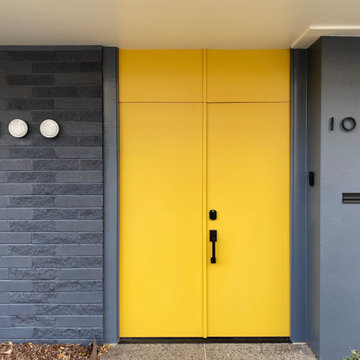
New lighting throughout, mostly indirect and all warm-dim LED , subtly and efficiently lights the home. All new plumbing and fixtures similarly reduce the home’s use of precious resources. On the exterior, new windows, insulation, and roofing provide modern standards of comfort and efficiency, while a new paint job and brick stain give the house an elegant yet playful character, with the golden yellow Heath tile from the primary bathroom floor reappearing on the front door.
174