
Search results for "Prediction" in Home Design Ideas
 Michelle's Interiors
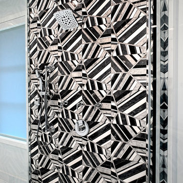
The random pattern of this tiled shower wall from Artistic Tile takes the design from predictable geometry to a jaw-dropping artistic statement.
Example of a trendy black and white tile bathroom design in Chicago
Example of a trendy black and white tile bathroom design in Chicago

 Helen & Co. Interior Design
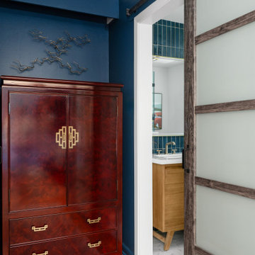
A sexy modern space that beckons you to toss the day’s cares away and sink under the sheets. We intentionally added lots of curves and soft surfaces, and the dark blue is like a warm hug at the end of the day. The mid-century beehive fan is the icing on the cake and far from predictable.
Find the right local pro for your project
 Eugene Pintail LLC
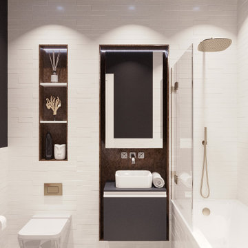
This design captures the spirit of eclectic modernity—boldly combining texture, form, and soulful detail. It embraces both clean contemporary lines and layered, curated elements, resulting in a space that feels thoughtfully collected, not predictable.
Textural richness is at the forefront—soft upholstery pairs with sleek surfaces, and mixed finishes (polished metals, matte woods, and plush textiles) create a tactile and visual dialogue. The contrast between refined and cozy elements builds warmth and sophistication.
The layout balances openness with intimacy. Thoughtfully placed furniture and visual rhythms guide movement through the space, allowing each area to feel both connected and distinct.
Lighting is composed with subtlety and intention—ambient fixtures and layered lighting gently sculpt the environment. Shadows and highlights enhance the ambiance without overpowering the architectural interplay.
This space tells a story of modern living infused with personality. It’s dynamic yet grounded—inviting curiosity, conversation, and comfort in equal measure.
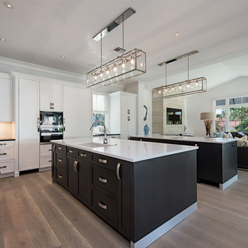
 Aurora Builders
This Custom Remodel located in Naples, FL and was built by 41 West, a Certified Luxury Builder. To learn more about 41 West, visit www.41west.com.
As a Certified Luxury Builder we are proud to feature photos of select projects from our other members around the country to inspire you with design ideas. Please feel free to contact the Certified Luxury Builder of this project with any questions or inquiries you may have.
Certified Luxury Builders is a network of leading custom home builders and luxury home and condo remodelers who create 5-Star experiences for luxury home and condo owners from New York to Los Angeles and Boston to Naples. Using a collaborative business model, Certified Luxury Builders assemble a design and construction team for each project including architects and interior designers to create inspired residences. By applying the highest level of quality building standards, Certified Luxury Builders provide predictable excellence for luxury home or condo owners.
 Eugene Pintail LLC
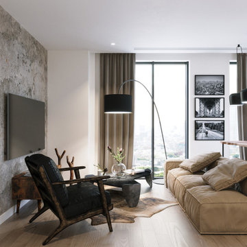
This design captures the spirit of eclectic modernity—boldly combining texture, form, and soulful detail. It embraces both clean contemporary lines and layered, curated elements, resulting in a space that feels thoughtfully collected, not predictable.
Textural richness is at the forefront—soft upholstery pairs with sleek surfaces, and mixed finishes (polished metals, matte woods, and plush textiles) create a tactile and visual dialogue. The contrast between refined and cozy elements builds warmth and sophistication.
The layout balances openness with intimacy. Thoughtfully placed furniture and visual rhythms guide movement through the space, allowing each area to feel both connected and distinct.
Lighting is composed with subtlety and intention—ambient fixtures and layered lighting gently sculpt the environment. Shadows and highlights enhance the ambiance without overpowering the architectural interplay.
This space tells a story of modern living infused with personality. It’s dynamic yet grounded—inviting curiosity, conversation, and comfort in equal measure.
 Alair Homes Milwaukee
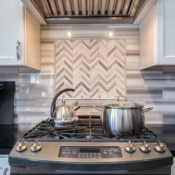
The Strato Marble tile with it's gray, white, and black striations, used on the backsplash and chevron pattern picture frame, keeps this Kitchen from looking predictably traditional.
James Meyer Photography
 MATHISON | MATHISON ARCHITECTS
Acton, MA
2008
sq ft varies
Visioning, programming, concept design, schematic design, construction documentation and construction administration
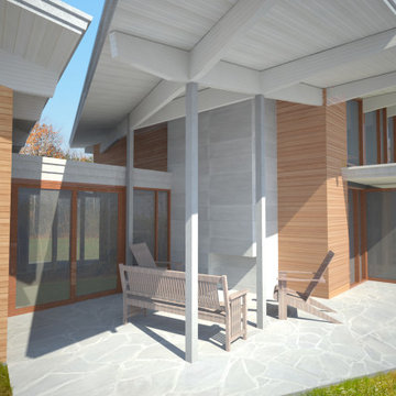
The HingeHouse project was the result of a unique partnership between an independent architect and a pre-fabricated home manufacturer – a partnership among the first of its kind in the country. Today, many pre-fab companies have adopted this collaborative approach recognizing that homeowners are looking for unique, custom homes while taking advantage of reliable and predictable construction methods and costs.
In 2008, the partnership was created to rethink pre-engineered post-and-beam and panelized systems to connect clients to a more modern and integrated set of design values. By integrating systems, factory design approach, manufacturing methodologies and construction sequences with design criteria grounded in sustainable planning and rigorous implementation, HingeHouse was developed.
HingeHouse is a fully-customizable pre-fab home which can be configured to meet the needs of any site, and any family. It is flexible and expandable using Deck House engineered building components. Starting with basic floor plans that are optimized spatially to Deck’s standard components, the living spaces are rotated around a "hinge” point. This design solution addresses the limitations and challenges of a particular site, while highlighting the best aspects of it. HingeHouse considers passive solar orientation depending on where the home is placed on the site and how it is “hinged”. It provides for maximum cross-ventilation from prevailing winds, preserves existing site formations and trees, and works on sloping grades. It addresses specific desired views while mitigating unwanted adjacencies, and provides great flexibility for entry sequences.
HingeHouse uses Deck’s standard sloped roof post-and-beam component system to create a lyrical, light-filled home. The western red cedar exterior is sculptural and dynamic. Interior spaces are lofty, with great view potential using Deck’s own custom-made mahogany windows. The “hinge” of the home, where the two building forms come together, has the added benefit of creating a desirable outdoor living room, complete with an outdoor fireplace. The "hinge” provides both a tool for maximizing customization and spatial orientation and a center of activity at the heart of the home.
Since this partnership in 2008, Maryann Thompson Architects and MATHISON | MATHISON ARCHITECTS have worked with Acorn Deck House Company on numerous full or partial pre-fab projects in the Boston Area, Western Massachusetts, Maryland and Michigan. We have become an advocate for their services and products because it offers advantages on a variety of levels including schedule, cost and quality.
Services provided included visioning, programming, concept design, schematic design, construction documentation and construction administration.
Evan’s Role: Project Designer & Project Manager
 House of L
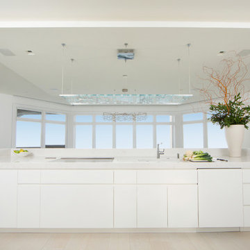
The "Illusionist" kitchen is a 2nd place winner in the prestigious Subzero and Wolf kitchen design contest in the state of Ohio. This tremendous house, which is situated on the lake, boasts a main kitchen and a prep kitchen. Its name was generated from the complete invisibility of the main kitchen's working components, whereas all of the appliances were completely concealed to provide a seamless look allowing for an unconventional look that is streamlined yet completely functional. The goal of the homeowners in the design stages were to simplify a more conventional house layout. A more predictable formal dining room was eliminated creating a merge of the main kitchen with a central eating area. The combining of these two spaces helped to develop the concept that the kitchen was an 'illusion'; accessible when necessary but unnoticed in every other way so there was less of a feel of being in a kitchen and more of a sense of being in a gathering area for family and friends to enjoy. The main kitchen boasts three ovens, a 36" Subzero refrigerator and a 36" Subzero freezer, all of which are paneled with white glass, providing a perfect reflective surface for the lake in the backdrop. The island is dual purposed, housing a sink and a 36" induction Wolf cooktop on one side and providing seating for 10 in a custom built banquette. The light fixture above the custom glass and stainless steel table is the "Etoile" from Terzanni while the massive light fixture over the island is the "Sospesa" from Fabbian and boasts a 2" sheet of glass with inset halogen lighting that is nearly invisible suspended from the 10' ceiling that features a drop ceiling with cove lighting. The prep kitchen, which was the 'workhorse' for everyday use is also a fully functional space, featuring additional 36" Subzero refrigerator and freezer, a 36" oven, microwave, two prep sinks (one in the island and one to the left of the freezer) and a concealed barstool which pulls out from the island and 'disappears' when not in use. A built-in dog feeding station allows for conveniences for all family members of this modern household.
 Universal Appliance and Kitchen Center
Available at Universal Appliance and Kitchen Center | uakc.com
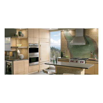
The E series made Wolf precision performance accessible for more cooks. Now three distinct new styles make the E series ideal for more kitchen designs than ever. The new 30" E series professional double oven features an all-stainless touch control panel, pro-style capped handles and stainless-framed doors - a design meant to coordinate beautifully with similarly-styled Wolf microwaves and warming drawers. Inside the upper oven, dual convection fans and ten cooking modes control heat and airflow more precisely than less sophisticated single-convection systems. Uniform heat throughout the oven and the efficiency of circulating air around the food produce faster, more consistent and more predictably delicious results for your baking, roasting and broiling. The lower oven is a standard, non-convection oven offering four modes (bake, broil, roast and proof). The E series oven controls are a favorite of Wolf chefs for their intuitive usability whether setting the temperature, mode or timer. Meanwhile, dual interior halogen lights and a large viewing window help you keep tabs on cooking progress without having to disturb your dish by opening the door. Other standard convenience features include self-clean and timed cook settings, along with one full-extension, easy-glide rack and one full-extension, door-glide rack that put even the largest, heaviest dishes safely within reach.
Appearance:
Cobalt Blue Porcelain Oven Interior (Each Oven)
Large Viewing Double-Pane Window (Each Oven)
Pro Handle
Stainless Steel Professional Design
Capacity:
4.5 Cu Ft Oven Capacity (Each Oven)
Dimensions:
50 3/8" H x 23 3/4" D x 29 7/8" W
Manufacturers Warranty:
2 Year Parts & Labor
5 Year Parts-Electric Elements, Electronic Control
Controls:
Touch Control Panel w/ LCD Display
Oven Features:
10 Cooking Modes (Upper Oven)
3 Oven Racks w/ 6 Level Guide (Each Oven)
Convection Bake, Roast, Broil
Conventional Bake, Roast, Broil
Dehydrate & Proof Modes
Dual Convection System with Two Fans - Upper Oven
Full Extension Bottom Rack
Hidden Bake Element
Recessed Broil Element
Self Clean Porcelain Oven (Each Oven)
Temperature Probe (Each Oven)
Convenience Features:
Delay Start Option (Each Oven)
Dual Interior Halogen Lighting (Each Oven)
Sabbath Mode (Each Oven)
Additional Features:
Balanced Door Hinge
Standard or Flush Inset Application Installation
 Just the Thing Decorating, Staging, and Windows
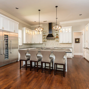
This retired couple loves collecting art on their worldwide travels and didn't want to settle for a predictable look for their new kitchen. We began with the black and gold honed granite they fell in love with, and added the glass tile mosaic back splash and custom mixed metal hood. The result is truly a work of art!
Collaboration with Sterling Renovations
Matt Ross-photos

 safe ZOnea
Ask a kitchen designer in Chicago which countertop question comes up most and you will hear the same answer: white or off-white quartz, and which shade. Homeowners walk into showrooms with a photo saved on their phone, usually a bright, veined slab from a magazine spread, and leave an hour later realizing there are a dozen versions of that same look. The confusion is not about taste. It is about the fact that "white quartz" covers a huge range of patterns, undertones, and price points, and nobody explains the differences before the sale.
Older bungalows and newer builds alike are getting stripped of their dated laminate and butcher block in favor of quartz, and the reasons are practical rather than trendy. Quartz does not need sealing, resists the kind of staining that granite can suffer over decades, and holds up to the freeze-thaw humidity swings that Chicago basements and kitchens go through every year. Once a homeowner commits to quartz, though, the real decision starts: which white, and does the pattern justify the difference in cost.
This piece walks through three specific slabs that keep showing up in Chicago renovation projects, why designers reach for them in different rooms, and what actually separates a flat white surface from one with real depth. None of this requires a design background to follow. It is mostly about paying attention to how a slab behaves under kitchen lighting, how busy the vending gets, and how it photographs versus how it looks in person.
Why White Quartz Took Over Chicago Kitchens
Ten years ago, granite dominated Chicago kitchen remodels almost by default. It was durable, it looked expensive, and every fabricator in the metro area carried a wide range of colors. Quartz has since taken over that position, and the shift happened faster than most contractors expected. Engineered stone gave homeowners a more predictable surface, since natural granite varies slab to slab while quartz is manufactured to a consistent pattern batch after batch.
The other driver is light. Chicago winters are long and gray, and a lot of kitchens, especially in older two-flats and courtyard buildings, do not get much direct sun. A dark granite countertop in a dim kitchen can make the whole room feel smaller. White and light-toned quartz reflects what little natural light comes through the windows, and it makes a galley kitchen or a north-facing space feel noticeably brighter without touching the cabinetry or the layout.
There is also a resale argument that local real estate agents bring up constantly. White quartz photographs well for listings, reads as updated and low-maintenance to buyers touring in person, and does not compete visually with whatever cabinet color the next owner might prefer. It is a safer bet than a bold veined marble look or a colored quartz that might feel dated in five years.
Arctic White and the Cost Question
Among the flatter, more uniform whites, arctic white quartz price comes up constantly in budget conversations because the slab sits at a more approachable point than the heavily veined Italian-marble-inspired patterns. It reads as clean and bright without the busy movement that some homeowners find overwhelming in a small kitchen. Fabricators in the Chicago area tend to keep it in stock precisely because demand stays steady across both new construction and remodel projects.
Part of what keeps this slab affordable relative to its heavily patterned cousins comes down to manufacturing complexity. A quartz surface with minimal veining and a consistent white base is simpler to produce at scale than one that mimics the irregular, high-contrast movement of natural Calacatta marble. That production difference shows up directly in what a homeowner pays per square foot, and it is worth asking a fabricator to walk through that pricing before assuming every white quartz costs the same.
Homeowners planning a full kitchen, including an island, backsplash, and perimeter counters, often use a flatter white like this specifically because it lets other elements carry the visual interest. A patterned tile backsplash or a bold cabinet color reads more clearly against a calm countertop than against one already fighting for attention with heavy veining. Designers frequently pair simpler whites with statement lighting fixtures for exactly this reason.
What Makes Calacatta Patterns Different
Calacatta refers to a family of marble originally quarried in Italy, known for a bright white background broken up by bold, often gold-toned veining that moves in thick, dramatic streaks rather than thin gray lines. Natural Calacatta marble is soft, porous, and expensive to maintain, which is exactly why quartz manufacturers spent years developing engineered versions that replicate the look without the upkeep headaches.
The challenge with any Calacatta-style quartz is getting the veining to look organic instead of printed. Early generations of engineered stone struggled with repetitive patterns that gave away the fact the slab was manufactured rather than cut from actual marble. Modern digital printing and layering techniques have closed that gap considerably, and the better Calacatta-inspired quartz lines now vary the veining across each slab batch so two counters in the same kitchen do not look identical.
Chicago designers gravitate toward Calacatta patterns for kitchens that function as the visual centerpiece of an open floor plan, which describes a large share of the gut renovations happening in neighborhoods like Lincoln Park, Roscoe Village, and the North Shore suburbs. When the kitchen island is visible from the living room and dining area, a dramatic veined surface becomes part of the home's overall design language rather than a purely functional work surface.
Calacatta Arno Under Kitchen Lighting
One of the more popular options in this category, calacatta arno quartz, balances a warm white base with soft gray and gold veining that avoids looking too stark under the cooler LED lighting common in newer Chicago builds. Homeowners touring showrooms sometimes make the mistake of judging a slab entirely under warm incandescent lighting, then get surprised when the same surface looks slightly different once installed under their kitchen's actual fixtures.
What separates this particular pattern from flatter competitors is how the veining clusters rather than spreading evenly across the slab. That clustering mimics the way real quarried marble forms, with denser mineral deposits in some sections and cleaner stretches in others. Fabricators cutting a large island slab from a single piece will often orient the pattern intentionally so the busiest veining lands somewhere visually interesting rather than getting cut off at an edge.
Because the background reads warmer than a stark white, this pattern tends to pair well with brass or matte gold hardware, a combination that has been showing up repeatedly in Chicago kitchen remodels over the past few renovation seasons. Cabinet painters report a similar trend, with more clients requesting warm white or greige cabinet colors specifically because they complement this kind of veined quartz better than a cooler, blue-toned white would.
Silestone's Version of the Calacatta Look
Manufacturers compete directly in this Calacatta-inspired category, and silestone eternal calacatta gold represents one brand's specific take on the pattern, distinguished by richer gold veining set against a brighter white base than some competing slabs in the same family. Silestone has built a reputation around anti-bacterial surface treatments in addition to the standard quartz durability, a detail some homeowners specifically ask about for kitchens used heavily by families with young children.
The veining in this particular slab tends to run in longer, more continuous lines compared to the clustered pattern found in some other Calacatta-style options, which gives large island surfaces a sense of visual flow from one end to the other. Fabricators working with bigger islands, the kind increasingly common in open-concept Chicago remodels, often favor patterns like this because there is less need to worry about seams interrupting a busy, disconnected pattern.
Price positioning for this slab tends to sit toward the upper end of the engineered quartz category, reflecting both the brand's manufacturing process and the complexity of replicating that continuous gold veining consistently across production batches. Homeowners weighing this option against other Calacatta-style quartz should ask their fabricator directly about batch availability, since premium patterns sometimes have longer lead times than standard stock colors.
Living With Quartz Day to Day
Beyond how a slab looks in a showroom or a listing photo, the daily experience of owning quartz countertops matters more once the renovation dust settles. Quartz resists scratching far better than laminate and holds up to the acidic spills, hot pans, and general abuse of an active kitchen without the sealing maintenance that natural stone requires every year or two. That low-maintenance reputation is a large part of why quartz overtook granite in the first place.
Heat resistance is a detail that gets less attention than it should. While quartz handles moderate heat well, manufacturers generally recommend using a trivet or pad for very hot pots straight off the stove, since sudden temperature shock can occasionally cause stress marks in the resin binder that holds the engineered stone together. This is a minor precaution rather than a major limitation, but it is worth mentioning to anyone assuming quartz is entirely indestructible.
Cleaning routines stay simple across almost every pattern in this category. A damp cloth and mild soap handle daily messes, and the nonporous surface means wine, coffee, and tomato-based sauces do not soak in the way they can with unsealed granite or marble. Homeowners moving from an older stone counter often mention how much less they worry about everyday spills once quartz is installed, which is a quality-of-life change that rarely makes it into the initial design conversation.
Choosing Between the Three
There is no single correct answer among these three slabs, and that is exactly why they keep coming up together in the same design conversations across Chicago renovation projects. A flatter white with minimal veining suits kitchens where other elements need to carry the visual interest, while a bolder Calacatta-inspired pattern makes sense when the countertop itself is meant to be the centerpiece of an open floor plan.
Budget matters too, and it is worth having a direct conversation with a fabricator about where each option lands before falling in love with a specific slab in a showroom. Lighting, cabinet color, and how the kitchen connects to the rest of the home all play into which pattern will actually look right once installation is finished rather than just in a photo.
Whatever direction a homeowner leans, seeing a full slab in person under actual kitchen lighting remains the single most useful step before signing off. Photos only go so far once the countertop is sitting in the room it will live in for years.

 dassoXTR
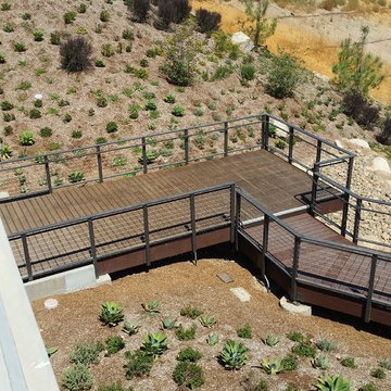
Civita Park, San Diego, CA is under development in Mission Valley featuring dassoXTR bamboo deck boardwalk throughout the park designed by Schmidt Design Group and supplied by Boise Cascade. Civita Park is predicted to be completed in 2018.

 Universal Appliance and Kitchen Center
Available at Universal Appliance and Kitchen Center | uakc.com
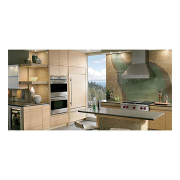
The E series made Wolf precision performance accessible for more cooks. Now three distinct new styles make the E series ideal for more kitchen designs than ever. The new 30" E series transitional double oven features an all-stainless touch control panel and slim, tubular handles - a design meant to coordinate beautifully with similarly-styled Wolf microwaves and warming drawers. Inside the upper oven, dual convection fans and ten cooking modes control heat and airflow more precisely than less sophisticated single-convection systems. Uniform heat throughout the oven and the efficiency of circulating air around the food produce faster, more consistent and more predictably delicious results for your baking, roasting and broiling. The lower oven is a standard, non-convection oven offering four modes (bake, broil, roast and proof). The E series oven controls are a favorite of Wolf chefs for their intuitive usability whether setting the temperature, mode or timer. Meanwhile, dual interior halogen lights and a large viewing window help you keep tabs on cooking progress without having to disturb your dish by opening the door. Other standard convenience features include self-clean and timed cook settings, along with one full-extension, easy-glide rack and one full-extension, door-glide rack that put even the largest, heaviest dishes safely within reach.
Appearance:
Cobalt Blue Porcelain Oven Interior (Each Oven)
Large Viewing Double-Pane Window (Each Oven)
Tubular Handle
Unframed Stainless Design
Capacity:
4.5 Cu Ft Oven Capacity (Each Oven)
Dimensions:
50 3/8" H x 24 3/4" D x 30" W
Manufacturers Warranty:
2 Year Parts & Labor
5 Year Parts-Electric Elements, Electronic Control
Controls:
Touch Control Panel w/ LCD Display
Oven Features:
10 Cooking Modes (Upper Oven)
3 Oven Racks w/ 6 Level Guide (Each Oven)
Convection Bake, Roast, Broil
Conventional Bake, Roast, Broil
Dehydrate & Proof Modes
Dual Convection System with Two Fans - Upper Oven
Full Extension Bottom Rack
Hidden Bake Element
Recessed Broil Element
Self Clean Porcelain Oven (Each Oven)
Temperature Probe (Each Oven)
Convenience Features:
Delay Start Option (Each Oven)
Dual Interior Halogen Lighting (Each Oven)
Sabbath Mode (Each Oven)
Additional Features:
Balanced Door Hinge
Standard or Flush Inset Application Installation

 Jay Sifford
Gravel, stone and boulders replaced the predictable turf as front yard covering. These elements pull the house into the landscape by replicating the stone porch pillars. Vertical conifers speak to those pillars and the ultimate height of the home, while pendulous specimen trees bring the eye down to ground level and keep it engaged and moving through the space. Photo by Jay Sifford
 Gina Drago Design
The only popcorn left in this place is "Fishers Popcorn"!
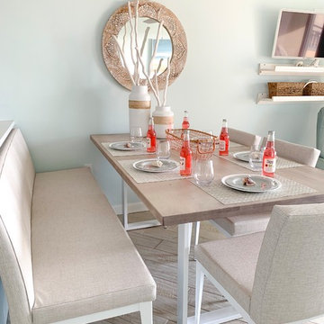
The first order of business - eliminate the caked on popcorn walls and ceiling, no easy task! Second - design a functional eat-in kitchen with what little wall space was available. Third - Lighting! It was important to have more cabinet storage, trash can pull out, an actual silverware drawer and of course a coffee bar. To keep it budget friendly I kept the existing refrigerator and dishwasher and replaced the bulky range and micro hood with a peninsula configuration. I decided to use copper lighting and accents as opposed to the predictable silver or gold. I think it really pops off the harbor blue cabinets and gives a subtle, feminine, mermaid feel. To top this kitchen off right, a scale tile backsplash and Quartz Borghini countertops with waterfalls were installed.
Backsplash/Counters: American Granite, Bishopville, MD
Photography: Ricky Johnson, Fenwick Island, DE
Dining Set/Sleeper Sofa: Casual Designs Furniture, Heidi Rae Ocean City, MD
 Eugene Pintail LLC
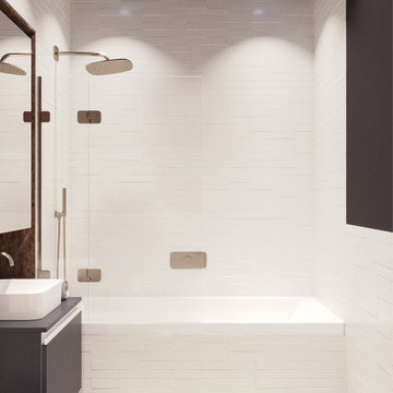
This design captures the spirit of eclectic modernity—boldly combining texture, form, and soulful detail. It embraces both clean contemporary lines and layered, curated elements, resulting in a space that feels thoughtfully collected, not predictable.
Textural richness is at the forefront—soft upholstery pairs with sleek surfaces, and mixed finishes (polished metals, matte woods, and plush textiles) create a tactile and visual dialogue. The contrast between refined and cozy elements builds warmth and sophistication.
The layout balances openness with intimacy. Thoughtfully placed furniture and visual rhythms guide movement through the space, allowing each area to feel both connected and distinct.
Lighting is composed with subtlety and intention—ambient fixtures and layered lighting gently sculpt the environment. Shadows and highlights enhance the ambiance without overpowering the architectural interplay.
This space tells a story of modern living infused with personality. It’s dynamic yet grounded—inviting curiosity, conversation, and comfort in equal measure.
24