
Search results for "Proper rest" in Home Design Ideas
 S Squared Design, LLC
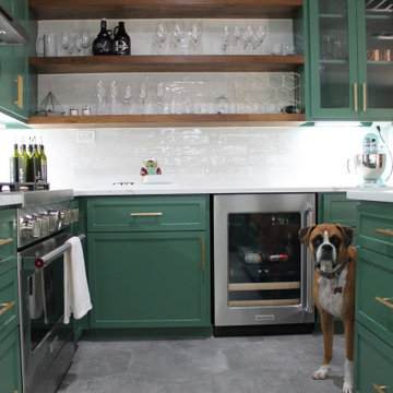
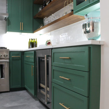
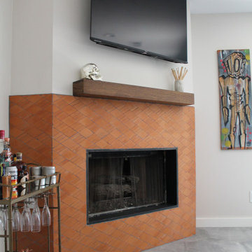
This remodel was one worth waiting for! Clients had a need for more storage, more counter and more room for entertaining friends and family. They love color and low maintenance materials so we went with a lovely happy green cabinet color, quartz counters, fun large hex porcelain floor tile and easy to clean backsplash. The original kitchen was lacking good flow, ample storage for this family.
We started in the laundry room but re configuring the layout so now the W/D and fridge could be on one wall which opened up space for a drop area. We removed the old small closet that was the pantry and replaced the old water heater with a tank-less one to allow more place where they needed it the most. Drop area has outlets for charging and one in the broom cabinet as well. We removed the door to allow for us to relocate the garage entry door which now sits in the mud room instead of right in the middle of the kitchen. We added an actual walk in pantry which is equipped with drawers and plenty of shelf storage, we put the small appliances in here to allow for more counter space in the kitchen. To access the kitchen is now through a pocket door which is a big space saver and allows a more open feel.
Let's get to this kitchen design! This was a odd layout before, now we have the fridge tucked away in it's proper home instead of sticking out. We relocated the garage entry door to the mud room to allow for this 36" range in its place featuring a pot filler as well. To maximize the kitchen footprint we closed up the door that went to the office and now we have a full L corner with plenty of storage and added some wood shelves for a sense of warmth and displace space in a beverage bar area, which also features an under-counter beverage fridge. Under-cabinet lighting, island fixture , a pendant above the sink and relocated the recessed lights to work better with the new kitchen layout. The island was a new addition which replaced the peninsula that used to cut off the kitchen from the rest of the home. We also removed a built in bookshelf and relocated the return air to the ceiling to free up even more floor space to truly transform this kitchen into the heart of the home.
 American Pool and Spa
The Monolith Features:
1. SPACIOUS SHALLOW END BENCH SEAT
Want to take a break from the action and hang out with some friends? This seating area is properly sized to accommodate the whole family.
2. LARGE SHALLOW END FOR SOCIALIZING AND PLAY
The problem with most deep end pools is the tiny shallow end, which is where most people gather.
3. OPEN POOL INTERIOR
Want plenty of room to float and frolic? The rectangular design of the Monolith provides ample room for all of your pool activities.
4. DEEP END SEATS / EXIT POINTS
When using deep end pools, people love to jump in, exit and repeat. The deep end seats of the Monolith provide a place to get in and out, as well as take a rest.
5. MASSIVE 8' 6" DEEP END
Looking for lots of water? The Monolith is 6" deeper than most of the fiberglass deep end pools on the market.
6. AUTOMATIC COVER FRIENDLY
The rectangular design of the Monolith allows cover tracks to be hidden beneath the pool coping, protecting them.
 Sweeney Design Remodel
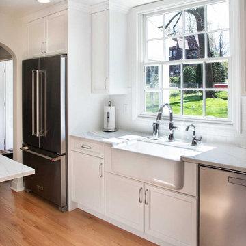
In order to open up the kitchen and create a brighter atmosphere, Sweeney Design Remodel widened the doorway between the kitchen and dining room and designed it to match the colonial-style archways found in the rest of the home.
While the kitchen footprint did not change, new white DuraSupreme cabinets were designed into the space to accommodate modern built-in appliances, including a larger stainless steel refrigerator. This minor adjustment also had a significant impact on improving the visual balance of the kitchen. The new easy-to-clean, marble-inspired quartz on the peninsula now offers plenty of eat-in space for two. The classic white subway tile backsplash and large farmhouse sink anchor the room.
Hardwood flooring used in the dining and living rooms was extended into the kitchen to flow the rooms seamlessly together. The original kitchen window that was cumbersome for one person to operate was replaced with a new easy-to-open window. In addition, to create proper soft general lighting, Sweeney replaced a large fluorescent light fixture with disk lights.
Find the right local pro for your project
 S Squared Design, LLC
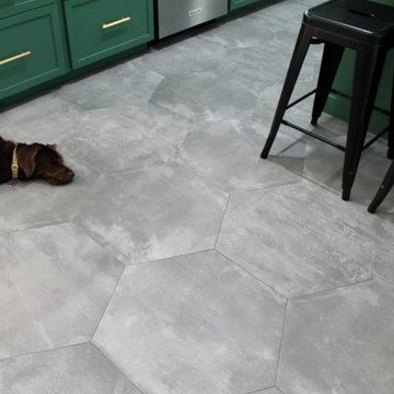
This remodel was one worth waiting for! Clients had a need for more storage, more counter and more room for entertaining friends and family. They love color and low maintenance materials so we went with a lovely happy green cabinet color, quartz counters, fun large hex porcelain floor tile and easy to clean backsplash. The original kitchen was lacking good flow, ample storage for this family.
We started in the laundry room but re configuring the layout so now the W/D and fridge could be on one wall which opened up space for a drop area. We removed the old small closet that was the pantry and replaced the old water heater with a tank-less one to allow more place where they needed it the most. Drop area has outlets for charging and one in the broom cabinet as well. We removed the door to allow for us to relocate the garage entry door which now sits in the mud room instead of right in the middle of the kitchen. We added an actual walk in pantry which is equipped with drawers and plenty of shelf storage, we put the small appliances in here to allow for more counter space in the kitchen. To access the kitchen is now through a pocket door which is a big space saver and allows a more open feel.
Let's get to this kitchen design! This was a odd layout before, now we have the fridge tucked away in it's proper home instead of sticking out. We relocated the garage entry door to the mud room to allow for this 36" range in its place featuring a pot filler as well. To maximize the kitchen footprint we closed up the door that went to the office and now we have a full L corner with plenty of storage and added some wood shelves for a sense of warmth and displace space in a beverage bar area, which also features an under-counter beverage fridge. Under-cabinet lighting, island fixture , a pendant above the sink and relocated the recessed lights to work better with the new kitchen layout. The island was a new addition which replaced the peninsula that used to cut off the kitchen from the rest of the home. We also removed a built in bookshelf and relocated the return air to the ceiling to free up even more floor space to truly transform this kitchen into the heart of the home.
 S Squared Design, LLC
This remodel was one worth waiting for! Clients had a need for more storage, more counter and more room for entertaining friends and family. They love color and low maintenance materials so we went with a lovely happy green cabinet color, quartz counters, fun large hex porcelain floor tile and easy to clean backsplash. The original kitchen was lacking good flow, ample storage for this family.
We started in the laundry room but re configuring the layout so now the W/D and fridge could be on one wall which opened up space for a drop area. We removed the old small closet that was the pantry and replaced the old water heater with a tank-less one to allow more place where they needed it the most. Drop area has outlets for charging and one in the broom cabinet as well. We removed the door to allow for us to relocate the garage entry door which now sits in the mud room instead of right in the middle of the kitchen. We added an actual walk in pantry which is equipped with drawers and plenty of shelf storage, we put the small appliances in here to allow for more counter space in the kitchen. To access the kitchen is now through a pocket door which is a big space saver and allows a more open feel.
Let's get to this kitchen design! This was a odd layout before, now we have the fridge tucked away in it's proper home instead of sticking out. We relocated the garage entry door to the mud room to allow for this 36" range in its place featuring a pot filler as well. To maximize the kitchen footprint we closed up the door that went to the office and now we have a full L corner with plenty of storage and added some wood shelves for a sense of warmth and displace space in a beverage bar area, which also features an under-counter beverage fridge. Under-cabinet lighting, island fixture , a pendant above the sink and relocated the recessed lights to work better with the new kitchen layout. The island was a new addition which replaced the peninsula that used to cut off the kitchen from the rest of the home. We also removed a built in bookshelf and relocated the return air to the ceiling to free up even more floor space to truly transform this kitchen into the heart of the home.
 S Squared Design, LLC
This remodel was one worth waiting for! Clients had a need for more storage, more counter and more room for entertaining friends and family. They love color and low maintenance materials so we went with a lovely happy green cabinet color, quartz counters, fun large hex porcelain floor tile and easy to clean backsplash. The original kitchen was lacking good flow, ample storage for this family.
We started in the laundry room but re configuring the layout so now the W/D and fridge could be on one wall which opened up space for a drop area. We removed the old small closet that was the pantry and replaced the old water heater with a tank-less one to allow more place where they needed it the most. Drop area has outlets for charging and one in the broom cabinet as well. We removed the door to allow for us to relocate the garage entry door which now sits in the mud room instead of right in the middle of the kitchen. We added an actual walk in pantry which is equipped with drawers and plenty of shelf storage, we put the small appliances in here to allow for more counter space in the kitchen. To access the kitchen is now through a pocket door which is a big space saver and allows a more open feel.
Let's get to this kitchen design! This was a odd layout before, now we have the fridge tucked away in it's proper home instead of sticking out. We relocated the garage entry door to the mud room to allow for this 36" range in its place featuring a pot filler as well. To maximize the kitchen footprint we closed up the door that went to the office and now we have a full L corner with plenty of storage and added some wood shelves for a sense of warmth and displace space in a beverage bar area, which also features an under-counter beverage fridge. Under-cabinet lighting, island fixture , a pendant above the sink and relocated the recessed lights to work better with the new kitchen layout. The island was a new addition which replaced the peninsula that used to cut off the kitchen from the rest of the home. We also removed a built in bookshelf and relocated the return air to the ceiling to free up even more floor space to truly transform this kitchen into the heart of the home.
 Four Elements Construction
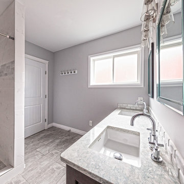
Clients were wanting to expand their 50's era semi-bungalow to a full two storey so they could add one more bedroom and bathroom to their second level. Part of the plan was to create an actual master suite with proper ensuite bathroom and walk-in closet space. Phase one took the project to drywall stage, but later we added phase two where we finished the rest of the second level to finish stage along with a complete refresh of the main level with new finishings including flooring and counter-tops. The exterior of the home was also re-done including new windows, doors, and siding plus roof shingles of course. The result was a great and expanded character bungalow in a very desirable area located close to downtown.

Sponsored
Fredericksburg, OH

High Point Cabinets
Columbus' Experienced Custom Cabinet Builder | 4x Best of Houzz Winner
 lavish
When a professional office space needs to make a lasting impression on clients and create an inspiring environment for staff, the design details matter just as much as they do at home. This thoughtful commercial interior refresh transformed a dated, purely functional office into a warm, sophisticated, and beautifully layered space — one that feels more like a high-end boutique or luxury residence than a typical workplace.
The guiding philosophy throughout was clear: every space, no matter how utilitarian its purpose, deserves intentional design. From the reception corridor to the staff break room, from the client restrooms to the storage corridor, each area received careful attention to finish, color, and texture.
Restrooms Reimagined
The two client-facing restrooms were the most dramatic transformations in the project. Rather than the builder-grade wallpaper and basic fixtures typically found in commercial spaces, both were treated as true design moments.
The first features floor-to-ceiling wallpaper in a rich taupe with a delicate white botanical branch pattern, creating an immersive, jewel-box feel. A white shaker vanity with dark granite countertop grounds the space, while an arched frameless mirror and brushed gold wall sconce add glamour. A tall gold and glass etagere serves as both decorative storage and a sculptural element, styled with woven baskets, greenery, and stacked accessories. Framed landscape watercolor art adds a serene, organic note, and a freestanding brass toilet paper holder elevates a typically overlooked detail.
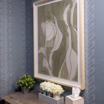
The second restroom takes an entirely different but equally compelling direction — soft, dusty blue-grey grasscloth-style wallpaper printed with a tone-on-tone chevron leaf stripe wraps every wall, creating a calm, spa-like atmosphere. A weathered wood console provides casual charm beneath a large-scale botanical tulip artwork in sage and cream. The wall-mount sink with exposed plumbing adds an intentional, editorial touch. An arched mirror with a sleek multi-bulb bar sconce in brushed nickel completes the look, while a pair of sculptural brass branch wall sculptures mounted directly to the wallpaper serve as unexpected, memorable art.
Storage Made Beautiful
The internal storage corridor received a full wall of custom floor-to-ceiling white shaker cabinetry with chrome pulls, flanked by open shelving sections for accessible display and storage. Clean, crisp, and highly organized — this space proves that even a purely functional corridor can be architectural and refined.
The Break Room & Kitchenette
The staff break room was updated with white shaker cabinetry, light speckled granite countertops, stainless appliances — including a French door refrigerator, dishwasher, and over-counter microwave — and warm sage green walls that bring a restful, refreshing energy to the space. Dark hardwood luxury vinyl plank flooring runs throughout the room, warming the look considerably. A round walnut dining table with upholstered chairs creates a proper gathering space for the team, and framed landscape oil art in an ornate gold frame adds a touch of collected character to the room.
Reception & Corridor Details
The reception and corridor spaces were treated with deep navy blue paint — bold, sophisticated, and unexpected in a commercial setting. A large abstract landscape painting in warm blues, blush, and gold hangs in a gilded frame against the navy wall, making an immediate statement. A brass and lucite table lamp sits on a floating brass-trimmed shelf alongside a sculptural art object, creating a vignette that communicates creativity and intentionality from the moment clients arrive.
The result is a professional environment that communicates confidence, taste, and care — one that clients will remember long after their visit, and one that staff will genuinely enjoy working in every day.
 Murphy Bros. Design | Build | Remodel
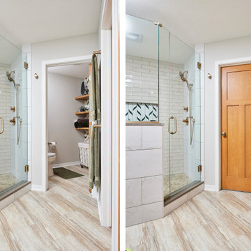
Homes 25 years or older often have minor mold issues to complicate whatever functionality and outdated issues need addressing. That was certainly the case in this Eagan master suite remodel that screamed “Tear me apart and put me back together so I work!”
So that’s what we did. After addressing the mold issues we shortened the vanity footprint, added that space to an enlarged low-threshold shower with a bench seat, and moved a lot of the storage needs to new cabinets in an adjacent properly enclosed water closet with a door. The tile work was extensive and really made a statement of luxury. New warm LVP flooring finished the aesthetic and livability upgrades.
The challenge in working with existing materials, such as oak doors, in a space that is going to change dramatically, is finding ways to incorporate them with the right balance. So, we replaced all the doors and floating shelves with an upgraded oak in the same tone, which worked in harmony with the taupes and grays we chose for the rest of the bathroom space.
As the homeowner put it, "I'm grateful for Murphy Brothers as a whole, for the work that they did to help make what I thought was my vision even better."
 American Pool and Spa
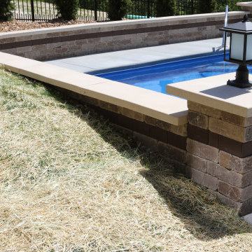
The Monolith Features:
1. SPACIOUS SHALLOW END BENCH SEAT
Want to take a break from the action and hang out with some friends? This seating area is properly sized to accommodate the whole family.
2. LARGE SHALLOW END FOR SOCIALIZING AND PLAY
The problem with most deep end pools is the tiny shallow end, which is where most people gather.
3. OPEN POOL INTERIOR
Want plenty of room to float and frolic? The rectangular design of the Monolith provides ample room for all of your pool activities.
4. DEEP END SEATS / EXIT POINTS
When using deep end pools, people love to jump in, exit and repeat. The deep end seats of the Monolith provide a place to get in and out, as well as take a rest.
5. MASSIVE 8' 6" DEEP END
Looking for lots of water? The Monolith is 6" deeper than most of the fiberglass deep end pools on the market.
6. AUTOMATIC COVER FRIENDLY
The rectangular design of the Monolith allows cover tracks to be hidden beneath the pool coping, protecting them.
 Windhill+Co.
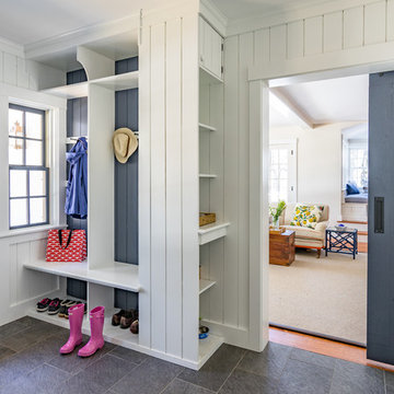
The Timothy Hyde House, c. 1729, dear to the homeowners for its historic details, but long-lacking the family oriented spaces and living areas essential for today’s extended family lifestyle. Unwilling to compromise an ounce of character, this growing family longed for more practical amenities like a visitor’s private retreat with bedroom, living room and bath, garage parking, a proper master bedroom layout with full bath and walk-in closet, in addition to a new kitchen that would function as the heart of the home. Ultimately the total square footage was doubled and the entire flow of the home was reworked keeping all of the character details intact. The kitchen is the hub, serving up its center island topped off with reclaimed white oak once belonging to a barn built in the 1880’s; jet mist leather granite tops off the remainder of the kitchen. Custom cable lighting was the ingenious solution for the complicated preservation of the original exposed beams and posts in the kitchen. The barn door was custom crafted from original timbers. Many cups of coffee will be enjoyed at the cozy, sun-filled dining nook overlooking the family room and new adjacent deck. The rear, separate entry mudroom with step-up laundry was a long awaited luxury over the previous basement facilities. Moving upstairs, a centrally located bathroom was removed to create a wheelhouse style landing/passage hall, now home to a quiet workspace, featuring original wide plank floors and tailor-made sconces. Baths were added and upgraded including soapstone tops, marble, a glorious soaker tub in the generous master bath, all giving the home a taste of luxury. Bathing in sunlight rests the master suite starring the original beams, cathedral ceilings, and well-suited chandelier. Throughout the home strategically designed built-ins provide a plethora of storage and organization. This 280 year-old Colonial shines on brighter than ever. We are proud to have been part of its long history.
Photo by Eric Roth
 ESF Home Textile LLC.
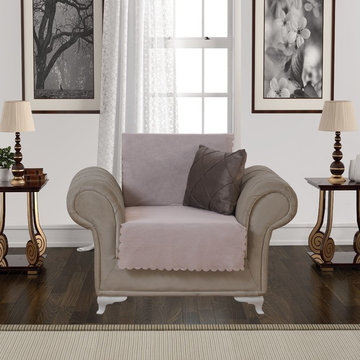
Chiara Rose Anti-slip Armless Sofa Cover Furniture Protector Chair Size Diamond
Dimensions: 29 Inch X 70 Inch
BEST SOFA PROTECTOR - This Slipcover is Extremely Sturdy, as well as an Instant, Magical Solution to Renew your Old Furniture with an Elegant Look! Ultrasonically welded seams prevent ripping apart and unraveling. The Edges are Laser-Cut to give a Chenille Trim Effect. Its Velvety Texture is Soft and also functions like a Warm Pet Bed giving a Sense of Security while your Pet is Resting. Our Covers are absolutely Pet-Friendly.
PROTECTIVE! Best Protection for ANIMAL SCRATCHES FUR SHED-HAIR DIRT FOOD SPILLS WEAR TEAR! STAIN PROOF! Perfect Guard against Cats Dogs Kids Children!
DECORATIVE! Great Stylish Coverage and Luxury Decoration in Living, Sitting Room with Full Solid Colors and Beautiful Printed, Patterned Designs, Extra Deluxe Décor, Nice Plush Texture! New Modern Look! CUSTOM-FIT! Relaxed fitted in Wing-back, Club, Rocker, Single Chair and a Half, one two three Pillow Coach, 1 2 Seaters, Box, T cushion, L, U shape Seaters! Big Large Long Wide Couches! Leather Velour Denim Twill Linen Sofas!
NON SLIDE! Slid-Resistant with PLASTIC DROP BACKING! No More Slipping Off / Sliding Over! Plastic Dots firmly Grip Upholstery! Stays in Place! No Zipper, Mat, Elastic Strap! No Pads under!
EASY CARE & WASH, DURABLE, DETERRENT! Machine Washable! Easily Removable Ready Made Furniture Throws! Cheap and Inexpensive! Heavy Duty Fabric! Stretch Enough to Cloth up Perfectly and Look Form Fit! NO ARMS! Slipcovers with Armrests DON’T properly FIT IN the Armrests and always create Fitting Problems. You know, they also have an Ugly Look. But with Chiara Rose no Need to Worry about Armrests anymore!
• PLEASE MAKE SURE TO READ DETAILED PRODUCT INFORMATION BELOW!
________________________________________
Product Description
WHY CHIARA ROSE SOFA COVERS?
Kids and Pets; We love them but we also love our furniture. Cleaning furniture is one of the most difficult chores and that’s why you need to protect it from dirt. The easiest and economical way of preserving your furniture is Chiara Rose Sofa Protector. Just put the sofa protector on your sofas (futon or couch) and stop worrying about stains and spills. It is perfect for homes with kids and pets. Pets love to scratch upholstery of the furniture. The enduring 220 gsm polyester fabric of Chiara Rose Sofa Protectors prevents tears and any kind of debris on your sofas. Its sturdy texture doesn’t let any spill and dirt penetrate the upholstery.
Besides being durable, Chiara Rose Sofa Cover is suitable to all types of decoration. To express your own personal style, you can choose from a variety of color and design options that fit perfectly to your home décor. With brilliant colors and attractive patterns, Chiara Rose Sofa Covers will give your room a completely new outlook. Unlike other covers, you don’t need to remove Chiara Rose Sofa Protector when you have guests. It will both protect your furniture and become a part of your home decoration.
WHY CHIARA ROSE SOFA PROTECTOR IS DURABLE?
The most common problem with traditional sofa covers is that after a short time of use the stitches come apart. The edges of Chiara Rose Sofa Cover are manufactured with ultrasonic laser cut technology. This technology prevents the edges from unraveling. What’s more, the 220 gsm polyester knitted fabric is the most long lasting fabric used in furniture protectors. While being durable, this fabric gives a warm sense
of touch and pleasure to sit upon.
WHY CHIARA ROSE IS THE BEST ANTI-SLIP SOFA PROTECTOR?
We always use the most contemporary technology to develop our products. That’s why we decided to use the patented plastic drop design on the back side of our covers to create the anti slip effect. These plastic drops firmly grip the upholstery of furniture so that the cover doesn’t slip off the seat easily. Even after your kids and pets jump on the sofa, Chiara Rose Sofa Cover holds on to your furniture. A quick adjustment is all it takes to get it back to look smooth. Chiara Rose Sofa Cover is the only sofa protector that uses this new technology.
WHY IT IS EASY TO USE CHIARA ROSE SOFA PROTECTORS?
No zippers, no elastic straps, no metal hooks!!! The anti-slip drops will take care of everything! , As shown on the image, just lay Chiara Rose Sofa Cover on your sofa, and tuck it between the cushion and the arms of the sofa. That’s all you need to do to put it on.
Chiara Rose Sofa Protector doesn’t allow everyday dirt, pet hair and food spills reach your sofa. The pattern of the fabric prevents accumulation of dirt on it. You can easily take off this dirt. In order to get best results, use a vacuum cleaner or shake your cover off before machine wash.
Chiara Rose Sofa Protector is easy care. It can be machine washed on max. 30°C or 85°F water temperature. Don’t use bleacher. Machine dryer can be used on low heat setting. To avoid wrinkles, use gentle cycle on washing machine and hang from a line while drying. If necessary, iron at low temperature.
 Outdoor Creations Unlimited
There are an infinite number of possible designs, and outdoor fire pits no longer need to be just a round pile of rocks. I work with several basic styles of gas fed fire pits when I design outdoor gardens to enchant my clients.
The popularity of fire pits and the fire effects they produce in the garden is one of fastest growing trends in outdoor design. The allure of sitting around a fire ring has been around since the beginning of mankind. Fire provides warmth, light, a cooking source and, of course relaxation. A dancing flame has a mesmerizing affect that encourages you to unwind and settle in. The popularity of fire pits, or conversation pits as they are commonly called, has grown rapidly in recent years. Proper design and construction will ensure a safe and enjoyable feature that will last several decades
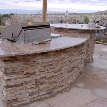
This fully equipped outdoor kitchen is separate from the rest of the living space, allowing the two areas to be utilized entirely on their own. outdoor kitchens are most efficient when it's zoned into logical uses. your cook space should have plenty of prep space, room to set down utensils and stage ingredients, and a comfortable buffer from the seating island to keep guests protected from the heat.
 American Pool and Spa
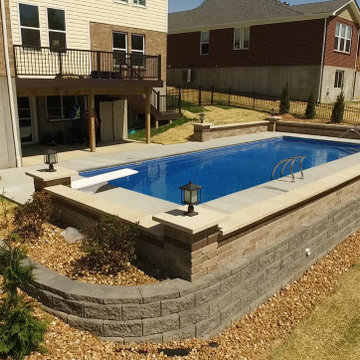
The Monolith Features:
1. SPACIOUS SHALLOW END BENCH SEAT
Want to take a break from the action and hang out with some friends? This seating area is properly sized to accommodate the whole family.
2. LARGE SHALLOW END FOR SOCIALIZING AND PLAY
The problem with most deep end pools is the tiny shallow end, which is where most people gather.
3. OPEN POOL INTERIOR
Want plenty of room to float and frolic? The rectangular design of the Monolith provides ample room for all of your pool activities.
4. DEEP END SEATS / EXIT POINTS
When using deep end pools, people love to jump in, exit and repeat. The deep end seats of the Monolith provide a place to get in and out, as well as take a rest.
5. MASSIVE 8' 6" DEEP END
Looking for lots of water? The Monolith is 6" deeper than most of the fiberglass deep end pools on the market.
6. AUTOMATIC COVER FRIENDLY
The rectangular design of the Monolith allows cover tracks to be hidden beneath the pool coping, protecting them.
 lavish
When a professional office space needs to make a lasting impression on clients and create an inspiring environment for staff, the design details matter just as much as they do at home. This thoughtful commercial interior refresh transformed a dated, purely functional office into a warm, sophisticated, and beautifully layered space — one that feels more like a high-end boutique or luxury residence than a typical workplace.
The guiding philosophy throughout was clear: every space, no matter how utilitarian its purpose, deserves intentional design. From the reception corridor to the staff break room, from the client restrooms to the storage corridor, each area received careful attention to finish, color, and texture.
Restrooms Reimagined
The two client-facing restrooms were the most dramatic transformations in the project. Rather than the builder-grade wallpaper and basic fixtures typically found in commercial spaces, both were treated as true design moments.
The first features floor-to-ceiling wallpaper in a rich taupe with a delicate white botanical branch pattern, creating an immersive, jewel-box feel. A white shaker vanity with dark granite countertop grounds the space, while an arched frameless mirror and brushed gold wall sconce add glamour. A tall gold and glass etagere serves as both decorative storage and a sculptural element, styled with woven baskets, greenery, and stacked accessories. Framed landscape watercolor art adds a serene, organic note, and a freestanding brass toilet paper holder elevates a typically overlooked detail.
The second restroom takes an entirely different but equally compelling direction — soft, dusty blue-grey grasscloth-style wallpaper printed with a tone-on-tone chevron leaf stripe wraps every wall, creating a calm, spa-like atmosphere. A weathered wood console provides casual charm beneath a large-scale botanical tulip artwork in sage and cream. The wall-mount sink with exposed plumbing adds an intentional, editorial touch. An arched mirror with a sleek multi-bulb bar sconce in brushed nickel completes the look, while a pair of sculptural brass branch wall sculptures mounted directly to the wallpaper serve as unexpected, memorable art.
Storage Made Beautiful
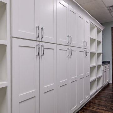
The internal storage corridor received a full wall of custom floor-to-ceiling white shaker cabinetry with chrome pulls, flanked by open shelving sections for accessible display and storage. Clean, crisp, and highly organized — this space proves that even a purely functional corridor can be architectural and refined.
The Break Room & Kitchenette
The staff break room was updated with white shaker cabinetry, light speckled granite countertops, stainless appliances — including a French door refrigerator, dishwasher, and over-counter microwave — and warm sage green walls that bring a restful, refreshing energy to the space. Dark hardwood luxury vinyl plank flooring runs throughout the room, warming the look considerably. A round walnut dining table with upholstered chairs creates a proper gathering space for the team, and framed landscape oil art in an ornate gold frame adds a touch of collected character to the room.
Reception & Corridor Details
The reception and corridor spaces were treated with deep navy blue paint — bold, sophisticated, and unexpected in a commercial setting. A large abstract landscape painting in warm blues, blush, and gold hangs in a gilded frame against the navy wall, making an immediate statement. A brass and lucite table lamp sits on a floating brass-trimmed shelf alongside a sculptural art object, creating a vignette that communicates creativity and intentionality from the moment clients arrive.
The result is a professional environment that communicates confidence, taste, and care — one that clients will remember long after their visit, and one that staff will genuinely enjoy working in every day.
 Vetter Architects
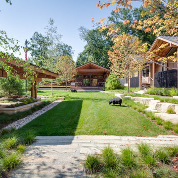
The owners requested a Private Resort that catered to their love for entertaining friends and family, a place where 2 people would feel just as comfortable as 42. Located on the western edge of a Wisconsin lake, the site provides a range of natural ecosystems from forest to prairie to water, allowing the building to have a more complex relationship with the lake - not merely creating large unencumbered views in that direction. The gently sloping site to the lake is atypical in many ways to most lakeside lots - as its main trajectory is not directly to the lake views - allowing for focus to be pushed in other directions such as a courtyard and into a nearby forest.
The biggest challenge was accommodating the large scale gathering spaces, while not overwhelming the natural setting with a single massive structure. Our solution was found in breaking down the scale of the project into digestible pieces and organizing them in a Camp-like collection of elements:
- Main Lodge: Providing the proper entry to the Camp and a Mess Hall
- Bunk House: A communal sleeping area and social space.
- Party Barn: An entertainment facility that opens directly on to a swimming pool & outdoor room.
- Guest Cottages: A series of smaller guest quarters.
- Private Quarters: The owners private space that directly links to the Main Lodge.
These elements are joined by a series green roof connectors, that merge with the landscape and allow the out buildings to retain their own identity. This Camp feel was further magnified through the materiality - specifically the use of Doug Fir, creating a modern Northwoods setting that is warm and inviting. The use of local limestone and poured concrete walls ground the buildings to the sloping site and serve as a cradle for the wood volumes that rest gently on them. The connections between these materials provided an opportunity to add a delicate reading to the spaces and re-enforce the camp aesthetic.
The oscillation between large communal spaces and private, intimate zones is explored on the interior and in the outdoor rooms. From the large courtyard to the private balcony - accommodating a variety of opportunities to engage the landscape was at the heart of the concept.
Overview
Chenequa, WI
Size
Total Finished Area: 9,543 sf
Completion Date
May 2013
Services
Architecture, Landscape Architecture, Interior Design
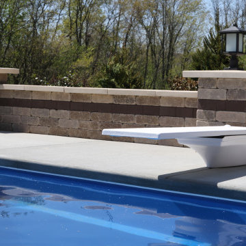 American Pool and Spa
The Monolith Features:
1. SPACIOUS SHALLOW END BENCH SEAT
Want to take a break from the action and hang out with some friends? This seating area is properly sized to accommodate the whole family.
2. LARGE SHALLOW END FOR SOCIALIZING AND PLAY
The problem with most deep end pools is the tiny shallow end, which is where most people gather.
3. OPEN POOL INTERIOR
Want plenty of room to float and frolic? The rectangular design of the Monolith provides ample room for all of your pool activities.
4. DEEP END SEATS / EXIT POINTS
When using deep end pools, people love to jump in, exit and repeat. The deep end seats of the Monolith provide a place to get in and out, as well as take a rest.
5. MASSIVE 8' 6" DEEP END
Looking for lots of water? The Monolith is 6" deeper than most of the fiberglass deep end pools on the market.
6. AUTOMATIC COVER FRIENDLY
The rectangular design of the Monolith allows cover tracks to be hidden beneath the pool coping, protecting them.
 Vetter Architects
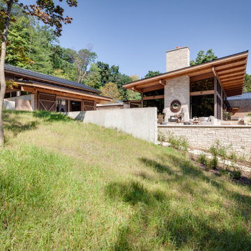
The owners requested a Private Resort that catered to their love for entertaining friends and family, a place where 2 people would feel just as comfortable as 42. Located on the western edge of a Wisconsin lake, the site provides a range of natural ecosystems from forest to prairie to water, allowing the building to have a more complex relationship with the lake - not merely creating large unencumbered views in that direction. The gently sloping site to the lake is atypical in many ways to most lakeside lots - as its main trajectory is not directly to the lake views - allowing for focus to be pushed in other directions such as a courtyard and into a nearby forest.
The biggest challenge was accommodating the large scale gathering spaces, while not overwhelming the natural setting with a single massive structure. Our solution was found in breaking down the scale of the project into digestible pieces and organizing them in a Camp-like collection of elements:
- Main Lodge: Providing the proper entry to the Camp and a Mess Hall
- Bunk House: A communal sleeping area and social space.
- Party Barn: An entertainment facility that opens directly on to a swimming pool & outdoor room.
- Guest Cottages: A series of smaller guest quarters.
- Private Quarters: The owners private space that directly links to the Main Lodge.
These elements are joined by a series green roof connectors, that merge with the landscape and allow the out buildings to retain their own identity. This Camp feel was further magnified through the materiality - specifically the use of Doug Fir, creating a modern Northwoods setting that is warm and inviting. The use of local limestone and poured concrete walls ground the buildings to the sloping site and serve as a cradle for the wood volumes that rest gently on them. The connections between these materials provided an opportunity to add a delicate reading to the spaces and re-enforce the camp aesthetic.
The oscillation between large communal spaces and private, intimate zones is explored on the interior and in the outdoor rooms. From the large courtyard to the private balcony - accommodating a variety of opportunities to engage the landscape was at the heart of the concept.
Overview
Chenequa, WI
Size
Total Finished Area: 9,543 sf
Completion Date
May 2013
Services
Architecture, Landscape Architecture, Interior Design
 Ground One Landscape Design + Build
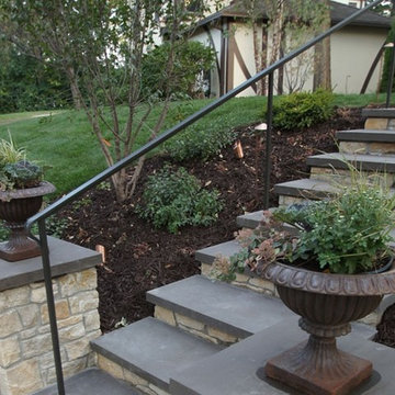
The challenge with this design was to address three different doors that lead from the house to the backyard. They all exit at different levels, and the existing grade of the backyard was higher than one of these door sills. In order to make sure to provide proper drainage from all these points, the design solution was to create a sunken courtyard with long curving stone steps that lift you up to the rest of the backyard. Materials were repeated for a remote fire pit patio and new front walk, stairs and architectural pillars. The deceptively simple design creates a quiet, elegant connection with the unique cottage architecture of the home.
 MA Peterson Design Build, Inc.
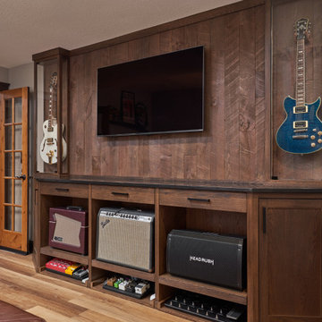
This beautiful floor-to-ceiling guitar humidor was custom-built to display the homeowner's guitar collection while maintaining proper humidity for the instruments. The custom music cabinetry makes storing and using music equipment a breeze with drawers that slide in and out for use. Both music spaces use warm lighting and rustic wood elements to tie in seamlessly with the rest of the lower level's aesthetic, enhancing the experience of space.
20