
Search results for "Quality extends" in Home Design Ideas
 STUDIO TASHIMA
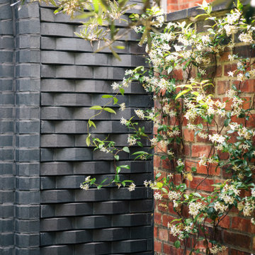
Keyes Road is a two-storey, semi-detached red brick house dating to around 1890-1910. The focus of our work was on the ground floor where we were asked to improve the layout and use of the main living areas of the house, for an active family of four. Important to the design was to maximise the quality and amount of light as well as connection to the garden and flow to the rest of the house.
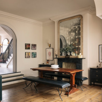
Our proposal introduces three single storey extensions, comprising a central, large space that extends the main outrigger of the house. To each side are smaller volumes, affording a full width kitchen. While defining a series of discrete volumes, it was important for us to ensure that the kitchen, living, family and dining rooms that are interconnecting and continuous. The result is a big space punctuated by a series of differently sized arches, defining spaces to ensure their intimacy.
It was important for our client to have a sense of warmth and comfort - perhaps not dissimilar to the qualities of a hotel lobby. The colour scheme of the rooms are warm white painted plaster, natural wood flooring with black, bronze and brass accents. Indirect and carefully placed light fittings pulls together the atmosphere of the rooms - particularly in the evenings.
Externally, we felt it important to differentiate the extensions from the main house by using a dark, charcoal grey brick. This sets up a contrasting yet complimentary relationship to the rich red coloured brick house. The facets of the brick play with light and depth as do the graduated brick arches.
During the design process, we grappled with floor levels, the direction of sunlight, and care to not encroach on the neighbouring properties. As the house is in a conservation area, we worked closely with our trusted planning advisor. Throughout, we pursued a sensitive design strategy, using pitched roofs, matching materials and careful detailing. Internally, many of the original details are intact. This has enabled us to create an eclectic ensemble of elements, colours and materials varying in age and period.

 Studio 804
The 722 Ash Street residence consists of a 1500 sf primary house with a contiguous 500 sf accessory dwelling. The project is set in the rich culture of North Lawrence, its rear property line abuts the Lawrence levee trail which runs for nine miles along the north bank of the Kansas River.
North Lawrence is known for its quality soil, large trees, curbless streets and random size parcels before it breaks into larger farms further from the urban center. It is built on the typical orthogonal grid of American development, but it represents the older growth of the city prior to urban planners and zoning regulations. The rumble of freight trains and farm trucks in the shadows of the towering grain elevators are only blocks away. It is home to many who enjoy being only a bridge crossing away from Lawrence’s vibrant downtown but are far enough away to maintain their independence from many of the restrictions on living near the historic district. They can work in their large gardens and toiling in their garages and shops in a manner more rural than urban.
The house on 722 Ash St. is imbued with the character of North Lawrence and the Levee Trail area. The design was inspired by the Midwestern farmstead vernacular of the region. These timeless vernacular qualities house all the accommodations necessary for modern, sustainable living. A unique feature of this house is the Accessory Dwelling Unit permitted in the zoning district. It is a small separate residence on the same lot that can be used for income property or for extended family members. It also supports the city of Lawrence’s goals of increased density close to downtown rather than continued sprawl into the countryside.
The buildings use technology and common-sense design to reduce the building’s footprint and assure the owners low energy use and costs. A 4.9 Kw solar collection system is located on the only south facing gable and the super insulated envelopes (r-62 roof and r-35 walls) of all three forms easily exceeds the standards. Studio 804 continues their long standing pattern of maintaining the highest level of sustainable design while remaining contextually sensitive to the surrounding community. This house, like every Studio 804 project since 2008, is USGBC LEED Platinum Certified.

 Barley|Pfeiffer Architecture
Our inspiration for this home was an updated and refined approach to Frank Lloyd Wright’s “Prairie-style”; one that responds well to the harsh Central Texas heat. By DESIGN we achieved soft balanced and glare-free daylighting, comfortable temperatures via passive solar control measures, energy efficiency without reliance on maintenance-intensive Green “gizmos” and lower exterior maintenance.
The client’s desire for a healthy, comfortable and fun home to raise a young family and to accommodate extended visitor stays, while being environmentally responsible through “high performance” building attributes, was met. Harmonious response to the site’s micro-climate, excellent Indoor Air Quality, enhanced natural ventilation strategies, and an elegant bug-free semi-outdoor “living room” that connects one to the outdoors are a few examples of the architect’s approach to Green by Design that results in a home that exceeds the expectations of its owners.
Photo by Mark Adams Media
Find the right local pro for your project
 lavish
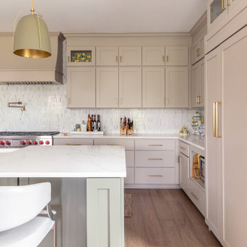
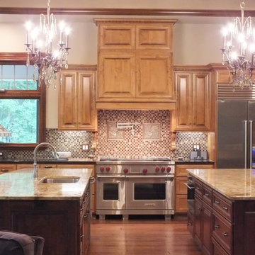
This stunning kitchen transformation proves that warm, earthy tones can be just as striking as classic white — and far more personal. The result is a sophisticated, chef-caliber space that feels layered, collected, and completely livable, with a color story rooted in nature and elevated by thoughtful material choices throughout.
The perimeter cabinetry is finished in a rich warm greige — that perfect blend of gray and beige that feels both current and timeless — running floor to ceiling with generous crown molding detail and brushed brass bar pulls that catch the light beautifully. The custom range hood, painted to match and finished with elegant curved molding, anchors the cooking wall and creates an architectural focal point that draws the eye immediately upon entering the room.
The central island makes a bold and confident design statement in a contrasting sage green, a color choice that bridges the warm cabinetry and cool marble-look quartz countertops with unexpected harmony. The island countertop — a striking Calacatta-style quartz with dramatic gold veining — extends across all perimeter surfaces, tying the entire kitchen together under one cohesive material story. A large white farmhouse apron-front sink sits within the island, paired with a brushed champagne bronze gooseneck faucet and matching pot filler above the range — hardware details that elevate the space from beautiful to truly bespoke.
The backsplash deserves its own moment: a full-field installation of a tone-on-tone marble mosaic tile in soft white, warm gray, and hints of gold runs wall to wall and floor to ceiling behind the range — a shimmering, textural surface that catches the light throughout the day and gives the kitchen an almost jewel-box quality up close. Three oversized sage green dome pendant lights with brass interiors and gold rods hang above the island, echoing the island color and creating a perfectly coordinated, designer-curated look.
The professional-grade Wolf dual-fuel range with signature red knobs commands the cooking wall — a statement appliance that signals serious culinary intent while adding a pop of bold color that energizes the otherwise soft palette. Panel-ready refrigerator cabinetry seamlessly integrates the appliance wall into the overall design, maintaining the clean, furniture-like quality of the custom cabinetry throughout.
The remodel extends into the adjacent family room, where a full fireplace surround tiled in the same marble mosaic as the kitchen backsplash creates a cohesive design thread between the two spaces. A warm wood mantel, linen drapery, and a mix of cognac leather and cream upholstery complete a sitting area that feels like a natural, harmonious extension of the kitchen beyond.
 lavish
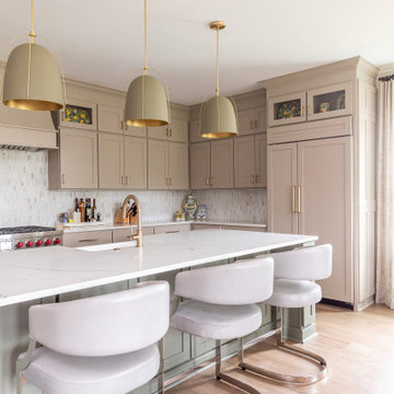
This stunning kitchen transformation proves that warm, earthy tones can be just as striking as classic white — and far more personal. The result is a sophisticated, chef-caliber space that feels layered, collected, and completely livable, with a color story rooted in nature and elevated by thoughtful material choices throughout.
The perimeter cabinetry is finished in a rich warm greige — that perfect blend of gray and beige that feels both current and timeless — running floor to ceiling with generous crown molding detail and brushed brass bar pulls that catch the light beautifully. The custom range hood, painted to match and finished with elegant curved molding, anchors the cooking wall and creates an architectural focal point that draws the eye immediately upon entering the room.
The central island makes a bold and confident design statement in a contrasting sage green, a color choice that bridges the warm cabinetry and cool marble-look quartz countertops with unexpected harmony. The island countertop — a striking Calacatta-style quartz with dramatic gold veining — extends across all perimeter surfaces, tying the entire kitchen together under one cohesive material story. A large white farmhouse apron-front sink sits within the island, paired with a brushed champagne bronze gooseneck faucet and matching pot filler above the range — hardware details that elevate the space from beautiful to truly bespoke.
The backsplash deserves its own moment: a full-field installation of a tone-on-tone marble mosaic tile in soft white, warm gray, and hints of gold runs wall to wall and floor to ceiling behind the range — a shimmering, textural surface that catches the light throughout the day and gives the kitchen an almost jewel-box quality up close. Three oversized sage green dome pendant lights with brass interiors and gold rods hang above the island, echoing the island color and creating a perfectly coordinated, designer-curated look.
The professional-grade Wolf dual-fuel range with signature red knobs commands the cooking wall — a statement appliance that signals serious culinary intent while adding a pop of bold color that energizes the otherwise soft palette. Panel-ready refrigerator cabinetry seamlessly integrates the appliance wall into the overall design, maintaining the clean, furniture-like quality of the custom cabinetry throughout.
The remodel extends into the adjacent family room, where a full fireplace surround tiled in the same marble mosaic as the kitchen backsplash creates a cohesive design thread between the two spaces. A warm wood mantel, linen drapery, and a mix of cognac leather and cream upholstery complete a sitting area that feels like a natural, harmonious extension of the kitchen beyond.
 Barley|Pfeiffer Architecture
Our inspiration for this home was an updated and refined approach to Frank Lloyd Wright’s “Prairie-style”; one that responds well to the harsh Central Texas heat. By DESIGN we achieved soft balanced and glare-free daylighting, comfortable temperatures via passive solar control measures, energy efficiency without reliance on maintenance-intensive Green “gizmos” and lower exterior maintenance.
The client’s desire for a healthy, comfortable and fun home to raise a young family and to accommodate extended visitor stays, while being environmentally responsible through “high performance” building attributes, was met. Harmonious response to the site’s micro-climate, excellent Indoor Air Quality, enhanced natural ventilation strategies, and an elegant bug-free semi-outdoor “living room” that connects one to the outdoors are a few examples of the architect’s approach to Green by Design that results in a home that exceeds the expectations of its owners.
Photo by Mark Adams Media
 Barley|Pfeiffer Architecture
Our inspiration for this home was an updated and refined approach to Frank Lloyd Wright’s “Prairie-style”; one that responds well to the harsh Central Texas heat. By DESIGN we achieved soft balanced and glare-free daylighting, comfortable temperatures via passive solar control measures, energy efficiency without reliance on maintenance-intensive Green “gizmos” and lower exterior maintenance.
The client’s desire for a healthy, comfortable and fun home to raise a young family and to accommodate extended visitor stays, while being environmentally responsible through “high performance” building attributes, was met. Harmonious response to the site’s micro-climate, excellent Indoor Air Quality, enhanced natural ventilation strategies, and an elegant bug-free semi-outdoor “living room” that connects one to the outdoors are a few examples of the architect’s approach to Green by Design that results in a home that exceeds the expectations of its owners.
Photo by Mark Adams Media


 Amanda Martocchio Architecture
Michael Moran/OTTO photography
We took a predictable suburban spec house and transformed it into a unique home of enduring value and family-centered design. The existing footprint was expanded where it needed it most: in the family and kitchen area, creating a large square room with open views to a protected nature preserve abutting the property. An unexpected glass canopy and teak entry door are clues that what lies beyond is hardly commonplace.
The design challenge was to infuse modern-day functionality and architectural quality into a spec house. Working in partnership with Gary Cruz Studio, we designed the pared down, art-filled interiors with the goal of creating comfortable, purposeful living environments. We also sought to integrate the existing pool and rear deck into the overall building design, extending the usable space outside as a screened-in porch, a dining terrace, and a seating area around a stone fire pit.
 Barley|Pfeiffer Architecture
Our inspiration for this home was an updated and refined approach to Frank Lloyd Wright’s “Prairie-style”; one that responds well to the harsh Central Texas heat. By DESIGN we achieved soft balanced and glare-free daylighting, comfortable temperatures via passive solar control measures, energy efficiency without reliance on maintenance-intensive Green “gizmos” and lower exterior maintenance.
The client’s desire for a healthy, comfortable and fun home to raise a young family and to accommodate extended visitor stays, while being environmentally responsible through “high performance” building attributes, was met. Harmonious response to the site’s micro-climate, excellent Indoor Air Quality, enhanced natural ventilation strategies, and an elegant bug-free semi-outdoor “living room” that connects one to the outdoors are a few examples of the architect’s approach to Green by Design that results in a home that exceeds the expectations of its owners.
Photo by Mark Adams Media
 Interior Pros - Design Studio
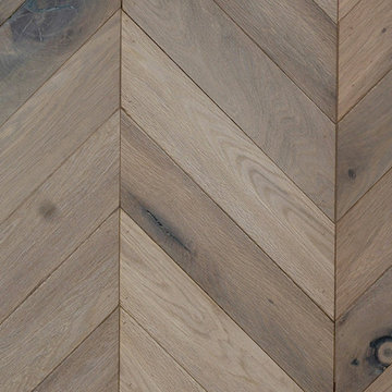
The grey trend has evolved in the last twelve months. Nowadays browns, beige and a touch of grey are in demand. Greige is the new buzzword.
Heavier hand scraped or contoured products, the rage that started around 2005 has taken a back seat in most areas, while a softer wire brushed "ceruse effect" seen mostly on White Oak has been remarkably strong showing no effects of becoming “dated” like the others mentioned.
Ceruse Color Possibilities
There are numerous color combinations to the "cerused" process with the most popular being white or off white. This design trend in hardwood flooring can have darker gray white oak with a mild ceruse off white effect.
There are limitless possibilities in either a prefinished hardwood floor or with what we can create for you in a custom on-site finished hardwood floor.
If something suits your fancy, contact us and we can work on creating just the look and sense of style you are looking for.

 Modern Mecca™ | Los Angeles Home Staging
photos by Everett Fenton Gidley
Minimalist deck photo in Los Angeles
Minimalist deck photo in Los Angeles

 User
Located on a narrow site between a local access road and Lake Washington, this three-level home is designed to take full advantage its lakefront views. Built on an undersized lot, quality of space was a priority over a large footprint. With an integrated garage, living, dining, master suite, guestrooms and office areas are compact into one-half floors. Most of the third level is designed to be multi-use.
The ground floor level contains storage and a mother-in-law suite.
Modern in style, with touches of traditional forms and materials of Tuscany, the home features a double height living/dining with a slide-fold door allowing the exterior deck to become an extension of the interior living room. A custom designed interior tile floor inlaid with re-claimed wood creates a warm, well-crafted feel to the interior. Owner designed and built barn doors extends that same sensibility to the upper level.
Exterior landscape design incorporates a large outdoor ground level patio with a beautiful pervious paver system, plantings designed to enhance the shoreline, integrates existing access to the boat dock and lake.
 Studio 804
The 722 Ash Street residence consists of a 1500 sf primary house with a contiguous 500 sf accessory dwelling. The project is set in the rich culture of North Lawrence, its rear property line abuts the Lawrence levee trail which runs for nine miles along the north bank of the Kansas River.
North Lawrence is known for its quality soil, large trees, curbless streets and random size parcels before it breaks into larger farms further from the urban center. It is built on the typical orthogonal grid of American development, but it represents the older growth of the city prior to urban planners and zoning regulations. The rumble of freight trains and farm trucks in the shadows of the towering grain elevators are only blocks away. It is home to many who enjoy being only a bridge crossing away from Lawrence’s vibrant downtown but are far enough away to maintain their independence from many of the restrictions on living near the historic district. They can work in their large gardens and toiling in their garages and shops in a manner more rural than urban.
The house on 722 Ash St. is imbued with the character of North Lawrence and the Levee Trail area. The design was inspired by the Midwestern farmstead vernacular of the region. These timeless vernacular qualities house all the accommodations necessary for modern, sustainable living. A unique feature of this house is the Accessory Dwelling Unit permitted in the zoning district. It is a small separate residence on the same lot that can be used for income property or for extended family members. It also supports the city of Lawrence’s goals of increased density close to downtown rather than continued sprawl into the countryside.
The buildings use technology and common-sense design to reduce the building’s footprint and assure the owners low energy use and costs. A 4.9 Kw solar collection system is located on the only south facing gable and the super insulated envelopes (r-62 roof and r-35 walls) of all three forms easily exceeds the standards. Studio 804 continues their long standing pattern of maintaining the highest level of sustainable design while remaining contextually sensitive to the surrounding community. This house, like every Studio 804 project since 2008, is USGBC LEED Platinum Certified.
Sponsored
Fredericksburg, OH

High Point Cabinets
Columbus' Experienced Custom Cabinet Builder | 4x Best of Houzz Winner
 Barley|Pfeiffer Architecture
Our inspiration for this home was an updated and refined approach to Frank Lloyd Wright’s “Prairie-style”; one that responds well to the harsh Central Texas heat. By DESIGN we achieved soft balanced and glare-free daylighting, comfortable temperatures via passive solar control measures, energy efficiency without reliance on maintenance-intensive Green “gizmos” and lower exterior maintenance.
The client’s desire for a healthy, comfortable and fun home to raise a young family and to accommodate extended visitor stays, while being environmentally responsible through “high performance” building attributes, was met. Harmonious response to the site’s micro-climate, excellent Indoor Air Quality, enhanced natural ventilation strategies, and an elegant bug-free semi-outdoor “living room” that connects one to the outdoors are a few examples of the architect’s approach to Green by Design that results in a home that exceeds the expectations of its owners.
Photo by Mark Adams Media
 STUDIO TASHIMA
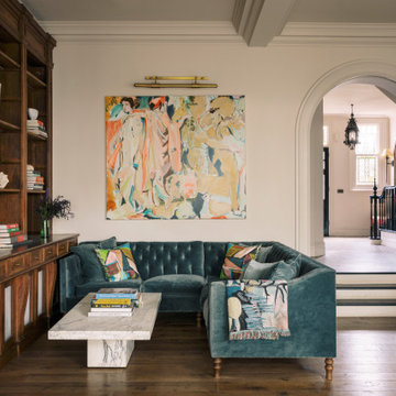
Keyes Road is a two-storey, semi-detached red brick house dating to around 1890-1910. The focus of our work was on the ground floor where we were asked to improve the layout and use of the main living areas of the house, for an active family of four. Important to the design was to maximise the quality and amount of light as well as connection to the garden and flow to the rest of the house.
Our proposal introduces three single storey extensions, comprising a central, large space that extends the main outrigger of the house. To each side are smaller volumes, affording a full width kitchen. While defining a series of discrete volumes, it was important for us to ensure that the kitchen, living, family and dining rooms that are interconnecting and continuous. The result is a big space punctuated by a series of differently sized arches, defining spaces to ensure their intimacy.
It was important for our client to have a sense of warmth and comfort - perhaps not dissimilar to the qualities of a hotel lobby. The colour scheme of the rooms are warm white painted plaster, natural wood flooring with black, bronze and brass accents. Indirect and carefully placed light fittings pulls together the atmosphere of the rooms - particularly in the evenings.
Externally, we felt it important to differentiate the extensions from the main house by using a dark, charcoal grey brick. This sets up a contrasting yet complimentary relationship to the rich red coloured brick house. The facets of the brick play with light and depth as do the graduated brick arches.
During the design process, we grappled with floor levels, the direction of sunlight, and care to not encroach on the neighbouring properties. As the house is in a conservation area, we worked closely with our trusted planning advisor. Throughout, we pursued a sensitive design strategy, using pitched roofs, matching materials and careful detailing. Internally, many of the original details are intact. This has enabled us to create an eclectic ensemble of elements, colours and materials varying in age and period.
 Barley|Pfeiffer Architecture
Our inspiration for this home was an updated and refined approach to Frank Lloyd Wright’s “Prairie-style”; one that responds well to the harsh Central Texas heat. By DESIGN we achieved soft balanced and glare-free daylighting, comfortable temperatures via passive solar control measures, energy efficiency without reliance on maintenance-intensive Green “gizmos” and lower exterior maintenance.
The client’s desire for a healthy, comfortable and fun home to raise a young family and to accommodate extended visitor stays, while being environmentally responsible through “high performance” building attributes, was met. Harmonious response to the site’s micro-climate, excellent Indoor Air Quality, enhanced natural ventilation strategies, and an elegant bug-free semi-outdoor “living room” that connects one to the outdoors are a few examples of the architect’s approach to Green by Design that results in a home that exceeds the expectations of its owners.
Photo by Mark Adams Media

 The Jack + Mare | Portland Design & Build
Split Level 1970 home of a young and active family of four. The main public spaces in this home were remodeled to create a fresh, clean look.
The Jack + Mare demo'd the kitchen and dining room down to studs and removed the wall between the kitchen/dining and living room to create an open concept space with a clean and fresh new kitchen and dining with ample storage. Now the family can all be together and enjoy one another's company even if mom or dad is busy in the kitchen prepping the next meal.
The custom white cabinets and the blue accent island (and walls) really give a nice clean and fun feel to the space. The island has a gorgeous local solid slab of wood on top. A local artisan salvaged and milled up the big leaf maple for this project. In fact, the tree was from the University of Portland's campus located right where the client once rode the bus to school when she was a child. So it's an extra special custom piece! (fun fact: there is a bullet lodged in the wood that is visible...we estimate it was shot into the tree 30-35 years ago!)
The 'public' spaces were given a brand new waterproof luxury vinyl wide plank tile. With 2 young daughters, a large golden retriever and elderly cat, the durable floor was a must.
project scope at quick glance:
- demo'd and rebuild kitchen and dining room.
- removed wall separating kitchen/dining and living room
- removed carpet and installed new flooring in public spaces
- removed stair carpet and gave fresh black and white paint
- painted all public spaces
- new hallway doorknob harware
- all new LED lighting (kitchen, dining, living room and hallway)
Jason Quigley Photography
Sponsored
Fredericksburg, OH
High Point Cabinets
Columbus' Experienced Custom Cabinet Builder | 4x Best of Houzz Winner

 The Handy Lion
The hall at the top of the stair was kept all white, with the master bed (left near off photo) dark gray with black and white artwork framed, the left bedroom, near a classic french country green (child's bed room) and the office at the end of the hall, a tan with yellow tones, more earthy than depicted by light. Each room with large picture windows and white framed and white horizontal blinds. And screens over half opening.
The master bath access on right (not shown) completed with blue and white floor river stone mosaic. Custom framed mirrors, a white tub, 2 restoration hardware wall cabinets, the shower surround, glass tile mosaic, a new black granite custom double sink with white bowls and light blue colormaching paint flecks in the black (not visible in the ebay link shown.) All new sink hardware and matching shower hardware have a delicate modern feel (follow the eBay link). The curtain was extended to increase open feel in a small space. A new toilet with top accent that matches the cabinets was included. And 3 utility shelves were added at the exterior shower edge. A linen closet is beyond the bath entrance on right. And custom closet knobs were added to walk in in master bed, additional master bed 2 door closet and 2 door white closet interiors. Cable and phone in all rooms. Special digital wall switches, with a timer on the babys room and master bath fan, with setting from 5 to 60 minutes to off - indicated by switch light.
 STUDIO TASHIMA
Keyes Road is a two-storey, semi-detached red brick house dating to around 1890-1910. The focus of our work was on the ground floor where we were asked to improve the layout and use of the main living areas of the house, for an active family of four. Important to the design was to maximise the quality and amount of light as well as connection to the garden and flow to the rest of the house.
Our proposal introduces three single storey extensions, comprising a central, large space that extends the main outrigger of the house. To each side are smaller volumes, affording a full width kitchen. While defining a series of discrete volumes, it was important for us to ensure that the kitchen, living, family and dining rooms that are interconnecting and continuous. The result is a big space punctuated by a series of differently sized arches, defining spaces to ensure their intimacy.
It was important for our client to have a sense of warmth and comfort - perhaps not dissimilar to the qualities of a hotel lobby. The colour scheme of the rooms are warm white painted plaster, natural wood flooring with black, bronze and brass accents. Indirect and carefully placed light fittings pulls together the atmosphere of the rooms - particularly in the evenings.
Externally, we felt it important to differentiate the extensions from the main house by using a dark, charcoal grey brick. This sets up a contrasting yet complimentary relationship to the rich red coloured brick house. The facets of the brick play with light and depth as do the graduated brick arches.
During the design process, we grappled with floor levels, the direction of sunlight, and care to not encroach on the neighbouring properties. As the house is in a conservation area, we worked closely with our trusted planning advisor. Throughout, we pursued a sensitive design strategy, using pitched roofs, matching materials and careful detailing. Internally, many of the original details are intact. This has enabled us to create an eclectic ensemble of elements, colours and materials varying in age and period.
 User
Located on a narrow site between a local access road and Lake Washington, this three-level home is designed to take full advantage its lakefront views. Built on an undersized lot, quality of space was a priority over a large footprint. With an integrated garage, living, dining, master suite, guestrooms and office areas are compact into one-half floors. Most of the third level is designed to be multi-use.
The ground floor level contains storage and a mother-in-law suite.
Modern in style, with touches of traditional forms and materials of Tuscany, the home features a double height living/dining with a slide-fold door allowing the exterior deck to become an extension of the interior living room. A custom designed interior tile floor inlaid with re-claimed wood creates a warm, well-crafted feel to the interior. Owner designed and built barn doors extends that same sensibility to the upper level.
Exterior landscape design incorporates a large outdoor ground level patio with a beautiful pervious paver system, plantings designed to enhance the shoreline, integrates existing access to the boat dock and lake.
65