
Search results for "Redtube same origin" in Home Design Ideas
 Alair Homes Plano
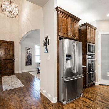
Our clients house was built in 2012, so it was not that outdated, it was just dark. The clients wanted to lighten the kitchen and create something that was their own, using more unique products. The master bath needed to be updated and they wanted the upstairs game room to be more functional for their family.
The original kitchen was very dark and all brown. The cabinets were stained dark brown, the countertops were a dark brown and black granite, with a beige backsplash. We kept the dark cabinets but lightened everything else. A new translucent frosted glass pantry door was installed to soften the feel of the kitchen. The main architecture in the kitchen stayed the same but the clients wanted to change the coffee bar into a wine bar, so we removed the upper cabinet door above a small cabinet and installed two X-style wine storage shelves instead. An undermount farm sink was installed with a 23” tall main faucet for more functionality. We replaced the chandelier over the island with a beautiful Arhaus Poppy large antique brass chandelier. Two new pendants were installed over the sink from West Elm with a much more modern feel than before, not to mention much brighter. The once dark backsplash was now a bright ocean honed marble mosaic 2”x4” a top the QM Calacatta Miel quartz countertops. We installed undercabinet lighting and added over-cabinet LED tape strip lighting to add even more light into the kitchen.
We basically gutted the Master bathroom and started from scratch. We demoed the shower walls, ceiling over tub/shower, demoed the countertops, plumbing fixtures, shutters over the tub and the wall tile and flooring. We reframed the vaulted ceiling over the shower and added an access panel in the water closet for a digital shower valve. A raised platform was added under the tub/shower for a shower slope to existing drain. The shower floor was Carrara Herringbone tile, accented with Bianco Venatino Honed marble and Metro White glossy ceramic 4”x16” tile on the walls. We then added a bench and a Kohler 8” rain showerhead to finish off the shower. The walk-in shower was sectioned off with a frameless clear anti-spot treated glass. The tub was not important to the clients, although they wanted to keep one for resale value. A Japanese soaker tub was installed, which the kids love! To finish off the master bath, the walls were painted with SW Agreeable Gray and the existing cabinets were painted SW Mega Greige for an updated look. Four Pottery Barn Mercer wall sconces were added between the new beautiful Distressed Silver leaf mirrors instead of the three existing over-mirror vanity bars that were originally there. QM Calacatta Miel countertops were installed which definitely brightened up the room!
Originally, the upstairs game room had nothing but a built-in bar in one corner. The clients wanted this to be more of a media room but still wanted to have a kitchenette upstairs. We had to remove the original plumbing and electrical and move it to where the new cabinets were. We installed 16’ of cabinets between the windows on one wall. Plank and Mill reclaimed barn wood plank veneers were used on the accent wall in between the cabinets as a backing for the wall mounted TV above the QM Calacatta Miel countertops. A kitchenette was installed to one end, housing a sink and a beverage fridge, so the clients can still have the best of both worlds. LED tape lighting was added above the cabinets for additional lighting. The clients love their updated rooms and feel that house really works for their family now.
Design/Remodel by Hatfield Builders & Remodelers | Photography by Versatile Imaging
 Centoni Restoration & Development, Inc.
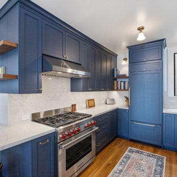
The same family had owned this elegant arts and crafts home for over 50 years and maintained many original architectural details – from art glass windows to hardware and interior decorative elements. Where the home was well cared for, major rooms needed modernization. The efficiency of the original kitchen and bathroom layout allowed for in-kind remodels.
DESIGN SOLUTION
The homeowners strived to maintain the original aesthetic of the arts and crafts home, utilized the extensive modern products available to renovate the kitchen and bathroom, and restored many original components.
Their discerning taste resulted in the efficiently designed kitchen, with modern appliances and room for casual eating. A slight reorganization of the bathroom fixtures provided a more efficient use of space and increased storage.
Their discerning taste resulted in the efficiently designed kitchen, with modern appliances and room for casual eating.
A slight reorganization of the bathroom fixtures provided a more efficient use of space and increased storage.
 Paradise Found Construction
The homes in Heritage Hills in Chapel Hill, NC are representative of the popularity and explosive growth of American Home Ownership that occurred during the economic expansion that followed the end of WW II. They were designed and built to foster the benefits and sense of “community”, where families could come together and share theirs and their children’s lives. They are typically in very desirable locations within their larger communities, and remodeling them with modern amenities, increasing the performance and efficiency of them, and having them Green Certified (independent third-party verified) makes them extremely attractive to buyers, and helps to raise other property values within the neighborhood.
Green Certified Remodeled Homes offer significant value and advantage in the marketplace over similar homes in their area, which is especially important as a new, younger era of home buyers enter the market. Current trends suggest that younger (as well as many “seasoned”) homeowners are interested in smaller, more efficient (and thus affordable) homes situated closer to shopping, their work, entertainment opportunities, and access to the economic and environmental benefits of mass transit.
These older homes also offer an additional value that is continuing to gain visibility and appreciation in the market place. They were built from lumber from slower-growth trees (denser and harder wood), and as such offer superior structural support compared to the same home built using lumber from today’s faster-growing (softer and less-dense wood) trees.
Robin and Kent had lived in their 2-story Gambrel Roof home in Heritage Hills since 1994. The house was structurally sound, due in large part to the old-growth (and denser) yellow pine that was used in its framing. They loved the quiet neighborhood, its sense of community and amenities, and their home. It suited their life-style and needs; and they had decided that they would remain in the home. It was showing its age, and was in need of general repairs and maintenance, and its energy, water, and indoor air quality performance was continuing to increase their ongoing cost of ownership.
Robin loved the screen porch that looked out on their private and nicely landscaped back yard, but she wanted to be able to use it in the colder months of the year. She was unsatisfied with the kitchen and the mud room / laundry room, and the darkness of other living spaces. A previous water leak in the laundry room had resulted in a large patch of mold that had compromised flooring, wall board, and insulation and contributed to the homes reduced indoor air quality.
The home lacked insulation in the crawl, and inadequate insulation in the attic. The single HVAC unit had been replaced a few years earlier with a more efficient unit, but with a single programmable thermostat control on the first floor and aging and un-insulated ducting, the second floor was often over-heated in the summer months.
The original wood windows had begun to deteriorate and were drafty and inefficient, and the original wood-burning fireplace was an open conduit for escaping conditioned air as well as an inlet for wood-smoke smelling air being pulled into the home. The siding had been replaced a few years earlier with a cement-fiber product, but the exterior wood trim was compromised and beginning to look unsightly. Its original architecture had been altered over the years in ways that presented ongoing maintenance and durability issues, as well as disrupting the elegance of the original design.
Kent has worked for over 30 years in the Environmental Sciences field, and is considered to be a national expert in understanding the sources of, and human exposure to pollutants in indoor environments. He had always been very conscious and cautious about the effects on indoor air quality that the construction, furnishings, and products used in home had on him and his family.
Project Goals
Increase the performance of their home by improving energy efficiency by at least 40% and lowering their natural gas and electric utility costs.
Increase the performance of their home by reducing water usage by at least 40% and lowering the water utility costs.
Increase the comfort of their home that was being compromised by an inadequate HVAC design, inadequate insulation, inefficient and compromised wood windows, and copious air intrusions and drafts.
Improve the healthiness of the homes indoor air quality that was being compromised by an open wood-burning fireplace, and prior water intrusion that had allowed colonies of mold to thrive.
Create a new Kitchen, Family Room, Home Office, Mudroom, and Laundry Room that featured some of the latest designs and trends and harmonized with the rest of the homes charm.
Increase the usefulness and aesthetics of the screened porch by creating a warm and inviting semi-conditioned 3-Season Room that extended the times during the year that it was comfortable.
Introduce day-lighting into areas of the home that were dark and uninviting.
Brighten and harmonize all of the interior finishes.
Protect and restore the exterior of the home with superior-performing products and finishes.
Achieve Gold Level Green Home Certification in conformance with the ICC 700-2012 National Green Building Standards (NGBS).
Find the right local pro for your project
 Paradise Found Construction
The homes in Heritage Hills in Chapel Hill, NC are representative of the popularity and explosive growth of American Home Ownership that occurred during the economic expansion that followed the end of WW II. They were designed and built to foster the benefits and sense of “community”, where families could come together and share theirs and their children’s lives. They are typically in very desirable locations within their larger communities, and remodeling them with modern amenities, increasing the performance and efficiency of them, and having them Green Certified (independent third-party verified) makes them extremely attractive to buyers, and helps to raise other property values within the neighborhood.
Green Certified Remodeled Homes offer significant value and advantage in the marketplace over similar homes in their area, which is especially important as a new, younger era of home buyers enter the market. Current trends suggest that younger (as well as many “seasoned”) homeowners are interested in smaller, more efficient (and thus affordable) homes situated closer to shopping, their work, entertainment opportunities, and access to the economic and environmental benefits of mass transit.
These older homes also offer an additional value that is continuing to gain visibility and appreciation in the market place. They were built from lumber from slower-growth trees (denser and harder wood), and as such offer superior structural support compared to the same home built using lumber from today’s faster-growing (softer and less-dense wood) trees.
Robin and Kent had lived in their 2-story Gambrel Roof home in Heritage Hills since 1994. The house was structurally sound, due in large part to the old-growth (and denser) yellow pine that was used in its framing. They loved the quiet neighborhood, its sense of community and amenities, and their home. It suited their life-style and needs; and they had decided that they would remain in the home. It was showing its age, and was in need of general repairs and maintenance, and its energy, water, and indoor air quality performance was continuing to increase their ongoing cost of ownership.
Robin loved the screen porch that looked out on their private and nicely landscaped back yard, but she wanted to be able to use it in the colder months of the year. She was unsatisfied with the kitchen and the mud room / laundry room, and the darkness of other living spaces. A previous water leak in the laundry room had resulted in a large patch of mold that had compromised flooring, wall board, and insulation and contributed to the homes reduced indoor air quality.
The home lacked insulation in the crawl, and inadequate insulation in the attic. The single HVAC unit had been replaced a few years earlier with a more efficient unit, but with a single programmable thermostat control on the first floor and aging and un-insulated ducting, the second floor was often over-heated in the summer months.
The original wood windows had begun to deteriorate and were drafty and inefficient, and the original wood-burning fireplace was an open conduit for escaping conditioned air as well as an inlet for wood-smoke smelling air being pulled into the home. The siding had been replaced a few years earlier with a cement-fiber product, but the exterior wood trim was compromised and beginning to look unsightly. Its original architecture had been altered over the years in ways that presented ongoing maintenance and durability issues, as well as disrupting the elegance of the original design.
Kent has worked for over 30 years in the Environmental Sciences field, and is considered to be a national expert in understanding the sources of, and human exposure to pollutants in indoor environments. He had always been very conscious and cautious about the effects on indoor air quality that the construction, furnishings, and products used in home had on him and his family.
Project Goals
Increase the performance of their home by improving energy efficiency by at least 40% and lowering their natural gas and electric utility costs.
Increase the performance of their home by reducing water usage by at least 40% and lowering the water utility costs.
Increase the comfort of their home that was being compromised by an inadequate HVAC design, inadequate insulation, inefficient and compromised wood windows, and copious air intrusions and drafts.
Improve the healthiness of the homes indoor air quality that was being compromised by an open wood-burning fireplace, and prior water intrusion that had allowed colonies of mold to thrive.
Create a new Kitchen, Family Room, Home Office, Mudroom, and Laundry Room that featured some of the latest designs and trends and harmonized with the rest of the homes charm.
Increase the usefulness and aesthetics of the screened porch by creating a warm and inviting semi-conditioned 3-Season Room that extended the times during the year that it was comfortable.
Introduce day-lighting into areas of the home that were dark and uninviting.
Brighten and harmonize all of the interior finishes.
Protect and restore the exterior of the home with superior-performing products and finishes.
Achieve Gold Level Green Home Certification in conformance with the ICC 700-2012 National Green Building Standards (NGBS).
 Fernanda Zulzke Interiores
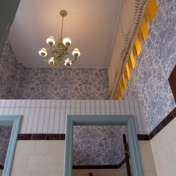
Fernanda Zulzke gifted São Paulo with an authentic experience by preserving the original 1920s tiles and architecture of the building. Many broken tiles were replaced, and missing ones were carefully sourced to breathe new life into a long-forgotten space. The floor tiles received the same care, though they posed an even greater challenge, as the original baseboard pieces could not be found even in the city’s largest tile archives. Beyond mere maintenance, the decoration aims to show visitors that history and its imperfections bring beauty, vitality, originality, and exclusivity to a space—a combination that can never be replicated, a luxury in its essence.
In the realm of restoration, the solid wood bathroom doors were personally tended to by Flávio Galli, a skilled designer and expert in raw materials, who followed the guidelines of the Parque da Água Branca manual. Four days of cleaning, sanding, and varnishing brought the doors back to life. In terms of carpentry, damaged baseboards and frames were crafted by Construverde using the building’s original wood—a true gift that Fernanda Zulzke was determined to offer the public and the park.
Completing the bathroom’s composition, imported wallpapers from Cordão Decor and a Roman curtain in cambric demonstrate the decorator’s ability to honor history while making bold, unexpected choices. Few can combine vintage, classic, and diverse colors and patterns in such a small space, transforming it into a light and fresh work of art, like the eucalyptus resting atop the marble and classic encyclopedias.
 Nathan Fell Architecture
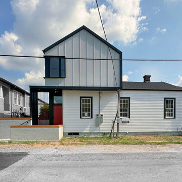
Camel Back in Black is the quintessential “mullet house,” which is the common name for a renovated historic home in the front (business) with a modern addition in the rear (party). In this case the existing structure was an early 20th century New Orleans Shotgun Duplex Home that was adapted to be shorter due to both site constraints and an existing carport addition, which was removed. The design strategy was to create a distinct new entry to the main unit of the home along the side of the property. This was achieved through a clear delineation of a modern massing of a second story addition (called a Camelback in New Orleans) with a roof that wraps to frame an exterior gate. The gate leads to a raised rear yard, which was filled in to be the same height as the main home to make it more of an extension of some of the public spaces rather than a small sunken pit, which can often be a lifeless space.
Many time you will see new Camelback additions in the city that take a more blended approach, but in this case because of the corner lot and the desire to create a prominent entry (along that side) a clear line is delineated between old and new. This was done intentionally to clearly represent the original form with appropriately renovate historic details true to the original, without creating a false sense of history through an addition that would have not represented a proportion that was standard for the time the original structure was built.
The existing home was the childhood dwelling of the owner, who inherited it years after it fell into disrepair. There was mold, rot and structural disrepair, but it was important to the owner that NFA preserved as much of the existing portions of the home as possible; so where there was flooring that could be preserved (and refinished) it was, where there were historic interior and exterior trim detailing that could be preserved it was and if not it was replicated in kind to the original. On the other hand, there were certain modern needs and updates that were desired and didn’t want the design to feel overly constrained by certain replicas of historic troupes. So, the addition and many of the interior finishes were intentionally contemporary.
 TaylorPro Design and Remodeling, Inc.
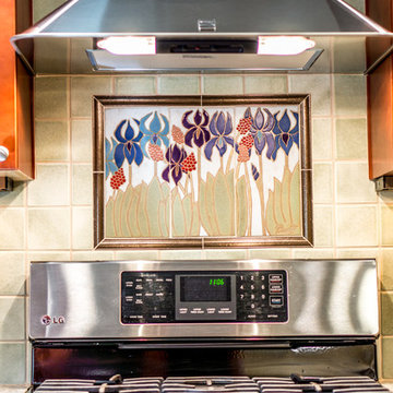
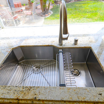
"TaylorPro remodeled our kitchen, replacing cabinets, countertops and appliances. Keeping with the same footprint of our original kitchen and keeping our original travertine floors, Kerry Taylor helped us select a palette of rich, natural colors and materials--mocha-maple glazed cabinets, handsome granite and polished travertine backsplash tiles--to create a warm and beautiful new kitchen. He offered excellent design suggestions for placements of cabinetry and appliances. He recommended and implemented window trim enhancements as well as paint color and lighting design that brought the kitchen and attached family room together with a modern and very warm look. He created a rich, textured backsplash behind the stovetop that enhances the modern stainless steel vent hood. We couldn't be more pleased with the character and design of the kitchen and family room suite.
To begin with, Kerry gave us a detailed estimate covering the likely costs of labor, cabinetry, granite, tile backsplash, construction materials and appliances. His estimate for labor, granite and tile turned out to be ""spot-on"" accurate. Much to our surprise, for example, the granite slabs we selected from Daltile turned out to be exactly the price Kerry had estimated when evaluating the level of materials we would likely install in our kitchen. Kerry kept to his original labor costs, to the penny. Each week, he provided us with an invoice that showed, in percentages, exactly how much labor had been performed that week and how much remained to be done in future weeks. The amounts he charged each week for his labor were exact percentages of the amount of labor his crew had performed to that point. Though these invoices invited us to do a little math to confirm the accuracy of these percentages, Kerry's figures were consistently accurate.
The only categories in which Kerry's original estimate did not conform to the actual costs were in the areas of supplies from Home Depot (needed for the remodeling) and supplies from paint and hardware stores (needed for painting). These materials ended up costing somewhat more that Kerry had estimated. However, Kerry did provide us with receipts for all of these supplies.
Kerry's cabinet man, Jerry, made a very workable design using pre-fabricated cabinets; he then customized the sizes of at least half of these cabinets to conform to the requirements of the center island, cooktop and pantry spaces. We are very happy with the quality of the cabinets. We found the installation expertise of Jerry's installer, Gil, to be top-rate. His installation achieved a custom look and all the cupboards and drawers worked flawlessly.
Kerry's crew, Jake, Randall and Kevin, were great guys to have on site. They respected our property (and our dog) and possessed both skill and integrity. They arrived daily at the time they specified and worked tirelessly to achieve what they set out to do. We couldn't have been happier with their work. Kerry was on site frequently to supervise and coordinate their work and the work of subcontractors.
The project went quickly and efficiently, and the final result was outstanding. We recommend TaylorPro very highly."
~ Judy & Ron C, Clients
Photo By: Kerry W. Taylor

Sponsored
Sunbury, OH

J.Holderby - Renovations
Franklin County's Leading General Contractors - 2X Best of Houzz!
 Alair Homes Plano
Our clients house was built in 2012, so it was not that outdated, it was just dark. The clients wanted to lighten the kitchen and create something that was their own, using more unique products. The master bath needed to be updated and they wanted the upstairs game room to be more functional for their family.
The original kitchen was very dark and all brown. The cabinets were stained dark brown, the countertops were a dark brown and black granite, with a beige backsplash. We kept the dark cabinets but lightened everything else. A new translucent frosted glass pantry door was installed to soften the feel of the kitchen. The main architecture in the kitchen stayed the same but the clients wanted to change the coffee bar into a wine bar, so we removed the upper cabinet door above a small cabinet and installed two X-style wine storage shelves instead. An undermount farm sink was installed with a 23” tall main faucet for more functionality. We replaced the chandelier over the island with a beautiful Arhaus Poppy large antique brass chandelier. Two new pendants were installed over the sink from West Elm with a much more modern feel than before, not to mention much brighter. The once dark backsplash was now a bright ocean honed marble mosaic 2”x4” a top the QM Calacatta Miel quartz countertops. We installed undercabinet lighting and added over-cabinet LED tape strip lighting to add even more light into the kitchen.
We basically gutted the Master bathroom and started from scratch. We demoed the shower walls, ceiling over tub/shower, demoed the countertops, plumbing fixtures, shutters over the tub and the wall tile and flooring. We reframed the vaulted ceiling over the shower and added an access panel in the water closet for a digital shower valve. A raised platform was added under the tub/shower for a shower slope to existing drain. The shower floor was Carrara Herringbone tile, accented with Bianco Venatino Honed marble and Metro White glossy ceramic 4”x16” tile on the walls. We then added a bench and a Kohler 8” rain showerhead to finish off the shower. The walk-in shower was sectioned off with a frameless clear anti-spot treated glass. The tub was not important to the clients, although they wanted to keep one for resale value. A Japanese soaker tub was installed, which the kids love! To finish off the master bath, the walls were painted with SW Agreeable Gray and the existing cabinets were painted SW Mega Greige for an updated look. Four Pottery Barn Mercer wall sconces were added between the new beautiful Distressed Silver leaf mirrors instead of the three existing over-mirror vanity bars that were originally there. QM Calacatta Miel countertops were installed which definitely brightened up the room!
Originally, the upstairs game room had nothing but a built-in bar in one corner. The clients wanted this to be more of a media room but still wanted to have a kitchenette upstairs. We had to remove the original plumbing and electrical and move it to where the new cabinets were. We installed 16’ of cabinets between the windows on one wall. Plank and Mill reclaimed barn wood plank veneers were used on the accent wall in between the cabinets as a backing for the wall mounted TV above the QM Calacatta Miel countertops. A kitchenette was installed to one end, housing a sink and a beverage fridge, so the clients can still have the best of both worlds. LED tape lighting was added above the cabinets for additional lighting. The clients love their updated rooms and feel that house really works for their family now.
Design/Remodel by Hatfield Builders & Remodelers | Photography by Versatile Imaging
 Klopf Architecture
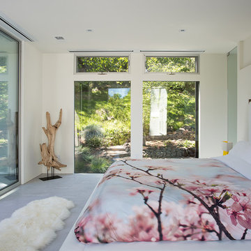
Sebastian and Tanja DiGrande's quest for natural light and open, modern design led them to Klopf Architecture in San Francisco. Working hand-in-hand with homeowner/designer Tanja DiGrande, Klopf collaborated on a modern addition to the rear of a traditional-style home. The idea was to depart from the original style completely to draw a distinction between the original house and any later additions, as well as observe a very minimal, clean, gallery-like modern style against which changing daylight, art, furniture, and of course the people provide the color and motion.
With its dark gray stuccoed walls, dark steel railing, and floor-to-ceiling windows, the exterior of the addition is at the same time an open, modern box as well as a receding volume that acts almost as a backdrop for the house, receding visually out of respect for the original home. From the interior, windows bring in nature and views from all around the lush property. They also allow views of the original house. Up on the roof deck the views magnify. The owners use a boom and crank to bring up food and drinks when entertaining!
Inside, the simple clean-lined spaces showcase the couple’s minimal, modern taste. The open bathroom epitomizes the clean, minimal style of the addition. On the exterior, steel elements bring a more industrial modern feeling to the addition from the rear.
Klopf Architecture Project Team: John Klopf, AIA, Geoff Campen, and Angela Todorova
Co-Designer: Tanja DiGrande
Contractor: Jose Ramirez & J-C General Contractors Inc.
Photography ©2015 Mariko Reed
Location: Orinda, CA
Year completed: 2014
 Centoni Restoration & Development, Inc.
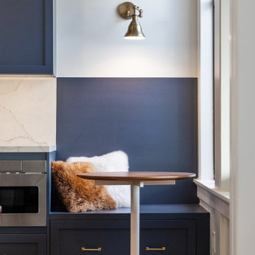
The same family had owned this elegant arts and crafts home for over 50 years and maintained many original architectural details – from art glass windows to hardware and interior decorative elements. Where the home was well cared for, major rooms needed modernization. The efficiency of the original kitchen and bathroom layout allowed for in-kind remodels.
DESIGN SOLUTION
The homeowners strived to maintain the original aesthetic of the arts and crafts home, utilized the extensive modern products available to renovate the kitchen and bathroom, and restored many original components.
Their discerning taste resulted in the efficiently designed kitchen, with modern appliances and room for casual eating. A slight reorganization of the bathroom fixtures provided a more efficient use of space and increased storage.
Their discerning taste resulted in the efficiently designed kitchen, with modern appliances and room for casual eating.
A slight reorganization of the bathroom fixtures provided a more efficient use of space and increased storage.
 Paradise Found Construction
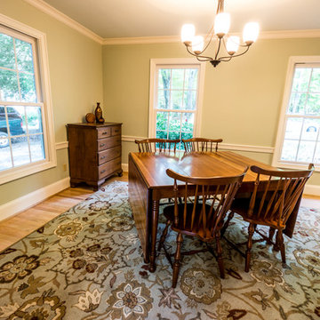
The homes in Heritage Hills in Chapel Hill, NC are representative of the popularity and explosive growth of American Home Ownership that occurred during the economic expansion that followed the end of WW II. They were designed and built to foster the benefits and sense of “community”, where families could come together and share theirs and their children’s lives. They are typically in very desirable locations within their larger communities, and remodeling them with modern amenities, increasing the performance and efficiency of them, and having them Green Certified (independent third-party verified) makes them extremely attractive to buyers, and helps to raise other property values within the neighborhood.
Green Certified Remodeled Homes offer significant value and advantage in the marketplace over similar homes in their area, which is especially important as a new, younger era of home buyers enter the market. Current trends suggest that younger (as well as many “seasoned”) homeowners are interested in smaller, more efficient (and thus affordable) homes situated closer to shopping, their work, entertainment opportunities, and access to the economic and environmental benefits of mass transit.
These older homes also offer an additional value that is continuing to gain visibility and appreciation in the market place. They were built from lumber from slower-growth trees (denser and harder wood), and as such offer superior structural support compared to the same home built using lumber from today’s faster-growing (softer and less-dense wood) trees.
Robin and Kent had lived in their 2-story Gambrel Roof home in Heritage Hills since 1994. The house was structurally sound, due in large part to the old-growth (and denser) yellow pine that was used in its framing. They loved the quiet neighborhood, its sense of community and amenities, and their home. It suited their life-style and needs; and they had decided that they would remain in the home. It was showing its age, and was in need of general repairs and maintenance, and its energy, water, and indoor air quality performance was continuing to increase their ongoing cost of ownership.
Robin loved the screen porch that looked out on their private and nicely landscaped back yard, but she wanted to be able to use it in the colder months of the year. She was unsatisfied with the kitchen and the mud room / laundry room, and the darkness of other living spaces. A previous water leak in the laundry room had resulted in a large patch of mold that had compromised flooring, wall board, and insulation and contributed to the homes reduced indoor air quality.
The home lacked insulation in the crawl, and inadequate insulation in the attic. The single HVAC unit had been replaced a few years earlier with a more efficient unit, but with a single programmable thermostat control on the first floor and aging and un-insulated ducting, the second floor was often over-heated in the summer months.
The original wood windows had begun to deteriorate and were drafty and inefficient, and the original wood-burning fireplace was an open conduit for escaping conditioned air as well as an inlet for wood-smoke smelling air being pulled into the home. The siding had been replaced a few years earlier with a cement-fiber product, but the exterior wood trim was compromised and beginning to look unsightly. Its original architecture had been altered over the years in ways that presented ongoing maintenance and durability issues, as well as disrupting the elegance of the original design.
Kent has worked for over 30 years in the Environmental Sciences field, and is considered to be a national expert in understanding the sources of, and human exposure to pollutants in indoor environments. He had always been very conscious and cautious about the effects on indoor air quality that the construction, furnishings, and products used in home had on him and his family.
Project Goals
Increase the performance of their home by improving energy efficiency by at least 40% and lowering their natural gas and electric utility costs.
Increase the performance of their home by reducing water usage by at least 40% and lowering the water utility costs.
Increase the comfort of their home that was being compromised by an inadequate HVAC design, inadequate insulation, inefficient and compromised wood windows, and copious air intrusions and drafts.
Improve the healthiness of the homes indoor air quality that was being compromised by an open wood-burning fireplace, and prior water intrusion that had allowed colonies of mold to thrive.
Create a new Kitchen, Family Room, Home Office, Mudroom, and Laundry Room that featured some of the latest designs and trends and harmonized with the rest of the homes charm.
Increase the usefulness and aesthetics of the screened porch by creating a warm and inviting semi-conditioned 3-Season Room that extended the times during the year that it was comfortable.
Introduce day-lighting into areas of the home that were dark and uninviting.
Brighten and harmonize all of the interior finishes.
Protect and restore the exterior of the home with superior-performing products and finishes.
Achieve Gold Level Green Home Certification in conformance with the ICC 700-2012 National Green Building Standards (NGBS).
 Klopf Architecture
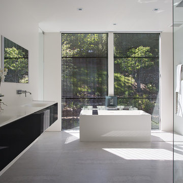
Sebastian and Tanja DiGrande's quest for natural light and open, modern design led them to Klopf Architecture in San Francisco. Working hand-in-hand with homeowner/designer Tanja DiGrande, Klopf collaborated on a modern addition to the rear of a traditional-style home. The idea was to depart from the original style completely to draw a distinction between the original house and any later additions, as well as observe a very minimal, clean, gallery-like modern style against which changing daylight, art, furniture, and of course the people provide the color and motion.
With its dark gray stuccoed walls, dark steel railing, and floor-to-ceiling windows, the exterior of the addition is at the same time an open, modern box as well as a receding volume that acts almost as a backdrop for the house, receding visually out of respect for the original home. From the interior, windows bring in nature and views from all around the lush property. They also allow views of the original house. Up on the roof deck the views magnify. The owners use a boom and crank to bring up food and drinks when entertaining!
Inside, the simple clean-lined spaces showcase the couple’s minimal, modern taste. The open bathroom epitomizes the clean, minimal style of the addition. On the exterior, steel elements bring a more industrial modern feeling to the addition from the rear.
Klopf Architecture Project Team: John Klopf, AIA, Geoff Campen, and Angela Todorova
Co-Designer: Tanja DiGrande
Contractor: Jose Ramirez & J-C General Contractors Inc.
Photography ©2015 Mariko Reed
Location: Orinda, CA
Year completed: 2014
 Klopf Architecture
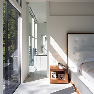
Sebastian and Tanja DiGrande's quest for natural light and open, modern design led them to Klopf Architecture in San Francisco. Working hand-in-hand with homeowner/designer Tanja DiGrande, Klopf collaborated on a modern addition to the rear of a traditional-style home. The idea was to depart from the original style completely to draw a distinction between the original house and any later additions, as well as observe a very minimal, clean, gallery-like modern style against which changing daylight, art, furniture, and of course the people provide the color and motion.
With its dark gray stuccoed walls, dark steel railing, and floor-to-ceiling windows, the exterior of the addition is at the same time an open, modern box as well as a receding volume that acts almost as a backdrop for the house, receding visually out of respect for the original home. From the interior, windows bring in nature and views from all around the lush property. They also allow views of the original house. Up on the roof deck the views magnify. The owners use a boom and crank to bring up food and drinks when entertaining!
Inside, the simple clean-lined spaces showcase the couple’s minimal, modern taste. The open bathroom epitomizes the clean, minimal style of the addition. On the exterior, steel elements bring a more industrial modern feeling to the addition from the rear.
Klopf Architecture Project Team: John Klopf, AIA, Geoff Campen, and Angela Todorova
Co-Designer: Tanja DiGrande
Contractor: Jose Ramirez & J-C General Contractors Inc.
Photography ©2015 Mariko Reed
Location: Orinda, CA
Year completed: 2014

Sponsored
Columbus, OH

Wannemacher Interiors
Customized Award-Winning Interior Design Solutions in Franklin Cnty OH
 The Myers Touch
In collaboration with the client’s architect, AR Design the layout of the kitchen was already in place. However, upon meeting the client it was clear she wanted a ‘wow’ island, symmetry in design and plenty of functional storage.
As well as a contemporary, family-friendly space it was also important the space that still respected the heritage of the house. The original walls of the property had many angled walls and featured some tight spaces, so careful consideration of SieMatic's cabinetry choices was given to ensure maximum functionality in those spaces. After much consideration, The Myers Touch specified SieMatic’s SC10 Cabinetry in a Provence Oak Laminate finish which was placed in a framed-style at the rear wall.
The same cabinetry was specified for under the island to create contrast with the new and original material features in the space. In order for the family to keep the kitchen uncluttered, careful planning of internal storage systems was considered in the form of using SieMatic’s internal Drawer boxes and their MultiMatic internal storage system which were used to store smaller items such as spices and sauces, as well whilst providing space for slide-out drawers and storage baskets.
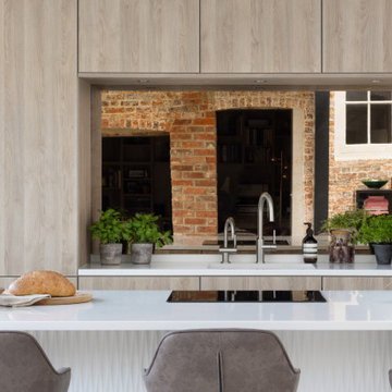
To ensure an elegant yet ‘wow’ factor central island, The Myers Touch combined contrasting textures by using 30mm Silestone Eternal Calacatta natural stone, polished worktops with ‘waterfall island’ edges and a Corian solid surface back panel. The distinctive geometric patterned Corian panel in Cameo White looks particularly spectacular at night when the owner's turn on the architectural-toned lighting under the island.
Appliances chosen for the island included a sophisticated Elica Illusion extractor hood so it could be totally integrated in the new architectural space without visual distraction, a Siemens iQ500 Induction Hob with touch-slide control and a Caple Under-counter Wine cabinet.
To maximise every inch of the new space, and to ensure the owners had a place for everything, The Myers Touch also used additional cabinetry and storage options in the island such as extra deep drawers to store saucepans, cutlery, and everyday crockery.
The eye-catching Antique-bronze mirrored splashback not only helps to provide the illusion of extra space, but reinforces family ‘togetherness’ as it reflects and links the rear of the kitchen ‘snug’ area where family members can sit and relax or work when not in the main kitchen extension area.
The original toned brickwork and 18th Century steel windows in the original part of the extension also helps to tell the story about the older part of the house which now juxtaposes to the new, contemporary kitchen living extension. A handy door was also included in the extension which leads to the garage on the main road for family convenience and over-flow storage.
Photography by Paul Craig (Reproduction of image by request only - joy@bakerpr.co.uk)
 Klopf Architecture
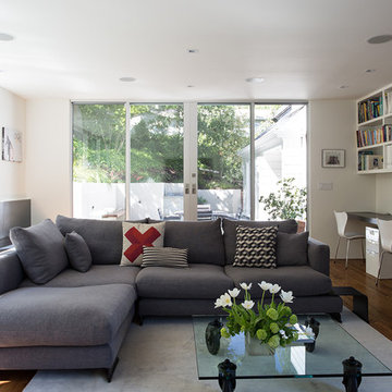
Sebastian and Tanja DiGrande's quest for natural light and open, modern design led them to Klopf Architecture in San Francisco. Working hand-in-hand with homeowner/designer Tanja DiGrande, Klopf collaborated on a modern addition to the rear of a traditional-style home. The idea was to depart from the original style completely to draw a distinction between the original house and any later additions, as well as observe a very minimal, clean, gallery-like modern style against which changing daylight, art, furniture, and of course the people provide the color and motion.
With its dark gray stuccoed walls, dark steel railing, and floor-to-ceiling windows, the exterior of the addition is at the same time an open, modern box as well as a receding volume that acts almost as a backdrop for the house, receding visually out of respect for the original home. From the interior, windows bring in nature and views from all around the lush property. They also allow views of the original house. Up on the roof deck the views magnify. The owners use a boom and crank to bring up food and drinks when entertaining!
Inside, the simple clean-lined spaces showcase the couple’s minimal, modern taste. The open bathroom epitomizes the clean, minimal style of the addition. On the exterior, steel elements bring a more industrial modern feeling to the addition from the rear.
Klopf Architecture Project Team: John Klopf, AIA, Geoff Campen, and Angela Todorova
Co-Designer: Tanja DiGrande
Contractor: Jose Ramirez & J-C General Contractors Inc.
Photography ©2015 Mariko Reed
Location: Orinda, CA
Year completed: 2014
 TaylorPro Design and Remodeling, Inc.
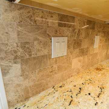
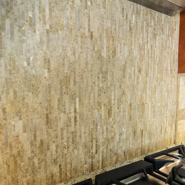
"TaylorPro remodeled our kitchen, replacing cabinets, countertops and appliances. Keeping with the same footprint of our original kitchen and keeping our original travertine floors, Kerry Taylor helped us select a palette of rich, natural colors and materials--mocha-maple glazed cabinets, handsome granite and polished travertine backsplash tiles--to create a warm and beautiful new kitchen. He offered excellent design suggestions for placements of cabinetry and appliances. He recommended and implemented window trim enhancements as well as paint color and lighting design that brought the kitchen and attached family room together with a modern and very warm look. He created a rich, textured backsplash behind the stovetop that enhances the modern stainless steel vent hood. We couldn't be more pleased with the character and design of the kitchen and family room suite.
To begin with, Kerry gave us a detailed estimate covering the likely costs of labor, cabinetry, granite, tile backsplash, construction materials and appliances. His estimate for labor, granite and tile turned out to be ""spot-on"" accurate. Much to our surprise, for example, the granite slabs we selected from Daltile turned out to be exactly the price Kerry had estimated when evaluating the level of materials we would likely install in our kitchen. Kerry kept to his original labor costs, to the penny. Each week, he provided us with an invoice that showed, in percentages, exactly how much labor had been performed that week and how much remained to be done in future weeks. The amounts he charged each week for his labor were exact percentages of the amount of labor his crew had performed to that point. Though these invoices invited us to do a little math to confirm the accuracy of these percentages, Kerry's figures were consistently accurate.
The only categories in which Kerry's original estimate did not conform to the actual costs were in the areas of supplies from Home Depot (needed for the remodeling) and supplies from paint and hardware stores (needed for painting). These materials ended up costing somewhat more that Kerry had estimated. However, Kerry did provide us with receipts for all of these supplies.
Kerry's cabinet man, Jerry, made a very workable design using pre-fabricated cabinets; he then customized the sizes of at least half of these cabinets to conform to the requirements of the center island, cooktop and pantry spaces. We are very happy with the quality of the cabinets. We found the installation expertise of Jerry's installer, Gil, to be top-rate. His installation achieved a custom look and all the cupboards and drawers worked flawlessly.
Kerry's crew, Jake, Randall and Kevin, were great guys to have on site. They respected our property (and our dog) and possessed both skill and integrity. They arrived daily at the time they specified and worked tirelessly to achieve what they set out to do. We couldn't have been happier with their work. Kerry was on site frequently to supervise and coordinate their work and the work of subcontractors.
The project went quickly and efficiently, and the final result was outstanding. We recommend TaylorPro very highly."
~ Judy & Ron C, Clients
Photo By: Kerry W. Taylor
 TaylorPro Design and Remodeling, Inc.
"TaylorPro remodeled our kitchen, replacing cabinets, countertops and appliances. Keeping with the same footprint of our original kitchen and keeping our original travertine floors, Kerry Taylor helped us select a palette of rich, natural colors and materials--mocha-maple glazed cabinets, handsome granite and polished travertine backsplash tiles--to create a warm and beautiful new kitchen. He offered excellent design suggestions for placements of cabinetry and appliances. He recommended and implemented window trim enhancements as well as paint color and lighting design that brought the kitchen and attached family room together with a modern and very warm look. He created a rich, textured backsplash behind the stovetop that enhances the modern stainless steel vent hood. We couldn't be more pleased with the character and design of the kitchen and family room suite.
To begin with, Kerry gave us a detailed estimate covering the likely costs of labor, cabinetry, granite, tile backsplash, construction materials and appliances. His estimate for labor, granite and tile turned out to be ""spot-on"" accurate. Much to our surprise, for example, the granite slabs we selected from Daltile turned out to be exactly the price Kerry had estimated when evaluating the level of materials we would likely install in our kitchen. Kerry kept to his original labor costs, to the penny. Each week, he provided us with an invoice that showed, in percentages, exactly how much labor had been performed that week and how much remained to be done in future weeks. The amounts he charged each week for his labor were exact percentages of the amount of labor his crew had performed to that point. Though these invoices invited us to do a little math to confirm the accuracy of these percentages, Kerry's figures were consistently accurate.
The only categories in which Kerry's original estimate did not conform to the actual costs were in the areas of supplies from Home Depot (needed for the remodeling) and supplies from paint and hardware stores (needed for painting). These materials ended up costing somewhat more that Kerry had estimated. However, Kerry did provide us with receipts for all of these supplies.
Kerry's cabinet man, Jerry, made a very workable design using pre-fabricated cabinets; he then customized the sizes of at least half of these cabinets to conform to the requirements of the center island, cooktop and pantry spaces. We are very happy with the quality of the cabinets. We found the installation expertise of Jerry's installer, Gil, to be top-rate. His installation achieved a custom look and all the cupboards and drawers worked flawlessly.
Kerry's crew, Jake, Randall and Kevin, were great guys to have on site. They respected our property (and our dog) and possessed both skill and integrity. They arrived daily at the time they specified and worked tirelessly to achieve what they set out to do. We couldn't have been happier with their work. Kerry was on site frequently to supervise and coordinate their work and the work of subcontractors.
The project went quickly and efficiently, and the final result was outstanding. We recommend TaylorPro very highly."
~ Judy & Ron C, Clients
Photo By: Kerry W. Taylor

Sponsored
Fredericksburg, OH

High Point Cabinets
Columbus' Experienced Custom Cabinet Builder | 4x Best of Houzz Winner
 Centoni Restoration & Development, Inc.
The same family had owned this elegant arts and crafts home for over 50 years and maintained many original architectural details – from art glass windows to hardware and interior decorative elements. Where the home was well cared for, major rooms needed modernization. The efficiency of the original kitchen and bathroom layout allowed for in-kind remodels.
DESIGN SOLUTION
The homeowners strived to maintain the original aesthetic of the arts and crafts home, utilized the extensive modern products available to renovate the kitchen and bathroom, and restored many original components.
Their discerning taste resulted in the efficiently designed kitchen, with modern appliances and room for casual eating. A slight reorganization of the bathroom fixtures provided a more efficient use of space and increased storage.
Their discerning taste resulted in the efficiently designed kitchen, with modern appliances and room for casual eating.
A slight reorganization of the bathroom fixtures provided a more efficient use of space and increased storage.
 Klopf Architecture
Sebastian and Tanja DiGrande's quest for natural light and open, modern design led them to Klopf Architecture in San Francisco. Working hand-in-hand with homeowner/designer Tanja DiGrande, Klopf collaborated on a modern addition to the rear of a traditional-style home. The idea was to depart from the original style completely to draw a distinction between the original house and any later additions, as well as observe a very minimal, clean, gallery-like modern style against which changing daylight, art, furniture, and of course the people provide the color and motion.
With its dark gray stuccoed walls, dark steel railing, and floor-to-ceiling windows, the exterior of the addition is at the same time an open, modern box as well as a receding volume that acts almost as a backdrop for the house, receding visually out of respect for the original home. From the interior, windows bring in nature and views from all around the lush property. They also allow views of the original house. Up on the roof deck the views magnify. The owners use a boom and crank to bring up food and drinks when entertaining!
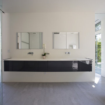
Inside, the simple clean-lined spaces showcase the couple’s minimal, modern taste. The open bathroom epitomizes the clean, minimal style of the addition. On the exterior, steel elements bring a more industrial modern feeling to the addition from the rear.
Klopf Architecture Project Team: John Klopf, AIA, Geoff Campen, and Angela Todorova
Co-Designer: Tanja DiGrande
Contractor: Jose Ramirez & J-C General Contractors Inc.
Photography ©2015 Mariko Reed
Location: Orinda, CA
Year completed: 2014
 Centoni Restoration & Development, Inc.
The same family had owned this elegant arts and crafts home for over 50 years and maintained many original architectural details – from art glass windows to hardware and interior decorative elements. Where the home was well cared for, major rooms needed modernization. The efficiency of the original kitchen and bathroom layout allowed for in-kind remodels.
DESIGN SOLUTION
The homeowners strived to maintain the original aesthetic of the arts and crafts home, utilized the extensive modern products available to renovate the kitchen and bathroom, and restored many original components.
Their discerning taste resulted in the efficiently designed kitchen, with modern appliances and room for casual eating. A slight reorganization of the bathroom fixtures provided a more efficient use of space and increased storage.
Their discerning taste resulted in the efficiently designed kitchen, with modern appliances and room for casual eating.
A slight reorganization of the bathroom fixtures provided a more efficient use of space and increased storage.
48