
Search results for "Reduce changed" in Home Design Ideas

 Nathan Taylor for Obelisk Home
The interior of the home went from Colonial to Classic Lodge without changing the footprint of the home. Columns were removed, fur downs removed that defined space, fireplace relocated, kitchen layout and direction changed, breakfast room and sitting room flip flopped, study reduced in size, entry to master bedroom changed, master suite completely re-arranged and enlarged, custom hand railing designed to open up stairwell, hardwood added to stairs, solid knotty alder 8’ doors added, knotty alder crown moldings added, reclaimed beamed ceiling grid, tongue and groove ceiling in kitchen, knotty alder cabinetry, leather finish to granite, seeded glass insets, custom door to panty to showcase an antique stained glass window from childhood church, custom doors and handles made for study entry, shredded straw added to wall texture, custom glazing done to all walls, wood floor remnants created an antique quilt pattern for the back wall of the powder bath, custom wall treatment created by designer, and a mixture of new and antique furnishing were added, all to create a warm, yet lived in feeling for this special family.
A new central stone wall reversed with an over scaled fireplace and reclaimed flooring from the East became the anchor for this level of the home. Removing all the “divisions” of space and using a unified surface made unused rooms, part of the daily living for this family. The desire to entertain large group in a unified space, yet still feel like you are in a cozy environment was the driving force for removing divisions of space.
Photos by Randy Colwell

 Designing Interiors Inc
Marina Storm
Home gym - mid-sized contemporary gray floor home gym idea in Chicago with gray walls
Home gym - mid-sized contemporary gray floor home gym idea in Chicago with gray walls
 Ke Design Collective Inc.
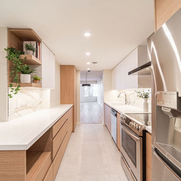
A complete two bath & kitchen renovation in a condo. Client wanted a larger kitchen area and better layout for bathrooms. We removed a wall near the entrance and extended the kitchen with additional cabinetry and storage area. Laundry room was reduced to accommodate the larger kitchen.
The shared and primary bathrooms were gutted and fully remodeled as well. Enlarged shower enclosure in shared bath for more space. Layout of primary bathroom was changed for better accessibility and flow in the area. Vanity and shower was relocated to create a more spacious and inviting environment.
Client didn’t like the current floors, we replaced it with luxury vinyl planks for durability.
Find the right local pro for your project

 CaliScape Landscape Services
While the Southern California drought is keeping homeowners water usage to a minimum, there are an abundance of plants that thrive on minimal water. A combination of drip irrigation systems and drought tolerant plants can keep your exterior spaces green and beautiful as well as water efficient. This image features our design a few months down the road. With the addition of a few spring flowers, this front yard is officially ready for the Spring and Summer season.
 Ke Design Collective Inc.
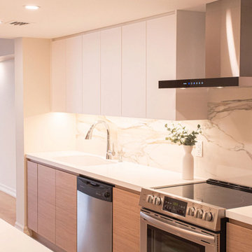
A complete two bath & kitchen renovation in a condo. Client wanted a larger kitchen area and better layout for bathrooms. We removed a wall near the entrance and extended the kitchen with additional cabinetry and storage area. Laundry room was reduced to accommodate the larger kitchen.
The shared and primary bathrooms were gutted and fully remodeled as well. Enlarged shower enclosure in shared bath for more space. Layout of primary bathroom was changed for better accessibility and flow in the area. Vanity and shower was relocated to create a more spacious and inviting environment.
Client didn’t like the current floors, we replaced it with luxury vinyl planks for durability.

 Mottram Architecture
Timber frame homes offer unique challenges during a remodel. What often makes them beautiful and attractive to most homeowners, also makes them challenging for space requirements.
Context: The lovely couple that owned this home were struggling with some interesting floor plan challenges that just didn't work for their family. The loved the beautiful timbers and woodwork of their home, but the dramatically sloping ceilings on the second floor, particularly in the bathroom, just didn't work for this 1 1/2 bath home. Needing to use the skylight to approach the toilet was a less then ideal scenario. Although the bathroom footprint was more then adequate, the sloped ceiling only made half of the space useable. Check out the Before/After post on our blog to see the photos of the house pre-renovation. As much as they loved all the wood features in their home, another challenge they had was light. The wood ceiling made everything inside the house darker, even with a fantastic array of south facing windows, there were spaces in the home that felt dark and small. When they contacted us they wanted to know how could they make their brighter and more inviting, were there solutions to the 2nd floor sloped ceiling issues, and if they were going to do all of this work, how could they make their home more comfortable and efficient. A nagging water leak in the upstairs bathroom spurred them into action and here is how we solved their dilemma.
Conclusion: First, we added a little dormer to the rear of the house so we could get full headroom in nearly all of the upstairs bathroom! Then we decided to extend that dormer one more timber bay over to create a walk in closet with natural light and plenty of space. Since we were contemplating energy efficiency, we resolved a nagging issue that is present in a lot of timber frame construction, air tightness. Commonly found in timber frame construction, fiberglass insulation is installed in the rafter bays and board ceilings are installed over top. Unfortunately, board ceilings are anything but air tight, and fiberglass insulation needs to be in an airtight cavity for maximum effectiveness. So we were able to solve two issues at the same time for this homeowner. We removed the board ceiling and fiberglass insulation, we dense packed the rafter bays with cellulose insulation, and installed sheetrock in place of the boards. The boards were salvaged for re-use by the homeowner, and the space and light quality was dramatically improved. Some may think that losing the board ceiling took something away from the space, but what you'll see in the pictures is that it highly accentuates the heavy timbers and really makes them stand out in a beautiful way. Now with this added airtightness, better insulation, and brighter space, the homeowner hardly runs their wood stove, and it's so quiet in the space, an added bonus from changing the insulation. It became necessary to also add a sheetrock ceiling to the living room to hide the plumbing from the new bathroom layout above. Changing this ceiling gave the homeowner some real quality lighting that was lacking in the living room before. The brighter ceiling and new lighting layout completely transforms the living room into a space you want to hang out, even though the layout didn't change at all. When the homeowner saw the finished spaces she said "I can't believe this is my house, I want to live in this house"
Energy Efficiency: I touched a little on the efficiency above, but like all projects done with Mottram Architecture, we always want to leave you with a little extra. Timber frame construction with board ceilings and fiberglass insulation are notoriously leaky! If you want to know what we think about fiberglass insulation, check our our blog post on Why Fiberglass Insulation Sucks. By installing cellulose insulation and covering it with sheetrock we were able to greatly reduce the heat flowing out of this home. It not only improves cashflow it improves the comfort level in the space. Who wants to sit in their living room and feel a draft? Let us remind you, we are not saying cellulose insulation is an air barrier, we use the sheetrock to help with that, but it does significantly reduce the air flow over fiberglass insulation. And when we reduce the airflow, we reduce the heat flow. And when we reduce the heat flow, we reduce the need to re-heat that drafty air from outside. When it comes to energy efficiency the first and best place to start is air infiltration. We greatly reduced the air infiltration with the new insulation, but we also added a hat and warm boots. What I mean by that is, we improved the insulation in the roof, and we installed insulation in the basement. Maybe it's a silly analogy, but when you think about keeping warm, we always start with the hat and boots! With sustainability in mind, the next project will be to add a deck to the front of this house with rain catchment barrels from the metal roof. They are planning to plant a garden in the spring and the rain catchment system will help to irrigate the new garden.
Builder: East Shore Builders
Photographer: Michael Eric Berube

 ZeroEnergy Design
This renovated brick rowhome in Boston’s South End offers a modern aesthetic within a historic structure, creative use of space, exceptional thermal comfort, a reduced carbon footprint, and a passive stream of income.
DESIGN PRIORITIES. The goals for the project were clear - design the primary unit to accommodate the family’s modern lifestyle, rework the layout to create a desirable rental unit, improve thermal comfort and introduce a modern aesthetic. We designed the street-level entry as a shared entrance for both the primary and rental unit. The family uses it as their everyday entrance - we planned for bike storage and an open mudroom with bench and shoe storage to facilitate the change from shoes to slippers or bare feet as they enter their home. On the main level, we expanded the kitchen into the dining room to create an eat-in space with generous counter space and storage, as well as a comfortable connection to the living space. The second floor serves as master suite for the couple - a bedroom with a walk-in-closet and ensuite bathroom, and an adjacent study, with refinished original pumpkin pine floors. The upper floor, aside from a guest bedroom, is the child's domain with interconnected spaces for sleeping, work and play. In the play space, which can be separated from the work space with new translucent sliding doors, we incorporated recreational features inspired by adventurous and competitive television shows, at their son’s request.
MODERN MEETS TRADITIONAL. We left the historic front facade of the building largely unchanged - the security bars were removed from the windows and the single pane windows were replaced with higher performing historic replicas. We designed the interior and rear facade with a vision of warm modernism, weaving in the notable period features. Each element was either restored or reinterpreted to blend with the modern aesthetic. The detailed ceiling in the living space, for example, has a new matte monochromatic finish, and the wood stairs are covered in a dark grey floor paint, whereas the mahogany doors were simply refinished. New wide plank wood flooring with a neutral finish, floor-to-ceiling casework, and bold splashes of color in wall paint and tile, and oversized high-performance windows (on the rear facade) round out the modern aesthetic.
RENTAL INCOME. The existing rowhome was zoned for a 2-family dwelling but included an undesirable, single-floor studio apartment at the garden level with low ceiling heights and questionable emergency egress. In order to increase the quality and quantity of space in the rental unit, we reimagined it as a two-floor, 1 or 2 bedroom, 2 bathroom apartment with a modern aesthetic, increased ceiling height on the lowest level and provided an in-unit washer/dryer. The apartment was listed with Jackie O'Connor Real Estate and rented immediately, providing the owners with a source of passive income.
ENCLOSURE WITH BENEFITS. The homeowners sought a minimal carbon footprint, enabled by their urban location and lifestyle decisions, paired with the benefits of a high-performance home. The extent of the renovation allowed us to implement a deep energy retrofit (DER) to address air tightness, insulation, and high-performance windows. The historic front facade is insulated from the interior, while the rear facade is insulated on the exterior. Together with these building enclosure improvements, we designed an HVAC system comprised of continuous fresh air ventilation, and an efficient, all-electric heating and cooling system to decouple the house from natural gas. This strategy provides optimal thermal comfort and indoor air quality, improved acoustic isolation from street noise and neighbors, as well as a further reduced carbon footprint. We also took measures to prepare the roof for future solar panels, for when the South End neighborhood’s aging electrical infrastructure is upgraded to allow them.
URBAN LIVING. The desirable neighborhood location allows the both the homeowners and tenant to walk, bike, and use public transportation to access the city, while each charging their respective plug-in electric cars behind the building to travel greater distances.
OVERALL. The understated rowhouse is now ready for another century of urban living, offering the owners comfort and convenience as they live life as an expression of their values.
Eric Roth Photo
Sponsored
Fredericksburg, OH

High Point Cabinets
Columbus' Experienced Custom Cabinet Builder | 4x Best of Houzz Winner
 Nathan Taylor for Obelisk Home
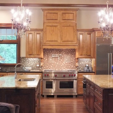
The interior of the home went from Colonial to Classic Lodge without changing the footprint of the home. Columns were removed, fur downs removed that defined space, fireplace relocated, kitchen layout and direction changed, breakfast room and sitting room flip flopped, study reduced in size, entry to master bedroom changed, master suite completely re-arranged and enlarged, custom hand railing designed to open up stairwell, hardwood added to stairs, solid knotty alder 8’ doors added, knotty alder crown moldings added, reclaimed beamed ceiling grid, tongue and groove ceiling in kitchen, knotty alder cabinetry, leather finish to granite, seeded glass insets, custom door to panty to showcase an antique stained glass window from childhood church, custom doors and handles made for study entry, shredded straw added to wall texture, custom glazing done to all walls, wood floor remnants created an antique quilt pattern for the back wall of the powder bath, custom wall treatment created by designer, and a mixture of new and antique furnishing were added, all to create a warm, yet lived in feeling for this special family.
A new central stone wall reversed with an over scaled fireplace and reclaimed flooring from the East became the anchor for this level of the home. Removing all the “divisions” of space and using a unified surface made unused rooms, part of the daily living for this family. The desire to entertain large group in a unified space, yet still feel like you are in a cozy environment was the driving force for removing divisions of space.
Photos by Randy Colwell

 Topnotch Design Studio
Sleek modern update to a 1998 stately brick colonial home. this kitchen features beautiful white painted stacked flush inset cabinets that accentuate the 10 ft ceilings, sleek flush installed appliances, a two tier island where everyone can gather, and a wine tower for entertaining.

 Carlton Edwards
The Cherry Road project is a humble yet striking example of how small changes can have a big impact. A meaningful project as the final room to be renovated in this house, thus our completion aligned with the family’s move-in. The kitchen posed a number of problems the design worked to remedy. Such as an existing window oriented the room towards a neighboring driveway. The initial design move sought to reorganize the space internally, focusing the view from the sink back through the house to the pool and courtyard beyond. This simple repositioning allowed the range to center on the opposite wall, flanked by two windows that reduce direct views to the driveway while increasing the natural light of the space.
Opposite that opening to the dining room, we created a new custom hutch that has the upper doors bypass doors incorporate an antique mirror, then led they magnified the light and view opposite side of the room. The ceilings we were confined to eight foot four, so we wanted to create as much verticality as possible. All the cabinetry was designed to go to the ceiling, incorporating a simple coat mold at the ceiling. The west wall of the kitchen is primarily floor-to-ceiling storage behind paneled doors. So the refrigeration and freezers are fully integrated.
The island has a custom steel base with hammered legs, with a natural wax finish on it. The top is soapstone and incorporates an integral drain board in the kitchen sink. We did custom bar stools with steel bases and upholstered seats. At the range, we incorporated stainless steel countertops to integrate with the range itself, to make that more seamless flow. The edge detail is historic from the 1930s.
There is a concealed sort of office for the homeowner behind custom, bi-folding panel doors. So it can be closed and totally concealed, or opened up and engaged with the kitchen.
In the office area, which was a former pantry, we repurposed a granite marble top that was on the former island. Then the walls have a grass cloth wall covering, which is pinnable, so the homeowner can display photographs, calendars, and schedules.

 Home Infatuation
This illuminated outdoor planter is available with LED lighting in multiple colors or a style with a fluorescent bulb that displays only white light.
It has a molded planting basin to reduce the amount of soil needed and water reservoir that filters water to the plant roots for up to three months. (Water reservoir is not available in the 54'' and 68'' high planters).
The LED lighted version will display white, red, green, blue, light blue, pink or yellow color. The colors can be changed with the included remote control. Only the fluorescent style is available in the 54''H and 68''H pots.
Both lighting styles use 120V current and come with a 10' cord.
They are made of rotationally molded of 100% recyclable polyethylene and resistant to extreme heat, cold and UV.
 Mottram Architecture
Timber frame homes offer unique challenges during a remodel. What often makes them beautiful and attractive to most homeowners, also makes them challenging for space requirements.
Context: The lovely couple that owned this home were struggling with some interesting floor plan challenges that just didn't work for their family. The loved the beautiful timbers and woodwork of their home, but the dramatically sloping ceilings on the second floor, particularly in the bathroom, just didn't work for this 1 1/2 bath home. Needing to use the skylight to approach the toilet was a less then ideal scenario. Although the bathroom footprint was more then adequate, the sloped ceiling only made half of the space useable. Check out the Before/After post on our blog to see the photos of the house pre-renovation. As much as they loved all the wood features in their home, another challenge they had was light. The wood ceiling made everything inside the house darker, even with a fantastic array of south facing windows, there were spaces in the home that felt dark and small. When they contacted us they wanted to know how could they make their brighter and more inviting, were there solutions to the 2nd floor sloped ceiling issues, and if they were going to do all of this work, how could they make their home more comfortable and efficient. A nagging water leak in the upstairs bathroom spurred them into action and here is how we solved their dilemma.
Conclusion: First, we added a little dormer to the rear of the house so we could get full headroom in nearly all of the upstairs bathroom! Then we decided to extend that dormer one more timber bay over to create a walk in closet with natural light and plenty of space. Since we were contemplating energy efficiency, we resolved a nagging issue that is present in a lot of timber frame construction, air tightness. Commonly found in timber frame construction, fiberglass insulation is installed in the rafter bays and board ceilings are installed over top. Unfortunately, board ceilings are anything but air tight, and fiberglass insulation needs to be in an airtight cavity for maximum effectiveness. So we were able to solve two issues at the same time for this homeowner. We removed the board ceiling and fiberglass insulation, we dense packed the rafter bays with cellulose insulation, and installed sheetrock in place of the boards. The boards were salvaged for re-use by the homeowner, and the space and light quality was dramatically improved. Some may think that losing the board ceiling took something away from the space, but what you'll see in the pictures is that it highly accentuates the heavy timbers and really makes them stand out in a beautiful way. Now with this added airtightness, better insulation, and brighter space, the homeowner hardly runs their wood stove, and it's so quiet in the space, an added bonus from changing the insulation. It became necessary to also add a sheetrock ceiling to the living room to hide the plumbing from the new bathroom layout above. Changing this ceiling gave the homeowner some real quality lighting that was lacking in the living room before. The brighter ceiling and new lighting layout completely transforms the living room into a space you want to hang out, even though the layout didn't change at all. When the homeowner saw the finished spaces she said "I can't believe this is my house, I want to live in this house"
Energy Efficiency: I touched a little on the efficiency above, but like all projects done with Mottram Architecture, we always want to leave you with a little extra. Timber frame construction with board ceilings and fiberglass insulation are notoriously leaky! If you want to know what we think about fiberglass insulation, check our our blog post on Why Fiberglass Insulation Sucks. By installing cellulose insulation and covering it with sheetrock we were able to greatly reduce the heat flowing out of this home. It not only improves cashflow it improves the comfort level in the space. Who wants to sit in their living room and feel a draft? Let us remind you, we are not saying cellulose insulation is an air barrier, we use the sheetrock to help with that, but it does significantly reduce the air flow over fiberglass insulation. And when we reduce the airflow, we reduce the heat flow. And when we reduce the heat flow, we reduce the need to re-heat that drafty air from outside. When it comes to energy efficiency the first and best place to start is air infiltration. We greatly reduced the air infiltration with the new insulation, but we also added a hat and warm boots. What I mean by that is, we improved the insulation in the roof, and we installed insulation in the basement. Maybe it's a silly analogy, but when you think about keeping warm, we always start with the hat and boots! With sustainability in mind, the next project will be to add a deck to the front of this house with rain catchment barrels from the metal roof. They are planning to plant a garden in the spring and the rain catchment system will help to irrigate the new garden.
Builder: East Shore Builders
Photographer: Michael Eric Berube
 Robert M. Cain, Architect
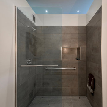
Daylighting with clerestories and solar tubes reduce daytime lighting requirements for baths and dressing areas
Inspiration for a mid-sized modern master gray tile and porcelain tile porcelain tile, gray floor and single-sink walk-in shower remodel in Atlanta with flat-panel cabinets, gray cabinets, white walls, an integrated sink, quartz countertops, white countertops and a built-in vanity
Inspiration for a mid-sized modern master gray tile and porcelain tile porcelain tile, gray floor and single-sink walk-in shower remodel in Atlanta with flat-panel cabinets, gray cabinets, white walls, an integrated sink, quartz countertops, white countertops and a built-in vanity
 Lightpoint Designs
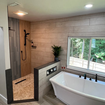
Thanks to a leaking shower pan liner in the home we purchased four years ago, we got to design a project for ourselves! By maximizing the existing space, we were able to add a gorgeous soaking tub and a two-person shower. While reusing our existing vanity, we added a new quartz countertop and hardware to give it an updated look. We also added in some extra fun treats such as color-changing LED recessed lights, sleek LED defogging mirrors, heated floors, and a heated towel rack. The unusual glass double doors were replaced with a large barn door to reduce wasted floor space when the door is open. The small arch top window was converted to a large horizontal sliding window to bring the outside in and natural materials in soft blue and beige tones create a spa-like oasis that we enjoy every time we enter.
 Ke Design Collective Inc.
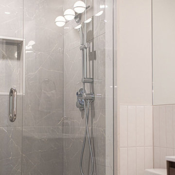
A complete two bath & kitchen renovation in a condo. Client wanted a larger kitchen area and better layout for bathrooms. We removed a wall near the entrance and extended the kitchen with additional cabinetry and storage area. Laundry room was reduced to accommodate the larger kitchen.
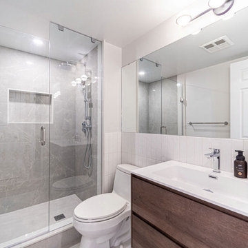
The shared and primary bathrooms were gutted and fully remodeled as well. Enlarged shower enclosure in shared bath for more space. Layout of primary bathroom was changed for better accessibility and flow in the area. Vanity and shower was relocated to create a more spacious and inviting environment.
Client didn’t like the current floors, we replaced it with luxury vinyl planks for durability.
 Ke Design Collective Inc.
A complete two bath & kitchen renovation in a condo. Client wanted a larger kitchen area and better layout for bathrooms. We removed a wall near the entrance and extended the kitchen with additional cabinetry and storage area. Laundry room was reduced to accommodate the larger kitchen.
The shared and primary bathrooms were gutted and fully remodeled as well. Enlarged shower enclosure in shared bath for more space. Layout of primary bathroom was changed for better accessibility and flow in the area. Vanity and shower was relocated to create a more spacious and inviting environment.
Client didn’t like the current floors, we replaced it with luxury vinyl planks for durability.

 Rylex Custom Cabinetry and Closets
As practical as it is stylish, this sophisticated master dressing room is filled with storage savvy elements. With today’s ever changing fashion, there is a greater need for adjustable hanging heights and shelving areas. Shoes range from flats to stilettos, so it’s important to consider the appropriate space heel heights require to reduce scratching and to allow for breathing room. A center island brings the best of wardrobe and grooming organization together in one perfect package. It’s here you can: organize your jewelry, scarves and other accessories, create a makeup and styling area, and even fold your garments.
Kara Lashuay
 Rain Garden Nursery LandscapeMakeoverDesignStaging
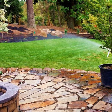
Scott Buley, High Tech Turf & Trees, Rain Garden Nursery, LandscapeMakeover.biz, Patio and Fire Pit nearing completion. Shishishagira Lion's Mane Japanese Maple tree delivered for placement between the three boulders in the background here. We also worked with clients on all plant placement, and even the capstone pattern on this fire pit. This shows one iteration, with 2 layers of colored capstones. Testing sprinklers here as well.
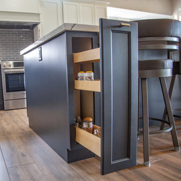
 Weslei Costa General Contractor
Full Kitchen Design & Remodel.
-To reduce costs, we made minimal plumbing & electrical changes on this kitchen and look at this transformation!
This kitchen features:
-Two tones cabinetry: Dove and Charcoal
-Brushed Gold Fixtures
-Cambria Quartz Slabs: Skara Brae and Charlestown
-Bosch Appliances
-Built-in Industrial Range Hood
-Pull-out spice racks, pull-out trash bins and blind corner.
-Glass Subway Backsplash
-Under cabinet lights
And much more!
Job site: Copper Valley Golf Resort, Copperopolis CA.
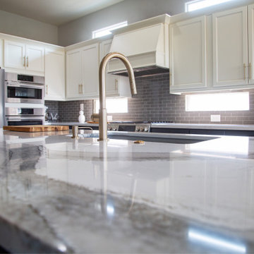 Weslei Costa General Contractor
Full Kitchen Design & Remodel.
-To reduce costs, we made minimal plumbing & electrical changes on this kitchen and look at this transformation!
This kitchen features:
-Two tones cabinetry: Dove and Charcoal
-Brushed Gold Fixtures
-Cambria Quartz Slabs: Skara Brae and Charlestown
-Bosch Appliances
-Built-in Industrial Range Hood
-Pull-out spice racks, pull-out trash bins and blind corner.
-Glass Subway Backsplash
-Under cabinet lights
And much more!
Job site: Copper Valley Golf Resort, Copperopolis CA.
30