
Search results for "Reduce major" in Home Design Ideas
 Janvrin & Co.
A transformation of a modest raised ranch into a modern oasis. I was the interior designer and general contractor from mechanicals to finishing. It’s also my personal home.
The interior design style is that of modern minimalist meets organic modern. I wanted a space that reduced distractions and let the eyes, head, and soul rest. Where everything inside the home has a specific use and purpose. The objects in our home are fewer but each hold a great personal value. You might expect to see this airy aesthetic, with its gallery white walls, in California or New York. Not nestled in a modest 50 year old neighborhood in Omaha, Nebraska. Creating a minimal aesthetic is one of the trickiest design styles to pull off. It is more than just less stuff and lots of white. It means sticking to these design principals:
-weaving in an abundance of textures
-incorporating natural finishes
-keenly curating art
-giving extra attention to scale
-limiting purely decorative items
-maximizing natural light
This style is not to be confused with the frugality of reductive design. I have incorporated many elevated basics that create an aesthetic of quiet luxury:
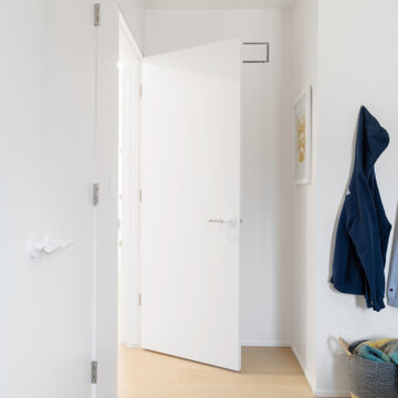
-architectural bead for trim-less doors
-first-of-its kind interior door hardware made of terrazzo
-historical marble found in landmark interiors like the NY Public Library
-premium flush air vents that disappear out of site
-luxury appliances from GE Café and Signature
-elegant and resilient terrazzo field tiles
Ours was not a simple interior remodel and addition:
-gutted and remodeled the existing 2,000 SF
-added on approximately another 1,000 SF
-moved and installed all new major mechanicals i.e. heating, plumbing and electrical.
-knocked through foundation walls to extend the space back
-dug down and built up
 Janvrin & Co.
A transformation of a modest raised ranch into a modern oasis. I was the interior designer and general contractor from mechanicals to finishing. It’s also my personal home.
The interior design style is that of modern minimalist meets organic modern. I wanted a space that reduced distractions and let the eyes, head, and soul rest. Where everything inside the home has a specific use and purpose. The objects in our home are fewer but each hold a great personal value. You might expect to see this airy aesthetic, with its gallery white walls, in California or New York. Not nestled in a modest 50 year old neighborhood in Omaha, Nebraska. Creating a minimal aesthetic is one of the trickiest design styles to pull off. It is more than just less stuff and lots of white. It means sticking to these design principals:
-weaving in an abundance of textures
-incorporating natural finishes
-keenly curating art
-giving extra attention to scale
-limiting purely decorative items
-maximizing natural light
This style is not to be confused with the frugality of reductive design. I have incorporated many elevated basics that create an aesthetic of quiet luxury:
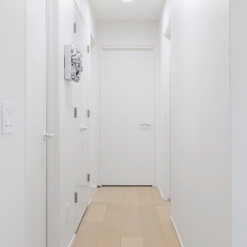
-architectural bead for trim-less doors
-first-of-its kind interior door hardware made of terrazzo
-historical marble found in landmark interiors like the NY Public Library
-premium flush air vents that disappear out of site
-luxury appliances from GE Café and Signature
-elegant and resilient terrazzo field tiles
Ours was not a simple interior remodel and addition:
-gutted and remodeled the existing 2,000 SF
-added on approximately another 1,000 SF
-moved and installed all new major mechanicals i.e. heating, plumbing and electrical.
-knocked through foundation walls to extend the space back
-dug down and built up
 Janvrin & Co.
A transformation of a modest raised ranch into a modern oasis. I was the interior designer and general contractor from mechanicals to finishing. It’s also my personal home.
The interior design style is that of modern minimalist meets organic modern. I wanted a space that reduced distractions and let the eyes, head, and soul rest. Where everything inside the home has a specific use and purpose. The objects in our home are fewer but each hold a great personal value. You might expect to see this airy aesthetic, with its gallery white walls, in California or New York. Not nestled in a modest 50 year old neighborhood in Omaha, Nebraska. Creating a minimal aesthetic is one of the trickiest design styles to pull off. It is more than just less stuff and lots of white. It means sticking to these design principals:
-weaving in an abundance of textures
-incorporating natural finishes
-keenly curating art
-giving extra attention to scale
-limiting purely decorative items
-maximizing natural light
This style is not to be confused with the frugality of reductive design. I have incorporated many elevated basics that create an aesthetic of quiet luxury:
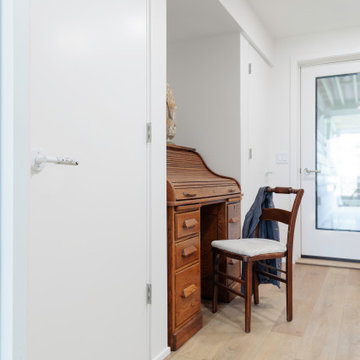
-architectural bead for trim-less doors
-first-of-its kind interior door hardware made of terrazzo
-historical marble found in landmark interiors like the NY Public Library
-premium flush air vents that disappear out of site
-luxury appliances from GE Café and Signature
-elegant and resilient terrazzo field tiles
Ours was not a simple interior remodel and addition:
-gutted and remodeled the existing 2,000 SF
-added on approximately another 1,000 SF
-moved and installed all new major mechanicals i.e. heating, plumbing and electrical.
-knocked through foundation walls to extend the space back
-dug down and built up
Find the right local pro for your project
 Janvrin & Co.
A transformation of a modest raised ranch into a modern oasis. I was the interior designer and general contractor from mechanicals to finishing. It’s also my personal home.
The interior design style is that of modern minimalist meets organic modern. I wanted a space that reduced distractions and let the eyes, head, and soul rest. Where everything inside the home has a specific use and purpose. The objects in our home are fewer but each hold a great personal value. You might expect to see this airy aesthetic, with its gallery white walls, in California or New York. Not nestled in a modest 50 year old neighborhood in Omaha, Nebraska. Creating a minimal aesthetic is one of the trickiest design styles to pull off. It is more than just less stuff and lots of white. It means sticking to these design principals:
-weaving in an abundance of textures
-incorporating natural finishes
-keenly curating art
-giving extra attention to scale
-limiting purely decorative items
-maximizing natural light
This style is not to be confused with the frugality of reductive design. I have incorporated many elevated basics that create an aesthetic of quiet luxury:
-architectural bead for trim-less doors
-first-of-its kind interior door hardware made of terrazzo
-historical marble found in landmark interiors like the NY Public Library
-premium flush air vents that disappear out of site
-luxury appliances from GE Café and Signature
-elegant and resilient terrazzo field tiles
Ours was not a simple interior remodel and addition:
-gutted and remodeled the existing 2,000 SF
-added on approximately another 1,000 SF
-moved and installed all new major mechanicals i.e. heating, plumbing and electrical.
-knocked through foundation walls to extend the space back
-dug down and built up
 Janvrin & Co.
A transformation of a modest raised ranch into a modern oasis. I was the interior designer and general contractor from mechanicals to finishing. It’s also my personal home.
The interior design style is that of modern minimalist meets organic modern. I wanted a space that reduced distractions and let the eyes, head, and soul rest. Where everything inside the home has a specific use and purpose. The objects in our home are fewer but each hold a great personal value. You might expect to see this airy aesthetic, with its gallery white walls, in California or New York. Not nestled in a modest 50 year old neighborhood in Omaha, Nebraska. Creating a minimal aesthetic is one of the trickiest design styles to pull off. It is more than just less stuff and lots of white. It means sticking to these design principals:
-weaving in an abundance of textures
-incorporating natural finishes
-keenly curating art
-giving extra attention to scale
-limiting purely decorative items
-maximizing natural light
This style is not to be confused with the frugality of reductive design. I have incorporated many elevated basics that create an aesthetic of quiet luxury:
-architectural bead for trim-less doors
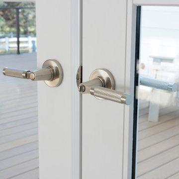
-first-of-its kind interior door hardware made of terrazzo
-historical marble found in landmark interiors like the NY Public Library
-premium flush air vents that disappear out of site
-luxury appliances from GE Café and Signature
-elegant and resilient terrazzo field tiles
Ours was not a simple interior remodel and addition:
-gutted and remodeled the existing 2,000 SF
-added on approximately another 1,000 SF
-moved and installed all new major mechanicals i.e. heating, plumbing and electrical.
-knocked through foundation walls to extend the space back
-dug down and built up
 Janvrin & Co.
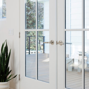
A transformation of a modest raised ranch into a modern oasis. I was the interior designer and general contractor from mechanicals to finishing. It’s also my personal home.
The interior design style is that of modern minimalist meets organic modern. I wanted a space that reduced distractions and let the eyes, head, and soul rest. Where everything inside the home has a specific use and purpose. The objects in our home are fewer but each hold a great personal value. You might expect to see this airy aesthetic, with its gallery white walls, in California or New York. Not nestled in a modest 50 year old neighborhood in Omaha, Nebraska. Creating a minimal aesthetic is one of the trickiest design styles to pull off. It is more than just less stuff and lots of white. It means sticking to these design principals:
-weaving in an abundance of textures
-incorporating natural finishes
-keenly curating art
-giving extra attention to scale
-limiting purely decorative items
-maximizing natural light
This style is not to be confused with the frugality of reductive design. I have incorporated many elevated basics that create an aesthetic of quiet luxury:
-architectural bead for trim-less doors
-first-of-its kind interior door hardware made of terrazzo
-historical marble found in landmark interiors like the NY Public Library
-premium flush air vents that disappear out of site
-luxury appliances from GE Café and Signature
-elegant and resilient terrazzo field tiles
Ours was not a simple interior remodel and addition:
-gutted and remodeled the existing 2,000 SF
-added on approximately another 1,000 SF
-moved and installed all new major mechanicals i.e. heating, plumbing and electrical.
-knocked through foundation walls to extend the space back
-dug down and built up
 Janvrin & Co.
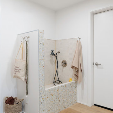
A transformation of a modest raised ranch into a modern oasis. I was the interior designer and general contractor from mechanicals to finishing. It’s also my personal home.
The interior design style is that of modern minimalist meets organic modern. I wanted a space that reduced distractions and let the eyes, head, and soul rest. Where everything inside the home has a specific use and purpose. The objects in our home are fewer but each hold a great personal value. You might expect to see this airy aesthetic, with its gallery white walls, in California or New York. Not nestled in a modest 50 year old neighborhood in Omaha, Nebraska. Creating a minimal aesthetic is one of the trickiest design styles to pull off. It is more than just less stuff and lots of white. It means sticking to these design principals:
-weaving in an abundance of textures
-incorporating natural finishes
-keenly curating art
-giving extra attention to scale
-limiting purely decorative items
-maximizing natural light
This style is not to be confused with the frugality of reductive design. I have incorporated many elevated basics that create an aesthetic of quiet luxury:
-architectural bead for trim-less doors
-first-of-its kind interior door hardware made of terrazzo
-historical marble found in landmark interiors like the NY Public Library
-premium flush air vents that disappear out of site
-luxury appliances from GE Café and Signature
-elegant and resilient terrazzo field tiles
Ours was not a simple interior remodel and addition:
-gutted and remodeled the existing 2,000 SF
-added on approximately another 1,000 SF
-moved and installed all new major mechanicals i.e. heating, plumbing and electrical.
-knocked through foundation walls to extend the space back
-dug down and built up


 Janvrin & Co.
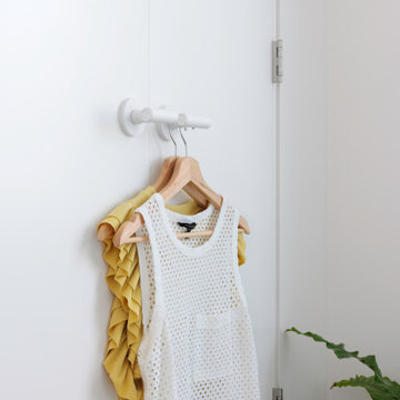
A transformation of a modest raised ranch into a modern oasis. I was the interior designer and general contractor from mechanicals to finishing. It’s also my personal home.
The interior design style is that of modern minimalist meets organic modern. I wanted a space that reduced distractions and let the eyes, head, and soul rest. Where everything inside the home has a specific use and purpose. The objects in our home are fewer but each hold a great personal value. You might expect to see this airy aesthetic, with its gallery white walls, in California or New York. Not nestled in a modest 50 year old neighborhood in Omaha, Nebraska. Creating a minimal aesthetic is one of the trickiest design styles to pull off. It is more than just less stuff and lots of white. It means sticking to these design principals:
-weaving in an abundance of textures
-incorporating natural finishes
-keenly curating art
-giving extra attention to scale
-limiting purely decorative items
-maximizing natural light
This style is not to be confused with the frugality of reductive design. I have incorporated many elevated basics that create an aesthetic of quiet luxury:
-architectural bead for trim-less doors
-first-of-its kind interior door hardware made of terrazzo
-historical marble found in landmark interiors like the NY Public Library
-premium flush air vents that disappear out of site
-luxury appliances from GE Café and Signature
-elegant and resilient terrazzo field tiles
Ours was not a simple interior remodel and addition:
-gutted and remodeled the existing 2,000 SF
-added on approximately another 1,000 SF
-moved and installed all new major mechanicals i.e. heating, plumbing and electrical.
-knocked through foundation walls to extend the space back
-dug down and built up
 Janvrin & Co.
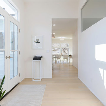
A transformation of a modest raised ranch into a modern oasis. I was the interior designer and general contractor from mechanicals to finishing. It’s also my personal home.
The interior design style is that of modern minimalist meets organic modern. I wanted a space that reduced distractions and let the eyes, head, and soul rest. Where everything inside the home has a specific use and purpose. The objects in our home are fewer but each hold a great personal value. You might expect to see this airy aesthetic, with its gallery white walls, in California or New York. Not nestled in a modest 50 year old neighborhood in Omaha, Nebraska. Creating a minimal aesthetic is one of the trickiest design styles to pull off. It is more than just less stuff and lots of white. It means sticking to these design principals:
-weaving in an abundance of textures
-incorporating natural finishes
-keenly curating art
-giving extra attention to scale
-limiting purely decorative items
-maximizing natural light
This style is not to be confused with the frugality of reductive design. I have incorporated many elevated basics that create an aesthetic of quiet luxury:
-architectural bead for trim-less doors
-first-of-its kind interior door hardware made of terrazzo
-historical marble found in landmark interiors like the NY Public Library
-premium flush air vents that disappear out of site
-luxury appliances from GE Café and Signature
-elegant and resilient terrazzo field tiles
Ours was not a simple interior remodel and addition:
-gutted and remodeled the existing 2,000 SF
-added on approximately another 1,000 SF
-moved and installed all new major mechanicals i.e. heating, plumbing and electrical.
-knocked through foundation walls to extend the space back
-dug down and built up
 Janvrin & Co.
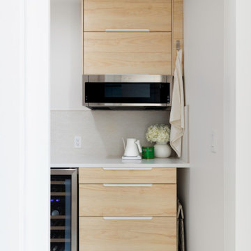
A transformation of a modest raised ranch into a modern oasis. I was the interior designer and general contractor from mechanicals to finishing. It’s also my personal home.
The interior design style is that of modern minimalist meets organic modern. I wanted a space that reduced distractions and let the eyes, head, and soul rest. Where everything inside the home has a specific use and purpose. The objects in our home are fewer but each hold a great personal value. You might expect to see this airy aesthetic, with its gallery white walls, in California or New York. Not nestled in a modest 50 year old neighborhood in Omaha, Nebraska. Creating a minimal aesthetic is one of the trickiest design styles to pull off. It is more than just less stuff and lots of white. It means sticking to these design principals:
-weaving in an abundance of textures
-incorporating natural finishes
-keenly curating art
-giving extra attention to scale
-limiting purely decorative items
-maximizing natural light
This style is not to be confused with the frugality of reductive design. I have incorporated many elevated basics that create an aesthetic of quiet luxury:
-architectural bead for trim-less doors
-first-of-its kind interior door hardware made of terrazzo
-historical marble found in landmark interiors like the NY Public Library
-premium flush air vents that disappear out of site
-luxury appliances from GE Café and Signature
-elegant and resilient terrazzo field tiles
Ours was not a simple interior remodel and addition:
-gutted and remodeled the existing 2,000 SF
-added on approximately another 1,000 SF
-moved and installed all new major mechanicals i.e. heating, plumbing and electrical.
-knocked through foundation walls to extend the space back
-dug down and built up
 Designs by KS
Project: Pelton Avenue - Coquitlam
Builder: Furtado Contracting
About this Project
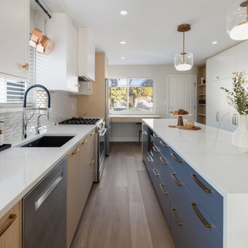
We partnered up with Furtado Contracting to transform the main floor and foyer of this Greater Vancouver classic home. Also referred to as the “Vancouver Special” this style of home was popular in the 60’s-80’s and has been re-decorated and renovated ever since.
Layout Details:
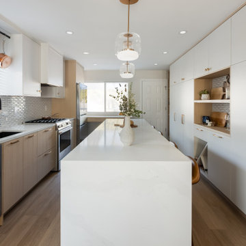
By eliminating the wall between the dining room and kitchen, and reducing the length of the hallway wall, we were able to create a large open concept space.
The previous u-shape kitchen turned into a large galley kitchen, which allowed us to incorporate an island with seating for four.
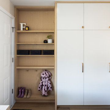
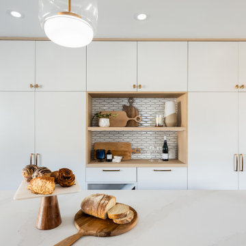
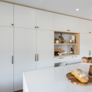
With the major appliances being housed on the window wall, we designed a large pantry space spanning from wall-to-wall to store all the necessities from food to cleaning supplies. Its niche not only breaks up the cabinets to add some personality but can be used as a wine/coffee area. On the far end of the kitchen, the pantry wall extends to a narrow cabinet that has been designed to act as a mudroom; a place for shoes and jackets near the back door. At the back of the kitchen you will also find a working space, that has been tied into the fridge area with some careful space planning.
Material Details:
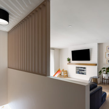
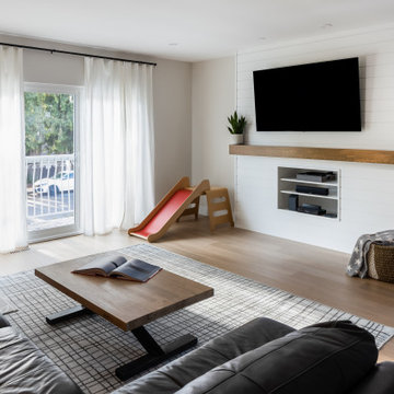
The living room and foyer received an upgrade with new flooring, light fixtures, paint, and a converted fireplace to A/V wall with a rustic wooden mantle.
In the kitchen, woodgrain cabinets made from durable laminate are paired with painted materials. A 1” shaker door painted in our favourite Benjamin Moore “Silver Satin” is seen on the upper cabinets only. This special detail is complimented with bronze knobs by Marathon Hardware. The same colour is seen on the pantry wall in a slab door, making it sleeker. The island is painted in Benjamin Moore “Black Pepper”, is paired with bronze hardware by Marathon Hardware and is clad in quartz, Silestone’s “Calcatta Gold” to be specific. Quartz is a go-to material if maintenance is not your thing!
Special Mentions:
There are so many amazing things about this project. All the light fixtures were supplied by Robinson Lighting, and include Canadian company Kuzco Lighting, as seen in the kitchen, entry and foyer. The black accents on the sink by Blanco and faucet by Grohe added some contrast against the backsplash by Julian Tile.
 Designs by KS
Project: Pelton Avenue - Coquitlam
Builder: Furtado Contracting
About this Project
We partnered up with Furtado Contracting to transform the main floor and foyer of this Greater Vancouver classic home. Also referred to as the “Vancouver Special” this style of home was popular in the 60’s-80’s and has been re-decorated and renovated ever since.
Layout Details:
By eliminating the wall between the dining room and kitchen, and reducing the length of the hallway wall, we were able to create a large open concept space.
The previous u-shape kitchen turned into a large galley kitchen, which allowed us to incorporate an island with seating for four.
With the major appliances being housed on the window wall, we designed a large pantry space spanning from wall-to-wall to store all the necessities from food to cleaning supplies. Its niche not only breaks up the cabinets to add some personality but can be used as a wine/coffee area. On the far end of the kitchen, the pantry wall extends to a narrow cabinet that has been designed to act as a mudroom; a place for shoes and jackets near the back door. At the back of the kitchen you will also find a working space, that has been tied into the fridge area with some careful space planning.
Material Details:
The living room and foyer received an upgrade with new flooring, light fixtures, paint, and a converted fireplace to A/V wall with a rustic wooden mantle.
In the kitchen, woodgrain cabinets made from durable laminate are paired with painted materials. A 1” shaker door painted in our favourite Benjamin Moore “Silver Satin” is seen on the upper cabinets only. This special detail is complimented with bronze knobs by Marathon Hardware. The same colour is seen on the pantry wall in a slab door, making it sleeker. The island is painted in Benjamin Moore “Black Pepper”, is paired with bronze hardware by Marathon Hardware and is clad in quartz, Silestone’s “Calcatta Gold” to be specific. Quartz is a go-to material if maintenance is not your thing!
Special Mentions:
There are so many amazing things about this project. All the light fixtures were supplied by Robinson Lighting, and include Canadian company Kuzco Lighting, as seen in the kitchen, entry and foyer. The black accents on the sink by Blanco and faucet by Grohe added some contrast against the backsplash by Julian Tile.

 Chapman Design Group, Inc.
This rustic style home on Hartwell Lake was designed and built for the owners to enjoy with family and friends during their active weekend lifestyle. The home was built on a narrow, deep lot that was semi-level on the roadside and steep on the lakeside. The back half of the lot heavily wooded with mature oak and poplar trees reducing the harsh sun’s heat gain on the home.
The exterior utilizes fiber cement cedar shake and lap siding complimented by deep brown colors for the windows, soffit, trim and the large square columns. A nice balance of natural earth toned stacked stone rounds out the exterior materials completing the rustic casual lake living.
The home 5400 SF is designed and built on thee levels each having a primary focus. The main level creates primary daily living for the owners. This level features an open plan with an entry, stair, dining, kitchen and living areas leading to a large lakeside screened porch. A master suite is privately tucked off its own hallway and allowing it to enjoy the lakeside as well with its own private deck. On the opposite side are two bedrooms, a study and a shared bathroom for each to utilize. An open carport for two vehicles was created with the motor court and connects to the mudroom/utility room giving the owners direct entry into their home.
The upper level is for the grand children with an oversized bedroom, bathroom and loft area for play.
The lower level is the considered the party level. Its primary feature is an elevated stage for the owner’s band opened to a large seating area, dining and kitchen for viewing and listening with direct access to another screened porch. Flanking each side is a theater and two additional bedrooms and bathrooms.
Energy Efficient features include:
• The majority of the lower level sunk into the site below grade
• 6” thick walls utilizing advanced framing techniques
• Foil covered roof sheathing
• Extensive use of blown in cellulous
• All windows & doors are double paned low E argon filed glass
• Tank-less water heaters
• Three separate high efficiency HVAC units with programmable thermostats and a fresh air ERV.
Lastly the owner requested we make every effort to sound proof the home. Many materials and techniques gave a duel purpose and added to the energy efficiency.
These items include:
• 2x6 walls with staggered studs
• Extensive use if rock wool acoustic batting
• Tempered glass in all exterior doors and windows
• ¼ thick Mass Loaded Vinyl (MLV) was installed on the top and bottom of the floor trusses and on all lower level walls.
The combination of the design and detailing utilizing these specific materials enabled us to achieve a 5 Star Plus Energy Star Certification with a HERS Index Score of 50. This home received a the 2015 Pinnacle Award from the SC Home Builders Association for the “Best Achievement in Energy Efficiency” sponsored by the SC Department Commerce.
 Designs by KS
Project: Pelton Avenue - Coquitlam
Builder: Furtado Contracting
About this Project
We partnered up with Furtado Contracting to transform the main floor and foyer of this Greater Vancouver classic home. Also referred to as the “Vancouver Special” this style of home was popular in the 60’s-80’s and has been re-decorated and renovated ever since.
Layout Details:
By eliminating the wall between the dining room and kitchen, and reducing the length of the hallway wall, we were able to create a large open concept space.
The previous u-shape kitchen turned into a large galley kitchen, which allowed us to incorporate an island with seating for four.
With the major appliances being housed on the window wall, we designed a large pantry space spanning from wall-to-wall to store all the necessities from food to cleaning supplies. Its niche not only breaks up the cabinets to add some personality but can be used as a wine/coffee area. On the far end of the kitchen, the pantry wall extends to a narrow cabinet that has been designed to act as a mudroom; a place for shoes and jackets near the back door. At the back of the kitchen you will also find a working space, that has been tied into the fridge area with some careful space planning.
Material Details:
The living room and foyer received an upgrade with new flooring, light fixtures, paint, and a converted fireplace to A/V wall with a rustic wooden mantle.
In the kitchen, woodgrain cabinets made from durable laminate are paired with painted materials. A 1” shaker door painted in our favourite Benjamin Moore “Silver Satin” is seen on the upper cabinets only. This special detail is complimented with bronze knobs by Marathon Hardware. The same colour is seen on the pantry wall in a slab door, making it sleeker. The island is painted in Benjamin Moore “Black Pepper”, is paired with bronze hardware by Marathon Hardware and is clad in quartz, Silestone’s “Calcatta Gold” to be specific. Quartz is a go-to material if maintenance is not your thing!
Special Mentions:
There are so many amazing things about this project. All the light fixtures were supplied by Robinson Lighting, and include Canadian company Kuzco Lighting, as seen in the kitchen, entry and foyer. The black accents on the sink by Blanco and faucet by Grohe added some contrast against the backsplash by Julian Tile.
 Designs by KS
Project: Pelton Avenue - Coquitlam
Builder: Furtado Contracting
About this Project
We partnered up with Furtado Contracting to transform the main floor and foyer of this Greater Vancouver classic home. Also referred to as the “Vancouver Special” this style of home was popular in the 60’s-80’s and has been re-decorated and renovated ever since.
Layout Details:
By eliminating the wall between the dining room and kitchen, and reducing the length of the hallway wall, we were able to create a large open concept space.
The previous u-shape kitchen turned into a large galley kitchen, which allowed us to incorporate an island with seating for four.
With the major appliances being housed on the window wall, we designed a large pantry space spanning from wall-to-wall to store all the necessities from food to cleaning supplies. Its niche not only breaks up the cabinets to add some personality but can be used as a wine/coffee area. On the far end of the kitchen, the pantry wall extends to a narrow cabinet that has been designed to act as a mudroom; a place for shoes and jackets near the back door. At the back of the kitchen you will also find a working space, that has been tied into the fridge area with some careful space planning.
Material Details:
The living room and foyer received an upgrade with new flooring, light fixtures, paint, and a converted fireplace to A/V wall with a rustic wooden mantle.
In the kitchen, woodgrain cabinets made from durable laminate are paired with painted materials. A 1” shaker door painted in our favourite Benjamin Moore “Silver Satin” is seen on the upper cabinets only. This special detail is complimented with bronze knobs by Marathon Hardware. The same colour is seen on the pantry wall in a slab door, making it sleeker. The island is painted in Benjamin Moore “Black Pepper”, is paired with bronze hardware by Marathon Hardware and is clad in quartz, Silestone’s “Calcatta Gold” to be specific. Quartz is a go-to material if maintenance is not your thing!
Special Mentions:
There are so many amazing things about this project. All the light fixtures were supplied by Robinson Lighting, and include Canadian company Kuzco Lighting, as seen in the kitchen, entry and foyer. The black accents on the sink by Blanco and faucet by Grohe added some contrast against the backsplash by Julian Tile.
 Designs by KS
Project: Pelton Avenue - Coquitlam
Builder: Furtado Contracting
About this Project
We partnered up with Furtado Contracting to transform the main floor and foyer of this Greater Vancouver classic home. Also referred to as the “Vancouver Special” this style of home was popular in the 60’s-80’s and has been re-decorated and renovated ever since.
Layout Details:
By eliminating the wall between the dining room and kitchen, and reducing the length of the hallway wall, we were able to create a large open concept space.
The previous u-shape kitchen turned into a large galley kitchen, which allowed us to incorporate an island with seating for four.
With the major appliances being housed on the window wall, we designed a large pantry space spanning from wall-to-wall to store all the necessities from food to cleaning supplies. Its niche not only breaks up the cabinets to add some personality but can be used as a wine/coffee area. On the far end of the kitchen, the pantry wall extends to a narrow cabinet that has been designed to act as a mudroom; a place for shoes and jackets near the back door. At the back of the kitchen you will also find a working space, that has been tied into the fridge area with some careful space planning.
Material Details:
The living room and foyer received an upgrade with new flooring, light fixtures, paint, and a converted fireplace to A/V wall with a rustic wooden mantle.
In the kitchen, woodgrain cabinets made from durable laminate are paired with painted materials. A 1” shaker door painted in our favourite Benjamin Moore “Silver Satin” is seen on the upper cabinets only. This special detail is complimented with bronze knobs by Marathon Hardware. The same colour is seen on the pantry wall in a slab door, making it sleeker. The island is painted in Benjamin Moore “Black Pepper”, is paired with bronze hardware by Marathon Hardware and is clad in quartz, Silestone’s “Calcatta Gold” to be specific. Quartz is a go-to material if maintenance is not your thing!
Special Mentions:
There are so many amazing things about this project. All the light fixtures were supplied by Robinson Lighting, and include Canadian company Kuzco Lighting, as seen in the kitchen, entry and foyer. The black accents on the sink by Blanco and faucet by Grohe added some contrast against the backsplash by Julian Tile.
 Designs by KS
Project: Pelton Avenue - Coquitlam
Builder: Furtado Contracting
About this Project
We partnered up with Furtado Contracting to transform the main floor and foyer of this Greater Vancouver classic home. Also referred to as the “Vancouver Special” this style of home was popular in the 60’s-80’s and has been re-decorated and renovated ever since.
Layout Details:
By eliminating the wall between the dining room and kitchen, and reducing the length of the hallway wall, we were able to create a large open concept space.
The previous u-shape kitchen turned into a large galley kitchen, which allowed us to incorporate an island with seating for four.
With the major appliances being housed on the window wall, we designed a large pantry space spanning from wall-to-wall to store all the necessities from food to cleaning supplies. Its niche not only breaks up the cabinets to add some personality but can be used as a wine/coffee area. On the far end of the kitchen, the pantry wall extends to a narrow cabinet that has been designed to act as a mudroom; a place for shoes and jackets near the back door. At the back of the kitchen you will also find a working space, that has been tied into the fridge area with some careful space planning.
Material Details:
The living room and foyer received an upgrade with new flooring, light fixtures, paint, and a converted fireplace to A/V wall with a rustic wooden mantle.
In the kitchen, woodgrain cabinets made from durable laminate are paired with painted materials. A 1” shaker door painted in our favourite Benjamin Moore “Silver Satin” is seen on the upper cabinets only. This special detail is complimented with bronze knobs by Marathon Hardware. The same colour is seen on the pantry wall in a slab door, making it sleeker. The island is painted in Benjamin Moore “Black Pepper”, is paired with bronze hardware by Marathon Hardware and is clad in quartz, Silestone’s “Calcatta Gold” to be specific. Quartz is a go-to material if maintenance is not your thing!
Special Mentions:
There are so many amazing things about this project. All the light fixtures were supplied by Robinson Lighting, and include Canadian company Kuzco Lighting, as seen in the kitchen, entry and foyer. The black accents on the sink by Blanco and faucet by Grohe added some contrast against the backsplash by Julian Tile.
 Designs by KS
Project: Pelton Avenue - Coquitlam
Builder: Furtado Contracting
About this Project
We partnered up with Furtado Contracting to transform the main floor and foyer of this Greater Vancouver classic home. Also referred to as the “Vancouver Special” this style of home was popular in the 60’s-80’s and has been re-decorated and renovated ever since.
Layout Details:
By eliminating the wall between the dining room and kitchen, and reducing the length of the hallway wall, we were able to create a large open concept space.
The previous u-shape kitchen turned into a large galley kitchen, which allowed us to incorporate an island with seating for four.
With the major appliances being housed on the window wall, we designed a large pantry space spanning from wall-to-wall to store all the necessities from food to cleaning supplies. Its niche not only breaks up the cabinets to add some personality but can be used as a wine/coffee area. On the far end of the kitchen, the pantry wall extends to a narrow cabinet that has been designed to act as a mudroom; a place for shoes and jackets near the back door. At the back of the kitchen you will also find a working space, that has been tied into the fridge area with some careful space planning.
Material Details:
The living room and foyer received an upgrade with new flooring, light fixtures, paint, and a converted fireplace to A/V wall with a rustic wooden mantle.
In the kitchen, woodgrain cabinets made from durable laminate are paired with painted materials. A 1” shaker door painted in our favourite Benjamin Moore “Silver Satin” is seen on the upper cabinets only. This special detail is complimented with bronze knobs by Marathon Hardware. The same colour is seen on the pantry wall in a slab door, making it sleeker. The island is painted in Benjamin Moore “Black Pepper”, is paired with bronze hardware by Marathon Hardware and is clad in quartz, Silestone’s “Calcatta Gold” to be specific. Quartz is a go-to material if maintenance is not your thing!
Special Mentions:
There are so many amazing things about this project. All the light fixtures were supplied by Robinson Lighting, and include Canadian company Kuzco Lighting, as seen in the kitchen, entry and foyer. The black accents on the sink by Blanco and faucet by Grohe added some contrast against the backsplash by Julian Tile.
 Janvrin & Co.
A transformation of a modest raised ranch into a modern oasis. I was the interior designer and general contractor from mechanicals to finishing. It’s also my personal home.
The interior design style is that of modern minimalist meets organic modern. I wanted a space that reduced distractions and let the eyes, head, and soul rest. Where everything inside the home has a specific use and purpose. The objects in our home are fewer but each hold a great personal value. You might expect to see this airy aesthetic, with its gallery white walls, in California or New York. Not nestled in a modest 50 year old neighborhood in Omaha, Nebraska. Creating a minimal aesthetic is one of the trickiest design styles to pull off. It is more than just less stuff and lots of white. It means sticking to these design principals:
-weaving in an abundance of textures
-incorporating natural finishes
-keenly curating art
-giving extra attention to scale
-limiting purely decorative items
-maximizing natural light
This style is not to be confused with the frugality of reductive design. I have incorporated many elevated basics that create an aesthetic of quiet luxury:
-architectural bead for trim-less doors
-first-of-its kind interior door hardware made of terrazzo
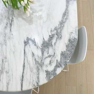
-historical marble found in landmark interiors like the NY Public Library
-premium flush air vents that disappear out of site
-luxury appliances from GE Café and Signature
-elegant and resilient terrazzo field tiles
Ours was not a simple interior remodel and addition:
-gutted and remodeled the existing 2,000 SF
-added on approximately another 1,000 SF
-moved and installed all new major mechanicals i.e. heating, plumbing and electrical.
-knocked through foundation walls to extend the space back
-dug down and built up
 Designs by KS
Project: Pelton Avenue - Coquitlam
Builder: Furtado Contracting
About this Project
We partnered up with Furtado Contracting to transform the main floor and foyer of this Greater Vancouver classic home. Also referred to as the “Vancouver Special” this style of home was popular in the 60’s-80’s and has been re-decorated and renovated ever since.
Layout Details:
By eliminating the wall between the dining room and kitchen, and reducing the length of the hallway wall, we were able to create a large open concept space.
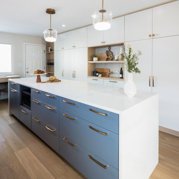
The previous u-shape kitchen turned into a large galley kitchen, which allowed us to incorporate an island with seating for four.
With the major appliances being housed on the window wall, we designed a large pantry space spanning from wall-to-wall to store all the necessities from food to cleaning supplies. Its niche not only breaks up the cabinets to add some personality but can be used as a wine/coffee area. On the far end of the kitchen, the pantry wall extends to a narrow cabinet that has been designed to act as a mudroom; a place for shoes and jackets near the back door. At the back of the kitchen you will also find a working space, that has been tied into the fridge area with some careful space planning.
Material Details:
The living room and foyer received an upgrade with new flooring, light fixtures, paint, and a converted fireplace to A/V wall with a rustic wooden mantle.
In the kitchen, woodgrain cabinets made from durable laminate are paired with painted materials. A 1” shaker door painted in our favourite Benjamin Moore “Silver Satin” is seen on the upper cabinets only. This special detail is complimented with bronze knobs by Marathon Hardware. The same colour is seen on the pantry wall in a slab door, making it sleeker. The island is painted in Benjamin Moore “Black Pepper”, is paired with bronze hardware by Marathon Hardware and is clad in quartz, Silestone’s “Calcatta Gold” to be specific. Quartz is a go-to material if maintenance is not your thing!
Special Mentions:
There are so many amazing things about this project. All the light fixtures were supplied by Robinson Lighting, and include Canadian company Kuzco Lighting, as seen in the kitchen, entry and foyer. The black accents on the sink by Blanco and faucet by Grohe added some contrast against the backsplash by Julian Tile.
11