
Search results for "Resolving" in Home Design Ideas
 Klopf Architecture
Built for the Bluff, A Sea Ranch Home is Remade from the Inside Out
The house had always been grounded, on an ocean bluff at The Sea Ranch. It sits unencumbered, adjacent to one of the most dramatic stretches of the Sonoma coast with protected commons meadow to the east, uninterrupted Pacific views to the west, and a bluff trail running alongside. What it lacked was the feeling of home, one that could hold up its own against the natural landscape.
The owners are entrepreneurs with deep involvement across tech, real estate, and development and they know how things are built. The Sea Ranch house had been in their lives for years, a second residence and a place for family to gather. Built for a different time, it felt more compromising than comfortable. Sitting in a closed off nook, the kitchen fit one cook at a time and turned its back on the rest of the house. The entry was dim and compressed, divided by a structural column that presented itself at exactly the wrong moment. The primary suite was small relative to the view outside it. A large rear bedroom sat behind a lowered ceiling with a bathroom that had never been added. The house was certainly worth the trouble of doing it right.
What followed was not one project but four, each with its own design challenge, each addressed over a period of time.
Where the House Meets the Ocean
The most complex piece of the project, in both structural and spatial terms, was the kitchen expansion. The existing room was a single-person galley squeezed in as an afterthought with no meaningful connection to the dining room, the living space, or the deck outside. To make it useful for a family that cooks and gathers, it needed to grow outward into an existing patio and flow into the rooms around it.
A big challenge was the roofline. Several planes at different pitches and angles converged directly where additional volume was needed. A new form had to join that geometry without reading as a correction. The solution found the simplest possible connection between the existing angles, a roofline that from outside the structure, appears entirely original. From the bluff trail where the addition is visible, there is no discernible seam.
Inside, the kitchen is now open to the living and dining rooms without interruption. A large sliding glass door connects the space onto the rear deck. The deck itself was expanded and oriented so that the body of the house shields it from the coastal wind which is a common consideration that determines whether outdoor space at The Sea Ranch actually gets used. The result is a room that works for large family gatherings where no one feels cutoff, and one that makes the boundary between being inside and outside easy to ignore.
Welcoming Light
A structural column stood at the convergence of eight distinct roof planes in the entry. It was load-bearing, but it was also the reason the entry had always felt like a hallway rather than a welcoming arrival.
With the structural engineer, a custom steel connector was designed to receive beams from six separate directions, redistributing the load through a single new continuous beam. The column was surgically removed. Three triangular skylights were then cut into the roof above, their shapes drawn from the
existing geometry of the planes around them. The entry is now bright and open. The skylights feel native to the structure because they follow the logic already present in the roof.
Two Suites, Two Views
At opposite ends of the house, the two bedroom suites were each reconfigured, and each found a different way to introduce more of the landscape into the room.
An addition to the primary suite extended the structure outward to create a wraparound plan with a loop from the bedroom through bath and closet that had not been possible before. The expansion opened a slot view from the tub and shower toward the ocean. The view is precise and private. The ocean view is present and deliberate.
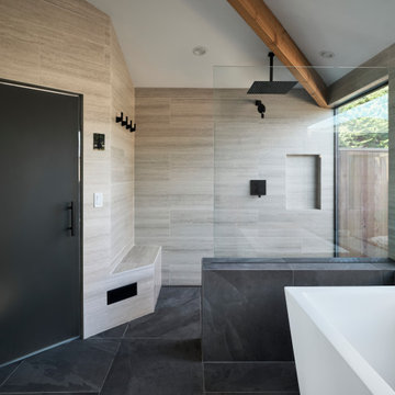
The rear bedroom absorbed an adjacent storage room to transform it into a full second suite with a vaulted ceiling, a large bathroom with a tub, a shower, and a sauna. A private fenced garden courtyard sits just beyond the glass bringing the outdoors inside. The tub was placed so that, looking past the courtyard and through the bedroom beyond, the ocean is visible at the far end. It is a long view and it makes the room feel larger and more settled than its footprint would suggest.
Glass on Four Sides, Fire at the Center
The main living and gathering room had always been caught between two competing facts: glass on four sides meant exceptional views but at The Sea Ranch, it also meant a cold room. A 360-degree cylindrical fireplace was added at the center on a raised stone base, providing radiant heat in every direction and giving the room a focal point around which a group naturally orients itself, whether that means two people at the end of the day or the whole family after dinner.
Owners Who Picked Up the Tools
The owner was not a passive client. they came with construction knowledge, specific ideas, and the desire to be an active part of the process, a dynamic that other architects may had found difficult, which Klopf Architecture accepted as an asset. They took it upon themselves to complete some of the work during construction, including the installation of a new radiant heating system beneath the floors.
The radiant system added to the older and less-desirable forced-air setup. At The Sea Ranch, that change matters as the house sits close enough to the ocean and moving air competes with the sound of it, where radiant heat does not. Solar panels were added to the roof as part of the new system. Insulation was upgraded throughout the walls, roof, and crawl space. The house that had always had the right setting now holds warmth the way a house on the bluff should.
They were also deeply involved in the design and selections throughout, and the finished house reflects both of them in ways that are specific rather than generic. The process took longer and moved through more iterations than a more arms-length relationship might have allowed. The result is more defined and personal because of it.
The Landscape Holds Priority
Every exterior decision was shaped by The Sea Ranch Design Standards, which require that buildings defer to the landscape around them rather than compete with it. Because this house sits on the bluff and is visible from the public trail, the additions faced a close review. Existing materials were matched. Geometries were resolved. The additions had to become indistinguishable from the original building.
From the trail, the house reads exactly as it always has — low, cedar-clad, secondary to the meadow and the water. The setting holds priority. Inside, the house has been remade.
Klopf Architecture Project Team: Geoff Campen and Trenton Jewett
Contractor: Shawn Bettega Construction
Photography: ©2025 Mariko Reed
Year Completed: 2023
Location: The Sea Ranch, CA
 Michael Nash Design, Build & Homes
This four-story townhome in the heart of old town Alexandria, was recently purchased by a family of four.
The outdated galley kitchen with confined spaces, lack of powder room on main level, dropped down ceiling, partition walls, small bathrooms, and the main level laundry were a few of the deficiencies this family wanted to resolve before moving in.
Starting with the top floor, we converted a small bedroom into a master suite, which has an outdoor deck with beautiful view of old town. We reconfigured the space to create a walk-in closet and another separate closet.
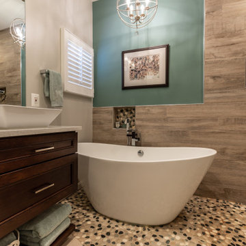
We took some space from the old closet and enlarged the master bath to include a bathtub and a walk-in shower. Double floating vanities and hidden toilet space were also added.
The addition of lighting and glass transoms allows light into staircase leading to the lower level.
On the third level is the perfect space for a girl’s bedroom. A new bathroom with walk-in shower and added space from hallway makes it possible to share this bathroom.
A stackable laundry space was added to the hallway, a few steps away from a new study with built in bookcase, French doors, and matching hardwood floors.
The main level was totally revamped. The walls were taken down, floors got built up to add extra insulation, new wide plank hardwood installed throughout, ceiling raised, and a new HVAC was added for three levels.
The storage closet under the steps was converted to a main level powder room, by relocating the electrical panel.
The new kitchen includes a large island with new plumbing for sink, dishwasher, and lots of storage placed in the center of this open kitchen. The south wall is complete with floor to ceiling cabinetry including a home for a new cooktop and stainless-steel range hood, covered with glass tile backsplash.
The dining room wall was taken down to combine the adjacent area with kitchen. The kitchen includes butler style cabinetry, wine fridge and glass cabinets for display. The old living room fireplace was torn down and revamped with a gas fireplace wrapped in stone.
Built-ins added on both ends of the living room gives floor to ceiling space provides ample display space for art. Plenty of lighting fixtures such as led lights, sconces and ceiling fans make this an immaculate remodel.
We added brick veneer on east wall to replicate the historic old character of old town homes.
The open floor plan with seamless wood floor and central kitchen has added warmth and with a desirable entertaining space.
 Klopf Architecture
Built for the Bluff, A Sea Ranch Home is Remade from the Inside Out
The house had always been grounded, on an ocean bluff at The Sea Ranch. It sits unencumbered, adjacent to one of the most dramatic stretches of the Sonoma coast with protected commons meadow to the east, uninterrupted Pacific views to the west, and a bluff trail running alongside. What it lacked was the feeling of home, one that could hold up its own against the natural landscape.
The owners are entrepreneurs with deep involvement across tech, real estate, and development and they know how things are built. The Sea Ranch house had been in their lives for years, a second residence and a place for family to gather. Built for a different time, it felt more compromising than comfortable. Sitting in a closed off nook, the kitchen fit one cook at a time and turned its back on the rest of the house. The entry was dim and compressed, divided by a structural column that presented itself at exactly the wrong moment. The primary suite was small relative to the view outside it. A large rear bedroom sat behind a lowered ceiling with a bathroom that had never been added. The house was certainly worth the trouble of doing it right.
What followed was not one project but four, each with its own design challenge, each addressed over a period of time.
Where the House Meets the Ocean
The most complex piece of the project, in both structural and spatial terms, was the kitchen expansion. The existing room was a single-person galley squeezed in as an afterthought with no meaningful connection to the dining room, the living space, or the deck outside. To make it useful for a family that cooks and gathers, it needed to grow outward into an existing patio and flow into the rooms around it.
A big challenge was the roofline. Several planes at different pitches and angles converged directly where additional volume was needed. A new form had to join that geometry without reading as a correction. The solution found the simplest possible connection between the existing angles, a roofline that from outside the structure, appears entirely original. From the bluff trail where the addition is visible, there is no discernible seam.
Inside, the kitchen is now open to the living and dining rooms without interruption. A large sliding glass door connects the space onto the rear deck. The deck itself was expanded and oriented so that the body of the house shields it from the coastal wind which is a common consideration that determines whether outdoor space at The Sea Ranch actually gets used. The result is a room that works for large family gatherings where no one feels cutoff, and one that makes the boundary between being inside and outside easy to ignore.
Welcoming Light
A structural column stood at the convergence of eight distinct roof planes in the entry. It was load-bearing, but it was also the reason the entry had always felt like a hallway rather than a welcoming arrival.
With the structural engineer, a custom steel connector was designed to receive beams from six separate directions, redistributing the load through a single new continuous beam. The column was surgically removed. Three triangular skylights were then cut into the roof above, their shapes drawn from the
existing geometry of the planes around them. The entry is now bright and open. The skylights feel native to the structure because they follow the logic already present in the roof.
Two Suites, Two Views
At opposite ends of the house, the two bedroom suites were each reconfigured, and each found a different way to introduce more of the landscape into the room.
An addition to the primary suite extended the structure outward to create a wraparound plan with a loop from the bedroom through bath and closet that had not been possible before. The expansion opened a slot view from the tub and shower toward the ocean. The view is precise and private. The ocean view is present and deliberate.
The rear bedroom absorbed an adjacent storage room to transform it into a full second suite with a vaulted ceiling, a large bathroom with a tub, a shower, and a sauna. A private fenced garden courtyard sits just beyond the glass bringing the outdoors inside. The tub was placed so that, looking past the courtyard and through the bedroom beyond, the ocean is visible at the far end. It is a long view and it makes the room feel larger and more settled than its footprint would suggest.
Glass on Four Sides, Fire at the Center
The main living and gathering room had always been caught between two competing facts: glass on four sides meant exceptional views but at The Sea Ranch, it also meant a cold room. A 360-degree cylindrical fireplace was added at the center on a raised stone base, providing radiant heat in every direction and giving the room a focal point around which a group naturally orients itself, whether that means two people at the end of the day or the whole family after dinner.
Owners Who Picked Up the Tools
The owner was not a passive client. they came with construction knowledge, specific ideas, and the desire to be an active part of the process, a dynamic that other architects may had found difficult, which Klopf Architecture accepted as an asset. They took it upon themselves to complete some of the work during construction, including the installation of a new radiant heating system beneath the floors.
The radiant system added to the older and less-desirable forced-air setup. At The Sea Ranch, that change matters as the house sits close enough to the ocean and moving air competes with the sound of it, where radiant heat does not. Solar panels were added to the roof as part of the new system. Insulation was upgraded throughout the walls, roof, and crawl space. The house that had always had the right setting now holds warmth the way a house on the bluff should.
They were also deeply involved in the design and selections throughout, and the finished house reflects both of them in ways that are specific rather than generic. The process took longer and moved through more iterations than a more arms-length relationship might have allowed. The result is more defined and personal because of it.
The Landscape Holds Priority
Every exterior decision was shaped by The Sea Ranch Design Standards, which require that buildings defer to the landscape around them rather than compete with it. Because this house sits on the bluff and is visible from the public trail, the additions faced a close review. Existing materials were matched. Geometries were resolved. The additions had to become indistinguishable from the original building.
From the trail, the house reads exactly as it always has — low, cedar-clad, secondary to the meadow and the water. The setting holds priority. Inside, the house has been remade.
Klopf Architecture Project Team: Geoff Campen and Trenton Jewett
Contractor: Shawn Bettega Construction
Photography: ©2025 Mariko Reed
Year Completed: 2023
Location: The Sea Ranch, CA
Find the right local pro for your project
 RBL Architects
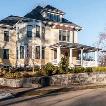
This project was nearly a complete gut renovation of an existing Victorian built in the 1890’s. We did save or rebuild major elements such as the exterior millwork, ornate entry stair and stained glass windows. An addition to the south side of the house integrated the rooflines and exterior details to create a seamless blend between the old and new. The goal of the project was to modernize the house and interior layout while still keeping the feel of a traditional home. Major elements in the scope included a completely new open kitchen, expanded living room, new master bedroom and bath suite, all new family baths and powder room. The renovation also included a library to house the owner’s extensive book collection as well as a basement workout and family room area. One primary request of the owners was to rid the house of a bat infestation problem due to poorly detailed roof vents. Once we rebuilt the roof soffits and provided new insulation for the house, the bat issue was resolved.
 Mottram Architecture
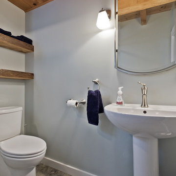
Timber frame homes offer unique challenges during a remodel. What often makes them beautiful and attractive to most homeowners, also makes them challenging for space requirements.
Context: The lovely couple that owned this home were struggling with some interesting floor plan challenges that just didn't work for their family. The loved the beautiful timbers and woodwork of their home, but the dramatically sloping ceilings on the second floor, particularly in the bathroom, just didn't work for this 1 1/2 bath home. Needing to use the skylight to approach the toilet was a less then ideal scenario. Although the bathroom footprint was more then adequate, the sloped ceiling only made half of the space useable. Check out the Before/After post on our blog to see the photos of the house pre-renovation. As much as they loved all the wood features in their home, another challenge they had was light. The wood ceiling made everything inside the house darker, even with a fantastic array of south facing windows, there were spaces in the home that felt dark and small. When they contacted us they wanted to know how could they make their brighter and more inviting, were there solutions to the 2nd floor sloped ceiling issues, and if they were going to do all of this work, how could they make their home more comfortable and efficient. A nagging water leak in the upstairs bathroom spurred them into action and here is how we solved their dilemma.
Conclusion: First, we added a little dormer to the rear of the house so we could get full headroom in nearly all of the upstairs bathroom! Then we decided to extend that dormer one more timber bay over to create a walk in closet with natural light and plenty of space. Since we were contemplating energy efficiency, we resolved a nagging issue that is present in a lot of timber frame construction, air tightness. Commonly found in timber frame construction, fiberglass insulation is installed in the rafter bays and board ceilings are installed over top. Unfortunately, board ceilings are anything but air tight, and fiberglass insulation needs to be in an airtight cavity for maximum effectiveness. So we were able to solve two issues at the same time for this homeowner. We removed the board ceiling and fiberglass insulation, we dense packed the rafter bays with cellulose insulation, and installed sheetrock in place of the boards. The boards were salvaged for re-use by the homeowner, and the space and light quality was dramatically improved. Some may think that losing the board ceiling took something away from the space, but what you'll see in the pictures is that it highly accentuates the heavy timbers and really makes them stand out in a beautiful way. Now with this added airtightness, better insulation, and brighter space, the homeowner hardly runs their wood stove, and it's so quiet in the space, an added bonus from changing the insulation. It became necessary to also add a sheetrock ceiling to the living room to hide the plumbing from the new bathroom layout above. Changing this ceiling gave the homeowner some real quality lighting that was lacking in the living room before. The brighter ceiling and new lighting layout completely transforms the living room into a space you want to hang out, even though the layout didn't change at all. When the homeowner saw the finished spaces she said "I can't believe this is my house, I want to live in this house"
Energy Efficiency: I touched a little on the efficiency above, but like all projects done with Mottram Architecture, we always want to leave you with a little extra. Timber frame construction with board ceilings and fiberglass insulation are notoriously leaky! If you want to know what we think about fiberglass insulation, check our our blog post on Why Fiberglass Insulation Sucks. By installing cellulose insulation and covering it with sheetrock we were able to greatly reduce the heat flowing out of this home. It not only improves cashflow it improves the comfort level in the space. Who wants to sit in their living room and feel a draft? Let us remind you, we are not saying cellulose insulation is an air barrier, we use the sheetrock to help with that, but it does significantly reduce the air flow over fiberglass insulation. And when we reduce the airflow, we reduce the heat flow. And when we reduce the heat flow, we reduce the need to re-heat that drafty air from outside. When it comes to energy efficiency the first and best place to start is air infiltration. We greatly reduced the air infiltration with the new insulation, but we also added a hat and warm boots. What I mean by that is, we improved the insulation in the roof, and we installed insulation in the basement. Maybe it's a silly analogy, but when you think about keeping warm, we always start with the hat and boots! With sustainability in mind, the next project will be to add a deck to the front of this house with rain catchment barrels from the metal roof. They are planning to plant a garden in the spring and the rain catchment system will help to irrigate the new garden.
Builder: East Shore Builders
Photographer: Michael Eric Berube
 Cerno
CernoCerno’s mission is to design and build original products in California. To make this possible we advocate for creativity and ingenuity in every step of the process. Our philosophy is grounded in the utmost respect for the materials, the craftsmanship and our entire team.
The Plura is a simple, straight forward fixture that is excellently executed. With the Plura it was about resolving the seams and edges and their relationships to one another. The result is a scalable fixture that has a sharp, sophisticated feel.
Features:
Wood Grain Will Vary
Energy Efficient LED Light Source
Handmade
Eco-Friendly
Switch Location: Hardwired
Damp Location rated to accommodate any room in the home including bathrooms, kitchens, covered patios, dining rooms, living rooms, bedrooms, hallways, entryways, foyers, and everything in between.
Specifications:
Voltage: 120-277V AC
Requires 1 x 19.5-Watt LED Module (Integrated)
1690 Lumes, 90 CRI, 2700K (Warm) Color Temperature
Compatible with TRIAC / ELV Dimmer / 0-10V Dimmers
 Cabinet Plant
See what our client say about working with us:
I started my search for a contractor about a year before I hired Paul to do a kitchen and bathroom renovation. This was my first time at the bat, and I really had no idea what to expect. I had many contractor proposals that swung wildly in price but for some reason I never felt inclined to hire any of the guys I met with. I happened to be looking at Houzz one day and came across Paul’s company and he had very good reviews. I gave him a call and he came to my apartment quickly. I liked him immediately when we met. I thought it was strange that he asked me for my budget and how much I wanted to spend but in hindsight, providing that information allowed Paul to come back to me with a very detailed proposal based on my budget. I soon realized that the lower proposals I had did not include many of the budget items that would be necessary to complete the job. Paul laid out the pricing and provided a very reasonable “allowance” based on your measurements for tile, toilet, sinks, etc. It is up to you to stay within that allowance.
Another reason I hired Paul was because of his design skills. Paul met me in the at tile stores several times and helped guide me in choosing tile and a style for the bathroom that really looks beautiful. I fought him a little but in the end, was glad I went with his recommendations. He also uses a kitchen cabinet maker so all the cabinets are custom to what you want. Paul also has a great customer website that allows you to see all the expenses, make choices, and easily communicate with him.
If you are planning to do a renovation, I think it helps to plan for the worst and hope for the best. I live in a co-op and we had a couple of little glitches and Paul was always quick to resolve issues as they arose. He was extremely responsive and really cared about the work and doing a good job. I would definitely hire Paul again if I needed a contractor.
 Reico Kitchen & Bath
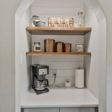
Jen Denham of Reico Kitchen and Bath in White Plains, MD collaborated with Steve Bowling to create a coastal-style inspired transitional kitchen remodel featuring Merillat cabinetry.
The perimeter cabinets are Merillat Classic in the Tolani 5-piece door style in the Cotton finish, paired with nook cabinets in Merillat Masterpiece in the Montresano door style in the Serenity Evercore finish. The kitchen countertop is MSI Q Calacatta Miraggio Gold quartz with a quarter inch Bevel Edge.
The client expressed their gratitude saying, “There isn’t one thing I would go back and do differently. I was able to work with the Reico sales team and make significant improvements to the functionality, layout and appearance of the space. We were able to turn a kitchen closet into a coffee nook, remove an outdated island and relocate the refrigerator area to improve the overall functionality of the kitchen.”
“Reico gave us great suggestions when we were unsure about something and worked quickly to resolve any concerns or issues. We made some minor tweaks along the way and Reico worked with us consistently to modify any changes. Overall, the Reico team is awesome, and I would highly recommend them to anyone. Thanks so much for giving us a great kitchen!”
According to Jen, the client was really professional and open to ideas. “The condo has a great view of the water, so they wanted to incorporate a light and bright theme with a bit of color. After the kitchen came together, we change the floating shelves from white painted finish to a darker stain. This created a wonderful contrast to the wall cabinets and helped bring in some natural colors of their new floor.”
“All and all, the client was happy with the result and ended up with a beautiful kitchen, a huge transformation from the closed in space from before.”
Photos courtesy of BTW Images.
 PORCELANOSA Group
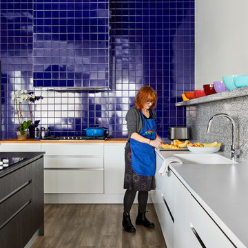
On March 19, ChopChop Kids, the publisher of ChopChop, The Fun Cooking Magazine for Families celebrated the opening of their new test kitchen in Belmont, MA. Designed by Deborah Berke Partners, the space is used for photoshoots, cooking classes, and recipe development for the non-profit magazine devoted to teaching children about nutrition and wellness through food. As an organization, ChopChop believes that cooking and eating together as a family is a vital step in resolving the obesity and hunger epidemics.
Porcelanosa products used:
Residence Line
G-037 Blanco Snow
G-017 Roble negro (ISLAND)
G-10 Roble Tierra
photos: Michael Granacki Photography (Michaelgranacki.format.com)
architect: Deborah Berke Partners
 Klopf Architecture
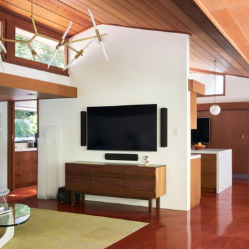
Nestled in the hills of Orinda, California, this 1951 residence is one of only seven extant homes, now known as “The Magnificent Seven”, designed by architect Olof Dahlstrand, a protégé of Frank Lloyd Wright. With its low-slung rooflines, natural materials, and deep integration with the sloping landscape, the home is a pristine example of mid-century modern design inspired by Wright’s organic principles. Over the years, prior homeowners have emphasized preservation, ensuring that the house remained relatively untouched. Each owner has respected the original architecture and stayed true to Dahlstrand’s intent. When a family of five—two college-aged sons and a middle school-aged daughter—acquired the property, they were captivated by its history, legacy of care, and architectural significance. While they appreciated Dahlstrand’s original vision, they also recognized the need to adapt the home for contemporary living while preserving its design integrity.
The remodel was conceived as a thoughtful response to the past—an effort to bring the house into the 21st century without compromising its soul. The primary mandate was to maintain architectural continuity while improving the functionality, comfort, and livability for a modern family. The design team—architects and contractor alike—worked with a shared reverence for the original architecture, allowing that mindset to guide even the most technical or pragmatic decisions.
A key objective was to increase natural light in the kitchen—a departure from Wrightian principles of enclosed, intimate cooking spaces—while maintaining the home’s architectural language. The kitchen was reconfigured to foster a stronger connection to adjacent living spaces while retaining the underlying concept of spatial separation. One of the most transformative architectural changes was the removal of a ridge beam that was originally planned to remain visible through the kitchen. During construction, the team collaborated on a better solution: a wide-flanged steel beam concealed within the roof envelope. This subtle move preserved the clean lines and ceiling continuity, a modern update carried out with utmost respect for the existing framework.
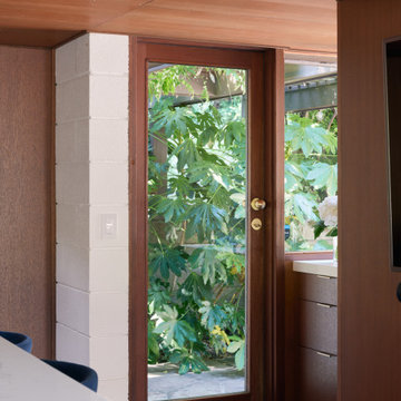
The home’s original powder room, previously accessible only through the kitchen, was relocated for better flow and privacy. A new powder room was carved out of former kitchen cabinetry—a narrow, interior space that could have felt dark and enclosed. To avoid this, the design extended the line of original transom windows into the new powder room and added a skylight above the vanity. The result is a bright and airy space that feels consistent with the rest of the home. Other updates included the installation of new solid-core interior doors with veneers carefully matched to the original mahogany, enhancing the continuity of the interiors. Even smaller decisions, such as placing the door knobs at 42 inches high, mirrored the original proportions. Every choice reflected a shared belief between the architect, contractor, and client: that new work should serve the integrity of the old.
The home’s extensive interior redwood millwork and paneling was meticulously restored. Where new materials were introduced—such as the replacement redwood soffit paneling—the contractor took pains to find finish nails that matched the original, rather than using modern equivalents. This level of craftsmanship and collaboration defined the project. It extended even to the detailing of a blind door to the new powder room, which had to disappear into the existing redwood board-and-batten wall. It was a team effort: the owner found a suitable handle, the architects devised the custom in-swing mechanism, and the contractor executed it so the door aligned precisely with the battens. Throughout, the homeowners were deeply engaged in the design process. One, a meticulous design enthusiast, focused on aesthetic integrity and historic detail. The other brought a practical and function-driven perspective, ensuring that new fixtures and materials would be durable and require minimal maintenance.
While the home’s location posed no major site challenges, sustainability was a key concern. The team upgraded the roof insulation, installed solar panels with battery storage, and added ductless mini-split cooling systems. Lighting was another area where modern technology was woven into a historic framework: new square LED fixtures echo the original custom perimeter soffit lights, maintaining the design language while offering advanced performance.
A planned expansion of a bedroom into suite with a bathroom had to be shelved due to budget constraints and the high cost of below-grade foundation work. Still, the team focused their efforts on making the most of the existing footprint, resolving constraints through design ingenuity rather than adding square footage. This renovation represents a collaborative achievement in preserving and evolving a historically significant home. Every decision was shaped by a shared ethos among clients, architects, and contractor: to maintain the home’s architectural soul while updating it for contemporary life. The result is a timeless modernist residence that continues Olof Dahlstrand’s legacy, remaining grounded in nature, craftsmanship, and human-scale design.
Klopf Architecture Team: John Klopf, AIA, Klara Kevane, Fernanda Bernardes
Interior Architectural Design: Klopf Architecture
Structural Engineer: Daniel Bastiao
Contractor: Don Larwood, Larwood Construction
Photography: Mariko Reed
Year Completed: 2022
 David Stern Architecture
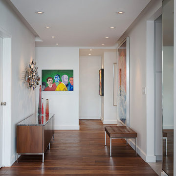
Entrance foyer. The concrete slab ceiling presented a challenge to light the artwork and space. Resolved by a graceful floating ceiling with integrated lighting.
 Artist's Proof
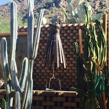
“Fashion is well known as a reliable reflection of cultural trends and historical events. On a personal level, it has become my creative vehicle for exploring the emotional roller coaster of life.
My inspiration arose from contemplating the dichotomy between the perception of women as fragile, delicate creatures, and the reality that most women are defined by resiliency and steely resolve. I employ a juxtaposition of extremes such as lightness and gravity, suppleness and intransigence, to convey feminine sensibilities.
Crafted of steel and embellished with flourishes of wire mesh, screening, cut-outs and bits of found objects, the dresses are at once both elegant and imposing. I like the duplicitous nature of steel which can be manipulated to appear feminine and soft while actually maintaining its strength and rigidity—an expression in contrasts and complements.”
-Donna McCullough
 Rue Sherwood Landscape Design, LLC
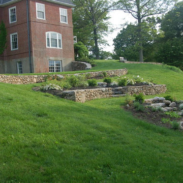
A hillside garden is created with terraces
Rue Sherwood Landscape Design
Design ideas for a mid-sized traditional full sun backyard stone retaining wall landscape in Boston for summer.
Design ideas for a mid-sized traditional full sun backyard stone retaining wall landscape in Boston for summer.
 Renovisions
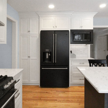
This client requested that we design her new kitchen space to look and function with her and her family’s usage in mind. She was not happy with her existing kitchen due to builder-grade ceramic flooring, lack of countertop space, poor lighting, inadequate and unorganized storage and the closed off feel of the area. Renovisions resolved all of these issues by designing and building an impressive, transitional styled kitchen; delivering a beautifully well thought-out space that provides a multi-functional approach and meets the needs of this busy and dynamic household.
Typically, we encounter challenges in every project, and this was no different. The upstairs bathroom plumbing ran across the entire length of the kitchen sink wall and it was necessary to work with it by moving the plumbing as far up as possible and then building a soffit to hide it.
Creating a space that has a more open feel was top of mind for our client. Installing a new wood floor that matched the existing dining room floor helped with this and in addition, warmed up the room. By relocating the refrigerator to the opposite wall and adding a bar area at the end toward the family room, the flow of traffic for family members and guests became more managed.
The open floor plan allowed for additional island cabinets to accommodate smart storage and better functionality when prepping meals, sitting to eat or gathering with friends and family. We believe having ample countertop surface space is a critical improvement in any renovation and this particular project now boasts a large countertop area with a stunning wide vein pattern that accentuates the design instead of overpowering it. The soft look of the Blanco Arabescato quartz enhances the space and looks lovely with the white inset styled cabinetry.
Beauty and function go hand-in-hand in this kitchen with several exceptional elements such as under-cabinet lighting with dimmers to control the mood light. Glass doors were added to the wall cabinets which flank the wine rack for displaying their decorative glassware and a beverage cooler below provided added convenience and access to cold beverages. The GE Café line of appliances in ‘Slate’ and ‘Stainless Steel’ finishes are a stunning contrast here.
The sensational looking decorative marble 6”x6” backsplash tile over the gas range and in the bar area creates nice focal points by creating a unique look for her that family and guests love.
Convenient and functional elements were added such as a blind corner pull-out for easier pot/pan storage, a sweep-o-vac under cabinet vacuum system for those constant quick clean-ups, a pull-out caddy under the sink base for storage of cleaning products and a protective mat to collect potential spills.
Our client let us know it was time for a change and we listened. She shared a few pictures she loved from a home magazine, we shared our insight and then designed/built the kitchen of her dreams! … A fabulous and functional space.

 Ponti Landscapes Inc
This project in Cary, NC included resolving grade and drainage issue and the installation of:
- Approximately 5,000 SQFT of fescue sod
- 100' L Retaining Wall
- Large dry creek drainage bed
 Klopf Architecture
Nestled in the hills of Orinda, California, this 1951 residence is one of only seven extant homes, now known as “The Magnificent Seven”, designed by architect Olof Dahlstrand, a protégé of Frank Lloyd Wright. With its low-slung rooflines, natural materials, and deep integration with the sloping landscape, the home is a pristine example of mid-century modern design inspired by Wright’s organic principles. Over the years, prior homeowners have emphasized preservation, ensuring that the house remained relatively untouched. Each owner has respected the original architecture and stayed true to Dahlstrand’s intent. When a family of five—two college-aged sons and a middle school-aged daughter—acquired the property, they were captivated by its history, legacy of care, and architectural significance. While they appreciated Dahlstrand’s original vision, they also recognized the need to adapt the home for contemporary living while preserving its design integrity.
The remodel was conceived as a thoughtful response to the past—an effort to bring the house into the 21st century without compromising its soul. The primary mandate was to maintain architectural continuity while improving the functionality, comfort, and livability for a modern family. The design team—architects and contractor alike—worked with a shared reverence for the original architecture, allowing that mindset to guide even the most technical or pragmatic decisions.
A key objective was to increase natural light in the kitchen—a departure from Wrightian principles of enclosed, intimate cooking spaces—while maintaining the home’s architectural language. The kitchen was reconfigured to foster a stronger connection to adjacent living spaces while retaining the underlying concept of spatial separation. One of the most transformative architectural changes was the removal of a ridge beam that was originally planned to remain visible through the kitchen. During construction, the team collaborated on a better solution: a wide-flanged steel beam concealed within the roof envelope. This subtle move preserved the clean lines and ceiling continuity, a modern update carried out with utmost respect for the existing framework.
The home’s original powder room, previously accessible only through the kitchen, was relocated for better flow and privacy. A new powder room was carved out of former kitchen cabinetry—a narrow, interior space that could have felt dark and enclosed. To avoid this, the design extended the line of original transom windows into the new powder room and added a skylight above the vanity. The result is a bright and airy space that feels consistent with the rest of the home. Other updates included the installation of new solid-core interior doors with veneers carefully matched to the original mahogany, enhancing the continuity of the interiors. Even smaller decisions, such as placing the door knobs at 42 inches high, mirrored the original proportions. Every choice reflected a shared belief between the architect, contractor, and client: that new work should serve the integrity of the old.
The home’s extensive interior redwood millwork and paneling was meticulously restored. Where new materials were introduced—such as the replacement redwood soffit paneling—the contractor took pains to find finish nails that matched the original, rather than using modern equivalents. This level of craftsmanship and collaboration defined the project. It extended even to the detailing of a blind door to the new powder room, which had to disappear into the existing redwood board-and-batten wall. It was a team effort: the owner found a suitable handle, the architects devised the custom in-swing mechanism, and the contractor executed it so the door aligned precisely with the battens. Throughout, the homeowners were deeply engaged in the design process. One, a meticulous design enthusiast, focused on aesthetic integrity and historic detail. The other brought a practical and function-driven perspective, ensuring that new fixtures and materials would be durable and require minimal maintenance.
While the home’s location posed no major site challenges, sustainability was a key concern. The team upgraded the roof insulation, installed solar panels with battery storage, and added ductless mini-split cooling systems. Lighting was another area where modern technology was woven into a historic framework: new square LED fixtures echo the original custom perimeter soffit lights, maintaining the design language while offering advanced performance.
A planned expansion of a bedroom into suite with a bathroom had to be shelved due to budget constraints and the high cost of below-grade foundation work. Still, the team focused their efforts on making the most of the existing footprint, resolving constraints through design ingenuity rather than adding square footage. This renovation represents a collaborative achievement in preserving and evolving a historically significant home. Every decision was shaped by a shared ethos among clients, architects, and contractor: to maintain the home’s architectural soul while updating it for contemporary life. The result is a timeless modernist residence that continues Olof Dahlstrand’s legacy, remaining grounded in nature, craftsmanship, and human-scale design.
Klopf Architecture Team: John Klopf, AIA, Klara Kevane, Fernanda Bernardes
Interior Architectural Design: Klopf Architecture
Structural Engineer: Daniel Bastiao
Contractor: Don Larwood, Larwood Construction
Photography: Mariko Reed
Year Completed: 2022
 San Jose Tree Service & Landscaping
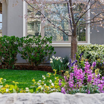
-Drip irrigation system repair, resolving improper watering patterns that were causing plant stress
-
Photo of a landscaping in San Francisco.
Photo of a landscaping in San Francisco.
 Ryan Associates Landscape Architecture & Planning
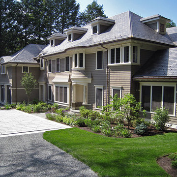
Visitors arrive at a granite autocourt. The challenge of this site was to design functional living spaces while resolving a series of problems. Two entry courts offer suitable welcomes to the home: a formal granite court that is approached from above as one descends down a once blind driveway, and a more utilitarian play court off the garage. The rear yard, once disconnected from the house, is terraced and suitable for entertaining. A granite stair descends from the terrace to a new expanded lower lawn. A custom fire pit sits off the upper terrace and provides a more intimate gathering space.
 Reico Kitchen & Bath
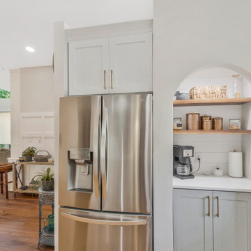
Jen Denham of Reico Kitchen and Bath in White Plains, MD collaborated with Steve Bowling to create a coastal-style inspired transitional kitchen remodel featuring Merillat cabinetry.
The perimeter cabinets are Merillat Classic in the Tolani 5-piece door style in the Cotton finish, paired with nook cabinets in Merillat Masterpiece in the Montresano door style in the Serenity Evercore finish. The kitchen countertop is MSI Q Calacatta Miraggio Gold quartz with a quarter inch Bevel Edge.
The client expressed their gratitude saying, “There isn’t one thing I would go back and do differently. I was able to work with the Reico sales team and make significant improvements to the functionality, layout and appearance of the space. We were able to turn a kitchen closet into a coffee nook, remove an outdated island and relocate the refrigerator area to improve the overall functionality of the kitchen.”
“Reico gave us great suggestions when we were unsure about something and worked quickly to resolve any concerns or issues. We made some minor tweaks along the way and Reico worked with us consistently to modify any changes. Overall, the Reico team is awesome, and I would highly recommend them to anyone. Thanks so much for giving us a great kitchen!”
According to Jen, the client was really professional and open to ideas. “The condo has a great view of the water, so they wanted to incorporate a light and bright theme with a bit of color. After the kitchen came together, we change the floating shelves from white painted finish to a darker stain. This created a wonderful contrast to the wall cabinets and helped bring in some natural colors of their new floor.”
“All and all, the client was happy with the result and ended up with a beautiful kitchen, a huge transformation from the closed in space from before.”
Photos courtesy of BTW Images.
 Michael Nash Design, Build & Homes
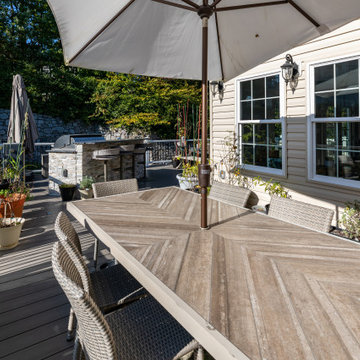
This couple desired to expand their horizon and maximize their outdoor living space. Their back yard was part of a big hill and a major amount of excavation needed to level up the ground for any kind of flat space use
• The homeowner’s goals where to have a big lower level patio to be able to walk out of their basement into stone patio
• Space for outdoor jacuzzi
• Space for outdoor wood burning fireplace and seating wall
• Outdoor lower bar
• Second floor large scale deck with a cooking bar
• A walkway ramp for wheelchair access (covered with roof)
• Lots of seating and entertainment space
Challenges:
The big backyard hill and big ground.
Big stone retaining walls needed.
Major excavation.
Run utilities, such as gas and water and sewer for bar area.
Resolve drainage.
The project started with breaking ground, and haul away major amount of dirt from back yard, implementing over 300 ft of retaining wall covered in stone to sunk in the patio
Cutting concrete walls in basement to create walk out into new patio
New flagstone patio over concrete slab was designed with outer radius to own a wood burning fireplace and seating walls. Right side was covered with tall stone wall and raining to adjacent neighbors
Under the deck area is a covered area for bar with stool seating wrapped with ledger stone and granite top and a secluded area for jacuzzi away from neighbors’ view
A double-sided staircase was built connecting lower patio to wrapped around upper deck,
The new Azak covered deck with listed rail system was equipped with cooking island, natural gas grill, sink and faucet, microwave and outdoor beverage center.
A covered walkway ramp has given an opportunity for elder mother in wheelchair to be able to visit them and spend time outdoor with them.
Beaded ceiling panels and hanging chandeliers has lid up this veranda.
This three-story addition into back of this dwelling stand tall in this community and now more than ever this family get to enjoy their backyard and outdoors with friends and family
The harmonizing choice of decking colors with ledger stone, granite tops, flagstone and veneer wall stones has given this outdoor project a standing ovation.
58