
Search results for "Rich selection" in Home Design Ideas

 Studio TOOP
design: Carrie Preston (Studio TOOP) and Jasper Helmantel (Cruydt Hoeck), 2011
location: Appeltern, NL
status: built in 2012 by Appeltern Model Garden Complex
photos: Olga van Saane, October 2013
Designed as assignment from both the Dutch gardening magazine Groei & Bloei and the television and radio nature program Vara's Vroege Vogels, this garden serves as a model of how homeowners can incorporate lots of plant life and wildlife into the design but without sacrificing practicality or aesthetics. The garden is deliberately contemporary in its style to emphasize that nature-rich gardens need not look a certain way - insects and birds don't care if the lines are straight or curved.
At the same time the garden makes use of affordable, simple, no-nonsense materials. The 40x60 cm paving stones are one of the most common and affordable paving options in the Netherlands, available en masse for free on the Internet. Conceptually we imagined a garden completely paved with the tiles (as to many gardens are) and what would happen if took out some of these stones, used them to build benches and structure and added plants where the tiles had been. In the construction of the benches we include other materials such as bamboo sticks and insulation bricks that create habitat for insects such as solitary bees.
The plant palette is based on a selection of native and host plants in combination with the 26 plants plan set up by Groei & Boei -- a list of plants aimed at making the use of more plants in gardens accessible and less intimidating. The choice for the number 26 corresponds with the number of letters in the alphabet in line with the famous Dutch garden designer Mien Ruy's comment that if we only need 26 letters to create a whole language, we should be able to combine and mix 26 plants to express far more than we think.

 Jarrett Design
These clients win the award for ‘Most Jarrett Design Projects in One Home’! We consider ourselves extremely fortunate to have been able to work with these kind folks so consistently over the years.
The most recent project features their master bath, a room they have been wanting to tackle for many years. We think it was well worth the wait! It started off as an outdated space with an enormous platform tub open to the bedroom featuring a large round column. The open concept was inspired by island homes long ago, but it was time for some privacy. The water closet, shower and linen closet served the clients well, but the tub and vanities had to be updated with storage improvements desired. The clients also wanted to add organized spaces for clothing, shoes and handbags. Swapping the large tub for a dainty freestanding tub centered on the new window, cleared space for gorgeous his and hers vanities and armoires flanking the tub. The area where the old double vanity existed was transformed into personalized storage closets boasting beautiful custom mirrored doors. The bathroom floors and shower surround were replaced with classic white and grey materials. Handmade vessel sinks and faucets add a rich touch. Soft brass wire doors are the highlight of a freestanding custom armoire created to house handbags adding more convenient storage and beauty to the bedroom. Star sconces, bell jar fixture, wallpaper and window treatments selected by the homeowner with the help of the talented Lisa Abdalla Interiors provide the finishing traditional touches for this sanctuary.
Jacqueline Powell Photography

 Kathleen Jennison
An Arts & Crafts Bungalow is one of my favorite styles of homes. We have quite a few of them in our Stockton Mid-Town area. And when C&L called us to help them remodel their 1923 American Bungalow, I was beyond thrilled.
As per usual, when we get a new inquiry, we quickly Google the project location while we are talking to you on the phone. My excitement escalated when I saw the Google Earth Image of the sweet Sage Green bungalow in Mid-Town Stockton. "Yes, we would be interested in working with you," I said trying to keep my cool.
But what made it even better was meeting C&L and touring their home, because they are the nicest young couple, eager to make their home period perfect. Unfortunately, it had been slightly molested by some bad house-flippers, and we needed to bring the bathroom back to it "roots."
We knew we had to banish the hideous brown tile and cheap vanity quickly. But C&L complained about the condensation problems and the constant fight with mold. This immediately told me that improper remodeling had occurred and we needed to remedy that right away.
The Before: Frustrations with a Botched Remodel
The bathroom needed to be brought back to period appropriate design with all the functionality of a modern bathroom. We thought of things like marble countertop, white mosaic floor tiles, white subway tile, board and batten molding, and of course a fabulous wallpaper.
This small (and only) bathroom on a tight budget required a little bit of design sleuthing to figure out how we could get the proper look and feel. Our goal was to determine where to splurge and where to economize and how to complete the remodel as quickly as possible because C&L would have to move out while construction was going on.
The Process: Hard Work to Remedy Design and Function
During our initial design study, (which included 2 hours in the owners’ home), we noticed framed images of William Morris Arts and Crafts textile patterns and knew this would be our design inspiration. We presented C&L with three options and they quickly selected the Pimpernel Design Concept.
We had originally selected the Black and Olive colors with a black vanity, mirror, and black and white floor tile. C&L liked it but weren’t quite sure about the black, We went back to the drawing board and decided the William & Co Pimpernel Wallpaper in Bayleaf and Manilla color with a softer gray painted vanity and mirror and white floor tile was more to their liking.
After the Design Concept was approved, we went to work securing the building permit, procuring all the elements, and scheduling our trusted tradesmen to perform the work.
We did uncover some shoddy work by the flippers such as live electrical wires hidden behind the wall, plumbing venting cut-off and buried in the walls (hence the constant dampness), the tub barely balancing on two fence boards across the floor joist, and no insulation on the exterior wall.
All of the previous blunders were fixed and the bathroom put back to its previous glory. We could feel the house thanking us for making it pretty again.
The After Reveal: Cohesive Design Decisions
We selected a simple white subway tile for the tub/shower. This is always classic and in keeping with the style of the house.
We selected a pre-fab vanity and mirror, but they look rich with the quartz countertop. There is much more storage in this small vanity than you would think.
The Transformation: A Period Perfect Refresh
We began the remodel just as the pandemic reared and stay-in-place orders went into effect. As C&L were already moved out and living with relatives, we got the go-ahead from city officials to get the work done (after all, how can you shelter in place without a bathroom?).
All our tradesmen were scheduled to work so that only one crew was on the job site at a time. We stayed on the original schedule with only a one week delay.
The end result is the sweetest little bathroom I've ever seen (and I can't wait to start work on C&L's kitchen next).
Thank you for joining me in this project transformation. I hope this inspired you to think about being creative with your design projects, determining what works best in keeping with the architecture of your space, and carefully assessing how you can have the best life in your home.
Find the right local pro for your project
 April Myn Design, LLC
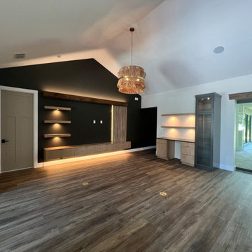
Designed to seamlessly blend rustic warmth with modern sophistication, this custom TV accent wall is the perfect fusion of the homeowners' distinct styles. After presenting multiple design concepts, this winning vision maintains harmony within the open-concept home.
To ensure a cohesive flow, I carried through the cabinet and island tones from the kitchen and dry bar. The floating flat-panel cabinetry along the bottom provides functional storage while keeping the design sleek and streamlined. Wood paneling strips and floating shelves add depth and character, with ambient and accent lighting for a warm, inviting glow.
A reclaimed mushroom wood beam spans overhead, featuring upper lighting that naturally draws the eye up while introducing a touch of rustic charm. This same stunning material was also used to craft a large beam over the sliders, seamlessly connecting the kitchen and dry bar, as well as a statement foyer entry beam, enhancing the home’s architectural flow.
For a dramatic yet refined effect, the back wall is painted Urbane Bronze, allowing the rich wood tones and lighting to take center stage. When the 85" TV is off, it blends effortlessly into the dark backdrop rather than dominating the space.
To complete the design, I selected a large woven natural light fixture, adding another layer of texture and organic beauty. The result is a one-of-a-kind feature wall that is both visually striking and effortlessly integrated into the home’s overall aesthetic.

 Robin's Nest Interiors
So this is one of my Guest Rooms. I love using twin beds in a Bedroom (although it can be pricey – two of everything!). I found these vintage iron bed frames from one of my favorite vendors. I wanted to lots of layers of bedding so I have two duvets – one on the bed and one at the foot of the bed – and a colorful throw and accent pillow. I repurposed the window treatment from my Master Bedroom. The balloon valance is the perfect style for this large scale floral fabric in vibrant blues and greens. The walls are painted one of my favorites – Sherwin Williams’ Anew Gray (SW7030). I love painted pieces – especially those with storage for a bedroom. The fun green chest with interesting shape fits nicely between the beds. The two shade lamp could not be more perfect for the twin beds. Every Bedroom needs seating, and I love a bench at the end of the bed. I had two problems – I did not have room for a full bench and I did not want to hide the bed frame. These small ottomans in rich blue velvet were the perfect solution. I added a gray wool rug for softness underfoot. On the wall opposite the beds, I used a painted blue dresser. To finish off the vignette, I selected a round mirror (because every Bedroom needs a mirror) with an oversized frame and unique accessories to support my color palette. Notice how nicely all of the different finishes – silver on the mirror, black iron on the bed and dresser and burnished brass on my little insect sculptures – work together. You can and should mix your metals – it makes every room more interesting! With the twin beds, the room was calling for symmetry so I dressed the walls with 6 botanical prints – 3 on each side.
This Bedroom makes me want to be a guest in my own home! Enjoy!

 White Birch Design
We are so excited to share with you this beautiful kitchen remodel in Lakeville, MN. Our clients came to us wanting to take out the wall between the kitchen and the dining room. By taking out the wall, we were able to create a new larger kitchen!
We kept the sink in the same location, and then moved the stove to the same wall as the sink. The fridge was moved to the far wall, we added an oven/micro combinations and a large pantry. We even had some extra room to create a desk space. The coolest thing about this kitchen is the DOUBLE island! The island closest to the sink functions as a working island and the other is for entertaining with seating for guests.
What really shines here is the combination of color that creates such a beautiful subtle elegance. The warm gray color of the cabinets were paired with the brown stained cabinets on the island. We then selected darker honed granite countertops on the perimeter cabinets and a light gray quartz countertop for the islands. The slightly marbled backsplash helps to tie everything in and give such a richness to the whole kitchen. I love adding little pops throughout the kitchen, so matte black hardware and the matte black sink light are perfect!
We are so happy with the final result of this kitchen! We would love the opportunity to help you out with any of your remodeling needs as well! Contact us today
 ASR DESIGN STUDIO
Our mission was to completely update and transform their huge house into a cozy, welcoming and warm home of their own.
“When we moved in, it was such a novelty to live in a proper house. But it still felt like the in-law’s home,” our clients told us. “Our dream was to make it feel like our home.”
Our transformation skills were put to the test when we created the host-worthy kitchen space (complete with a barista bar!) that would double as the heart of their home and a place to make memories with their friends and family.
We upgraded and updated their dark and uninviting family room with fresh furnishings, flooring and lighting and turned those beautiful exposed beams into a feature point of the space.
The end result was a flow of modern, welcoming and authentic spaces that finally felt like home. And, yep … the invite was officially sent out!
Our clients had an eclectic style rich in history, culture and a lifetime of adventures. We wanted to highlight these stories in their home and give their memorabilia places to be seen and appreciated.
The at-home office was crafted to blend subtle elegance with a calming, casual atmosphere that would make it easy for our clients to enjoy spending time in the space (without it feeling like they were working!)
We carefully selected a pop of color as the feature wall in the primary suite and installed a gorgeous shiplap ledge wall for our clients to display their meaningful art and memorabilia.
Then, we carried the theme all the way into the ensuite to create a retreat that felt complete.


 Zola European Windows
Essential, contemporary, and inviting defines this extremely energy efficient, Energy Star certified, Passive House design-inspired home in the Pacific Northwest. Designed for an active family of four, the one-story 3 bedroom, 2 bath floor plan offers tasteful aging in place features, a strong sense of privacy, and a low profile that doesn’t impinge on the natural landscape. This house will heat itself in the dead of winter with less energy than it takes to run a hair dryer, and be sensual to live in while it does it. The forms throughout the home are simple and neutral, allowing for ample natural light, rich warm materials, and of course, room for the Guinea pigs makes this a great example of artful architecture applied to a genuine family lifestyle.
This ultra energy efficient home relies on extremely high levels of insulation, air-tight detailing and construction, and the implementation of high performance, custom made European windows and doors by Zola Windows. Zola’s ThermoPlus Clad line, which boasts R-11 triple glazing and is thermally broken with a layer of patented German Purenit®, was selected for the project. Natural daylight enters both from the tilt & turn and fixed windows in the living and dining areas, and through the terrace door that leads seamlessly outside to the natural landscape.
Project Designed & Built by: artisansgroup
Certifications: Energy Star & Built Green Lvl 4
Photography: Art Gray of Art Gray Photography
 Robin's Nest Interiors
Updated Spec Home: The Bathrooms
The last stop on the main level of this Updated Spec Home are the Bathrooms. Every surface of the Guest Bath and Master Bath was touched- even some renovations in the Master bedroom. All I can say is thank goodness these two love wallpaper – we selected classic patterns for each bath that will stand the test of time!
Guest Bathroom
The Guest Bath also doubles as my mom’s bath. The footprint remained the same but we updated everything. A new vanity was chosen to give her that furniture look while still providing some storage – although there is a linen closet located just outside the bath. We topped it off with a beautiful mirror with great detail and an equally great light fixture. Also, we mixed the finishes in the bath between nickel and champagne, i.e., gold/silver mix. Mixing metals is perfectly acceptable and quite frankly way more interesting the everything matching. Updated Spec Home Bathrooms - Robin's Nest Interiors
Updated Spec Home Bathrooms - Robin's Nest Interiors
We found this amazing wallpaper with its subtle colors and pattern and selected a large square tile to coordinate for the floor. Yes, you can do a large tile in a small bath because it actually makes the space feel larger. For finishing touches, we had this gorgeous shower curtain made. Above the new toilet, we added interesting abstract artwork framed in a large mat so it would not clash with the wallpaper.
Master Bathroom
Originally, the Master Bath had a large garden tub as the focal point and a tiny stand up shower in the corner. We removed the garden tub, moved the shower to this area as the focal point and turned the tiny shower into a much needed linen closet. At this point, I know you are thinking, what about resale with no tub? There is a tub in the Guest Bath so the house will still be appealing to young families or bath lovers alike.
© 2016 RealTourCast | Tim Furlong Jr.
Tile selections came first – my sister fell in love with this gorgeous dark greige glass tile. We used it in the upper half of the shower while keeping the lower half light with this plank tile in a striated pattern. We carried the plank tile onto the floor for a seamless look.
Updated Spec Home Bathrooms - Robin's Nest Interiors
We replaced the two vanities with stock cabinetry that looks custom in a rich wood stain. Also, we found a gorgeous granite remnant for the countertop and finished off the vanity area with oversized mirrors, sleek lighting, and striking hardware.Updated Spec Home Bathrooms - Robin's Nest Interiors
The wallpaper is absolutely perfect for this space – it adds an interesting backdrop without overpowering the room. Her fantastic artwork was able to fit in the niche next to the new toilet. This is one gorgeous bath!
Updated Spec Home Bathrooms - Robin's Nest Interiors
Coming Soon
Spoiler Alert – my mom and sister have decided to update their Basement Family Room and add a small Powder Bath so look for Season 2 of the Updated Spec Home series!
See the rest of this house through these links! Foyer & Great Room, Kitchen & Breakfast Area, Bedrooms, Guest Bedroom.

 lavish
This whole-home remodel in Raleigh, NC blends warm organic textures with clean modern lines for a look that feels current but built to last.
The kitchen remodel pairs white oak cabinetry with a contrasting white island, all wrapped in dramatic full-slab marble that runs from the countertops up the backsplash to a sculpted plaster-style range hood.
Brass hardware, glass cone pendants, woven-back oak counter stools, and wide-plank white oak flooring keep the palette light and layered — a kitchen design that's as practical for family life as it is beautiful.
In the two-story family room, our team designed around the dramatic ceiling height with an oversized gallery of landscape art, a deep white sectional, a caramel leather swivel chair, and a charcoal ottoman that grounds the space.
The formal dining room design makes a bolder statement: a coffered ceiling and wall paneling in a rich espresso-black envelop a solid wood table with rope-back chairs, connected to the rest of the main floor through a series of arched openings.
A casual dining nook nearby features a double-sided fireplace clad in large-format slate-look tile, a round pedestal table, and olive velvet chairs beneath a fluted drum pendant.
As a full-service interior design firm in Raleigh, NC, Lavish led this project from kitchen design and materials selection through the living room, dining room, and finishing details — delivering a cohesive home design where every space connects.

 Birchwood Construction Company
Camp Wobegon is a nostalgic waterfront retreat for a multi-generational family. The home's name pays homage to a radio show the homeowner listened to when he was a child in Minnesota. Throughout the home, there are nods to the sentimental past paired with modern features of today.
The five-story home sits on Round Lake in Charlevoix with a beautiful view of the yacht basin and historic downtown area. Each story of the home is devoted to a theme, such as family, grandkids, and wellness. The different stories boast standout features from an in-home fitness center complete with his and her locker rooms to a movie theater and a grandkids' getaway with murphy beds. The kids' library highlights an upper dome with a hand-painted welcome to the home's visitors.
Throughout Camp Wobegon, the custom finishes are apparent. The entire home features radius drywall, eliminating any harsh corners. Masons carefully crafted two fireplaces for an authentic touch. In the great room, there are hand constructed dark walnut beams that intrigue and awe anyone who enters the space. Birchwood artisans and select Allenboss carpenters built and assembled the grand beams in the home.
Perhaps the most unique room in the home is the exceptional dark walnut study. It exudes craftsmanship through the intricate woodwork. The floor, cabinetry, and ceiling were crafted with care by Birchwood carpenters. When you enter the study, you can smell the rich walnut. The room is a nod to the homeowner's father, who was a carpenter himself.
The custom details don't stop on the interior. As you walk through 26-foot NanoLock doors, you're greeted by an endless pool and a showstopping view of Round Lake. Moving to the front of the home, it's easy to admire the two copper domes that sit atop the roof. Yellow cedar siding and painted cedar railing complement the eye-catching domes.
 Kathleen Jennison
An Arts & Crafts Bungalow is one of my favorite styles of homes. We have quite a few of them in our Stockton Mid-Town area. And when C&L called us to help them remodel their 1923 American Bungalow, I was beyond thrilled.
As per usual, when we get a new inquiry, we quickly Google the project location while we are talking to you on the phone. My excitement escalated when I saw the Google Earth Image of the sweet Sage Green bungalow in Mid-Town Stockton. "Yes, we would be interested in working with you," I said trying to keep my cool.
But what made it even better was meeting C&L and touring their home, because they are the nicest young couple, eager to make their home period perfect. Unfortunately, it had been slightly molested by some bad house-flippers, and we needed to bring the bathroom back to it "roots."
We knew we had to banish the hideous brown tile and cheap vanity quickly. But C&L complained about the condensation problems and the constant fight with mold. This immediately told me that improper remodeling had occurred and we needed to remedy that right away.
The Before: Frustrations with a Botched Remodel
The bathroom needed to be brought back to period appropriate design with all the functionality of a modern bathroom. We thought of things like marble countertop, white mosaic floor tiles, white subway tile, board and batten molding, and of course a fabulous wallpaper.
This small (and only) bathroom on a tight budget required a little bit of design sleuthing to figure out how we could get the proper look and feel. Our goal was to determine where to splurge and where to economize and how to complete the remodel as quickly as possible because C&L would have to move out while construction was going on.
The Process: Hard Work to Remedy Design and Function
During our initial design study, (which included 2 hours in the owners’ home), we noticed framed images of William Morris Arts and Crafts textile patterns and knew this would be our design inspiration. We presented C&L with three options and they quickly selected the Pimpernel Design Concept.
We had originally selected the Black and Olive colors with a black vanity, mirror, and black and white floor tile. C&L liked it but weren’t quite sure about the black, We went back to the drawing board and decided the William & Co Pimpernel Wallpaper in Bayleaf and Manilla color with a softer gray painted vanity and mirror and white floor tile was more to their liking.
After the Design Concept was approved, we went to work securing the building permit, procuring all the elements, and scheduling our trusted tradesmen to perform the work.
We did uncover some shoddy work by the flippers such as live electrical wires hidden behind the wall, plumbing venting cut-off and buried in the walls (hence the constant dampness), the tub barely balancing on two fence boards across the floor joist, and no insulation on the exterior wall.
All of the previous blunders were fixed and the bathroom put back to its previous glory. We could feel the house thanking us for making it pretty again.
The After Reveal: Cohesive Design Decisions
We selected a simple white subway tile for the tub/shower. This is always classic and in keeping with the style of the house.
We selected a pre-fab vanity and mirror, but they look rich with the quartz countertop. There is much more storage in this small vanity than you would think.
The Transformation: A Period Perfect Refresh
We began the remodel just as the pandemic reared and stay-in-place orders went into effect. As C&L were already moved out and living with relatives, we got the go-ahead from city officials to get the work done (after all, how can you shelter in place without a bathroom?).
All our tradesmen were scheduled to work so that only one crew was on the job site at a time. We stayed on the original schedule with only a one week delay.
The end result is the sweetest little bathroom I've ever seen (and I can't wait to start work on C&L's kitchen next).
Thank you for joining me in this project transformation. I hope this inspired you to think about being creative with your design projects, determining what works best in keeping with the architecture of your space, and carefully assessing how you can have the best life in your home.
 lavish
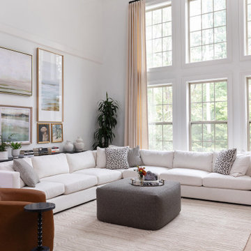
This whole-home remodel in Raleigh, NC blends warm organic textures with clean modern lines for a look that feels current but built to last.
The kitchen remodel pairs white oak cabinetry with a contrasting white island, all wrapped in dramatic full-slab marble that runs from the countertops up the backsplash to a sculpted plaster-style range hood.
Brass hardware, glass cone pendants, woven-back oak counter stools, and wide-plank white oak flooring keep the palette light and layered — a kitchen design that's as practical for family life as it is beautiful.
In the two-story family room, our team designed around the dramatic ceiling height with an oversized gallery of landscape art, a deep white sectional, a caramel leather swivel chair, and a charcoal ottoman that grounds the space.
The formal dining room design makes a bolder statement: a coffered ceiling and wall paneling in a rich espresso-black envelop a solid wood table with rope-back chairs, connected to the rest of the main floor through a series of arched openings.
A casual dining nook nearby features a double-sided fireplace clad in large-format slate-look tile, a round pedestal table, and olive velvet chairs beneath a fluted drum pendant.
As a full-service interior design firm in Raleigh, NC, Lavish led this project from kitchen design and materials selection through the living room, dining room, and finishing details — delivering a cohesive home design where every space connects.
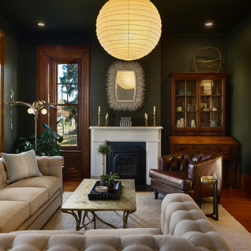
Sponsored
Columbus, OH

Wannemacher Interiors
Customized Award-Winning Interior Design Solutions in Franklin Cnty OH
 Studio TOOP
design: Carrie Preston (Studio TOOP) and Jasper Helmantel (Cruydt Hoeck), 2011
location: Appeltern, NL
status: built in 2012 by Appeltern Model Garden Complex
photos: Olga van Saane, October 2013
Designed as assignment from both the Dutch gardening magazine Groei & Bloei and the television and radio nature program Vara's Vroege Vogels, this garden serves as a model of how homeowners can incorporate lots of plant life and wildlife into the design but without sacrificing practicality or aesthetics. The garden is deliberately contemporary in its style to emphasize that nature-rich gardens need not look a certain way - insects and birds don't care if the lines are straight or curved.
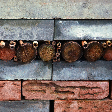
At the same time the garden makes use of affordable, simple, no-nonsense materials. The 40x60 cm paving stones are one of the most common and affordable paving options in the Netherlands, available en masse for free on the Internet. Conceptually we imagined a garden completely paved with the tiles (as to many gardens are) and what would happen if took out some of these stones, used them to build benches and structure and added plants where the tiles had been. In the construction of the benches we include other materials such as bamboo sticks and insulation bricks that create habitat for insects such as solitary bees.
The plant palette is based on a selection of native and host plants in combination with the 26 plants plan set up by Groei & Boei -- a list of plants aimed at making the use of more plants in gardens accessible and less intimidating. The choice for the number 26 corresponds with the number of letters in the alphabet in line with the famous Dutch garden designer Mien Ruy's comment that if we only need 26 letters to create a whole language, we should be able to combine and mix 26 plants to express far more than we think.
 lavish
This whole-home remodel in Raleigh, NC blends warm organic textures with clean modern lines for a look that feels current but built to last.
The kitchen remodel pairs white oak cabinetry with a contrasting white island, all wrapped in dramatic full-slab marble that runs from the countertops up the backsplash to a sculpted plaster-style range hood.
Brass hardware, glass cone pendants, woven-back oak counter stools, and wide-plank white oak flooring keep the palette light and layered — a kitchen design that's as practical for family life as it is beautiful.
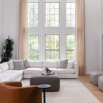
In the two-story family room, our team designed around the dramatic ceiling height with an oversized gallery of landscape art, a deep white sectional, a caramel leather swivel chair, and a charcoal ottoman that grounds the space.
The formal dining room design makes a bolder statement: a coffered ceiling and wall paneling in a rich espresso-black envelop a solid wood table with rope-back chairs, connected to the rest of the main floor through a series of arched openings.
A casual dining nook nearby features a double-sided fireplace clad in large-format slate-look tile, a round pedestal table, and olive velvet chairs beneath a fluted drum pendant.
As a full-service interior design firm in Raleigh, NC, Lavish led this project from kitchen design and materials selection through the living room, dining room, and finishing details — delivering a cohesive home design where every space connects.
 ASR DESIGN STUDIO
Our mission was to completely update and transform their huge house into a cozy, welcoming and warm home of their own.
“When we moved in, it was such a novelty to live in a proper house. But it still felt like the in-law’s home,” our clients told us. “Our dream was to make it feel like our home.”
Our transformation skills were put to the test when we created the host-worthy kitchen space (complete with a barista bar!) that would double as the heart of their home and a place to make memories with their friends and family.
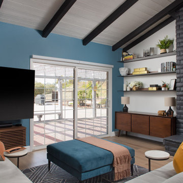
We upgraded and updated their dark and uninviting family room with fresh furnishings, flooring and lighting and turned those beautiful exposed beams into a feature point of the space.
The end result was a flow of modern, welcoming and authentic spaces that finally felt like home. And, yep … the invite was officially sent out!
Our clients had an eclectic style rich in history, culture and a lifetime of adventures. We wanted to highlight these stories in their home and give their memorabilia places to be seen and appreciated.
The at-home office was crafted to blend subtle elegance with a calming, casual atmosphere that would make it easy for our clients to enjoy spending time in the space (without it feeling like they were working!)
We carefully selected a pop of color as the feature wall in the primary suite and installed a gorgeous shiplap ledge wall for our clients to display their meaningful art and memorabilia.
Then, we carried the theme all the way into the ensuite to create a retreat that felt complete.
 lavish
This whole-home remodel in Raleigh, NC blends warm organic textures with clean modern lines for a look that feels current but built to last.
The kitchen remodel pairs white oak cabinetry with a contrasting white island, all wrapped in dramatic full-slab marble that runs from the countertops up the backsplash to a sculpted plaster-style range hood.
Brass hardware, glass cone pendants, woven-back oak counter stools, and wide-plank white oak flooring keep the palette light and layered — a kitchen design that's as practical for family life as it is beautiful.
In the two-story family room, our team designed around the dramatic ceiling height with an oversized gallery of landscape art, a deep white sectional, a caramel leather swivel chair, and a charcoal ottoman that grounds the space.
The formal dining room design makes a bolder statement: a coffered ceiling and wall paneling in a rich espresso-black envelop a solid wood table with rope-back chairs, connected to the rest of the main floor through a series of arched openings.
A casual dining nook nearby features a double-sided fireplace clad in large-format slate-look tile, a round pedestal table, and olive velvet chairs beneath a fluted drum pendant.
As a full-service interior design firm in Raleigh, NC, Lavish led this project from kitchen design and materials selection through the living room, dining room, and finishing details — delivering a cohesive home design where every space connects.

 Zola European Windows
Essential, contemporary, and inviting defines this extremely energy efficient, Energy Star certified, Passive House design-inspired home in the Pacific Northwest. Designed for an active family of four, the one-story 3 bedroom, 2 bath floor plan offers tasteful aging in place features, a strong sense of privacy, and a low profile that doesn’t impinge on the natural landscape. This house will heat itself in the dead of winter with less energy than it takes to run a hair dryer, and be sensual to live in while it does it. The forms throughout the home are simple and neutral, allowing for ample natural light, rich warm materials, and of course, room for the Guinea pigs makes this a great example of artful architecture applied to a genuine family lifestyle.
This ultra energy efficient home relies on extremely high levels of insulation, air-tight detailing and construction, and the implementation of high performance, custom made European windows and doors by Zola Windows. Zola’s ThermoPlus Clad line, which boasts R-11 triple glazing and is thermally broken with a layer of patented German Purenit®, was selected for the project. Natural daylight enters both from the tilt & turn and fixed windows in the living and dining areas, and through the terrace door that leads seamlessly outside to the natural landscape.
Project Designed & Built by: artisansgroup
Certifications: Energy Star & Built Green Lvl 4
Photography: Art Gray of Art Gray Photography

 Irons Brothers Construction Inc
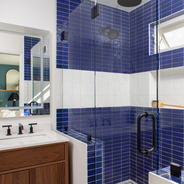
This stunning master bathroom started with a creative reconfiguration of space, but it’s the wall of shimmering blue dimensional tile that really makes this a “statement” bathroom.
The homeowners’, parents of two boys, wanted to add a master bedroom and bath onto the main floor of their classic mid-century home. Their objective was to be close to their kids’ rooms, but still have a quiet and private retreat.
To obtain space for the master suite, the construction was designed to add onto the rear of their home. This was done by expanding the interior footprint into their existing outside corner covered patio. To create a sizeable suite, we also utilized the current interior footprint of their existing laundry room, adjacent to the patio. The design also required rebuilding the exterior walls of the kitchen nook which was adjacent to the back porch. Our clients rounded out the updated rear home design by installing all new windows along the back wall of their living and dining rooms.
Once the structure was formed, our design team worked with the homeowners to fill in the space with luxurious elements to form their desired retreat with universal design in mind. The selections were intentional, mixing modern-day comfort and amenities with 1955 architecture.
The shower was planned to be accessible and easy to use at the couple ages in place. Features include a curb-less, walk-in shower with a wide shower door. We also installed two shower fixtures, a handheld unit and showerhead.
To brighten the room without sacrificing privacy, a clearstory window was installed high in the shower and the room is topped off with a skylight.
For ultimate comfort, heated floors were installed below the silvery gray wood-plank floor tiles which run throughout the entire room and into the shower! Additional features include custom cabinetry in rich walnut with horizontal grain and white quartz countertops. In the shower, oversized white subway tiles surround a mermaid-like soft-blue tile niche, and at the vanity the mirrors are surrounded by boomerang-shaped ultra-glossy marine blue tiles. These create a dramatic focal point. Serene and spectacular.
 Studio TOOP
design: Carrie Preston (Studio TOOP) and Jasper Helmantel (Cruydt Hoeck), 2011
location: Appeltern, NL
status: built in 2012 by Appeltern Model Garden Complex
photos: Olga van Saane, October 2013
Designed as assignment from both the Dutch gardening magazine Groei & Bloei and the television and radio nature program Vara's Vroege Vogels, this garden serves as a model of how homeowners can incorporate lots of plant life and wildlife into the design but without sacrificing practicality or aesthetics. The garden is deliberately contemporary in its style to emphasize that nature-rich gardens need not look a certain way - insects and birds don't care if the lines are straight or curved.
At the same time the garden makes use of affordable, simple, no-nonsense materials. The 40x60 cm paving stones are one of the most common and affordable paving options in the Netherlands, available en masse for free on the Internet. Conceptually we imagined a garden completely paved with the tiles (as to many gardens are) and what would happen if took out some of these stones, used them to build benches and structure and added plants where the tiles had been. In the construction of the benches we include other materials such as bamboo sticks and insulation bricks that create habitat for insects such as solitary bees.
The plant palette is based on a selection of native and host plants in combination with the 26 plants plan set up by Groei & Boei -- a list of plants aimed at making the use of more plants in gardens accessible and less intimidating. The choice for the number 26 corresponds with the number of letters in the alphabet in line with the famous Dutch garden designer Mien Ruy's comment that if we only need 26 letters to create a whole language, we should be able to combine and mix 26 plants to express far more than we think.
200