
Search results for "Rigorous setting" in Home Design Ideas
 Reza Nouranian Design
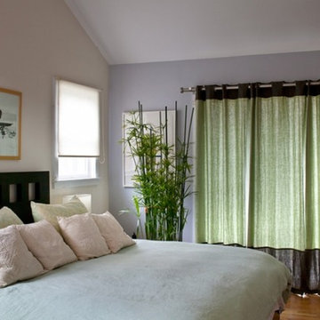
Tucked away in a forested grove, the classic Shelter Island split-level beach home designed by local architect Ralph Cast offered the owners a chance to carve out a private getaway set within the essence of exclusivity. Looking to create a self-contained aesthetic environment that residents and guests could enjoy without leaving, RND designed a haven of outdoor living, complete with an outdoor living room and a dining area shaded beneath a pergola featuring Philip Stark lounge chairs and dining chairs. RND raised an elevated deck made from durable Ipe wood and stainless steel cabling, connecting the upper level of the house to a freestanding garage converted into an artist's studio. Inside, light and sturdy fabrics splashed with color from an almost-pastel palette meet the rigors of beach days and highlight the play of summer sun on wood flooring and furniture. RND's gourmet-inspired kitchen caters to every need, while the shady, graveled porch opens to a lolling green landscape offset by the blue rectangle of a gahnite pool. The aesthetic playground is hedged by a sculpture garden, a row of umbrella-shaded lounge chairs, and an outdoor dining room featuring custom designed chairs and a Stone Age-inspired table of roughly hewn stone slabs.
 EAG Studio
On a quiet street just steps from San Francisco’s beloved Dolores Park, a formerly modest urban structure has been transformed into a luminous vertical residence that quietly redefines contemporary city living. Through a comprehensive remodel and both vertical and horizontal expansion, the project turns a constrained urban footprint into a sequence of serene, art-forward living spaces that unfold upward toward expansive city views.
The architecture balances restraint and warmth: crisp contemporary geometry softened by natural materials, artful lighting, and carefully curated interiors. The result is a home that feels simultaneously grounded and elevated—deeply connected to its neighborhood yet remarkably private.
Reimagining the Urban Envelope
The original building has been almost entirely reconceived. The facade now reads as a disciplined composition of plaster volumes and precisely detailed window openings framed by subtle projecting bands. The geometry references San Francisco’s classic rhythm of bayed facades while stripping the language down to a refined modern expression.
Behind this quiet exterior lies a dramatically expanded interior volume. The redesign adds both additional floor area and new vertical circulation, transforming what was once a conventional city house into a multi-level architectural sequence organized around light, art, and views.
At the roofline, planted terraces soften the building’s silhouette and create a green crown visible from surrounding hillsides.
Interiors as a Sequence of Galleries
Inside, the home unfolds as a series of spatial moments connected by a sculptural stair and gallery-like corridors.
Wide plank oak floors run throughout, providing continuity and warmth against a palette of plaster walls, dark steel detailing, and natural stone. The hallways function almost as curated galleries, with layered artworks suspended in front of mesh panels that create depth and subtle shadow.
Light filters through carefully placed windows and stair openings, transforming circulation spaces into contemplative transitions rather than mere passageways.
A Living Room Anchored by Stone and Light
The primary living room occupies one of the home’s central floors, where a quiet interplay of texture and geometry defines the space.
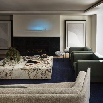
A monumental fireplace wrapped in dark stone forms the room’s anchor, its mass contrasting with a recessed ceiling plane that seems to float above the seating area. Integrated perimeter lighting creates a soft architectural glow that washes the ceiling and walls.
Furniture is sculptural yet understated—rounded lounge chairs in warm ochre velvet, tailored sofas, and a striking marble cocktail table whose expressive veining becomes a focal artwork in itself. Deep blue carpeting grounds the seating arrangement and subtly absorbs light, enhancing the calm atmosphere.
Above the fireplace, a delicate projection artwork introduces a moment of visual poetry—an unexpected cinematic gesture that transforms the wall into a quietly animated canvas.
Kitchen as Architectural Furniture
The kitchen expresses a different register: crisp, tactile, and materially rich.
Custom walnut cabinetry spans the wall in a continuous plane, punctuated only by the sculpted hood and integrated appliances. The wood’s depth and warmth are balanced by expanses of pale marble that flow seamlessly from countertop to backsplash.
Three dome pendants hover above the island like industrial sculptures, casting pools of warm light onto the stone surface.
A row of vivid red stools introduces a controlled burst of color, a small but confident departure from the otherwise restrained palette.
Dining With a Living Backdrop
Adjacent to the kitchen, the dining room opens toward a glass wall overlooking a vertical garden of climbing ivy. The greenery becomes a constantly changing backdrop—lush and shadowy during the day, atmospheric and cinematic after sunset.
A dark wood table anchors the room, surrounded by pale oak chairs whose understated forms echo Scandinavian design traditions. The simplicity of the furniture allows the view and natural light to become the dominant experience.
Intimate Spaces and Material Contrast
Throughout the home, smaller rooms offer moments of intimacy and material experimentation.
The powder room pairs textured wall coverings with a dramatic black marble vanity whose bold veining feels almost geological. A suspended mirror and slender pendant create a sculptural composition against the tactile backdrop.
The primary bedroom, by contrast, feels serene and expansive. Floor-to-ceiling glazing frames sweeping views of the city, while soft textiles and warm wood paneling create a cocooning effect. Slender black columns subtly define a sitting area without interrupting the openness of the space.
Bathing Above the City
In the primary bathroom, a sculptural freestanding tub sits beside a panoramic window overlooking San Francisco’s hills and rooftops.
The room’s palette—light oak, grey stone, and matte metals—reinforces the spa-like atmosphere. Floating cabinetry and integrated lighting maintain a sense of visual lightness despite the richness of the materials.
Entertaining Above the Park
Higher in the house, a lounge and bar area becomes the social heart of the home. Here, dark stone slabs with dramatic veining wrap the bar wall like a piece of monumental art.
Open shelving displays glassware and spirits, while integrated wine storage hints at the home’s entertaining ambitions. A soft leather sectional and low glass table create a relaxed setting for conversation, framed by expansive views of the city skyline.
Cinema and Retreat
The lower level introduces yet another atmosphere: a dedicated media room designed for immersive viewing.
Dark walls, plush seating, and soft lighting create a cinematic environment that contrasts intentionally with the airy upper floors. It’s a retreat within the home—intimate, quiet, and removed from the brightness above.
Architecture That Balances Discipline and Warmth
What makes the project particularly compelling is its balance between architectural discipline and lived warmth.
Every element—from the carefully framed views to the restrained material palette—contributes to a cohesive spatial narrative. Yet the home never feels austere. Natural materials, curated art, and layered lighting create a sense of comfort and depth.
The result is a house that feels both architecturally rigorous and deeply human.
A Contemporary Interpretation of San Francisco Living
In a neighborhood defined by historic homes and iconic park views, this transformation offers a contemporary interpretation of San Francisco living.
It respects the city’s urban density while embracing openness, light, and vertical living. The home rises quietly above its surroundings, culminating in panoramic vistas that stretch across rooftops, hills, and sky.
What began as a conventional structure has become something far more nuanced: a modern urban sanctuary—part gallery, part retreat, and wholly connected to the vibrant city just beyond its walls.
 Dale Cohen Designstudio
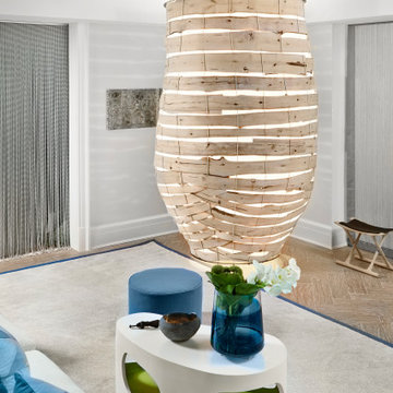
Dale was chosen to participate in the 2013 Hampton Designer Showhouse, sponsored by Traditional Home Magazine, because she has built a reputation for precise, elegant, and livable design work in Manhattan. The challenge of the showhouse, essentially a blank canvas with an imaginary client, was not beyond her. The room she was given is the Terrace Level Lounge; she chose a program to embrace a burgeoning art collection, and devise areas of repose to enjoy the work. And Ms. Cohen’s early training as a painter and photographer clearly are clearly a great asset in this particular room. Her method is to analyze the room as an architectural proposition. A Yale Architectural School graduate, she is able to cast a few intelligent moves to make the room a stage rather than a hallway. Creating a platform for her creative collaboration and designing the Monumental Lantern with artist John Houshmand.
The seating areas are a series of compressed compositions with shapes and forms of chairs, a Minotti sofa, a Valerie Goodman Gallery coffee table, and the Holland and Sherry geometric throw pillows that evoke the early modernist paintings of Jean Arp. Accented by ceiling panels covered in a Maharam wallpaper. Her next big move was enrolling the work of artist and furniture maker John Houshmand. Ms. Cohen thrives on creative collaboration and designing the Monumental Lantern that with Houshmand, that she boldly placed in one entire corner of the room. Few designers would welcome a giant rough sawn luminaire but Ms. Cohen’s early apprenticeship with Richard Serra is evident in this wonderful juxtaposition of scale. Ms. Cohen’s reputation as a brave designer has been established with the inclusion of Houshmand’s piece.
Ms. Cohen’s method is to analyze the room as an architectural proposition. A Yale Architectural School graduate, she is able to cast a few intelligent moves to make the room a stage rather than a hallway. The stairway was divided into two events, one behind a scrim and the other revealed. This gave the sitting area a theatrical backdrop as well as choreographing a Hollywood-style entrance for the visitor walking down the stairs. In fact Ms. Cohen uses a series of fabric backdrops throughout the space to denote different spatial conditions.
The color palette, if said aloud, is the prototypical Hamptons beach house cheery; though Ms. Cohen’s take is altogether different. With a sea blue as her base, she treats the envelope of the space with tinted whites and grays, and just as you are comfortable with this resolve she infuses the space with drops of chartreuse. The optic shock of an electric green is a sign of strength in Ms. Cohen’s tool box. The result is a perfect balance of whimsy and sophistication.
Whimsy, bravery, and compositional sophistication will not be evident or sufficient without Ms. Cohen’s razor sharp rigor. Her attention to detail is what makes one want to sit in the Fritz Hansen chair, under the reading light, with cashmere throw at its side. Ms. Cohen’s embrace of the luxury of detail is what makes for valuable moments in the design world and what sets her work apart.
Find the right local pro for your project
 McKinney York Architects
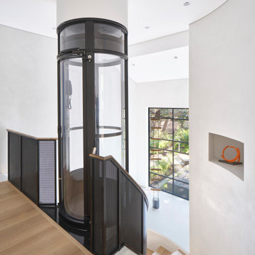
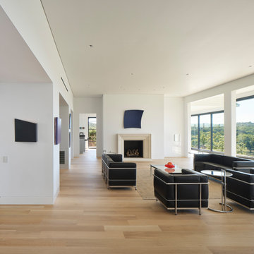
This extensive remodel overlooking Lake Austin is a paean to the powerful art it enfolds. Rigorous editing of every distracting, inconsequential element of the original house was critical. So too was the insertion of new complementary components that provide artful ways to move through both interior and exterior rooms. The collection of modern art is arresting. Ranging from a Turrell hologram to a pair of Agnes Martins, the art is framed by the architecture and lighting so that it is experienced in a choreographed, curated way that encourages wandering and an intimate connection to each piece. The mood is set in the entry courtyard. A floating walkway curves down and around a brilliant spiraling blue Clement sculpture. It pauses once, at a moment of surprise, when the first view through the house is filled with the blue water of the lake beyond. Inside, the saturated color of many of the pieces of art are balanced by an absence of other visual clutter in the color palette, furniture, and architecture. A new interior plaster, steel, and bronze stair carves through a space occupied by two small Clement sculptures in niches, a McKay Otto sculpture on a landing and a glass cylinder elevator. This is a very specific place, designed for specific art and for a collector who has a close relationship with each piece.
 JLC Architecture
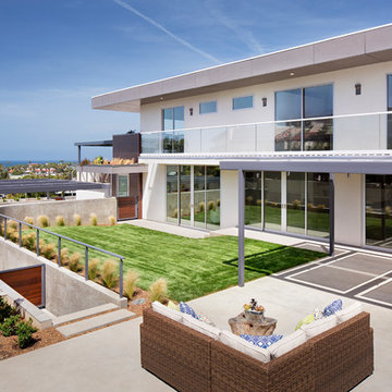
Located at a prominent corner on one of the few undeveloped residential sites left in Solana Beach, this project is important not only for the homeowner, but for the community as well. A rigorous site analysis laid the groundwork for a design response which took into account the homeowner’s program, input from the neighbors, and the scale of the project and the character of the neighborhood. The end result is a design that is well set into the existing grade, a move which preserves adjacent views and reduces the visual impact of the structure from the street; all while graciously meeting the desires of the owner.
The plan is broken into six unique floor plates. The bottom four of which tie together along the gradually sloping site. An intentionally long southern exposure implements the basics of passive solar design: large amounts of glass bring in abundant light and warmth in the winter, while deep overhangs protect from unwanted summer heat gain. Ocean views to the west are selectively framed throughout the house without compromising privacy from the busy street corner. Public functions within the house flow seamlessly between indoor and outdoor living spaces. JLC Architecture was responsible for a full architecture and interior package as well as exterior hardscape design.
 McKinney York Architects
This extensive remodel overlooking Lake Austin is a paean to the powerful art it enfolds. Rigorous editing of every distracting, inconsequential element of the original house was critical. So too was the insertion of new complementary components that provide artful ways to move through both interior and exterior rooms. The collection of modern art is arresting. Ranging from a Turrell hologram to a pair of Agnes Martins, the art is framed by the architecture and lighting so that it is experienced in a choreographed, curated way that encourages wandering and an intimate connection to each piece. The mood is set in the entry courtyard. A floating walkway curves down and around a brilliant spiraling blue Clement sculpture. It pauses once, at a moment of surprise, when the first view through the house is filled with the blue water of the lake beyond. Inside, the saturated color of many of the pieces of art are balanced by an absence of other visual clutter in the color palette, furniture, and architecture. A new interior plaster, steel, and bronze stair carves through a space occupied by two small Clement sculptures in niches, a McKay Otto sculpture on a landing and a glass cylinder elevator. This is a very specific place, designed for specific art and for a collector who has a close relationship with each piece.
 JLC Architecture
Located at a prominent corner on one of the few undeveloped residential sites left in Solana Beach, this project is important not only for the homeowner, but for the community as well. A rigorous site analysis laid the groundwork for a design response which took into account the homeowner’s program, input from the neighbors, and the scale of the project and the character of the neighborhood. The end result is a design that is well set into the existing grade, a move which preserves adjacent views and reduces the visual impact of the structure from the street; all while graciously meeting the desires of the owner.
The plan is broken into six unique floor plates. The bottom four of which tie together along the gradually sloping site. An intentionally long southern exposure implements the basics of passive solar design: large amounts of glass bring in abundant light and warmth in the winter, while deep overhangs protect from unwanted summer heat gain. Ocean views to the west are selectively framed throughout the house without compromising privacy from the busy street corner. Public functions within the house flow seamlessly between indoor and outdoor living spaces. JLC Architecture was responsible for a full architecture and interior package as well as exterior hardscape design.
Sponsored
Columbus, OH
Free consultation for landscape design!

Peabody Landscape Group
Franklin County's Reliable Landscape Design & Contracting
 Domus Constructors, LLC.
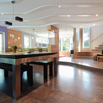
“Compelling.” That’s how one of our judges characterized this stair, which manages to embody both reassuring solidity and airy weightlessness. Architect Mahdad Saniee specified beefy maple treads—each laminated from two boards, to resist twisting and cupping—and supported them at the wall with hidden steel hangers. “We wanted to make them look like they are floating,” he says, “so they sit away from the wall by about half an inch.” The stainless steel rods that seem to pierce the treads’ opposite ends are, in fact, joined by threaded couplings hidden within the thickness of the wood. The result is an assembly whose stiffness underfoot defies expectation, Saniee says. “It feels very solid, much more solid than average stairs.” With the rods working in tension from above and compression below, “it’s very hard for those pieces of wood to move.”
The interplay of wood and steel makes abstract reference to a Steinway concert grand, Saniee notes. “It’s taking elements of a piano and playing with them.” A gently curved soffit in the ceiling reinforces the visual rhyme. The jury admired the effect but was equally impressed with the technical acumen required to achieve it. “The rhythm established by the vertical rods sets up a rigorous discipline that works with the intricacies of stair dimensions,” observed one judge. “That’s really hard to do.”
 McKinney York Architects
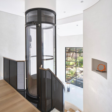
This extensive remodel overlooking Lake Austin is a paean to the powerful art it enfolds. Rigorous editing of every distracting, inconsequential element of the original house was critical. So too was the insertion of new complementary components that provide artful ways to move through both interior and exterior rooms.
The collection of modern art is arresting. Ranging from a Turrell hologram to a pair of Agnes Martins, the art is framed by the architecture and lighting so that it is experienced in a choregraphed, curated way that encourages wandering and an intimate connection to each piece.
The mood is set in the entry courtyard. A floating walkway curves down and around a brilliant spiraling blue Clement sculpture. It pauses once, at a moment of surprise, when the first view through the house is filled with the blue water of the lake beyond. Inside the saturated color of many of the pieces of art are balanced by an absence of other visual clutter in the color palette, furniture and architecture. A new interior plaster, steel and bronze stair carves through a space occupied by two small Clement sculptures in niches, a Page Kempner sculpture on a landing and a glass cylinder elevator.
This is a very specific place, designed for specific art and for a collector who has a close relationship with each piece.
 Studio DC Architects
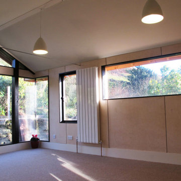
This extension to a very distinctive timber clad house set in a prominent hilltop position in the Peak District National Park, Derbyshire was an exciting project with many contextual constraints. The clients had a large family and needed to provide more bed space for visiting grandchildren, so we created a new large en-suite bedroom for them at first floor level, which freed up other areas of the house for guest accommodation.
The extension is designed to sensitively integrate with the existing house whilst having its own distinct character. The existing palette of materials is reinterpreted in a thoroughly modern way. A rigorous design process had to be adopted in order to secure planning approval for this contemporary design from the notoriously difficult Peak District National Park.
The existing rough grit-stone side wall is treated as a ‘ruined’ solid base from which the lighter weight construction of the timber and glass facades spring from. Much thought went into the multi layered timber cladding which imbue the extension with its own unique character, and the carefully positioned areas of clean, frameless glazing which focus and frame the amazing views out to the surrounding countryside. A large frameless corner window provides a sun-drenched corner with seating, perfect for quiet contemplation.
Beautifully finished in elegant birch faced plywood panelling the interior exudes a minimalist serenity which makes a pleasing contrast to the rugged exterior finishes.
 Dale Tu Photography
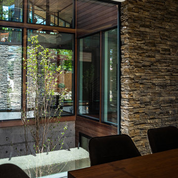
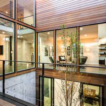
The simple material palette of stained white oak hardwood floors and modern gray walls set the stage for the play of light, foliage and wind from the outside. The austerity and permanence of the cast-in-place concrete, the warmth of the cedar, and the changing color of the sky play against the sunlight and the garden to provide a fluid and changing atmosphere. The organic forms of the northwest-inspired interior garden is a welcome softening contrast to the rigor of the floor plan geometry.
 Contemporary Home Construction, LLC
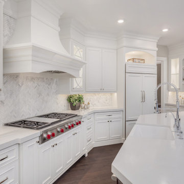
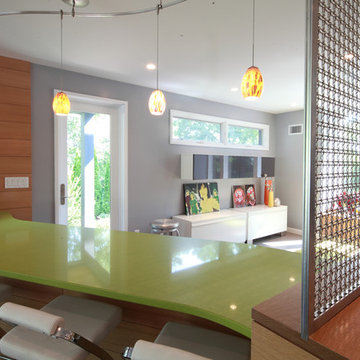
In the realm of kitchen and bathroom renovations, Covossi Solid Surface Countertops emerge as a superior choice for both residential and commercial applications, offering an unparalleled blend of durability, practicality, and cost efficiency. Designed to meet the demands of modern living, these countertops are an epitome of innovation and style, ensuring longevity and ease of maintenance without compromising on aesthetics.
Unmatched Durability
Constructed with a top layer of ¼ inch solid polyester resin and supported by a robust 1¼ inch chipboard core, Covossi Solid Surface Countertops are engineered to withstand the rigors of daily use. This unique composition offers exceptional resistance to stains, scratches, liquids, and impacts, making it an ideal choice for high-traffic areas.
Aesthetic Versatility
One of the most compelling attributes of Covossi Solid Surface Countertops is the color consistency throughout the material. This feature not only enhances the visual appeal of the countertops but also allows for easy repair of minor scratches. Damages can be effortlessly sanded out and polished, restoring the countertop to its original splendor. The material's seamless design further contributes to its aesthetic appeal, providing a sleek and unified look that elevates any space.
Seamless and Hygienic
The innovative seamless design of Covossi Solid Surface Countertops is not just about aesthetics; it also plays a crucial role in maintaining hygiene. By allowing the material to be sanded and joined in a way that cracks are virtually non-existent, it eliminates the collection of dirt and debris, making it an exceptionally hygienic option for kitchens and bathrooms.
Ease of Installation and Maintenance
Designed with practicality in mind, these countertops can be easily installed by a 1-2 person team using commonly used tools, making it a convenient choice for both DIY enthusiasts and professional installers. The finished product exudes the luxury and sophistication of an expensive solid surface, without the hefty price tag.
Warranty and Certification
Covossi Solid Surfaces come with an 8-year Manufacturer Limited Warranty, offering peace of mind and assurance of quality. Additionally, being NSF Certified, these countertops meet strict standards for public health protection, further reinforcing their suitability for both residential and commercial settings.
In conclusion, Covossi Solid Surface Countertops stand out as a smart investment for those seeking a blend of functionality, durability, and aesthetic appeal. Whether for a home kitchen, bathroom, or a commercial space, these countertops promise to deliver performance and style that lasts.
 Dale Tu Photography
The simple material palette of stained white oak hardwood floors and modern gray walls set the stage for the play of light, foliage and wind from the outside. The austerity and permanence of the cast-in-place concrete, the warmth of the cedar, and the changing color of the sky play against the sunlight and the garden to provide a fluid and changing atmosphere. The organic forms of the northwest-inspired interior garden is a welcome softening contrast to the rigor of the floor plan geometry.


 Domus Constructors, LLC.
“Compelling.” That’s how one of our judges characterized this stair, which manages to embody both reassuring solidity and airy weightlessness. Architect Mahdad Saniee specified beefy maple treads—each laminated from two boards, to resist twisting and cupping—and supported them at the wall with hidden steel hangers. “We wanted to make them look like they are floating,” he says, “so they sit away from the wall by about half an inch.” The stainless steel rods that seem to pierce the treads’ opposite ends are, in fact, joined by threaded couplings hidden within the thickness of the wood. The result is an assembly whose stiffness underfoot defies expectation, Saniee says. “It feels very solid, much more solid than average stairs.” With the rods working in tension from above and compression below, “it’s very hard for those pieces of wood to move.”
The interplay of wood and steel makes abstract reference to a Steinway concert grand, Saniee notes. “It’s taking elements of a piano and playing with them.” A gently curved soffit in the ceiling reinforces the visual rhyme. The jury admired the effect but was equally impressed with the technical acumen required to achieve it. “The rhythm established by the vertical rods sets up a rigorous discipline that works with the intricacies of stair dimensions,” observed one judge. “That’s really hard to do.”
 McKinney York Architects
This extensive remodel overlooking Lake Austin is a paean to the powerful art it enfolds. Rigorous editing of every distracting, inconsequential element of the original house was critical. So too was the insertion of new complementary components that provide artful ways to move through both interior and exterior rooms.
The collection of modern art is arresting. Ranging from a Turrell hologram to a pair of Agnes Martins, the art is framed by the architecture and lighting so that it is experienced in a choregraphed, curated way that encourages wandering and an intimate connection to each piece.
The mood is set in the entry courtyard. A floating walkway curves down and around a brilliant spiraling blue Clement sculpture. It pauses once, at a moment of surprise, when the first view through the house is filled with the blue water of the lake beyond. Inside the saturated color of many of the pieces of art are balanced by an absence of other visual clutter in the color palette, furniture and architecture. A new interior plaster, steel and bronze stair carves through a space occupied by two small Clement sculptures in niches, a Page Kempner sculpture on a landing and a glass cylinder elevator.
This is a very specific place, designed for specific art and for a collector who has a close relationship with each piece.
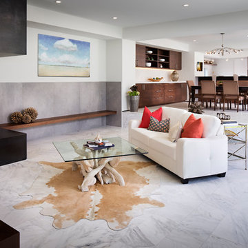 JLC Architecture
Located at a prominent corner on one of the few undeveloped residential sites left in Solana Beach, this project is important not only for the homeowner, but for the community as well. A rigorous site analysis laid the groundwork for a design response which took into account the homeowner’s program, input from the neighbors, and the scale of the project and the character of the neighborhood. The end result is a design that is well set into the existing grade, a move which preserves adjacent views and reduces the visual impact of the structure from the street; all while graciously meeting the desires of the owner.
The plan is broken into six unique floor plates. The bottom four of which tie together along the gradually sloping site. An intentionally long southern exposure implements the basics of passive solar design: large amounts of glass bring in abundant light and warmth in the winter, while deep overhangs protect from unwanted summer heat gain. Ocean views to the west are selectively framed throughout the house without compromising privacy from the busy street corner. Public functions within the house flow seamlessly between indoor and outdoor living spaces. JLC Architecture was responsible for a full architecture and interior package as well as exterior hardscape design.
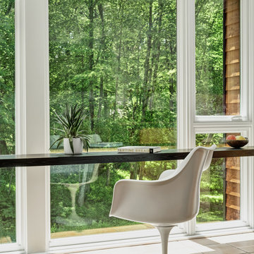
 Amanda Martocchio Architecture
Time had stood still at this 1970s ranch in Armonk when the owners invited us to collaborate with them to transform it into a modern, light-filled home for their young family. The budget was lean, so economy was a primary consideration for every design decision. The challenge was to identify the modest home’s virtues – vaulted ceilings and a lovely backyard – and accentuate them by strategically optimizing available funds.
We were tasked with rectifying a dysfunctional interior stair, connecting to the outdoors with new large windows, and updating the exterior. We focused our attention on a finite set of architectural moves which would have the biggest impact and improve our clients’ daily experience of the home. Detailing was kept simple, using common grade materials and standard components. All exterior walls were revamped with new windows and siding. Although these materials were not particularly costly, thoughtful layout of boards, battens, and openings produced a cohesive, rigorous composition at each facade.
Since the budget would not cover the homeowners’ complete wish list, some items were bracketed for subsequent phases. The challenge was to establish a framework that would allow future work – including a new roof and kitchen renovation – to proceed smoothly.
The homeowners, both scientists, were enthusiastic collaborators, contributing their outstanding design sensibilities to selection of fixtures and finishes. Construction ended just in time for the arrival of their baby – and with that, the transformation of their family home was complete.

Sponsored
Columbus, OH

Hope Restoration & General Contracting
Columbus Design-Build, Kitchen & Bath Remodeling, Historic Renovations
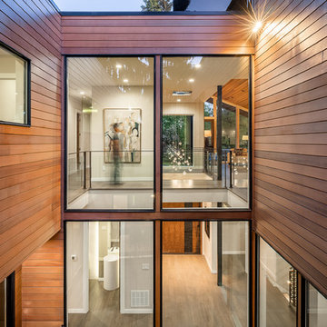 Dale Tu Photography
The simple material palette of stained white oak hardwood floors and modern gray walls set the stage for the play of light, foliage and wind from the outside. The austerity and permanence of the cast-in-place concrete, the warmth of the cedar, and the changing color of the sky play against the sunlight and the garden to provide a fluid and changing atmosphere. The organic forms of the northwest-inspired interior garden is a welcome softening contrast to the rigor of the floor plan geometry.
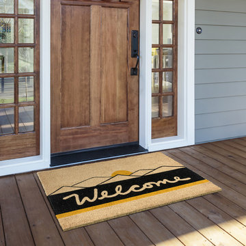
 Kosas
KosasSet a warm greeting at your door with our coir doormat. Made with durable coconut husk, this mat will stand up to the rigors of daily use. Its welcome message and mountain range are printed with a no bleed dye, ensuring lasting color.
 Domus Constructors, LLC.
“Compelling.” That’s how one of our judges characterized this stair, which manages to embody both reassuring solidity and airy weightlessness. Architect Mahdad Saniee specified beefy maple treads—each laminated from two boards, to resist twisting and cupping—and supported them at the wall with hidden steel hangers. “We wanted to make them look like they are floating,” he says, “so they sit away from the wall by about half an inch.” The stainless steel rods that seem to pierce the treads’ opposite ends are, in fact, joined by threaded couplings hidden within the thickness of the wood. The result is an assembly whose stiffness underfoot defies expectation, Saniee says. “It feels very solid, much more solid than average stairs.” With the rods working in tension from above and compression below, “it’s very hard for those pieces of wood to move.”
The interplay of wood and steel makes abstract reference to a Steinway concert grand, Saniee notes. “It’s taking elements of a piano and playing with them.” A gently curved soffit in the ceiling reinforces the visual rhyme. The jury admired the effect but was equally impressed with the technical acumen required to achieve it. “The rhythm established by the vertical rods sets up a rigorous discipline that works with the intricacies of stair dimensions,” observed one judge. “That’s really hard to do.”
10