
Search results for "Separated couples" in Home Design Ideas
 Twelve Stones Designs, LLC
The owners of this kitchen had spent the money to upgrade the finishes in their kitchen upon building the home 12 years ago, but after living in the space for several years they realized how nonfunctional the layout really was. The (then) two preschool aged children had grown into busy, hungry teenagers with many friends who also liked to hang out at the house. So the family needed a more functional kitchen with better traffic flow, space for daily activities revolving around the kitchen at different times of day, and a kitchen that could accommodate cooking for and serving large groups. Furthermore, the dark, traditional finishes no longer reflected the homeowners’ style. They requested a brighter, more relaxed, coastal style that reflected their love of the seaside cities they like to visit.
Originally, the kitchen was U-shaped with a narrow island in the middle. The island created narrow aisles that bottle-necked at the dishwasher, refrigerator, and cooktop areas. There was a pass-through from the foyer into the kitchen, but the owners never liked that the pass-through was also located so close to the powder room. The awkward proximity was unappealing and made guests feel uncomfortable.
The kitchen’s storage was made up of lots of narrow cabinets, apothecary drawers, clipped corner units, and very few drawers. It lacked useful storage for the larger items the family used on a daily basis. And the kitchen’s only pantry was small closet that had only builder-grade, narrow shelving with no illumination to be able to see the contents inside.
Overall, the kitchen’s lighting plan was poorly executed. Only six recessed cans illuminated the entire kitchen and nook areas. The under cabinet lighting was not evenly distributed either. In fact, the builder had mis-placed the under cabinet lighting around the decorative pilasters which made for choppy, dark cubbies. Further, the builder didn’t include any lighting over the sink or the bar area, which meant whoever was doing the dishes was always in their own shadow. That, coupled with the steep overhang of the game room above made the bar area feel like a dim, cavernous space that wasn’t inviting or task oriented. The kitchen looked out into the main living space, but the raised bar and a narrow wall (which held the only large cabinet in the kitchen) created more of a barrier than a relationship to the living room or breakfast nook. In fact, one couldn’t even see the breakfast nook from the cooktop or sink areas due to its orientation. The raised bar top was too narrow to comfortably sit to either dine at or chat from due to the lack of knee space. The the homeowners confided that the kitchen felt more like a dark, dirty prison than place where the family, or their guests, wanted to gather and commune.
The clients' needs and desires were:
➢ to create a kitchen that would be a space the family loved to be in; to relate to the adjacent spaces all around, and to have better flow for entertaining large groups
➢ to remove the walls between the breakfast nook and living area and to be able to utilize the natural light from the windows in both those areas
➢ to incorporate a functional chopping block for prepping fresh food for home cooked meals, an island with a large sink and drain board, 2 pull out trash cans, and seating for at least the 2 teens to eat or do homework
➢ to design a kitchen and breakfast nook with an airy, coastal, relaxed vibe that blended with the rest of the house's coastal theme
➢ to integrate a layered lighting plan which would include ample general illumination, specific task lighting, decorative lighting, and lots of illuminated storage
➢ to design a kitchen with not only more storage for all the husband’s kitchen gadgets and collection of oils and spices, but smart storage, including a coffee/breakfast bar and a place to store and conceal the toaster oven and microwave
➢ to find a way to utilize the large open space between the kitchen, pantry area, and breakfast nook
Twelve Stones Designs achieved the owner's goals by:
➢ removing the walls between the kitchen and living room to allow the natural light to filter in from the adjacent rooms and to create a connection between the kitchen, nook, and living spaces for a sense of unity and communion
➢ removing the existing pantry and designing 3 large pantry style cabinets with LED tape lights and rollout drawers to house lots of kitchen appliances, gadgets, and tons of groceries. We also took the cabinets all the way up to the 9’ ceiling for additional storage for seasonal items and bulk storage.
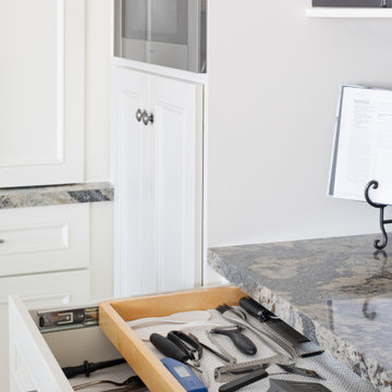
➢ designing 2 islands - 1 with a gorgeous black walnut chopping block that houses a drawer for chopping and carving knives and a custom double pull out trash unit for point of use utilization - and 1 that houses the dishwasher, a large Blanco Gourmet sink with integrated drain board, woven baskets for fresh root vegetables and kitchen towels, plenty of drawer storage for kitchen items, and bar seating for up to 4 diners.
➢ closing off the space between the kitchen and the powder room to create a beautiful new private alcove for the powder room as well as adding some decorative storage. This also gave us space to include more tall storage near the new range for precision placement of the husband’s extensive oil and spice collection as well as a location for a combo-steam oven the wife wanted for baking and cooking healthy meals.
The project is enhanced functionally by:
➢ incorporated USB and standard receptacles for the kids’ laptops and phone charging in the large island
➢ designing the small island to include additional open shelving for items used on a daily basis such as a variety of bowls, plates, and colanders. This set up also works well for the husband who prefers to “plate” his dinners in restaurant-style fashion before presenting them to the table.
➢ the integration of specific storage units, such as double stacked cutlery drawers, a custom spice pull-out, a Kuerig coffee and tea pod drawer, and custom double stacked utensil drawers
➢ moving the refrigerator to the old oven location - this eliminated the bottle neck as well as created a better relationship to the eating table. It also utilizes the floor space between the pantry, nook, and kitchen
➢ creating a banquet style breakfast nook - this banquette seating not only doubles the amount of seating for large gatherings but it better utilizes the odd space between the kitchen and the previous nook area. It also helps to create a distinct pathway from the mudroom room through the pantry area, kitchen, nook, and living room.
➢ the coffee/breakfast bar area which includes the perfect location for the concealed microwave and toaster oven, convenient storage for the coffee pods and tea accoutrements. Roll-out drawers below also house the smoothie maker, hot water kettle, and a plethora of smoothie-making ingredients such as protein powders, smoothie additives, etc. Furthermore, the drawers below the Keurig house measuring utensil, cutlery, baking supplies and tupperware storage.
➢ incorporating lots of wide drawers and pullouts to accommodate large cookware.
➢ utilizing as much vertical space as possible by building storage to the ceiling which accommodates the family’s abundant amount of serving platters, baking sheets, bakeware, casserole dishes, and additional cutting boards.
The project is enhanced aesthetically by:
➢ new 5-piece Versailles pattern porcelain tile that now seamlessly joins the entire down stairs area together creating a bright, cohesiveness feeling instead of choppy separated spaces - it also adds a coastal feeling
➢ designing a cabinet to conceal the microwave and toaster oven
➢ the coastal influenced light fixtures over the nook table and island
➢ the sandy colors of the Langdon Cambria countertops. The swirling pattern and sparkling quartz pieces remind the homeowner of black-and-tan sandy beaches
➢ the striped banquet seating whose creamy white background and blue-green stripes were the inspiration for the cabinet and wall colors.
➢ All the interior doors were painted black to coordinate with the blacks and grays in the backsplash tile and countertop. This also adds a hint of tailored formality to an otherwise casual space.
➢ the use of WAC's Oculux small aperture LED units for the overhead lighting complimented with Diode LED strips for task lighting under the cabinets and inside the pantry and glass wall cabinets. All of the lighting applications are on separate dimmer switches.
Innovative uses of materials or construction methods by Realty Restoration LLC:
➢ Each 1-1/2” x 3” block of reclaimed end-grain black walnut that makes up the center island chopping block was hand milled and built in the shop. It was designed to look substantial and proportional to the surrounding elements, executed by creating the 4 inch tall top with a solid wood chamfered edge band.
➢ The metal doors on either side of the vent hood were also custom designed for this project and built in the Realty Restoration LLC shop. They are made 1x2, 11-gauge mild steel with ribbed glass. Weighing 60 lbs a piece, heavy duty cabinet hinges were added to support the weight of the door and keep them from sagging.
➢ Under-cabinet receptacles were added along the range wall in order to have a clean, uninterrupted backsplash.
Design obstacles to overcome:
➢ Because we were removing the demising walls between the kitchen and living room, we had to find a way to plumb and vent the new island. We did this by tunneling through the slab (the slab had post tension cables which prevented us from just trenching) to run a new wet vent through a nearby structural wall. We pulled the existing hot and cold lines between upper floor joists and ran them down the structural wall as well and up through a conduit in the tunnel.
➢ Since we were converting from wall overs to a gas range it allowed us to utilize the 220 feed for the wall ovens to provide a new sub panel for all the new kitchen circuits
➢ Due to framing deficiencies inherited from the original build there was a 1-1/2” differential in the floor-to-ceiling height over a 20 foot span; by utilizing the process of cutting and furring coupled with the crown moulding details on the cabinet elevations we were able to mask the problem and provide seamless transitions between the cabinet components.
Evidence of superior craftsmanship:
➢ uniquely designed, one-of-a-kind metal “X” end panels on the large island. The end panels were custom made in the Realty Restoration LLC shop and fitted to the exact dimensions of the island. The welding seams are completely indistinguishable - the posts look like they are cut from a single sheet of metal
➢ square metal posts on the small island were also custom made and designed to compliment and carry through the metal element s throughout the kitchen
➢ the beautiful, oversized end panels on the pantry cabinets which give the breakfast nook a tailored look
➢ integrating a large format 5 piece Versailles tile pattern to seamlessly flow from the existing spaces into the new kitchen space
➢ By constructing a custom cabinet that jogged around a corner we could not remodel (housing the entry way coat closet) we were able to camouflage the adjacent wall offset within the upper and lower cabinets. By designing around the existing jog in the structural walls we accomplished a few things: we were able to find the space to house, and hide, the microwave and toaster oven yet still have a clean cohesive appearance from the kitchen side. Additionally, the owners were able to keep their much needed coat closet and we didn’t have to increase the budget with unnecessary structural work.

 Jami Abbadessa
This couple in the La Verne Heights gated community contacted me when it was time to remodel their master bathroom. After years of debating whether or not they should, they decided it was time to treat themselves to a proper master bathroom. They requested a classic look and finishes that would stand the test of time. The “after” is a complete transformation.
Custom cabinetry, made to look like furniture with crystal knobs, was crafted and topped off with a slab of Cambria Quartz. The flooring and shower are clad in marble, surrounded by frameless glass. The soaking tub is Victoria + Albert and framed with custom pleated panels with custom Roman shades beneath for privacy. Chrome fixtures and lighting were added for a touch of classic sparkle.

 Emilia Decor
Kitchen - transitional u-shaped light wood floor kitchen idea in Portland with shaker cabinets, blue cabinets, quartzite countertops, porcelain backsplash and a peninsula
Find the right local pro for your project

 CIRCLE Design Studio
Kip Dawkins
Dining room - mid-sized transitional slate floor and gray floor dining room idea in Richmond with no fireplace, a standard ceiling and beige walls
Dining room - mid-sized transitional slate floor and gray floor dining room idea in Richmond with no fireplace, a standard ceiling and beige walls

 TOPOS Architects, Inc
This Mediterranean style home is fit on a compact lot in the heart of town for a professional couple with young children and au pair. The below grade bedrooms, family room and office are essential to providing for the family needs, with the extensive window light wells with lush landscaping and detailed masonry finishes bringing in sufficient light and pleasant views so that the rooms a comfortably used on an everyday basis. The open kitchen, living and dining rooms allow for a casual and informal lifestyle, while careful control of the openings, finishes and lighting create let each space per separately experienced. Italian mahogany windows, hand split limestone walls and antique clay roof tiles give an authentic Tuscan flavor to the exterior.
Photos by Phil Bond Photography
Stone: Select Stone
Tile: All Natural Stone
 Simply Home Decorating
This beautiful North Vancouver home belongs to a nature-loving and health-conscious couple, Emma and Vince (names changed), their two young children, and their dog, Jasper. When they contacted us about renovating and furnishing their kitchen and family room, we walked in and saw a world of potential waiting to be uncovered.
Before: Larkhall Crescent Home:
Like many original North Vancouver homes, the interior was definitely dated. We encountered late ‘80s finishes in powder pink and teal green, old carpet, and a kitchen that wasn’t maximized to suit this family’s modern-day lifestyle. However, the size of the rooms offered us a ton of space with which to get creative.
Knowing our clients’ love of cooking, need for work spaces (Emma and Vince both work remotely), and growing family, we developed a design concept that would increase usable space, optimize storage, and create intimacy in this large area. As for the style, we were inspired by their European roots, inventing a new and modern take on “Belgian Farmhouse” style. Now, the home is truly one-of-a-kind.
After: Warm & Cozy Family Room:
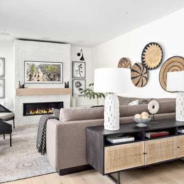
Fresh, bright, and comfortable, this living area has been transformed! We started with the fireplace as a focal point, selecting aged brick tiles for added texture and a crisp wood mantle. The taupe-coloured sectional infuses the room with visual warmth and serves the added purpose of separating the family room from the kitchen.
Emma and Vince were also keen on using non-toxic materials in their home, and we were happy to oblige. To meet their needs, we sourced natural wood elements and sought out Canadian-made products - that adhere to high health standards - whenever possible.
Look closer at the elements of this space, and you will find this stunning, honeycomb-patterned rug in earthy gold, beige, and charcoal tones. It’s plush to the touch and full of visual texture that brings this room’s colour palette together. We sourced these two-tone chairs with caning, petrified wood side table, black sconces, and botanical prints in greyscale from local artist, Heather Johnston.
We topped off the space with this dark wood and rattan console that offers storage facing the kitchen and presents an opportunity to display cherished items. The result is a cozy lounging space brimming with comfort and functionality. It’s perfect for enjoying quality family time, or Emma can simply slide the coffee table away to make room for her morning yoga practice.
Now, let’s turn around and give some attention to the kitchen. Do you remember what the original kitchen looked like? If not, scroll back up, because the transformation is shocking…
Moody & Welcoming Kitchen for Healthy Living:
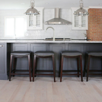
This kitchen looks very different from how it started, right? Though we didn’t touch any walls, the kitchen has almost doubled in usable space! We created a long, extended island with storage, an outlet for small appliances, and seating for comfortable prep, after-school snacking, or mingling among friends.
On the other side of the island, the family has even more storage and an integrated dishwasher within easy reach of the sink, perfect for quick clean-up. From this angle, you can also see the expansive custom Shaker cabinetry in white and the integrated double ovens. These facilitate their cooking experience and gave us the opportunity to add an additional surprise…
A coffee garage station and more hidden storage! Keeping these items located along the perimeter allows them to be accessed by the family or their guests without someone getting under the cook’s feet. These are the little details that make everyday life easier and more enjoyable.
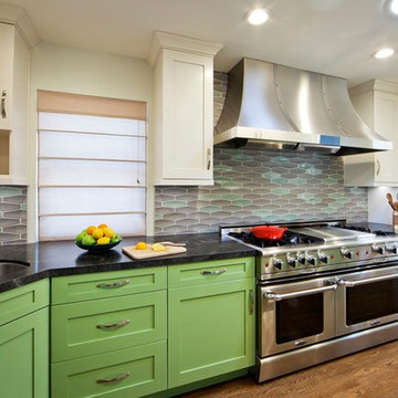
Moving deeper into the kitchen, the seamless induction cooktop topped with a freestanding concealed hood fan commands attention in a soft yet prominent way. The natural wood accent mirrors the fireplace mantle, and the choice of off-black wood-grain cabinets not only continues our black-and-white colour palette but adds a sense of depth and contrast. The corner sink is located to the right and perfectly positioned with a view of their thriving backyard.
To invite more of this family’s character into the space, we mixed metals for interest — matte black, dark pewter, and warm brass — and created open shelves in white oak for their plants and decor. You can also glimpse the tumbled edge of the backsplash tile, which echoes the rustic brick of the fireplace. It adds that farmhouse charm while still feeling timeless and sophisticated.
Last but not least, we designed this dining banquette in the bay window (with integrated bench storage, of course), where the family can share a meal together, the kids can do homework, or Emma and Vince can work and enjoy a change of scenery from their offices. Like the other spaces in the home, it was designed to be beautiful, multi-functional, and long-lasting.
Praise from Our Clients:
It is clear that we love this home, but what did our clients have to say?
“Lori is a visionary and masters execution to the finest detail all at the same time. When she first met us to know more about who we are and how we live, she could right away envision how we could use the space in our kitchen and living room…The results exceeded our expectations.
Lori and her team were also a delight to work with — coordination with all the trades, fast problem-solving, regular updates, professional and friendly attitude of her entire team — made it the dream team. Thank you SHD for making our space so beautiful!”
In turn, we are so grateful for this family’s trust, their open communication, and for being wonderful people with whom to work. (So, thank you!)

Sponsored
Plain City, OH

The Creative Kitchen Company
Columbus Area Kitchen Remodeling and Refacing Professional

 Paula McDonald Design Build & Interiors
For a couple that really loves to cook and entertain we got rid of their old dining room and created an openness and entertainment capability without the need for a dining table, which is how people really want to live now. The new Okite quartz topped peninsula island seats four, while the open floor plan means the cook is never separated from his or her guests. With sleek design touches like stainless trimmed custom high gloss white cabinets, honed statuary marble tile backsplash, and distressed gray porcelain tile floors, this is one kitchen you'll never mind seeing from the living area.

 Olamar Interiors
This condo in Sterling, VA belongs to a couple about to enter into retirement. They own this home in Sterling, along with a weekend home in West Virginia, a vacation home on Emerald Isle in North Carolina and a vacation home in St. John. They want to use this home as their "home-base" during their retirement, when they need to be in the metro area for business or to see family. The condo is small and they felt it was too "choppy," it didn't have good flow and the rooms were too separated and confined. They wondered if it could have more of an open concept feel but were doubtful due to the size and layout of the home. The furnishings they owned from their previous home were very traditional and heavy. They wanted a much lighter, more open and more contemporary feel to this home. They wanted it to feel clean, light, airy and much bigger then it is.
The first thing we tackled was an unsightly, and very heavy stone veneered fireplace wall that separated the family room from the office space. It made both rooms look heavy and dark. We took down the stone and opened up parts of the wall so that the two spaces would flow into each other.
We added a view thru fireplace and gave the fireplace wall a faux marble finish to lighten it and make it much more contemporary. Glass shelves bounce light and keep the wall feeling light and streamlined. Custom built ins add hidden storage and make great use of space in these small rooms.
Our strategy was to open as much as possible and to lighten the space through the use of color, fabric and glass. New furnishings in lighter colors and soft textures help keep the feeling light and modernize the space. Sheer linen draperies soften the hard lines and add to the light, airy feel. Tinius Photography

 Rolf Schroeder General Contractors, Inc.
This young couple was looking to create a space where they could entertain adults and children simultaneously. We designed an adult side with walk in Wine Closet, Wine Tasting Bar, and TV area. The other third of the basement was designed as an expansive playroom for the children to gather. Barn doors separate the adult side from the childrens side, this also allows for the parents to close off the toys while entertaining adults only. To finish off the basement is a full bathroom and bedroom.

 Stephanie Nash
Small to Medium Custom Walk-in closet utilizing a space saving design to maximize hanging space in a medium size closet. Shown here in a Honey Maple finish, this design efficiently incorporates built in shoe storage, sliding storage baskets for T-Shirts & Sweaters, and two built in drawer system for additional storage.
Call Today to schedule your free in home consultation, and be sure to ask about our monthly promotions.
Tailored Living® & Premier Garage® Grand Strand / Mount Pleasant
OFFICE: 843-957-3309
EMAIL: jsnash@tailoredliving.com
WEB: tailoredliving.com/myrtlebeach

 Michael Nash Design, Build & Homes
2010 NARI CAPITAL COTY GRAND AWARD WINNER
We were asked to create an addition to match this large brick Spanish style home in McLean, so that the couple could entertain visiting guests in style in their own guest suite. To do this, we created a large two story brick addition, with three car garage on the lower level, convenient entrance to the main home, as well as to the garage, and large upstairs suite complete with living room overlooking the pool, built in cabinetry, sculptured wrought iron balconies, arched French doors, arched windows, kitchenette, large master bedroom area with marble bath and small laundry area. In this addition, we paid special attention to details, and matched up materials and styles to the original home, including arches, custom matched brick, stucco window surrounds, gabled windows, wrought iron railing inside and balconies outside, hardwood flooring throughout, indoor arches separating the spaces visually, and luxury surfaces in the bath and kitchenette.
 Olamar Interiors
This condo in Sterling, VA belongs to a couple about to enter into retirement. They own this home in Sterling, along with a weekend home in West Virginia, a vacation home on Emerald Isle in North Carolina and a vacation home in St. John. They want to use this home as their "home-base" during their retirement, when they need to be in the metro area for business or to see family. The condo is small and they felt it was too "choppy," it didn't have good flow and the rooms were too separated and confined. They wondered if it could have more of an open concept feel but were doubtful due to the size and layout of the home. The furnishings they owned from their previous home were very traditional and heavy. They wanted a much lighter, more open and more contemporary feel to this home. They wanted it to feel clean, light, airy and much bigger then it is.
The first thing we tackled was an unsightly, and very heavy stone veneered fireplace wall that separated the family room from the office space. It made both rooms look heavy and dark. We took down the stone and opened up parts of the wall so that the two spaces would flow into each other.
We added a view thru fireplace and gave the fireplace wall a faux marble finish to lighten it and make it much more contemporary. Glass shelves bounce light and keep the wall feeling light and streamlined. Custom built ins add hidden storage and make great use of space in these small rooms.
Our strategy was to open as much as possible and to lighten the space through the use of color, fabric and glass. New furnishings in lighter colors and soft textures help keep the feeling light and modernize the space. Sheer linen draperies soften the hard lines and add to the light, airy feel. Tinius Photography
Sponsored
Plain City, OH
The Creative Kitchen Company
Columbus Area Kitchen Remodeling and Refacing Professional

 JRP Design & Remodel
Joe and Denise purchased a large Tudor style home that never truly fit their needs. While interviewing contractors to replace the roof and stucco on their home, it prompted them to consider a complete remodel. With two young daughters and pets in the home, our clients were convinced they needed an open concept to entertain and enjoy family and friends together. The couple also desired a blend of traditional and contemporary styles with sophisticated finishes for the project.
JRP embarked on a new floor plan design for both stories of the home. The top floor would include a complete rearrangement of the master suite allowing for separate vanities, spacious master shower, soaking tub, and bigger walk-in closet. On the main floor, walls separating the kitchen and formal dining room would come down. Steel beams and new SQFT was added to open the spaces up to one another. Central to the open-concept layout is a breathtaking great room with an expansive 6-panel bi-folding door creating a seamless view to the gorgeous hills. It became an entirely new space with structural changes, additional living space, and all-new finishes, inside and out to embody our clients’ dream home.
PROJECT DETAILS:
• Style: Transitional
• Flooring: White Oak (Titanium wash)
• Photographer: Andrew (Open House VC)

 2Scale Architects
With the amazing influx of gifted clothes from friends and relatives that recently had children (or recently went on a shopping spree), some organization was in order to make sense of the large amounts of clothes. Here is our solution.
 Michelle's Interiors
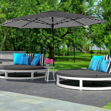
Lounging becomes an art form with these 78-inch round daybeds, positioned below a 13-foot parasol in dual fabrics. Just imagine a parent or grandparent sitting there with two or three kids or grandkids sprawled beside them. Or picture a couple of friends stretched out, enjoying great conversation on a beautiful day. So much better than two separate lounge chairs!
 JRP Design & Remodel
Joe and Denise purchased a large Tudor style home that never truly fit their needs. While interviewing contractors to replace the roof and stucco on their home, it prompted them to consider a complete remodel. With two young daughters and pets in the home, our clients were convinced they needed an open concept to entertain and enjoy family and friends together. The couple also desired a blend of traditional and contemporary styles with sophisticated finishes for the project.
JRP embarked on a new floor plan design for both stories of the home. The top floor would include a complete rearrangement of the master suite allowing for separate vanities, spacious master shower, soaking tub, and bigger walk-in closet. On the main floor, walls separating the kitchen and formal dining room would come down. Steel beams and new SQFT was added to open the spaces up to one another. Central to the open-concept layout is a breathtaking great room with an expansive 6-panel bi-folding door creating a seamless view to the gorgeous hills. It became an entirely new space with structural changes, additional living space, and all-new finishes, inside and out to embody our clients’ dream home.
PROJECT DETAILS:
• Style: Transitional
• Colors: Gray & White
• Countertops: Caesarstone Calacatta Nuvo
• Cabinets: DeWils Frameless Shaker, White
• Hardware/Plumbing Fixture Finish: Chrome
• Lighting Fixtures: unique and bold lighting fixtures throughout every room in the house (pendant lighting, chandeliers, sconces, etc)
• Tile/Backsplash: varies throughout home
• Photographer: Andrew (Open House VC)
Sponsored
Sunbury, OH

J.Holderby - Renovations
Franklin County's Leading General Contractors - 2X Best of Houzz!
 JRP Design & Remodel
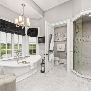
Our clients were living with outdated, dark bathrooms in their newly purchased Falling Star home. The dull palette of warm neutrals did not reflect the couple’s East Coast traditional style. They noticed several renovation projects by JRP in the neighborhood. The professionalism and the process impressed them. After receiving a Pardon Our Dust courtesy letter from JRP, the couple decided to call for a consultation. Their wish list was clear. They wanted the Falling Star design to be light, airy, and white. It had to reflect their East Coast roots. Working with the original footprint, JRP completely transformed the space, creating a tranquil primary suite rich with traditional detail. The result is an effusive celebration of classic style.
Now, the radiant rooms glow. To enlarge the primary closet, the JRP team removed a cluttered storage area. Inside, a separate dressing space is finished with upgraded storage and refined built-in cabinetry with recessed panels. Pops of glam such as Robert Abbey glass chandeliers and brilliant bits of chrome are moored by traditional elements like crown molding, porcelain tiles, and a quartz-clad drop-in soaking tub. Large windows in the primary bath and funnel skylights in the closet harness the natural light to stunning effect, sweeping the rooms with the cool feeling of fresh air. The “Sail Cloth” white paint adds soft depth to the uncomplicated elegance of both rooms.
PROJECT DETAILS:
• Style: Transitional
• Countertops: Vadara Quartz – Calacatta Dorado
• Cabinets: DeWils Recessed-panel, painted white
• Hardware/Plumbing Fixture Finish: Chrome
• Lighting Fixtures:
Master Closet: Skylight Sun Tunnel
Master Bath: Robert Abbey, Glass Chandelier
• Flooring:
Floor: Calacatta Dorado Porcelain Tiles w/Accent
• Tile/Backsplash: Shower Surround: Ceramic Blanc/Crackle
• Paint Colors:
Master Bath & Closet: Dunn Edwards Sail Cloth
Hall Bath: Benjamin Moore Ballet White
• Other Details: Drop-in soaking Tub
Photographer: J.R. Maddox

 Ko'olau Builders
Remodeling this Kahala home to accommodate a young, growing family. We’ve demolished 3 bedrooms and 2 bathrooms, and are replacing them with 3 new bedrooms, 2 new bathrooms, and a family room.
Mom and Dad will enjoy their master suite getaway on a new 2nd story, with a master bedroom, bathroom and walk-in closet.
Separate of the additions above, the existing garage will be re-configured to free up the space the old driveway used, and new laundry room will be added off of the garage and kitchen – laundry rooms are always a great addition!


74