
Search results for "Sequence" in Home Design Ideas
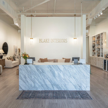
 dl-Design Studio PLLC
The entry sequence is established by a luxury marble stone retail reception and checkout desk, revealing glimpses of the other spaces beyond.
Inspiration for a transitional entryway remodel in Raleigh
Inspiration for a transitional entryway remodel in Raleigh
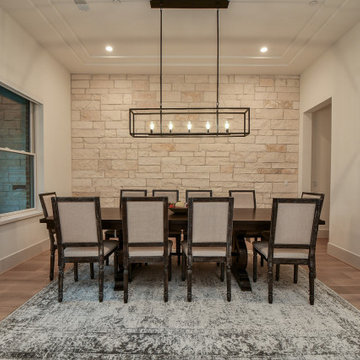
 Design DCA
This dining room anchors the entry sequence with a full height cream limestone accent wall laid in a coursed ashlar pattern.
Cottage chic light wood floor and tray ceiling great room photo in Houston with white walls
Cottage chic light wood floor and tray ceiling great room photo in Houston with white walls
 BBA Architects
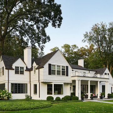
This colonial home renovation reimagines the original character of the house by adding a light-filled entry gallery overlooking the covered front porch. The revised circulation plan opens up the interior to frame views and improve the flow between spaces while maintaining the traditionally defined rooms throughout. New large-paned casement windows replace the modest double-hung units to enhance the scale of the exterior facade and streamline the architectural detailing. The arrival sequence is improved by relocating a brick-lined driveway southward to extend the lawn and allow boxwood clouds set in ground cover to frame new bluestone walks. Overlooking the idyllic golf course beyond, the new rear garden and bluestone terrace better defines the yard and provides a generous outdoor living space.
View more of this home through #BBAFocusOnTheFairway on Instagram
Find the right local pro for your project
 Studio TOOP
design: Studio TOOP, 2008
location: Driebergen, NL
status: built in 2008, Tuinvreugd
photo: Jolanthe Lalkens, 2010
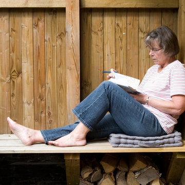
A letter from the town of Driebergen explaining that there were subsidies available if residents wanted to build a rainwater catchment in their garden was the impulse necessary for Ben and Ine to finally redo their garden. About to start retirement they had more time to garden and enjoy being at home. Ine hd been a gardener for years and looked for the opportunity to spend more time on the hobby and Ben was already working out the technical details of the rainwater catchment and ponds.
Studio TOOP helped them translate their wishes and interests into a clear design that made smart use of the small elevation change in the garden. Sequences of steps and raised beds separate each section of the garden. Three lines - a row of three ponds, a row of crab apple trees and a rose covered pergola - emphasize the gardens length. Each pond is 15 cm lower than the next, allowing the water to flows from one to another, and then to another lower lying pond at the end of the pergola. Under a lid that works as a bench integrated into two of the raised beds are the rainwater tanks.
 Shuler Architecture
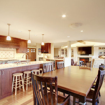
This classic 1970's rambler was purchased by our clients as their 'forever' retirement home and as a gathering place for their large, extended family. Situated on a large, verdant lot, the house was burdened with extremely dated finishes and poorly conceived spaces. These flaws were more than offset by the overwhelming advantages of a single level plan and spectacular sunset views. Weighing their options, our clients executed their purchase fully intending to hire us to immediately remodel this structure for them.
Our first task was to open up this plan and give the house a fresh, contemporary look that emphasizes views toward Lake Washington and the Olympic Mountains in the distance. Our initial response was to recreate our favorite Great Room plan. This started with the elimination of a large, masonry fireplace awkwardly located in the middle of the plan and to then tear out all the walls. We then flipped the Kitchen and Dining Room and inserted a walk-in pantry between the Garage and new Kitchen location.
While our clients' initial intention was to execute a simple Kitchen remodel, the project scope grew during the design phase. We convinced them that the original ill-conceived entry needed a make-over as well as both bathrooms on the main level. Now, instead of an entry sequence that looks like an afterthought, there is a formal court on axis with an entry art wall that arrests views before moving into the heart of the plan. The master suite was updated by sliding the wall between the bedroom and Great Room into the family area and then placing closets along this wall - in essence, using these closets as an acoustical buffer between the Master Suite and the Great Room. Moving these closets then freed up space for a 5-piece master bath, a more efficient hall bath and a stacking washer/dryer in a closet at the top of the stairs.
 EAG Studio
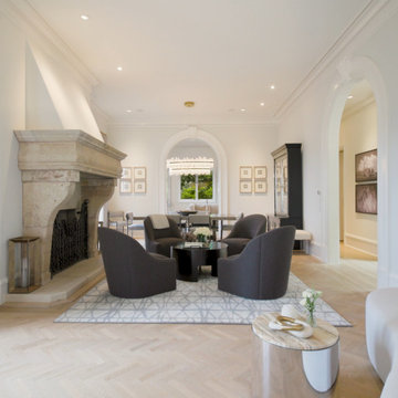
Refined Continuity: Bridging Classical Architecture and Modern Living
This comprehensive remodel of a grand Cow Hollow residence reimagines a historically expressive envelope through a lens of contemporary livability, precision detailing, and material restraint. The design approach carefully balances the home’s classical proportions and ornamental heritage with a refined, modern sensibility—evident in the disciplined palette of warm neutrals, soft plasters, pale oak flooring, and tailored millwork. Circulation has been clarified and subtly expanded to enhance spatial flow, while openings are leveraged to capture light, garden outlooks, and distant water views. Throughout, architectural interventions are executed with a high level of craft, ensuring that new insertions—whether cabinetry, railings, or apertures—read as seamless continuations of the original structure rather than applied elements.
The kitchen serves as the operational and visual anchor of the home, conceived as a sculptural yet highly functional environment. Custom rift-cut cabinetry, softened through a desaturated finish, is paired with honed stone surfaces and integrated brass hardware to create a quiet, tactile richness. A monolithic island establishes a central gathering point, while perimeter work zones are carefully layered with concealed storage, integrated appliances, and open, backlit shelving that elevates everyday objects into curated displays. The adjacent bar and entertaining areas extend this language, reinforcing a cohesive hospitality-driven program. In parallel, the primary bathroom is designed as a serene, spa-like retreat, where bookmatched stone, frameless glass enclosures, and finely detailed metalwork converge. The composition prioritizes symmetry, clarity, and light—balancing generous volumes with intimate moments through integrated lighting, custom vanities, and a restrained material hierarchy.
The library and ancillary living spaces introduce a more intimate scale, anchored by bespoke built-ins that combine closed storage with illuminated display niches, creating depth and rhythm along the walls. Here, material transitions and furniture integration are handled with particular nuance, allowing the architecture to support both quiet retreat and social gathering. A continuous language of custom railings—executed in refined metal profiles—threads through the interior and extends outward, where the exterior gate and garden elements have been reinterpreted to align with the home’s renewed identity. The entry sequence is now defined by a calibrated interplay of solidity and transparency, with sculptural metalwork and landscape integration establishing a sense of arrival that is both secure and elegant. Collectively, the project reflects a holistic transformation—one that elevates performance, livability, and aesthetic clarity while preserving the inherent dignity of the original architecture.
 David Lester
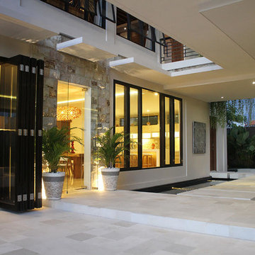
Exterior entrance sequence over fishpond
Example of a large asian home design design in Other
Example of a large asian home design design in Other
 New Explode Construction
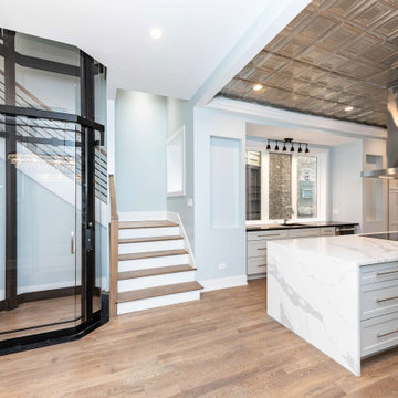
This Chicago luxury kitchen renovation was designed to bring structure, flow, and elevated daily living into one fully integrated space. The project features a custom waterfall island, full-height cabinetry, integrated appliances, statement metal ceiling detail, and carefully planned lighting that defines the heart of the home.
A key architectural element of the project is the residential elevator, seamlessly integrated into the kitchen and circulation layout without disrupting the visual balance of the space. This required early structural coordination, precise sequencing, and alignment across trades long before finishes were installed.
The result is a modern kitchen that combines function, accessibility, and strong architectural presence. Every detail was designed to support how the home is lived in while maintaining a clean, timeless aesthetic built to endure.

 Native Landscapes
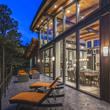
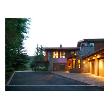
Moving the garage east of the house created a dramatically improved entry and arrival sequence. Mixed paving materials in directional patterns reflecting the geometry of the house reduce the impact of the driveway and direct guests to the front door.
 Dynia Architects
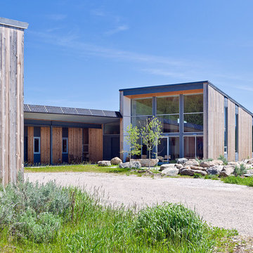
The site of this single story residence is at the base of the Teton Mountain range with views of canyons and peaks. To respond to this topographical edge condition, the form of the primary living space rises to capture this view. The entry sequence begins by arrival into a south facing “courtyard” defined by the house and an outbuilding. A linear porch accessed from the garage or the exterior leads to the entry. This ‘tail’ of the scheme wraps around itself, culminating at the expansive glazed wall and terrace beyond.
Project Year: 2008
 Miles Enterprises Inc
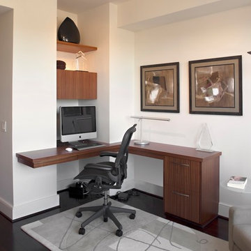
The owners of this Bethesda condominium were scaling down from a large single-family home. This master bedroom features sequenced matched Sapele mahogany and high-gloss closet cabinetry around the perimeter of the room. The curtains and the nightstand continue behind the floor to ceiling head board. The bookcases and desk were made from ribbon striped Sapele
 ANX / Aaron Neubert Architects
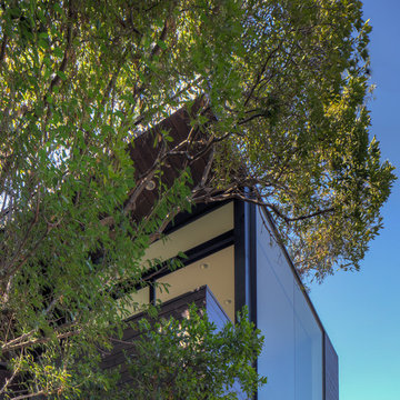
A steeply sloping property in the Franklin Hills neighborhood of Los Angeles is the site for this 200 square foot writer’s studio, labeled the “Black Box” for its minimal geometry and dark stained cladding. Floating above an existing residence and capturing a panoramic view of Griffith Park and its famed Observatory, the Black Box serves as the office for a technology author and columnist.
Entry to the structure is obtained by ascending the hillside stairs and passing below the tree canopy enveloping the studio. A custom fabricated steel fenestration system opens to the entry platform though a pair of telescoping doors. The assembly turns the corner and terminates in a picture window, directing the occupant to the expansive views. The position of the studio and the arrival sequence creates the desired separation between home life and work life.
Brian Thomas Jones
 Timberline Patio Covers
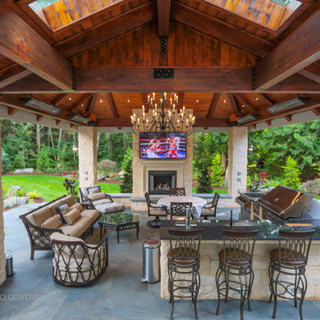
This outdoor living transformation brought together multiple phases of construction to create a seamless, year-round entertaining space. The project began with dry rot repairs and termite remediation, followed by framing a custom outdoor fireplace, completing the chimney, and preparing it for a beautiful stone finish. A custom soffit with skylights and detailed trim was installed to create a warm, finished ceiling that complements the home's architecture.
The existing deck was removed and replaced with a newly framed deck featuring custom stairs, durable decking, and modern railing. New siding and trim were completed around the home and breezeway, tying the addition into the existing exterior for a cohesive look.
The outdoor living area was further enhanced with a fully equipped outdoor kitchen, including cabinetry, shelving, appliances, a kegerator, and a wine temperature control system. Electrical work included recessed lighting, heaters, fireplace power, dimmers, and a dedicated subpanel to support the space's amenities. A new fence and gate were also constructed and painted to match the homeowner's preferences, providing both privacy and a polished finish.
Throughout the project, our team coordinated closely with specialty contractors, including the stone mason and paver installer, ensuring each phase was completed in the proper sequence. The result is a thoughtfully designed outdoor living space that blends craftsmanship, functionality, and lasting quality—creating the perfect setting for entertaining family and friends throughout every season.

 Nautilus Architects
Located on a marsh in the upper reaches of the Lieutenant River in Old Lyme, the existing house was well-sited and well-built, but the design failed to exploit the views and more importantly was a confused combination of contemporary and traditional elements. The new homeowners, a successful businesswoman and an accomplished artist and photographer, were interested in creating a fully-contemporary environment to open up space, connect indoors with outdoors, display artwork and showcase the husband’s distinctive photographs.
One glaring deficiency was the curb appeal and approach sequence: the grade sloped down and the path to the house followed, but this led to an uncomfortable dip and abrupt rise to the front door. By creating a virtual “moat,” occupied by a grid of raised-bed grasses contained in aluminum-clad boxes, and spanning the moat with an ipe bridge, the approach becomes level and engaging. The façade of the existing house was blank and bland, and with no cover. Adding a deep overhang with a wide porch creates a welcoming, covered condition, accentuated by a 6’ wide pivoting front door that feels more like a moving piece of wall.
Another deficiency was the connection to the outdoors. By adding glass to the front and back of the house, and removing interior walls selectively, the house takes on a diaphanous quality that allows one to see through to the marsh beyond, even when in the driveway. The raised-bed grasses act as abstract, geometric versions of the marsh beyond. A large, pyramidal skylight establishes a spatial hierarchy around which the rooms revolve.
The house featured several tray-ceilinged spaces – living room, kitchen, and master bedroom – that were poorly-proportioned and with panels at the top that resembled inset flat panel doors. The solution was to use a different strategy for each: the bedroom turns the ceiling into an eggshell through the use of a creative trim detail; the living room has an oversized sculptural, backlit lighting element; and the kitchen has a collage of painted rectangular forms that support or include lighting pieces.
A palette of concrete, blackened steel, stainless steel and colors carefully chosen by homeowner and architect create an interior and exterior environment punctuated by moments that are as artistic as the featured works in the black-ceilinged gallery.
 Banyon Tree Design Studio
Winter garden in the fall
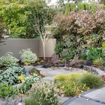
This is an example of a mediterranean privacy front yard landscaping in Seattle for winter.
This is an example of a mediterranean privacy front yard landscaping in Seattle for winter.
 George Ocampo
Upper Valley Estate Curb Appeal – El Paso, Texas
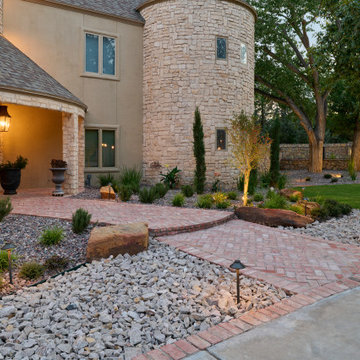
This curb appeal transformation was conceived as a deliberate sequence—an arrival experience where architecture, landscape, and lighting work together as one. Every element was designed to honor the home’s stone construction, turreted forms, and Old World character while responding precisely to the Upper Valley climate and lifestyle.
By day, the experience is grounded and composed. Brick-edged concrete drives establish order and permanence, guiding movement through the property with clarity and intention. Natural stone walls and columns anchor the architecture, while layered gravel beds, drought-tolerant plantings, and manicured turf soften transitions and connect the home to its desert setting. Mature trees were preserved and carefully integrated, providing scale, shade, and a sense of continuity.
As afternoon shifts toward sunset, the materials begin to speak differently. Stone warms, textures deepen, and sightlines subtly draw the eye toward the front entry. The landscape narrows the focus, creating a moment of pause before arrival—calm, quiet, and refined.
At night, the design reveals its final layer. Low-voltage lighting is integrated with precision, washing stone surfaces, tracing architectural curves, and uplighting specimen trees to create depth without glare. The drive, walkways, and entry feel safe, legible, and inviting, while the home itself glows with a restrained elegance. Coming home after dark feels intentional—protected, welcoming, and unmistakably yours.
What was created is more than curb appeal. It is a cohesive design-build solution where nothing is ornamental without purpose and nothing is built without intention. A daily experience of arrival that reflects craftsmanship, care, and the enduring character of the Upper Valley.
 Halflants + Pichette
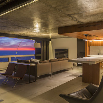
Besides designing and building the unit, Halflants + Pichette Studio for Modern Architecture also selected the furniture which includes a lounge chair by Poul Kjaerholm, a B&B Italia couch by Antonio Citterio, and a swivel chair by Jeffrey Bernett. All furniture were selected for their sculptural form, comfort, and for their weightlessness. The designers wanted pieces that floated above the large porcelain tiles to add to the sense of a continuous fluid space. The architects took care not to design the condominium room by room, but as an uninterrupted sequence of spaces to increase the perceived dimensions of the unit.
 Banyon Tree Design Studio
Lots of roses, peachy roses
Photo of a mediterranean full sun front yard stone and metal fence landscaping in Seattle for summer.
Photo of a mediterranean full sun front yard stone and metal fence landscaping in Seattle for summer.
 Wooden Hammer
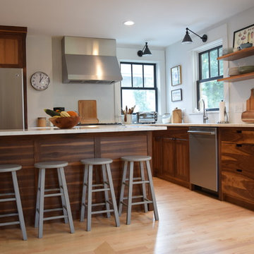
We made these custom walnut cabinets with many nice details, such as furniture-style legs, cut-out drawer pulls, and lots of sequenced, grain-matched panels. The customer wanted a mix of dark and light wood, with interesting character. We also built some walnut floating shelves to match.
34