
Search results for "Shorter expression movements" in Home Design Ideas
 SM Design
St. Andrews Project — Primary Bathroom & Spa Retreat
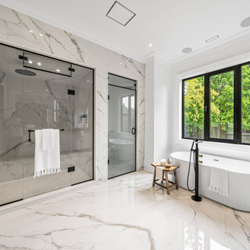
This St. Andrews primary bathroom is conceived as a private spa retreat, where material continuity, sculptural forms, and architectural restraint create a sense of understated luxury. The design intentionally avoids visual clutter, allowing the quality of the materials and precision of the detailing to define the space.
The room is anchored by a dramatic marble-look stone that extends continuously across the shower enclosure and floor, creating a seamless visual envelope. The expressive veining introduces movement and natural variation, transforming what could otherwise be a minimal white bathroom into a richly layered composition. Carrying the stone through multiple surfaces also gives the room a sense of scale and architectural cohesion.
The freestanding bathtub is treated as a sculptural object rather than simply a functional fixture. Its softly curved silhouette and vertically fluted exterior introduce an organic counterpoint to the linear geometry of the surrounding architecture. Positioned directly beneath the large black-framed window, the tub becomes a quiet focal point while taking advantage of abundant natural light and views toward the greenery beyond.
Black-framed glass creates another important layer of contrast. The expansive shower enclosure and adjacent glazed opening establish a crisp graphic framework against the pale stone, while black plumbing fixtures and hardware reinforce the same architectural language. This repeated use of black creates visual continuity without overwhelming the light palette.
The oversized window is particularly important to the atmosphere of the room. Instead of treating the bathroom as an enclosed, highly private environment, the design establishes a connection to nature, allowing daylight and greenery to become part of the experience. The result is a space that feels bright, open, and restorative.
A restrained wooden stool introduces warmth and an organic material note against the stone and glass. Its natural finish prevents the monochromatic palette from feeling overly clinical, while the simple form complements the sculptural bathtub.
The overall design is based on material continuity, contrast, and calm geometry. Veined stone provides movement, fluted surfaces provide texture, black metal provides definition, and natural wood introduces warmth. The result is a contemporary luxury bathroom that feels architectural, serene, and highly considered, more like a private wellness retreat than a conventional ensuite.
 Fabco Sanctuary
The architect and designer Guy Derwent was approached by his client with a clear and compelling brief: to completely transform a grand Victorian terrace house they were planning to renovate. The client envisioned something far beyond a standard renovation – this was to be a bold and dramatic reimagining of a family home that could grow with them over time.
With the property having remained largely untouched for more than fifty years, the architects saw an opportunity to unlock its potential and deliver a contemporary design that would contrast beautifully with its Victorian heritage.
The existing layout consisted of a series of small, disconnected rooms to the rear of the house. To respond to the client’s need for openness and flexibility, the architect proposed a radical restructuring of the ground floor:
The rear rooms were completely removed
Suspended timber floors were lowered by up to two metres to align with the garden
Two bold extensions were added
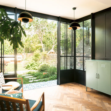
The first extension filled in the side return with a London stock brick facade and a glazed roof, while the second – a striking black steel and glass pavilion was glazed on three sides and placed along the garden elevation.
This new pavilion redefined the building’s relationship with the garden. Its steel-framed glazing created a seamless dialogue between interior and exterior, offering a sense of immersion in the surrounding landscape.
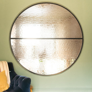
At the heart of the plan sits a dramatic, five-metre-tall dining space that acts as a transition from the original entrance hall into the new addition. A large, circular cast-glass window, framed in steel, provides a visual and spatial link between old and new, allowing light and movement to travel through the depth of the home.
Throughout the project, a series of black metal elements were introduced as sculptural interventions – each marking moments of transformation within the house. These included the bespoke steel framed circular window, a custom metal staircase, a cylindrical support column, and the striking steel and glass garden pavilion. Together, they formed a coherent architectural language that underscored the project’s bold intent.
Our steel windows and doors played a vital role in delivering the project’s vision. The architects chose steel for its refined sight lines and distinctive material character, which helped bridge the gap between the historical context of the building and the bold new additions.
The black steel frames provided a crisp contrast to the pale London stock brick and added definition to the glazed pavilion, reinforcing the sense of architectural precision. In particular, the fine steel profiles of the garden room allowed the extension to feel both lightweight and immersive, blurring the boundary between the house and its garden.
The architect drew inspiration from the Bauhaus Movement, particularly the work of Walter Gropius, whose approach to functional beauty and industrial materials informed the design of the garden pavilion.
Here, our glazing system was used not just for transparency, but as an expressive architectural element. The carefully proportioned panels help to conceal the roof thickness and reinforce the pavilion’s industrial yet abstract character – a deliberate nod to product design and modernist detailing.
Sustainability was an important factor in the selection of materials. Our steel systems, made from 99% recycled content and 100% recyclable, aligned with the project’s broader environmental goals.
The architects noted that this commitment to material longevity and circularity was central to their decision to use steel. The durability and recyclability of the windows and doors ensured the project met both aesthetic and ethical criteria.
This London terrace house now stands as a celebration of contrast – between heritage and innovation, solidity and transparency, tradition and transformation. Our steel windows and doors were not simply components; they were essential tools in crafting a home that is as bold and expressive as it is functional.
The result is a home designed for modern family life, where light, space, and materiality come together in perfect harmony.
 Fabco Sanctuary
The architect and designer Guy Derwent was approached by his client with a clear and compelling brief: to completely transform a grand Victorian terrace house they were planning to renovate. The client envisioned something far beyond a standard renovation – this was to be a bold and dramatic reimagining of a family home that could grow with them over time.
With the property having remained largely untouched for more than fifty years, the architects saw an opportunity to unlock its potential and deliver a contemporary design that would contrast beautifully with its Victorian heritage.
The existing layout consisted of a series of small, disconnected rooms to the rear of the house. To respond to the client’s need for openness and flexibility, the architect proposed a radical restructuring of the ground floor:
The rear rooms were completely removed
Suspended timber floors were lowered by up to two metres to align with the garden
Two bold extensions were added
The first extension filled in the side return with a London stock brick facade and a glazed roof, while the second – a striking black steel and glass pavilion was glazed on three sides and placed along the garden elevation.
This new pavilion redefined the building’s relationship with the garden. Its steel-framed glazing created a seamless dialogue between interior and exterior, offering a sense of immersion in the surrounding landscape.
At the heart of the plan sits a dramatic, five-metre-tall dining space that acts as a transition from the original entrance hall into the new addition. A large, circular cast-glass window, framed in steel, provides a visual and spatial link between old and new, allowing light and movement to travel through the depth of the home.
Throughout the project, a series of black metal elements were introduced as sculptural interventions – each marking moments of transformation within the house. These included the bespoke steel framed circular window, a custom metal staircase, a cylindrical support column, and the striking steel and glass garden pavilion. Together, they formed a coherent architectural language that underscored the project’s bold intent.
Our steel windows and doors played a vital role in delivering the project’s vision. The architects chose steel for its refined sight lines and distinctive material character, which helped bridge the gap between the historical context of the building and the bold new additions.
The black steel frames provided a crisp contrast to the pale London stock brick and added definition to the glazed pavilion, reinforcing the sense of architectural precision. In particular, the fine steel profiles of the garden room allowed the extension to feel both lightweight and immersive, blurring the boundary between the house and its garden.
The architect drew inspiration from the Bauhaus Movement, particularly the work of Walter Gropius, whose approach to functional beauty and industrial materials informed the design of the garden pavilion.
Here, our glazing system was used not just for transparency, but as an expressive architectural element. The carefully proportioned panels help to conceal the roof thickness and reinforce the pavilion’s industrial yet abstract character – a deliberate nod to product design and modernist detailing.
Sustainability was an important factor in the selection of materials. Our steel systems, made from 99% recycled content and 100% recyclable, aligned with the project’s broader environmental goals.
The architects noted that this commitment to material longevity and circularity was central to their decision to use steel. The durability and recyclability of the windows and doors ensured the project met both aesthetic and ethical criteria.
This London terrace house now stands as a celebration of contrast – between heritage and innovation, solidity and transparency, tradition and transformation. Our steel windows and doors were not simply components; they were essential tools in crafting a home that is as bold and expressive as it is functional.
The result is a home designed for modern family life, where light, space, and materiality come together in perfect harmony.
Find the right local pro for your project
 Boyenga Team / Compass
Eichler X-100 Bedroom: A Private Retreat Defined by Light and Calm
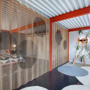
The bedrooms of the Eichler X-100 offer a quieter, more intimate expression of the home’s architectural vision—spaces designed for rest, reflection, and connection to light and nature. Conceived by A. Quincy Jones and Frederick Emmons for Joseph Eichler, these rooms balance simplicity with thoughtful design in a way that feels both modern and timeless.
Minimalism with Purpose
The bedrooms are intentionally restrained—free of unnecessary detail—allowing the architecture itself to define the experience. Clean lines, open volumes, and uncluttered surfaces create a sense of calm that feels almost meditative.
Every element serves a purpose, reinforcing a lifestyle centered on clarity and ease.
Light, Softened and Controlled
Unlike the expansive public spaces, the bedrooms receive light in a more subtle way:
Skylights filter daylight from above, creating a soft, even glow
Carefully placed glazing maintains brightness while preserving privacy
Light shifts gently throughout the day, enhancing the room’s tranquil atmosphere
This approach transforms light into something quiet and restorative.
A Connection to Nature—On Your Terms
Even in these more private spaces, the X-100 maintains its connection to the outdoors. Views often extend toward interior gardens or landscaped areas, allowing nature to remain present without sacrificing seclusion.
The result is a unique balance:
open, yet protected.
Integrated Within the Plan
Positioned along the home’s central circulation, the bedrooms are seamlessly connected to the rest of the house while still feeling distinctly separate. The layout allows for easy movement, yet maintains a clear transition from public to private zones.
There are no long corridors or wasted space—just efficient, intentional design.
Comfort Through Design
The bedrooms reflect Eichler’s belief that architecture should enhance everyday life. Radiant-heated floors, natural materials, and thoughtful proportions create an environment that is both comfortable and visually refined.
It’s a space that supports rest without distraction.
A Quiet Expression of Modernism
While the X-100 is known for its bold experimentation, the bedrooms reveal a softer side—where modernism becomes personal. These rooms are not about making a statement; they are about creating a sense of peace within a larger architectural vision.
In the Eichler X-100, even the most private spaces are designed with intention—proving that great architecture isn’t just experienced in grand gestures, but in the quiet moments of everyday life.

 InnovationLand
Among our Houston outdoor kitchens, this one is unique because of its concrete countertops, pergola with stucco wrapping and custom storage.
"It's not one of our biggest covered outdoor kitchens in Houston," says Outdoor Homescapes of Houston owner Wayne Franks. "But it's unique, and it looks really nice, too!"
The client, a young family, wanted an outdoor kitchen with a more minimalistic, modern look, explains Outdoor Homescapes senior designer Lisha Maxey.
"They're both doctors and very much attuned to detail," she says. "Their primary goal was to create a space where they could lounge while the children played as well as an area to entertain family and friends while cooking and dining outside."
Like a growing number of people wanting small outdoor kitchens in Houston, this client expressed interest in using concrete as a surface material: "The look is contemporary and is easily paired with any type of outdoor furniture," says Maxey, "from wicker to teak to iron."
Here's a closeup of the concrete countertops. You'll notice that they're glossy and smooth like glass, thanks to special sealers and a topcoat of UV-resistant resin that prevents the countertop from yellowing.
Since these particular clients lean toward the minimalistic side of contemporary design, she continues, "the standard granite countertop of many Houston outdoor kitchens would not work, since it typically has a lot of movement and can be busy."
Lisha sees the use of concrete as a growing outdoor design trend for Houston outdoor kitchens: "It's easy to maintain and again, leans towards a more modern look for outdoor."
All the furniture and lighting is from Restoration Hardware, says Lisha, who's offering $500 in free outdoor furniture consultation services as a special promotion. (Interested? Just contact us!)
The dining and lounge chairs are from the Antibes collection in cast aluminum with a bronze finish. The table is a Belgian Trestle made of weathered concrete and teak. Simple track lighting was used on the pergola in keeping with the minimalist look of the space.
The pergola is a treated pine, stained a Minwax Jacobean, which appears almost black. "This client chose a pergola over a roof extension off the house because they wanted it to still seem light and airy in their outdoor space for their young children," explains Lisha. "They wanted a certain degree of sun and shade protection, which a pergola does provide, but they wanted it to seem a bit like a park for the kids to play in."
"The seating/storage bin was not a part of the original design," says Lisha. "As the project progressed, the client expressed interest in some sort of chest for the new outdoor furniture cushions to be stored in."
The design for the storage bin was developed to accommodate this request: "It eventually evolved into a seating area as well. And to keep the look consistent with the new kitchen, it was agreed that the stone be carried through the design. The wood top was necessary so we could design a hinged access for storage."
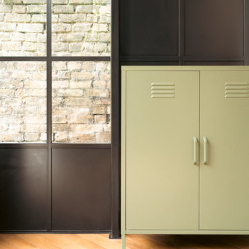 Fabco Sanctuary
The architect and designer Guy Derwent was approached by his client with a clear and compelling brief: to completely transform a grand Victorian terrace house they were planning to renovate. The client envisioned something far beyond a standard renovation – this was to be a bold and dramatic reimagining of a family home that could grow with them over time.
With the property having remained largely untouched for more than fifty years, the architects saw an opportunity to unlock its potential and deliver a contemporary design that would contrast beautifully with its Victorian heritage.
The existing layout consisted of a series of small, disconnected rooms to the rear of the house. To respond to the client’s need for openness and flexibility, the architect proposed a radical restructuring of the ground floor:
The rear rooms were completely removed
Suspended timber floors were lowered by up to two metres to align with the garden
Two bold extensions were added
The first extension filled in the side return with a London stock brick facade and a glazed roof, while the second – a striking black steel and glass pavilion was glazed on three sides and placed along the garden elevation.
This new pavilion redefined the building’s relationship with the garden. Its steel-framed glazing created a seamless dialogue between interior and exterior, offering a sense of immersion in the surrounding landscape.
At the heart of the plan sits a dramatic, five-metre-tall dining space that acts as a transition from the original entrance hall into the new addition. A large, circular cast-glass window, framed in steel, provides a visual and spatial link between old and new, allowing light and movement to travel through the depth of the home.
Throughout the project, a series of black metal elements were introduced as sculptural interventions – each marking moments of transformation within the house. These included the bespoke steel framed circular window, a custom metal staircase, a cylindrical support column, and the striking steel and glass garden pavilion. Together, they formed a coherent architectural language that underscored the project’s bold intent.
Our steel windows and doors played a vital role in delivering the project’s vision. The architects chose steel for its refined sight lines and distinctive material character, which helped bridge the gap between the historical context of the building and the bold new additions.
The black steel frames provided a crisp contrast to the pale London stock brick and added definition to the glazed pavilion, reinforcing the sense of architectural precision. In particular, the fine steel profiles of the garden room allowed the extension to feel both lightweight and immersive, blurring the boundary between the house and its garden.
The architect drew inspiration from the Bauhaus Movement, particularly the work of Walter Gropius, whose approach to functional beauty and industrial materials informed the design of the garden pavilion.
Here, our glazing system was used not just for transparency, but as an expressive architectural element. The carefully proportioned panels help to conceal the roof thickness and reinforce the pavilion’s industrial yet abstract character – a deliberate nod to product design and modernist detailing.
Sustainability was an important factor in the selection of materials. Our steel systems, made from 99% recycled content and 100% recyclable, aligned with the project’s broader environmental goals.
The architects noted that this commitment to material longevity and circularity was central to their decision to use steel. The durability and recyclability of the windows and doors ensured the project met both aesthetic and ethical criteria.
This London terrace house now stands as a celebration of contrast – between heritage and innovation, solidity and transparency, tradition and transformation. Our steel windows and doors were not simply components; they were essential tools in crafting a home that is as bold and expressive as it is functional.
The result is a home designed for modern family life, where light, space, and materiality come together in perfect harmony.

 Cape Associates, Inc.
The little cottage on Turnip Field Road in Eastham had been owned by the same couple since 1940, until they built a new, adjacent house on the property. The cottage was then handed down to the next generation, who began spending more and more time at the cottage. It was then that they contacted Cape Associates to construct a more livable home in place of that little cottage. It was crucial to the owners however, that the home keep with the understated charm and Cape Cod-feel of the neighborhood.
The primary challenge was to keep it humble, while building the owners their well-deserved vacation retreat. The original cottage had no air conditioning, and renovating was quickly dismissed because of the inadequacies and the cost of modernizing. Building new allowed the team to relocate the house further back from the street, and it meant meeting the owners’ needs without compromise.
Cape Associates’ project manager Lance LaLone said the owners expressed their desire to incorporate lots of wood and the types of materials that were in the old cottage. Most of the interior is pine, which was used on the flooring, the walls, and wrapped around the ceiling’s beams, giving the owners what they desired on a grander scale – a beautiful, modern dwelling that still held the personality of that little cottage that held such cherished memories.
The front of the home has a two-car garage and breezeway entrance, while the rear reveals an entertainer’s paradise, with an enormous mahogany deck with an outdoor shower, a stunning Connecticut-fieldstone fireplace with a chimney that reaches around 30 feet in height, and multiple sliders to access the home. The finished basement opens to the ground level, and above the entrance breezeway is another small deck with a great view. It’s the best of indoor/outdoor living.
Movement patterns from beach to house to bedroom were an important consideration. The site also provided an excellent opportunity to visually connect the basement level patio visually to the main level deck and finally the master bedroom deck. The finished home provides year-round living, with a summer-getaway atmosphere.

Sponsored
Columbus, OH

Hope Restoration & General Contracting
Columbus Design-Build, Kitchen & Bath Remodeling, Historic Renovations
 Boyenga Team / Compass
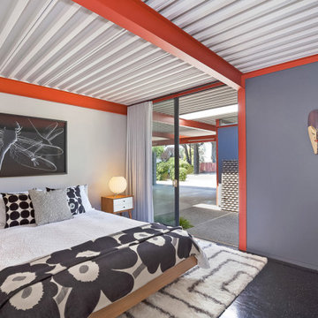
Eichler X-100 Bedroom: A Private Retreat Defined by Light and Calm
The bedrooms of the Eichler X-100 offer a quieter, more intimate expression of the home’s architectural vision—spaces designed for rest, reflection, and connection to light and nature. Conceived by A. Quincy Jones and Frederick Emmons for Joseph Eichler, these rooms balance simplicity with thoughtful design in a way that feels both modern and timeless.
Minimalism with Purpose
The bedrooms are intentionally restrained—free of unnecessary detail—allowing the architecture itself to define the experience. Clean lines, open volumes, and uncluttered surfaces create a sense of calm that feels almost meditative.
Every element serves a purpose, reinforcing a lifestyle centered on clarity and ease.
Light, Softened and Controlled
Unlike the expansive public spaces, the bedrooms receive light in a more subtle way:
Skylights filter daylight from above, creating a soft, even glow
Carefully placed glazing maintains brightness while preserving privacy
Light shifts gently throughout the day, enhancing the room’s tranquil atmosphere
This approach transforms light into something quiet and restorative.
A Connection to Nature—On Your Terms
Even in these more private spaces, the X-100 maintains its connection to the outdoors. Views often extend toward interior gardens or landscaped areas, allowing nature to remain present without sacrificing seclusion.
The result is a unique balance:
open, yet protected.
Integrated Within the Plan
Positioned along the home’s central circulation, the bedrooms are seamlessly connected to the rest of the house while still feeling distinctly separate. The layout allows for easy movement, yet maintains a clear transition from public to private zones.
There are no long corridors or wasted space—just efficient, intentional design.
Comfort Through Design
The bedrooms reflect Eichler’s belief that architecture should enhance everyday life. Radiant-heated floors, natural materials, and thoughtful proportions create an environment that is both comfortable and visually refined.
It’s a space that supports rest without distraction.
A Quiet Expression of Modernism
While the X-100 is known for its bold experimentation, the bedrooms reveal a softer side—where modernism becomes personal. These rooms are not about making a statement; they are about creating a sense of peace within a larger architectural vision.
In the Eichler X-100, even the most private spaces are designed with intention—proving that great architecture isn’t just experienced in grand gestures, but in the quiet moments of everyday life. image Sabrina Huang
 InnovationLand
Among our Houston outdoor kitchens, this one is unique because of its concrete countertops, pergola with stucco wrapping and custom storage.
"It's not one of our biggest covered outdoor kitchens in Houston," says Outdoor Homescapes of Houston owner Wayne Franks. "But it's unique, and it looks really nice, too!"
The client, a young family, wanted an outdoor kitchen with a more minimalistic, modern look, explains Outdoor Homescapes senior designer Lisha Maxey.
"They're both doctors and very much attuned to detail," she says. "Their primary goal was to create a space where they could lounge while the children played as well as an area to entertain family and friends while cooking and dining outside."
Like a growing number of people wanting small outdoor kitchens in Houston, this client expressed interest in using concrete as a surface material: "The look is contemporary and is easily paired with any type of outdoor furniture," says Maxey, "from wicker to teak to iron."
Here's a closeup of the concrete countertops. You'll notice that they're glossy and smooth like glass, thanks to special sealers and a topcoat of UV-resistant resin that prevents the countertop from yellowing.
Since these particular clients lean toward the minimalistic side of contemporary design, she continues, "the standard granite countertop of many Houston outdoor kitchens would not work, since it typically has a lot of movement and can be busy."
Lisha sees the use of concrete as a growing outdoor design trend for Houston outdoor kitchens: "It's easy to maintain and again, leans towards a more modern look for outdoor."
All the furniture and lighting is from Restoration Hardware, says Lisha, who's offering $500 in free outdoor furniture consultation services as a special promotion. (Interested? Just contact us!)
The dining and lounge chairs are from the Antibes collection in cast aluminum with a bronze finish. The table is a Belgian Trestle made of weathered concrete and teak. Simple track lighting was used on the pergola in keeping with the minimalist look of the space.
The pergola is a treated pine, stained a Minwax Jacobean, which appears almost black. "This client chose a pergola over a roof extension off the house because they wanted it to still seem light and airy in their outdoor space for their young children," explains Lisha. "They wanted a certain degree of sun and shade protection, which a pergola does provide, but they wanted it to seem a bit like a park for the kids to play in."
"The seating/storage bin was not a part of the original design," says Lisha. "As the project progressed, the client expressed interest in some sort of chest for the new outdoor furniture cushions to be stored in."
The design for the storage bin was developed to accommodate this request: "It eventually evolved into a seating area as well. And to keep the look consistent with the new kitchen, it was agreed that the stone be carried through the design. The wood top was necessary so we could design a hinged access for storage."
 SM Design
York Mills Residence | Layered Contemporary Elegance
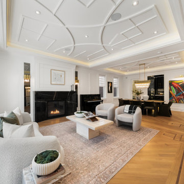
This York Mills residence was designed around the idea of quiet luxury expressed through architectural detail rather than excess. The interior combines classical residential proportions with contemporary forms, creating a sophisticated environment that feels highly curated while remaining comfortable and inviting for everyday living.
A key design strategy was to establish a continuous architectural language across the connected living, dining, and circulation spaces. Rather than designing each zone independently, the spaces are visually tied together through consistent wall paneling, warm oak flooring, carefully controlled neutral tones, and a coordinated lighting strategy. This creates a strong sense of continuity and allows the eye to move naturally through the home.
The ceiling design plays an important role in defining the character of the interior. Elaborate geometric and curved coffering introduces a sculptural element overhead, transforming the ceiling into a fifth architectural surface. The integrated perimeter illumination emphasizes these forms after dark, while recessed lighting provides functional illumination without competing with the decorative architecture.
The black stone fireplace provides a deliberate counterpoint to the predominantly light interior. Its strong visual weight anchors the living area and establishes a dramatic focal point, while the softer curved seating and neutral upholstery balance its intensity. This contrast between monumental architectural elements and tactile, rounded furnishings gives the room a contemporary character without losing its residential warmth.
Furniture planning was approached as an exercise in conversation, proportion, and movement. The seating arrangement creates an intimate conversational zone while maintaining a clear visual and physical connection to the dining area. The curved forms soften the geometry of the architecture and introduce a more relaxed human scale within the larger room.
The dining area extends the social function of the space and is visually framed by the architectural detailing and artwork. A sculptural chandelier establishes a focal point above the dining table, while the large-scale artwork introduces color, energy, and individuality into the otherwise restrained palette. This balance between a controlled architectural background and expressive art allows the homeowner's personality to become part of the design.
The flooring contributes another layer of craftsmanship. The warm wood surface establishes continuity throughout the open interior, while geometric floor detailing and directional patterns subtly define zones without relying on physical partitions. This allows the architecture to remain open while still providing a sense of hierarchy and spatial organization.
Artwork, decorative objects, greenery, and furnishings were intentionally selected to introduce moments of color, texture, softness, and visual contrast. The result is not a purely minimalist interior; instead, it is a layered composition in which restraint provides the foundation for carefully selected moments of expression.
Overall, the project reflects a contemporary approach to traditional luxury, architectural, highly detailed, and timeless, but never overly formal. The design prioritizes proportion, craftsmanship, material relationships, natural light, and the experience of moving through the home, creating an interior that functions as both an elegant entertaining environment and a comfortable everyday living space.
 MANDARINA STUDIO interior design
LOCATION: MILTON, MASSACHUSETTS
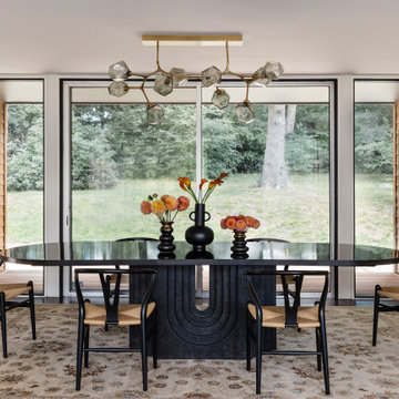
The renovation of this midcentury home centers on a complete transformation of the kitchen, which reshaped how the house functions and connects to its surroundings. The original layout relied on low cabinetry that failed to take advantage of the room’s generous volume. Mandarina Studio reworked the plan to improve circulation and take full advantage of the home’s soaring height and natural light.
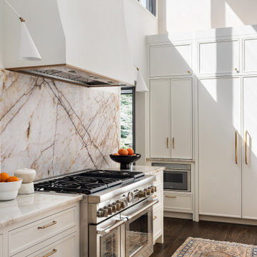
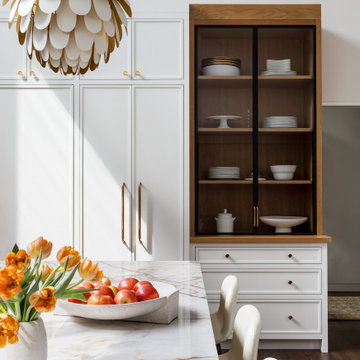
The redesigned kitchen replaces a dated peninsula with a generously scaled island that supports both everyday use and entertaining. Cabinetry was reimagined vertically as well as horizontally, allowing storage and display to extend upward and reinforce the room’s proportions. A custom china cabinet with tall glass doors framed in blackened iron and finished in white oak adds presence and refinement.
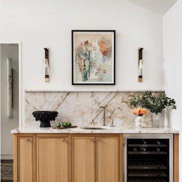
At one end of the kitchen, a dedicated bar introduces a more intimate moment. Art, layered lighting, and wall-mounted sconces give this area its own identity, offering contrast to the openness of the main kitchen while supporting entertaining. Clerestory windows introduce shifting daylight throughout the day, bringing depth and movement to the quartzite focal wall at the range. Pendant lights reference midcentury forms in a refined, contemporary way. The completed kitchen was featured on the cover of Modern Luxury Interiors.
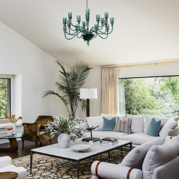
The renovation extended beyond the kitchen to include a new primary bath, a refreshed guest bath, and updated furnishings throughout the living and dining rooms. In the primary bath, marble with expressive veining is paired with a custom floating white oak vanity, balancing warmth and restraint. In the living room, a new picture window frames wooded views, while the furniture plan grounds the space. A turquoise Murano glass chandelier introduces color and artistry, adding a distinctive, personal note to the interior.
 MANDARINA STUDIO interior design
LOCATION: MILTON, MASSACHUSETTS
The renovation of this midcentury home centers on a complete transformation of the kitchen, which reshaped how the house functions and connects to its surroundings. The original layout relied on low cabinetry that failed to take advantage of the room’s generous volume. Mandarina Studio reworked the plan to improve circulation and take full advantage of the home’s soaring height and natural light.
The redesigned kitchen replaces a dated peninsula with a generously scaled island that supports both everyday use and entertaining. Cabinetry was reimagined vertically as well as horizontally, allowing storage and display to extend upward and reinforce the room’s proportions. A custom china cabinet with tall glass doors framed in blackened iron and finished in white oak adds presence and refinement.
At one end of the kitchen, a dedicated bar introduces a more intimate moment. Art, layered lighting, and wall-mounted sconces give this area its own identity, offering contrast to the openness of the main kitchen while supporting entertaining. Clerestory windows introduce shifting daylight throughout the day, bringing depth and movement to the quartzite focal wall at the range. Pendant lights reference midcentury forms in a refined, contemporary way. The completed kitchen was featured on the cover of Modern Luxury Interiors.
The renovation extended beyond the kitchen to include a new primary bath, a refreshed guest bath, and updated furnishings throughout the living and dining rooms. In the primary bath, marble with expressive veining is paired with a custom floating white oak vanity, balancing warmth and restraint. In the living room, a new picture window frames wooded views, while the furniture plan grounds the space. A turquoise Murano glass chandelier introduces color and artistry, adding a distinctive, personal note to the interior.


Sponsored
Columbus, OH
Hope Restoration & General Contracting
Columbus Design-Build, Kitchen & Bath Remodeling, Historic Renovations

 JRP Design & Remodel
Our clients are seasoned home renovators. Their Malibu oceanside property was the second project JRP had undertaken for them. After years of renting and the age of the home, it was becoming prevalent the waterfront beach house, needed a facelift. Our clients expressed their desire for a clean and contemporary aesthetic with the need for more functionality. After a thorough design process, a new spatial plan was essential to meet the couple’s request. This included developing a larger master suite, a grander kitchen with seating at an island, natural light, and a warm, comfortable feel to blend with the coastal setting.
Demolition revealed an unfortunate surprise on the second level of the home: Settlement and subpar construction had allowed the hillside to slide and cover structural framing members causing dangerous living conditions. Our design team was now faced with the challenge of creating a fix for the sagging hillside. After thorough evaluation of site conditions and careful planning, a new 10’ high retaining wall was contrived to be strategically placed into the hillside to prevent any future movements.
With the wall design and build completed — additional square footage allowed for a new laundry room, a walk-in closet at the master suite. Once small and tucked away, the kitchen now boasts a golden warmth of natural maple cabinetry complimented by a striking center island complete with white quartz countertops and stunning waterfall edge details. The open floor plan encourages entertaining with an organic flow between the kitchen, dining, and living rooms. New skylights flood the space with natural light, creating a tranquil seaside ambiance. New custom maple flooring and ceiling paneling finish out the first floor.
Downstairs, the ocean facing Master Suite is luminous with breathtaking views and an enviable bathroom oasis. The master bath is modern and serene, woodgrain tile flooring and stunning onyx mosaic tile channel the golden sandy Malibu beaches. The minimalist bathroom includes a generous walk-in closet, his & her sinks, a spacious steam shower, and a luxurious soaking tub. Defined by an airy and spacious floor plan, clean lines, natural light, and endless ocean views, this home is the perfect rendition of a contemporary coastal sanctuary.
PROJECT DETAILS:
• Style: Contemporary
• Colors: White, Beige, Yellow Hues
• Countertops: White Ceasarstone Quartz
• Cabinets: Bellmont Natural finish maple; Shaker style
• Hardware/Plumbing Fixture Finish: Polished Chrome
• Lighting Fixtures: Pendent lighting in Master bedroom, all else recessed
• Flooring:
Hardwood - Natural Maple
Tile – Ann Sacks, Porcelain in Yellow Birch
• Tile/Backsplash: Glass mosaic in kitchen
• Other Details: Bellevue Stand Alone Tub
Photographer: Andrew, Open House VC
 MANDARINA STUDIO interior design
LOCATION: MILTON, MASSACHUSETTS
The renovation of this midcentury home centers on a complete transformation of the kitchen, which reshaped how the house functions and connects to its surroundings. The original layout relied on low cabinetry that failed to take advantage of the room’s generous volume. Mandarina Studio reworked the plan to improve circulation and take full advantage of the home’s soaring height and natural light.
The redesigned kitchen replaces a dated peninsula with a generously scaled island that supports both everyday use and entertaining. Cabinetry was reimagined vertically as well as horizontally, allowing storage and display to extend upward and reinforce the room’s proportions. A custom china cabinet with tall glass doors framed in blackened iron and finished in white oak adds presence and refinement.
At one end of the kitchen, a dedicated bar introduces a more intimate moment. Art, layered lighting, and wall-mounted sconces give this area its own identity, offering contrast to the openness of the main kitchen while supporting entertaining. Clerestory windows introduce shifting daylight throughout the day, bringing depth and movement to the quartzite focal wall at the range. Pendant lights reference midcentury forms in a refined, contemporary way. The completed kitchen was featured on the cover of Modern Luxury Interiors.
The renovation extended beyond the kitchen to include a new primary bath, a refreshed guest bath, and updated furnishings throughout the living and dining rooms. In the primary bath, marble with expressive veining is paired with a custom floating white oak vanity, balancing warmth and restraint. In the living room, a new picture window frames wooded views, while the furniture plan grounds the space. A turquoise Murano glass chandelier introduces color and artistry, adding a distinctive, personal note to the interior.
 JRP Design & Remodel
Our clients are seasoned home renovators. Their Malibu oceanside property was the second project JRP had undertaken for them. After years of renting and the age of the home, it was becoming prevalent the waterfront beach house, needed a facelift. Our clients expressed their desire for a clean and contemporary aesthetic with the need for more functionality. After a thorough design process, a new spatial plan was essential to meet the couple’s request. This included developing a larger master suite, a grander kitchen with seating at an island, natural light, and a warm, comfortable feel to blend with the coastal setting.
Demolition revealed an unfortunate surprise on the second level of the home: Settlement and subpar construction had allowed the hillside to slide and cover structural framing members causing dangerous living conditions. Our design team was now faced with the challenge of creating a fix for the sagging hillside. After thorough evaluation of site conditions and careful planning, a new 10’ high retaining wall was contrived to be strategically placed into the hillside to prevent any future movements.
With the wall design and build completed — additional square footage allowed for a new laundry room, a walk-in closet at the master suite. Once small and tucked away, the kitchen now boasts a golden warmth of natural maple cabinetry complimented by a striking center island complete with white quartz countertops and stunning waterfall edge details. The open floor plan encourages entertaining with an organic flow between the kitchen, dining, and living rooms. New skylights flood the space with natural light, creating a tranquil seaside ambiance. New custom maple flooring and ceiling paneling finish out the first floor.
Downstairs, the ocean facing Master Suite is luminous with breathtaking views and an enviable bathroom oasis. The master bath is modern and serene, woodgrain tile flooring and stunning onyx mosaic tile channel the golden sandy Malibu beaches. The minimalist bathroom includes a generous walk-in closet, his & her sinks, a spacious steam shower, and a luxurious soaking tub. Defined by an airy and spacious floor plan, clean lines, natural light, and endless ocean views, this home is the perfect rendition of a contemporary coastal sanctuary.
PROJECT DETAILS:
• Style: Contemporary
• Colors: White, Beige, Yellow Hues
• Countertops: White Ceasarstone Quartz
• Cabinets: Bellmont Natural finish maple; Shaker style
• Hardware/Plumbing Fixture Finish: Polished Chrome
• Lighting Fixtures: Pendent lighting in Master bedroom, all else recessed
• Flooring:
Hardwood - Natural Maple
Tile – Ann Sacks, Porcelain in Yellow Birch
• Tile/Backsplash: Glass mosaic in kitchen
• Other Details: Bellevue Stand Alone Tub
Photographer: Andrew, Open House VC
 MANDARINA STUDIO interior design
LOCATION: MILTON, MASSACHUSETTS
The renovation of this midcentury home centers on a complete transformation of the kitchen, which reshaped how the house functions and connects to its surroundings. The original layout relied on low cabinetry that failed to take advantage of the room’s generous volume. Mandarina Studio reworked the plan to improve circulation and take full advantage of the home’s soaring height and natural light.
The redesigned kitchen replaces a dated peninsula with a generously scaled island that supports both everyday use and entertaining. Cabinetry was reimagined vertically as well as horizontally, allowing storage and display to extend upward and reinforce the room’s proportions. A custom china cabinet with tall glass doors framed in blackened iron and finished in white oak adds presence and refinement.
At one end of the kitchen, a dedicated bar introduces a more intimate moment. Art, layered lighting, and wall-mounted sconces give this area its own identity, offering contrast to the openness of the main kitchen while supporting entertaining. Clerestory windows introduce shifting daylight throughout the day, bringing depth and movement to the quartzite focal wall at the range. Pendant lights reference midcentury forms in a refined, contemporary way. The completed kitchen was featured on the cover of Modern Luxury Interiors.
The renovation extended beyond the kitchen to include a new primary bath, a refreshed guest bath, and updated furnishings throughout the living and dining rooms. In the primary bath, marble with expressive veining is paired with a custom floating white oak vanity, balancing warmth and restraint. In the living room, a new picture window frames wooded views, while the furniture plan grounds the space. A turquoise Murano glass chandelier introduces color and artistry, adding a distinctive, personal note to the interior.
 MANDARINA STUDIO interior design
LOCATION: MILTON, MASSACHUSETTS
The renovation of this midcentury home centers on a complete transformation of the kitchen, which reshaped how the house functions and connects to its surroundings. The original layout relied on low cabinetry that failed to take advantage of the room’s generous volume. Mandarina Studio reworked the plan to improve circulation and take full advantage of the home’s soaring height and natural light.
The redesigned kitchen replaces a dated peninsula with a generously scaled island that supports both everyday use and entertaining. Cabinetry was reimagined vertically as well as horizontally, allowing storage and display to extend upward and reinforce the room’s proportions. A custom china cabinet with tall glass doors framed in blackened iron and finished in white oak adds presence and refinement.
At one end of the kitchen, a dedicated bar introduces a more intimate moment. Art, layered lighting, and wall-mounted sconces give this area its own identity, offering contrast to the openness of the main kitchen while supporting entertaining. Clerestory windows introduce shifting daylight throughout the day, bringing depth and movement to the quartzite focal wall at the range. Pendant lights reference midcentury forms in a refined, contemporary way. The completed kitchen was featured on the cover of Modern Luxury Interiors.
The renovation extended beyond the kitchen to include a new primary bath, a refreshed guest bath, and updated furnishings throughout the living and dining rooms. In the primary bath, marble with expressive veining is paired with a custom floating white oak vanity, balancing warmth and restraint. In the living room, a new picture window frames wooded views, while the furniture plan grounds the space. A turquoise Murano glass chandelier introduces color and artistry, adding a distinctive, personal note to the interior.
 MANDARINA STUDIO interior design
LOCATION: MILTON, MASSACHUSETTS
The renovation of this midcentury home centers on a complete transformation of the kitchen, which reshaped how the house functions and connects to its surroundings. The original layout relied on low cabinetry that failed to take advantage of the room’s generous volume. Mandarina Studio reworked the plan to improve circulation and take full advantage of the home’s soaring height and natural light.
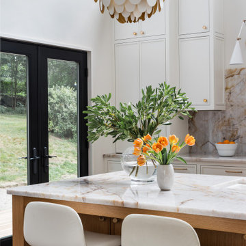
The redesigned kitchen replaces a dated peninsula with a generously scaled island that supports both everyday use and entertaining. Cabinetry was reimagined vertically as well as horizontally, allowing storage and display to extend upward and reinforce the room’s proportions. A custom china cabinet with tall glass doors framed in blackened iron and finished in white oak adds presence and refinement.
At one end of the kitchen, a dedicated bar introduces a more intimate moment. Art, layered lighting, and wall-mounted sconces give this area its own identity, offering contrast to the openness of the main kitchen while supporting entertaining. Clerestory windows introduce shifting daylight throughout the day, bringing depth and movement to the quartzite focal wall at the range. Pendant lights reference midcentury forms in a refined, contemporary way. The completed kitchen was featured on the cover of Modern Luxury Interiors.
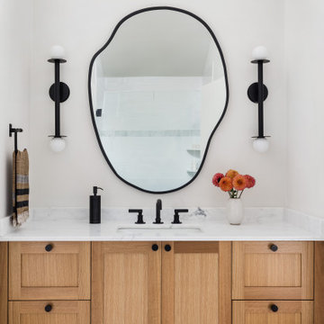
The renovation extended beyond the kitchen to include a new primary bath, a refreshed guest bath, and updated furnishings throughout the living and dining rooms. In the primary bath, marble with expressive veining is paired with a custom floating white oak vanity, balancing warmth and restraint. In the living room, a new picture window frames wooded views, while the furniture plan grounds the space. A turquoise Murano glass chandelier introduces color and artistry, adding a distinctive, personal note to the interior.
 MANDARINA STUDIO interior design
LOCATION: MILTON, MASSACHUSETTS
The renovation of this midcentury home centers on a complete transformation of the kitchen, which reshaped how the house functions and connects to its surroundings. The original layout relied on low cabinetry that failed to take advantage of the room’s generous volume. Mandarina Studio reworked the plan to improve circulation and take full advantage of the home’s soaring height and natural light.
The redesigned kitchen replaces a dated peninsula with a generously scaled island that supports both everyday use and entertaining. Cabinetry was reimagined vertically as well as horizontally, allowing storage and display to extend upward and reinforce the room’s proportions. A custom china cabinet with tall glass doors framed in blackened iron and finished in white oak adds presence and refinement.
At one end of the kitchen, a dedicated bar introduces a more intimate moment. Art, layered lighting, and wall-mounted sconces give this area its own identity, offering contrast to the openness of the main kitchen while supporting entertaining. Clerestory windows introduce shifting daylight throughout the day, bringing depth and movement to the quartzite focal wall at the range. Pendant lights reference midcentury forms in a refined, contemporary way. The completed kitchen was featured on the cover of Modern Luxury Interiors.
The renovation extended beyond the kitchen to include a new primary bath, a refreshed guest bath, and updated furnishings throughout the living and dining rooms. In the primary bath, marble with expressive veining is paired with a custom floating white oak vanity, balancing warmth and restraint. In the living room, a new picture window frames wooded views, while the furniture plan grounds the space. A turquoise Murano glass chandelier introduces color and artistry, adding a distinctive, personal note to the interior.
19