Search results for "Shorter time frames" in Home Design Ideas

Douglas Fir
© Carolina Timberworks
Mid-sized mountain style slate floor entryway photo in Charlotte with green walls and a light wood front door

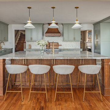
In our world of kitchen design, it’s lovely to see all the varieties of styles come to life. From traditional to modern, and everything in between, we love to design a broad spectrum. Here, we present a two-tone modern kitchen that has used materials in a fresh and eye-catching way. With a mix of finishes, it blends perfectly together to create a space that flows and is the pulsating heart of the home.
With the main cooking island and gorgeous prep wall, the cook has plenty of space to work. The second island is perfect for seating – the three materials interacting seamlessly, we have the main white material covering the cabinets, a short grey table for the kids, and a taller walnut top for adults to sit and stand while sipping some wine! I mean, who wouldn’t want to spend time in this kitchen?!
Cabinetry
With a tuxedo trend look, we used Cabico Elmwood New Haven door style, walnut vertical grain in a natural matte finish. The white cabinets over the sink are the Ventura MDF door in a White Diamond Gloss finish.
Countertops
The white counters on the perimeter and on both islands are from Caesarstone in a Frosty Carrina finish, and the added bar on the second countertop is a custom walnut top (made by the homeowner!) with a shorter seated table made from Caesarstone’s Raw Concrete.
Backsplash
The stone is from Marble Systems from the Mod Glam Collection, Blocks – Glacier honed, in Snow White polished finish, and added Brass.
Fixtures
A Blanco Precis Silgranit Cascade Super Single Bowl Kitchen Sink in White works perfect with the counters. A Waterstone transitional pulldown faucet in New Bronze is complemented by matching water dispenser, soap dispenser, and air switch. The cabinet hardware is from Emtek – their Trinity pulls in brass.
Appliances
The cooktop, oven, steam oven and dishwasher are all from Miele. The dishwashers are paneled with cabinetry material (left/right of the sink) and integrate seamlessly Refrigerator and Freezer columns are from SubZero and we kept the stainless look to break up the walnut some. The microwave is a counter sitting Panasonic with a custom wood trim (made by Cabico) and the vent hood is from Zephyr.

Featuring Dura Supreme Cabinetry
Freestanding bathtub - cottage gray tile freestanding bathtub idea in Minneapolis with shaker cabinets and white cabinets
Find the right local pro for your project

Mike Schultz Photography
Arrow Timber Framing
9726 NE 302nd St, Battle Ground, WA 98604
(360) 687-1868
Web Site: https://www.arrowtimber.com

This was a detached building from the main house just for the theater. The interior of the room was designed to look like an old lodge with reclaimed barn wood on the interior walls and old rustic beams in the ceiling. In the process of remodeling the room we had to find old barn wood that matched the existing barn wood and weave in the old with the new so you could not see the difference when complete. We also had to hide speakers in the walls by Faux painting the fabric speaker grills to match the grain of the barn wood on all sides of it so the speakers were completely hidden.
We also had a very short timeline to complete the project so the client could screen a movie premiere in the theater. To complete the project in a very short time frame we worked 10-15 hour days with multiple crew shifts to get the project done on time.
The ceiling of the theater was over 30’ high and all of the new fabric, barn wood, speakers, and lighting required high scaffolding work.

The Oakley Red Leather Recliner simply screams refined elegance. This simple, stately chair offers all the comfort and convenience of a high-quality recliner with the body and frame of a high-end chair. This luxurious piece of furniture is made from the finest top-grain Italian leather with hand burnished details, stretched over high-density cushioning and a hardwood frame. Bronze nail head accents serve to perfectly complement the deep, dulcet tones of the rich red leather upholstery. The Oakley Red Leather Recliner is a subtle, elegant addition to virtually any home or living area. This unique piece of furniture is a surefire way to show off your sense of style and classical tastes. Thanks to its clean, elegant appearance, this piece pairs well with virtually any collection of furniture and any décor theme, instantly becoming a standout piece that you'll be proud to show off.
Overall Dimensions: 44" H x 33" W x 38" D
Arm Height: 26"
Seat Dimensions: 21" H x 21" W x 20" D
Semi-Attached Back
Overall Layout: 67"
Leather Description: Artisan Leathers beautifully evoke this time worn quality, unique to every individual piece, like the originals. To pure aniline leather crusts, already fully and carefully upholstered to the piece, a base color is created with multiple applications of waxes and oils, hand-worked by the leather Artisan. After drying, this craftsman then carefully builds-up the finish with an expert's eye, and touch, to achieve an aged patina in just the right places to reflect the aged qualities only time, wear, and frequent care could have accomplished naturally. Every individual piece upholstered with Artisan Leather finishing methods is first beautifully built to the highest standards of quality. The leather is then hand-colored and aged to bespeak the loving touch of time, providing a quality antique appearance to a beautiful new piece of quality leather furniture. Every chair, sofa, or bench has its very own unique identity only these hand-crafted methods can provide, reflecting the presence of a time honored past.
True 100% top/full grain cowhide leather is characterized by variations in shade, texture, color and grain. Healed marks and scars are to be expected and enhance the natural beauty of the hides. These variations are normal and unique features of true genuine 100% top grain cowhide leather.
Frame Construction: Using traditional hand craftsmanship with modern manufacturing methods to produce frames that are among the finest used in the upholstery business. Each frame is precisely cut and hand assembled using kilned dried lumber. Double dowels are utilized in all structural parts to form sturdy, long lasting joints. To complete construction and add stability to the frame, large precisely cut corner blocks are positioned at each corner where the greatest stress occurs using both glues and screws. Double cone coil springs of high carbon tempered steel produce the ultimate in seating comfort. Eight-way hand tied construction provides durability and luxurious seating. We use only premium, highly resilient polyurethane cushions to ensure consistent shape and comfort.
Seat Cushions: Marshall Springs encased in 1.8 density foam, wrapped in 2 ounce fiber and encased in a sewn ticking. Limited Lifetime Warranty

Our Lariat Leather Recliner alludes rustic elegance. This simple, stately chair offers all the comfort and convenience of a high-quality recliner with the body and frame of a high-end chair. This luxurious piece of furniture is made from the finest possible top-grain Italian leather, stretched over high-density cushioning and a hardwood frame. Bronze nail head accents serve to perfectly complement the deep, dulcet tones of this rich, hand burnished saddle leather. The Lariat is a subtle, elegant addition to virtually any home or living area. This unique piece of furniture is a surefire way to show off your sense of style and classical tastes. Thanks to its clean, elegant appearance, this piece pairs well with virtually any collection of furniture and any décor theme, instantly becoming a standout piece that you'll be proud to show off.
Overall Dimensions: 44" H x 33" W x 38" D
Arm Height: 26"
Seat Dimensions: 21" H x 21" W x 20" D
Semi-Attached Back
Overall Layout: 67"
Leather Description: Artisan Leathers beautifully evoke this time worn quality, unique to every individual piece, like the originals. To pure aniline leather crusts, already fully and carefully upholstered to the piece, a base color is created with multiple applications of waxes and oils, hand-worked by the leather Artisan. After drying, this craftsman then carefully builds-up the finish with an expert’s eye, and touch, to achieve an aged patina in just the right places to reflect the aged qualities only time, wear, and frequent care could have accomplished naturally. Every individual piece upholstered with Artisan Leather finishing methods is first beautifully built to the highest standards of quality. The leather is then hand-colored and aged to bespeak the loving touch of time, providing a quality antique appearance to a beautiful new piece of quality leather furniture. Every chair, sofa, or bench has its very own unique identity only these hand-crafted methods can provide, reflecting the presence of a time honored past.
True 100% top/full grain cowhide leather is characterized by variations in shade, texture, color and grain. Healed marks and scars are to be expected and enhance the natural beauty of the hides. These variations are normal and unique features of true genuine 100% top grain cowhide leather.
Frame Construction: Using traditional hand craftsmanship with modern manufacturing methods to produce frames that are among the finest used in the upholstery business. Each frame is precisely cut and hand assembled using kilned dried lumber. Double dowels are utilized in all structural parts to form sturdy, long lasting joints. To complete construction and add stability to the frame, large precisely cut corner blocks are positioned at each corner where the greatest stress occurs using both glues and screws. Limited Lifetime Warranty
Seat Cushions: Marshall Springs encased in 1.8 density foam, wrapped in 2 ounce fiber and encased in a sewn ticking. Limited Lifetime Warranty

Sponsored
Sunbury, OH
J.Holderby - Renovations
Franklin County's Leading General Contractors - 2X Best of Houzz!

Organized Living freedomRail is the perfect combination of strength, ease and versatility to save you time, money and stress. The heart of this organization system is its ability to adjust- and readjust – to suit you and your family’s ever-changing needs. Learn more about freedomRail and its unique benefits here: http://organizedliving.com/home/products/freedomrail/about

Artistically Tuscan
Francesca called me, nearly 13 years ago, as she had seen one of our ads in the Orange County Living Magazine. In that particular ad, she fell in love with the mural work our artists had done for another home we designed in Huntington Beach, California. Although this was a newly built home in Portofira Estates neighborhood, in the city of Orange, both she and her husband knew they would eventually add to the existing square footage, making the family room and kitchen much bigger.
We proceeded with designing the house as her time frame and budget proceeded until we completed the entire home.
Then, about 5 years ago, Francesca and her husband decided to move forward with getting their expansion project underway. They moved the walls out in the family room and the kitchen area, creating more space. They also added a game room to the upstairs portion of their home. The results are spectacular!
This family room has a large angular sofa with a shaped wood frame. Two oversized chairs and ottomans on either side of the sofa to create a circular conversation and almost theatre like setting. A warm, wonderful color palette of deep plums, caramels, rich reds, burgundy, calming greens and accents of black make the entire home come together perfectly.
The entertainment center wraps the fireplace and nook shelving as it takes up the entire wall opposite the sofa. The window treatments consist of working balloon shades in a deep plum silk with valances in a rich gold silk featuring wrought iron rods running vertically through the fabric. The treatment frames the stunning panoramic view of all of Orange County.

 
Download our free ebook, Creating the Ideal Kitchen. DOWNLOAD NOW
 
Lakefront property in the northwest suburbs of Chicago is hard to come by, so when we were hired by this young family with exactly that, we were immediately inspired by not just the unusually large footprint of this 1950’s colonial revival but also the lovely views of the manmade lake it was sited on. The large 5-bedroom home was solidly stuck in the 1980’s, but we saw tons of potential. We started out by updating the existing staircase with a fresh coat of paint and adding new herringbone slate to the entry hall.
The powder room off the entryway also got a refresh - new flooring, new cabinets and fixtures. We ran the new slate right through into this space for some consistency. A fun wallpaper and shiplap trim add a welcoming feel and set the tone for the home.
Next, we tackled the kitchen. Located away from the rest of the first floor, the kitchen felt a little isolated, so we immediately began planning for how to better connect it to the rest of the first floor. We landed on removing the wall between the kitchen and dining room and designed a modified galley style space with separate cooking and clean up zones. The cooking zone consists of the refrigerator, prep sink and cooktop, along with a nice long run of prep space at the island. The cleanup side of the kitchen consists of the main sink and dishwasher. Both areas are situated so that the user can view the lake during prep work and cleanup!
One of the home’s main puzzles was how to incorporate the mudroom and area in front of the patio doors at the back of the house. We already had a breakfast table area, so the space by the patio doors was a bit of a no man’s land. We decided to separate the kitchen proper from what became the new mudroom with a large set of barn doors. That way you can quickly hide any mudroom messes but have easy access to the light coming in through the patio doors as well as the outdoor grilling station. We also love the impact the barn doors add to the overall space.
The homeowners’ first words to us were “it’s time to ditch the brown,” so we did! We chose a lovely blue pallet that reflects the home’s location on the lake which is also vibrant yet easy on the eye. Countertops are white quartz, and the natural oak floor works well with the other honey accents. The breakfast table was given a refresh with new chairs, chandelier and window treatments that frame the gorgeous views of the lake out the back.
We coordinated the slate mudroom flooring with that used in the home’s main entrance for a consistent feel. The storage area consists of open and closed storage to allow for some clutter control as needed.
Next on our “to do” list was revamping the dated brown bar area in the neighboring dining room. We eliminated the clutter by adding some closed cabinets and did some easy updates to help the space feel more current. One snag we ran into here was the discovery of a beam above the existing open shelving that had to be modified with a smaller structural beam to allow for our new design to work. This was an unexpected surprise, but in the end we think it was well worth it!
We kept the colors here a bit more muted to blend with the homeowner’s existing furnishings. Open shelving and polished nickel hardware add some simple detail to the new entertainment zone which also looks out onto the lake!
Next we tackled the upstairs starting with the homeowner’s son’s bath. The bath originally had both a tub shower and a separate shower, so we decided to swap out the shower for a new laundry area. This freed up some space downstairs in what used to be the mudroom/laundry room and is much more convenient for daily laundry needs.
We continued the blue palette here with navy cabinetry and the navy tile in the shower. Porcelain floor tile and chrome fixtures keep maintenance to a minimum while matte black mirrors and lighting add some depth the design. A low maintenance runner adds some warmth underfoot and ties the whole space together.
We added a pocket door to the bathroom to minimize interference with the door swings. The left door of the laundry closet is on a 180 degree hinge to allow for easy full access to the machines. Next we tackled the master bath which is an en suite arrangement. The original was typical of the 1980’s with the vanity outside of the bathroom, situated near the master closet. And the brown theme continued here with multiple shades of brown.
Our first move was to segment off the bath and the closet from the master bedroom. We created a short hall from the bedroom to the bathroom with his and hers walk-in closets on the left and right as well as a separate toilet closet outside of the main bathroom for privacy and flexibility.
The original bathroom had a giant soaking tub with steps (dangerous!) as well as a small shower that did not work well for our homeowner who is 6’3”. With other bathtubs in the home, they decided to eliminate the tub and create an oversized shower which takes up the space where the old tub was located. The double vanity is on the opposite wall and a bench is located under the window for morning conversations and a place to set a couple of towels.
The pallet in here is light and airy with a mix of blond wood, creamy porcelain and marble tile, and brass accents. A simple roman shade adds some texture and it’s top-down mechanism allows for light and privacy.
This large whole house remodel gave our homeowners not only the ability to maximize the potential of their home but also created a lovely new frame from which to view their fabulous lake views.
Designed by: Susan Klimala, CKD, CBD
Photography by: Michael Kaskel
For more information on kitchen and bath design ideas go to: www.kitchenstudio-ge.com

This project was such an incredible design opportunity, and instilled inspiration and excitement at every turn! Our amazing clients came to us with the challenge of converting their beloved family home into a welcoming haven for all members of the family. At the time that we met our clients, they were struggling with the difficult personal decision of the fate of the home. Their father/father-in-law had passed away and their mother/mother-in-law had recently been admitted into a nursing facility and was fighting Alzheimer’s. Resistant to loss of the home now that both parents were out of it, our clients purchased the home to keep in in the family. Despite their permanent home currently being in New Jersey, these clients dedicated themselves to keeping and revitalizing the house. We were moved by the story and became immediately passionate about bringing this dream to life.
The home was built by the parents of our clients and was only ever owned by them, making this a truly special space to the family. Our goal was to revitalize the home and to bring new energy into every room without losing the special characteristics that were original to the home when it was built. In this way, we were able to develop a house that maintains its own unique personality while offering a space of welcoming neutrality for all members of the family to enjoy over time.
The renovation touched every part of the home: the exterior, foyer, kitchen, living room, sun room, garage, six bedrooms, three bathrooms, the laundry room, and everything in between. The focus was to develop a style that carried consistently from space to space, but allowed for unique expression in the small details in every room.
Starting at the entry, we renovated the front door and entry point to offer more presence and to bring more of the mid-century vibe to the home’s exterior. We integrated a new modern front door, cedar shingle accents, new exterior paint, and gorgeous contemporary house numbers that really allow the home to stand out. Just inside the entry, we renovated the foyer to create a playful entry point worthy of attention. Cement look tile adorns the foyer floor, and we’ve added new lighting and upgraded the entry coat storage.
Upon entering the home, one will immediately be captivated by the stunning kitchen just off the entry. We transformed this space in just about every way. While the footprint of the home ultimately remained almost identical, the aesthetics were completely turned on their head. We re-worked the kitchen to maximize storage and to create an informal dining area that is great for casual hosting or morning coffee.
We removed the entry to the garage that was once in the informal dining, and created a peninsula in its place that offers a unique division between the kitchen/informal dining and the formal dining and living areas. The simple light warm light gray cabinetry offers a bit of traditional elegance, along with the marble backsplash and quartz countertops. We extended the original wood flooring into the kitchen and stained all floors to match for a warmth that truly resonates through all spaces. We upgraded appliances, added lighting everywhere, and finished the space with some gorgeous mid century furniture pieces.
In the formal dining and living room, we really focused on maintaining the original marble fireplace as a focal point. We cleaned the marble, repaired the mortar, and refinished the original fireplace screen to give a new sleek look in black. We then integrated a new gas insert for modern heating and painted the upper portion in a rich navy blue; an accent that is carried through the home consistently as a nod to our client’s love of the color.
The former entry into the old covered porch is now an elegant glass door leading to a stunning finished sunroom. This room was completely upgraded as well. We wrapped the entire space in cozy white shiplap to keep a casual feel with brightness. We tiled the floor with large format concrete look tile, and painted the old brick fireplace a bright white. We installed a new gas burning unit, and integrated transitional style lighting to bring warmth and elegance into the space. The new black-frame windows are adorned with decorative shades that feature hand-sketched bird prints, and we’ve created a dedicated garden-ware “nook” for our client who loves to work in the yard. The far end of this space is completed with two oversized chaise loungers and overhead lights…the most perfect little reading nook!
Just off the dining room, we created an entirely new space to the home: a mudroom. The clients lacked this space and desperately needed a landing spot upon entering the home from the garage. We uniquely planned existing space in the garage to utilize for this purpose, and were able to create a small but functional entry point without losing the ability to park cars in the garage. This new space features cement-look tile, gorgeous deep brown cabinetry, and plenty of storage for all the small items one might need to store while moving in and out of the home.
The remainder of the upstairs level includes massive renovations to the guest hall bathroom and guest bedroom, upstairs master bed/bath suite, and a third bedroom that we converted into a home office for the client.
Some of the largest transformations were made in the basement, where unfinished space and lack of light were converted into gloriously lit, cozy, finished spaces. Our first task was to convert the massive basement living room into the new master bedroom for our clients. We removed existing built-ins, created an entirely new walk-in closet, painted the old brick fireplace, installed a new gas unit, added carpet, introduced new lighting, replaced windows, and upgraded every part of the aesthetic appearance. One of the most incredible features of this space is the custom double sliding barn door made by a Denver artisan. This space is truly a retreat for our clients!
We also completely transformed the laundry room, back storage room, basement master bathroom, and two bedrooms.
This home’s massive scope and ever-evolving challenges were thrilling and exciting to work with, and the result is absolutely amazing. At the end of the day, this home offers a look and feel that the clients love. Above all, though, the clients feel the spirit of their family home and have a welcoming environment for all members of the family to enjoy for years to come.

Photographer Rich Frutchey
Inspiration for a rustic master bedroom remodel in Boston with green walls

Sponsored
Sunbury, OH
J.Holderby - Renovations
Franklin County's Leading General Contractors - 2X Best of Houzz!

The owners of this property had been away from the Bay Area for many years, and looked forward to returning to an elegant mid-century modern house. The one they bought was anything but that. Faced with a “remuddled” kitchen from one decade, a haphazard bedroom / family room addition from another, and an otherwise disjointed and generally run-down mid-century modern house, the owners asked Klopf Architecture and Envision Landscape Studio to re-imagine this house and property as a unified, flowing, sophisticated, warm, modern indoor / outdoor living space for a family of five.
Opening up the spaces internally and from inside to out was the first order of business. The formerly disjointed eat-in kitchen with 7 foot high ceilings were opened up to the living room, re-oriented, and replaced with a spacious cook's kitchen complete with a row of skylights bringing light into the space. Adjacent the living room wall was completely opened up with La Cantina folding door system, connecting the interior living space to a new wood deck that acts as a continuation of the wood floor. People can flow from kitchen to the living / dining room and the deck seamlessly, making the main entertainment space feel at once unified and complete, and at the same time open and limitless.
Klopf opened up the bedroom with a large sliding panel, and turned what was once a large walk-in closet into an office area, again with a large sliding panel. The master bathroom has high windows all along one wall to bring in light, and a large wet room area for the shower and tub. The dark, solid roof structure over the patio was replaced with an open trellis that allows plenty of light, brightening the new deck area as well as the interior of the house.
All the materials of the house were replaced, apart from the framing and the ceiling boards. This allowed Klopf to unify the materials from space to space, running the same wood flooring throughout, using the same paint colors, and generally creating a consistent look from room to room. Located in Lafayette, CA this remodeled single-family house is 3,363 square foot, 4 bedroom, and 3.5 bathroom.
Klopf Architecture Project Team: John Klopf, AIA, Jackie Detamore, and Jeffrey Prose
Landscape Design: Envision Landscape Studio
Structural Engineer: Brian Dotson Consulting Engineers
Contractor: Kasten Builders
Photography ©2015 Mariko Reed
Staging: The Design Shop
Location: Lafayette, CA
Year completed: 2014

Custom designed by MossCreek, this four-seasons resort home in a New England vacation destination showcases natural stone, square timbers, vertical and horizontal wood siding, cedar shingles, and beautiful hardwood floors.
MossCreek's design staff worked closely with the owners to create spaces that brought the outside in, while at the same time providing for cozy evenings during the ski season. MossCreek also made sure to design lots of nooks and niches to accommodate the homeowners' eclectic collection of sports and skiing memorabilia.
The end result is a custom-designed home that reflects both it's New England surroundings and the owner's style.
MossCreek.net

Get the cabin of your dreams with a new front door and a beam mantel. This Belleville Smooth 2 panel door with Adelaide Glass is a gorgeous upgrade and will add a pop of color for you. The Hand Hewn Wooden Beam Mantel is great for adding in natural tones to enhance the rustic feel.
Door: BLS-106-21-2
Beam Mantel: BMH-EC
Visit us at ELandELWoodProducts.com to see more options

Turn any wall in your home into a statement wall and transform any room into a eye catching visual experience with a super saturated Splendex fabric graphic with a sleek, modern looking brushed aluminum frame.
Should you decide at any time to change your artwork, without removing the frame from the wall, the fabric art can be removed and replaced. Change the look and feel of your room at a fraction of the time and cost of purchasing and hanging a new piece of art.
Visit www.dezinerwallz.com for more information.

Turn any wall in your home into a statement wall and transform any room into a eye catching visual experience with a super saturated Splendex fabric graphic with a sleek, modern looking brushed aluminum frame.
Should you decide at any time to change your artwork, without removing the frame from the wall, the fabric art can be removed and replaced. Change the look and feel of your room at a fraction of the time and cost of purchasing and hanging a new piece of art.
Visit www.dezinerwallz.com for more information.

Timber frame homes offer unique challenges during a remodel. What often makes them beautiful and attractive to most homeowners, also makes them challenging for space requirements.
Context: The lovely couple that owned this home were struggling with some interesting floor plan challenges that just didn't work for their family. The loved the beautiful timbers and woodwork of their home, but the dramatically sloping ceilings on the second floor, particularly in the bathroom, just didn't work for this 1 1/2 bath home. Needing to use the skylight to approach the toilet was a less then ideal scenario. Although the bathroom footprint was more then adequate, the sloped ceiling only made half of the space useable. Check out the Before/After post on our blog to see the photos of the house pre-renovation. As much as they loved all the wood features in their home, another challenge they had was light. The wood ceiling made everything inside the house darker, even with a fantastic array of south facing windows, there were spaces in the home that felt dark and small. When they contacted us they wanted to know how could they make their brighter and more inviting, were there solutions to the 2nd floor sloped ceiling issues, and if they were going to do all of this work, how could they make their home more comfortable and efficient. A nagging water leak in the upstairs bathroom spurred them into action and here is how we solved their dilemma.
Conclusion: First, we added a little dormer to the rear of the house so we could get full headroom in nearly all of the upstairs bathroom! Then we decided to extend that dormer one more timber bay over to create a walk in closet with natural light and plenty of space. Since we were contemplating energy efficiency, we resolved a nagging issue that is present in a lot of timber frame construction, air tightness. Commonly found in timber frame construction, fiberglass insulation is installed in the rafter bays and board ceilings are installed over top. Unfortunately, board ceilings are anything but air tight, and fiberglass insulation needs to be in an airtight cavity for maximum effectiveness. So we were able to solve two issues at the same time for this homeowner. We removed the board ceiling and fiberglass insulation, we dense packed the rafter bays with cellulose insulation, and installed sheetrock in place of the boards. The boards were salvaged for re-use by the homeowner, and the space and light quality was dramatically improved. Some may think that losing the board ceiling took something away from the space, but what you'll see in the pictures is that it highly accentuates the heavy timbers and really makes them stand out in a beautiful way. Now with this added airtightness, better insulation, and brighter space, the homeowner hardly runs their wood stove, and it's so quiet in the space, an added bonus from changing the insulation. It became necessary to also add a sheetrock ceiling to the living room to hide the plumbing from the new bathroom layout above. Changing this ceiling gave the homeowner some real quality lighting that was lacking in the living room before. The brighter ceiling and new lighting layout completely transforms the living room into a space you want to hang out, even though the layout didn't change at all. When the homeowner saw the finished spaces she said "I can't believe this is my house, I want to live in this house"
Energy Efficiency: I touched a little on the efficiency above, but like all projects done with Mottram Architecture, we always want to leave you with a little extra. Timber frame construction with board ceilings and fiberglass insulation are notoriously leaky! If you want to know what we think about fiberglass insulation, check our our blog post on Why Fiberglass Insulation Sucks. By installing cellulose insulation and covering it with sheetrock we were able to greatly reduce the heat flowing out of this home. It not only improves cashflow it improves the comfort level in the space. Who wants to sit in their living room and feel a draft? Let us remind you, we are not saying cellulose insulation is an air barrier, we use the sheetrock to help with that, but it does significantly reduce the air flow over fiberglass insulation. And when we reduce the airflow, we reduce the heat flow. And when we reduce the heat flow, we reduce the need to re-heat that drafty air from outside. When it comes to energy efficiency the first and best place to start is air infiltration. We greatly reduced the air infiltration with the new insulation, but we also added a hat and warm boots. What I mean by that is, we improved the insulation in the roof, and we installed insulation in the basement. Maybe it's a silly analogy, but when you think about keeping warm, we always start with the hat and boots! With sustainability in mind, the next project will be to add a deck to the front of this house with rain catchment barrels from the metal roof. They are planning to plant a garden in the spring and the rain catchment system will help to irrigate the new garden.
Builder: East Shore Builders
Photographer: Michael Eric Berube

Timber frame homes offer unique challenges during a remodel. What often makes them beautiful and attractive to most homeowners, also makes them challenging for space requirements.
Context: The lovely couple that owned this home were struggling with some interesting floor plan challenges that just didn't work for their family. The loved the beautiful timbers and woodwork of their home, but the dramatically sloping ceilings on the second floor, particularly in the bathroom, just didn't work for this 1 1/2 bath home. Needing to use the skylight to approach the toilet was a less then ideal scenario. Although the bathroom footprint was more then adequate, the sloped ceiling only made half of the space useable. Check out the Before/After post on our blog to see the photos of the house pre-renovation. As much as they loved all the wood features in their home, another challenge they had was light. The wood ceiling made everything inside the house darker, even with a fantastic array of south facing windows, there were spaces in the home that felt dark and small. When they contacted us they wanted to know how could they make their brighter and more inviting, were there solutions to the 2nd floor sloped ceiling issues, and if they were going to do all of this work, how could they make their home more comfortable and efficient. A nagging water leak in the upstairs bathroom spurred them into action and here is how we solved their dilemma.
Conclusion: First, we added a little dormer to the rear of the house so we could get full headroom in nearly all of the upstairs bathroom! Then we decided to extend that dormer one more timber bay over to create a walk in closet with natural light and plenty of space. Since we were contemplating energy efficiency, we resolved a nagging issue that is present in a lot of timber frame construction, air tightness. Commonly found in timber frame construction, fiberglass insulation is installed in the rafter bays and board ceilings are installed over top. Unfortunately, board ceilings are anything but air tight, and fiberglass insulation needs to be in an airtight cavity for maximum effectiveness. So we were able to solve two issues at the same time for this homeowner. We removed the board ceiling and fiberglass insulation, we dense packed the rafter bays with cellulose insulation, and installed sheetrock in place of the boards. The boards were salvaged for re-use by the homeowner, and the space and light quality was dramatically improved. Some may think that losing the board ceiling took something away from the space, but what you'll see in the pictures is that it highly accentuates the heavy timbers and really makes them stand out in a beautiful way. Now with this added airtightness, better insulation, and brighter space, the homeowner hardly runs their wood stove, and it's so quiet in the space, an added bonus from changing the insulation. It became necessary to also add a sheetrock ceiling to the living room to hide the plumbing from the new bathroom layout above. Changing this ceiling gave the homeowner some real quality lighting that was lacking in the living room before. The brighter ceiling and new lighting layout completely transforms the living room into a space you want to hang out, even though the layout didn't change at all. When the homeowner saw the finished spaces she said "I can't believe this is my house, I want to live in this house"
Energy Efficiency: I touched a little on the efficiency above, but like all projects done with Mottram Architecture, we always want to leave you with a little extra. Timber frame construction with board ceilings and fiberglass insulation are notoriously leaky! If you want to know what we think about fiberglass insulation, check our our blog post on Why Fiberglass Insulation Sucks. By installing cellulose insulation and covering it with sheetrock we were able to greatly reduce the heat flowing out of this home. It not only improves cashflow it improves the comfort level in the space. Who wants to sit in their living room and feel a draft? Let us remind you, we are not saying cellulose insulation is an air barrier, we use the sheetrock to help with that, but it does significantly reduce the air flow over fiberglass insulation. And when we reduce the airflow, we reduce the heat flow. And when we reduce the heat flow, we reduce the need to re-heat that drafty air from outside. When it comes to energy efficiency the first and best place to start is air infiltration. We greatly reduced the air infiltration with the new insulation, but we also added a hat and warm boots. What I mean by that is, we improved the insulation in the roof, and we installed insulation in the basement. Maybe it's a silly analogy, but when you think about keeping warm, we always start with the hat and boots! With sustainability in mind, the next project will be to add a deck to the front of this house with rain catchment barrels from the metal roof. They are planning to plant a garden in the spring and the rain catchment system will help to irrigate the new garden.
Builder: East Shore Builders
Photographer: Michael Eric Berube
17