
Search results for "Sites failed" in Home Design Ideas
 Nautilus Architects
Located on a marsh in the upper reaches of the Lieutenant River in Old Lyme, the existing house was well-sited and well-built, but the design failed to exploit the views and more importantly was a confused combination of contemporary and traditional elements. The new homeowners, a successful businesswoman and an accomplished artist and photographer, were interested in creating a fully-contemporary environment to open up space, connect indoors with outdoors, display artwork and showcase the husband’s distinctive photographs.
One glaring deficiency was the curb appeal and approach sequence: the grade sloped down and the path to the house followed, but this led to an uncomfortable dip and abrupt rise to the front door. By creating a virtual “moat,” occupied by a grid of raised-bed grasses contained in aluminum-clad boxes, and spanning the moat with an ipe bridge, the approach becomes level and engaging. The façade of the existing house was blank and bland, and with no cover. Adding a deep overhang with a wide porch creates a welcoming, covered condition, accentuated by a 6’ wide pivoting front door that feels more like a moving piece of wall.
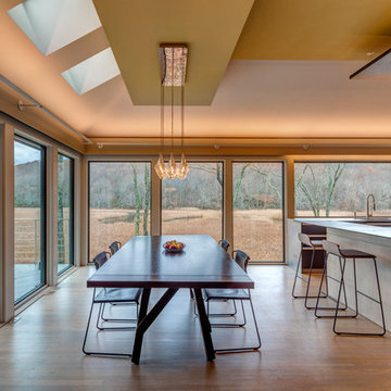
Another deficiency was the connection to the outdoors. By adding glass to the front and back of the house, and removing interior walls selectively, the house takes on a diaphanous quality that allows one to see through to the marsh beyond, even when in the driveway. The raised-bed grasses act as abstract, geometric versions of the marsh beyond. A large, pyramidal skylight establishes a spatial hierarchy around which the rooms revolve.
The house featured several tray-ceilinged spaces – living room, kitchen, and master bedroom – that were poorly-proportioned and with panels at the top that resembled inset flat panel doors. The solution was to use a different strategy for each: the bedroom turns the ceiling into an eggshell through the use of a creative trim detail; the living room has an oversized sculptural, backlit lighting element; and the kitchen has a collage of painted rectangular forms that support or include lighting pieces.
A palette of concrete, blackened steel, stainless steel and colors carefully chosen by homeowner and architect create an interior and exterior environment punctuated by moments that are as artistic as the featured works in the black-ceilinged gallery.
 Nautilus Architects
Located on a marsh in the upper reaches of the Lieutenant River in Old Lyme, the existing house was well-sited and well-built, but the design failed to exploit the views and more importantly was a confused combination of contemporary and traditional elements. The new homeowners, a successful businesswoman and an accomplished artist and photographer, were interested in creating a fully-contemporary environment to open up space, connect indoors with outdoors, display artwork and showcase the husband’s distinctive photographs.
One glaring deficiency was the curb appeal and approach sequence: the grade sloped down and the path to the house followed, but this led to an uncomfortable dip and abrupt rise to the front door. By creating a virtual “moat,” occupied by a grid of raised-bed grasses contained in aluminum-clad boxes, and spanning the moat with an ipe bridge, the approach becomes level and engaging. The façade of the existing house was blank and bland, and with no cover. Adding a deep overhang with a wide porch creates a welcoming, covered condition, accentuated by a 6’ wide pivoting front door that feels more like a moving piece of wall.
Another deficiency was the connection to the outdoors. By adding glass to the front and back of the house, and removing interior walls selectively, the house takes on a diaphanous quality that allows one to see through to the marsh beyond, even when in the driveway. The raised-bed grasses act as abstract, geometric versions of the marsh beyond. A large, pyramidal skylight establishes a spatial hierarchy around which the rooms revolve.
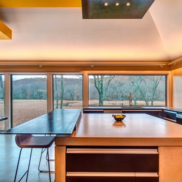
The house featured several tray-ceilinged spaces – living room, kitchen, and master bedroom – that were poorly-proportioned and with panels at the top that resembled inset flat panel doors. The solution was to use a different strategy for each: the bedroom turns the ceiling into an eggshell through the use of a creative trim detail; the living room has an oversized sculptural, backlit lighting element; and the kitchen has a collage of painted rectangular forms that support or include lighting pieces.
A palette of concrete, blackened steel, stainless steel and colors carefully chosen by homeowner and architect create an interior and exterior environment punctuated by moments that are as artistic as the featured works in the black-ceilinged gallery.
 Nautilus Architects
Located on a marsh in the upper reaches of the Lieutenant River in Old Lyme, the existing house was well-sited and well-built, but the design failed to exploit the views and more importantly was a confused combination of contemporary and traditional elements. The new homeowners, a successful businesswoman and an accomplished artist and photographer, were interested in creating a fully-contemporary environment to open up space, connect indoors with outdoors, display artwork and showcase the husband’s distinctive photographs.
One glaring deficiency was the curb appeal and approach sequence: the grade sloped down and the path to the house followed, but this led to an uncomfortable dip and abrupt rise to the front door. By creating a virtual “moat,” occupied by a grid of raised-bed grasses contained in aluminum-clad boxes, and spanning the moat with an ipe bridge, the approach becomes level and engaging. The façade of the existing house was blank and bland, and with no cover. Adding a deep overhang with a wide porch creates a welcoming, covered condition, accentuated by a 6’ wide pivoting front door that feels more like a moving piece of wall.
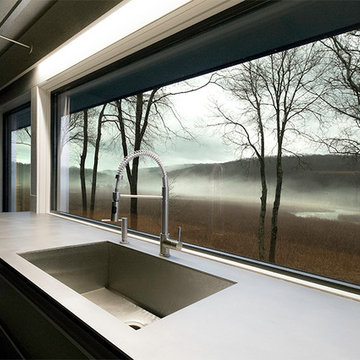
Another deficiency was the connection to the outdoors. By adding glass to the front and back of the house, and removing interior walls selectively, the house takes on a diaphanous quality that allows one to see through to the marsh beyond, even when in the driveway. The raised-bed grasses act as abstract, geometric versions of the marsh beyond. A large, pyramidal skylight establishes a spatial hierarchy around which the rooms revolve.
The house featured several tray-ceilinged spaces – living room, kitchen, and master bedroom – that were poorly-proportioned and with panels at the top that resembled inset flat panel doors. The solution was to use a different strategy for each: the bedroom turns the ceiling into an eggshell through the use of a creative trim detail; the living room has an oversized sculptural, backlit lighting element; and the kitchen has a collage of painted rectangular forms that support or include lighting pieces.
A palette of concrete, blackened steel, stainless steel and colors carefully chosen by homeowner and architect create an interior and exterior environment punctuated by moments that are as artistic as the featured works in the black-ceilinged gallery.
Find the right local pro for your project
 Nautilus Architects
Located on a marsh in the upper reaches of the Lieutenant River in Old Lyme, the existing house was well-sited and well-built, but the design failed to exploit the views and more importantly was a confused combination of contemporary and traditional elements. The new homeowners, a successful businesswoman and an accomplished artist and photographer, were interested in creating a fully-contemporary environment to open up space, connect indoors with outdoors, display artwork and showcase the husband’s distinctive photographs.
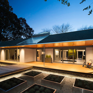
One glaring deficiency was the curb appeal and approach sequence: the grade sloped down and the path to the house followed, but this led to an uncomfortable dip and abrupt rise to the front door. By creating a virtual “moat,” occupied by a grid of raised-bed grasses contained in aluminum-clad boxes, and spanning the moat with an ipe bridge, the approach becomes level and engaging. The façade of the existing house was blank and bland, and with no cover. Adding a deep overhang with a wide porch creates a welcoming, covered condition, accentuated by a 6’ wide pivoting front door that feels more like a moving piece of wall.
Another deficiency was the connection to the outdoors. By adding glass to the front and back of the house, and removing interior walls selectively, the house takes on a diaphanous quality that allows one to see through to the marsh beyond, even when in the driveway. The raised-bed grasses act as abstract, geometric versions of the marsh beyond. A large, pyramidal skylight establishes a spatial hierarchy around which the rooms revolve.
The house featured several tray-ceilinged spaces – living room, kitchen, and master bedroom – that were poorly-proportioned and with panels at the top that resembled inset flat panel doors. The solution was to use a different strategy for each: the bedroom turns the ceiling into an eggshell through the use of a creative trim detail; the living room has an oversized sculptural, backlit lighting element; and the kitchen has a collage of painted rectangular forms that support or include lighting pieces.
A palette of concrete, blackened steel, stainless steel and colors carefully chosen by homeowner and architect create an interior and exterior environment punctuated by moments that are as artistic as the featured works in the black-ceilinged gallery.
 Nautilus Architects
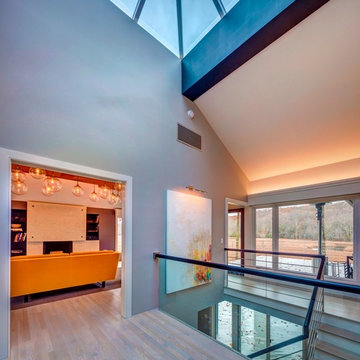
Located on a marsh in the upper reaches of the Lieutenant River in Old Lyme, the existing house was well-sited and well-built, but the design failed to exploit the views and more importantly was a confused combination of contemporary and traditional elements. The new homeowners, a successful businesswoman and an accomplished artist and photographer, were interested in creating a fully-contemporary environment to open up space, connect indoors with outdoors, display artwork and showcase the husband’s distinctive photographs.
One glaring deficiency was the curb appeal and approach sequence: the grade sloped down and the path to the house followed, but this led to an uncomfortable dip and abrupt rise to the front door. By creating a virtual “moat,” occupied by a grid of raised-bed grasses contained in aluminum-clad boxes, and spanning the moat with an ipe bridge, the approach becomes level and engaging. The façade of the existing house was blank and bland, and with no cover. Adding a deep overhang with a wide porch creates a welcoming, covered condition, accentuated by a 6’ wide pivoting front door that feels more like a moving piece of wall.
Another deficiency was the connection to the outdoors. By adding glass to the front and back of the house, and removing interior walls selectively, the house takes on a diaphanous quality that allows one to see through to the marsh beyond, even when in the driveway. The raised-bed grasses act as abstract, geometric versions of the marsh beyond. A large, pyramidal skylight establishes a spatial hierarchy around which the rooms revolve.
The house featured several tray-ceilinged spaces – living room, kitchen, and master bedroom – that were poorly-proportioned and with panels at the top that resembled inset flat panel doors. The solution was to use a different strategy for each: the bedroom turns the ceiling into an eggshell through the use of a creative trim detail; the living room has an oversized sculptural, backlit lighting element; and the kitchen has a collage of painted rectangular forms that support or include lighting pieces.
A palette of concrete, blackened steel, stainless steel and colors carefully chosen by homeowner and architect create an interior and exterior environment punctuated by moments that are as artistic as the featured works in the black-ceilinged gallery.
 Rocky Tops Granite & Marble LLC
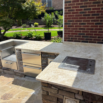
This outdoor kitchen in Lexington is built around 3cm unfilled travertine, and that's a material choice that says a lot about what this space is meant to do. Unfilled travertine keeps its natural pits and texture instead of having them smoothed over with resin, which means the surface reads as raw and organic rather than polished. Out here, under open sky and full sun, that texture works in the stone's favor. It doesn't glare back at you at midday and it doesn't get slick when a hose or a rain shower hits it.
The layout is an L-shaped countertop set over a stacked stone veneer base, with stainless steel drawers and cabinets tucked underneath and a built-in grill anchoring one leg of the L. There's a cutout in the counter for a sink or a cooler, which is the kind of detail that takes real planning at the template stage. You can't cut that opening freehand on site and expect clean lines. We measure twice, dry-fit the appliance or basin, and cut the stone to match before it ever leaves the shop.
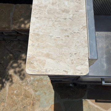
Travertine outdoors is a practical call as much as a good-looking one. It handles heat well, which matters right next to a grill, and it won't crack or discolor the way some engineered materials can when they take direct sun for years. Unfilled travertine in particular breathes a little more than the filled version, so it doesn't trap moisture the way a sealed slab might. We finished the edges eased, which keeps the whole thing feeling soft and unfussy, no sharp lines to bang a hip on when you're moving between the grill and the prep space.
Outdoor kitchens take a beating that indoor ones never see: pollen, humidity, the occasional hard freeze here in the Midlands, direct sun for months at a stretch. Travertine's been used outdoors for centuries for exactly that reason, it ages instead of failing. Sealing it now and then keeps water from sitting in the pits, but even bare it holds up. This one in Lexington is set up to be used hard, grilled on, gathered around, and to look better for the wear rather than worse.
 Rocky Tops Granite & Marble LLC
This outdoor kitchen in Lexington is built around 3cm unfilled travertine, and that's a material choice that says a lot about what this space is meant to do. Unfilled travertine keeps its natural pits and texture instead of having them smoothed over with resin, which means the surface reads as raw and organic rather than polished. Out here, under open sky and full sun, that texture works in the stone's favor. It doesn't glare back at you at midday and it doesn't get slick when a hose or a rain shower hits it.
The layout is an L-shaped countertop set over a stacked stone veneer base, with stainless steel drawers and cabinets tucked underneath and a built-in grill anchoring one leg of the L. There's a cutout in the counter for a sink or a cooler, which is the kind of detail that takes real planning at the template stage. You can't cut that opening freehand on site and expect clean lines. We measure twice, dry-fit the appliance or basin, and cut the stone to match before it ever leaves the shop.
Travertine outdoors is a practical call as much as a good-looking one. It handles heat well, which matters right next to a grill, and it won't crack or discolor the way some engineered materials can when they take direct sun for years. Unfilled travertine in particular breathes a little more than the filled version, so it doesn't trap moisture the way a sealed slab might. We finished the edges eased, which keeps the whole thing feeling soft and unfussy, no sharp lines to bang a hip on when you're moving between the grill and the prep space.
Outdoor kitchens take a beating that indoor ones never see: pollen, humidity, the occasional hard freeze here in the Midlands, direct sun for months at a stretch. Travertine's been used outdoors for centuries for exactly that reason, it ages instead of failing. Sealing it now and then keeps water from sitting in the pits, but even bare it holds up. This one in Lexington is set up to be used hard, grilled on, gathered around, and to look better for the wear rather than worse.
 Nautilus Architects
Located on a marsh in the upper reaches of the Lieutenant River in Old Lyme, the existing house was well-sited and well-built, but the design failed to exploit the views and more importantly was a confused combination of contemporary and traditional elements. The new homeowners, a successful businesswoman and an accomplished artist and photographer, were interested in creating a fully-contemporary environment to open up space, connect indoors with outdoors, display artwork and showcase the husband’s distinctive photographs.
One glaring deficiency was the curb appeal and approach sequence: the grade sloped down and the path to the house followed, but this led to an uncomfortable dip and abrupt rise to the front door. By creating a virtual “moat,” occupied by a grid of raised-bed grasses contained in aluminum-clad boxes, and spanning the moat with an ipe bridge, the approach becomes level and engaging. The façade of the existing house was blank and bland, and with no cover. Adding a deep overhang with a wide porch creates a welcoming, covered condition, accentuated by a 6’ wide pivoting front door that feels more like a moving piece of wall.
Another deficiency was the connection to the outdoors. By adding glass to the front and back of the house, and removing interior walls selectively, the house takes on a diaphanous quality that allows one to see through to the marsh beyond, even when in the driveway. The raised-bed grasses act as abstract, geometric versions of the marsh beyond. A large, pyramidal skylight establishes a spatial hierarchy around which the rooms revolve.
The house featured several tray-ceilinged spaces – living room, kitchen, and master bedroom – that were poorly-proportioned and with panels at the top that resembled inset flat panel doors. The solution was to use a different strategy for each: the bedroom turns the ceiling into an eggshell through the use of a creative trim detail; the living room has an oversized sculptural, backlit lighting element; and the kitchen has a collage of painted rectangular forms that support or include lighting pieces.
A palette of concrete, blackened steel, stainless steel and colors carefully chosen by homeowner and architect create an interior and exterior environment punctuated by moments that are as artistic as the featured works in the black-ceilinged gallery.
 Nautilus Architects
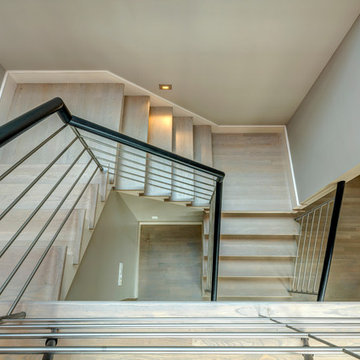
Located on a marsh in the upper reaches of the Lieutenant River in Old Lyme, the existing house was well-sited and well-built, but the design failed to exploit the views and more importantly was a confused combination of contemporary and traditional elements. The new homeowners, a successful businesswoman and an accomplished artist and photographer, were interested in creating a fully-contemporary environment to open up space, connect indoors with outdoors, display artwork and showcase the husband’s distinctive photographs.
One glaring deficiency was the curb appeal and approach sequence: the grade sloped down and the path to the house followed, but this led to an uncomfortable dip and abrupt rise to the front door. By creating a virtual “moat,” occupied by a grid of raised-bed grasses contained in aluminum-clad boxes, and spanning the moat with an ipe bridge, the approach becomes level and engaging. The façade of the existing house was blank and bland, and with no cover. Adding a deep overhang with a wide porch creates a welcoming, covered condition, accentuated by a 6’ wide pivoting front door that feels more like a moving piece of wall.
Another deficiency was the connection to the outdoors. By adding glass to the front and back of the house, and removing interior walls selectively, the house takes on a diaphanous quality that allows one to see through to the marsh beyond, even when in the driveway. The raised-bed grasses act as abstract, geometric versions of the marsh beyond. A large, pyramidal skylight establishes a spatial hierarchy around which the rooms revolve.
The house featured several tray-ceilinged spaces – living room, kitchen, and master bedroom – that were poorly-proportioned and with panels at the top that resembled inset flat panel doors. The solution was to use a different strategy for each: the bedroom turns the ceiling into an eggshell through the use of a creative trim detail; the living room has an oversized sculptural, backlit lighting element; and the kitchen has a collage of painted rectangular forms that support or include lighting pieces.
A palette of concrete, blackened steel, stainless steel and colors carefully chosen by homeowner and architect create an interior and exterior environment punctuated by moments that are as artistic as the featured works in the black-ceilinged gallery.
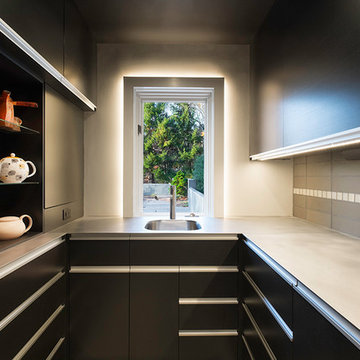 Nautilus Architects
Located on a marsh in the upper reaches of the Lieutenant River in Old Lyme, the existing house was well-sited and well-built, but the design failed to exploit the views and more importantly was a confused combination of contemporary and traditional elements. The new homeowners, a successful businesswoman and an accomplished artist and photographer, were interested in creating a fully-contemporary environment to open up space, connect indoors with outdoors, display artwork and showcase the husband’s distinctive photographs.
One glaring deficiency was the curb appeal and approach sequence: the grade sloped down and the path to the house followed, but this led to an uncomfortable dip and abrupt rise to the front door. By creating a virtual “moat,” occupied by a grid of raised-bed grasses contained in aluminum-clad boxes, and spanning the moat with an ipe bridge, the approach becomes level and engaging. The façade of the existing house was blank and bland, and with no cover. Adding a deep overhang with a wide porch creates a welcoming, covered condition, accentuated by a 6’ wide pivoting front door that feels more like a moving piece of wall.
Another deficiency was the connection to the outdoors. By adding glass to the front and back of the house, and removing interior walls selectively, the house takes on a diaphanous quality that allows one to see through to the marsh beyond, even when in the driveway. The raised-bed grasses act as abstract, geometric versions of the marsh beyond. A large, pyramidal skylight establishes a spatial hierarchy around which the rooms revolve.
The house featured several tray-ceilinged spaces – living room, kitchen, and master bedroom – that were poorly-proportioned and with panels at the top that resembled inset flat panel doors. The solution was to use a different strategy for each: the bedroom turns the ceiling into an eggshell through the use of a creative trim detail; the living room has an oversized sculptural, backlit lighting element; and the kitchen has a collage of painted rectangular forms that support or include lighting pieces.
A palette of concrete, blackened steel, stainless steel and colors carefully chosen by homeowner and architect create an interior and exterior environment punctuated by moments that are as artistic as the featured works in the black-ceilinged gallery.
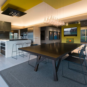 Nautilus Architects
Located on a marsh in the upper reaches of the Lieutenant River in Old Lyme, the existing house was well-sited and well-built, but the design failed to exploit the views and more importantly was a confused combination of contemporary and traditional elements. The new homeowners, a successful businesswoman and an accomplished artist and photographer, were interested in creating a fully-contemporary environment to open up space, connect indoors with outdoors, display artwork and showcase the husband’s distinctive photographs.
One glaring deficiency was the curb appeal and approach sequence: the grade sloped down and the path to the house followed, but this led to an uncomfortable dip and abrupt rise to the front door. By creating a virtual “moat,” occupied by a grid of raised-bed grasses contained in aluminum-clad boxes, and spanning the moat with an ipe bridge, the approach becomes level and engaging. The façade of the existing house was blank and bland, and with no cover. Adding a deep overhang with a wide porch creates a welcoming, covered condition, accentuated by a 6’ wide pivoting front door that feels more like a moving piece of wall.
Another deficiency was the connection to the outdoors. By adding glass to the front and back of the house, and removing interior walls selectively, the house takes on a diaphanous quality that allows one to see through to the marsh beyond, even when in the driveway. The raised-bed grasses act as abstract, geometric versions of the marsh beyond. A large, pyramidal skylight establishes a spatial hierarchy around which the rooms revolve.
The house featured several tray-ceilinged spaces – living room, kitchen, and master bedroom – that were poorly-proportioned and with panels at the top that resembled inset flat panel doors. The solution was to use a different strategy for each: the bedroom turns the ceiling into an eggshell through the use of a creative trim detail; the living room has an oversized sculptural, backlit lighting element; and the kitchen has a collage of painted rectangular forms that support or include lighting pieces.
A palette of concrete, blackened steel, stainless steel and colors carefully chosen by homeowner and architect create an interior and exterior environment punctuated by moments that are as artistic as the featured works in the black-ceilinged gallery.
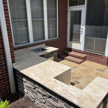 Rocky Tops Granite & Marble LLC
This outdoor kitchen in Lexington is built around 3cm unfilled travertine, and that's a material choice that says a lot about what this space is meant to do. Unfilled travertine keeps its natural pits and texture instead of having them smoothed over with resin, which means the surface reads as raw and organic rather than polished. Out here, under open sky and full sun, that texture works in the stone's favor. It doesn't glare back at you at midday and it doesn't get slick when a hose or a rain shower hits it.
The layout is an L-shaped countertop set over a stacked stone veneer base, with stainless steel drawers and cabinets tucked underneath and a built-in grill anchoring one leg of the L. There's a cutout in the counter for a sink or a cooler, which is the kind of detail that takes real planning at the template stage. You can't cut that opening freehand on site and expect clean lines. We measure twice, dry-fit the appliance or basin, and cut the stone to match before it ever leaves the shop.
Travertine outdoors is a practical call as much as a good-looking one. It handles heat well, which matters right next to a grill, and it won't crack or discolor the way some engineered materials can when they take direct sun for years. Unfilled travertine in particular breathes a little more than the filled version, so it doesn't trap moisture the way a sealed slab might. We finished the edges eased, which keeps the whole thing feeling soft and unfussy, no sharp lines to bang a hip on when you're moving between the grill and the prep space.
Outdoor kitchens take a beating that indoor ones never see: pollen, humidity, the occasional hard freeze here in the Midlands, direct sun for months at a stretch. Travertine's been used outdoors for centuries for exactly that reason, it ages instead of failing. Sealing it now and then keeps water from sitting in the pits, but even bare it holds up. This one in Lexington is set up to be used hard, grilled on, gathered around, and to look better for the wear rather than worse.
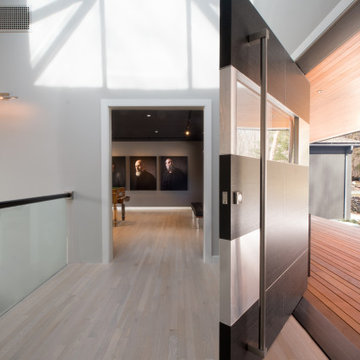 Nautilus Architects
Located on a marsh in the upper reaches of the Lieutenant River in Old Lyme, the existing house was well-sited and well-built, but the design failed to exploit the views and more importantly was a confused combination of contemporary and traditional elements. The new homeowners, a successful businesswoman and an accomplished artist and photographer, were interested in creating a fully-contemporary environment to open up space, connect indoors with outdoors, display artwork and showcase the husband’s distinctive photographs.
One glaring deficiency was the curb appeal and approach sequence: the grade sloped down and the path to the house followed, but this led to an uncomfortable dip and abrupt rise to the front door. By creating a virtual “moat,” occupied by a grid of raised-bed grasses contained in aluminum-clad boxes, and spanning the moat with an ipe bridge, the approach becomes level and engaging. The façade of the existing house was blank and bland, and with no cover. Adding a deep overhang with a wide porch creates a welcoming, covered condition, accentuated by a 6’ wide pivoting front door that feels more like a moving piece of wall.
Another deficiency was the connection to the outdoors. By adding glass to the front and back of the house, and removing interior walls selectively, the house takes on a diaphanous quality that allows one to see through to the marsh beyond, even when in the driveway. The raised-bed grasses act as abstract, geometric versions of the marsh beyond. A large, pyramidal skylight establishes a spatial hierarchy around which the rooms revolve.
The house featured several tray-ceilinged spaces – living room, kitchen, and master bedroom – that were poorly-proportioned and with panels at the top that resembled inset flat panel doors. The solution was to use a different strategy for each: the bedroom turns the ceiling into an eggshell through the use of a creative trim detail; the living room has an oversized sculptural, backlit lighting element; and the kitchen has a collage of painted rectangular forms that support or include lighting pieces.
A palette of concrete, blackened steel, stainless steel and colors carefully chosen by homeowner and architect create an interior and exterior environment punctuated by moments that are as artistic as the featured works in the black-ceilinged gallery.
 Nautilus Architects
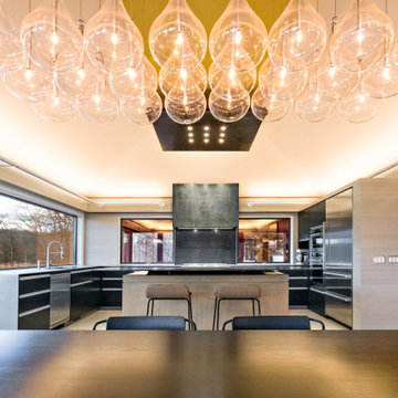
Located on a marsh in the upper reaches of the Lieutenant River in Old Lyme, the existing house was well-sited and well-built, but the design failed to exploit the views and more importantly was a confused combination of contemporary and traditional elements. The new homeowners, a successful businesswoman and an accomplished artist and photographer, were interested in creating a fully-contemporary environment to open up space, connect indoors with outdoors, display artwork and showcase the husband’s distinctive photographs.
One glaring deficiency was the curb appeal and approach sequence: the grade sloped down and the path to the house followed, but this led to an uncomfortable dip and abrupt rise to the front door. By creating a virtual “moat,” occupied by a grid of raised-bed grasses contained in aluminum-clad boxes, and spanning the moat with an ipe bridge, the approach becomes level and engaging. The façade of the existing house was blank and bland, and with no cover. Adding a deep overhang with a wide porch creates a welcoming, covered condition, accentuated by a 6’ wide pivoting front door that feels more like a moving piece of wall.
Another deficiency was the connection to the outdoors. By adding glass to the front and back of the house, and removing interior walls selectively, the house takes on a diaphanous quality that allows one to see through to the marsh beyond, even when in the driveway. The raised-bed grasses act as abstract, geometric versions of the marsh beyond. A large, pyramidal skylight establishes a spatial hierarchy around which the rooms revolve.
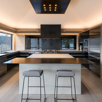
The house featured several tray-ceilinged spaces – living room, kitchen, and master bedroom – that were poorly-proportioned and with panels at the top that resembled inset flat panel doors. The solution was to use a different strategy for each: the bedroom turns the ceiling into an eggshell through the use of a creative trim detail; the living room has an oversized sculptural, backlit lighting element; and the kitchen has a collage of painted rectangular forms that support or include lighting pieces.
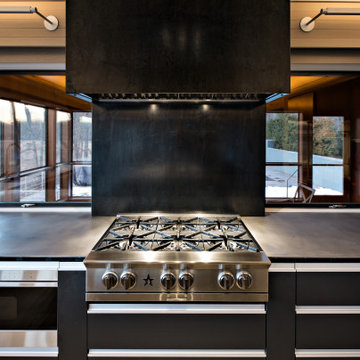
A palette of concrete, blackened steel, stainless steel and colors carefully chosen by homeowner and architect create an interior and exterior environment punctuated by moments that are as artistic as the featured works in the black-ceilinged gallery.
 Nautilus Architects
Located on a marsh in the upper reaches of the Lieutenant River in Old Lyme, the existing house was well-sited and well-built, but the design failed to exploit the views and more importantly was a confused combination of contemporary and traditional elements. The new homeowners, a successful businesswoman and an accomplished artist and photographer, were interested in creating a fully-contemporary environment to open up space, connect indoors with outdoors, display artwork and showcase the husband’s distinctive photographs.
One glaring deficiency was the curb appeal and approach sequence: the grade sloped down and the path to the house followed, but this led to an uncomfortable dip and abrupt rise to the front door. By creating a virtual “moat,” occupied by a grid of raised-bed grasses contained in aluminum-clad boxes, and spanning the moat with an ipe bridge, the approach becomes level and engaging. The façade of the existing house was blank and bland, and with no cover. Adding a deep overhang with a wide porch creates a welcoming, covered condition, accentuated by a 6’ wide pivoting front door that feels more like a moving piece of wall.
Another deficiency was the connection to the outdoors. By adding glass to the front and back of the house, and removing interior walls selectively, the house takes on a diaphanous quality that allows one to see through to the marsh beyond, even when in the driveway. The raised-bed grasses act as abstract, geometric versions of the marsh beyond. A large, pyramidal skylight establishes a spatial hierarchy around which the rooms revolve.
The house featured several tray-ceilinged spaces – living room, kitchen, and master bedroom – that were poorly-proportioned and with panels at the top that resembled inset flat panel doors. The solution was to use a different strategy for each: the bedroom turns the ceiling into an eggshell through the use of a creative trim detail; the living room has an oversized sculptural, backlit lighting element; and the kitchen has a collage of painted rectangular forms that support or include lighting pieces.
A palette of concrete, blackened steel, stainless steel and colors carefully chosen by homeowner and architect create an interior and exterior environment punctuated by moments that are as artistic as the featured works in the black-ceilinged gallery.
 Nautilus Architects
Located on a marsh in the upper reaches of the Lieutenant River in Old Lyme, the existing house was well-sited and well-built, but the design failed to exploit the views and more importantly was a confused combination of contemporary and traditional elements. The new homeowners, a successful businesswoman and an accomplished artist and photographer, were interested in creating a fully-contemporary environment to open up space, connect indoors with outdoors, display artwork and showcase the husband’s distinctive photographs.
One glaring deficiency was the curb appeal and approach sequence: the grade sloped down and the path to the house followed, but this led to an uncomfortable dip and abrupt rise to the front door. By creating a virtual “moat,” occupied by a grid of raised-bed grasses contained in aluminum-clad boxes, and spanning the moat with an ipe bridge, the approach becomes level and engaging. The façade of the existing house was blank and bland, and with no cover. Adding a deep overhang with a wide porch creates a welcoming, covered condition, accentuated by a 6’ wide pivoting front door that feels more like a moving piece of wall.
Another deficiency was the connection to the outdoors. By adding glass to the front and back of the house, and removing interior walls selectively, the house takes on a diaphanous quality that allows one to see through to the marsh beyond, even when in the driveway. The raised-bed grasses act as abstract, geometric versions of the marsh beyond. A large, pyramidal skylight establishes a spatial hierarchy around which the rooms revolve.
The house featured several tray-ceilinged spaces – living room, kitchen, and master bedroom – that were poorly-proportioned and with panels at the top that resembled inset flat panel doors. The solution was to use a different strategy for each: the bedroom turns the ceiling into an eggshell through the use of a creative trim detail; the living room has an oversized sculptural, backlit lighting element; and the kitchen has a collage of painted rectangular forms that support or include lighting pieces.
A palette of concrete, blackened steel, stainless steel and colors carefully chosen by homeowner and architect create an interior and exterior environment punctuated by moments that are as artistic as the featured works in the black-ceilinged gallery.
 Rocky Tops Granite & Marble LLC
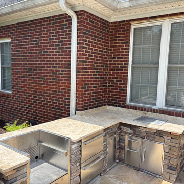
This outdoor kitchen in Lexington is built around 3cm unfilled travertine, and that's a material choice that says a lot about what this space is meant to do. Unfilled travertine keeps its natural pits and texture instead of having them smoothed over with resin, which means the surface reads as raw and organic rather than polished. Out here, under open sky and full sun, that texture works in the stone's favor. It doesn't glare back at you at midday and it doesn't get slick when a hose or a rain shower hits it.
The layout is an L-shaped countertop set over a stacked stone veneer base, with stainless steel drawers and cabinets tucked underneath and a built-in grill anchoring one leg of the L. There's a cutout in the counter for a sink or a cooler, which is the kind of detail that takes real planning at the template stage. You can't cut that opening freehand on site and expect clean lines. We measure twice, dry-fit the appliance or basin, and cut the stone to match before it ever leaves the shop.
Travertine outdoors is a practical call as much as a good-looking one. It handles heat well, which matters right next to a grill, and it won't crack or discolor the way some engineered materials can when they take direct sun for years. Unfilled travertine in particular breathes a little more than the filled version, so it doesn't trap moisture the way a sealed slab might. We finished the edges eased, which keeps the whole thing feeling soft and unfussy, no sharp lines to bang a hip on when you're moving between the grill and the prep space.
Outdoor kitchens take a beating that indoor ones never see: pollen, humidity, the occasional hard freeze here in the Midlands, direct sun for months at a stretch. Travertine's been used outdoors for centuries for exactly that reason, it ages instead of failing. Sealing it now and then keeps water from sitting in the pits, but even bare it holds up. This one in Lexington is set up to be used hard, grilled on, gathered around, and to look better for the wear rather than worse.
 Nautilus Architects
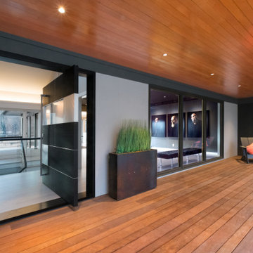
Located on a marsh in the upper reaches of the Lieutenant River in Old Lyme, the existing house was well-sited and well-built, but the design failed to exploit the views and more importantly was a confused combination of contemporary and traditional elements. The new homeowners, a successful businesswoman and an accomplished artist and photographer, were interested in creating a fully-contemporary environment to open up space, connect indoors with outdoors, display artwork and showcase the husband’s distinctive photographs.
One glaring deficiency was the curb appeal and approach sequence: the grade sloped down and the path to the house followed, but this led to an uncomfortable dip and abrupt rise to the front door. By creating a virtual “moat,” occupied by a grid of raised-bed grasses contained in aluminum-clad boxes, and spanning the moat with an ipe bridge, the approach becomes level and engaging. The façade of the existing house was blank and bland, and with no cover. Adding a deep overhang with a wide porch creates a welcoming, covered condition, accentuated by a 6’ wide pivoting front door that feels more like a moving piece of wall.
Another deficiency was the connection to the outdoors. By adding glass to the front and back of the house, and removing interior walls selectively, the house takes on a diaphanous quality that allows one to see through to the marsh beyond, even when in the driveway. The raised-bed grasses act as abstract, geometric versions of the marsh beyond. A large, pyramidal skylight establishes a spatial hierarchy around which the rooms revolve.
The house featured several tray-ceilinged spaces – living room, kitchen, and master bedroom – that were poorly-proportioned and with panels at the top that resembled inset flat panel doors. The solution was to use a different strategy for each: the bedroom turns the ceiling into an eggshell through the use of a creative trim detail; the living room has an oversized sculptural, backlit lighting element; and the kitchen has a collage of painted rectangular forms that support or include lighting pieces.
A palette of concrete, blackened steel, stainless steel and colors carefully chosen by homeowner and architect create an interior and exterior environment punctuated by moments that are as artistic as the featured works in the black-ceilinged gallery.
 Nautilus Architects
Located on a marsh in the upper reaches of the Lieutenant River in Old Lyme, the existing house was well-sited and well-built, but the design failed to exploit the views and more importantly was a confused combination of contemporary and traditional elements. The new homeowners, a successful businesswoman and an accomplished artist and photographer, were interested in creating a fully-contemporary environment to open up space, connect indoors with outdoors, display artwork and showcase the husband’s distinctive photographs.
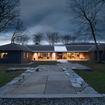
One glaring deficiency was the curb appeal and approach sequence: the grade sloped down and the path to the house followed, but this led to an uncomfortable dip and abrupt rise to the front door. By creating a virtual “moat,” occupied by a grid of raised-bed grasses contained in aluminum-clad boxes, and spanning the moat with an ipe bridge, the approach becomes level and engaging. The façade of the existing house was blank and bland, and with no cover. Adding a deep overhang with a wide porch creates a welcoming, covered condition, accentuated by a 6’ wide pivoting front door that feels more like a moving piece of wall.
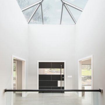
Another deficiency was the connection to the outdoors. By adding glass to the front and back of the house, and removing interior walls selectively, the house takes on a diaphanous quality that allows one to see through to the marsh beyond, even when in the driveway. The raised-bed grasses act as abstract, geometric versions of the marsh beyond. A large, pyramidal skylight establishes a spatial hierarchy around which the rooms revolve.
The house featured several tray-ceilinged spaces – living room, kitchen, and master bedroom – that were poorly-proportioned and with panels at the top that resembled inset flat panel doors. The solution was to use a different strategy for each: the bedroom turns the ceiling into an eggshell through the use of a creative trim detail; the living room has an oversized sculptural, backlit lighting element; and the kitchen has a collage of painted rectangular forms that support or include lighting pieces.
A palette of concrete, blackened steel, stainless steel and colors carefully chosen by homeowner and architect create an interior and exterior environment punctuated by moments that are as artistic as the featured works in the black-ceilinged gallery.
 Nautilus Architects
Located on a marsh in the upper reaches of the Lieutenant River in Old Lyme, the existing house was well-sited and well-built, but the design failed to exploit the views and more importantly was a confused combination of contemporary and traditional elements. The new homeowners, a successful businesswoman and an accomplished artist and photographer, were interested in creating a fully-contemporary environment to open up space, connect indoors with outdoors, display artwork and showcase the husband’s distinctive photographs.
One glaring deficiency was the curb appeal and approach sequence: the grade sloped down and the path to the house followed, but this led to an uncomfortable dip and abrupt rise to the front door. By creating a virtual “moat,” occupied by a grid of raised-bed grasses contained in aluminum-clad boxes, and spanning the moat with an ipe bridge, the approach becomes level and engaging. The façade of the existing house was blank and bland, and with no cover. Adding a deep overhang with a wide porch creates a welcoming, covered condition, accentuated by a 6’ wide pivoting front door that feels more like a moving piece of wall.
Another deficiency was the connection to the outdoors. By adding glass to the front and back of the house, and removing interior walls selectively, the house takes on a diaphanous quality that allows one to see through to the marsh beyond, even when in the driveway. The raised-bed grasses act as abstract, geometric versions of the marsh beyond. A large, pyramidal skylight establishes a spatial hierarchy around which the rooms revolve.
The house featured several tray-ceilinged spaces – living room, kitchen, and master bedroom – that were poorly-proportioned and with panels at the top that resembled inset flat panel doors. The solution was to use a different strategy for each: the bedroom turns the ceiling into an eggshell through the use of a creative trim detail; the living room has an oversized sculptural, backlit lighting element; and the kitchen has a collage of painted rectangular forms that support or include lighting pieces.
A palette of concrete, blackened steel, stainless steel and colors carefully chosen by homeowner and architect create an interior and exterior environment punctuated by moments that are as artistic as the featured works in the black-ceilinged gallery.
4