
Search results for "Skin sorts" in Home Design Ideas
 In Detail Interiors
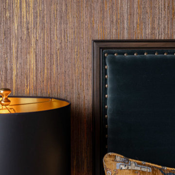
A master bedroom with rich color, texture and personality!
With a colorful master bathroom that blends the perfect matte finish, semi-primitive blast of pattern with rich, saturated jewel tones and a little calacatta gold tile – determining the best fabrics and finishes for the master bedroom felt like a HUGE challenge. How do you stand up to something so fabulously unique and still create a soft respite for someone to slumber?!
This bedroom was a small space with existing Vetrazzo floors and an entire wall dedicated to floor-to-ceiling fixed glass pane windows. Between the cracks in the plaster ceiling and the lacquered pink dresser we knew we had our work cut out.
Saturated colors create a fairy tale bedroom
Fast forward to finding the perfect, sumptuously soft evergreen mohair for the headboard and furry tuffets for the foot of the bed. Texture became the name of the game and a certain level of color variation had to tie through from selection to selection. Cladding the walls with a gilt woven cloth wall covering that also pulled a sort of skin-tone clay from detail found in the Vetrazzo flooring (OMG! so pretty!) and grounding everything with a sort of deco-inspired one-of-a-kind wool rug. The layers of unexpected style helped develop a more collected – less stylized – feeling overall.
Then it was bye-bye to the pink lacquer! A local artisan worked on a faux finish for the custom dresser that the client had already invested in and we just gave it a refresh with a deep bronze finish. Balancing this piece with the playful silk tassel pendant lights that frame a beautiful original painting of red headed queens by artist Nancy Rhodes Harper.
Exquisite lighting for a sexy master bedroom
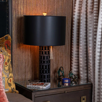
Additionally, the swirl and swoop of the forged metal light fixture overhead play off the more structured spinal-column type pattern of the black out window treatments that truly act as their own piece of art. Each element has its place and plays with the visual and textural aesthetics that make our client (and our team) swoon.
Want more colorful and moody interior spaces? Check out another one of our recent projects here! Then call us for more information on how we can help you! Read more about our full-service interior design here!
 Lauren Levant
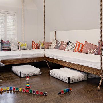
The soaring cathedral ceilings and warm exposed beams were the only features to speak of in this non-descript open landing. Off the hallway near the kids’ rooms, its small size and open layout made it something in between a hallway and a room. While most might consider a TV or office nook for this space, its adjacency to the children’s quarters inspired the designer toward something more imaginative. Inspired by the bright open space, this design achieves a sort of Balinese treehouse aesthetic – and all of it is designed specifically for fun.
Playful hanging beds swing freely on sisal rope, creating a beckoning space that draws in children and adults alike. The mattresses were filled especially with non-toxic, non-petroleum natural fiber fill to make them healthy to sleep and lounge on – and encased in removable, washable organic cotton slipcovers. As the children are young, the floor space (finished in non-toxic lacquer) is kept clear and available for sprawling play. Large storage benches topped with walnut seats keep toys and books well organized, and ready for action at any time.
Dave Bryce Photography
 Almesedoors
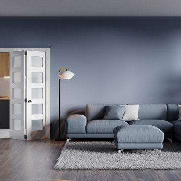
FINISH: PRIMED
The advantages of this approach – of this type of interior door finish – are fairly obvious. Pick a color, any color that suits your projects best. Mix and apply. Re- coat whenever you feel it is necessary to do so. Touch it up. It gives you, the proud owner of these interior doors, complete freedom of choice, and the significant savings, especially where it comes to bulk orders, can be a true source of joy.
As Kurt Vonnegut mentions in one of his novels (Bluebeard, unless I’m mistaken … check it out when you get a chance), the thrill of laying on colors is a large part of the artist’s professional satisfaction. In other words, a keen pleasure.
When back in the remote past visual arts became a field dominated by professionals rather than hobbyists, the main problem of “just laying on paint” became obvious: you can’t.
The medium of choice back then was egg tempera, a permanent, fast-drying substance consisting of colored pigments mixed with a water-soluble binder medium, usually glutinous material such as egg yolk. Portraits and ornaments were executed in this medium, and the wood panel was the surface of choice. One of tempera’s interesting features is that it is not as easily absorbed by wood as other mediums. Some sort of primer was necessary, of course, but pretty much any substance that dried evenly could be used.
The drawbacks of tempera, or pintura al temple, as the Spanish call it, only became obvious with the advent of the Renaissance, when the leading representatives of the trade turned to oil (and interior doors suddenly became a great deal less crude, but that’s a story for another day).
Oil painting is the process of “painting with pigments with a medium of drying oil as the binder.” Commonly used types include linseed (highly preferable in art, though not necessarily in interior doors, mind you), poppy seed, walnut, and safflower.
Today, five hundred years later, it is safe to say that oil is more versatile than pintura al temple – by orders of magnitude. Specifically, the contrasts achieved through the former are much greater, the darks are far deeper, and three- dimensional, highly realistic images are much easier to achieve. Next time you visit a museum, take a closer look at pintura al temple portraits. All of them, without exception, come off as a bit “flat” as opposed to their latter-day counterparts.
Also, where glazing is concerned …
Glazing: a painting technique in which a transparent layer, with just a touch of pigment, is laid over a previously painted surface, allowing light to travel through the glaze and be reflected back off of the opaque layer below. Gentle shadows, subtle changes of color, smooth transitions – all these can be achieved through glazing, which was used by all artists up until the middle of the Nineteenth Century, when artist tubes were invented, revolutionizing the field, and other techniques began to be explored.
Tempera enthusiasts (it takes all kinds to make a world) will assure you that glazing is not just possible in pintura al temple but is actually the basis of the whole enterprise. Well, what are you going to do? They’re enthusiasts.
Anyway, la peinture à l'huile, as the French call it, re-introduced the ancient problem of most surface’s propensity to absorb dipingere, as the Italians call the stuff. Wood or canvas, it is all the same: you’re not going to get very far without a good primer.
Experiments were conducted, and soon rabbit skin glue emerged as the least expensive and most effective solution. It was easy to apply. It dried evenly. It made the application of the l’huile stuff on top of it a walk in the park.
There were drawbacks. Today, rabbit skin glue is considered to be a major cause of cracking by most modern conservators. (Remember, when you visited the Metropolitan Museum of Art – and did you see those interior doors? … some of them are quite something … - most “old masters” pictures are completely covered with a cobweb of cracks? There you go). Because the glue is hygroscopic, it continually absorbs moisture from the atmosphere, causing the glue to swell and shrink as ambient humidity levels change. Over many humidity cycles, this repeated flexing causes the brittle oily layers to crack.
To combat this problem, modern primers are made of acrylic materials which are guaranteed not to cause any damage to the dipingere. No bubbling, no cracks. Your interior doors are safe.
Find the right local pro for your project
 danielle colding design, inc.
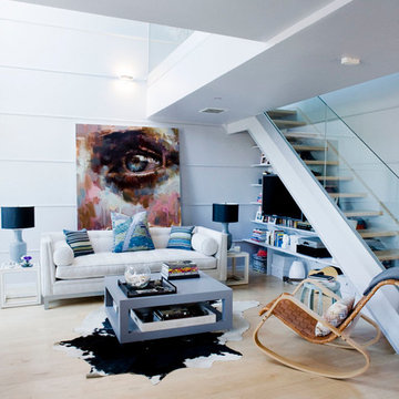
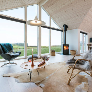
Example of a mid-sized danish light wood floor living room design in New York with white walls
 In Detail Interiors
A master bedroom with rich color, texture and personality!
With a colorful master bathroom that blends the perfect matte finish, semi-primitive blast of pattern with rich, saturated jewel tones and a little calacatta gold tile – determining the best fabrics and finishes for the master bedroom felt like a HUGE challenge. How do you stand up to something so fabulously unique and still create a soft respite for someone to slumber?!
This bedroom was a small space with existing Vetrazzo floors and an entire wall dedicated to floor-to-ceiling fixed glass pane windows. Between the cracks in the plaster ceiling and the lacquered pink dresser we knew we had our work cut out.
Saturated colors create a fairy tale bedroom
Fast forward to finding the perfect, sumptuously soft evergreen mohair for the headboard and furry tuffets for the foot of the bed. Texture became the name of the game and a certain level of color variation had to tie through from selection to selection. Cladding the walls with a gilt woven cloth wall covering that also pulled a sort of skin-tone clay from detail found in the Vetrazzo flooring (OMG! so pretty!) and grounding everything with a sort of deco-inspired one-of-a-kind wool rug. The layers of unexpected style helped develop a more collected – less stylized – feeling overall.
Then it was bye-bye to the pink lacquer! A local artisan worked on a faux finish for the custom dresser that the client had already invested in and we just gave it a refresh with a deep bronze finish. Balancing this piece with the playful silk tassel pendant lights that frame a beautiful original painting of red headed queens by artist Nancy Rhodes Harper.
Exquisite lighting for a sexy master bedroom
Additionally, the swirl and swoop of the forged metal light fixture overhead play off the more structured spinal-column type pattern of the black out window treatments that truly act as their own piece of art. Each element has its place and plays with the visual and textural aesthetics that make our client (and our team) swoon.
Want more colorful and moody interior spaces? Check out another one of our recent projects here! Then call us for more information on how we can help you! Read more about our full-service interior design here!
 Totem Studio Architects
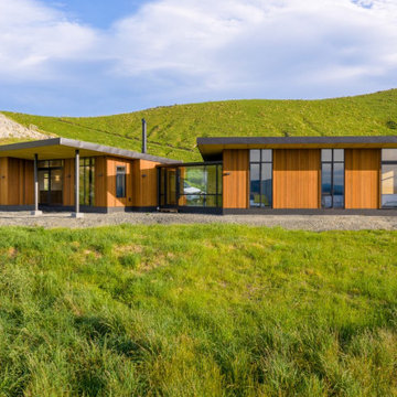
Carefully orientated and sited on the edge of small plateau this house looks out across the rolling countryside of North Canterbury. The 3-bedroom rural family home is an exemplar of simplicity done with care and precision.
Tucked in alongside a private limestone quarry with cows grazing in the distance the choice of materials are intuitively natural and implemented with bare authenticity.
Oiled random width cedar weatherboards are contemporary and rustic, the polished concrete floors with exposed aggregate tie in wonderfully to the adjacent limestone cliffs, and the clean folded wall to roof, envelopes the building from the sheltered south to the amazing views to the north. Designed to portray purity of form the outer metal surface provides enclosure and shelter from the elements, while its inner face is a continuous skin of hoop pine timber from inside to out.
The hoop pine linings bend up the inner walls to form the ceiling and then soar continuous outward past the full height glazing to become the outside soffit. The bold vertical lines of the panel joins are strongly expressed aligning with windows and jambs, they guild the eye up and out so as you step in through the sheltered Southern entrances the landscape flows out in front of you.
Every detail required careful thought in design and craft in construction. As two simple boxes joined by a glass link, a house that sits so beautifully in the landscape was deceptively challenging, and stands as a credit to our client passion for their new home & the builders craftsmanship to see it though, it is a end result we are all very proud to have been a part of.

2