
Search results for "Solid focus" in Home Design Ideas
 MAKHNO studio
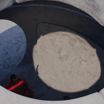
This temple design embodies an ultra-modern, sculptural form, focusing on curvilinear shapes and a minimalist aesthetic. The use of concrete in various textures provides a sense of solidity and permanence, while the clever play of light and shadow through circular openings adds a dynamic quality to the tranquil space. The interior's stark simplicity and the absence of ornamentation draw attention to the meditative atmosphere, encouraging introspection and peace.
 Bespoke By Acorn
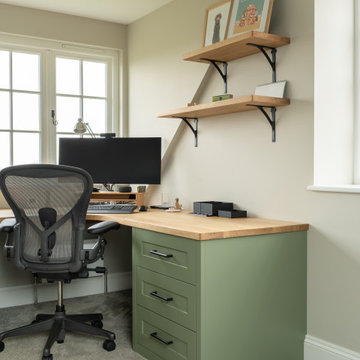
We had the pleasure of crafting this bespoke modern, painted home office for our client’s residence in Reigate, Surrey. They had decided it was time to invest in a fresh, inviting and dedicated workspace where they could be more productive. The desk, which fits seamlessly into the space, features a full stave prime oak worktop finished with a protective oil to provide a superior long-lasting surface. The custom desk cabinetry has been flawlessly spray finished Little Greene Sage Green, which contrasts beautifully with the attractive, natural oak wood desktop. The soothing, muted green paint colour and tailored storage creates a calm, uncluttered setting, perfect for a focused workspace.
Customised and crafted for comfort
The right storage was vital for our client and this made to measure desk features integrated drawers and a double cupboard putting work essentials right at their fingertips. Every drawer and door functions effortlessly and quietly thanks to the best quality Hafele ironmongery and soft close mechanisms. In this home office design, we also incorporated two matching oak wall-mounted shelves which follow the angle of the ceiling and a low-level built-in bookcase which fits perfectly under the sloped ceiling.
Made to measure curved corner desk
The curved corner desk has been constructed with integrated drawers, cupboard space, cable management tray on the underside, and an open bookshelf unit to one side. Having a curved corner desk in front of the window is a strategic decision that combines ergonomic comfort and enhanced use of space. The curved shape brings the workspace closer to the body, allowing for a more natural, wraparound working experience that pairs well with the natural light and views from the window. The design also delivers additional comfort, thanks to the spacious full depth leg room underneath. A curved L-shape design also makes the desk feel less dominant than a traditional straight desk, preventing the room from feeling cramped while still providing ample workspace.
Solid prime oak work top
The desk’s beautiful solid prime oak top provides a stable, heavy surface for working. It also offers exceptional strength and durability. While oak resists dents and scratches, it can be sanded and refinished, when necessary, to restore its condition. Real wood surfaces, such as oak, have natural antibacterial properties, which can help maintain a cleaner working environment too.
A full stave worktop is a premium one-piece surface made from a continuous oak plank (stave) that runs the entire length of the worktop creating a luxurious, linear, and consistent appearance and showcasing the natural beauty of the timber.
 Bespoke By Acorn
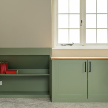
We had the pleasure of crafting this bespoke modern, painted home office for our client’s residence in Reigate, Surrey. They had decided it was time to invest in a fresh, inviting and dedicated workspace where they could be more productive. The desk, which fits seamlessly into the space, features a full stave prime oak worktop finished with a protective oil to provide a superior long-lasting surface. The custom desk cabinetry has been flawlessly spray finished Little Greene Sage Green, which contrasts beautifully with the attractive, natural oak wood desktop. The soothing, muted green paint colour and tailored storage creates a calm, uncluttered setting, perfect for a focused workspace.
Customised and crafted for comfort
The right storage was vital for our client and this made to measure desk features integrated drawers and a double cupboard putting work essentials right at their fingertips. Every drawer and door functions effortlessly and quietly thanks to the best quality Hafele ironmongery and soft close mechanisms. In this home office design, we also incorporated two matching oak wall-mounted shelves which follow the angle of the ceiling and a low-level built-in bookcase which fits perfectly under the sloped ceiling.
Made to measure curved corner desk
The curved corner desk has been constructed with integrated drawers, cupboard space, cable management tray on the underside, and an open bookshelf unit to one side. Having a curved corner desk in front of the window is a strategic decision that combines ergonomic comfort and enhanced use of space. The curved shape brings the workspace closer to the body, allowing for a more natural, wraparound working experience that pairs well with the natural light and views from the window. The design also delivers additional comfort, thanks to the spacious full depth leg room underneath. A curved L-shape design also makes the desk feel less dominant than a traditional straight desk, preventing the room from feeling cramped while still providing ample workspace.
Solid prime oak work top
The desk’s beautiful solid prime oak top provides a stable, heavy surface for working. It also offers exceptional strength and durability. While oak resists dents and scratches, it can be sanded and refinished, when necessary, to restore its condition. Real wood surfaces, such as oak, have natural antibacterial properties, which can help maintain a cleaner working environment too.
A full stave worktop is a premium one-piece surface made from a continuous oak plank (stave) that runs the entire length of the worktop creating a luxurious, linear, and consistent appearance and showcasing the natural beauty of the timber.
Find the right local pro for your project
 Klopf Architecture
Nestled in the hills of Orinda, California, this 1951 residence is one of only seven extant homes, now known as “The Magnificent Seven”, designed by architect Olof Dahlstrand, a protégé of Frank Lloyd Wright. With its low-slung rooflines, natural materials, and deep integration with the sloping landscape, the home is a pristine example of mid-century modern design inspired by Wright’s organic principles. Over the years, prior homeowners have emphasized preservation, ensuring that the house remained relatively untouched. Each owner has respected the original architecture and stayed true to Dahlstrand’s intent. When a family of five—two college-aged sons and a middle school-aged daughter—acquired the property, they were captivated by its history, legacy of care, and architectural significance. While they appreciated Dahlstrand’s original vision, they also recognized the need to adapt the home for contemporary living while preserving its design integrity.
The remodel was conceived as a thoughtful response to the past—an effort to bring the house into the 21st century without compromising its soul. The primary mandate was to maintain architectural continuity while improving the functionality, comfort, and livability for a modern family. The design team—architects and contractor alike—worked with a shared reverence for the original architecture, allowing that mindset to guide even the most technical or pragmatic decisions.
A key objective was to increase natural light in the kitchen—a departure from Wrightian principles of enclosed, intimate cooking spaces—while maintaining the home’s architectural language. The kitchen was reconfigured to foster a stronger connection to adjacent living spaces while retaining the underlying concept of spatial separation. One of the most transformative architectural changes was the removal of a ridge beam that was originally planned to remain visible through the kitchen. During construction, the team collaborated on a better solution: a wide-flanged steel beam concealed within the roof envelope. This subtle move preserved the clean lines and ceiling continuity, a modern update carried out with utmost respect for the existing framework.
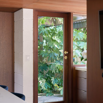
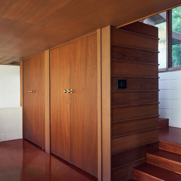
The home’s original powder room, previously accessible only through the kitchen, was relocated for better flow and privacy. A new powder room was carved out of former kitchen cabinetry—a narrow, interior space that could have felt dark and enclosed. To avoid this, the design extended the line of original transom windows into the new powder room and added a skylight above the vanity. The result is a bright and airy space that feels consistent with the rest of the home. Other updates included the installation of new solid-core interior doors with veneers carefully matched to the original mahogany, enhancing the continuity of the interiors. Even smaller decisions, such as placing the door knobs at 42 inches high, mirrored the original proportions. Every choice reflected a shared belief between the architect, contractor, and client: that new work should serve the integrity of the old.
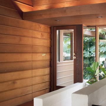
The home’s extensive interior redwood millwork and paneling was meticulously restored. Where new materials were introduced—such as the replacement redwood soffit paneling—the contractor took pains to find finish nails that matched the original, rather than using modern equivalents. This level of craftsmanship and collaboration defined the project. It extended even to the detailing of a blind door to the new powder room, which had to disappear into the existing redwood board-and-batten wall. It was a team effort: the owner found a suitable handle, the architects devised the custom in-swing mechanism, and the contractor executed it so the door aligned precisely with the battens. Throughout, the homeowners were deeply engaged in the design process. One, a meticulous design enthusiast, focused on aesthetic integrity and historic detail. The other brought a practical and function-driven perspective, ensuring that new fixtures and materials would be durable and require minimal maintenance.
While the home’s location posed no major site challenges, sustainability was a key concern. The team upgraded the roof insulation, installed solar panels with battery storage, and added ductless mini-split cooling systems. Lighting was another area where modern technology was woven into a historic framework: new square LED fixtures echo the original custom perimeter soffit lights, maintaining the design language while offering advanced performance.
A planned expansion of a bedroom into suite with a bathroom had to be shelved due to budget constraints and the high cost of below-grade foundation work. Still, the team focused their efforts on making the most of the existing footprint, resolving constraints through design ingenuity rather than adding square footage. This renovation represents a collaborative achievement in preserving and evolving a historically significant home. Every decision was shaped by a shared ethos among clients, architects, and contractor: to maintain the home’s architectural soul while updating it for contemporary life. The result is a timeless modernist residence that continues Olof Dahlstrand’s legacy, remaining grounded in nature, craftsmanship, and human-scale design.
Klopf Architecture Team: John Klopf, AIA, Klara Kevane, Fernanda Bernardes
Interior Architectural Design: Klopf Architecture
Structural Engineer: Daniel Bastiao
Contractor: Don Larwood, Larwood Construction
Photography: Mariko Reed
Year Completed: 2022
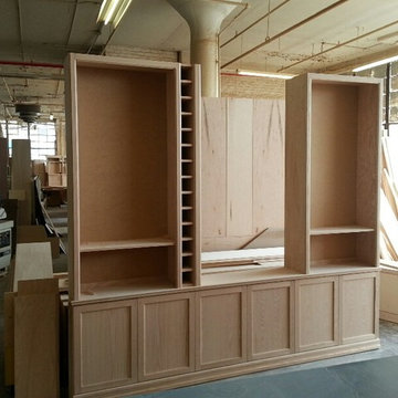
 Gothic Cabinet Craft
Gothic Cabinet Craft has made custom furniture for over 40 years. Whether you need a custom fit built-in wall unit of cabinets or a unique piece that until now has only been in your imagination, Gothic can make it for you.
With the American Dream and a lot of hard work. Gothic Cabinet Craft was started in 1969 in NYC by a Greek immigrant Theodore Zaharopoulos, who was determined to make it. With a focus on quality and affordability, our founder's designs evolved into practical storage solutions for urban areas.
The Original ™ Storage, Original ™ Platform, and Original ™ Captains beds were all developed by him and are now a common staple in all furniture stores. A family operated business, Gothic continues to offer high quality affordable furniture for every home. To back this up, Gothic is one of the only furniture companies anywhere in the world to provide a lifetime warranty. Now serving the entire US, Gothic is the largest manufacturer of unfinished furniture on the East Coast.
Gothic Cabinet Craft is a family operated business that manufacturers affordable real wood furniture for every room in your home. Stop into our stores today and experience the Gothic difference.
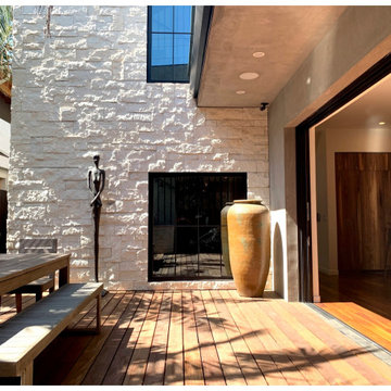
 Hoff-Genoist
We purchased this lot with an existing duplex and plans for a large addition, which transformed the property into a large 3,600 square foot “main house” with a huge roof-top deck and a 800 square foot attached guest house.
We focused primarily on the interior and exterior design, given the constraints of existing architectural plans. In the main house, we used rich natural materials and color palettes throughout, while creating a uniqueness to each space. Walnut is used generously, from the solid wood floors and custom live-edge bar, to the master vanity and feature wall. The stairs are also entirely clad in walnut to create the illusion of solid wood blocks that are dramatically separated with metal railings spanning the entire height of the 3-story stairway tower. On the exterior, teak decking creates seamless transitions from interior to exterior living spaces and contrast perfectly with the natural limestone that clads the tower and the barbeque area.
We purposely created a more playful vibe in the guest house, a sun-drenched happy space with vaulted ceilings and skylights, and a more casual yet contrasting color palette of blue-grey, black and white.
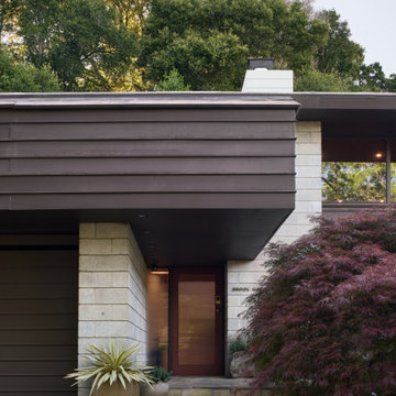 Klopf Architecture
Nestled in the hills of Orinda, California, this 1951 residence is one of only seven extant homes, now known as “The Magnificent Seven”, designed by architect Olof Dahlstrand, a protégé of Frank Lloyd Wright. With its low-slung rooflines, natural materials, and deep integration with the sloping landscape, the home is a pristine example of mid-century modern design inspired by Wright’s organic principles. Over the years, prior homeowners have emphasized preservation, ensuring that the house remained relatively untouched. Each owner has respected the original architecture and stayed true to Dahlstrand’s intent. When a family of five—two college-aged sons and a middle school-aged daughter—acquired the property, they were captivated by its history, legacy of care, and architectural significance. While they appreciated Dahlstrand’s original vision, they also recognized the need to adapt the home for contemporary living while preserving its design integrity.
The remodel was conceived as a thoughtful response to the past—an effort to bring the house into the 21st century without compromising its soul. The primary mandate was to maintain architectural continuity while improving the functionality, comfort, and livability for a modern family. The design team—architects and contractor alike—worked with a shared reverence for the original architecture, allowing that mindset to guide even the most technical or pragmatic decisions.
A key objective was to increase natural light in the kitchen—a departure from Wrightian principles of enclosed, intimate cooking spaces—while maintaining the home’s architectural language. The kitchen was reconfigured to foster a stronger connection to adjacent living spaces while retaining the underlying concept of spatial separation. One of the most transformative architectural changes was the removal of a ridge beam that was originally planned to remain visible through the kitchen. During construction, the team collaborated on a better solution: a wide-flanged steel beam concealed within the roof envelope. This subtle move preserved the clean lines and ceiling continuity, a modern update carried out with utmost respect for the existing framework.
The home’s original powder room, previously accessible only through the kitchen, was relocated for better flow and privacy. A new powder room was carved out of former kitchen cabinetry—a narrow, interior space that could have felt dark and enclosed. To avoid this, the design extended the line of original transom windows into the new powder room and added a skylight above the vanity. The result is a bright and airy space that feels consistent with the rest of the home. Other updates included the installation of new solid-core interior doors with veneers carefully matched to the original mahogany, enhancing the continuity of the interiors. Even smaller decisions, such as placing the door knobs at 42 inches high, mirrored the original proportions. Every choice reflected a shared belief between the architect, contractor, and client: that new work should serve the integrity of the old.
The home’s extensive interior redwood millwork and paneling was meticulously restored. Where new materials were introduced—such as the replacement redwood soffit paneling—the contractor took pains to find finish nails that matched the original, rather than using modern equivalents. This level of craftsmanship and collaboration defined the project. It extended even to the detailing of a blind door to the new powder room, which had to disappear into the existing redwood board-and-batten wall. It was a team effort: the owner found a suitable handle, the architects devised the custom in-swing mechanism, and the contractor executed it so the door aligned precisely with the battens. Throughout, the homeowners were deeply engaged in the design process. One, a meticulous design enthusiast, focused on aesthetic integrity and historic detail. The other brought a practical and function-driven perspective, ensuring that new fixtures and materials would be durable and require minimal maintenance.
While the home’s location posed no major site challenges, sustainability was a key concern. The team upgraded the roof insulation, installed solar panels with battery storage, and added ductless mini-split cooling systems. Lighting was another area where modern technology was woven into a historic framework: new square LED fixtures echo the original custom perimeter soffit lights, maintaining the design language while offering advanced performance.
A planned expansion of a bedroom into suite with a bathroom had to be shelved due to budget constraints and the high cost of below-grade foundation work. Still, the team focused their efforts on making the most of the existing footprint, resolving constraints through design ingenuity rather than adding square footage. This renovation represents a collaborative achievement in preserving and evolving a historically significant home. Every decision was shaped by a shared ethos among clients, architects, and contractor: to maintain the home’s architectural soul while updating it for contemporary life. The result is a timeless modernist residence that continues Olof Dahlstrand’s legacy, remaining grounded in nature, craftsmanship, and human-scale design.
Klopf Architecture Team: John Klopf, AIA, Klara Kevane, Fernanda Bernardes
Interior Architectural Design: Klopf Architecture
Structural Engineer: Daniel Bastiao
Contractor: Don Larwood, Larwood Construction
Photography: Mariko Reed
Year Completed: 2022

Sponsored
Sunbury, OH

J.Holderby - Renovations
Franklin County's Leading General Contractors - 2X Best of Houzz!
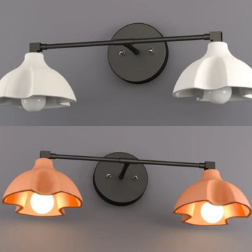
 Naaya Studio
Introducing the range of ceramic wall sconce and vanity lighting with an added touch of design exploration that took almost 6 months in the making. For these deigns, our focus was mainly to focus on clay as a material and stretch the boundaries in the field of mold making, aesthetics, technology and clay. Add a touch or dash and sustainability to your project with these hand made vanity light and sconce. With solid brass fittings these lights will last years of service with little or no maintenance.
 Klopf Architecture
Nestled in the hills of Orinda, California, this 1951 residence is one of only seven extant homes, now known as “The Magnificent Seven”, designed by architect Olof Dahlstrand, a protégé of Frank Lloyd Wright. With its low-slung rooflines, natural materials, and deep integration with the sloping landscape, the home is a pristine example of mid-century modern design inspired by Wright’s organic principles. Over the years, prior homeowners have emphasized preservation, ensuring that the house remained relatively untouched. Each owner has respected the original architecture and stayed true to Dahlstrand’s intent. When a family of five—two college-aged sons and a middle school-aged daughter—acquired the property, they were captivated by its history, legacy of care, and architectural significance. While they appreciated Dahlstrand’s original vision, they also recognized the need to adapt the home for contemporary living while preserving its design integrity.
The remodel was conceived as a thoughtful response to the past—an effort to bring the house into the 21st century without compromising its soul. The primary mandate was to maintain architectural continuity while improving the functionality, comfort, and livability for a modern family. The design team—architects and contractor alike—worked with a shared reverence for the original architecture, allowing that mindset to guide even the most technical or pragmatic decisions.
A key objective was to increase natural light in the kitchen—a departure from Wrightian principles of enclosed, intimate cooking spaces—while maintaining the home’s architectural language. The kitchen was reconfigured to foster a stronger connection to adjacent living spaces while retaining the underlying concept of spatial separation. One of the most transformative architectural changes was the removal of a ridge beam that was originally planned to remain visible through the kitchen. During construction, the team collaborated on a better solution: a wide-flanged steel beam concealed within the roof envelope. This subtle move preserved the clean lines and ceiling continuity, a modern update carried out with utmost respect for the existing framework.
The home’s original powder room, previously accessible only through the kitchen, was relocated for better flow and privacy. A new powder room was carved out of former kitchen cabinetry—a narrow, interior space that could have felt dark and enclosed. To avoid this, the design extended the line of original transom windows into the new powder room and added a skylight above the vanity. The result is a bright and airy space that feels consistent with the rest of the home. Other updates included the installation of new solid-core interior doors with veneers carefully matched to the original mahogany, enhancing the continuity of the interiors. Even smaller decisions, such as placing the door knobs at 42 inches high, mirrored the original proportions. Every choice reflected a shared belief between the architect, contractor, and client: that new work should serve the integrity of the old.
The home’s extensive interior redwood millwork and paneling was meticulously restored. Where new materials were introduced—such as the replacement redwood soffit paneling—the contractor took pains to find finish nails that matched the original, rather than using modern equivalents. This level of craftsmanship and collaboration defined the project. It extended even to the detailing of a blind door to the new powder room, which had to disappear into the existing redwood board-and-batten wall. It was a team effort: the owner found a suitable handle, the architects devised the custom in-swing mechanism, and the contractor executed it so the door aligned precisely with the battens. Throughout, the homeowners were deeply engaged in the design process. One, a meticulous design enthusiast, focused on aesthetic integrity and historic detail. The other brought a practical and function-driven perspective, ensuring that new fixtures and materials would be durable and require minimal maintenance.
While the home’s location posed no major site challenges, sustainability was a key concern. The team upgraded the roof insulation, installed solar panels with battery storage, and added ductless mini-split cooling systems. Lighting was another area where modern technology was woven into a historic framework: new square LED fixtures echo the original custom perimeter soffit lights, maintaining the design language while offering advanced performance.
A planned expansion of a bedroom into suite with a bathroom had to be shelved due to budget constraints and the high cost of below-grade foundation work. Still, the team focused their efforts on making the most of the existing footprint, resolving constraints through design ingenuity rather than adding square footage. This renovation represents a collaborative achievement in preserving and evolving a historically significant home. Every decision was shaped by a shared ethos among clients, architects, and contractor: to maintain the home’s architectural soul while updating it for contemporary life. The result is a timeless modernist residence that continues Olof Dahlstrand’s legacy, remaining grounded in nature, craftsmanship, and human-scale design.
Klopf Architecture Team: John Klopf, AIA, Klara Kevane, Fernanda Bernardes
Interior Architectural Design: Klopf Architecture
Structural Engineer: Daniel Bastiao
Contractor: Don Larwood, Larwood Construction
Photography: Mariko Reed
Year Completed: 2022
 Klopf Architecture
Nestled in the hills of Orinda, California, this 1951 residence is one of only seven extant homes, now known as “The Magnificent Seven”, designed by architect Olof Dahlstrand, a protégé of Frank Lloyd Wright. With its low-slung rooflines, natural materials, and deep integration with the sloping landscape, the home is a pristine example of mid-century modern design inspired by Wright’s organic principles. Over the years, prior homeowners have emphasized preservation, ensuring that the house remained relatively untouched. Each owner has respected the original architecture and stayed true to Dahlstrand’s intent. When a family of five—two college-aged sons and a middle school-aged daughter—acquired the property, they were captivated by its history, legacy of care, and architectural significance. While they appreciated Dahlstrand’s original vision, they also recognized the need to adapt the home for contemporary living while preserving its design integrity.
The remodel was conceived as a thoughtful response to the past—an effort to bring the house into the 21st century without compromising its soul. The primary mandate was to maintain architectural continuity while improving the functionality, comfort, and livability for a modern family. The design team—architects and contractor alike—worked with a shared reverence for the original architecture, allowing that mindset to guide even the most technical or pragmatic decisions.
A key objective was to increase natural light in the kitchen—a departure from Wrightian principles of enclosed, intimate cooking spaces—while maintaining the home’s architectural language. The kitchen was reconfigured to foster a stronger connection to adjacent living spaces while retaining the underlying concept of spatial separation. One of the most transformative architectural changes was the removal of a ridge beam that was originally planned to remain visible through the kitchen. During construction, the team collaborated on a better solution: a wide-flanged steel beam concealed within the roof envelope. This subtle move preserved the clean lines and ceiling continuity, a modern update carried out with utmost respect for the existing framework.
The home’s original powder room, previously accessible only through the kitchen, was relocated for better flow and privacy. A new powder room was carved out of former kitchen cabinetry—a narrow, interior space that could have felt dark and enclosed. To avoid this, the design extended the line of original transom windows into the new powder room and added a skylight above the vanity. The result is a bright and airy space that feels consistent with the rest of the home. Other updates included the installation of new solid-core interior doors with veneers carefully matched to the original mahogany, enhancing the continuity of the interiors. Even smaller decisions, such as placing the door knobs at 42 inches high, mirrored the original proportions. Every choice reflected a shared belief between the architect, contractor, and client: that new work should serve the integrity of the old.
The home’s extensive interior redwood millwork and paneling was meticulously restored. Where new materials were introduced—such as the replacement redwood soffit paneling—the contractor took pains to find finish nails that matched the original, rather than using modern equivalents. This level of craftsmanship and collaboration defined the project. It extended even to the detailing of a blind door to the new powder room, which had to disappear into the existing redwood board-and-batten wall. It was a team effort: the owner found a suitable handle, the architects devised the custom in-swing mechanism, and the contractor executed it so the door aligned precisely with the battens. Throughout, the homeowners were deeply engaged in the design process. One, a meticulous design enthusiast, focused on aesthetic integrity and historic detail. The other brought a practical and function-driven perspective, ensuring that new fixtures and materials would be durable and require minimal maintenance.
While the home’s location posed no major site challenges, sustainability was a key concern. The team upgraded the roof insulation, installed solar panels with battery storage, and added ductless mini-split cooling systems. Lighting was another area where modern technology was woven into a historic framework: new square LED fixtures echo the original custom perimeter soffit lights, maintaining the design language while offering advanced performance.
A planned expansion of a bedroom into suite with a bathroom had to be shelved due to budget constraints and the high cost of below-grade foundation work. Still, the team focused their efforts on making the most of the existing footprint, resolving constraints through design ingenuity rather than adding square footage. This renovation represents a collaborative achievement in preserving and evolving a historically significant home. Every decision was shaped by a shared ethos among clients, architects, and contractor: to maintain the home’s architectural soul while updating it for contemporary life. The result is a timeless modernist residence that continues Olof Dahlstrand’s legacy, remaining grounded in nature, craftsmanship, and human-scale design.
Klopf Architecture Team: John Klopf, AIA, Klara Kevane, Fernanda Bernardes
Interior Architectural Design: Klopf Architecture
Structural Engineer: Daniel Bastiao
Contractor: Don Larwood, Larwood Construction
Photography: Mariko Reed
Year Completed: 2022
 Interior Designs by Renee
David O. Marlow
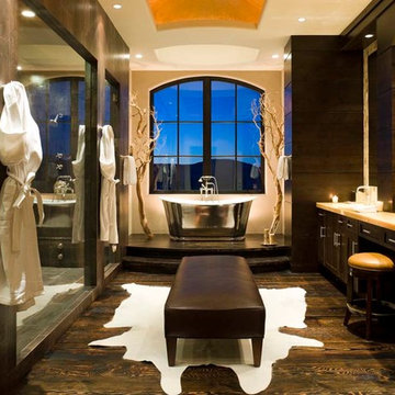
Bathroom - huge transitional master dark wood floor bathroom idea in Denver with an undermount sink, dark wood cabinets, onyx countertops, a wall-mount toilet and recessed-panel cabinets
Bathroom - huge transitional master dark wood floor bathroom idea in Denver with an undermount sink, dark wood cabinets, onyx countertops, a wall-mount toilet and recessed-panel cabinets

 Tomecek Studio Architecture
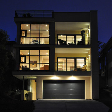
Project by Studio H:T. Principal Brad Tomecek now with Tomecek Studio Architecture. Constructed using a sophisticated German prefabrication system, this unique 40 feet wide property boasts expansive front range views. The humble transparent entry elevation is based on a series of north-south solid walls that are connected with storefront glass. This experience unfolds moving through the residence until the occupant is hovering on a deck three stories above the rear yard – ‘floating’ in the trees. Alpine residence blurs the distinction between interior and exterior space while focusing a significant amount of attention to the Flatirons. (Photos by Wilson Kauanui)

Sponsored
Columbus, OH

Hope Restoration & General Contracting
Columbus Design-Build, Kitchen & Bath Remodeling, Historic Renovations
 Simply Home Decorating
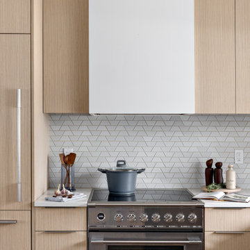
Our clients, a couple with four children, wanted to update their 1952 home with a mid-century feel, focusing on the main floor. The renovation emphasized enhancing finishes, optimizing storage, and maximizing seating in the dining and living areas. The entryway was designed to be inviting and practical, while the living room featured a statement sectional and a stunning terrazzo fireplace. The kitchen and dining area were transformed to be both functional and elegant, with playful touches like “Drunk Monkeys” wallpaper in the powder room.
 User
UserFine Focus Photography
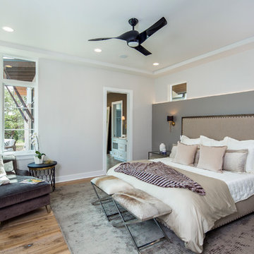
Example of a trendy master medium tone wood floor bedroom design in Austin with no fireplace
Example of a trendy master medium tone wood floor bedroom design in Austin with no fireplace
 Tomecek Studio Architecture
Project by Studio H:T. Principal Brad Tomecek now with Tomecek Studio Architecture. Constructed using a sophisticated German prefabrication system, this unique 40 feet wide property boasts expansive front range views. The humble transparent entry elevation is based on a series of north-south solid walls that are connected with storefront glass. This experience unfolds moving through the residence until the occupant is hovering on a deck three stories above the rear yard – ‘floating’ in the trees. Alpine residence blurs the distinction between interior and exterior space while focusing a significant amount of attention to the Flatirons. (Photos by Wilson Kauanui)
 InnovationLand
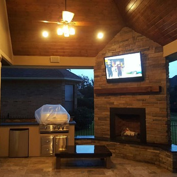
We are so excited about this stylish Houston patio addition!
It's one of our most recent outdoor living space design projects - and one of our new favorites!
We particularly love the rustic corner fireplace, the beautiful, vaulted pine ceiling and the Restoration Hardware furniture and accessories.
"Even though this space has an outdoor kitchen - often the highlight of our projects - the focus here is beautiful, comfortable outdoor living," says Outdoor Homescapes of Houston owner Wayne Franks. "And I have to say, I think this is one of the most gorgeous spaces we've created for doing that - in style."
"This project was special from the start, as we were creating this space for a friend of Wayne’s who had been a long time mentor to his boys growing up," adds Lisha Maxey, owner of LGH Designs in Houston (she coordinated furniture and finishes for the project). "This client was the principal of their high school and knew all of them very well and Wayne, too. This made it very personal, indeed, and we wanted everything to be perfect!"
The 23- by 16-foot addition, located at the back of the house in Cypress, looks out onto a manmade lake in the homeowners' subdivision. The focal point? A 9-foot-8-inch-high-by-7-foot-wide corner fireplace in Earth Grey rustic ledgestone from Colorstone in Houston. The fireplace features a custom wooden mantel, stone bench seating and a 52-inch Sunbrite outdoor TV.
Another highlight is the flooring - silver travertine tile laid out in a Versailles pattern. "We chose silver travertine in a 'Tumbled' color palette with variations of cream and brown," says Lisha. "So we had those two colors, plus grey, to pull from."
The 7-foot-long, stucco outdoor kitchen island's countertops are also noteworthy - Absolute Black granite in a leathered finish offering a modern look and a dark grey hue that works perfectly with the color palette. The kitchen island also houses an RCS 30-inch grill and fridge.
The seating area includes a sectional couch, coffee table, two swivel chairs and two ottomans - all from Restoration Hardware.
"We used Restoration Hardware's Biscayne sectional, swivel chairs and ottomans in gray, with textured linen weave in Sand and cushions and peacock accent pillows in gray," says Lisha. The coffee table is made of solid teak with a concrete top - as is the matching side table.
"We added a console table, also in teak, behind the sofa. And for accents, we added three Amalfi lanterns from Restoration Hardware in weathered zinc."
A Sunbrella® Heathered area rug (in Gray) was added to anchor the space and visually tie it together.
"The space as a whole leans towards a transitional style, in that it has many traditional cozy comforts and colors, but the furniture gives it a more contemporary look," says Lisha. "The idea from the beginning was to marry these two styles, as our clients wanted a look that would not age and be in vogue for years to come."
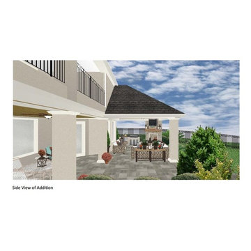
On the exterior, you can see how we worked to make the addition blend with the existing home - matching the shingles and stucco and continuing the landscaping.
3D graphic renderings and a virtual video tour allowed the clients to know exactly what the space would look like beforehand.
"It takes a lot of the guesswork out of the process," says Outdoor Homescapes' graphic designer, Kristy Buell Franks. "Floor plans and elevation drawings are good for giving an idea of the overall scope of the project, but it's the 3D renderings that really show what the space is going to look like."
The 3D graphics and video tours also help immensely when choosing finishing materials and furniture, she says: "The clients' choices can be put into the design to allow the clients to see how the materials will work with the existing materials on the house and how the furniture will look in the space."
What do you like about this space? Post a comment and let us know!

 Penny Black Interiors LLC.
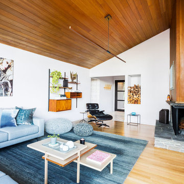
The architecture of this mid-century ranch in Portland’s West Hills oozes modernism’s core values. We wanted to focus on areas of the home that didn’t maximize the architectural beauty. The Client—a family of three, with Lucy the Great Dane, wanted to improve what was existing and update the kitchen and Jack and Jill Bathrooms, add some cool storage solutions and generally revamp the house.
We totally reimagined the entry to provide a “wow” moment for all to enjoy whilst entering the property. A giant pivot door was used to replace the dated solid wood door and side light.
We designed and built new open cabinetry in the kitchen allowing for more light in what was a dark spot. The kitchen got a makeover by reconfiguring the key elements and new concrete flooring, new stove, hood, bar, counter top, and a new lighting plan.
Our work on the Humphrey House was featured in Dwell Magazine.
 InnovationLand
We are so excited about this stylish Houston patio addition!
It's one of our most recent outdoor living space design projects - and one of our new favorites!
We particularly love the rustic corner fireplace, the beautiful, vaulted pine ceiling and the Restoration Hardware furniture and accessories.
"Even though this space has an outdoor kitchen - often the highlight of our projects - the focus here is beautiful, comfortable outdoor living," says Outdoor Homescapes of Houston owner Wayne Franks. "And I have to say, I think this is one of the most gorgeous spaces we've created for doing that - in style."
"This project was special from the start, as we were creating this space for a friend of Wayne’s who had been a long time mentor to his boys growing up," adds Lisha Maxey, owner of LGH Designs in Houston (she coordinated furniture and finishes for the project). "This client was the principal of their high school and knew all of them very well and Wayne, too. This made it very personal, indeed, and we wanted everything to be perfect!"
The 23- by 16-foot addition, located at the back of the house in Cypress, looks out onto a manmade lake in the homeowners' subdivision. The focal point? A 9-foot-8-inch-high-by-7-foot-wide corner fireplace in Earth Grey rustic ledgestone from Colorstone in Houston. The fireplace features a custom wooden mantel, stone bench seating and a 52-inch Sunbrite outdoor TV.
Another highlight is the flooring - silver travertine tile laid out in a Versailles pattern. "We chose silver travertine in a 'Tumbled' color palette with variations of cream and brown," says Lisha. "So we had those two colors, plus grey, to pull from."
The 7-foot-long, stucco outdoor kitchen island's countertops are also noteworthy - Absolute Black granite in a leathered finish offering a modern look and a dark grey hue that works perfectly with the color palette. The kitchen island also houses an RCS 30-inch grill and fridge.
The seating area includes a sectional couch, coffee table, two swivel chairs and two ottomans - all from Restoration Hardware.
"We used Restoration Hardware's Biscayne sectional, swivel chairs and ottomans in gray, with textured linen weave in Sand and cushions and peacock accent pillows in gray," says Lisha. The coffee table is made of solid teak with a concrete top - as is the matching side table.
"We added a console table, also in teak, behind the sofa. And for accents, we added three Amalfi lanterns from Restoration Hardware in weathered zinc."
A Sunbrella® Heathered area rug (in Gray) was added to anchor the space and visually tie it together.
"The space as a whole leans towards a transitional style, in that it has many traditional cozy comforts and colors, but the furniture gives it a more contemporary look," says Lisha. "The idea from the beginning was to marry these two styles, as our clients wanted a look that would not age and be in vogue for years to come."
On the exterior, you can see how we worked to make the addition blend with the existing home - matching the shingles and stucco and continuing the landscaping.
3D graphic renderings and a virtual video tour allowed the clients to know exactly what the space would look like beforehand.
"It takes a lot of the guesswork out of the process," says Outdoor Homescapes' graphic designer, Kristy Buell Franks. "Floor plans and elevation drawings are good for giving an idea of the overall scope of the project, but it's the 3D renderings that really show what the space is going to look like."
The 3D graphics and video tours also help immensely when choosing finishing materials and furniture, she says: "The clients' choices can be put into the design to allow the clients to see how the materials will work with the existing materials on the house and how the furniture will look in the space."
What do you like about this space? Post a comment and let us know!
URL http://www.outdoorhomescapes.com
 Penny Black Interiors LLC.
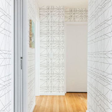
The architecture of this mid-century ranch in Portland’s West Hills oozes modernism’s core values. We wanted to focus on areas of the home that didn’t maximize the architectural beauty. The Client—a family of three, with Lucy the Great Dane, wanted to improve what was existing and update the kitchen and Jack and Jill Bathrooms, add some cool storage solutions and generally revamp the house.
We totally reimagined the entry to provide a “wow” moment for all to enjoy whilst entering the property. A giant pivot door was used to replace the dated solid wood door and side light.
We designed and built new open cabinetry in the kitchen allowing for more light in what was a dark spot. The kitchen got a makeover by reconfiguring the key elements and new concrete flooring, new stove, hood, bar, counter top, and a new lighting plan.
Our work on the Humphrey House was featured in Dwell Magazine.
34