
Search results for "Solutions play" in Home Design Ideas
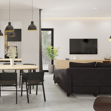
 Ferriss - Architectural Renderings
Here are some practical tips for creating a beautiful, comfortable and thoughtful living room design.
The living room in the house is the place where, as the name suggests, receives guests. However, the owners themselves relax here, spending time in front of the TV or a book, with drinks, pleasant conversation and other activities. Therefore, the living room should be the most comfortable place in your home.
The place of the sofa in the design of the living room
The sofa does not need to be placed in a draft. This means that it should not be on an imaginary line from window to door - if you drew a floor plan, it will just be easy to trace.
1. The sofa in front of the TV, diagonally from the door, is a great location. As if inviting you to sit down :)
2. Sofa near the door. A good solution if you often have overnight guests.
3. Corner sofa in the living room. Best placed in the farthest corner from the door. This will make the room look more spacious.
Correct opening of the door in the living room. Inward or outward?
Open inward or outward? There is no clear rule here, because everything depends on the layout and on the furniture placed. The main thing is that the door leaf opens freely and does not interfere with entering and exiting the room. Also, the door should not interfere with free access to the closet or dressing room.
TV in living room size and location. Location.
The TV is placed on the wall opposite to the sofa - this is the most logical and reasonable place for it in the living room. Moreover, the distance to it does not really matter: modern TV models can be placed close to the sofa.
Cabinet or bracket? To your taste. The main thing is that the television zone looks neat and presentable. Provide in advance a cable channel in which all the wires and numerous sockets for the receiver, modem, set-top box, sound bar will hide. Nothing spoils a design like sticking wires!
Height from the floor. It is optimal to place the TV 1 m from the floor to the middle of the screen - this is exactly the level of the eyes of a seated person.
Diagonal size. If there is a financial opportunity, consider options from 50 inches - smaller screens look lonely and lonely on an empty wall.
Living room furniture.
Armchair. Often the chair becomes an accent item in the interior, then its shade, and sometimes its shape, differ from the rest of the furniture. When choosing a chair, be guided also by your habits: for example, it will be more convenient to climb up with your feet and read a book in an armchair with dimensions of 90x90 cm, and you can “just sit comfortably” in a fireplace chair with a high back, comfortable armrests and with a seat 80x80 cm.
TV stand. Large TV stands are no longer as relevant as they used to be, when it was necessary to store a player, cassettes and discs there. For now, a console table or a narrow elegant pedestal is enough.
Coffee table. Nice piece of furniture that creates a cozy atmosphere. Some models, if necessary, can be transformed into a more spacious table for receiving guests - however, finding comfortable and beautiful specimens is not easy, plus they usually cost a lot.
Rack. An extremely useful type of furniture. :) Firstly, a large number of decor items can be beautifully placed on the rack. And secondly, it can also play the role of a light through partition, which divides the room into zones and does not select light at the same time. This is a very big plus for small apartments.
Fireplace. Here we are talking about electric fireplaces. Some of them come with a humidifier and heated, so 3-in-1 models can be very helpful. Fireplace portals have different styles: classic, antique, modern. Inconsistency with the general style of the living room can greatly spoil the impression of the room, so be careful with creativity. Sizing is an important issue. A large wall with a high ceiling also needs a proportionate fireplace; in horror, a small portal will look lonely and ridiculous.
What do you think about our new living room project?
https://www.ferriss.co
#ferriss #We_bring_objects_to_life #3drendering #architecture #San_Francisco


 Vintage Elements LLC
Reclaimed weathered barn siding wall paneling perfectly terminates into the grey limestone floor without the need of baseboards.
Small tuscan 3/4 gray tile and stone tile limestone floor bathroom photo with flat-panel cabinets, black cabinets, marble countertops, a two-piece toilet and white walls
Small tuscan 3/4 gray tile and stone tile limestone floor bathroom photo with flat-panel cabinets, black cabinets, marble countertops, a two-piece toilet and white walls
Find the right local pro for your project
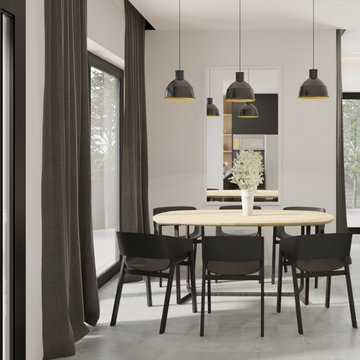 Ferriss - Architectural Renderings
Here are some practical tips for creating a beautiful, comfortable and thoughtful living room design.
The living room in the house is the place where, as the name suggests, receives guests. However, the owners themselves relax here, spending time in front of the TV or a book, with drinks, pleasant conversation and other activities. Therefore, the living room should be the most comfortable place in your home.
The place of the sofa in the design of the living room
The sofa does not need to be placed in a draft. This means that it should not be on an imaginary line from window to door - if you drew a floor plan, it will just be easy to trace.
1. The sofa in front of the TV, diagonally from the door, is a great location. As if inviting you to sit down :)
2. Sofa near the door. A good solution if you often have overnight guests.
3. Corner sofa in the living room. Best placed in the farthest corner from the door. This will make the room look more spacious.
Correct opening of the door in the living room. Inward or outward?
Open inward or outward? There is no clear rule here, because everything depends on the layout and on the furniture placed. The main thing is that the door leaf opens freely and does not interfere with entering and exiting the room. Also, the door should not interfere with free access to the closet or dressing room.
TV in living room size and location. Location.
The TV is placed on the wall opposite to the sofa - this is the most logical and reasonable place for it in the living room. Moreover, the distance to it does not really matter: modern TV models can be placed close to the sofa.
Cabinet or bracket? To your taste. The main thing is that the television zone looks neat and presentable. Provide in advance a cable channel in which all the wires and numerous sockets for the receiver, modem, set-top box, sound bar will hide. Nothing spoils a design like sticking wires!
Height from the floor. It is optimal to place the TV 1 m from the floor to the middle of the screen - this is exactly the level of the eyes of a seated person.
Diagonal size. If there is a financial opportunity, consider options from 50 inches - smaller screens look lonely and lonely on an empty wall.
Living room furniture.
Armchair. Often the chair becomes an accent item in the interior, then its shade, and sometimes its shape, differ from the rest of the furniture. When choosing a chair, be guided also by your habits: for example, it will be more convenient to climb up with your feet and read a book in an armchair with dimensions of 90x90 cm, and you can “just sit comfortably” in a fireplace chair with a high back, comfortable armrests and with a seat 80x80 cm.
TV stand. Large TV stands are no longer as relevant as they used to be, when it was necessary to store a player, cassettes and discs there. For now, a console table or a narrow elegant pedestal is enough.
Coffee table. Nice piece of furniture that creates a cozy atmosphere. Some models, if necessary, can be transformed into a more spacious table for receiving guests - however, finding comfortable and beautiful specimens is not easy, plus they usually cost a lot.
Rack. An extremely useful type of furniture. :) Firstly, a large number of decor items can be beautifully placed on the rack. And secondly, it can also play the role of a light through partition, which divides the room into zones and does not select light at the same time. This is a very big plus for small apartments.
Fireplace. Here we are talking about electric fireplaces. Some of them come with a humidifier and heated, so 3-in-1 models can be very helpful. Fireplace portals have different styles: classic, antique, modern. Inconsistency with the general style of the living room can greatly spoil the impression of the room, so be careful with creativity. Sizing is an important issue. A large wall with a high ceiling also needs a proportionate fireplace; in horror, a small portal will look lonely and ridiculous.
What do you think about our new living room project?
https://www.ferriss.co
#ferriss #We_bring_objects_to_life #3drendering #architecture #San_Francisco

 Ecoworkz Inc.
Giant Artificial Grass Chess Board installation using two different types of Artificial Putting Green material.
Design ideas for a large traditional full sun backyard stone outdoor basketball/tennis/multi-game court in Orange County.
Design ideas for a large traditional full sun backyard stone outdoor basketball/tennis/multi-game court in Orange County.

 Premier Builder
This was a full-gut kitchen renovation that included removing a load bearing wall to expand into an adjacent room.
Small transitional l-shaped medium tone wood floor and brown floor eat-in kitchen photo with a double-bowl sink, shaker cabinets, gray cabinets, quartz countertops, white backsplash, subway tile backsplash, stainless steel appliances, no island and white countertops
Small transitional l-shaped medium tone wood floor and brown floor eat-in kitchen photo with a double-bowl sink, shaker cabinets, gray cabinets, quartz countertops, white backsplash, subway tile backsplash, stainless steel appliances, no island and white countertops

 User
Modern compact design features full length concealed handles to open double doors. Constructed from solid hard maple and maple plywood (unit 40”w X 33”d X 93”h). Interior with single clothes rod and four pull out trays to hold up to 40 pairs of shoes and boots.
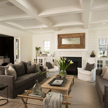


 DZINE
FLOS | IC Lights floor lamp by Michael Anastassiades
Home design - contemporary home design idea in San Francisco
Home design - contemporary home design idea in San Francisco

 Shannon Adamson Interior Design
This ski-in, ski-out condo features a strong Arts and Crafts influence. The interiors feature reclaimed oak floors, mortise-and-tenon carpentry, stone, and custom period details.

 Accoya Wood
DILLON KYLE ARCHITECTS OFFICE BUILDING GIVES THE WOW FACTOR WITH ACCOYA
PROJECT DETAILS
Building Type: Office Building
Completed: 2018
Architect: Dillon Kyle Architects
Supplier: Universal Forest Products
Millwork Shop: S&S Constructors
Installer: Arista Construction
Over the years, the Houston Museum District located in the Montrose neighborhood has morphed from a residential area into a lively art district, home to art galleries, museums, and aesthetically distinct buildings. When Dillon Kyle Architects set out to design their new office space across the street from the Houston Center for Photography, they needed creative solutions to fit a 5,000 square foot building plus parking on the lot’s small unique space.
The three-story building takes the form of an inverted L, a configuration that allows for maximized parking on the narrow corner lot. The cantilever space was built to shade the cars from the hot Texas sun, while also creating a semi-public place that invites pedestrians to interact with the space and peer inside as they walk through the neighborhood.
The interior design includes open ceilings, concrete walls, wood floors, residential scale furnishings and rugs and warm, neutral colors for a more industrial tone. The exterior has a commercial boxy look, so the team looked for creative cladding finishes to wrap the building and also serve as a rainscreen. After dismissing glass and papier-mâché options, the team settled on wood – Accoya® wood. “The idea was to use a material where you couldn’t tell where the patterns started and stopped, just one big continuous object,” said Peter Klein, architect at DKA.
An abstract leaf-like pattern is carved into 2,500 eight-foot long by eight-inches tall and 11/16-inches in depth, Accoya wood boards wrapping the entire building. The leaf pattern serves as a gentle reference to the live oak trees that line the neighborhood. The rainscreen is made of G80 galvanized steel sheets offset from the building with the Accoya leaf boards attached to it. “We settled on wood, and specifically Accoya wood, because it is easy to mill, and we knew we were going to leave it unsealed,” said Klein.
Because DKA had time, they inadvertantly put Accoya wood to the test by installing a four foot by eight foot sample wall on site. They watched the sample weather to a nice gray patina, which was the desired result. “Even left untreated, it didn’t warp or mildew or mold, and that let us know we were on the right path,” added Klein. The neutral gray tones coupled with its longterm durability, resistance to rot and insects made Accoya wood the ideal material for this project.
The Accoya wood pieces were milled using a CNC machine, which programmed the patterns. Arista Construction and its crew installed the pieces and they “knocked it out of the park,” according to DKA Architects


 Floors To Go
Beautiful dark hardwood stair installation
Staircase - traditional staircase idea in Miami
Staircase - traditional staircase idea in Miami
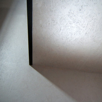
 Farbica
The transparent silver shimmer transforms the yellowish OSB-structure in cool and glamorous rooms.
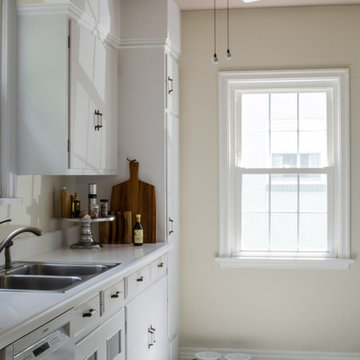
Sponsored
Columbus, OH

Wannemacher Interiors
Customized Award-Winning Interior Design Solutions in Franklin Cnty OH

 cityhomeCOLLECTIVE
Example of a mid-sized eclectic open concept carpeted living room design in Salt Lake City with white walls

 Tonic Interiors
Original tile with pinstripe detail and original sink.
Mosaic hex porcelain floor tile.
Vintage-style mirror.
Art deco wallpaper.
Crystal globe light fixture.
Marble threshold.

 Eastside Kitchen & Bath
Drew Bauer
Mid-sized trendy master white tile and ceramic tile ceramic tile and brown floor corner bathtub photo in Seattle with shaker cabinets, gray cabinets, gray walls, an undermount sink, quartz countertops, a hinged shower door and white countertops
Mid-sized trendy master white tile and ceramic tile ceramic tile and brown floor corner bathtub photo in Seattle with shaker cabinets, gray cabinets, gray walls, an undermount sink, quartz countertops, a hinged shower door and white countertops


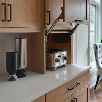
 Drury Design
The Setup:
After purchasing this home, the homeowners faced a unique opportunity to reimagine their kitchen and nearby spaces. Water damage from a burst pipe had left much of the home’s interior in need of repair, and while the existing kitchen was functional and in relatively good shape, it didn’t align with the family’s vision for their new home. The layout included a peninsula that wasn’t ideal, and there were some druthers with the nearby pantry.
Since the space needed to be rebuilt anyway, the homeowners saw this as a chance to create a kitchen that was both highly functional for their four young children and timeless in its design. The project also included a refresh of the adjacent message center and dining room — spaces that play key roles in the family’s daily life. The goal was to create a cohesive flow between these areas, balancing modern functionality with the craftsman-inspired character of the rest of the home.
Design Objectives:
- Replace the outdated peninsula with a large island to maximize counter space and create new seating options.
- Open up the space visually by removing soffits and rethinking the cabinetry layout.
Incorporate concealed refrigeration and freezer units to provide significant storage for the family while maintaining a streamlined aesthetic.
- Integrate black cabinetry into the design without making the space feel harsh or heavy.
- Ensure the lighting plan balances functional task lighting with ambient accent lighting.
- Avoid visual clutter in the cabinetry design while still giving a nod to the craftsman aesthetic.
- Incorporate a slab backsplash as a key design feature.
Design Challenges:
- The outdated peninsula left dead space in the kitchen and lacked sufficient seating for the family.
- The cooktop wall was cramped, with small cabinets flanking the hood, limited storage, and soffits that made the space feel closed-in.
- The family needed significant refrigeration space (two refrigerators and a freezer) but wanted to avoid a cluttered look with visible stainless steel appliances.
- Adding black cabinetry risked making the space feel too dark or heavy.
- The original lighting plan was insufficient, particularly over the dining table where a decorative fixture proved too dim.
- The family wanted shaker-style drawer fronts to match the home’s arts-and-crafts design but worried that too much shaker cabinetry might look overly busy.
- Prioritizing a slab backsplash in the wish list priority planning.
The Renewed Space
Design Solutions:
- A functional island: The peninsula was replaced with a large island that provides continuous countertop space for prepping and serving. The island also features seating for four people, creating a central hub for informal meals and activities.
- Streamlined cooktop wall: The soffits were removed, and the upper cabinets on the cooktop wall were eliminated to create a more open, streamlined design. A custom oversized hood became the focal point of the wall, with the blower unit offset inside it to align with the cooktop while maintaining exterior visual symmetry.
- Concealed refrigeration: Two column refrigerators and one freezer were integrated into the cabinetry, concealing them behind wood paneling that blends seamlessly with the overall design.
- Warm black cabinetry: The black cabinetry was crafted from hickory with a visible grain, softening its appearance and adding warmth. The grain detail gives the cabinetry a rich, textured look that avoids feeling stark or overpowering.
- Additional lighting: In the dining area, recessed can lights were added during an additional installation phase to supplement the gorgeous decorative fixture’s dim output. The new lighting plan creates a layered effect, combining functional task lighting with softer ambient lighting.
- Simplified cabinetry details: Slab drawer fronts were used on the upper drawers, while five-piece shaker fronts (with slightly less prominent rail and stile pieces) were reserved for the middle and lower drawers. This approach simplified the overall look while maintaining the craftsman-inspired aesthetic.
- Slab backsplash priority: The slab backsplash was prioritized by making thoughtful adjustments elsewhere, like opting not to extend cabinetry to the ceiling, which also helped visually prioritize the gorgeous slab backsplash. This decision also enhanced the kitchen’s furniture-like feel, aligning with the home’s craftsman character.
- This kitchen perfectly balances practicality with timeless style. By addressing the family’s functional needs — ample seating, smart storage, and effective lighting — while incorporating thoughtful design elements like warm black cabinetry and a striking slab backsplash, Alicia created a space that works beautifully for a busy household. The result is a cohesive, inviting kitchen that honors the home’s craftsman roots and will serve the family well for years to come.
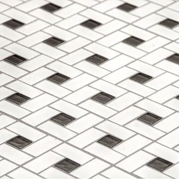
 Carolina Craftsman Builders
 is a Craftsman Style Custom Home Builder in Charlotte, North Carolina. Neighborhoods Chantilly, Elizabeth, Plaza Midwood, Dilworth, and NoDa's Builder, Specializing in New Construction Custom Homes, Remodeling, Renovations, and Design.
157