
Search results for "Space optimization" in Home Design Ideas
 Saikley Architects
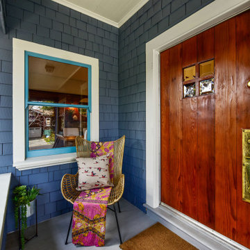
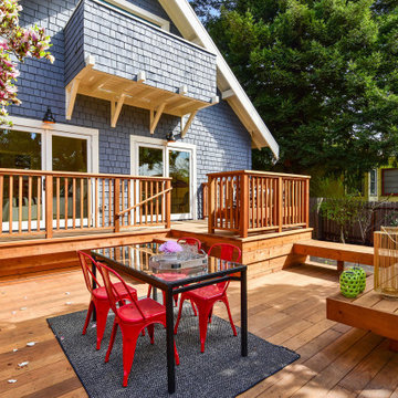
We updated this 1907 two-story family home for re-sale. We added modern design elements and amenities while retaining the home’s original charm in the layout and key details. The aim was to optimize the value of the property for a prospective buyer, within a reasonable budget.
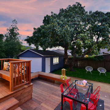
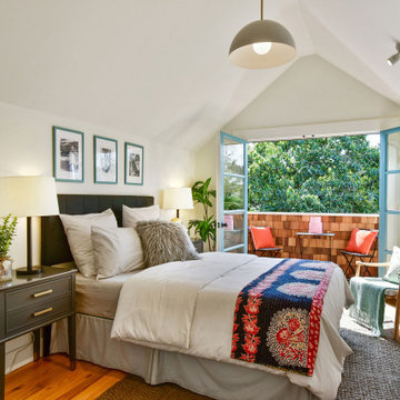
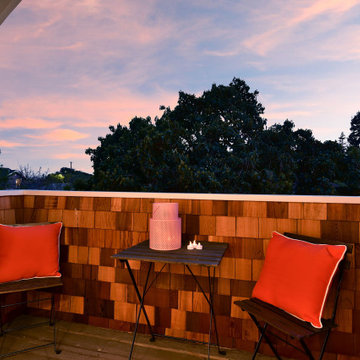
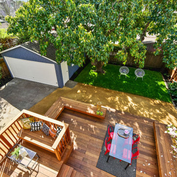
New French doors from kitchen and a rear bedroom open out to a new bi-level deck that allows good sight lines, functional outdoor living space, and easy access to a garden full of mature fruit trees. French doors from an upstairs bedroom open out to a private high deck overlooking the garden. The garage has been converted to a family room that opens to the garden.
The bathrooms and kitchen were remodeled the kitchen with simple, light, classic materials and contemporary lighting fixtures. New windows and skylights flood the spaces with light. Stained wood windows and doors at the kitchen pick up on the original stained wood of the other living spaces.
New redwood picture molding was created for the living room where traces in the plaster suggested that picture molding has originally been. A sweet corner window seat at the living room was restored. At a downstairs bedroom we created a new plate rail and other redwood trim matching the original at the dining room. The original dining room hutch and woodwork were restored and a new mantel built for the fireplace.
We built deep shelves into space carved out of the attic next to upstairs bedrooms and added other built-ins for character and usefulness. Storage was created in nooks throughout the house. A small room off the kitchen was set up for efficient laundry and pantry space.
We provided the future owner of the house with plans showing design possibilities for expanding the house and creating a master suite with upstairs roof dormers and a small addition downstairs. The proposed design would optimize the house for current use while respecting the original integrity of the house.
Photography: John Hayes, Open Homes Photography
https://saikleyarchitects.com/portfolio/classic-craftsman-update/
 Irene Designs
Home Remodeling Project Overview
This extensive home remodeling project transformed a dated and inefficient layout into a functional, open, and aesthetically cohesive living space. The original layout had several challenges:
• A kitchen with limited storage, no cabinets on the window side, a sink facing the wall, and a range crammed into the corner. The pantry closet was too deep and impractical.
• A living room that couldn’t accommodate furniture without interfering with traffic flow.
• A front foyer with wasted space.
• A claustrophobic hallway toilet room without a sink, located near the laundry room.
The Remodeling Concept
The scope of this project extended well beyond the kitchen. We proposed several layout options to address issues in all adjacent spaces, ultimately implementing a plan that:
• Removed two walls and moved doorways.
• Replaced the kitchen window.
• Converted the hallway toilet room into a storage space.
• Installed pocket doors to separate the laundry hallway from the living room.
Kitchen Transformation
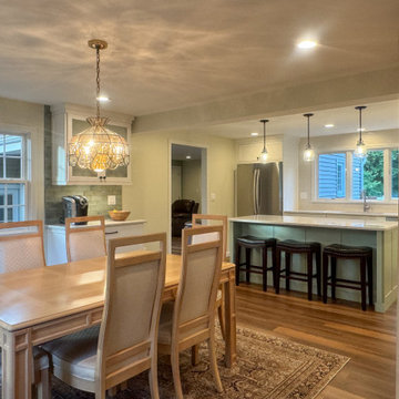
• Open Concept: By removing the wall between the kitchen and dining room, the two spaces became a seamless open area.
• New Layout: Cabinets were relocated to the window side for more storage and natural light. A central island with storage and seating was added, and a coffee bar was installed in the dining room.
• Updated Pantry: The deep pantry closet was converted into a pullout pantry with a cabinet front for better accessibility.
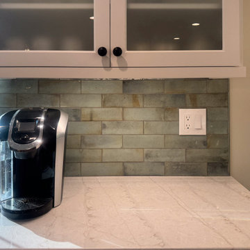
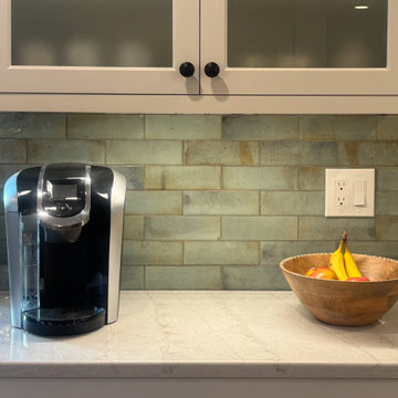
• Design Details: Off-white kitchen cabinets pair beautifully with a light green island. Warm white quartz counters and an artisan tile backsplash complete the look.
Dining Room
• Expanded Space: Most of the wall separating the dining room and foyer was removed, creating a more spacious area while still accommodating all furniture thanks to careful measurements.
Living Room Improvements
• Optimized Layout: Moving doorways and installing pocket doors allowed for better furniture placement, including a sofa that doesn’t interfere with traffic flow.
• Fireplace Upgrade: The brick fireplace was updated with a three-dimensional staggered stone veneer in a color matching the kitchen cabinets, creating a cohesive look. A TV was installed above the fireplace at a comfortable viewing angle.
Additional Updates
• New Flooring: All remodeled rooms now feature updated flooring.
• Ceilings: Popcorn ceilings were replaced with smooth, flat finishes, complemented by recessed lighting.
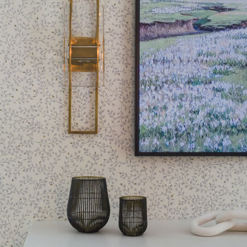
• Walls: Fresh paint throughout the space, with an accent wall in the living room matching the light green of the kitchen island.
• Lighting: Stylish sconces were added for a touch of elegance.
The Result
The homeowners are thrilled with the transformation, marveling at how their once cramped and inefficient home now feels spacious, functional, and beautifully cohesive. They can’t believe their house could ever look like this!
 Saikley Architects
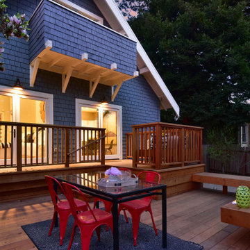
We updated this 1907 two-story family home for re-sale. We added modern design elements and amenities while retaining the home’s original charm in the layout and key details. The aim was to optimize the value of the property for a prospective buyer, within a reasonable budget.
New French doors from kitchen and a rear bedroom open out to a new bi-level deck that allows good sight lines, functional outdoor living space, and easy access to a garden full of mature fruit trees. French doors from an upstairs bedroom open out to a private high deck overlooking the garden. The garage has been converted to a family room that opens to the garden.
The bathrooms and kitchen were remodeled the kitchen with simple, light, classic materials and contemporary lighting fixtures. New windows and skylights flood the spaces with light. Stained wood windows and doors at the kitchen pick up on the original stained wood of the other living spaces.
New redwood picture molding was created for the living room where traces in the plaster suggested that picture molding has originally been. A sweet corner window seat at the living room was restored. At a downstairs bedroom we created a new plate rail and other redwood trim matching the original at the dining room. The original dining room hutch and woodwork were restored and a new mantel built for the fireplace.
We built deep shelves into space carved out of the attic next to upstairs bedrooms and added other built-ins for character and usefulness. Storage was created in nooks throughout the house. A small room off the kitchen was set up for efficient laundry and pantry space.
We provided the future owner of the house with plans showing design possibilities for expanding the house and creating a master suite with upstairs roof dormers and a small addition downstairs. The proposed design would optimize the house for current use while respecting the original integrity of the house.
Photography: John Hayes, Open Homes Photography
https://saikleyarchitects.com/portfolio/classic-craftsman-update/
Find the right local pro for your project
 Drury Design
The Setup
When our clients decided to remodel their primary bathroom, the goal was to transform the space into a brighter, more open retreat tailored to their needs. The previous layout, with its enclosed zones and limited functionality, no longer met their needs. By reimagining the layout and introducing thoughtful design choices, we created a modern, elegant bathroom that serves their current and future lifestyle.
Design objectives:
- Create a brighter, more open bathroom while maintaining privacy.
- Provide functional storage solutions without relying on the old linen closet.
- Incorporate a freestanding tub, large shower, and a makeup area for added versatility.
- Retain natural light from existing windows.
- Introduce elegant finishes and accents for a timeless aesthetic.
The Remodel
Design challenges to be solved:
- Reconfiguring the layout while keeping the existing plumbing for the toilet.
- Creating storage that houses everything that resided within the linen closet.
- Designing clearance and functionality for a freestanding tub, shower, and makeup area within the limited space.
- Accommodating the client’s desire for a pocket door in the commode room despite spatial constraints.
Introducing accent tile and cabinetry colors that align with the client’s vision yet maintain a cohesive look with the rest of the home.
The Renewed Space
Design solutions:
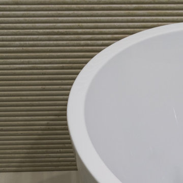
- Reimagined Layout: Moved the shower from the back of the room, creating a more open feel with additional glass while preserving privacy with a wing wall and bench. The freestanding tub was angled to optimize space and enhance circulation, with textured tile behind it adding visual interest.
- Efficient Storage: Eliminated the original linen closet and incorporated functional base cabinet storage and a designated makeup area for added utility.
- Optimized Access: Adjusted the depth of the makeup vanity to provide sufficient walkway clearance, ensuring a comfortable flow around the tub.
- Tailored Features: Installed a smaller pocket door in the commode room to resolve framing and plumbing limitations.
- Elegant Accents: Introduced a subtle marble herringbone mosaic tile in the shower and textured tile behind the tub to enhance the monochromatic palette. Painted cabinetry in a dark gray finish provided a bold yet refined contrast to the light countertops.
Final Thoughts:
The reimagined primary bathroom is a true reflection of the client’s needs and style preferences. By thoughtfully reworking the layout and incorporating functional yet elegant design elements, we created a serene and practical space that serves as a personal retreat. The result is a timeless bathroom that supports their busy lifestyle while providing moments of tranquility.
 Saikley Architects
We updated this 1907 two-story family home for re-sale. We added modern design elements and amenities while retaining the home’s original charm in the layout and key details. The aim was to optimize the value of the property for a prospective buyer, within a reasonable budget.
New French doors from kitchen and a rear bedroom open out to a new bi-level deck that allows good sight lines, functional outdoor living space, and easy access to a garden full of mature fruit trees. French doors from an upstairs bedroom open out to a private high deck overlooking the garden. The garage has been converted to a family room that opens to the garden.
The bathrooms and kitchen were remodeled the kitchen with simple, light, classic materials and contemporary lighting fixtures. New windows and skylights flood the spaces with light. Stained wood windows and doors at the kitchen pick up on the original stained wood of the other living spaces.
New redwood picture molding was created for the living room where traces in the plaster suggested that picture molding has originally been. A sweet corner window seat at the living room was restored. At a downstairs bedroom we created a new plate rail and other redwood trim matching the original at the dining room. The original dining room hutch and woodwork were restored and a new mantel built for the fireplace.
We built deep shelves into space carved out of the attic next to upstairs bedrooms and added other built-ins for character and usefulness. Storage was created in nooks throughout the house. A small room off the kitchen was set up for efficient laundry and pantry space.
We provided the future owner of the house with plans showing design possibilities for expanding the house and creating a master suite with upstairs roof dormers and a small addition downstairs. The proposed design would optimize the house for current use while respecting the original integrity of the house.
Photography: John Hayes, Open Homes Photography
https://saikleyarchitects.com/portfolio/classic-craftsman-update/
 Drury Design
The Setup
After 25+ years in their home, these long-time clients were ready to upgrade their outdated primary bath into something more modern, functional, and reflective of their personal taste. The original space had all the hallmarks of a ’90s builder-grade bathroom — bulky built-in tub, undersized shower, and a layout that wasn’t making the most of the square footage. With the kids grown and a successful kitchen remodel already under their belt, the couple returned to Drury Design for a complete bathroom transformation.
Design objectives:
Create a contemporary, personalized retreat with clean lines and a calming palette
Incorporate the husband’s favorite color (blue) in a bold but tasteful way
Add more efficient storage, including a long-desired linen closet
Improve lighting and ventilation
Make better use of space, especially in the old tub-and-shower zone
Maintain dual sinks and a dedicated makeup area
Add heated floors for extra comfort
The Remodel
Design challenges to be solved:
Reimagine a large but awkward separate shower/tub room to feel more intentional and spa-like
Integrate bold color in a way that felt stylish, not overpowering
Combine two previously separate sinks into one shared vanity without losing the “his and hers” feel
Maintain a sense of flow and cohesion across two adjoining zones of the bathroom
Create a makeup area that feels set apart without breaking design continuity
Maximize comfort in winter without dramatically inflating the project budget
The Renewed Space
Design solutions:
Shifted the location of the tub and expanded the shower to reconfigure the secondary room into a functional spa space; introduced floating shelves and a linen cabinet to tie it all together
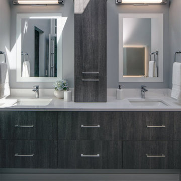
Let the rich blue shower tile take center stage as a statement piece while keeping the rest of the palette subdued and modern with layered grays
Centered a tall cabinet between the two sinks to provide extra storage and gently divide the shared vanity wall into his-and-hers zones
Chose a freestanding-style tub that installs flush against the wall—preserving the aesthetic while optimizing space and maximizing flow between rooms
Added subtle glam touches — like jewelry-inspired drawer pulls — at the makeup station to give it identity without disrupting the flow
Installed heated floors with programmable settings, offering hotel-level comfort without blowing the budget
Final Thoughts:
The finished space is a stylish blend of utility and serenity. Clean lines, modern finishes, and pops of bold color reflect the homeowners’ taste without overwhelming the design. What was once a dated, underused space is now a calm, contemporary retreat with thoughtful details throughout – from the integrated makeup zone to the just-right splash of color and the luxurious heated floors. Another successful collaboration with Drury Design, this project proves that remodeling isn’t just about resale — it’s about finally getting the space you’ve always wanted, and loving it every day.
 Irene Designs
Home Remodeling Project Overview
This extensive home remodeling project transformed a dated and inefficient layout into a functional, open, and aesthetically cohesive living space. The original layout had several challenges:
• A kitchen with limited storage, no cabinets on the window side, a sink facing the wall, and a range crammed into the corner. The pantry closet was too deep and impractical.
• A living room that couldn’t accommodate furniture without interfering with traffic flow.
• A front foyer with wasted space.
• A claustrophobic hallway toilet room without a sink, located near the laundry room.
The Remodeling Concept
The scope of this project extended well beyond the kitchen. We proposed several layout options to address issues in all adjacent spaces, ultimately implementing a plan that:
• Removed two walls and moved doorways.
• Replaced the kitchen window.
• Converted the hallway toilet room into a storage space.
• Installed pocket doors to separate the laundry hallway from the living room.
Kitchen Transformation
• Open Concept: By removing the wall between the kitchen and dining room, the two spaces became a seamless open area.
• New Layout: Cabinets were relocated to the window side for more storage and natural light. A central island with storage and seating was added, and a coffee bar was installed in the dining room.
• Updated Pantry: The deep pantry closet was converted into a pullout pantry with a cabinet front for better accessibility.
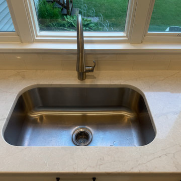
• Design Details: Off-white kitchen cabinets pair beautifully with a light green island. Warm white quartz counters and an artisan tile backsplash complete the look.
Dining Room
• Expanded Space: Most of the wall separating the dining room and foyer was removed, creating a more spacious area while still accommodating all furniture thanks to careful measurements.
Living Room Improvements
• Optimized Layout: Moving doorways and installing pocket doors allowed for better furniture placement, including a sofa that doesn’t interfere with traffic flow.
• Fireplace Upgrade: The brick fireplace was updated with a three-dimensional staggered stone veneer in a color matching the kitchen cabinets, creating a cohesive look. A TV was installed above the fireplace at a comfortable viewing angle.
Additional Updates
• New Flooring: All remodeled rooms now feature updated flooring.
• Ceilings: Popcorn ceilings were replaced with smooth, flat finishes, complemented by recessed lighting.
• Walls: Fresh paint throughout the space, with an accent wall in the living room matching the light green of the kitchen island.
• Lighting: Stylish sconces were added for a touch of elegance.
The Result
The homeowners are thrilled with the transformation, marveling at how their once cramped and inefficient home now feels spacious, functional, and beautifully cohesive. They can’t believe their house could ever look like this!
Sponsored
Columbus, OH
Free consultation for landscape design!

Peabody Landscape Group
Franklin County's Reliable Landscape Design & Contracting
 VDT Construction
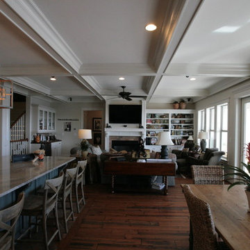
The kitchen has coffered ceilings and a large kitchen island. The cabinets have plenty of storage space and a custom look with beautiful shaker style cabinet doors. An open floor plan to maximize space and large windows provide a bright space with optimal views. Designed by Bob Chatham Custom Home Design and built by Phillip Vlahos.
 Drury Design
THE SETUP
Originally an empty front living room, this space offered a blank canvas for transformation. Alicia’s client — a financial wealth management professional facing a career shift towards more home-based work — was excited to make it her new office. Capitalizing on the space’s abundant natural light, perfect for on-camera meetings, Alicia helped convert the area into a primary workspace.
Design Objectives:
- Create a functional and professional home office
Cultivate an aesthetic that is both comfortable and feminine
- Optimize the office for the space’s ideal lighting and provide an appealing background for virtual meetings
Design Challenges:
- Transforming a large, undefined space into a structured, functional office
- Selecting a color palette that enhances focus and professionalism, balanced with a feminine touch
- Strategically placing the desk to maximize functionality and aesthetics within the large area
Incorporating solutions for effective real-time stock trade tracking and analog task management
THE RENEWED SPACE
Design Solutions:
Workspace Configuration: Centered the desk to utilize indirect light, ideal for video calls, while providing a commanding view of the office, the outdoors and the entrance. A floor-installed power outlet under the desk ensures a clean, cord-free setup.
Aesthetic and Palette: Anchored by a striking wallpaper chosen by the client, Alicia developed a soft, neutral color scheme that complements the room’s black window frames and maintains a feminine touch.
Digital Integration: Included a screen dedicated to monitoring daily stock trends, positioned for easy viewing. The energy efficient monitor doubles as artwork when not in use, seamlessly blending functionality with style.
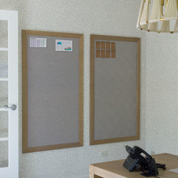
Organizational Features: Implemented dual large bulletin boards for task and project tracking, integrating them aesthetically with custom cabinetry and interesting, yet subdued, fabric backing.
Our client is thrilled with her new home office, which not only meets her professional needs but also adds comfort and style to her daily work routine. The space is highly functional for both solo work and client appointments, providing a perfect blend of business professionalism and personal comfort. It embodies the essence of a #girlboss, combining a professional atmosphere with feminine elegance, making every workday enjoyable and productive.
 Gallery KBNY
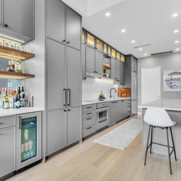
A classic West Side loft in Hell’s Kitchen, Gallery’s main task was to renovate the large kitchen. The clients like to entertain, so in addition to remodeling the aesthetic, we expanded the footprint of the island and built an entirely new bar at the opposite end of the kitchen. Some design choices are a natural fit for the space. In this case, that meant leaning into the industrial vibe of the exposed concrete while bringing in some character with the material choices.
INDUSTRIAL CHIC
With an industrial aesthetic in mind, gray was a natural color choice for the fully custom Miralis cabinets. The backsplash was designed in a subway brick pattern, but rather than the typical porcelain or marble, a clay tile in a white matte tone resembling cement was chosen to further coordinate with the exposed concrete.
Stacked cabinets were installed to accommodate the tall loft ceilings. For contrast, we incorporated glass front cabinetry with lighting in some areas. The resulting marriage of concrete, glass, and wood is well-matched for an industrial chic loft kitchen.
Further highlighting the homeowners’ love of entertaining, we also built an entirely custom bar at one end of the space, featuring open shelving in contrasting wood tones with underlighting and a custom mirrored backsplash for an authentic bar feel.
ADVENTURES IN APPROACHING COLUMNS
Loft renovations tend to come with two common needs: how to fill all that space tastefully and how to work with those ever present columns. In the case of this loft kitchen renovation, it suited the industrial aesthetic not to wrap the concrete column as one typically would, but rather to leave it exposed, accentuating the raw character of the space. Partially as a result, the island expanded too, creating more room for functional additions such as a built-in microwave, wine fridge, and more open shelving to match the bar, outlined with a countertop overhang to optimize counter space and chair storage.
ANCHORED IN SYMMETRY
With a loft space as unusually large as this one, an ideal design strategy, especially when high ceilings are involved, is to anchor the kitchen on opposing sides. Here, one side is anchored by a large floor-to-ceiling pantry, while the other is anchored by the counter-depth fridge with cabinetry above. The connecting element is the counter space in the middle, resulting in the visual impact of a long kitchen run within the open floor plan of a loft.
SOME HIGHLIGHTS
- Entirely custom-built bar with custom mirrored backsplash templated specifically for this project
- Large, oversized island with seating all around, open shelving, and built-in microwave
- Subway backsplash tiles in clay rather than porcelain or marble
- Olympian white marble countertops
Considering a kitchen loft renovation in New York? Our expertise is in renovating all kinds of New York Spaces, from gut renovations of historic landmark buildings like brownstones and townhomes to kitchens and bathrooms in lofts and other apartments in managed buildings. Contact us to find out if our full-scale design-and-build approach is right for your project.
 Sosna Inc
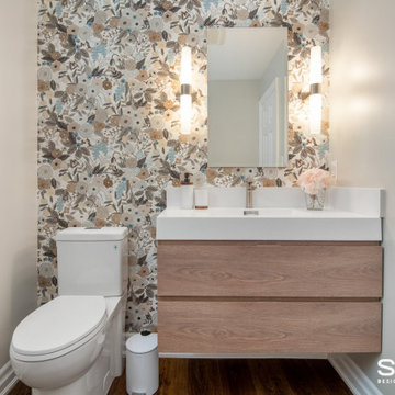
Our retired clients approached us to renovate the Kitchen and Powder Room in their 1993 home, which they have lived in for 30 years.
As they love to entertain and have visits with their grandchildren, they needed the Renovation to focus on creating an updated and open concept Main Floor to make their home to look and feel more spacious and inviting.
Their Kitchen was outdated and cramped, lacking in counter space and storage. The Powder Room was dated, and the plumbing fixtures were lacking in both looks and function. As they love to cook and bake, a more open and functional Kitchen was a must.
The closed off Main Floor was lacking in flow and function. As the Dining Room and Living Room both felt closed off and isolated, they were often unused. As well, the Main Staircase was carpeted with wooden pickets, and needed a modern facelift.
After working closely with the clients to understand their wants and needs, one of our talented Sosna designers, Camila, was able to create a design plan that not only optimized functionality but also made the space uniquely theirs.
During the planning stage, it was discovered that an exhaust pipe that went from the Basement, and through the Main Floor to the roof could be removed. Removing this pipe freed up a lot of space, allowing for more storage to be added.
Camila then worked closely with the construction area of the Sosna team to provide our clients with the home of their dreams. Our team first removed the walls separating the Living Room, Dining Room, and Kitchen to create a brighter, more open space. We then brought up an existing window sill to match the window at the Kitchen sink to make space for an extra long countertop and plenty of cabinetry. We built a large peninsula with 4 seats in the Kitchen, functioning much like an Island. The peninsula was positioned to face Kitchen window, providing a direct view to their beautiful backyard.
We made sure to incorporate plenty of storage space, and practical features. Appliance garages were installed to store unsightly small appliances, and a coffee station was added, perfect for mornings and afternoon visits with family and friends.
The Powder Room plumbing was updated, providing the space with a modern look, and more efficient fixtures, and the staircase was given a beautiful modern update that will be much easier to maintain.
Our clients and their beautiful dog stayed with their daughter’s family during the renovation. While it was wonderful to spend time with family, it’s always nice to be home again. Our proven process and detailed planning enabled us to keep our promise to get the project completed on time.
In the end, we were able to create an open concept space that was both inviting and functional, perfect for entertaining and cooking. Our clients were thrilled with the results and have already started planning their next get-together.
If you love your home, but looking to make it more functional and comfortable for your specific needs, we're the Renovator You Can Count On. It's our promise. Contact us to get started!
 Saikley Architects
We updated this 1907 two-story family home for re-sale. We added modern design elements and amenities while retaining the home’s original charm in the layout and key details. The aim was to optimize the value of the property for a prospective buyer, within a reasonable budget.
New French doors from kitchen and a rear bedroom open out to a new bi-level deck that allows good sight lines, functional outdoor living space, and easy access to a garden full of mature fruit trees. French doors from an upstairs bedroom open out to a private high deck overlooking the garden. The garage has been converted to a family room that opens to the garden.
The bathrooms and kitchen were remodeled the kitchen with simple, light, classic materials and contemporary lighting fixtures. New windows and skylights flood the spaces with light. Stained wood windows and doors at the kitchen pick up on the original stained wood of the other living spaces.
New redwood picture molding was created for the living room where traces in the plaster suggested that picture molding has originally been. A sweet corner window seat at the living room was restored. At a downstairs bedroom we created a new plate rail and other redwood trim matching the original at the dining room. The original dining room hutch and woodwork were restored and a new mantel built for the fireplace.
We built deep shelves into space carved out of the attic next to upstairs bedrooms and added other built-ins for character and usefulness. Storage was created in nooks throughout the house. A small room off the kitchen was set up for efficient laundry and pantry space.
We provided the future owner of the house with plans showing design possibilities for expanding the house and creating a master suite with upstairs roof dormers and a small addition downstairs. The proposed design would optimize the house for current use while respecting the original integrity of the house.
Photography: John Hayes, Open Homes Photography
https://saikleyarchitects.com/portfolio/classic-craftsman-update/
 Irene Designs
Home Remodeling Project Overview
This extensive home remodeling project transformed a dated and inefficient layout into a functional, open, and aesthetically cohesive living space. The original layout had several challenges:
• A kitchen with limited storage, no cabinets on the window side, a sink facing the wall, and a range crammed into the corner. The pantry closet was too deep and impractical.
• A living room that couldn’t accommodate furniture without interfering with traffic flow.
• A front foyer with wasted space.
• A claustrophobic hallway toilet room without a sink, located near the laundry room.
The Remodeling Concept
The scope of this project extended well beyond the kitchen. We proposed several layout options to address issues in all adjacent spaces, ultimately implementing a plan that:
• Removed two walls and moved doorways.
• Replaced the kitchen window.
• Converted the hallway toilet room into a storage space.
• Installed pocket doors to separate the laundry hallway from the living room.
Kitchen Transformation
• Open Concept: By removing the wall between the kitchen and dining room, the two spaces became a seamless open area.
• New Layout: Cabinets were relocated to the window side for more storage and natural light. A central island with storage and seating was added, and a coffee bar was installed in the dining room.
• Updated Pantry: The deep pantry closet was converted into a pullout pantry with a cabinet front for better accessibility.
• Design Details: Off-white kitchen cabinets pair beautifully with a light green island. Warm white quartz counters and an artisan tile backsplash complete the look.
Dining Room
• Expanded Space: Most of the wall separating the dining room and foyer was removed, creating a more spacious area while still accommodating all furniture thanks to careful measurements.
Living Room Improvements
• Optimized Layout: Moving doorways and installing pocket doors allowed for better furniture placement, including a sofa that doesn’t interfere with traffic flow.
• Fireplace Upgrade: The brick fireplace was updated with a three-dimensional staggered stone veneer in a color matching the kitchen cabinets, creating a cohesive look. A TV was installed above the fireplace at a comfortable viewing angle.
Additional Updates
• New Flooring: All remodeled rooms now feature updated flooring.
• Ceilings: Popcorn ceilings were replaced with smooth, flat finishes, complemented by recessed lighting.
• Walls: Fresh paint throughout the space, with an accent wall in the living room matching the light green of the kitchen island.
• Lighting: Stylish sconces were added for a touch of elegance.
The Result
The homeowners are thrilled with the transformation, marveling at how their once cramped and inefficient home now feels spacious, functional, and beautifully cohesive. They can’t believe their house could ever look like this!


 Saikley Architects
We updated this 1907 two-story family home for re-sale. We added modern design elements and amenities while retaining the home’s original charm in the layout and key details. The aim was to optimize the value of the property for a prospective buyer, within a reasonable budget.
New French doors from kitchen and a rear bedroom open out to a new bi-level deck that allows good sight lines, functional outdoor living space, and easy access to a garden full of mature fruit trees. French doors from an upstairs bedroom open out to a private high deck overlooking the garden. The garage has been converted to a family room that opens to the garden.
The bathrooms and kitchen were remodeled the kitchen with simple, light, classic materials and contemporary lighting fixtures. New windows and skylights flood the spaces with light. Stained wood windows and doors at the kitchen pick up on the original stained wood of the other living spaces.
New redwood picture molding was created for the living room where traces in the plaster suggested that picture molding has originally been. A sweet corner window seat at the living room was restored. At a downstairs bedroom we created a new plate rail and other redwood trim matching the original at the dining room. The original dining room hutch and woodwork were restored and a new mantel built for the fireplace.
We built deep shelves into space carved out of the attic next to upstairs bedrooms and added other built-ins for character and usefulness. Storage was created in nooks throughout the house. A small room off the kitchen was set up for efficient laundry and pantry space.
We provided the future owner of the house with plans showing design possibilities for expanding the house and creating a master suite with upstairs roof dormers and a small addition downstairs. The proposed design would optimize the house for current use while respecting the original integrity of the house.
Photography: John Hayes, Open Homes Photography
https://saikleyarchitects.com/portfolio/classic-craftsman-update/
 Saikley Architects
We updated this 1907 two-story family home for re-sale. We added modern design elements and amenities while retaining the home’s original charm in the layout and key details. The aim was to optimize the value of the property for a prospective buyer, within a reasonable budget.
New French doors from kitchen and a rear bedroom open out to a new bi-level deck that allows good sight lines, functional outdoor living space, and easy access to a garden full of mature fruit trees. French doors from an upstairs bedroom open out to a private high deck overlooking the garden. The garage has been converted to a family room that opens to the garden.
The bathrooms and kitchen were remodeled the kitchen with simple, light, classic materials and contemporary lighting fixtures. New windows and skylights flood the spaces with light. Stained wood windows and doors at the kitchen pick up on the original stained wood of the other living spaces.
New redwood picture molding was created for the living room where traces in the plaster suggested that picture molding has originally been. A sweet corner window seat at the living room was restored. At a downstairs bedroom we created a new plate rail and other redwood trim matching the original at the dining room. The original dining room hutch and woodwork were restored and a new mantel built for the fireplace.
We built deep shelves into space carved out of the attic next to upstairs bedrooms and added other built-ins for character and usefulness. Storage was created in nooks throughout the house. A small room off the kitchen was set up for efficient laundry and pantry space.
We provided the future owner of the house with plans showing design possibilities for expanding the house and creating a master suite with upstairs roof dormers and a small addition downstairs. The proposed design would optimize the house for current use while respecting the original integrity of the house.
Photography: John Hayes, Open Homes Photography
https://saikleyarchitects.com/portfolio/classic-craftsman-update/
 Saikley Architects
We updated this 1907 two-story family home for re-sale. We added modern design elements and amenities while retaining the home’s original charm in the layout and key details. The aim was to optimize the value of the property for a prospective buyer, within a reasonable budget.
New French doors from kitchen and a rear bedroom open out to a new bi-level deck that allows good sight lines, functional outdoor living space, and easy access to a garden full of mature fruit trees. French doors from an upstairs bedroom open out to a private high deck overlooking the garden. The garage has been converted to a family room that opens to the garden.
The bathrooms and kitchen were remodeled the kitchen with simple, light, classic materials and contemporary lighting fixtures. New windows and skylights flood the spaces with light. Stained wood windows and doors at the kitchen pick up on the original stained wood of the other living spaces.
New redwood picture molding was created for the living room where traces in the plaster suggested that picture molding has originally been. A sweet corner window seat at the living room was restored. At a downstairs bedroom we created a new plate rail and other redwood trim matching the original at the dining room. The original dining room hutch and woodwork were restored and a new mantel built for the fireplace.
We built deep shelves into space carved out of the attic next to upstairs bedrooms and added other built-ins for character and usefulness. Storage was created in nooks throughout the house. A small room off the kitchen was set up for efficient laundry and pantry space.
We provided the future owner of the house with plans showing design possibilities for expanding the house and creating a master suite with upstairs roof dormers and a small addition downstairs. The proposed design would optimize the house for current use while respecting the original integrity of the house.
Photography: John Hayes, Open Homes Photography
https://saikleyarchitects.com/portfolio/classic-craftsman-update/
 Irene Designs
Home Remodeling Project Overview
This extensive home remodeling project transformed a dated and inefficient layout into a functional, open, and aesthetically cohesive living space. The original layout had several challenges:
• A kitchen with limited storage, no cabinets on the window side, a sink facing the wall, and a range crammed into the corner. The pantry closet was too deep and impractical.
• A living room that couldn’t accommodate furniture without interfering with traffic flow.
• A front foyer with wasted space.
• A claustrophobic hallway toilet room without a sink, located near the laundry room.
The Remodeling Concept
The scope of this project extended well beyond the kitchen. We proposed several layout options to address issues in all adjacent spaces, ultimately implementing a plan that:
• Removed two walls and moved doorways.
• Replaced the kitchen window.
• Converted the hallway toilet room into a storage space.
• Installed pocket doors to separate the laundry hallway from the living room.
Kitchen Transformation
• Open Concept: By removing the wall between the kitchen and dining room, the two spaces became a seamless open area.
• New Layout: Cabinets were relocated to the window side for more storage and natural light. A central island with storage and seating was added, and a coffee bar was installed in the dining room.
• Updated Pantry: The deep pantry closet was converted into a pullout pantry with a cabinet front for better accessibility.
• Design Details: Off-white kitchen cabinets pair beautifully with a light green island. Warm white quartz counters and an artisan tile backsplash complete the look.
Dining Room
• Expanded Space: Most of the wall separating the dining room and foyer was removed, creating a more spacious area while still accommodating all furniture thanks to careful measurements.
Living Room Improvements
• Optimized Layout: Moving doorways and installing pocket doors allowed for better furniture placement, including a sofa that doesn’t interfere with traffic flow.
• Fireplace Upgrade: The brick fireplace was updated with a three-dimensional staggered stone veneer in a color matching the kitchen cabinets, creating a cohesive look. A TV was installed above the fireplace at a comfortable viewing angle.
Additional Updates
• New Flooring: All remodeled rooms now feature updated flooring.
• Ceilings: Popcorn ceilings were replaced with smooth, flat finishes, complemented by recessed lighting.
• Walls: Fresh paint throughout the space, with an accent wall in the living room matching the light green of the kitchen island.
• Lighting: Stylish sconces were added for a touch of elegance.
The Result
The homeowners are thrilled with the transformation, marveling at how their once cramped and inefficient home now feels spacious, functional, and beautifully cohesive. They can’t believe their house could ever look like this!

 Drury Design
THE SETUP
Originally an empty front living room, this space offered a blank canvas for transformation. Alicia’s client — a financial wealth management professional facing a career shift towards more home-based work — was excited to make it her new office. Capitalizing on the space’s abundant natural light, perfect for on-camera meetings, Alicia helped convert the area into a primary workspace.
Design Objectives:
- Create a functional and professional home office
Cultivate an aesthetic that is both comfortable and feminine
- Optimize the office for the space’s ideal lighting and provide an appealing background for virtual meetings
Design Challenges:
- Transforming a large, undefined space into a structured, functional office
- Selecting a color palette that enhances focus and professionalism, balanced with a feminine touch
- Strategically placing the desk to maximize functionality and aesthetics within the large area
Incorporating solutions for effective real-time stock trade tracking and analog task management
THE RENEWED SPACE
Design Solutions:
Workspace Configuration: Centered the desk to utilize indirect light, ideal for video calls, while providing a commanding view of the office, the outdoors and the entrance. A floor-installed power outlet under the desk ensures a clean, cord-free setup.
Aesthetic and Palette: Anchored by a striking wallpaper chosen by the client, Alicia developed a soft, neutral color scheme that complements the room’s black window frames and maintains a feminine touch.
Digital Integration: Included a screen dedicated to monitoring daily stock trends, positioned for easy viewing. The energy efficient monitor doubles as artwork when not in use, seamlessly blending functionality with style.
Organizational Features: Implemented dual large bulletin boards for task and project tracking, integrating them aesthetically with custom cabinetry and interesting, yet subdued, fabric backing.
Our client is thrilled with her new home office, which not only meets her professional needs but also adds comfort and style to her daily work routine. The space is highly functional for both solo work and client appointments, providing a perfect blend of business professionalism and personal comfort. It embodies the essence of a #girlboss, combining a professional atmosphere with feminine elegance, making every workday enjoyable and productive.
 Irene Designs
Home Remodeling Project Overview
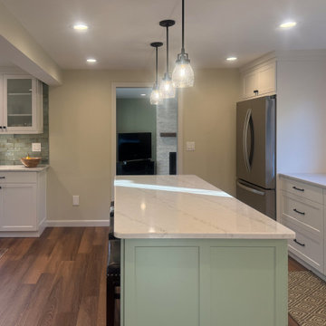
This extensive home remodeling project transformed a dated and inefficient layout into a functional, open, and aesthetically cohesive living space. The original layout had several challenges:
• A kitchen with limited storage, no cabinets on the window side, a sink facing the wall, and a range crammed into the corner. The pantry closet was too deep and impractical.
• A living room that couldn’t accommodate furniture without interfering with traffic flow.
• A front foyer with wasted space.
• A claustrophobic hallway toilet room without a sink, located near the laundry room.
The Remodeling Concept
The scope of this project extended well beyond the kitchen. We proposed several layout options to address issues in all adjacent spaces, ultimately implementing a plan that:
• Removed two walls and moved doorways.
• Replaced the kitchen window.
• Converted the hallway toilet room into a storage space.
• Installed pocket doors to separate the laundry hallway from the living room.
Kitchen Transformation
• Open Concept: By removing the wall between the kitchen and dining room, the two spaces became a seamless open area.
• New Layout: Cabinets were relocated to the window side for more storage and natural light. A central island with storage and seating was added, and a coffee bar was installed in the dining room.
• Updated Pantry: The deep pantry closet was converted into a pullout pantry with a cabinet front for better accessibility.
• Design Details: Off-white kitchen cabinets pair beautifully with a light green island. Warm white quartz counters and an artisan tile backsplash complete the look.
Dining Room
• Expanded Space: Most of the wall separating the dining room and foyer was removed, creating a more spacious area while still accommodating all furniture thanks to careful measurements.
Living Room Improvements
• Optimized Layout: Moving doorways and installing pocket doors allowed for better furniture placement, including a sofa that doesn’t interfere with traffic flow.
• Fireplace Upgrade: The brick fireplace was updated with a three-dimensional staggered stone veneer in a color matching the kitchen cabinets, creating a cohesive look. A TV was installed above the fireplace at a comfortable viewing angle.
Additional Updates
• New Flooring: All remodeled rooms now feature updated flooring.
• Ceilings: Popcorn ceilings were replaced with smooth, flat finishes, complemented by recessed lighting.
• Walls: Fresh paint throughout the space, with an accent wall in the living room matching the light green of the kitchen island.
• Lighting: Stylish sconces were added for a touch of elegance.
The Result
The homeowners are thrilled with the transformation, marveling at how their once cramped and inefficient home now feels spacious, functional, and beautifully cohesive. They can’t believe their house could ever look like this!
 Saikley Architects
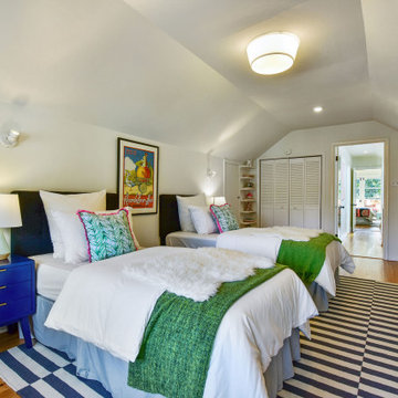
We updated this 1907 two-story family home for re-sale. We added modern design elements and amenities while retaining the home’s original charm in the layout and key details. The aim was to optimize the value of the property for a prospective buyer, within a reasonable budget.
New French doors from kitchen and a rear bedroom open out to a new bi-level deck that allows good sight lines, functional outdoor living space, and easy access to a garden full of mature fruit trees. French doors from an upstairs bedroom open out to a private high deck overlooking the garden. The garage has been converted to a family room that opens to the garden.
The bathrooms and kitchen were remodeled the kitchen with simple, light, classic materials and contemporary lighting fixtures. New windows and skylights flood the spaces with light. Stained wood windows and doors at the kitchen pick up on the original stained wood of the other living spaces.
New redwood picture molding was created for the living room where traces in the plaster suggested that picture molding has originally been. A sweet corner window seat at the living room was restored. At a downstairs bedroom we created a new plate rail and other redwood trim matching the original at the dining room. The original dining room hutch and woodwork were restored and a new mantel built for the fireplace.
We built deep shelves into space carved out of the attic next to upstairs bedrooms and added other built-ins for character and usefulness. Storage was created in nooks throughout the house. A small room off the kitchen was set up for efficient laundry and pantry space.
We provided the future owner of the house with plans showing design possibilities for expanding the house and creating a master suite with upstairs roof dormers and a small addition downstairs. The proposed design would optimize the house for current use while respecting the original integrity of the house.
Photography: John Hayes, Open Homes Photography
https://saikleyarchitects.com/portfolio/classic-craftsman-update/
69