
Search results for "Specific process" in Home Design Ideas
 AG Construction & Remodeling
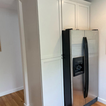
Kitchen Remodeling Project
Looking to upgrade your kitchen? Our professional kitchen remodeling services are designed to transform your space into a modern, functional, and stunning area that suits your lifestyle. We specialize in custom kitchen designs that optimize space, enhance usability, and elevate the overall look of your home.
Why Choose Our Kitchen Remodeling Services?
Customized Designs: We create personalized kitchen designs that reflect your taste and meet your specific needs.
Premium Materials: We use high-quality, long-lasting materials to ensure durability and style.
Experienced Team: Our skilled craftsmen are dedicated to delivering exceptional workmanship on every project.
Our Kitchen Remodeling Process
Consultation and Planning: We start by understanding your vision, needs, and budget to create a detailed kitchen design plan.
Design and Approval: Our team provides 3D designs and layouts for your review, ensuring the final look matches your expectations.
Construction and Installation: We handle every aspect of the remodel, from demolition to installation of cabinets, countertops, appliances, and flooring.
Final Details: We complete the transformation with finishing touches like lighting fixtures, backsplashes, and hardware to bring your vision to life.
Popular Kitchen Remodeling Features
Custom Cabinets and Smart Storage Solutions
Stylish Quartz, Granite, or Marble Countertops
Energy-Efficient Appliances for Modern Living
Contemporary Backsplashes and Statement Lighting
Open-Concept Layouts for a Spacious and Welcoming Atmosphere
Why Remodel Your Kitchen?
Remodeling your kitchen not only improves its functionality and appearance but also significantly increases your home’s value. Whether you want a more efficient cooking space, a modern look, or an area perfect for entertaining, our team is here to bring your dream kitchen to life.
Schedule Your Consultation Today!
Ready to get started on your kitchen remodeling project? Contact us today to schedule a free consultation! Let us help you design a kitchen that you’ll love for years to come.
 Klopf Architecture
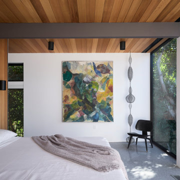
Malibu Glass Box House by Klopf Architecture
Following the devastating Woolsey Fire of 2018, the site in Malibu offered a unique opportunity to rebuild not just a home, but a new architectural composition that highlighted the property’s potential while navigating strict fire-rebuild codes in the area. Designed by Klopf Architecture, this project embraced a set of limitations and translated them into an architectural asset.
The city’s fire-rebuild process required the new structure to remain close to the original footprint, size and bulk, a constraint that ultimately clarified the architectural direction. Perched near the front of a long, narrow lot, the new home frames and overlooks a private, park-like rear expanse, an uncommon luxury especially in this part of Malibu .
Without a fixed program, the design process allowed for a different kind of creative focus allowing Klopf Architecture the opportunity to explore how a modernist home could best respond to this site. The team approached the project not with a list of requirements, but with a question: How might a modernist live here? What spatial qualities would inspire calm, connection, and a sense of wonder in this setting? The process became less about problem-solving and more about architectural storytelling—letting the site, the light, and the principles of modern design guide the form and flow of the home.
The response emerged in the form of a glass-box pavilion, an open, Mid-Century Modern inspired living, dining, and kitchen space that floats at the edge of the property’s natural descent. Connected to the more enclosed, private areas of the home by a glass-walled hallway, the living pavilion becomes a distinct centerpiece of the design. It opens on all four sides to the landscape with decks and patios on the flanks, an internal garden and water feature to the north, and a dramatic unguarded view of the expansive backyard and ocean horizon to the south.
Because of the mandated footprint, careful planning was required to ensure every space could still engage with light, landscape, or both. Strategic voids in the form of atriums and courtyards allow daylight to filter deep into the home’s core, while offering moments of surprise and retreat. These design gestures allow natural light to filter deep into the interior, creating a sense of brightness and openness throughout the day. At the same time, they expand the perceptual boundaries between inside and out, making the home feel more expansive while anchoring its connection to the surrounding landscape.
The siting of the house is what gives it its unique character. Rather than receding into the backyard like the neighboring homes, the house holds a slight prominence. From the central living pavilion, stepping down into the landscape feels more like entering a secluded park where a separate existing accessory structure, trail, and recreational areas await. The home’s modest street presence gives way to this unfolding drama of space, view, and nature.
Fire-resilient materials and assemblies are integrated seamlessly throughout including triple-pane glazing, under-slab and roof insulation, and locally sourced fire-rated cladding ensure the house not only meets Calfornia’s rigorous wildland-urban interface (WUI) standards, but feels effortlessly aligned with them. While technical decisions like fire-hardening and mechanical systems presented some construction challenges, particularly around the cantilevered glass box, the team found a functional compromise that preserved the integrity of the design.
Inside, a restrained palette and exposed post and beam design celebrate the ethos of mid-century modernism. A central circulation spine extends from the entry to the rear glass wall, offering a continuous visual link from street to ocean. Spaces such as the library and office, though more intimate in scale, are never cut off from nature as each opens to its own unique courtyard or garden view.
Though born out of a strict regulatory framework and developed without a specific client, the rebuild design unfolded with remarkable clarity. Grounded in site logic, refined by limitations and an emphasis on timeless spatial relationships – light, proportion, and a strong connection to nature, the resulting design feels both effortless and uplifting. The home lives lightly on the land, opens generously to its surroundings, and strikes a careful balance between privacy, openness, and calm. For Klopf Architecture, it stands as a compelling case study in how site, code, and circumstantial constraints can inspire enduring, modernist architecture. With years of experience reimagining mid-century modern design for how people live today, the firm took the project’s limitations as an opportunity. The result is a home shaped by open, flowing spaces, strong indoor-outdoor connections, and a calm, clear sense of structure. It’s a good reminder that even with strict constraints, there’s still room for architecture to breathe—and for modernism to keep moving forward.
Klopf Architecture project team: Geoff Campen, John Klopf, AIA, and Sherry Tan
Structural Engineer: ZFA
Contractor: Maison D’Artiste
Photography: ©2025 Mariko Reed
Year Completed: 2023

 Gallery KBNY
The owner of this historic and landmarked town-home renovation in Hudson Square, originally built in 1826, hired Gallery Kitchen and Bath to fully gut-renovate this 3-unit row-home. The scope of work included a full-scale renovation of the owners unit, including the renovation of the kitchen, one 4-piece master ensuite bathroom, one 3-piece bathroom with a walk-in steam shower, and a beautiful powder room. Additional work in the owners unit also included flooring, electrical upgrade, major plumbing work, new HVAC system, restoration of a fireplace, installation of a fully integrated smart home system and landmarked approved windows.
CELLAR RENOVATION IN NYC LANDMARKED TOWN-HOME
Rounding out the owners unit we renovated the cellar, which was converted into an entertainment space and featured a custom glass curtain wall, along with a custom staircase with an exposed brick wall. During the demolition phase of the cellar, our team discovered 56 wine jugs filled with wine from the prohibition era, leading us to name this project the prohibition house. For the two tenant units, Gallery Kitchen and Bath undertook the renovation of 2 kitchens, 4 bathrooms, new hardwood flooring throughout, along with detailed carpentry work in the entire home.
WHY GALLERY KITCHEN AND BATH
After interviewing multiple contractors, our client decided on Gallery Kitchen and Bath primarily because of our turnkey design, selection, and build process. In a renovation of this magnitude it is crucial to have a centralized full service contractor under one roof to handle all of the aspects and simultaneous moving parts of the project. Decentralizing the entire process by having multiple unaffiliated vendors handle various parts of the process can easily become chaotic, time consuming, and costly.
Because Gallery Kitchen and Bath undertook the entire process, from the design of the entire space to the selection and procurement of all finishes and fixtures, down to the procurement of all permits and LPC filings, it made a seemingly chaotic project a’lot more manageable.
PHASE 1: DESIGN, SELECTION, PROCUREMENT
Our client wanted the renovation to incorporate a fully modern design into his Hudson Square town-house. Being that this is a landmarked property, the exterior facade had to be restored and kept with the original aesthetic, the interior of the home however was a whole different story.
In keeping up with the modern aesthetic, our designers went to work to design a custom kitchen that included fully custom flat panel base cabinets in a white high gloss finish and an absolute matte black appliance/pantry wall. The kitchen design also included a white quartz countertop and backsplash with a waterfall edge island. To bring warmth to the modern kitchen, our designers incorporated a rifted and quartered select oak wood floor in a herringbone pattern, and custom blended stain with matte polyurethane finish. For continuity, the wood floor was also extended throughout the entire owners unit.
In the ensuite bathroom we created a “wet area” which houses a standalone soaking tub as well as a beautiful rainfall shower, completely leveled with the rest of the floor in the bathroom. Some highlights within this space include a tiled square drain, large niche cutouts with a carrera marble accents. Once again, to bring warmth to this modern bathroom, our designers incorporated a floating rustic oak vanity and carrera marble mosaic floor tile.
Last on the list on the owners unit floor was the cellar, which our client wanted to utilize as an entertainment space for his friends and family. During the design phase, we incorporated an open concept layout, wedding the indoor and outdoor space with a custom glass curtain wall. The design also included custom walnut built-ins that serve as a custom wet bar and storage piece.
With the design approved and selections made our office liaisons moved to procure all of the material selections and finishes.
PHASE 2: DEMO
Because this home is almost two centuries old, we had to take extra precaution during the interior demolition phase of the project. One specific area that we had to pay special attention to was the existing brick. Over time the mortar in old brick homes deteriorates and turns into dust – for this reason it was extremely important that a thorough and ongoing inspection of the exteriors and interior walls took place during the demolition of the space.
After 14 30-yard debris containers and 56 wine filled jugs from the prohibition era later , the demolition of this historic Hudson Square town-home came to an end. If you are wondering whether we tried the wine? After notifying the owner we agreed to open one of the jugs and try them together – nothing but vinegar.
PHASE 3: BUILD
One of the challenges in a renovation project of this scope is nailing down the logistics and delivery of fixtures and finish material. Adding to this challenge was a narrow entry door that required us to use a boom truck in order to deliver some of the larger materials on site. To ensure a succinct time schedule, we boomed all of the materials through the 3rd floor for the entire project and worked our renovation work from top floor to cellar. This technique also insured that any unexpected water issues during the renovation process would not damage a finished floor.
With all roughing and framing complete, the Gallery KBNY team proceeded to execute on the design plan.
THE REVEAL
From what was once a dilapidated town-home with nothing but potential, to a glamorous and luxurious modern interior space – the prohibition house was complete. Ready to speak with us about your renovation project? Contact us to schedule your free consultation and let Gallery KBNY show you why our all-inclusive approach to your renovation is the smartest way to renovating in NYC.
Find the right local pro for your project

 INSPIRED KITCHEN DESIGN
It was also important for the white IKEA kitchen to have plenty of storage.
“This is a dining room/kitchen combination room, so we wanted to make sure there was ample room for both dining and cooking activities,” he says.
Therefore, featured throughout the kitchen in both the upper and base cabinetry is IKEA VEDDINGE cabinetry in white along with IKEA MAXIMERA drawers and IKEA UTRUSTA door fronts.
Combined with the stainless steel appliances, this creates a light yet warm feel; especially when set against the IKEA KASKER countertops in custom light gray with sleek concrete effect.
From a functional standpoint, there is enormous storage potential throughout.
There is storage above the refrigerator and along the upper perimeter to the electric range and accompanying range hood, and then on the opposite side as well. There is even a small, three-drawer base cabinet on the opposite side of the stainless steel refrigerator.
One standout element of the space is a clever IKEA “hack” using IKEA cabinetry retrofitted to conceal a washer-dryer combo set.
Justin notes this was originally the biggest obstacle of the kitchen design.
He explains: “We thought a washer/dryer was essential to the space, but we were really struggling with where exactly to put it and how to conceal it so that you weren’t staring at your laundry while eating breakfast.”
In addition, the type of cabinet needed was not a cabinet that IKEA standardly offers, so IKD came up with an IKEA hack that was both functional and stylish.
Specifically, the 80”(H) IKEA VEDDINGE cabinetry allows the washer-dryer to seamlessly blend into the layout; which maximizes the kitchen space.
Justin concludes: “We chose IKEA because IKEA’s price point is unbeatable for the quality. We liked that IKEA offered versatility and ease and we really liked that there is a whole industry of professionals that only deal with IKEA products. So they know precisely how to design for IKEA cabinets and build IKEA cabinets, etc.”
Having experienced the IKEA design and installation process, Justin shares some advice with other IKEA customers.
“I would recommend that folks not try to do everything themselves, such as design, demo, shop and build. Designing a kitchen is a lot of work. If you can afford it: seek assistance,” he says.
“We would also recommend using experienced installers who know IKEA cabinets in and out and can help with the details of your kitchen that make it look polished and complete. They also save time.”
To that end, since it was a rental their timeline for the IKEA kitchen to be completed was very tight.
“Our IKEA kitchen wasn’t a project we wanted stretched over six months. We wanted the whole project finished in several weeks [and we accomplished it],” he concludes.
 Drury Design
The original idea was to update the tile floor and the tub. That’s it.
A further discussion of wants and needs revealed intentions for an eventual larger shower and an improved vanity storage. It made sense to map out the possibilities and design our update with potential next steps in mind. The process was exciting, ultimately leading to the decision to do a full primary bath remodel.
Design Objectives:
-Maintain existing locations for all major bathroom functions
-Make the shower larger and more open
-Use luxurious materials throughout
-Improve vanity storage and define accessories for specific items
-Incorporate luxury shower fixtures
-Include the latest technology
Design Challenges
-Enlarging the shower in a typical rectangular shape would block the view and light from the alcove windows behind the tub
-Logical placement of the built-in shower caddy and all shower components in accordance with how and where they were to be used
-Keeping the long, back wall free from any shower modules to maintain the decorative tile design
-Combining the owner’s existing smart home system with a comprehensive shower system
-Planning cabinetry for hidden storage and use for various small appliances and make-up
-Integrating expensive shower wall tile with less expensive wall tile for aesthetic and budget purposes
-Incorporating special design features to balance the highly decorative shower tile
Design solutions:
-A clipped corner was planned for the shower bench seat – this allowed for a larger glass wall. The glass wall at the angled bench also brought more natural light into the shower
-Thoughtful shower space design prevented the crowding of features – the shower caddy and handheld shower head were placed on the full-height wall by the shower bench, the regular shower head and body sprays remained on the opposite wall, and the rain head was placed in the center of the shower
-A multi-port DTV system was installed, providing control of all shower components, including chromotherapy and music inside and outside the shower
-The lavish water-jet stone and glass decorative tile was paired with a less-expensive glass tile found in the mosaic
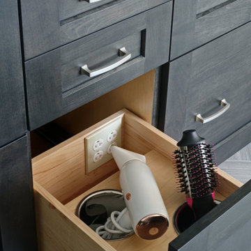
-Pull-out grooming organizers and electrical docking stations were incorporated into the cabinetry
Additional storage was created in the lower corner cabinet
The homeowners are thrilled with their new primary bathroom. Clear goals and carefully evaluated materials informed a fun and functional design that is both thoughtful and sumptuous!

 Edgewater Design Group
As written in Northern Home & Cottage by Elizabeth Edwards
In general, Bryan and Connie Rellinger loved the charm of the old cottage they purchased on a Crooked Lake peninsula, north of Petoskey. Specifically, however, the presence of a live-well in the kitchen (a huge cement basin with running water for keeping fish alive was right in the kitchen entryway, seriously), rickety staircase and green shag carpet, not so much. An extreme renovation was the only solution. The downside? The rebuild would have to fit into the smallish nonconforming footprint. The upside? That footprint was built when folks could place a building close enough to the water to feel like they could dive in from the house. Ahhh...
Stephanie Baldwin of Edgewater Design helped the Rellingers come up with a timeless cottage design that breathes efficiency into every nook and cranny. It also expresses the synergy of Bryan, Connie and Stephanie, who emailed each other links to products they liked throughout the building process. That teamwork resulted in an interior that sports a young take on classic cottage. Highlights include a brass sink and light fixtures, coffered ceilings with wide beadboard planks, leathered granite kitchen counters and a way-cool floor made of American chestnut planks from an old barn.
Thanks to an abundant use of windows that deliver a grand view of Crooked Lake, the home feels airy and much larger than it is. Bryan and Connie also love how well the layout functions for their family - especially when they are entertaining. The kids' bedrooms are off a large landing at the top of the stairs - roomy enough to double as an entertainment room. When the adults are enjoying cocktail hour or a dinner party downstairs, they can pull a sliding door across the kitchen/great room area to seal it off from the kids' ruckus upstairs (or vice versa!).
From its gray-shingled dormers to its sweet white window boxes, this charmer on Crooked Lake is packed with ideas!
- Jacqueline Southby Photography
 LOREC Ranch Home Furnishings
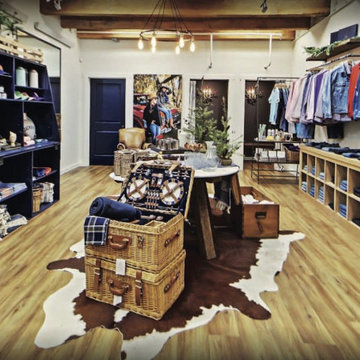
Cowboy Kitchen
LOREC Ranch is renowned for its artisanal approach to creating cowboy kitchen table cabinets, a tradition deeply rooted in both craftsmanship and rustic charm. The ranch’s approach to woodworking melds time-honored techniques with innovative methods, producing cabinets that epitomize the rugged elegance of cowboy culture.
Selecting the Wood
The process begins with the selection of high-quality wood. At LOREC Ranch, the choice of lumber is critical to the final product. They use a variety of hardwoods such as oak, pine, and walnut. Each type of wood offers unique characteristics—oak for its strength and durability, pine for its workability and warm hue, and walnut for its rich, dark tones. The wood is carefully sourced from sustainable forests, ensuring both environmental responsibility and superior quality. Once procured, the wood undergoes a thorough drying process to reduce moisture content, which is crucial for preventing future warping or cracking.
Design and Craftsmanship
Design is a pivotal stage in the creation of cowboy kitchen table cabinets. LOREC Ranch's designs often draw inspiration from traditional cowboy aesthetics, incorporating elements like sturdy, rugged lines and intricate detailing that reflects the essence of Western life. The design phase involves detailed planning and sketching, ensuring that the cabinets not only serve their functional purpose but also enhance the rustic charm of any kitchen. Cowboy Kitchens are a stable of the American Midwest.
The next step is crafting the cabinet frames. Skilled artisans at LOREC Ranch use a combination of modern and traditional techniques. While some aspects of the construction process involve high-tech machinery for precision cutting and joining, much of the fine detailing is done by hand. This includes hand-carving and finishing touches that give each cabinet a unique, handcrafted feel. The artisans' expertise ensures that every joint is perfectly aligned and every surface is smooth and ready for finishing.
Assembly and Finishing
Once the components are cut and shaped, they are assembled using time-tested joinery techniques. LOREC Ranch favors methods such as dovetail and mortise-and-tenon joints, which not only enhance the strength and durability of the cabinets but also align with the traditional craftsmanship that defines their products of the Cowboys Kitchen. The assembly process is meticulous, ensuring that each piece fits together seamlessly and stands the test of time.
Finishing is where the cabinets truly come to life. LOREC Ranch uses a range of techniques to achieve a finish that complements the wood’s natural beauty while providing protection against wear and tear. This often involves multiple coats of stain or varnish, each applied with care to enhance the wood’s grain and texture. The finishing process is both art and science, requiring a delicate balance to ensure the cabinets not only look beautiful but are also resistant to daily use.
Quality Control and Delivery
Before any cabinet leaves the workshop, it undergoes rigorous quality control. Every detail is inspected to ensure that the cabinet meets LOREC Ranch’s high standards. This includes checking for structural integrity, finish consistency, and overall craftsmanship. Only after passing this thorough inspection are the Cowboys Kitchens cabinets prepared for delivery.
At LOREC Ranch, the journey of creating cowboy kitchen cabinets is a blend of tradition and innovation. From selecting the finest wood to the final touches of finishing, every step is executed with precision and care. The result is a product that is not only a testament to the rich heritage of cowboy craftsmanship but also a functional and stylish addition to any kitchen.
The Cowboy Kitchen by LOREC Ranch Home Furnishings is a celebration of the rustic, western lifestyle, offering a unique blend of rugged charm and modern practicality. Designed for those who appreciate the simplicity and warmth of western living, the Cowboy Kitchen collection includes a variety of furniture and decor that can transform any kitchen into a western oasis. Central to this collection are the cowboy kitchen tables and cowboy kitchen cabinets, which feature solid wood construction, intricate detailing, and finishes that reflect the natural beauty of the materials used. These pieces are ideal for creating a western style kitchen that feels both authentic and welcoming.
LOREC Ranch's cowboy kitchen tables are crafted with both functionality and style in mind. Whether you’re looking for a cowboy dining table for family meals or a cowboy kitchen fold-up table for smaller spaces, these pieces are designed to meet a variety of needs. The hideaway kitchen tables and Murphy kitchen tables offer innovative solutions for maximizing space without sacrificing the rustic aesthetic. For those interested in DIY projects, cowboy kitchen table plans are available, allowing you to customize your table to suit your specific preferences and space requirements.
In addition to tables, the cowboy kitchen cabinets and cowboy kitchen armoires are key elements in creating a cohesive western style kitchen. These cowboy cabinets are made from high-quality wood and feature designs that are both practical and decorative, with ample storage space and a style that echoes the rugged charm of the American frontier. The western style kitchen cabinets are perfect for those who want to bring a touch of the wild west into their home while ensuring their kitchen remains functional and organized.
To complete the look, cowboy kitchen decor items, such as western-themed accents and accessories, are available to enhance the overall atmosphere of the western kitchens. These decor pieces complement the larger furniture items, tying together the rustic aesthetic and creating a warm, inviting space that feels like a true cowboy's kitchen. Whether you’re looking to create a completely western-themed kitchen or just want to add a few rustic touches, LOREC Ranch’s Cowboy Kitchen collection offers everything you need to bring your vision to life
 Drury Design
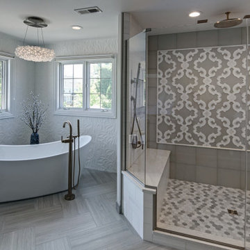
The original idea was to update the tile floor and the tub. That’s it.
A further discussion of wants and needs revealed intentions for an eventual larger shower and an improved vanity storage. It made sense to map out the possibilities and design our update with potential next steps in mind. The process was exciting, ultimately leading to the decision to do a full primary bath remodel.
Design Objectives:
-Maintain existing locations for all major bathroom functions
-Make the shower larger and more open
-Use luxurious materials throughout
-Improve vanity storage and define accessories for specific items
-Incorporate luxury shower fixtures
-Include the latest technology
Design Challenges
-Enlarging the shower in a typical rectangular shape would block the view and light from the alcove windows behind the tub
-Logical placement of the built-in shower caddy and all shower components in accordance with how and where they were to be used
-Keeping the long, back wall free from any shower modules to maintain the decorative tile design
-Combining the owner’s existing smart home system with a comprehensive shower system
-Planning cabinetry for hidden storage and use for various small appliances and make-up
-Integrating expensive shower wall tile with less expensive wall tile for aesthetic and budget purposes
-Incorporating special design features to balance the highly decorative shower tile
Design solutions:
-A clipped corner was planned for the shower bench seat – this allowed for a larger glass wall. The glass wall at the angled bench also brought more natural light into the shower
-Thoughtful shower space design prevented the crowding of features – the shower caddy and handheld shower head were placed on the full-height wall by the shower bench, the regular shower head and body sprays remained on the opposite wall, and the rain head was placed in the center of the shower
-A multi-port DTV system was installed, providing control of all shower components, including chromotherapy and music inside and outside the shower
-The lavish water-jet stone and glass decorative tile was paired with a less-expensive glass tile found in the mosaic
-Pull-out grooming organizers and electrical docking stations were incorporated into the cabinetry
Additional storage was created in the lower corner cabinet
The homeowners are thrilled with their new primary bathroom. Clear goals and carefully evaluated materials informed a fun and functional design that is both thoughtful and sumptuous!

 G and S Installation USA, LLC.
Can you spot the caulk?!?!?
Our installation team at G&S takes great pride in having spot-on caulk jobs!
Trendy home office photo in Bridgeport
Trendy home office photo in Bridgeport

 Guggenheim Architecture + Design Studio
With sweeping views of the Willamette river and Mt. Hood, this Atwater Place condo was designed with a balance of minimalism and livability in mind. A complete kitchen remodel brought a dark interior kitchen to the light and a full furnishings package welcomed Los Angeles transplants home to their new modern and bright residence. Our clients, a retired camera operator for both feature films and television and a producer/production manager on numerous television series including Weeds and The Middle, relocated from their traditionally-styled LA bungalow to Portland in the Summer of 2014. The couple sought a design departure from their long-term California residence and a fresh start for their new life in the South Waterfront.
With only two pieces of sentimental furniture and a handful of artwork included in the plan, we set out to create a comfortable and clean-lined furnishings package complimenting the broad southeast views. Organically shaped upholstery pieces juxtaposed with angular steel and wood tables create a soft balance in the open floor plan. Several custom pieces, including a dining table designed by our studio and a custom hand-blown glass chandelier crafted by Scott Schiesel with Lightlite compliment timeless pieces from Knoll, Herman Miller, and B&B Italia.
The kitchen is designed to reflect light and create brilliance in a space that is otherwise naturally dark. A material balance of stainless steel, back painted glass, quartz composite, lacquer, and mirror all play their part in creating a vibrant cooking environment. We collectively decided to forgo the traditional island pendant for a linear commercial fixture that provides tremendous light to the prep surface and creates an unexpected architectural element. The mirrored prep island creates the illusion of open space while concealing casework and wine storage on the working side of the kitchen.
It is worth noting that this project was designed and installed almost entirely while our clients were still living in LA and wrapping up professional obligations and selling their home. This afforded us the tremendous opportunity to send our clients to showrooms not available in Portland to view key pieces before final specification. Textiles and finish samples were approved via mail and communication took place over e-mail, telephone, and an occasional office visit. This unique process lead to a successful result and a beautifully balanced living environment.
Josh Partee Photography
 User
House Plan #20-1825 : Houseplans.com
Questions? Call us at 1-800-913-2350
Photographs may show modified designs. All images are copyrighted.
Plan 20-1825
3124 sq ft
4 beds
4.50 baths
68' wide
63' deep
×
Plans
Main Floor Plan
Reverse
Upper Floor Plan
Reverse
Specifications
Plan Styles
Craftsman
European
Area
Garage Sq Ft
930 sq ft
Main Floor Sq Ft
1988 sq ft
Bonus Sq Ft
499 sq ft
Total Sq Ft
3124 sq ft
Upper Floor Sq Ft
1136 sq ft
Porch Sq Ft
144 sq ft
Basic Features
Bedrooms
4
Baths
4.50
Potential Bedrooms
0
Garage Stalls
3
Stories
2
Dimension
Width
68'
Depth
63'
Height
33'
Ceiling
Upper Ceiling Ft
8'
Main Ceiling Ft
9'
Plan Feature
Unlimited Use
Designer Notes
Included
COVER PAGE: Plan features the rendered elevation and informative reference sections including general notes and design criteria, abbreviations and symbols.
ELEVATIONS: Drafted at 1/4" scale for the front and 1/8" scale for the rear and sides.
All elevations are detailed and an aerial view of the roof is provided, showing all hips, valleys and ridges.
FOUNDATIONS: Drafted at 1/4" scale.
Block foundations and basements are standard.
The foundation plan also shows the HVAC equipment, structural information, steel beam and pole locations and the direction and spacing of the floor system above.
MAIN LEVEL FLOOR PLAN: 1/4" scale.
Fully dimensioned from stud to stud for ease of framing.
2x4 walls are standard unless noted otherwise.
The detailed drawings include such things as structural header locations, framing layout and kitchen layout.
SECOND LEVEL FLOOR PLAN: (if applicable) 1/4" scale.
Dimensioned from stud to stud and drafted to the same degree of detail as the main level floor plan.
INTERIOR ELEVATIONS: Useful for the cabinet and bidding process, this page shows all kitchen and bathroom cabinets as well as any other cabinet elevations.
ELECTRICAL AND SECTIONS: Illustrated on a separate page for clarity, the electrical plan shows suggested electrical layout for the foundation, main and second level
 Edgewater Design Group
As written in Northern Home & Cottage by Elizabeth Edwards
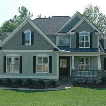
In general, Bryan and Connie Rellinger loved the charm of the old cottage they purchased on a Crooked Lake peninsula, north of Petoskey. Specifically, however, the presence of a live-well in the kitchen (a huge cement basin with running water for keeping fish alive was right in the kitchen entryway, seriously), rickety staircase and green shag carpet, not so much. An extreme renovation was the only solution. The downside? The rebuild would have to fit into the smallish nonconforming footprint. The upside? That footprint was built when folks could place a building close enough to the water to feel like they could dive in from the house. Ahhh...
Stephanie Baldwin of Edgewater Design helped the Rellingers come up with a timeless cottage design that breathes efficiency into every nook and cranny. It also expresses the synergy of Bryan, Connie and Stephanie, who emailed each other links to products they liked throughout the building process. That teamwork resulted in an interior that sports a young take on classic cottage. Highlights include a brass sink and light fixtures, coffered ceilings with wide beadboard planks, leathered granite kitchen counters and a way-cool floor made of American chestnut planks from an old barn.
Thanks to an abundant use of windows that deliver a grand view of Crooked Lake, the home feels airy and much larger than it is. Bryan and Connie also love how well the layout functions for their family - especially when they are entertaining. The kids' bedrooms are off a large landing at the top of the stairs - roomy enough to double as an entertainment room. When the adults are enjoying cocktail hour or a dinner party downstairs, they can pull a sliding door across the kitchen/great room area to seal it off from the kids' ruckus upstairs (or vice versa!).
From its gray-shingled dormers to its sweet white window boxes, this charmer on Crooked Lake is packed with ideas!
- Jacqueline Southby Photography
 Klopf Architecture
Malibu Glass Box House by Klopf Architecture
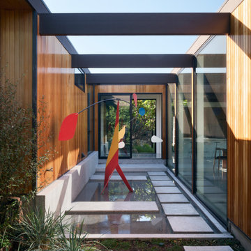
Following the devastating Woolsey Fire of 2018, the site in Malibu offered a unique opportunity to rebuild not just a home, but a new architectural composition that highlighted the property’s potential while navigating strict fire-rebuild codes in the area. Designed by Klopf Architecture, this project embraced a set of limitations and translated them into an architectural asset.
The city’s fire-rebuild process required the new structure to remain close to the original footprint, size and bulk, a constraint that ultimately clarified the architectural direction. Perched near the front of a long, narrow lot, the new home frames and overlooks a private, park-like rear expanse, an uncommon luxury especially in this part of Malibu .
Without a fixed program, the design process allowed for a different kind of creative focus allowing Klopf Architecture the opportunity to explore how a modernist home could best respond to this site. The team approached the project not with a list of requirements, but with a question: How might a modernist live here? What spatial qualities would inspire calm, connection, and a sense of wonder in this setting? The process became less about problem-solving and more about architectural storytelling—letting the site, the light, and the principles of modern design guide the form and flow of the home.
The response emerged in the form of a glass-box pavilion, an open, Mid-Century Modern inspired living, dining, and kitchen space that floats at the edge of the property’s natural descent. Connected to the more enclosed, private areas of the home by a glass-walled hallway, the living pavilion becomes a distinct centerpiece of the design. It opens on all four sides to the landscape with decks and patios on the flanks, an internal garden and water feature to the north, and a dramatic unguarded view of the expansive backyard and ocean horizon to the south.
Because of the mandated footprint, careful planning was required to ensure every space could still engage with light, landscape, or both. Strategic voids in the form of atriums and courtyards allow daylight to filter deep into the home’s core, while offering moments of surprise and retreat. These design gestures allow natural light to filter deep into the interior, creating a sense of brightness and openness throughout the day. At the same time, they expand the perceptual boundaries between inside and out, making the home feel more expansive while anchoring its connection to the surrounding landscape.
The siting of the house is what gives it its unique character. Rather than receding into the backyard like the neighboring homes, the house holds a slight prominence. From the central living pavilion, stepping down into the landscape feels more like entering a secluded park where a separate existing accessory structure, trail, and recreational areas await. The home’s modest street presence gives way to this unfolding drama of space, view, and nature.
Fire-resilient materials and assemblies are integrated seamlessly throughout including triple-pane glazing, under-slab and roof insulation, and locally sourced fire-rated cladding ensure the house not only meets Calfornia’s rigorous wildland-urban interface (WUI) standards, but feels effortlessly aligned with them. While technical decisions like fire-hardening and mechanical systems presented some construction challenges, particularly around the cantilevered glass box, the team found a functional compromise that preserved the integrity of the design.
Inside, a restrained palette and exposed post and beam design celebrate the ethos of mid-century modernism. A central circulation spine extends from the entry to the rear glass wall, offering a continuous visual link from street to ocean. Spaces such as the library and office, though more intimate in scale, are never cut off from nature as each opens to its own unique courtyard or garden view.
Though born out of a strict regulatory framework and developed without a specific client, the rebuild design unfolded with remarkable clarity. Grounded in site logic, refined by limitations and an emphasis on timeless spatial relationships – light, proportion, and a strong connection to nature, the resulting design feels both effortless and uplifting. The home lives lightly on the land, opens generously to its surroundings, and strikes a careful balance between privacy, openness, and calm. For Klopf Architecture, it stands as a compelling case study in how site, code, and circumstantial constraints can inspire enduring, modernist architecture. With years of experience reimagining mid-century modern design for how people live today, the firm took the project’s limitations as an opportunity. The result is a home shaped by open, flowing spaces, strong indoor-outdoor connections, and a calm, clear sense of structure. It’s a good reminder that even with strict constraints, there’s still room for architecture to breathe—and for modernism to keep moving forward.
Klopf Architecture project team: Geoff Campen, John Klopf, AIA, and Sherry Tan
Structural Engineer: ZFA
Contractor: Maison D’Artiste
Photography: ©2025 Mariko Reed
Year Completed: 2023
 Northwest Outdoor Lighting
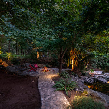
This immersive water feature experience is like nothing we’ve ever seen or lit before!
This large water feature circumstance is at least 40 feet wide with multiple waterfalls and viewing vignettes. Each sitting area provides a different experience. Some areas are purposefully darker and more intimate than others. You can walk from the patio area to the firepit, situated in the back corner. Then from the sitting area and back to the patio all while enjoying this beautiful experience. Never fearing that you'll fall in!
During their evening consultation, the homeowners were greatly involved. They even chose specific fixtures. With our design guidance, we included various color tones for high impact and minimal light glare. We used multiple uplights, path lights and submersible lights in a mixture of 2700 K (Kelvin). We also used the Sunset tone in the water feature to create a waterscape that was relaxing.
That's the beauty of hiring Northwest Outdoor Lighting. You can choose how involved you want to be. Our designers are flexible! We know we'll select the best products based on function and aesthetics. But having homeowners get involved in the design process means you'll love it that much more!
The extensive backyard lawn and trees were also lit with flush in-grade well lights. This makes mowing and lawn care so much easier. Highlighting the tall evergreens creates a safe environment for when the puppies need to go out at night. No scary animals are lurking in dark corners now. Path lights have been added to all the walkways.
After having the water feature unlit for years, the water feature has now become the homeowner’s pride and joy!

 Stone Action
Cambrian Black granite is shown in this project!
Search the specific granite name, see more granite or other stone options: http://www.stoneaction.com
Learn more about granite to see if it’s right for you:
Granite countertops can last a lifetime. It contains no harmful chemicals and do not emit harmful radiation or gasses. Granite is heat resistant and is one of the most heat-resistant countertops on the market. You can place a hot pan out of the oven directly onto the countertop surface. Experts do recommend the use of a trivet when using appliances that emit heat for long periods of time, such as crockpots. Since the material is so dense, there is a small possibility heating one area of the top and not the entire thing, could cause the countertop to crack.
Granite is scratch resistant. You can cut on it, but it will dull your knives! Granite scores a seven on Moh’s hardness scale.
Granite countertops are considered to be a low maintenance countertop surface. The likelihood of needing to be repaired or resurfaced is low. Granite is a porous material. Most fabricators will apply a sealer to granite countertops before they are installed which will protect them from absorbing liquids too quickly. Many sealers last more than 10 years before needing to be reapplied. When they do need to be reapplied, it is something that most homeowners can do on their own as the process is similar to cleaning. Darker granites are very dense and sometimes don’t even require a sealer.
When it comes to pricing, there are a lot of variables such as edge profile, total square footage, backsplash, etc. Don’t be fooled by the stereotype that all granite is expensive. Lower-range granites will cost less than high-range laminate. Though granite countertops are not considered “low range” in pricing, there are a lot of affordable options.
If you are looking for something truly unique, consider an exotic granite. Some quarries are not easily accessible and/or only able to be quarried for short periods of time throughout the year. If these circumstances exist in a quarry with gorgeous stone, the price will be driven upward
You won’t find a lot of solid patterns or bright colors, but both do exist. Also, watch for a large range of color and pattern within the same color of stone. It’s always a good idea to view the exact slab(s) that will be fabricated for your kitchen to make sure they are what you expected to see from the sample. Another factor is that many exotic types of granite have huge flowing waves, and a small sample will not be an accurate representation of the whole slab.
Granite countertops are very resistant to chemicals. Acids and bases will not harm the material.
 Twelve Stones Designs, LLC
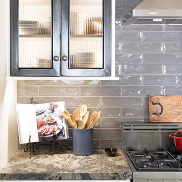
The owners of this kitchen had spent the money to upgrade the finishes in their kitchen upon building the home 12 years ago, but after living in the space for several years they realized how nonfunctional the layout really was. The (then) two preschool aged children had grown into busy, hungry teenagers with many friends who also liked to hang out at the house. So the family needed a more functional kitchen with better traffic flow, space for daily activities revolving around the kitchen at different times of day, and a kitchen that could accommodate cooking for and serving large groups. Furthermore, the dark, traditional finishes no longer reflected the homeowners’ style. They requested a brighter, more relaxed, coastal style that reflected their love of the seaside cities they like to visit.
Originally, the kitchen was U-shaped with a narrow island in the middle. The island created narrow aisles that bottle-necked at the dishwasher, refrigerator, and cooktop areas. There was a pass-through from the foyer into the kitchen, but the owners never liked that the pass-through was also located so close to the powder room. The awkward proximity was unappealing and made guests feel uncomfortable.
The kitchen’s storage was made up of lots of narrow cabinets, apothecary drawers, clipped corner units, and very few drawers. It lacked useful storage for the larger items the family used on a daily basis. And the kitchen’s only pantry was small closet that had only builder-grade, narrow shelving with no illumination to be able to see the contents inside.
Overall, the kitchen’s lighting plan was poorly executed. Only six recessed cans illuminated the entire kitchen and nook areas. The under cabinet lighting was not evenly distributed either. In fact, the builder had mis-placed the under cabinet lighting around the decorative pilasters which made for choppy, dark cubbies. Further, the builder didn’t include any lighting over the sink or the bar area, which meant whoever was doing the dishes was always in their own shadow. That, coupled with the steep overhang of the game room above made the bar area feel like a dim, cavernous space that wasn’t inviting or task oriented. The kitchen looked out into the main living space, but the raised bar and a narrow wall (which held the only large cabinet in the kitchen) created more of a barrier than a relationship to the living room or breakfast nook. In fact, one couldn’t even see the breakfast nook from the cooktop or sink areas due to its orientation. The raised bar top was too narrow to comfortably sit to either dine at or chat from due to the lack of knee space. The the homeowners confided that the kitchen felt more like a dark, dirty prison than place where the family, or their guests, wanted to gather and commune.
The clients' needs and desires were:
➢ to create a kitchen that would be a space the family loved to be in; to relate to the adjacent spaces all around, and to have better flow for entertaining large groups
➢ to remove the walls between the breakfast nook and living area and to be able to utilize the natural light from the windows in both those areas
➢ to incorporate a functional chopping block for prepping fresh food for home cooked meals, an island with a large sink and drain board, 2 pull out trash cans, and seating for at least the 2 teens to eat or do homework
➢ to design a kitchen and breakfast nook with an airy, coastal, relaxed vibe that blended with the rest of the house's coastal theme
➢ to integrate a layered lighting plan which would include ample general illumination, specific task lighting, decorative lighting, and lots of illuminated storage
➢ to design a kitchen with not only more storage for all the husband’s kitchen gadgets and collection of oils and spices, but smart storage, including a coffee/breakfast bar and a place to store and conceal the toaster oven and microwave
➢ to find a way to utilize the large open space between the kitchen, pantry area, and breakfast nook
Twelve Stones Designs achieved the owner's goals by:
➢ removing the walls between the kitchen and living room to allow the natural light to filter in from the adjacent rooms and to create a connection between the kitchen, nook, and living spaces for a sense of unity and communion
➢ removing the existing pantry and designing 3 large pantry style cabinets with LED tape lights and rollout drawers to house lots of kitchen appliances, gadgets, and tons of groceries. We also took the cabinets all the way up to the 9’ ceiling for additional storage for seasonal items and bulk storage.
➢ designing 2 islands - 1 with a gorgeous black walnut chopping block that houses a drawer for chopping and carving knives and a custom double pull out trash unit for point of use utilization - and 1 that houses the dishwasher, a large Blanco Gourmet sink with integrated drain board, woven baskets for fresh root vegetables and kitchen towels, plenty of drawer storage for kitchen items, and bar seating for up to 4 diners.
➢ closing off the space between the kitchen and the powder room to create a beautiful new private alcove for the powder room as well as adding some decorative storage. This also gave us space to include more tall storage near the new range for precision placement of the husband’s extensive oil and spice collection as well as a location for a combo-steam oven the wife wanted for baking and cooking healthy meals.
The project is enhanced functionally by:
➢ incorporated USB and standard receptacles for the kids’ laptops and phone charging in the large island
➢ designing the small island to include additional open shelving for items used on a daily basis such as a variety of bowls, plates, and colanders. This set up also works well for the husband who prefers to “plate” his dinners in restaurant-style fashion before presenting them to the table.
➢ the integration of specific storage units, such as double stacked cutlery drawers, a custom spice pull-out, a Kuerig coffee and tea pod drawer, and custom double stacked utensil drawers
➢ moving the refrigerator to the old oven location - this eliminated the bottle neck as well as created a better relationship to the eating table. It also utilizes the floor space between the pantry, nook, and kitchen
➢ creating a banquet style breakfast nook - this banquette seating not only doubles the amount of seating for large gatherings but it better utilizes the odd space between the kitchen and the previous nook area. It also helps to create a distinct pathway from the mudroom room through the pantry area, kitchen, nook, and living room.
➢ the coffee/breakfast bar area which includes the perfect location for the concealed microwave and toaster oven, convenient storage for the coffee pods and tea accoutrements. Roll-out drawers below also house the smoothie maker, hot water kettle, and a plethora of smoothie-making ingredients such as protein powders, smoothie additives, etc. Furthermore, the drawers below the Keurig house measuring utensil, cutlery, baking supplies and tupperware storage.
➢ incorporating lots of wide drawers and pullouts to accommodate large cookware.
➢ utilizing as much vertical space as possible by building storage to the ceiling which accommodates the family’s abundant amount of serving platters, baking sheets, bakeware, casserole dishes, and additional cutting boards.
The project is enhanced aesthetically by:
➢ new 5-piece Versailles pattern porcelain tile that now seamlessly joins the entire down stairs area together creating a bright, cohesiveness feeling instead of choppy separated spaces - it also adds a coastal feeling
➢ designing a cabinet to conceal the microwave and toaster oven
➢ the coastal influenced light fixtures over the nook table and island
➢ the sandy colors of the Langdon Cambria countertops. The swirling pattern and sparkling quartz pieces remind the homeowner of black-and-tan sandy beaches
➢ the striped banquet seating whose creamy white background and blue-green stripes were the inspiration for the cabinet and wall colors.
➢ All the interior doors were painted black to coordinate with the blacks and grays in the backsplash tile and countertop. This also adds a hint of tailored formality to an otherwise casual space.
➢ the use of WAC's Oculux small aperture LED units for the overhead lighting complimented with Diode LED strips for task lighting under the cabinets and inside the pantry and glass wall cabinets. All of the lighting applications are on separate dimmer switches.
Innovative uses of materials or construction methods by Realty Restoration LLC:
➢ Each 1-1/2” x 3” block of reclaimed end-grain black walnut that makes up the center island chopping block was hand milled and built in the shop. It was designed to look substantial and proportional to the surrounding elements, executed by creating the 4 inch tall top with a solid wood chamfered edge band.
➢ The metal doors on either side of the vent hood were also custom designed for this project and built in the Realty Restoration LLC shop. They are made 1x2, 11-gauge mild steel with ribbed glass. Weighing 60 lbs a piece, heavy duty cabinet hinges were added to support the weight of the door and keep them from sagging.
➢ Under-cabinet receptacles were added along the range wall in order to have a clean, uninterrupted backsplash.
Design obstacles to overcome:
➢ Because we were removing the demising walls between the kitchen and living room, we had to find a way to plumb and vent the new island. We did this by tunneling through the slab (the slab had post tension cables which prevented us from just trenching) to run a new wet vent through a nearby structural wall. We pulled the existing hot and cold lines between upper floor joists and ran them down the structural wall as well and up through a conduit in the tunnel.
➢ Since we were converting from wall overs to a gas range it allowed us to utilize the 220 feed for the wall ovens to provide a new sub panel for all the new kitchen circuits
➢ Due to framing deficiencies inherited from the original build there was a 1-1/2” differential in the floor-to-ceiling height over a 20 foot span; by utilizing the process of cutting and furring coupled with the crown moulding details on the cabinet elevations we were able to mask the problem and provide seamless transitions between the cabinet components.
Evidence of superior craftsmanship:
➢ uniquely designed, one-of-a-kind metal “X” end panels on the large island. The end panels were custom made in the Realty Restoration LLC shop and fitted to the exact dimensions of the island. The welding seams are completely indistinguishable - the posts look like they are cut from a single sheet of metal
➢ square metal posts on the small island were also custom made and designed to compliment and carry through the metal element s throughout the kitchen
➢ the beautiful, oversized end panels on the pantry cabinets which give the breakfast nook a tailored look
➢ integrating a large format 5 piece Versailles tile pattern to seamlessly flow from the existing spaces into the new kitchen space
➢ By constructing a custom cabinet that jogged around a corner we could not remodel (housing the entry way coat closet) we were able to camouflage the adjacent wall offset within the upper and lower cabinets. By designing around the existing jog in the structural walls we accomplished a few things: we were able to find the space to house, and hide, the microwave and toaster oven yet still have a clean cohesive appearance from the kitchen side. Additionally, the owners were able to keep their much needed coat closet and we didn’t have to increase the budget with unnecessary structural work.
 Drury Design
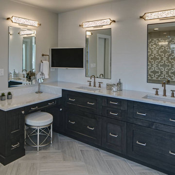
The original idea was to update the tile floor and the tub. That’s it.
A further discussion of wants and needs revealed intentions for an eventual larger shower and an improved vanity storage. It made sense to map out the possibilities and design our update with potential next steps in mind. The process was exciting, ultimately leading to the decision to do a full primary bath remodel.
Design Objectives:
-Maintain existing locations for all major bathroom functions
-Make the shower larger and more open
-Use luxurious materials throughout
-Improve vanity storage and define accessories for specific items
-Incorporate luxury shower fixtures
-Include the latest technology
Design Challenges
-Enlarging the shower in a typical rectangular shape would block the view and light from the alcove windows behind the tub
-Logical placement of the built-in shower caddy and all shower components in accordance with how and where they were to be used
-Keeping the long, back wall free from any shower modules to maintain the decorative tile design
-Combining the owner’s existing smart home system with a comprehensive shower system
-Planning cabinetry for hidden storage and use for various small appliances and make-up
-Integrating expensive shower wall tile with less expensive wall tile for aesthetic and budget purposes
-Incorporating special design features to balance the highly decorative shower tile
Design solutions:
-A clipped corner was planned for the shower bench seat – this allowed for a larger glass wall. The glass wall at the angled bench also brought more natural light into the shower
-Thoughtful shower space design prevented the crowding of features – the shower caddy and handheld shower head were placed on the full-height wall by the shower bench, the regular shower head and body sprays remained on the opposite wall, and the rain head was placed in the center of the shower
-A multi-port DTV system was installed, providing control of all shower components, including chromotherapy and music inside and outside the shower
-The lavish water-jet stone and glass decorative tile was paired with a less-expensive glass tile found in the mosaic
-Pull-out grooming organizers and electrical docking stations were incorporated into the cabinetry
Additional storage was created in the lower corner cabinet
The homeowners are thrilled with their new primary bathroom. Clear goals and carefully evaluated materials informed a fun and functional design that is both thoughtful and sumptuous!
 The Safety Letterbox Company
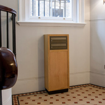
Floral Court is a mixed-use development featuring a high-quality residential, retail and restaurant space located in London’s Covent Garden. The project has created a new public walkway between Floral Street and King Street, providing increased footfall levels that provide a vital link to the retail and restaurant units in the development.
The mailboxes used in the Floral Court project are situated in internal lobby areas that residents pass through to access their apartment. Each bank of mailboxes is fitted into a bespoke timber frame with an internal steel frame support that ensures multiple mailboxes are securely installed in their respective locations.
The chosen mailbox model for this development is the NW2 product, an item that is particularly popular with clients looking for a mailbox that has a minimalist design finish and where mail is to be both delivered and retrieved through the front face. This project uses a lateral variation of the NW2 mailbox, which allows for A4 sized flexible mail to be deposited and securely stored in the post box. The lateral type of post box typically features a shorter depth and larger width, which is ideal for installation areas that are relatively narrow.
To reflect the number of residences that they service, the mailboxes are in a variety of different configurations across the site.
Each post box has been engraved with corresponding residence numbers during the manufacturing process. To allow for a clean finish on the mailbox, the client opted for the engraving to be the same colour as the mailboxes themselves. Being used with the NW2 product, which has been specifically designed to have minimal features, this is the ideal mailbox and engraving combination for a sleek designer look.
The mailbox is engraved with the front family ‘Calisto MT’, which is used in other locations on the site. This ensures a consistent mirroring of fonts used throughout the Floral Court development.
 Northwest Outdoor Lighting
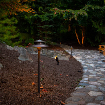
This immersive water feature experience is like nothing we’ve ever seen or lit before!
This large water feature circumstance is at least 40 feet wide with multiple waterfalls and viewing vignettes. Each sitting area provides a different experience. Some areas are purposefully darker and more intimate than others. You can walk from the patio area to the firepit, situated in the back corner. Then from the sitting area and back to the patio all while enjoying this beautiful experience. Never fearing that you'll fall in!
During their evening consultation, the homeowners were greatly involved. They even chose specific fixtures. With our design guidance, we included various color tones for high impact and minimal light glare. We used multiple uplights, path lights and submersible lights in a mixture of 2700 K (Kelvin). We also used the Sunset tone in the water feature to create a waterscape that was relaxing.
That's the beauty of hiring Northwest Outdoor Lighting. You can choose how involved you want to be. Our designers are flexible! We know we'll select the best products based on function and aesthetics. But having homeowners get involved in the design process means you'll love it that much more!
The extensive backyard lawn and trees were also lit with flush in-grade well lights. This makes mowing and lawn care so much easier. Highlighting the tall evergreens creates a safe environment for when the puppies need to go out at night. No scary animals are lurking in dark corners now. Path lights have been added to all the walkways.
After having the water feature unlit for years, the water feature has now become the homeowner’s pride and joy!
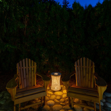 Northwest Outdoor Lighting
This immersive water feature experience is like nothing we’ve ever seen or lit before!
This large water feature circumstance is at least 40 feet wide with multiple waterfalls and viewing vignettes. Each sitting area provides a different experience. Some areas are purposefully darker and more intimate than others. You can walk from the patio area to the firepit, situated in the back corner. Then from the sitting area and back to the patio all while enjoying this beautiful experience. Never fearing that you'll fall in!
During their evening consultation, the homeowners were greatly involved. They even chose specific fixtures. With our design guidance, we included various color tones for high impact and minimal light glare. We used multiple uplights, path lights and submersible lights in a mixture of 2700 K (Kelvin). We also used the Sunset tone in the water feature to create a waterscape that was relaxing.
That's the beauty of hiring Northwest Outdoor Lighting. You can choose how involved you want to be. Our designers are flexible! We know we'll select the best products based on function and aesthetics. But having homeowners get involved in the design process means you'll love it that much more!
The extensive backyard lawn and trees were also lit with flush in-grade well lights. This makes mowing and lawn care so much easier. Highlighting the tall evergreens creates a safe environment for when the puppies need to go out at night. No scary animals are lurking in dark corners now. Path lights have been added to all the walkways.
After having the water feature unlit for years, the water feature has now become the homeowner’s pride and joy!
39