
Search results for "Storage capacity" in Home Design Ideas
 STACT Wine Displays Inc.
http://www.getSTACT.com
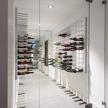
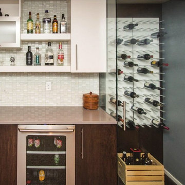
STACT wine racks are incredibly easy to specify and incorporate into wine cellars, wine rooms, kitchens, home bars, commercial bars, and restaurants. Our customers have found that when it comes to modern wine cellar solutions, our system offers a number of advantages versus other wine storage solutions available on the market, here are just a few:
✓ Quality - premium *furniture grade* solution is unique to the industry, with unrivalled refinement when it comes to materials, aesthetic and craftsmanship. Our panels feature a premium high-gloss painted finish (not a laminated surface). Each panel takes more than a week to complete, with meticulous attention to detail. Once numerous coats of lacquer have been applied, each panel is hand buffed to a mirror-like piano finish.
✓ Versatility - mount any way you wish, and designed to work equally well within both commercial and residential applications, our clients have found our modular system to be the most versatile, and easiest to specify, assemble, and install - whether for 9 bottles or 9,000 within a large scale wine cellar application (www.stact.co/cellars). Available on your choice of 10 finishes, mix and match STACT panels to create your own unique look (3,628,800 possible configurations).
✓ Convenience - designed for quick and easy *DIY installation*, our patented system comes ready-to-install to any drywall surface right out of the box, minimizing the costs associated with labor and installation when compared with many custom solutions you will find on the market. Avoiding the need for a dedicated wine cellar builder to produce and arrive on site for assembly and installation. In-stock items typically ship within 1 business day.
✓ Value - direct-to-client distribution model to effectively cut out retail markup. Builders and specifiers have found STACT to be a fraction of the price of what it would cost to develop and produce a comparable custom solution. Plus currently we are offering *free shipping worldwide*.
✓ Design pedigree - created by 2012 ICFF winning designer Eric Pfeiffer, our patented prefabricated ready-to-assemble modular design is unique to the industry.
✓ Space-saving - highest bottle capacity on the market (10.7 bottles / sq ft). Each panel supports 9-12 bottles depending on how they are configured.
✓ Security - superior bottle stability, versus other wall-mounted wine storage solutions on the market. The aircraft grade aluminum bottle support structure ensures a lower center of gravity there is a more substantial portion of the bottle resting below the contact points. Thus a minimalist design aesthetic is retained, while eliminating the need for unnecessary and unsightly materials/clutter such as rubber gaskets, straps, etc.
Learn more at www.getSTACT.com
 SERGIO HALFON | Architecture & Interior Design
English – Project Description
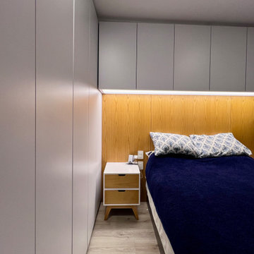
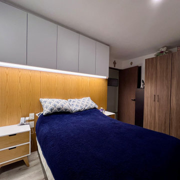
This project involved the complete transformation of a small bedroom in Mexico City, redefining the space through integrated architectural millwork and a clear, cohesive design strategy.
Prior to the intervention, the room lacked sufficient storage and contained a mix of unrelated furniture pieces that created visual clutter and inefficient use of space. The design addressed these limitations by replacing all existing furniture with custom-built elements conceived as part of the architectural envelope.
Two full-height closets were designed to significantly increase storage capacity and establish visual order. One closet was executed during the initial phase, with the second planned for future implementation to further optimize the space. In addition, a continuous storage volume was integrated above the bed, incorporating concealed compartments and linear integrated lighting that provides soft, indirect illumination.
A wood headboard panel was introduced to bring warmth and material balance to the composition, contrasting with the clean, neutral millwork and reinforcing the architectural identity of the space.
By consolidating storage into integrated elements and eliminating fragmented furniture, the intervention freed usable floor area, improved circulation, and created a calm, organized, and visually coherent environment. The result is a contemporary bedroom that prioritizes spatial clarity, functional efficiency, and material harmony through precise architectural integration.
Español – Descripción del Proyecto
Este proyecto consistió en la transformación completa de una recámara pequeña en la Ciudad de México, redefiniendo el espacio mediante carpintería arquitectónica integrada y una estrategia de diseño clara y coherente.
Antes de la intervención, la recámara carecía de suficiente espacio de guardado y contenía una mezcla de muebles sin relación entre sí, lo que generaba desorden visual y un uso ineficiente del espacio. El diseño resolvió estas limitaciones reemplazando el mobiliario existente por elementos hechos a medida, concebidos como parte de la arquitectura.
Se diseñaron dos closets de altura completa para incrementar significativamente la capacidad de almacenamiento y establecer orden visual. Uno de los closets fue construido en la primera etapa, mientras que el segundo está previsto para una futura implementación, con el fin de optimizar aún más el espacio. Adicionalmente, se integró un volumen continuo de guardado sobre la cama, incorporando compartimentos ocultos e iluminación lineal integrada que proporciona luz indirecta y uniforme.
Se introdujo un panel de madera como cabecera para aportar calidez y balance material a la composición, contrastando con la carpintería neutra y reforzando la identidad arquitectónica del espacio.
Al consolidar el almacenamiento en elementos integrados y eliminar el mobiliario fragmentado, la intervención liberó superficie útil, mejoró la circulación y creó un ambiente tranquilo, ordenado y visualmente coherente. El resultado es una recámara contemporánea que prioriza la claridad espacial, la eficiencia funcional y la armonía material mediante una integración arquitectónica precisa.
 SERGIO HALFON | Architecture & Interior Design
English – Project Description
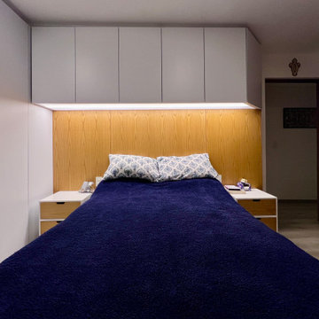
This project involved the complete transformation of a small bedroom in Mexico City, redefining the space through integrated architectural millwork and a clear, cohesive design strategy.
Prior to the intervention, the room lacked sufficient storage and contained a mix of unrelated furniture pieces that created visual clutter and inefficient use of space. The design addressed these limitations by replacing all existing furniture with custom-built elements conceived as part of the architectural envelope.
Two full-height closets were designed to significantly increase storage capacity and establish visual order. One closet was executed during the initial phase, with the second planned for future implementation to further optimize the space. In addition, a continuous storage volume was integrated above the bed, incorporating concealed compartments and linear integrated lighting that provides soft, indirect illumination.
A wood headboard panel was introduced to bring warmth and material balance to the composition, contrasting with the clean, neutral millwork and reinforcing the architectural identity of the space.
By consolidating storage into integrated elements and eliminating fragmented furniture, the intervention freed usable floor area, improved circulation, and created a calm, organized, and visually coherent environment. The result is a contemporary bedroom that prioritizes spatial clarity, functional efficiency, and material harmony through precise architectural integration.
Español – Descripción del Proyecto
Este proyecto consistió en la transformación completa de una recámara pequeña en la Ciudad de México, redefiniendo el espacio mediante carpintería arquitectónica integrada y una estrategia de diseño clara y coherente.
Antes de la intervención, la recámara carecía de suficiente espacio de guardado y contenía una mezcla de muebles sin relación entre sí, lo que generaba desorden visual y un uso ineficiente del espacio. El diseño resolvió estas limitaciones reemplazando el mobiliario existente por elementos hechos a medida, concebidos como parte de la arquitectura.
Se diseñaron dos closets de altura completa para incrementar significativamente la capacidad de almacenamiento y establecer orden visual. Uno de los closets fue construido en la primera etapa, mientras que el segundo está previsto para una futura implementación, con el fin de optimizar aún más el espacio. Adicionalmente, se integró un volumen continuo de guardado sobre la cama, incorporando compartimentos ocultos e iluminación lineal integrada que proporciona luz indirecta y uniforme.
Se introdujo un panel de madera como cabecera para aportar calidez y balance material a la composición, contrastando con la carpintería neutra y reforzando la identidad arquitectónica del espacio.
Al consolidar el almacenamiento en elementos integrados y eliminar el mobiliario fragmentado, la intervención liberó superficie útil, mejoró la circulación y creó un ambiente tranquilo, ordenado y visualmente coherente. El resultado es una recámara contemporánea que prioriza la claridad espacial, la eficiencia funcional y la armonía material mediante una integración arquitectónica precisa.
Find the right local pro for your project
 SERGIO HALFON | Architecture & Interior Design
English – Project Description
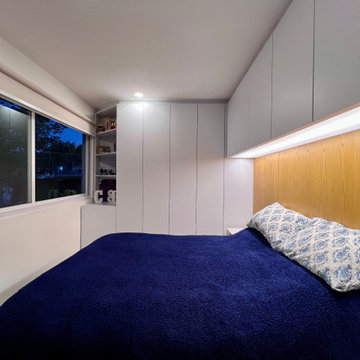
This project involved the complete transformation of a small bedroom in Mexico City, redefining the space through integrated architectural millwork and a clear, cohesive design strategy.
Prior to the intervention, the room lacked sufficient storage and contained a mix of unrelated furniture pieces that created visual clutter and inefficient use of space. The design addressed these limitations by replacing all existing furniture with custom-built elements conceived as part of the architectural envelope.
Two full-height closets were designed to significantly increase storage capacity and establish visual order. One closet was executed during the initial phase, with the second planned for future implementation to further optimize the space. In addition, a continuous storage volume was integrated above the bed, incorporating concealed compartments and linear integrated lighting that provides soft, indirect illumination.
A wood headboard panel was introduced to bring warmth and material balance to the composition, contrasting with the clean, neutral millwork and reinforcing the architectural identity of the space.
By consolidating storage into integrated elements and eliminating fragmented furniture, the intervention freed usable floor area, improved circulation, and created a calm, organized, and visually coherent environment. The result is a contemporary bedroom that prioritizes spatial clarity, functional efficiency, and material harmony through precise architectural integration.
Español – Descripción del Proyecto
Este proyecto consistió en la transformación completa de una recámara pequeña en la Ciudad de México, redefiniendo el espacio mediante carpintería arquitectónica integrada y una estrategia de diseño clara y coherente.
Antes de la intervención, la recámara carecía de suficiente espacio de guardado y contenía una mezcla de muebles sin relación entre sí, lo que generaba desorden visual y un uso ineficiente del espacio. El diseño resolvió estas limitaciones reemplazando el mobiliario existente por elementos hechos a medida, concebidos como parte de la arquitectura.
Se diseñaron dos closets de altura completa para incrementar significativamente la capacidad de almacenamiento y establecer orden visual. Uno de los closets fue construido en la primera etapa, mientras que el segundo está previsto para una futura implementación, con el fin de optimizar aún más el espacio. Adicionalmente, se integró un volumen continuo de guardado sobre la cama, incorporando compartimentos ocultos e iluminación lineal integrada que proporciona luz indirecta y uniforme.
Se introdujo un panel de madera como cabecera para aportar calidez y balance material a la composición, contrastando con la carpintería neutra y reforzando la identidad arquitectónica del espacio.
Al consolidar el almacenamiento en elementos integrados y eliminar el mobiliario fragmentado, la intervención liberó superficie útil, mejoró la circulación y creó un ambiente tranquilo, ordenado y visualmente coherente. El resultado es una recámara contemporánea que prioriza la claridad espacial, la eficiencia funcional y la armonía material mediante una integración arquitectónica precisa.
 SERGIO HALFON | Architecture & Interior Design
English – Project Description
This project involved the complete transformation of a small bedroom in Mexico City, redefining the space through integrated architectural millwork and a clear, cohesive design strategy.
Prior to the intervention, the room lacked sufficient storage and contained a mix of unrelated furniture pieces that created visual clutter and inefficient use of space. The design addressed these limitations by replacing all existing furniture with custom-built elements conceived as part of the architectural envelope.
Two full-height closets were designed to significantly increase storage capacity and establish visual order. One closet was executed during the initial phase, with the second planned for future implementation to further optimize the space. In addition, a continuous storage volume was integrated above the bed, incorporating concealed compartments and linear integrated lighting that provides soft, indirect illumination.
A wood headboard panel was introduced to bring warmth and material balance to the composition, contrasting with the clean, neutral millwork and reinforcing the architectural identity of the space.
By consolidating storage into integrated elements and eliminating fragmented furniture, the intervention freed usable floor area, improved circulation, and created a calm, organized, and visually coherent environment. The result is a contemporary bedroom that prioritizes spatial clarity, functional efficiency, and material harmony through precise architectural integration.
Español – Descripción del Proyecto
Este proyecto consistió en la transformación completa de una recámara pequeña en la Ciudad de México, redefiniendo el espacio mediante carpintería arquitectónica integrada y una estrategia de diseño clara y coherente.
Antes de la intervención, la recámara carecía de suficiente espacio de guardado y contenía una mezcla de muebles sin relación entre sí, lo que generaba desorden visual y un uso ineficiente del espacio. El diseño resolvió estas limitaciones reemplazando el mobiliario existente por elementos hechos a medida, concebidos como parte de la arquitectura.
Se diseñaron dos closets de altura completa para incrementar significativamente la capacidad de almacenamiento y establecer orden visual. Uno de los closets fue construido en la primera etapa, mientras que el segundo está previsto para una futura implementación, con el fin de optimizar aún más el espacio. Adicionalmente, se integró un volumen continuo de guardado sobre la cama, incorporando compartimentos ocultos e iluminación lineal integrada que proporciona luz indirecta y uniforme.
Se introdujo un panel de madera como cabecera para aportar calidez y balance material a la composición, contrastando con la carpintería neutra y reforzando la identidad arquitectónica del espacio.
Al consolidar el almacenamiento en elementos integrados y eliminar el mobiliario fragmentado, la intervención liberó superficie útil, mejoró la circulación y creó un ambiente tranquilo, ordenado y visualmente coherente. El resultado es una recámara contemporánea que prioriza la claridad espacial, la eficiencia funcional y la armonía material mediante una integración arquitectónica precisa.
 STACT Wine Displays Inc.
http://www.getSTACT.com
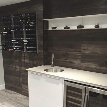
STACT wine racks are incredibly easy to specify and incorporate into wine cellars, wine rooms, kitchens, home bars, commercial bars, and restaurants. Our customers have found that when it comes to modern wine cellar solutions, our system offers a number of advantages versus other wine storage solutions available on the market, here are just a few:
✓ Quality - premium *furniture grade* solution is unique to the industry, with unrivalled refinement when it comes to materials, aesthetic and craftsmanship. Our panels feature a premium high-gloss painted finish (not a laminated surface). Each panel takes more than a week to complete, with meticulous attention to detail. Once numerous coats of lacquer have been applied, each panel is hand buffed to a mirror-like piano finish.
✓ Versatility - mount any way you wish, and designed to work equally well within both commercial and residential applications, our clients have found our modular system to be the most versatile, and easiest to specify, assemble, and install - whether for 9 bottles or 9,000 within a large scale wine cellar application (www.stact.co/cellars). Available on your choice of 10 finishes, mix and match STACT panels to create your own unique look (3,628,800 possible configurations).
✓ Convenience - designed for quick and easy *DIY installation*, our patented system comes ready-to-install to any drywall surface right out of the box, minimizing the costs associated with labor and installation when compared with many custom solutions you will find on the market. Avoiding the need for a dedicated wine cellar builder to produce and arrive on site for assembly and installation. In-stock items typically ship within 1 business day.
✓ Value - direct-to-client distribution model to effectively cut out retail markup. Builders and specifiers have found STACT to be a fraction of the price of what it would cost to develop and produce a comparable custom solution. Plus currently we are offering *free shipping worldwide*.
✓ Design pedigree - created by 2012 ICFF winning designer Eric Pfeiffer, our patented prefabricated ready-to-assemble modular design is unique to the industry.
✓ Space-saving - highest bottle capacity on the market (10.7 bottles / sq ft). Each panel supports 9-12 bottles depending on how they are configured.
✓ Security - superior bottle stability, versus other wall-mounted wine storage solutions on the market. The aircraft grade aluminum bottle support structure ensures a lower center of gravity there is a more substantial portion of the bottle resting below the contact points. Thus a minimalist design aesthetic is retained, while eliminating the need for unnecessary and unsightly materials/clutter such as rubber gaskets, straps, etc.
Learn more at www.getSTACT.com

 Design Depot
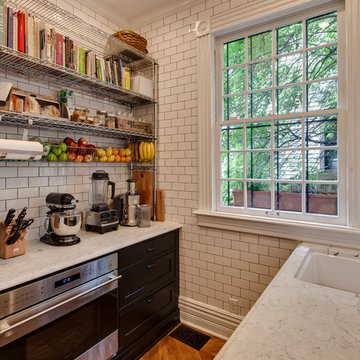
Mid-sized minimalist l-shaped light wood floor eat-in kitchen photo in New York with an undermount sink, flat-panel cabinets, medium tone wood cabinets, quartz countertops, white backsplash, stainless steel appliances, an island and white countertops
Sponsored
Columbus, OH

Hope Restoration & General Contracting
Columbus Design-Build, Kitchen & Bath Remodeling, Historic Renovations
 SERGIO HALFON | Architecture & Interior Design
English – Project Description
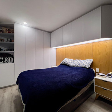
This project involved the complete transformation of a small bedroom in Mexico City, redefining the space through integrated architectural millwork and a clear, cohesive design strategy.
Prior to the intervention, the room lacked sufficient storage and contained a mix of unrelated furniture pieces that created visual clutter and inefficient use of space. The design addressed these limitations by replacing all existing furniture with custom-built elements conceived as part of the architectural envelope.
Two full-height closets were designed to significantly increase storage capacity and establish visual order. One closet was executed during the initial phase, with the second planned for future implementation to further optimize the space. In addition, a continuous storage volume was integrated above the bed, incorporating concealed compartments and linear integrated lighting that provides soft, indirect illumination.
A wood headboard panel was introduced to bring warmth and material balance to the composition, contrasting with the clean, neutral millwork and reinforcing the architectural identity of the space.
By consolidating storage into integrated elements and eliminating fragmented furniture, the intervention freed usable floor area, improved circulation, and created a calm, organized, and visually coherent environment. The result is a contemporary bedroom that prioritizes spatial clarity, functional efficiency, and material harmony through precise architectural integration.
Español – Descripción del Proyecto
Este proyecto consistió en la transformación completa de una recámara pequeña en la Ciudad de México, redefiniendo el espacio mediante carpintería arquitectónica integrada y una estrategia de diseño clara y coherente.
Antes de la intervención, la recámara carecía de suficiente espacio de guardado y contenía una mezcla de muebles sin relación entre sí, lo que generaba desorden visual y un uso ineficiente del espacio. El diseño resolvió estas limitaciones reemplazando el mobiliario existente por elementos hechos a medida, concebidos como parte de la arquitectura.
Se diseñaron dos closets de altura completa para incrementar significativamente la capacidad de almacenamiento y establecer orden visual. Uno de los closets fue construido en la primera etapa, mientras que el segundo está previsto para una futura implementación, con el fin de optimizar aún más el espacio. Adicionalmente, se integró un volumen continuo de guardado sobre la cama, incorporando compartimentos ocultos e iluminación lineal integrada que proporciona luz indirecta y uniforme.
Se introdujo un panel de madera como cabecera para aportar calidez y balance material a la composición, contrastando con la carpintería neutra y reforzando la identidad arquitectónica del espacio.
Al consolidar el almacenamiento en elementos integrados y eliminar el mobiliario fragmentado, la intervención liberó superficie útil, mejoró la circulación y creó un ambiente tranquilo, ordenado y visualmente coherente. El resultado es una recámara contemporánea que prioriza la claridad espacial, la eficiencia funcional y la armonía material mediante una integración arquitectónica precisa.
 Drury Design
THE SETUP
Multiple ovens, multiple workspaces, multiple sinks – when you think about it, non-jewish kitchens have been adapting the criteria of kosher kitchens for years.
Gladys’ clients in West Rogers Park are Orthodox Jewish. The house they bought already had a kosher kitchen – it just wasn’t done that well. It needed some more things to be duplicated for the dairy side and the meat side. Plus, it was dark and the configuration wasn’t very conducive for a family of eight.
It was time for a remodel.
Design Objectives
Improve kosher kitchen
Add more storage in the island
Better lighting
More open, lighter feel
Change the wood floor in the kitchen to tile
THE REMODEL
Design Challenges
- We had originally planned on removing a wing wall by the breakfast area. During demolition, we learned it contained a support beam.
- The kitchen is a substantial size, but having two sinks, dishwashers, and ovens presented a challenge – how do we fit it all in and make it flow with the storage still accessible near the work areas?
Where do you stop the materials for the new space? - -- The right tile, paint, lighting, etc. would be needed to make the remodeled area cohesive with the rest of the main floor.
- An existing column limited cabinet options and thus, storage capacity. Could we conceal it without disrupting the cabinetry flow?
Design Solutions
- We had to keep the wing wall, but decided to continue the tile on the sides of the cabinets and maintain the height of the tile to line up with the rest of the backsplash. This actually presented a very nice and cohesive look, especially since the opposite side has a wing wall to the left of the refrigerator.
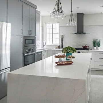
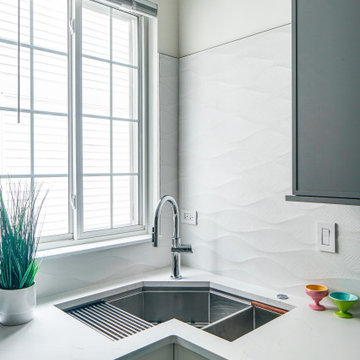
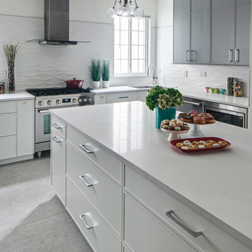
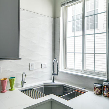
- We used “L-shaped” corner sinks instead of the rectangular ones set on an angle. This gave us more of the legs of the triangles versus the hypotenuse, which allowed for the two dishwashers, and the pullout utensil canisters and spice pullouts while still keeping the 3-drawer cabinets on either side of the range (by the sinks). The old island had the recess for stools which the family never used. By extending the width of the island 6” and utilizing this leg space, we were able to fit 18”-deep cabinets on this side – adding lots of accessible storage. The family can now work simultaneously on the dairy side (the side with the fridge) and the meat side (opposite) without getting in each other’s way. We separated the cooking by using the range oven for the meat and a built-in microwave in the base cabinet. The wall oven with built-in microwave on top is for dairy.
- Corner sinks opened up the middle area for a wider range – we went from a 30” to a 36”. Removing all the wall cabinets (on the range wall) made a big difference. That opened up the entire space while adding some visual impact. (Not pictured: We also made the cabinets directly opposite the range wall tall and removed the countertop, resulting in more room for rollouts and even more storage!) The kitchen now has more storage than it did before.
- We ended up painting the ceiling of the kitchen into the hallway that leads to the foyer. The living and dining rooms were separated by a soffit, so that became a natural boundary. We kept the tile in the kitchen by stopping it short of the hallway and lining it up with the pantry wall. This creates a border between the breakfast area and family room. The rest of the existing wood floors were refinished to refresh and make the hue darker. We also painted a dark accent wall and carried it into the breakfast area to make the rooms look deeper.
- The in-the-way column housed plumbing and couldn’t be moved. We still built cabinets in that spot – we just had to build a chase inside it to conceal the pipes. There was still plenty of room for new storage. We also took the cabinets all the way to the ceiling. The continuous tall cabinets added a functional elegance to the space.
THE RENEWED SPACE
The client’s long-awaited dream of a better kosher kitchen has finally been achieved, beautifully combining enhanced storage solutions with adherence to the family’s orthodox dietary laws. The kitchen’s standout feature, an expanded island, now offers a spacious and efficient workspace. This allows several family members to cook together comfortably, without the inconvenience of bumping into each other, ensuring a harmonious and productive cooking environment.
 Drury Design
THE SETUP
Multiple ovens, multiple workspaces, multiple sinks – when you think about it, non-jewish kitchens have been adapting the criteria of kosher kitchens for years.
Gladys’ clients in West Rogers Park are Orthodox Jewish. The house they bought already had a kosher kitchen – it just wasn’t done that well. It needed some more things to be duplicated for the dairy side and the meat side. Plus, it was dark and the configuration wasn’t very conducive for a family of eight.
It was time for a remodel.
Design Objectives
Improve kosher kitchen
Add more storage in the island
Better lighting
More open, lighter feel
Change the wood floor in the kitchen to tile
THE REMODEL
Design Challenges
- We had originally planned on removing a wing wall by the breakfast area. During demolition, we learned it contained a support beam.
- The kitchen is a substantial size, but having two sinks, dishwashers, and ovens presented a challenge – how do we fit it all in and make it flow with the storage still accessible near the work areas?
Where do you stop the materials for the new space? - -- The right tile, paint, lighting, etc. would be needed to make the remodeled area cohesive with the rest of the main floor.
- An existing column limited cabinet options and thus, storage capacity. Could we conceal it without disrupting the cabinetry flow?
Design Solutions
- We had to keep the wing wall, but decided to continue the tile on the sides of the cabinets and maintain the height of the tile to line up with the rest of the backsplash. This actually presented a very nice and cohesive look, especially since the opposite side has a wing wall to the left of the refrigerator.
- We used “L-shaped” corner sinks instead of the rectangular ones set on an angle. This gave us more of the legs of the triangles versus the hypotenuse, which allowed for the two dishwashers, and the pullout utensil canisters and spice pullouts while still keeping the 3-drawer cabinets on either side of the range (by the sinks). The old island had the recess for stools which the family never used. By extending the width of the island 6” and utilizing this leg space, we were able to fit 18”-deep cabinets on this side – adding lots of accessible storage. The family can now work simultaneously on the dairy side (the side with the fridge) and the meat side (opposite) without getting in each other’s way. We separated the cooking by using the range oven for the meat and a built-in microwave in the base cabinet. The wall oven with built-in microwave on top is for dairy.
- Corner sinks opened up the middle area for a wider range – we went from a 30” to a 36”. Removing all the wall cabinets (on the range wall) made a big difference. That opened up the entire space while adding some visual impact. (Not pictured: We also made the cabinets directly opposite the range wall tall and removed the countertop, resulting in more room for rollouts and even more storage!) The kitchen now has more storage than it did before.
- We ended up painting the ceiling of the kitchen into the hallway that leads to the foyer. The living and dining rooms were separated by a soffit, so that became a natural boundary. We kept the tile in the kitchen by stopping it short of the hallway and lining it up with the pantry wall. This creates a border between the breakfast area and family room. The rest of the existing wood floors were refinished to refresh and make the hue darker. We also painted a dark accent wall and carried it into the breakfast area to make the rooms look deeper.
- The in-the-way column housed plumbing and couldn’t be moved. We still built cabinets in that spot – we just had to build a chase inside it to conceal the pipes. There was still plenty of room for new storage. We also took the cabinets all the way to the ceiling. The continuous tall cabinets added a functional elegance to the space.
THE RENEWED SPACE
The client’s long-awaited dream of a better kosher kitchen has finally been achieved, beautifully combining enhanced storage solutions with adherence to the family’s orthodox dietary laws. The kitchen’s standout feature, an expanded island, now offers a spacious and efficient workspace. This allows several family members to cook together comfortably, without the inconvenience of bumping into each other, ensuring a harmonious and productive cooking environment.
 Drury Design
THE SETUP
Multiple ovens, multiple workspaces, multiple sinks – when you think about it, non-jewish kitchens have been adapting the criteria of kosher kitchens for years.
Gladys’ clients in West Rogers Park are Orthodox Jewish. The house they bought already had a kosher kitchen – it just wasn’t done that well. It needed some more things to be duplicated for the dairy side and the meat side. Plus, it was dark and the configuration wasn’t very conducive for a family of eight.
It was time for a remodel.
Design Objectives
Improve kosher kitchen
Add more storage in the island
Better lighting
More open, lighter feel
Change the wood floor in the kitchen to tile
THE REMODEL
Design Challenges
- We had originally planned on removing a wing wall by the breakfast area. During demolition, we learned it contained a support beam.
- The kitchen is a substantial size, but having two sinks, dishwashers, and ovens presented a challenge – how do we fit it all in and make it flow with the storage still accessible near the work areas?
Where do you stop the materials for the new space? - -- The right tile, paint, lighting, etc. would be needed to make the remodeled area cohesive with the rest of the main floor.
- An existing column limited cabinet options and thus, storage capacity. Could we conceal it without disrupting the cabinetry flow?
Design Solutions
- We had to keep the wing wall, but decided to continue the tile on the sides of the cabinets and maintain the height of the tile to line up with the rest of the backsplash. This actually presented a very nice and cohesive look, especially since the opposite side has a wing wall to the left of the refrigerator.
- We used “L-shaped” corner sinks instead of the rectangular ones set on an angle. This gave us more of the legs of the triangles versus the hypotenuse, which allowed for the two dishwashers, and the pullout utensil canisters and spice pullouts while still keeping the 3-drawer cabinets on either side of the range (by the sinks). The old island had the recess for stools which the family never used. By extending the width of the island 6” and utilizing this leg space, we were able to fit 18”-deep cabinets on this side – adding lots of accessible storage. The family can now work simultaneously on the dairy side (the side with the fridge) and the meat side (opposite) without getting in each other’s way. We separated the cooking by using the range oven for the meat and a built-in microwave in the base cabinet. The wall oven with built-in microwave on top is for dairy.
- Corner sinks opened up the middle area for a wider range – we went from a 30” to a 36”. Removing all the wall cabinets (on the range wall) made a big difference. That opened up the entire space while adding some visual impact. (Not pictured: We also made the cabinets directly opposite the range wall tall and removed the countertop, resulting in more room for rollouts and even more storage!) The kitchen now has more storage than it did before.
- We ended up painting the ceiling of the kitchen into the hallway that leads to the foyer. The living and dining rooms were separated by a soffit, so that became a natural boundary. We kept the tile in the kitchen by stopping it short of the hallway and lining it up with the pantry wall. This creates a border between the breakfast area and family room. The rest of the existing wood floors were refinished to refresh and make the hue darker. We also painted a dark accent wall and carried it into the breakfast area to make the rooms look deeper.
- The in-the-way column housed plumbing and couldn’t be moved. We still built cabinets in that spot – we just had to build a chase inside it to conceal the pipes. There was still plenty of room for new storage. We also took the cabinets all the way to the ceiling. The continuous tall cabinets added a functional elegance to the space.
THE RENEWED SPACE
The client’s long-awaited dream of a better kosher kitchen has finally been achieved, beautifully combining enhanced storage solutions with adherence to the family’s orthodox dietary laws. The kitchen’s standout feature, an expanded island, now offers a spacious and efficient workspace. This allows several family members to cook together comfortably, without the inconvenience of bumping into each other, ensuring a harmonious and productive cooking environment.
 Drury Design
THE SETUP
Multiple ovens, multiple workspaces, multiple sinks – when you think about it, non-jewish kitchens have been adapting the criteria of kosher kitchens for years.
Gladys’ clients in West Rogers Park are Orthodox Jewish. The house they bought already had a kosher kitchen – it just wasn’t done that well. It needed some more things to be duplicated for the dairy side and the meat side. Plus, it was dark and the configuration wasn’t very conducive for a family of eight.
It was time for a remodel.
Design Objectives
Improve kosher kitchen
Add more storage in the island
Better lighting
More open, lighter feel
Change the wood floor in the kitchen to tile
THE REMODEL
Design Challenges
- We had originally planned on removing a wing wall by the breakfast area. During demolition, we learned it contained a support beam.
- The kitchen is a substantial size, but having two sinks, dishwashers, and ovens presented a challenge – how do we fit it all in and make it flow with the storage still accessible near the work areas?
Where do you stop the materials for the new space? - -- The right tile, paint, lighting, etc. would be needed to make the remodeled area cohesive with the rest of the main floor.
- An existing column limited cabinet options and thus, storage capacity. Could we conceal it without disrupting the cabinetry flow?
Design Solutions
- We had to keep the wing wall, but decided to continue the tile on the sides of the cabinets and maintain the height of the tile to line up with the rest of the backsplash. This actually presented a very nice and cohesive look, especially since the opposite side has a wing wall to the left of the refrigerator.
- We used “L-shaped” corner sinks instead of the rectangular ones set on an angle. This gave us more of the legs of the triangles versus the hypotenuse, which allowed for the two dishwashers, and the pullout utensil canisters and spice pullouts while still keeping the 3-drawer cabinets on either side of the range (by the sinks). The old island had the recess for stools which the family never used. By extending the width of the island 6” and utilizing this leg space, we were able to fit 18”-deep cabinets on this side – adding lots of accessible storage. The family can now work simultaneously on the dairy side (the side with the fridge) and the meat side (opposite) without getting in each other’s way. We separated the cooking by using the range oven for the meat and a built-in microwave in the base cabinet. The wall oven with built-in microwave on top is for dairy.
- Corner sinks opened up the middle area for a wider range – we went from a 30” to a 36”. Removing all the wall cabinets (on the range wall) made a big difference. That opened up the entire space while adding some visual impact. (Not pictured: We also made the cabinets directly opposite the range wall tall and removed the countertop, resulting in more room for rollouts and even more storage!) The kitchen now has more storage than it did before.
- We ended up painting the ceiling of the kitchen into the hallway that leads to the foyer. The living and dining rooms were separated by a soffit, so that became a natural boundary. We kept the tile in the kitchen by stopping it short of the hallway and lining it up with the pantry wall. This creates a border between the breakfast area and family room. The rest of the existing wood floors were refinished to refresh and make the hue darker. We also painted a dark accent wall and carried it into the breakfast area to make the rooms look deeper.
- The in-the-way column housed plumbing and couldn’t be moved. We still built cabinets in that spot – we just had to build a chase inside it to conceal the pipes. There was still plenty of room for new storage. We also took the cabinets all the way to the ceiling. The continuous tall cabinets added a functional elegance to the space.
THE RENEWED SPACE
The client’s long-awaited dream of a better kosher kitchen has finally been achieved, beautifully combining enhanced storage solutions with adherence to the family’s orthodox dietary laws. The kitchen’s standout feature, an expanded island, now offers a spacious and efficient workspace. This allows several family members to cook together comfortably, without the inconvenience of bumping into each other, ensuring a harmonious and productive cooking environment.
 STACT Wine Displays Inc.
http://www.getSTACT.com
STACT wine racks are incredibly easy to specify and incorporate into wine cellars, wine rooms, kitchens, home bars, commercial bars, and restaurants. Our customers have found that when it comes to modern wine cellar solutions, our system offers a number of advantages versus other wine storage solutions available on the market, here are just a few:
✓ Quality - premium *furniture grade* solution is unique to the industry, with unrivalled refinement when it comes to materials, aesthetic and craftsmanship. Our panels feature a premium high-gloss painted finish (not a laminated surface). Each panel takes more than a week to complete, with meticulous attention to detail. Once numerous coats of lacquer have been applied, each panel is hand buffed to a mirror-like piano finish.
✓ Versatility - mount any way you wish, and designed to work equally well within both commercial and residential applications, our clients have found our modular system to be the most versatile, and easiest to specify, assemble, and install - whether for 9 bottles or 9,000 within a large scale wine cellar application (www.stact.co/cellars). Available on your choice of 10 finishes, mix and match STACT panels to create your own unique look (3,628,800 possible configurations).
✓ Convenience - designed for quick and easy *DIY installation*, our patented system comes ready-to-install to any drywall surface right out of the box, minimizing the costs associated with labor and installation when compared with many custom solutions you will find on the market. Avoiding the need for a dedicated wine cellar builder to produce and arrive on site for assembly and installation. In-stock items typically ship within 1 business day.
✓ Value - direct-to-client distribution model to effectively cut out retail markup. Builders and specifiers have found STACT to be a fraction of the price of what it would cost to develop and produce a comparable custom solution. Plus currently we are offering *free shipping worldwide*.
✓ Design pedigree - created by 2012 ICFF winning designer Eric Pfeiffer, our patented prefabricated ready-to-assemble modular design is unique to the industry.
✓ Space-saving - highest bottle capacity on the market (10.7 bottles / sq ft). Each panel supports 9-12 bottles depending on how they are configured.
✓ Security - superior bottle stability, versus other wall-mounted wine storage solutions on the market. The aircraft grade aluminum bottle support structure ensures a lower center of gravity there is a more substantial portion of the bottle resting below the contact points. Thus a minimalist design aesthetic is retained, while eliminating the need for unnecessary and unsightly materials/clutter such as rubber gaskets, straps, etc.
Learn more at www.getSTACT.com
Sponsored
Columbus, OH

Trish Takacs Design
Award Winning & Highly Skilled Kitchen & Bath Designer in Columbus
 Drury Design
THE SETUP
Multiple ovens, multiple workspaces, multiple sinks – when you think about it, non-jewish kitchens have been adapting the criteria of kosher kitchens for years.
Gladys’ clients in West Rogers Park are Orthodox Jewish. The house they bought already had a kosher kitchen – it just wasn’t done that well. It needed some more things to be duplicated for the dairy side and the meat side. Plus, it was dark and the configuration wasn’t very conducive for a family of eight.
It was time for a remodel.
Design Objectives
Improve kosher kitchen
Add more storage in the island
Better lighting
More open, lighter feel
Change the wood floor in the kitchen to tile
THE REMODEL
Design Challenges
- We had originally planned on removing a wing wall by the breakfast area. During demolition, we learned it contained a support beam.
- The kitchen is a substantial size, but having two sinks, dishwashers, and ovens presented a challenge – how do we fit it all in and make it flow with the storage still accessible near the work areas?
Where do you stop the materials for the new space? - -- The right tile, paint, lighting, etc. would be needed to make the remodeled area cohesive with the rest of the main floor.
- An existing column limited cabinet options and thus, storage capacity. Could we conceal it without disrupting the cabinetry flow?
Design Solutions
- We had to keep the wing wall, but decided to continue the tile on the sides of the cabinets and maintain the height of the tile to line up with the rest of the backsplash. This actually presented a very nice and cohesive look, especially since the opposite side has a wing wall to the left of the refrigerator.
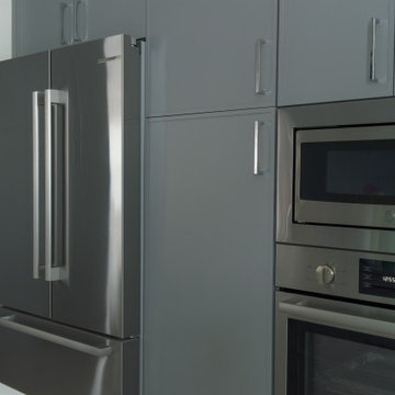
- We used “L-shaped” corner sinks instead of the rectangular ones set on an angle. This gave us more of the legs of the triangles versus the hypotenuse, which allowed for the two dishwashers, and the pullout utensil canisters and spice pullouts while still keeping the 3-drawer cabinets on either side of the range (by the sinks). The old island had the recess for stools which the family never used. By extending the width of the island 6” and utilizing this leg space, we were able to fit 18”-deep cabinets on this side – adding lots of accessible storage. The family can now work simultaneously on the dairy side (the side with the fridge) and the meat side (opposite) without getting in each other’s way. We separated the cooking by using the range oven for the meat and a built-in microwave in the base cabinet. The wall oven with built-in microwave on top is for dairy.
- Corner sinks opened up the middle area for a wider range – we went from a 30” to a 36”. Removing all the wall cabinets (on the range wall) made a big difference. That opened up the entire space while adding some visual impact. (Not pictured: We also made the cabinets directly opposite the range wall tall and removed the countertop, resulting in more room for rollouts and even more storage!) The kitchen now has more storage than it did before.
- We ended up painting the ceiling of the kitchen into the hallway that leads to the foyer. The living and dining rooms were separated by a soffit, so that became a natural boundary. We kept the tile in the kitchen by stopping it short of the hallway and lining it up with the pantry wall. This creates a border between the breakfast area and family room. The rest of the existing wood floors were refinished to refresh and make the hue darker. We also painted a dark accent wall and carried it into the breakfast area to make the rooms look deeper.
- The in-the-way column housed plumbing and couldn’t be moved. We still built cabinets in that spot – we just had to build a chase inside it to conceal the pipes. There was still plenty of room for new storage. We also took the cabinets all the way to the ceiling. The continuous tall cabinets added a functional elegance to the space.
THE RENEWED SPACE
The client’s long-awaited dream of a better kosher kitchen has finally been achieved, beautifully combining enhanced storage solutions with adherence to the family’s orthodox dietary laws. The kitchen’s standout feature, an expanded island, now offers a spacious and efficient workspace. This allows several family members to cook together comfortably, without the inconvenience of bumping into each other, ensuring a harmonious and productive cooking environment.
 Drury Design
THE SETUP
Multiple ovens, multiple workspaces, multiple sinks – when you think about it, non-jewish kitchens have been adapting the criteria of kosher kitchens for years.
Gladys’ clients in West Rogers Park are Orthodox Jewish. The house they bought already had a kosher kitchen – it just wasn’t done that well. It needed some more things to be duplicated for the dairy side and the meat side. Plus, it was dark and the configuration wasn’t very conducive for a family of eight.
It was time for a remodel.
Design Objectives
Improve kosher kitchen
Add more storage in the island
Better lighting
More open, lighter feel
Change the wood floor in the kitchen to tile
THE REMODEL
Design Challenges
- We had originally planned on removing a wing wall by the breakfast area. During demolition, we learned it contained a support beam.
- The kitchen is a substantial size, but having two sinks, dishwashers, and ovens presented a challenge – how do we fit it all in and make it flow with the storage still accessible near the work areas?
Where do you stop the materials for the new space? - -- The right tile, paint, lighting, etc. would be needed to make the remodeled area cohesive with the rest of the main floor.
- An existing column limited cabinet options and thus, storage capacity. Could we conceal it without disrupting the cabinetry flow?
Design Solutions
- We had to keep the wing wall, but decided to continue the tile on the sides of the cabinets and maintain the height of the tile to line up with the rest of the backsplash. This actually presented a very nice and cohesive look, especially since the opposite side has a wing wall to the left of the refrigerator.
- We used “L-shaped” corner sinks instead of the rectangular ones set on an angle. This gave us more of the legs of the triangles versus the hypotenuse, which allowed for the two dishwashers, and the pullout utensil canisters and spice pullouts while still keeping the 3-drawer cabinets on either side of the range (by the sinks). The old island had the recess for stools which the family never used. By extending the width of the island 6” and utilizing this leg space, we were able to fit 18”-deep cabinets on this side – adding lots of accessible storage. The family can now work simultaneously on the dairy side (the side with the fridge) and the meat side (opposite) without getting in each other’s way. We separated the cooking by using the range oven for the meat and a built-in microwave in the base cabinet. The wall oven with built-in microwave on top is for dairy.
- Corner sinks opened up the middle area for a wider range – we went from a 30” to a 36”. Removing all the wall cabinets (on the range wall) made a big difference. That opened up the entire space while adding some visual impact. (Not pictured: We also made the cabinets directly opposite the range wall tall and removed the countertop, resulting in more room for rollouts and even more storage!) The kitchen now has more storage than it did before.
- We ended up painting the ceiling of the kitchen into the hallway that leads to the foyer. The living and dining rooms were separated by a soffit, so that became a natural boundary. We kept the tile in the kitchen by stopping it short of the hallway and lining it up with the pantry wall. This creates a border between the breakfast area and family room. The rest of the existing wood floors were refinished to refresh and make the hue darker. We also painted a dark accent wall and carried it into the breakfast area to make the rooms look deeper.
- The in-the-way column housed plumbing and couldn’t be moved. We still built cabinets in that spot – we just had to build a chase inside it to conceal the pipes. There was still plenty of room for new storage. We also took the cabinets all the way to the ceiling. The continuous tall cabinets added a functional elegance to the space.
THE RENEWED SPACE
The client’s long-awaited dream of a better kosher kitchen has finally been achieved, beautifully combining enhanced storage solutions with adherence to the family’s orthodox dietary laws. The kitchen’s standout feature, an expanded island, now offers a spacious and efficient workspace. This allows several family members to cook together comfortably, without the inconvenience of bumping into each other, ensuring a harmonious and productive cooking environment.
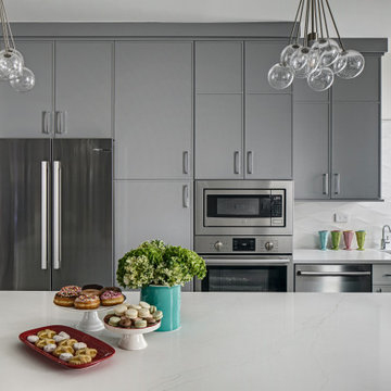 Drury Design
THE SETUP
Multiple ovens, multiple workspaces, multiple sinks – when you think about it, non-jewish kitchens have been adapting the criteria of kosher kitchens for years.
Gladys’ clients in West Rogers Park are Orthodox Jewish. The house they bought already had a kosher kitchen – it just wasn’t done that well. It needed some more things to be duplicated for the dairy side and the meat side. Plus, it was dark and the configuration wasn’t very conducive for a family of eight.
It was time for a remodel.
Design Objectives
Improve kosher kitchen
Add more storage in the island
Better lighting
More open, lighter feel
Change the wood floor in the kitchen to tile
THE REMODEL
Design Challenges
- We had originally planned on removing a wing wall by the breakfast area. During demolition, we learned it contained a support beam.
- The kitchen is a substantial size, but having two sinks, dishwashers, and ovens presented a challenge – how do we fit it all in and make it flow with the storage still accessible near the work areas?
Where do you stop the materials for the new space? - -- The right tile, paint, lighting, etc. would be needed to make the remodeled area cohesive with the rest of the main floor.
- An existing column limited cabinet options and thus, storage capacity. Could we conceal it without disrupting the cabinetry flow?
Design Solutions
- We had to keep the wing wall, but decided to continue the tile on the sides of the cabinets and maintain the height of the tile to line up with the rest of the backsplash. This actually presented a very nice and cohesive look, especially since the opposite side has a wing wall to the left of the refrigerator.
- We used “L-shaped” corner sinks instead of the rectangular ones set on an angle. This gave us more of the legs of the triangles versus the hypotenuse, which allowed for the two dishwashers, and the pullout utensil canisters and spice pullouts while still keeping the 3-drawer cabinets on either side of the range (by the sinks). The old island had the recess for stools which the family never used. By extending the width of the island 6” and utilizing this leg space, we were able to fit 18”-deep cabinets on this side – adding lots of accessible storage. The family can now work simultaneously on the dairy side (the side with the fridge) and the meat side (opposite) without getting in each other’s way. We separated the cooking by using the range oven for the meat and a built-in microwave in the base cabinet. The wall oven with built-in microwave on top is for dairy.
- Corner sinks opened up the middle area for a wider range – we went from a 30” to a 36”. Removing all the wall cabinets (on the range wall) made a big difference. That opened up the entire space while adding some visual impact. (Not pictured: We also made the cabinets directly opposite the range wall tall and removed the countertop, resulting in more room for rollouts and even more storage!) The kitchen now has more storage than it did before.
- We ended up painting the ceiling of the kitchen into the hallway that leads to the foyer. The living and dining rooms were separated by a soffit, so that became a natural boundary. We kept the tile in the kitchen by stopping it short of the hallway and lining it up with the pantry wall. This creates a border between the breakfast area and family room. The rest of the existing wood floors were refinished to refresh and make the hue darker. We also painted a dark accent wall and carried it into the breakfast area to make the rooms look deeper.
- The in-the-way column housed plumbing and couldn’t be moved. We still built cabinets in that spot – we just had to build a chase inside it to conceal the pipes. There was still plenty of room for new storage. We also took the cabinets all the way to the ceiling. The continuous tall cabinets added a functional elegance to the space.
THE RENEWED SPACE
The client’s long-awaited dream of a better kosher kitchen has finally been achieved, beautifully combining enhanced storage solutions with adherence to the family’s orthodox dietary laws. The kitchen’s standout feature, an expanded island, now offers a spacious and efficient workspace. This allows several family members to cook together comfortably, without the inconvenience of bumping into each other, ensuring a harmonious and productive cooking environment.
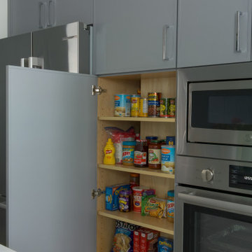 Drury Design
THE SETUP
Multiple ovens, multiple workspaces, multiple sinks – when you think about it, non-jewish kitchens have been adapting the criteria of kosher kitchens for years.
Gladys’ clients in West Rogers Park are Orthodox Jewish. The house they bought already had a kosher kitchen – it just wasn’t done that well. It needed some more things to be duplicated for the dairy side and the meat side. Plus, it was dark and the configuration wasn’t very conducive for a family of eight.
It was time for a remodel.
Design Objectives
Improve kosher kitchen
Add more storage in the island
Better lighting
More open, lighter feel
Change the wood floor in the kitchen to tile
THE REMODEL
Design Challenges
- We had originally planned on removing a wing wall by the breakfast area. During demolition, we learned it contained a support beam.
- The kitchen is a substantial size, but having two sinks, dishwashers, and ovens presented a challenge – how do we fit it all in and make it flow with the storage still accessible near the work areas?
Where do you stop the materials for the new space? - -- The right tile, paint, lighting, etc. would be needed to make the remodeled area cohesive with the rest of the main floor.
- An existing column limited cabinet options and thus, storage capacity. Could we conceal it without disrupting the cabinetry flow?
Design Solutions
- We had to keep the wing wall, but decided to continue the tile on the sides of the cabinets and maintain the height of the tile to line up with the rest of the backsplash. This actually presented a very nice and cohesive look, especially since the opposite side has a wing wall to the left of the refrigerator.
- We used “L-shaped” corner sinks instead of the rectangular ones set on an angle. This gave us more of the legs of the triangles versus the hypotenuse, which allowed for the two dishwashers, and the pullout utensil canisters and spice pullouts while still keeping the 3-drawer cabinets on either side of the range (by the sinks). The old island had the recess for stools which the family never used. By extending the width of the island 6” and utilizing this leg space, we were able to fit 18”-deep cabinets on this side – adding lots of accessible storage. The family can now work simultaneously on the dairy side (the side with the fridge) and the meat side (opposite) without getting in each other’s way. We separated the cooking by using the range oven for the meat and a built-in microwave in the base cabinet. The wall oven with built-in microwave on top is for dairy.
- Corner sinks opened up the middle area for a wider range – we went from a 30” to a 36”. Removing all the wall cabinets (on the range wall) made a big difference. That opened up the entire space while adding some visual impact. (Not pictured: We also made the cabinets directly opposite the range wall tall and removed the countertop, resulting in more room for rollouts and even more storage!) The kitchen now has more storage than it did before.
- We ended up painting the ceiling of the kitchen into the hallway that leads to the foyer. The living and dining rooms were separated by a soffit, so that became a natural boundary. We kept the tile in the kitchen by stopping it short of the hallway and lining it up with the pantry wall. This creates a border between the breakfast area and family room. The rest of the existing wood floors were refinished to refresh and make the hue darker. We also painted a dark accent wall and carried it into the breakfast area to make the rooms look deeper.
- The in-the-way column housed plumbing and couldn’t be moved. We still built cabinets in that spot – we just had to build a chase inside it to conceal the pipes. There was still plenty of room for new storage. We also took the cabinets all the way to the ceiling. The continuous tall cabinets added a functional elegance to the space.
THE RENEWED SPACE
The client’s long-awaited dream of a better kosher kitchen has finally been achieved, beautifully combining enhanced storage solutions with adherence to the family’s orthodox dietary laws. The kitchen’s standout feature, an expanded island, now offers a spacious and efficient workspace. This allows several family members to cook together comfortably, without the inconvenience of bumping into each other, ensuring a harmonious and productive cooking environment.
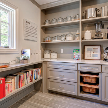
Sponsored
Columbus, OH
Hope Restoration & General Contracting
Columbus Design-Build, Kitchen & Bath Remodeling, Historic Renovations
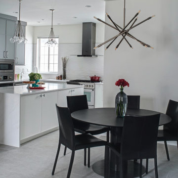 Drury Design
THE SETUP
Multiple ovens, multiple workspaces, multiple sinks – when you think about it, non-jewish kitchens have been adapting the criteria of kosher kitchens for years.
Gladys’ clients in West Rogers Park are Orthodox Jewish. The house they bought already had a kosher kitchen – it just wasn’t done that well. It needed some more things to be duplicated for the dairy side and the meat side. Plus, it was dark and the configuration wasn’t very conducive for a family of eight.
It was time for a remodel.
Design Objectives
Improve kosher kitchen
Add more storage in the island
Better lighting
More open, lighter feel
Change the wood floor in the kitchen to tile
THE REMODEL
Design Challenges
- We had originally planned on removing a wing wall by the breakfast area. During demolition, we learned it contained a support beam.
- The kitchen is a substantial size, but having two sinks, dishwashers, and ovens presented a challenge – how do we fit it all in and make it flow with the storage still accessible near the work areas?
Where do you stop the materials for the new space? - -- The right tile, paint, lighting, etc. would be needed to make the remodeled area cohesive with the rest of the main floor.
- An existing column limited cabinet options and thus, storage capacity. Could we conceal it without disrupting the cabinetry flow?
Design Solutions
- We had to keep the wing wall, but decided to continue the tile on the sides of the cabinets and maintain the height of the tile to line up with the rest of the backsplash. This actually presented a very nice and cohesive look, especially since the opposite side has a wing wall to the left of the refrigerator.
- We used “L-shaped” corner sinks instead of the rectangular ones set on an angle. This gave us more of the legs of the triangles versus the hypotenuse, which allowed for the two dishwashers, and the pullout utensil canisters and spice pullouts while still keeping the 3-drawer cabinets on either side of the range (by the sinks). The old island had the recess for stools which the family never used. By extending the width of the island 6” and utilizing this leg space, we were able to fit 18”-deep cabinets on this side – adding lots of accessible storage. The family can now work simultaneously on the dairy side (the side with the fridge) and the meat side (opposite) without getting in each other’s way. We separated the cooking by using the range oven for the meat and a built-in microwave in the base cabinet. The wall oven with built-in microwave on top is for dairy.
- Corner sinks opened up the middle area for a wider range – we went from a 30” to a 36”. Removing all the wall cabinets (on the range wall) made a big difference. That opened up the entire space while adding some visual impact. (Not pictured: We also made the cabinets directly opposite the range wall tall and removed the countertop, resulting in more room for rollouts and even more storage!) The kitchen now has more storage than it did before.
- We ended up painting the ceiling of the kitchen into the hallway that leads to the foyer. The living and dining rooms were separated by a soffit, so that became a natural boundary. We kept the tile in the kitchen by stopping it short of the hallway and lining it up with the pantry wall. This creates a border between the breakfast area and family room. The rest of the existing wood floors were refinished to refresh and make the hue darker. We also painted a dark accent wall and carried it into the breakfast area to make the rooms look deeper.
- The in-the-way column housed plumbing and couldn’t be moved. We still built cabinets in that spot – we just had to build a chase inside it to conceal the pipes. There was still plenty of room for new storage. We also took the cabinets all the way to the ceiling. The continuous tall cabinets added a functional elegance to the space.
THE RENEWED SPACE
The client’s long-awaited dream of a better kosher kitchen has finally been achieved, beautifully combining enhanced storage solutions with adherence to the family’s orthodox dietary laws. The kitchen’s standout feature, an expanded island, now offers a spacious and efficient workspace. This allows several family members to cook together comfortably, without the inconvenience of bumping into each other, ensuring a harmonious and productive cooking environment.
 STACT Wine Displays Inc.
http://www.getSTACT.com
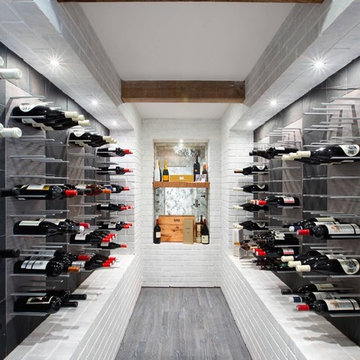
STACT wine racks are incredibly easy to specify and incorporate into wine cellars, wine rooms, kitchens, home bars, commercial bars, and restaurants. Our customers have found that when it comes to modern wine cellar solutions, our system offers a number of advantages versus other wine storage solutions available on the market, here are just a few:
✓ Quality - premium *furniture grade* solution is unique to the industry, with unrivalled refinement when it comes to materials, aesthetic and craftsmanship. Our panels feature a premium high-gloss painted finish (not a laminated surface). Each panel takes more than a week to complete, with meticulous attention to detail. Once numerous coats of lacquer have been applied, each panel is hand buffed to a mirror-like piano finish.
✓ Versatility - mount any way you wish, and designed to work equally well within both commercial and residential applications, our clients have found our modular system to be the most versatile, and easiest to specify, assemble, and install - whether for 9 bottles or 9,000 within a large scale wine cellar application (www.stact.co/cellars). Available on your choice of 10 finishes, mix and match STACT panels to create your own unique look (3,628,800 possible configurations).
✓ Convenience - designed for quick and easy *DIY installation*, our patented system comes ready-to-install to any drywall surface right out of the box, minimizing the costs associated with labor and installation when compared with many custom solutions you will find on the market. Avoiding the need for a dedicated wine cellar builder to produce and arrive on site for assembly and installation. In-stock items typically ship within 1 business day.
✓ Value - direct-to-client distribution model to effectively cut out retail markup. Builders and specifiers have found STACT to be a fraction of the price of what it would cost to develop and produce a comparable custom solution. Plus currently we are offering *free shipping worldwide*.
✓ Design pedigree - created by 2012 ICFF winning designer Eric Pfeiffer, our patented prefabricated ready-to-assemble modular design is unique to the industry.
✓ Space-saving - highest bottle capacity on the market (10.7 bottles / sq ft). Each panel supports 9-12 bottles depending on how they are configured.
✓ Security - superior bottle stability, versus other wall-mounted wine storage solutions on the market. The aircraft grade aluminum bottle support structure ensures a lower center of gravity there is a more substantial portion of the bottle resting below the contact points. Thus a minimalist design aesthetic is retained, while eliminating the need for unnecessary and unsightly materials/clutter such as rubber gaskets, straps, etc.
Learn more at www.getSTACT.com
 Drury Design
THE SETUP
Multiple ovens, multiple workspaces, multiple sinks – when you think about it, non-jewish kitchens have been adapting the criteria of kosher kitchens for years.
Gladys’ clients in West Rogers Park are Orthodox Jewish. The house they bought already had a kosher kitchen – it just wasn’t done that well. It needed some more things to be duplicated for the dairy side and the meat side. Plus, it was dark and the configuration wasn’t very conducive for a family of eight.
It was time for a remodel.
Design Objectives
Improve kosher kitchen
Add more storage in the island
Better lighting
More open, lighter feel
Change the wood floor in the kitchen to tile
THE REMODEL
Design Challenges
- We had originally planned on removing a wing wall by the breakfast area. During demolition, we learned it contained a support beam.
- The kitchen is a substantial size, but having two sinks, dishwashers, and ovens presented a challenge – how do we fit it all in and make it flow with the storage still accessible near the work areas?
Where do you stop the materials for the new space? - -- The right tile, paint, lighting, etc. would be needed to make the remodeled area cohesive with the rest of the main floor.
- An existing column limited cabinet options and thus, storage capacity. Could we conceal it without disrupting the cabinetry flow?
Design Solutions
- We had to keep the wing wall, but decided to continue the tile on the sides of the cabinets and maintain the height of the tile to line up with the rest of the backsplash. This actually presented a very nice and cohesive look, especially since the opposite side has a wing wall to the left of the refrigerator.
- We used “L-shaped” corner sinks instead of the rectangular ones set on an angle. This gave us more of the legs of the triangles versus the hypotenuse, which allowed for the two dishwashers, and the pullout utensil canisters and spice pullouts while still keeping the 3-drawer cabinets on either side of the range (by the sinks). The old island had the recess for stools which the family never used. By extending the width of the island 6” and utilizing this leg space, we were able to fit 18”-deep cabinets on this side – adding lots of accessible storage. The family can now work simultaneously on the dairy side (the side with the fridge) and the meat side (opposite) without getting in each other’s way. We separated the cooking by using the range oven for the meat and a built-in microwave in the base cabinet. The wall oven with built-in microwave on top is for dairy.
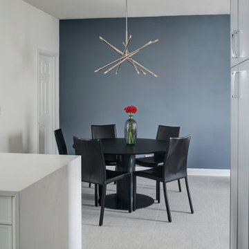
- Corner sinks opened up the middle area for a wider range – we went from a 30” to a 36”. Removing all the wall cabinets (on the range wall) made a big difference. That opened up the entire space while adding some visual impact. (Not pictured: We also made the cabinets directly opposite the range wall tall and removed the countertop, resulting in more room for rollouts and even more storage!) The kitchen now has more storage than it did before.
- We ended up painting the ceiling of the kitchen into the hallway that leads to the foyer. The living and dining rooms were separated by a soffit, so that became a natural boundary. We kept the tile in the kitchen by stopping it short of the hallway and lining it up with the pantry wall. This creates a border between the breakfast area and family room. The rest of the existing wood floors were refinished to refresh and make the hue darker. We also painted a dark accent wall and carried it into the breakfast area to make the rooms look deeper.
- The in-the-way column housed plumbing and couldn’t be moved. We still built cabinets in that spot – we just had to build a chase inside it to conceal the pipes. There was still plenty of room for new storage. We also took the cabinets all the way to the ceiling. The continuous tall cabinets added a functional elegance to the space.
THE RENEWED SPACE
The client’s long-awaited dream of a better kosher kitchen has finally been achieved, beautifully combining enhanced storage solutions with adherence to the family’s orthodox dietary laws. The kitchen’s standout feature, an expanded island, now offers a spacious and efficient workspace. This allows several family members to cook together comfortably, without the inconvenience of bumping into each other, ensuring a harmonious and productive cooking environment.
124