
Search results for "Storage forces" in Home Design Ideas
 Mark Brand Architecture
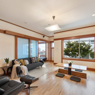
The design of this remodel of a small two-level residence in Noe Valley reflects the owner's passion for Japanese architecture. Having decided to completely gut the interior partitions, we devised a better-arranged floor plan with traditional Japanese features, including a sunken floor pit for dining and a vocabulary of natural wood trim and casework. Vertical grain Douglas Fir takes the place of Hinoki wood traditionally used in Japan. Natural wood flooring, soft green granite and green glass backsplashes in the kitchen further develop the desired Zen aesthetic. A wall to wall window above the sunken bath/shower creates a connection to the outdoors. Privacy is provided through the use of switchable glass, which goes from opaque to clear with a flick of a switch. We used in-floor heating to eliminate the noise associated with forced-air systems.
 Joe & Linda Sopo | Keller Williams Realty
UTM - Ultimate Target Marketing: Gary Marsh
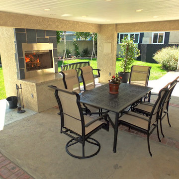
Elegant patio photo in Los Angeles
Elegant patio photo in Los Angeles
 Drury Design
The 100-year old home’s kitchen was old and just didn’t function well. A peninsula in the middle of the main part of the kitchen blocked the path from the back door. This forced the homeowners to mostly use an odd, U-shaped corner of the kitchen.
Design objectives:
-Add an island
-Wow-factor design
-Incorporate arts and crafts with a touch of Mid-century modern style
-Allow for a better work triangle when cooking
-Create a seamless path coming into the home from the backdoor
-Make all the countertops in the space 36” high (the old kitchen had different base cabinet heights)
Design challenges to be solved:
-Island design
-Where to place the sink and dishwasher
-The family’s main entrance into the home is a back door located within the kitchen space. Samantha needed to find a way to make an unobstructed path through the kitchen to the outside
-A large eating area connected to the kitchen felt slightly misplaced – Samantha wanted to bring the kitchen and materials more into this area
-The client does not like appliance garages/cabinets to the counter. The more countertop space, the better!
Design solutions:
-Adding the right island made all the difference! Now the family has a couple of seats within the kitchen space. -Multiple walkways facilitate traffic flow.
-Multiple pantry cabinets (both shallow and deep) are placed throughout the space. A couple of pantry cabinets were even added to the back door wall and wrap around into the breakfast nook to give the kitchen a feel of extending into the adjoining eating area.
-Upper wall cabinets with clear glass offer extra lighting and the opportunity for the client to display her beautiful vases and plates. They add and an airy feel to the space.
-The kitchen had two large existing windows that were ideal for a sink placement. The window closest to the back door made the most sense due to the fact that the other window was in the corner. Now that the sink had a place, we needed to worry about the dishwasher. Samantha didn’t want the dishwasher to be in the way of people coming in the back door – it’s now in the island right across from the sink.
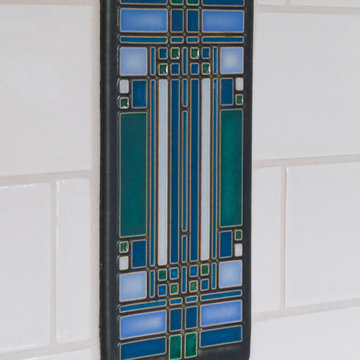
-The homeowners love Motawi Tile. Some fantastic pieces are placed within the backsplash throughout the kitchen. -Larger tiles with borders make for nice accent pieces over the rangetop and by the bar/beverage area.
-The adjacent area for eating is a gorgeous nook with massive windows. We added a built-in furniture-style banquette with additional lower storage cabinets in the same finish. It’s a great way to connect and blend the two areas into what now feels like one big space!
Find the right local pro for your project
 Klopf Architecture
Built for the Bluff, A Sea Ranch Home is Remade from the Inside Out
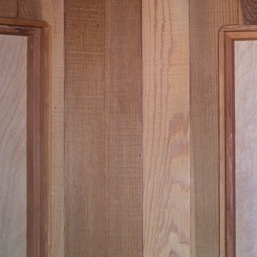
The house had always been grounded, on an ocean bluff at The Sea Ranch. It sits unencumbered, adjacent to one of the most dramatic stretches of the Sonoma coast with protected commons meadow to the east, uninterrupted Pacific views to the west, and a bluff trail running alongside. What it lacked was the feeling of home, one that could hold up its own against the natural landscape.
The owners are entrepreneurs with deep involvement across tech, real estate, and development and they know how things are built. The Sea Ranch house had been in their lives for years, a second residence and a place for family to gather. Built for a different time, it felt more compromising than comfortable. Sitting in a closed off nook, the kitchen fit one cook at a time and turned its back on the rest of the house. The entry was dim and compressed, divided by a structural column that presented itself at exactly the wrong moment. The primary suite was small relative to the view outside it. A large rear bedroom sat behind a lowered ceiling with a bathroom that had never been added. The house was certainly worth the trouble of doing it right.
What followed was not one project but four, each with its own design challenge, each addressed over a period of time.
Where the House Meets the Ocean
The most complex piece of the project, in both structural and spatial terms, was the kitchen expansion. The existing room was a single-person galley squeezed in as an afterthought with no meaningful connection to the dining room, the living space, or the deck outside. To make it useful for a family that cooks and gathers, it needed to grow outward into an existing patio and flow into the rooms around it.
A big challenge was the roofline. Several planes at different pitches and angles converged directly where additional volume was needed. A new form had to join that geometry without reading as a correction. The solution found the simplest possible connection between the existing angles, a roofline that from outside the structure, appears entirely original. From the bluff trail where the addition is visible, there is no discernible seam.
Inside, the kitchen is now open to the living and dining rooms without interruption. A large sliding glass door connects the space onto the rear deck. The deck itself was expanded and oriented so that the body of the house shields it from the coastal wind which is a common consideration that determines whether outdoor space at The Sea Ranch actually gets used. The result is a room that works for large family gatherings where no one feels cutoff, and one that makes the boundary between being inside and outside easy to ignore.
Welcoming Light
A structural column stood at the convergence of eight distinct roof planes in the entry. It was load-bearing, but it was also the reason the entry had always felt like a hallway rather than a welcoming arrival.
With the structural engineer, a custom steel connector was designed to receive beams from six separate directions, redistributing the load through a single new continuous beam. The column was surgically removed. Three triangular skylights were then cut into the roof above, their shapes drawn from the
existing geometry of the planes around them. The entry is now bright and open. The skylights feel native to the structure because they follow the logic already present in the roof.
Two Suites, Two Views
At opposite ends of the house, the two bedroom suites were each reconfigured, and each found a different way to introduce more of the landscape into the room.
An addition to the primary suite extended the structure outward to create a wraparound plan with a loop from the bedroom through bath and closet that had not been possible before. The expansion opened a slot view from the tub and shower toward the ocean. The view is precise and private. The ocean view is present and deliberate.
The rear bedroom absorbed an adjacent storage room to transform it into a full second suite with a vaulted ceiling, a large bathroom with a tub, a shower, and a sauna. A private fenced garden courtyard sits just beyond the glass bringing the outdoors inside. The tub was placed so that, looking past the courtyard and through the bedroom beyond, the ocean is visible at the far end. It is a long view and it makes the room feel larger and more settled than its footprint would suggest.
Glass on Four Sides, Fire at the Center
The main living and gathering room had always been caught between two competing facts: glass on four sides meant exceptional views but at The Sea Ranch, it also meant a cold room. A 360-degree cylindrical fireplace was added at the center on a raised stone base, providing radiant heat in every direction and giving the room a focal point around which a group naturally orients itself, whether that means two people at the end of the day or the whole family after dinner.
Owners Who Picked Up the Tools
The owner was not a passive client. they came with construction knowledge, specific ideas, and the desire to be an active part of the process, a dynamic that other architects may had found difficult, which Klopf Architecture accepted as an asset. They took it upon themselves to complete some of the work during construction, including the installation of a new radiant heating system beneath the floors.
The radiant system added to the older and less-desirable forced-air setup. At The Sea Ranch, that change matters as the house sits close enough to the ocean and moving air competes with the sound of it, where radiant heat does not. Solar panels were added to the roof as part of the new system. Insulation was upgraded throughout the walls, roof, and crawl space. The house that had always had the right setting now holds warmth the way a house on the bluff should.
They were also deeply involved in the design and selections throughout, and the finished house reflects both of them in ways that are specific rather than generic. The process took longer and moved through more iterations than a more arms-length relationship might have allowed. The result is more defined and personal because of it.
The Landscape Holds Priority
Every exterior decision was shaped by The Sea Ranch Design Standards, which require that buildings defer to the landscape around them rather than compete with it. Because this house sits on the bluff and is visible from the public trail, the additions faced a close review. Existing materials were matched. Geometries were resolved. The additions had to become indistinguishable from the original building.
From the trail, the house reads exactly as it always has — low, cedar-clad, secondary to the meadow and the water. The setting holds priority. Inside, the house has been remade.
Klopf Architecture Project Team: Geoff Campen and Trenton Jewett
Contractor: Shawn Bettega Construction
Photography: ©2025 Mariko Reed
Year Completed: 2023
Location: The Sea Ranch, CA
 Amanda George Interior Design
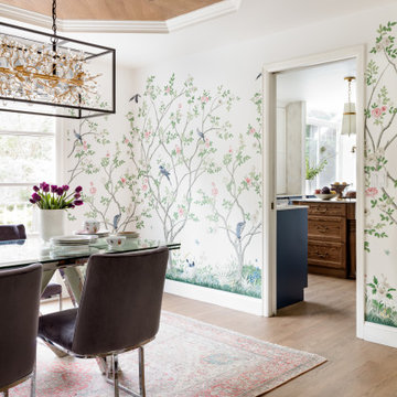
A whimsical English garden was the foundation and driving force for the design inspiration. A lingering garden mural wraps all the walls floor to ceiling, while a union jack wood detail adorns the existing tray ceiling, as a nod to the client’s English roots. Custom heritage blue base cabinets and antiqued white glass front uppers create a beautifully balanced built-in buffet that stretches the east wall providing display and storage for the client's extensive inherited China collection.
 User
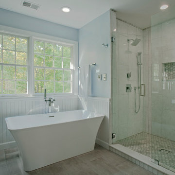
UserMaster bathroom with freestanding tub, shower with frameless door and marble floor and niches, modern faucets and accessories. Design by April Force Pardoe Interiors. Photo by Vince Lupo.
 Buchanan Kitchen Curators
These engaging homeowners are fortuitous enough to reside in a three level townhouse on a quiet street in
downtown Minneapolis. This couple loves to entertain and host family holidays. Spaces are tight in most
urban areas. This townhome is no exception. There was nothing horribly wrong with the way the home
was laid out, it just did not serve the needs of the family. The kitchen was tucked up front and forced into
a small space, making it difficult for multiple people to be in the space at the same time. The homeowners
also wished to upgrade to professional appliances. Due to size and mechanical code restrictions, this was just
not possible in the existing space. The back of the townhome had a large living room and good sized dining
room. Off this space is a shaded deck and swimming pool, which are used all the time. Traffic always ran from
the outdoor entertaining space directly to the kitchen in the front. Not only was this inconvenient, a mess was
dragged in from wet swimmers.
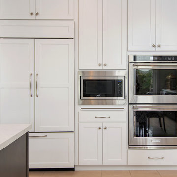
To alleviate these challenges, we moved the kitchen from the smaller space at the front of the home to the
larger space the under utilized living room furniture occupied. This allowed us to curate a large kitchen that
fits all their needs, wants, and aesthetic desires. Now there is plenty of room to cook, relax, and bustle about.
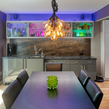
We also added a wet bar next to the patio door in the dining room. Right by the door is a beverage cooler from
which guests may grab beverages and snacks without dragging the outside in with them.
Being the homeowners and designer are all members of the creative community in the Twin Cities, it was important
to incorporate the work of local artists. This kitchen is fully curated with all Minnesota products (with the exception
of the appliances, which are manufactured in Wisconsin). The cabinets and countertops are from larger local
companies, while all the other features are hand made by near by artists. These artisan products include a custom
stainless steel range hood, black powder coated table base and fireplace mantel, hand made tile for the backsplash
and fireplace surround, wood elevated island table, and wood panel backsplash at the bar. Hand made tiles had
previously been installed in the existing kitchen. The color of these tiles is no longer available. It was the home-
owners desire to preserve these tiles somehow. We cut the tile off the walls and soaked the drywall from them.
We then installed them in the powder room as a feature behind the vanity and mirror.

 Tracy Berman Interiors
An unfortunate water leak forced these homeowners to entertain a remodel of their kitchen. The previous kitchen had dark builder grade cabinets with little function and even less style. After some great exploratory conversations The words "classic, clean and functional" kept coming up. What's more classic then a white kitchen with marble? We didn't want the kitchen to appear sterile so we added dark grey cabinets for contrast and light grey counter tops to soften. Creating a focal point at the beautiful kitchen window and it's view were key. I tiled the whole wall in marble subway tile to really highlight the gorgeous natural stone. I used frosted glass in the cabinets so the light would come through, but the contents were still somewhat hidden. The butlers pantry tile has a geometric pattern for a bit more pop. The upper cabinet's decorative mullions are similar in style to the window cabinets. The homeowners like to cook and entertain so I packed a lot of function into the island. It houses the cook top with downdraft, spice pull out, knife/utensil pullout, and tray dividers. New bar stools and a dining set complete the look
 Capital Kitchen & Bath
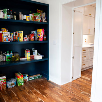
This kitchen remodel is the definition of elevated everyday living, where clean lines, warm textures, and intentional function come together in a space designed to truly perform.
The quartz countertops & full height backsplash give the entire kitchen a clean, luminous feel while providing durable, low-maintenance performance for real everyday living.
A large statement island was created by expanding the kitchen footprint and eliminating the unused formal dining room. The island adds generous prep space, comfortable seating, and the perfect gathering spot for morning coffee or evening entertaining.
Tucked seamlessly into the cabinetry is a hidden walk-in pantry with wet bar & storage galore, keeping the kitchen's visual lines beautifully uncluttered.
And for effortless hosting, a dedicated beverage station- in the kitchen- featuring an ice maker and refrigerator creates a functional mini-hub for drinks, snacks, and celebrations.
Modern. Functional. Timeless. This is more than a kitchen remodel, it’s a space designed to make daily life feel beautiful and effortless.
 MP DESIGN
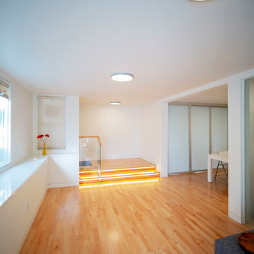
Condo remodel in a 2 unit Victorian building in Noe Valley District, San Francisco, CA. The unit was fully sound proofed to mitigate noise penetration from unit above. The forced air was replaced with hydronic floor under new hardwood sprung floors (electrical floor and bench heating in Master Bath). The Master Bath and kitchen was remodeled. The lighting and electrical upgraded. All doors replaced with glass paneled doors. All casings/trims replaced with recessed casings/trims. We also added a long custom storage unit with acrylic LED lit operable lids.
 Drury Design
The 100-year old home’s kitchen was old and just didn’t function well. A peninsula in the middle of the main part of the kitchen blocked the path from the back door. This forced the homeowners to mostly use an odd, U-shaped corner of the kitchen.
Design objectives:
-Add an island
-Wow-factor design
-Incorporate arts and crafts with a touch of Mid-century modern style
-Allow for a better work triangle when cooking
-Create a seamless path coming into the home from the backdoor
-Make all the countertops in the space 36” high (the old kitchen had different base cabinet heights)
Design challenges to be solved:
-Island design
-Where to place the sink and dishwasher
-The family’s main entrance into the home is a back door located within the kitchen space. Samantha needed to find a way to make an unobstructed path through the kitchen to the outside
-A large eating area connected to the kitchen felt slightly misplaced – Samantha wanted to bring the kitchen and materials more into this area
-The client does not like appliance garages/cabinets to the counter. The more countertop space, the better!
Design solutions:
-Adding the right island made all the difference! Now the family has a couple of seats within the kitchen space. -Multiple walkways facilitate traffic flow.
-Multiple pantry cabinets (both shallow and deep) are placed throughout the space. A couple of pantry cabinets were even added to the back door wall and wrap around into the breakfast nook to give the kitchen a feel of extending into the adjoining eating area.
-Upper wall cabinets with clear glass offer extra lighting and the opportunity for the client to display her beautiful vases and plates. They add and an airy feel to the space.
-The kitchen had two large existing windows that were ideal for a sink placement. The window closest to the back door made the most sense due to the fact that the other window was in the corner. Now that the sink had a place, we needed to worry about the dishwasher. Samantha didn’t want the dishwasher to be in the way of people coming in the back door – it’s now in the island right across from the sink.
-The homeowners love Motawi Tile. Some fantastic pieces are placed within the backsplash throughout the kitchen. -Larger tiles with borders make for nice accent pieces over the rangetop and by the bar/beverage area.
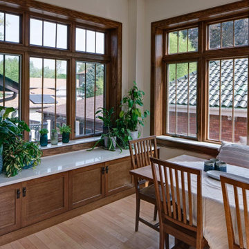
-The adjacent area for eating is a gorgeous nook with massive windows. We added a built-in furniture-style banquette with additional lower storage cabinets in the same finish. It’s a great way to connect and blend the two areas into what now feels like one big space!
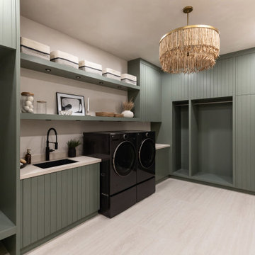
 Living with Lolo
Laundry Room in Wabi Sabi Retreat |
Room Type:
3 bed, 4 bath, 3770 square feet- Master Bath, Kitchen, Dining Room, Den, Laundry Room, Powder Bath, Family Room, Living Room, Entry.
Project Name:
Wabi Sabi Retreat.
Key Feature:
A wabi sabi–inspired home that captures simplicity, imperfection, and tranquility through organic textures, weathered finishes, and intentional negative space, while working within the existing architecture.
Challenge:
The home’s architecture did not naturally lend itself to traditional wabi sabi design, requiring a thoughtful approach to achieve the desired feeling without forcing the aesthetic.
Solution:
Rather than applying a rigid style, the team focused on evoking tranquility through contrast, organic materials, intentional emptiness, and finishes that develop character over time.
Materials:
Furniture: Four Hands, Noir, Vig, Moss Studio, Dovetail, TOV.
Lighting: Arteriors, Lucent Light Shop, Ping Lighting.
Rugs: Jaipur, Loloi.
Artwork: Leftbank, Etsy.
Budget:
$100k- $300k |
Timeline:
6 months, completed March 2025
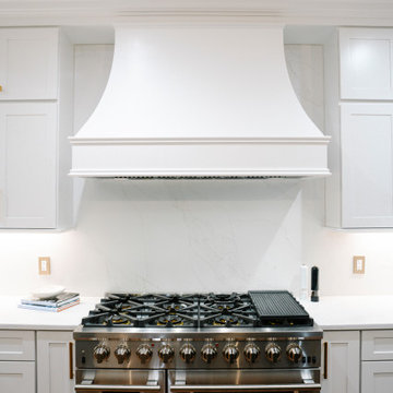 Capital Kitchen & Bath
This kitchen remodel is the definition of elevated everyday living, where clean lines, warm textures, and intentional function come together in a space designed to truly perform.
The quartz countertops & full height backsplash give the entire kitchen a clean, luminous feel while providing durable, low-maintenance performance for real everyday living.
A large statement island was created by expanding the kitchen footprint and eliminating the unused formal dining room. The island adds generous prep space, comfortable seating, and the perfect gathering spot for morning coffee or evening entertaining.
Tucked seamlessly into the cabinetry is a hidden walk-in pantry with wet bar & storage galore, keeping the kitchen's visual lines beautifully uncluttered.
And for effortless hosting, a dedicated beverage station- in the kitchen- featuring an ice maker and refrigerator creates a functional mini-hub for drinks, snacks, and celebrations.
Modern. Functional. Timeless. This is more than a kitchen remodel, it’s a space designed to make daily life feel beautiful and effortless.
Sponsored
Plain City, OH

Kuhns Contracting, Inc.
Central Ohio's Trusted Home Remodeler Specializing in Kitchens & Baths
 Joe & Linda Sopo | Keller Williams Realty
UTM - Ultimate Target Marketing: Gary Marsh
Inspiration for a timeless bedroom remodel in Los Angeles
Inspiration for a timeless bedroom remodel in Los Angeles
 Joe & Linda Sopo | Keller Williams Realty
UTM - Ultimate Target Marketing: Gary Marsh
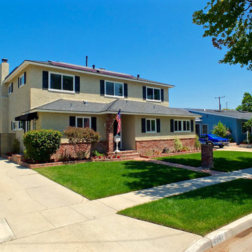
Example of a classic exterior home design in Los Angeles
Example of a classic exterior home design in Los Angeles
 Burgin Design • Remodel
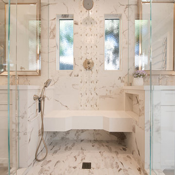
A desire for more space and an updated look in their 1960’s home were the driving forces for the Cops family’s new bathroom remodels.
We began with a great design by Tamara Stratton relocating a hall bathroom which allowed us to combine the former hall bath space with the master, essentially doubling it. We added more lighting, updated finishes, a new, round window in the guest bath with water jetted cut tile, Pental Quartz countertops, Starphire shower glass enclosure, a floating shower bench and a linen storage cabinet with decorative grids.
In addition to the two bathrooms, we also turned a guest bedroom into a brand new office space with custom cabinetry and recessed lighting. The Cops family is now enjoying their new space and loving their home even more.
 Living with Lolo
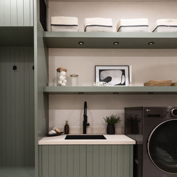
Laundry Room in Wabi Sabi Retreat |
Room Type:
3 bed, 4 bath, 3770 square feet- Master Bath, Kitchen, Dining Room, Den, Laundry Room, Powder Bath, Family Room, Living Room, Entry.
Project Name:
Wabi Sabi Retreat.
Key Feature:
A wabi sabi–inspired home that captures simplicity, imperfection, and tranquility through organic textures, weathered finishes, and intentional negative space, while working within the existing architecture.
Challenge:
The home’s architecture did not naturally lend itself to traditional wabi sabi design, requiring a thoughtful approach to achieve the desired feeling without forcing the aesthetic.
Solution:
Rather than applying a rigid style, the team focused on evoking tranquility through contrast, organic materials, intentional emptiness, and finishes that develop character over time.
Materials:
Furniture: Four Hands, Noir, Vig, Moss Studio, Dovetail, TOV.
Lighting: Arteriors, Lucent Light Shop, Ping Lighting.
Rugs: Jaipur, Loloi.
Artwork: Leftbank, Etsy.
Budget:
$100k- $300k |
Timeline:
6 months, completed March 2025
 Klopf Architecture
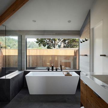
Built for the Bluff, A Sea Ranch Home is Remade from the Inside Out
The house had always been grounded, on an ocean bluff at The Sea Ranch. It sits unencumbered, adjacent to one of the most dramatic stretches of the Sonoma coast with protected commons meadow to the east, uninterrupted Pacific views to the west, and a bluff trail running alongside. What it lacked was the feeling of home, one that could hold up its own against the natural landscape.
The owners are entrepreneurs with deep involvement across tech, real estate, and development and they know how things are built. The Sea Ranch house had been in their lives for years, a second residence and a place for family to gather. Built for a different time, it felt more compromising than comfortable. Sitting in a closed off nook, the kitchen fit one cook at a time and turned its back on the rest of the house. The entry was dim and compressed, divided by a structural column that presented itself at exactly the wrong moment. The primary suite was small relative to the view outside it. A large rear bedroom sat behind a lowered ceiling with a bathroom that had never been added. The house was certainly worth the trouble of doing it right.
What followed was not one project but four, each with its own design challenge, each addressed over a period of time.
Where the House Meets the Ocean
The most complex piece of the project, in both structural and spatial terms, was the kitchen expansion. The existing room was a single-person galley squeezed in as an afterthought with no meaningful connection to the dining room, the living space, or the deck outside. To make it useful for a family that cooks and gathers, it needed to grow outward into an existing patio and flow into the rooms around it.
A big challenge was the roofline. Several planes at different pitches and angles converged directly where additional volume was needed. A new form had to join that geometry without reading as a correction. The solution found the simplest possible connection between the existing angles, a roofline that from outside the structure, appears entirely original. From the bluff trail where the addition is visible, there is no discernible seam.
Inside, the kitchen is now open to the living and dining rooms without interruption. A large sliding glass door connects the space onto the rear deck. The deck itself was expanded and oriented so that the body of the house shields it from the coastal wind which is a common consideration that determines whether outdoor space at The Sea Ranch actually gets used. The result is a room that works for large family gatherings where no one feels cutoff, and one that makes the boundary between being inside and outside easy to ignore.
Welcoming Light
A structural column stood at the convergence of eight distinct roof planes in the entry. It was load-bearing, but it was also the reason the entry had always felt like a hallway rather than a welcoming arrival.
With the structural engineer, a custom steel connector was designed to receive beams from six separate directions, redistributing the load through a single new continuous beam. The column was surgically removed. Three triangular skylights were then cut into the roof above, their shapes drawn from the
existing geometry of the planes around them. The entry is now bright and open. The skylights feel native to the structure because they follow the logic already present in the roof.
Two Suites, Two Views
At opposite ends of the house, the two bedroom suites were each reconfigured, and each found a different way to introduce more of the landscape into the room.
An addition to the primary suite extended the structure outward to create a wraparound plan with a loop from the bedroom through bath and closet that had not been possible before. The expansion opened a slot view from the tub and shower toward the ocean. The view is precise and private. The ocean view is present and deliberate.
The rear bedroom absorbed an adjacent storage room to transform it into a full second suite with a vaulted ceiling, a large bathroom with a tub, a shower, and a sauna. A private fenced garden courtyard sits just beyond the glass bringing the outdoors inside. The tub was placed so that, looking past the courtyard and through the bedroom beyond, the ocean is visible at the far end. It is a long view and it makes the room feel larger and more settled than its footprint would suggest.
Glass on Four Sides, Fire at the Center
The main living and gathering room had always been caught between two competing facts: glass on four sides meant exceptional views but at The Sea Ranch, it also meant a cold room. A 360-degree cylindrical fireplace was added at the center on a raised stone base, providing radiant heat in every direction and giving the room a focal point around which a group naturally orients itself, whether that means two people at the end of the day or the whole family after dinner.
Owners Who Picked Up the Tools
The owner was not a passive client. they came with construction knowledge, specific ideas, and the desire to be an active part of the process, a dynamic that other architects may had found difficult, which Klopf Architecture accepted as an asset. They took it upon themselves to complete some of the work during construction, including the installation of a new radiant heating system beneath the floors.
The radiant system added to the older and less-desirable forced-air setup. At The Sea Ranch, that change matters as the house sits close enough to the ocean and moving air competes with the sound of it, where radiant heat does not. Solar panels were added to the roof as part of the new system. Insulation was upgraded throughout the walls, roof, and crawl space. The house that had always had the right setting now holds warmth the way a house on the bluff should.
They were also deeply involved in the design and selections throughout, and the finished house reflects both of them in ways that are specific rather than generic. The process took longer and moved through more iterations than a more arms-length relationship might have allowed. The result is more defined and personal because of it.
The Landscape Holds Priority
Every exterior decision was shaped by The Sea Ranch Design Standards, which require that buildings defer to the landscape around them rather than compete with it. Because this house sits on the bluff and is visible from the public trail, the additions faced a close review. Existing materials were matched. Geometries were resolved. The additions had to become indistinguishable from the original building.
From the trail, the house reads exactly as it always has — low, cedar-clad, secondary to the meadow and the water. The setting holds priority. Inside, the house has been remade.
Klopf Architecture Project Team: Geoff Campen and Trenton Jewett
Contractor: Shawn Bettega Construction
Photography: ©2025 Mariko Reed
Year Completed: 2023
Location: The Sea Ranch, CA
 Capital Kitchen & Bath
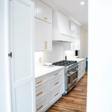
This kitchen remodel is the definition of elevated everyday living, where clean lines, warm textures, and intentional function come together in a space designed to truly perform.
The quartz countertops & full height backsplash give the entire kitchen a clean, luminous feel while providing durable, low-maintenance performance for real everyday living.
A large statement island was created by expanding the kitchen footprint and eliminating the unused formal dining room. The island adds generous prep space, comfortable seating, and the perfect gathering spot for morning coffee or evening entertaining.
Tucked seamlessly into the cabinetry is a hidden walk-in pantry with wet bar & storage galore, keeping the kitchen's visual lines beautifully uncluttered.
And for effortless hosting, a dedicated beverage station- in the kitchen- featuring an ice maker and refrigerator creates a functional mini-hub for drinks, snacks, and celebrations.
Modern. Functional. Timeless. This is more than a kitchen remodel, it’s a space designed to make daily life feel beautiful and effortless.
 Sherman Associates
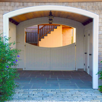
Views of the Atlantic and Katama Bay from the second floor were a driving force behind the Design of this home built several years ago in Edgartown. The Gambrel roof provides great headroom on the second floor with dormers in critical areas for windows and doors. Subtle curves soften the edges and a mix of materials help to reduce the scale and add interest to the exterior. The Porte Cochere provides access to the pool area as well as an entire wall of storage closets for the trappings of summer. Attention to detail and more than ample natural light make this house a very pleasant experience.
29