
Search results for "Support dependable" in Home Design Ideas

 Patio Lane
Located in the heart of Downtown St. Petersburg, the Vinoy Renaissance Resort & Golf Club is one of the city's most iconic hotels. This downtown gem can easily be distinguished by its salmon color and Mediterranean Revival style architecture. Situated right on the bay, this luxury resort is just a short walk from all of the area’s major attractions such as the Dali Museum, Beach Drive, and the Mahaffey Theater.
The Vinoy was constructed in 1925 and has been through a long history of renovations and construction within its lifetime. Efforts are constantly being made to preserve the hotel’s historic past while still providing guests with a unique, comfortable, and luxurious experience. With that being said, it was recently announced that the hotel will undergo a three-year $50 million plan to improve several aspects of the property.
Patio Lane took part in these upgrades by designing and producing custom cushions for two locations on the property: the veranda and smoking area seating. We fabricated a total of 187 custom cushions with 13 different configurations for the hotel: dining chair seat, lounge chair, love seat, center sectional, end sectionals, as well as ottomans. Patio Lane directly competed with the original furniture and cushion manufacturer for this project. However, being an essential part of St. Petersburg, the resort appreciated a local vendor with strong initiative to earn their business.
As far as the project requirements, the Vinoy needed something that will hold up through the harsh sun and storms of Central Florida. Typically, cushions in a commercial setting will last a few years depending on the human traffic. For a luxury hotel, such as the Vinoy, these cushions should have been replaced within 3 years.
To ensure that they would have high performing seating for their guests, they chose cushions fabricated with Sunbrella Rain performance fabric. This fabric is 100% waterproof and specifically made for outdoor spaces that endure heavy rainfall or any kind of moisture. Sunbrella Rain eliminates drying time after wet weather. Resort staff can simply wipe the cushions down and their guests are ready to continue lounging and relaxing.
The Vinoy’s original cushions used a polyurethane foam that had since lost its strength and was no longer providing a comfortable seat. (When we initially surveyed the Vinoy, we witnessed many customers doubling up on cushions to place behind their backs!) Numerous cushions had ripped at the seams and the zippers were non-functional. Dry-fast foam, the preferred option for cushions fabricated with Sunbrella Rain, was the perfect choice with the 4 in. thick seats & 5 in. thick backs because it will provide a firm seat and support for years to come.

 Valentini Kids Furniture Brooklyn NY
Modern Italian Curio Trend 217 by Artigian Mobili
Made in Italy
Trend 217 by ArtigianMobili is a stylish Italian curio that charms with its a bit rounded shape and eternal design that perfectly matches both modern and contemporary styled interiors. The vitrine features Solid Wood frame finished in Cherry. Two doors and both sides are made of clear glass giving a wide view on collectibles exhibited inside the showcase. The internal space of the display unit is smartly organized with five thick and strong clear glass shelves, making the curio very spacious and gorgeous. Moreover, this Italian glass vitrine comes with two built-in LED Lights that will illuminate your collectibles when it is required. Optionally, the curio Trend 226 can be ordered with Cherry finished back panel or a mirrored one for the extra charge.
The starting price is for the Trend 217 Curio with Cherry finished back panel.
Dimensions:
Curio: W35.4" x D16"/21.3" x H87.4"
 Patio Lane
Located in the heart of Downtown St. Petersburg, the Vinoy Renaissance Resort & Golf Club is one of the city's most iconic hotels. This downtown gem can easily be distinguished by its salmon color and Mediterranean Revival style architecture. Situated right on the bay, this luxury resort is just a short walk from all of the area’s major attractions such as the Dali Museum, Beach Drive, and the Mahaffey Theater.
The Vinoy was constructed in 1925 and has been through a long history of renovations and construction within its lifetime. Efforts are constantly being made to preserve the hotel’s historic past while still providing guests with a unique, comfortable, and luxurious experience. With that being said, it was recently announced that the hotel will undergo a three-year $50 million plan to improve several aspects of the property.
Patio Lane took part in these upgrades by designing and producing custom cushions for two locations on the property: the veranda and smoking area seating. We fabricated a total of 187 custom cushions with 13 different configurations for the hotel: dining chair seat, lounge chair, love seat, center sectional, end sectionals, as well as ottomans. Patio Lane directly competed with the original furniture and cushion manufacturer for this project. However, being an essential part of St. Petersburg, the resort appreciated a local vendor with strong initiative to earn their business.
As far as the project requirements, the Vinoy needed something that will hold up through the harsh sun and storms of Central Florida. Typically, cushions in a commercial setting will last a few years depending on the human traffic. For a luxury hotel, such as the Vinoy, these cushions should have been replaced within 3 years.
To ensure that they would have high performing seating for their guests, they chose cushions fabricated with Sunbrella Rain performance fabric. This fabric is 100% waterproof and specifically made for outdoor spaces that endure heavy rainfall or any kind of moisture. Sunbrella Rain eliminates drying time after wet weather. Resort staff can simply wipe the cushions down and their guests are ready to continue lounging and relaxing.
The Vinoy’s original cushions used a polyurethane foam that had since lost its strength and was no longer providing a comfortable seat. (When we initially surveyed the Vinoy, we witnessed many customers doubling up on cushions to place behind their backs!) Numerous cushions had ripped at the seams and the zippers were non-functional. Dry-fast foam, the preferred option for cushions fabricated with Sunbrella Rain, was the perfect choice with the 4 in. thick seats & 5 in. thick backs because it will provide a firm seat and support for years to come.
Find the right local pro for your project
 Patio Lane
Located in the heart of Downtown St. Petersburg, the Vinoy Renaissance Resort & Golf Club is one of the city's most iconic hotels. This downtown gem can easily be distinguished by its salmon color and Mediterranean Revival style architecture. Situated right on the bay, this luxury resort is just a short walk from all of the area’s major attractions such as the Dali Museum, Beach Drive, and the Mahaffey Theater.
The Vinoy was constructed in 1925 and has been through a long history of renovations and construction within its lifetime. Efforts are constantly being made to preserve the hotel’s historic past while still providing guests with a unique, comfortable, and luxurious experience. With that being said, it was recently announced that the hotel will undergo a three-year $50 million plan to improve several aspects of the property.
Patio Lane took part in these upgrades by designing and producing custom cushions for two locations on the property: the veranda and smoking area seating. We fabricated a total of 187 custom cushions with 13 different configurations for the hotel: dining chair seat, lounge chair, love seat, center sectional, end sectionals, as well as ottomans. Patio Lane directly competed with the original furniture and cushion manufacturer for this project. However, being an essential part of St. Petersburg, the resort appreciated a local vendor with strong initiative to earn their business.
As far as the project requirements, the Vinoy needed something that will hold up through the harsh sun and storms of Central Florida. Typically, cushions in a commercial setting will last a few years depending on the human traffic. For a luxury hotel, such as the Vinoy, these cushions should have been replaced within 3 years.
To ensure that they would have high performing seating for their guests, they chose cushions fabricated with Sunbrella Rain performance fabric. This fabric is 100% waterproof and specifically made for outdoor spaces that endure heavy rainfall or any kind of moisture. Sunbrella Rain eliminates drying time after wet weather. Resort staff can simply wipe the cushions down and their guests are ready to continue lounging and relaxing.
The Vinoy’s original cushions used a polyurethane foam that had since lost its strength and was no longer providing a comfortable seat. (When we initially surveyed the Vinoy, we witnessed many customers doubling up on cushions to place behind their backs!) Numerous cushions had ripped at the seams and the zippers were non-functional. Dry-fast foam, the preferred option for cushions fabricated with Sunbrella Rain, was the perfect choice with the 4 in. thick seats & 5 in. thick backs because it will provide a firm seat and support for years to come.
 Patio Lane
Located in the heart of Downtown St. Petersburg, the Vinoy Renaissance Resort & Golf Club is one of the city's most iconic hotels. This downtown gem can easily be distinguished by its salmon color and Mediterranean Revival style architecture. Situated right on the bay, this luxury resort is just a short walk from all of the area’s major attractions such as the Dali Museum, Beach Drive, and the Mahaffey Theater.
The Vinoy was constructed in 1925 and has been through a long history of renovations and construction within its lifetime. Efforts are constantly being made to preserve the hotel’s historic past while still providing guests with a unique, comfortable, and luxurious experience. With that being said, it was recently announced that the hotel will undergo a three-year $50 million plan to improve several aspects of the property.
Patio Lane took part in these upgrades by designing and producing custom cushions for two locations on the property: the veranda and smoking area seating. We fabricated a total of 187 custom cushions with 13 different configurations for the hotel: dining chair seat, lounge chair, love seat, center sectional, end sectionals, as well as ottomans. Patio Lane directly competed with the original furniture and cushion manufacturer for this project. However, being an essential part of St. Petersburg, the resort appreciated a local vendor with strong initiative to earn their business.
As far as the project requirements, the Vinoy needed something that will hold up through the harsh sun and storms of Central Florida. Typically, cushions in a commercial setting will last a few years depending on the human traffic. For a luxury hotel, such as the Vinoy, these cushions should have been replaced within 3 years.
To ensure that they would have high performing seating for their guests, they chose cushions fabricated with Sunbrella Rain performance fabric. This fabric is 100% waterproof and specifically made for outdoor spaces that endure heavy rainfall or any kind of moisture. Sunbrella Rain eliminates drying time after wet weather. Resort staff can simply wipe the cushions down and their guests are ready to continue lounging and relaxing.
The Vinoy’s original cushions used a polyurethane foam that had since lost its strength and was no longer providing a comfortable seat. (When we initially surveyed the Vinoy, we witnessed many customers doubling up on cushions to place behind their backs!) Numerous cushions had ripped at the seams and the zippers were non-functional. Dry-fast foam, the preferred option for cushions fabricated with Sunbrella Rain, was the perfect choice with the 4 in. thick seats & 5 in. thick backs because it will provide a firm seat and support for years to come.
 Patio Lane
Located in the heart of Downtown St. Petersburg, the Vinoy Renaissance Resort & Golf Club is one of the city's most iconic hotels. This downtown gem can easily be distinguished by its salmon color and Mediterranean Revival style architecture. Situated right on the bay, this luxury resort is just a short walk from all of the area’s major attractions such as the Dali Museum, Beach Drive, and the Mahaffey Theater.
The Vinoy was constructed in 1925 and has been through a long history of renovations and construction within its lifetime. Efforts are constantly being made to preserve the hotel’s historic past while still providing guests with a unique, comfortable, and luxurious experience. With that being said, it was recently announced that the hotel will undergo a three-year $50 million plan to improve several aspects of the property.
Patio Lane took part in these upgrades by designing and producing custom cushions for two locations on the property: the veranda and smoking area seating. We fabricated a total of 187 custom cushions with 13 different configurations for the hotel: dining chair seat, lounge chair, love seat, center sectional, end sectionals, as well as ottomans. Patio Lane directly competed with the original furniture and cushion manufacturer for this project. However, being an essential part of St. Petersburg, the resort appreciated a local vendor with strong initiative to earn their business.
As far as the project requirements, the Vinoy needed something that will hold up through the harsh sun and storms of Central Florida. Typically, cushions in a commercial setting will last a few years depending on the human traffic. For a luxury hotel, such as the Vinoy, these cushions should have been replaced within 3 years.
To ensure that they would have high performing seating for their guests, they chose cushions fabricated with Sunbrella Rain performance fabric. This fabric is 100% waterproof and specifically made for outdoor spaces that endure heavy rainfall or any kind of moisture. Sunbrella Rain eliminates drying time after wet weather. Resort staff can simply wipe the cushions down and their guests are ready to continue lounging and relaxing.
The Vinoy’s original cushions used a polyurethane foam that had since lost its strength and was no longer providing a comfortable seat. (When we initially surveyed the Vinoy, we witnessed many customers doubling up on cushions to place behind their backs!) Numerous cushions had ripped at the seams and the zippers were non-functional. Dry-fast foam, the preferred option for cushions fabricated with Sunbrella Rain, was the perfect choice with the 4 in. thick seats & 5 in. thick backs because it will provide a firm seat and support for years to come.
 Patio Lane
Located in the heart of Downtown St. Petersburg, the Vinoy Renaissance Resort & Golf Club is one of the city's most iconic hotels. This downtown gem can easily be distinguished by its salmon color and Mediterranean Revival style architecture. Situated right on the bay, this luxury resort is just a short walk from all of the area’s major attractions such as the Dali Museum, Beach Drive, and the Mahaffey Theater.
The Vinoy was constructed in 1925 and has been through a long history of renovations and construction within its lifetime. Efforts are constantly being made to preserve the hotel’s historic past while still providing guests with a unique, comfortable, and luxurious experience. With that being said, it was recently announced that the hotel will undergo a three-year $50 million plan to improve several aspects of the property.
Patio Lane took part in these upgrades by designing and producing custom cushions for two locations on the property: the veranda and smoking area seating. We fabricated a total of 187 custom cushions with 13 different configurations for the hotel: dining chair seat, lounge chair, love seat, center sectional, end sectionals, as well as ottomans. Patio Lane directly competed with the original furniture and cushion manufacturer for this project. However, being an essential part of St. Petersburg, the resort appreciated a local vendor with strong initiative to earn their business.
As far as the project requirements, the Vinoy needed something that will hold up through the harsh sun and storms of Central Florida. Typically, cushions in a commercial setting will last a few years depending on the human traffic. For a luxury hotel, such as the Vinoy, these cushions should have been replaced within 3 years.
To ensure that they would have high performing seating for their guests, they chose cushions fabricated with Sunbrella Rain performance fabric. This fabric is 100% waterproof and specifically made for outdoor spaces that endure heavy rainfall or any kind of moisture. Sunbrella Rain eliminates drying time after wet weather. Resort staff can simply wipe the cushions down and their guests are ready to continue lounging and relaxing.
The Vinoy’s original cushions used a polyurethane foam that had since lost its strength and was no longer providing a comfortable seat. (When we initially surveyed the Vinoy, we witnessed many customers doubling up on cushions to place behind their backs!) Numerous cushions had ripped at the seams and the zippers were non-functional. Dry-fast foam, the preferred option for cushions fabricated with Sunbrella Rain, was the perfect choice with the 4 in. thick seats & 5 in. thick backs because it will provide a firm seat and support for years to come.
Sponsored
Fredericksburg, OH

High Point Cabinets
Columbus' Experienced Custom Cabinet Builder | 4x Best of Houzz Winner


 Lisa Tharp Design
Governor's House Entry by Lisa Tharp. 2019 Bulfinch Award - Interior Design. Photo by Michael J. Lee
Transitional painted wood floor foyer photo with white walls and a black front door
Transitional painted wood floor foyer photo with white walls and a black front door

 KINGDOM WOODWORKS
Collaboration with Canonbury Homes and Frank Neely Design Associates.
Inspiration for a timeless open concept kitchen remodel in Atlanta with beaded inset cabinets and two islands
Inspiration for a timeless open concept kitchen remodel in Atlanta with beaded inset cabinets and two islands


Carex brevior / Shortbeak Sedge
Photo: Matt Lavin, via Flickr, licensed under Creative Commons Attribution-ShareAlike 2.0 Generic

 Skill Construction & Design, LLC
There are so many design elements to this kitchen, I almost don’t know where to start. Bright and airy with crisp clean white cabinets, the kitchen is open and welcoming. Still crisp but gently contrasting, the stainless steel appliance add depth amid the white. To keep this kitchen warm, natural oak covers the floors and a toasted wheat color washes the walls. And then there is the architectural elements. You know. That post and beam in the middle of the room. It’s the center of attention.
When you walk into a room your eyes roam around, establishing the size and shape of the room as your feet take you forward. From the front door of this home straight ahead you encountered this wall. The dining area to the right gives you a glimpse of things to come. Where there is a dining room you will usually find a kitchen.
The architecture of years gone by consistently hides the kitchen, the heart of the home, behind walls. I sympathize with my Mom, and all the other Moms, who have had to spend so much time tucked into a tight kitchen, away from the family. This wall had to go, but it was structural. We needed its support but not its bulk.
So we got rid of the bulk and only the bulk. Instead of a wall we have a post and beam, offering all of the structure we need. We could have installed a huge steel beam and reconfigure the joists to upset the beam, but why? The small beam and post add an incredible architectural element. It’s turning lemons into lemon, we simply made the most of what we had. It may be functional but it’s so fantastic. It looks like we created the effect just for the drama.
The original kitchen may have had a working triangle and some counter space, but it was fairly small, with each area only a step or two away. The dark cabinets made the space feel even smaller and the butcher block patterned laminate counter tops were very dated. The appliances were feeling their age as well, from a coil burner electric stove to a top freezer refrigerator. To keep this kitchen within its space, a half wall separated it from the dining area.
With the wall gone we borrowed some space from the living room and extended what was a U shaped kitchen into an L. At the living room window we start our new kitchen. We kept a small part of the wall to support the other end of our decorative beam. Sandwiched between a large pantry and our new French door refrigerator, the wall disappears. With our new open floor plan a sizable island was in order.
We split our cooking areas and installed a continuous grill gas cooktop into the island. A sleek island hood takes care of exhaust and adds an extra element to our architectural feature. Under the cooktop we added over-sized drawers for pots and pan storage. The frameless cabinets from New River Cabinetry are maple, painted white, with the Herndon door style. With the cooktop safely nestled into our island, we still had to add an oven.
We used the space where the old range sat for a large single oven of stainless steel and glass. If it worked for one, why not two? We created a home for a microwave in the wall cabinets. It’s perfect for heating leftovers so close to the refrigerator.
An important consideration for hot spots in your kitchen is landing zones. Each of our cooking areas have generous landing zones, one on each side of the cooktop and an entire counter area above or below the ovens, depending on which one you’re using.
We wanted to give the sink area more room so the half wall had to come out. We moved the trash and recycle cans into a cabinet, removed the heavy soffits and kept the sink under the window.
With that little bit of extra space we were able to add a larger cabinet above the dishwasher and slide it all down. This used to be where the carpeting met the vinyl floor, but all of it is gone. Long oak planks eliminate that final divide between the kitchen and the dining area, while adding visual length to the area. White wall cabinets on each side of the window reflect the sunlight for a brighter view.
With all of the darker cabinetry the backsplash walls had been painted white. Even still, there was a darkness in the corners and it wasn’t very exciting. We wanted to add visual interest and reflect the new under-cabinet lighting, eliminating the shadows in this corner.
With 1″x 2″ Arabescato Honed marble mosaics and those under-cabinet lights, we achieved the perfect balance. The marble has subtle swirls in gray and beige on a clean white background, but with the honed finish the light is softly reflected instead of glaring. For granite, we chose the soft gray tones of Luna Pearl. The speckles of gray and beige are a gentle contrast to the white cabinets and emulate the color of the stainless steel.
Between the carpet, red half wall, dark railing and dated light fixture, the dining area felt tired. Since the kitchen lacked sufficient storage, a large utility cabinet crowded the table space without adding any decorate elements.
Although it didn’t get any bigger, our dining area feels fresher and more open too. With the oak flooring joining the area to the rest of our space and the toasted wheat on the walls, the white table and chairs compliment the cabinetry while contrasting the warmer colors. We replaced the chandelier with recessed lighting and changed that railing too.
With our new open floor plan, we ended up with a fairly open area in between our foyer closet and the living room window. Not one to miss an opportunity, we filled the space with a multi-functional work space.
With the sunlight streaming in this bright corner works for anything this family needs.
There’s plenty of space for a chair under this large desk drawer. A closed cabinet below, glass doors above and lots of open shelving let you store and or showcase your belongings. We added a lite area at the top to keep away the darker corners.
The transformation is complete. This kitchen and all of its features are truly the center of attention in this home.
http://www.designsbyskill.com/
http://www.rjkconstructioninc.com/

 Dumpster Rentals
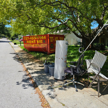
KOZAK Roll Off Dumpster Rentals, LLC 727-455-5144 - New Port Richey, FL, is a leading dumpster rental and junk removal service provider in New Port Richey, Florida. They serve residential and commercial clients, offering various waste disposal solutions. Their services are ideal for repair, renovation, development, and cleanout projects. The company takes pride in keeping its customers on schedule and under budget with reliable and reasonably-priced driveway-friendly bins. They offer low-cost rentals for all projects and jobs in New Port Richey, Florida. Along with top-quality roll-off container rentals, they also offer junk removal services to help clear away waste, allowing customers to focus on their tasks. As a locally owned and operated company, they are committed to providing the #1 dumpster rental service in New Port Richey, FL, for short-term and long-term waste removal needs. Their offerings include 15-yard dump trailers, roll-offs, and 20-yard roll-offs, catering to different project scales and waste volumes. They also provide flexible scheduling to accommodate the needs of their customers and ensure that all waste is disposed of responsibly in partnership with the Pasco and Pinellas County Solid Waste Landfills. Whether you're a homeowner undertaking a DIY remodel, a contractor in need of reliable waste disposal, or a business owner managing a large-scale project, KOZAK Roll Off Dumpster Rentals 727-455-5144 - New Port Richey, FL, is a top choice for quality equipment, outstanding customer support, and affordable pricing. Their services can be quickly booked online or over the phone.
 Skill Construction & Design, LLC
There are so many design elements to this kitchen, I almost don’t know where to start. Bright and airy with crisp clean white cabinets, the kitchen is open and welcoming. Still crisp but gently contrasting, the stainless steel appliance add depth amid the white. To keep this kitchen warm, natural oak covers the floors and a toasted wheat color washes the walls. And then there is the architectural elements. You know. That post and beam in the middle of the room. It’s the center of attention.
When you walk into a room your eyes roam around, establishing the size and shape of the room as your feet take you forward. From the front door of this home straight ahead you encountered this wall. The dining area to the right gives you a glimpse of things to come. Where there is a dining room you will usually find a kitchen.
The architecture of years gone by consistently hides the kitchen, the heart of the home, behind walls. I sympathize with my Mom, and all the other Moms, who have had to spend so much time tucked into a tight kitchen, away from the family. This wall had to go, but it was structural. We needed its support but not its bulk.
So we got rid of the bulk and only the bulk. Instead of a wall we have a post and beam, offering all of the structure we need. We could have installed a huge steel beam and reconfigure the joists to upset the beam, but why? The small beam and post add an incredible architectural element. It’s turning lemons into lemon, we simply made the most of what we had. It may be functional but it’s so fantastic. It looks like we created the effect just for the drama.
The original kitchen may have had a working triangle and some counter space, but it was fairly small, with each area only a step or two away. The dark cabinets made the space feel even smaller and the butcher block patterned laminate counter tops were very dated. The appliances were feeling their age as well, from a coil burner electric stove to a top freezer refrigerator. To keep this kitchen within its space, a half wall separated it from the dining area.
With the wall gone we borrowed some space from the living room and extended what was a U shaped kitchen into an L. At the living room window we start our new kitchen. We kept a small part of the wall to support the other end of our decorative beam. Sandwiched between a large pantry and our new French door refrigerator, the wall disappears. With our new open floor plan a sizable island was in order.
We split our cooking areas and installed a continuous grill gas cooktop into the island. A sleek island hood takes care of exhaust and adds an extra element to our architectural feature. Under the cooktop we added over-sized drawers for pots and pan storage. The frameless cabinets from New River Cabinetry are maple, painted white, with the Herndon door style. With the cooktop safely nestled into our island, we still had to add an oven.
We used the space where the old range sat for a large single oven of stainless steel and glass. If it worked for one, why not two? We created a home for a microwave in the wall cabinets. It’s perfect for heating leftovers so close to the refrigerator.
An important consideration for hot spots in your kitchen is landing zones. Each of our cooking areas have generous landing zones, one on each side of the cooktop and an entire counter area above or below the ovens, depending on which one you’re using.
We wanted to give the sink area more room so the half wall had to come out. We moved the trash and recycle cans into a cabinet, removed the heavy soffits and kept the sink under the window.
With that little bit of extra space we were able to add a larger cabinet above the dishwasher and slide it all down. This used to be where the carpeting met the vinyl floor, but all of it is gone. Long oak planks eliminate that final divide between the kitchen and the dining area, while adding visual length to the area. White wall cabinets on each side of the window reflect the sunlight for a brighter view.
With all of the darker cabinetry the backsplash walls had been painted white. Even still, there was a darkness in the corners and it wasn’t very exciting. We wanted to add visual interest and reflect the new under-cabinet lighting, eliminating the shadows in this corner.
With 1″x 2″ Arabescato Honed marble mosaics and those under-cabinet lights, we achieved the perfect balance. The marble has subtle swirls in gray and beige on a clean white background, but with the honed finish the light is softly reflected instead of glaring. For granite, we chose the soft gray tones of Luna Pearl. The speckles of gray and beige are a gentle contrast to the white cabinets and emulate the color of the stainless steel.
Between the carpet, red half wall, dark railing and dated light fixture, the dining area felt tired. Since the kitchen lacked sufficient storage, a large utility cabinet crowded the table space without adding any decorate elements.
Although it didn’t get any bigger, our dining area feels fresher and more open too. With the oak flooring joining the area to the rest of our space and the toasted wheat on the walls, the white table and chairs compliment the cabinetry while contrasting the warmer colors. We replaced the chandelier with recessed lighting and changed that railing too.
With our new open floor plan, we ended up with a fairly open area in between our foyer closet and the living room window. Not one to miss an opportunity, we filled the space with a multi-functional work space.
With the sunlight streaming in this bright corner works for anything this family needs.
There’s plenty of space for a chair under this large desk drawer. A closed cabinet below, glass doors above and lots of open shelving let you store and or showcase your belongings. We added a lite area at the top to keep away the darker corners.
The transformation is complete. This kitchen and all of its features are truly the center of attention in this home.
http://www.designsbyskill.com/
http://www.rjkconstructioninc.com/
 Skill Construction & Design, LLC
There are so many design elements to this kitchen, I almost don’t know where to start. Bright and airy with crisp clean white cabinets, the kitchen is open and welcoming. Still crisp but gently contrasting, the stainless steel appliance add depth amid the white. To keep this kitchen warm, natural oak covers the floors and a toasted wheat color washes the walls. And then there is the architectural elements. You know. That post and beam in the middle of the room. It’s the center of attention.
When you walk into a room your eyes roam around, establishing the size and shape of the room as your feet take you forward. From the front door of this home straight ahead you encountered this wall. The dining area to the right gives you a glimpse of things to come. Where there is a dining room you will usually find a kitchen.
The architecture of years gone by consistently hides the kitchen, the heart of the home, behind walls. I sympathize with my Mom, and all the other Moms, who have had to spend so much time tucked into a tight kitchen, away from the family. This wall had to go, but it was structural. We needed its support but not its bulk.
So we got rid of the bulk and only the bulk. Instead of a wall we have a post and beam, offering all of the structure we need. We could have installed a huge steel beam and reconfigure the joists to upset the beam, but why? The small beam and post add an incredible architectural element. It’s turning lemons into lemon, we simply made the most of what we had. It may be functional but it’s so fantastic. It looks like we created the effect just for the drama.
The original kitchen may have had a working triangle and some counter space, but it was fairly small, with each area only a step or two away. The dark cabinets made the space feel even smaller and the butcher block patterned laminate counter tops were very dated. The appliances were feeling their age as well, from a coil burner electric stove to a top freezer refrigerator. To keep this kitchen within its space, a half wall separated it from the dining area.
With the wall gone we borrowed some space from the living room and extended what was a U shaped kitchen into an L. At the living room window we start our new kitchen. We kept a small part of the wall to support the other end of our decorative beam. Sandwiched between a large pantry and our new French door refrigerator, the wall disappears. With our new open floor plan a sizable island was in order.
We split our cooking areas and installed a continuous grill gas cooktop into the island. A sleek island hood takes care of exhaust and adds an extra element to our architectural feature. Under the cooktop we added over-sized drawers for pots and pan storage. The frameless cabinets from New River Cabinetry are maple, painted white, with the Herndon door style. With the cooktop safely nestled into our island, we still had to add an oven.
We used the space where the old range sat for a large single oven of stainless steel and glass. If it worked for one, why not two? We created a home for a microwave in the wall cabinets. It’s perfect for heating leftovers so close to the refrigerator.
An important consideration for hot spots in your kitchen is landing zones. Each of our cooking areas have generous landing zones, one on each side of the cooktop and an entire counter area above or below the ovens, depending on which one you’re using.
We wanted to give the sink area more room so the half wall had to come out. We moved the trash and recycle cans into a cabinet, removed the heavy soffits and kept the sink under the window.
With that little bit of extra space we were able to add a larger cabinet above the dishwasher and slide it all down. This used to be where the carpeting met the vinyl floor, but all of it is gone. Long oak planks eliminate that final divide between the kitchen and the dining area, while adding visual length to the area. White wall cabinets on each side of the window reflect the sunlight for a brighter view.
With all of the darker cabinetry the backsplash walls had been painted white. Even still, there was a darkness in the corners and it wasn’t very exciting. We wanted to add visual interest and reflect the new under-cabinet lighting, eliminating the shadows in this corner.
With 1″x 2″ Arabescato Honed marble mosaics and those under-cabinet lights, we achieved the perfect balance. The marble has subtle swirls in gray and beige on a clean white background, but with the honed finish the light is softly reflected instead of glaring. For granite, we chose the soft gray tones of Luna Pearl. The speckles of gray and beige are a gentle contrast to the white cabinets and emulate the color of the stainless steel.
Between the carpet, red half wall, dark railing and dated light fixture, the dining area felt tired. Since the kitchen lacked sufficient storage, a large utility cabinet crowded the table space without adding any decorate elements.
Although it didn’t get any bigger, our dining area feels fresher and more open too. With the oak flooring joining the area to the rest of our space and the toasted wheat on the walls, the white table and chairs compliment the cabinetry while contrasting the warmer colors. We replaced the chandelier with recessed lighting and changed that railing too.
With our new open floor plan, we ended up with a fairly open area in between our foyer closet and the living room window. Not one to miss an opportunity, we filled the space with a multi-functional work space.
With the sunlight streaming in this bright corner works for anything this family needs.
There’s plenty of space for a chair under this large desk drawer. A closed cabinet below, glass doors above and lots of open shelving let you store and or showcase your belongings. We added a lite area at the top to keep away the darker corners.
The transformation is complete. This kitchen and all of its features are truly the center of attention in this home.
http://www.designsbyskill.com/
http://www.rjkconstructioninc.com/
 Skill Construction & Design, LLC
There are so many design elements to this kitchen, I almost don’t know where to start. Bright and airy with crisp clean white cabinets, the kitchen is open and welcoming. Still crisp but gently contrasting, the stainless steel appliance add depth amid the white. To keep this kitchen warm, natural oak covers the floors and a toasted wheat color washes the walls. And then there is the architectural elements. You know. That post and beam in the middle of the room. It’s the center of attention.
When you walk into a room your eyes roam around, establishing the size and shape of the room as your feet take you forward. From the front door of this home straight ahead you encountered this wall. The dining area to the right gives you a glimpse of things to come. Where there is a dining room you will usually find a kitchen.
The architecture of years gone by consistently hides the kitchen, the heart of the home, behind walls. I sympathize with my Mom, and all the other Moms, who have had to spend so much time tucked into a tight kitchen, away from the family. This wall had to go, but it was structural. We needed its support but not its bulk.
So we got rid of the bulk and only the bulk. Instead of a wall we have a post and beam, offering all of the structure we need. We could have installed a huge steel beam and reconfigure the joists to upset the beam, but why? The small beam and post add an incredible architectural element. It’s turning lemons into lemon, we simply made the most of what we had. It may be functional but it’s so fantastic. It looks like we created the effect just for the drama.
The original kitchen may have had a working triangle and some counter space, but it was fairly small, with each area only a step or two away. The dark cabinets made the space feel even smaller and the butcher block patterned laminate counter tops were very dated. The appliances were feeling their age as well, from a coil burner electric stove to a top freezer refrigerator. To keep this kitchen within its space, a half wall separated it from the dining area.
With the wall gone we borrowed some space from the living room and extended what was a U shaped kitchen into an L. At the living room window we start our new kitchen. We kept a small part of the wall to support the other end of our decorative beam. Sandwiched between a large pantry and our new French door refrigerator, the wall disappears. With our new open floor plan a sizable island was in order.
We split our cooking areas and installed a continuous grill gas cooktop into the island. A sleek island hood takes care of exhaust and adds an extra element to our architectural feature. Under the cooktop we added over-sized drawers for pots and pan storage. The frameless cabinets from New River Cabinetry are maple, painted white, with the Herndon door style. With the cooktop safely nestled into our island, we still had to add an oven.
We used the space where the old range sat for a large single oven of stainless steel and glass. If it worked for one, why not two? We created a home for a microwave in the wall cabinets. It’s perfect for heating leftovers so close to the refrigerator.
An important consideration for hot spots in your kitchen is landing zones. Each of our cooking areas have generous landing zones, one on each side of the cooktop and an entire counter area above or below the ovens, depending on which one you’re using.
We wanted to give the sink area more room so the half wall had to come out. We moved the trash and recycle cans into a cabinet, removed the heavy soffits and kept the sink under the window.
With that little bit of extra space we were able to add a larger cabinet above the dishwasher and slide it all down. This used to be where the carpeting met the vinyl floor, but all of it is gone. Long oak planks eliminate that final divide between the kitchen and the dining area, while adding visual length to the area. White wall cabinets on each side of the window reflect the sunlight for a brighter view.
With all of the darker cabinetry the backsplash walls had been painted white. Even still, there was a darkness in the corners and it wasn’t very exciting. We wanted to add visual interest and reflect the new under-cabinet lighting, eliminating the shadows in this corner.
With 1″x 2″ Arabescato Honed marble mosaics and those under-cabinet lights, we achieved the perfect balance. The marble has subtle swirls in gray and beige on a clean white background, but with the honed finish the light is softly reflected instead of glaring. For granite, we chose the soft gray tones of Luna Pearl. The speckles of gray and beige are a gentle contrast to the white cabinets and emulate the color of the stainless steel.
Between the carpet, red half wall, dark railing and dated light fixture, the dining area felt tired. Since the kitchen lacked sufficient storage, a large utility cabinet crowded the table space without adding any decorate elements.
Although it didn’t get any bigger, our dining area feels fresher and more open too. With the oak flooring joining the area to the rest of our space and the toasted wheat on the walls, the white table and chairs compliment the cabinetry while contrasting the warmer colors. We replaced the chandelier with recessed lighting and changed that railing too.
With our new open floor plan, we ended up with a fairly open area in between our foyer closet and the living room window. Not one to miss an opportunity, we filled the space with a multi-functional work space.
With the sunlight streaming in this bright corner works for anything this family needs.
There’s plenty of space for a chair under this large desk drawer. A closed cabinet below, glass doors above and lots of open shelving let you store and or showcase your belongings. We added a lite area at the top to keep away the darker corners.
The transformation is complete. This kitchen and all of its features are truly the center of attention in this home.
http://www.designsbyskill.com/
http://www.rjkconstructioninc.com/
 Skill Construction & Design, LLC
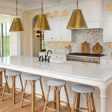
There are so many design elements to this kitchen, I almost don’t know where to start. Bright and airy with crisp clean white cabinets, the kitchen is open and welcoming. Still crisp but gently contrasting, the stainless steel appliance add depth amid the white. To keep this kitchen warm, natural oak covers the floors and a toasted wheat color washes the walls. And then there is the architectural elements. You know. That post and beam in the middle of the room. It’s the center of attention.
When you walk into a room your eyes roam around, establishing the size and shape of the room as your feet take you forward. From the front door of this home straight ahead you encountered this wall. The dining area to the right gives you a glimpse of things to come. Where there is a dining room you will usually find a kitchen.
The architecture of years gone by consistently hides the kitchen, the heart of the home, behind walls. I sympathize with my Mom, and all the other Moms, who have had to spend so much time tucked into a tight kitchen, away from the family. This wall had to go, but it was structural. We needed its support but not its bulk.
So we got rid of the bulk and only the bulk. Instead of a wall we have a post and beam, offering all of the structure we need. We could have installed a huge steel beam and reconfigure the joists to upset the beam, but why? The small beam and post add an incredible architectural element. It’s turning lemons into lemon, we simply made the most of what we had. It may be functional but it’s so fantastic. It looks like we created the effect just for the drama.
The original kitchen may have had a working triangle and some counter space, but it was fairly small, with each area only a step or two away. The dark cabinets made the space feel even smaller and the butcher block patterned laminate counter tops were very dated. The appliances were feeling their age as well, from a coil burner electric stove to a top freezer refrigerator. To keep this kitchen within its space, a half wall separated it from the dining area.
With the wall gone we borrowed some space from the living room and extended what was a U shaped kitchen into an L. At the living room window we start our new kitchen. We kept a small part of the wall to support the other end of our decorative beam. Sandwiched between a large pantry and our new French door refrigerator, the wall disappears. With our new open floor plan a sizable island was in order.
We split our cooking areas and installed a continuous grill gas cooktop into the island. A sleek island hood takes care of exhaust and adds an extra element to our architectural feature. Under the cooktop we added over-sized drawers for pots and pan storage. The frameless cabinets from New River Cabinetry are maple, painted white, with the Herndon door style. With the cooktop safely nestled into our island, we still had to add an oven.
We used the space where the old range sat for a large single oven of stainless steel and glass. If it worked for one, why not two? We created a home for a microwave in the wall cabinets. It’s perfect for heating leftovers so close to the refrigerator.
An important consideration for hot spots in your kitchen is landing zones. Each of our cooking areas have generous landing zones, one on each side of the cooktop and an entire counter area above or below the ovens, depending on which one you’re using.
We wanted to give the sink area more room so the half wall had to come out. We moved the trash and recycle cans into a cabinet, removed the heavy soffits and kept the sink under the window.
With that little bit of extra space we were able to add a larger cabinet above the dishwasher and slide it all down. This used to be where the carpeting met the vinyl floor, but all of it is gone. Long oak planks eliminate that final divide between the kitchen and the dining area, while adding visual length to the area. White wall cabinets on each side of the window reflect the sunlight for a brighter view.
With all of the darker cabinetry the backsplash walls had been painted white. Even still, there was a darkness in the corners and it wasn’t very exciting. We wanted to add visual interest and reflect the new under-cabinet lighting, eliminating the shadows in this corner.
With 1″x 2″ Arabescato Honed marble mosaics and those under-cabinet lights, we achieved the perfect balance. The marble has subtle swirls in gray and beige on a clean white background, but with the honed finish the light is softly reflected instead of glaring. For granite, we chose the soft gray tones of Luna Pearl. The speckles of gray and beige are a gentle contrast to the white cabinets and emulate the color of the stainless steel.
Between the carpet, red half wall, dark railing and dated light fixture, the dining area felt tired. Since the kitchen lacked sufficient storage, a large utility cabinet crowded the table space without adding any decorate elements.
Although it didn’t get any bigger, our dining area feels fresher and more open too. With the oak flooring joining the area to the rest of our space and the toasted wheat on the walls, the white table and chairs compliment the cabinetry while contrasting the warmer colors. We replaced the chandelier with recessed lighting and changed that railing too.
With our new open floor plan, we ended up with a fairly open area in between our foyer closet and the living room window. Not one to miss an opportunity, we filled the space with a multi-functional work space.
With the sunlight streaming in this bright corner works for anything this family needs.
There’s plenty of space for a chair under this large desk drawer. A closed cabinet below, glass doors above and lots of open shelving let you store and or showcase your belongings. We added a lite area at the top to keep away the darker corners.
The transformation is complete. This kitchen and all of its features are truly the center of attention in this home.
http://www.designsbyskill.com/
http://www.rjkconstructioninc.com/

 CairnsCraft Design & Remodel
Great spacious bathroom with lot of amenities.
Photographer: Jon Upson
Large elegant master beige tile and porcelain tile drop-in bathtub photo in San Diego with an undermount sink, raised-panel cabinets, medium tone wood cabinets, granite countertops, beige walls and a two-piece toilet
Large elegant master beige tile and porcelain tile drop-in bathtub photo in San Diego with an undermount sink, raised-panel cabinets, medium tone wood cabinets, granite countertops, beige walls and a two-piece toilet
 Skill Construction & Design, LLC
There are so many design elements to this kitchen, I almost don’t know where to start. Bright and airy with crisp clean white cabinets, the kitchen is open and welcoming. Still crisp but gently contrasting, the stainless steel appliance add depth amid the white. To keep this kitchen warm, natural oak covers the floors and a toasted wheat color washes the walls. And then there is the architectural elements. You know. That post and beam in the middle of the room. It’s the center of attention.
When you walk into a room your eyes roam around, establishing the size and shape of the room as your feet take you forward. From the front door of this home straight ahead you encountered this wall. The dining area to the right gives you a glimpse of things to come. Where there is a dining room you will usually find a kitchen.
The architecture of years gone by consistently hides the kitchen, the heart of the home, behind walls. I sympathize with my Mom, and all the other Moms, who have had to spend so much time tucked into a tight kitchen, away from the family. This wall had to go, but it was structural. We needed its support but not its bulk.
So we got rid of the bulk and only the bulk. Instead of a wall we have a post and beam, offering all of the structure we need. We could have installed a huge steel beam and reconfigure the joists to upset the beam, but why? The small beam and post add an incredible architectural element. It’s turning lemons into lemon, we simply made the most of what we had. It may be functional but it’s so fantastic. It looks like we created the effect just for the drama.
The original kitchen may have had a working triangle and some counter space, but it was fairly small, with each area only a step or two away. The dark cabinets made the space feel even smaller and the butcher block patterned laminate counter tops were very dated. The appliances were feeling their age as well, from a coil burner electric stove to a top freezer refrigerator. To keep this kitchen within its space, a half wall separated it from the dining area.
With the wall gone we borrowed some space from the living room and extended what was a U shaped kitchen into an L. At the living room window we start our new kitchen. We kept a small part of the wall to support the other end of our decorative beam. Sandwiched between a large pantry and our new French door refrigerator, the wall disappears. With our new open floor plan a sizable island was in order.
We split our cooking areas and installed a continuous grill gas cooktop into the island. A sleek island hood takes care of exhaust and adds an extra element to our architectural feature. Under the cooktop we added over-sized drawers for pots and pan storage. The frameless cabinets from New River Cabinetry are maple, painted white, with the Herndon door style. With the cooktop safely nestled into our island, we still had to add an oven.
We used the space where the old range sat for a large single oven of stainless steel and glass. If it worked for one, why not two? We created a home for a microwave in the wall cabinets. It’s perfect for heating leftovers so close to the refrigerator.
An important consideration for hot spots in your kitchen is landing zones. Each of our cooking areas have generous landing zones, one on each side of the cooktop and an entire counter area above or below the ovens, depending on which one you’re using.
We wanted to give the sink area more room so the half wall had to come out. We moved the trash and recycle cans into a cabinet, removed the heavy soffits and kept the sink under the window.
With that little bit of extra space we were able to add a larger cabinet above the dishwasher and slide it all down. This used to be where the carpeting met the vinyl floor, but all of it is gone. Long oak planks eliminate that final divide between the kitchen and the dining area, while adding visual length to the area. White wall cabinets on each side of the window reflect the sunlight for a brighter view.
With all of the darker cabinetry the backsplash walls had been painted white. Even still, there was a darkness in the corners and it wasn’t very exciting. We wanted to add visual interest and reflect the new under-cabinet lighting, eliminating the shadows in this corner.
With 1″x 2″ Arabescato Honed marble mosaics and those under-cabinet lights, we achieved the perfect balance. The marble has subtle swirls in gray and beige on a clean white background, but with the honed finish the light is softly reflected instead of glaring. For granite, we chose the soft gray tones of Luna Pearl. The speckles of gray and beige are a gentle contrast to the white cabinets and emulate the color of the stainless steel.
Between the carpet, red half wall, dark railing and dated light fixture, the dining area felt tired. Since the kitchen lacked sufficient storage, a large utility cabinet crowded the table space without adding any decorate elements.
Although it didn’t get any bigger, our dining area feels fresher and more open too. With the oak flooring joining the area to the rest of our space and the toasted wheat on the walls, the white table and chairs compliment the cabinetry while contrasting the warmer colors. We replaced the chandelier with recessed lighting and changed that railing too.
With our new open floor plan, we ended up with a fairly open area in between our foyer closet and the living room window. Not one to miss an opportunity, we filled the space with a multi-functional work space.
With the sunlight streaming in this bright corner works for anything this family needs.
There’s plenty of space for a chair under this large desk drawer. A closed cabinet below, glass doors above and lots of open shelving let you store and or showcase your belongings. We added a lite area at the top to keep away the darker corners.
The transformation is complete. This kitchen and all of its features are truly the center of attention in this home.
http://www.designsbyskill.com/
http://www.rjkconstructioninc.com/
28