
Search results for "Third party websites" in Home Design Ideas
 AAHA Studio
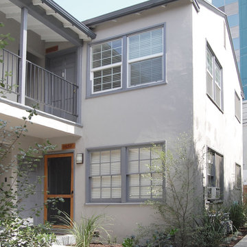
Apartment Courtyard
Small transitional gray two-story stucco gable roof photo in Los Angeles with a shingle roof
Small transitional gray two-story stucco gable roof photo in Los Angeles with a shingle roof
 ballonSTUDIO interiors & remodeling
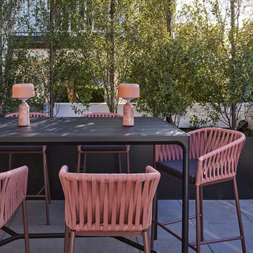
Our San Francisco studio designed this beautiful four-story home for a young newlywed couple to create a warm, welcoming haven for entertaining family and friends. In the living spaces, we chose a beautiful neutral palette with light beige and added comfortable furnishings in soft materials. The kitchen is designed to look elegant and functional, and the breakfast nook with beautiful rust-toned chairs adds a pop of fun, breaking the neutrality of the space. In the game room, we added a gorgeous fireplace which creates a stunning focal point, and the elegant furniture provides a classy appeal. On the second floor, we went with elegant, sophisticated decor for the couple's bedroom and a charming, playful vibe in the baby's room. The third floor has a sky lounge and wine bar, where hospitality-grade, stylish furniture provides the perfect ambiance to host a fun party night with friends. In the basement, we designed a stunning wine cellar with glass walls and concealed lights which create a beautiful aura in the space. The outdoor garden got a putting green making it a fun space to share with friends.
---
Project designed by ballonSTUDIO. They discreetly tend to the interior design needs of their high-net-worth individuals in the greater Bay Area and to their second home locations.
For more about ballonSTUDIO, see here: https://www.ballonstudio.com/
 Albert, Righter & Tittmann Architects, Inc.
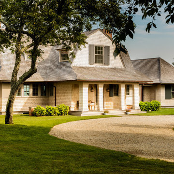
Harbor View is a modern-day interpretation of the shingled vacation houses of its seaside community. The gambrel roof, horizontal, ground-hugging emphasis, and feeling of simplicity, are all part of the character of the place.
While fitting in with local traditions, Harbor View is meant for modern living. The kitchen is a central gathering spot, open to the main combined living/dining room and to the waterside porch. One easily moves between indoors and outdoors.
The house is designed for an active family, a couple with three grown children and a growing number of grandchildren. It is zoned so that the whole family can be there together but retain privacy. Living, dining, kitchen, library, and porch occupy the center of the main floor. One-story wings on each side house two bedrooms and bathrooms apiece, and two more bedrooms and bathrooms and a study occupy the second floor of the central block. The house is mostly one room deep, allowing cross breezes and light from both sides.
The porch, a third of which is screened, is a main dining and living space, with a stone fireplace offering a cozy place to gather on summer evenings.
A barn with a loft provides storage for a car or boat off-season and serves as a big space for projects or parties in summer.
Find the right local pro for your project
 Mantell-Hecathorn Builders
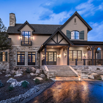
Several years of collaboration between the owners, builder and architect came to fruition in the creation of this exquisite, sophisticated custom home located in the distinguished Two Dogs Subdivision. Designed by world-renowned architect James P. Rothwell, this home is in a class of its own.
The Country Manor design and interior floor plan reflect the Owners’ desire to create interior spaces reminiscent of the 1920’s era that showcased finely detailed rooms and private spaces. Elegant fixtures and intricate woodwork are featured throughout the home. The formal kitchen, dining room and butler pantry are in keeping with the early 20th century design influence. Many of the rooms focus on the stunning mountain and forest views. Spacious porches, patios and an outdoor fireplace create opportunities for special family memories.
The Owners of this spectacular home selected Mantell-Hecathorn Builders for their dedication to quality, their 100% commitment to third party certified high performance standards, and for their personal attention to detail throughout all phases of a project. Despite its size and complexity, this home had exceptional test results and was rated to be 61% more energy efficient than a similar home built to county code.
 Mark Brand Architecture
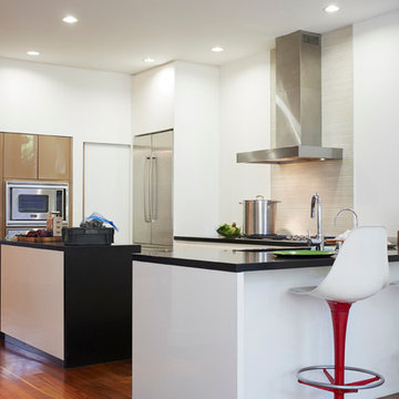
Kitchen Photo.
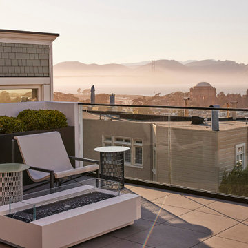
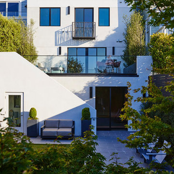
"Business in the Front, Party in the Back" This project provided Mark with the opportunity to revisit a project from the first year of his practice. Our clients were the third owners since Mark first worked on this house in 1987. The original project had consisted of a small addition to the rear of an existing single-story (over garage) house. The new owners wanted to completely remodel the house and add two floors. In addition they wanted it to be MODERN. This was a perfect fit for where the firm had evolved to over the years, but the neighbors weren't having it. The neighbors were very organized and didn’t like the idea of a large modern structure in what was a mostly traditional block. We were able to work with the neighbors to agree to a design that was Craftsman on the front and modern on the interior and rear. Because of this dichotomy, we sometimes refer to this as the "Mullet House". We were able to minimize the apparent height of the facade by hiding the top floor behind a dormered roof. Unique features of this house include a stunning roof deck with glass guardrails, a custom stair with a zigzag edge and a guardrail composed of vertical stainless steel tubes and an asymmetrical fireplace composition.
Photo by Michael David Rose
 ballonSTUDIO interiors & remodeling
Our San Francisco studio designed this beautiful four-story home for a young newlywed couple to create a warm, welcoming haven for entertaining family and friends. In the living spaces, we chose a beautiful neutral palette with light beige and added comfortable furnishings in soft materials. The kitchen is designed to look elegant and functional, and the breakfast nook with beautiful rust-toned chairs adds a pop of fun, breaking the neutrality of the space. In the game room, we added a gorgeous fireplace which creates a stunning focal point, and the elegant furniture provides a classy appeal. On the second floor, we went with elegant, sophisticated decor for the couple's bedroom and a charming, playful vibe in the baby's room. The third floor has a sky lounge and wine bar, where hospitality-grade, stylish furniture provides the perfect ambiance to host a fun party night with friends. In the basement, we designed a stunning wine cellar with glass walls and concealed lights which create a beautiful aura in the space. The outdoor garden got a putting green making it a fun space to share with friends.
---
Project designed by ballonSTUDIO. They discreetly tend to the interior design needs of their high-net-worth individuals in the greater Bay Area and to their second home locations.
For more about ballonSTUDIO, see here: https://www.ballonstudio.com/
 Mark Brand Architecture
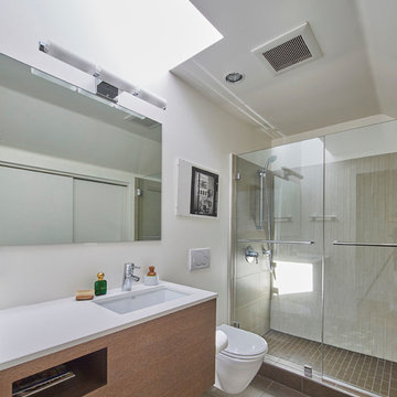
Guest Bathroom Photo.
"Business in the Front, Party in the Back" This project provided Mark with the opportunity to revisit a project from the first year of his practice. Our clients were the third owners since Mark first worked on this house in 1987. The original project had consisted of a small addition to the rear of an existing single-story (over garage) house. The new owners wanted to completely remodel the house and add two floors. In addition they wanted it to be MODERN. This was a perfect fit for where the firm had evolved to over the years, but the neighbors weren't having it. The neighbors were very organized and didn’t like the idea of a large modern structure in what was a mostly traditional block. We were able to work with the neighbors to agree to a design that was Craftsman on the front and modern on the interior and rear. Because of this dichotomy, we sometimes refer to this as the "Mullet House". We were able to minimize the apparent height of the facade by hiding the top floor behind a dormered roof. Unique features of this house include a stunning roof deck with glass guardrails, a custom stair with a zigzag edge and a guardrail composed of vertical stainless steel tubes and an asymmetrical fireplace composition.
Photo by Michael David Rose.

Sponsored
Fredericksburg, OH

High Point Cabinets
Columbus' Experienced Custom Cabinet Builder | 4x Best of Houzz Winner
 ballonSTUDIO interiors & remodeling
Our San Francisco studio designed this beautiful four-story home for a young newlywed couple to create a warm, welcoming haven for entertaining family and friends. In the living spaces, we chose a beautiful neutral palette with light beige and added comfortable furnishings in soft materials. The kitchen is designed to look elegant and functional, and the breakfast nook with beautiful rust-toned chairs adds a pop of fun, breaking the neutrality of the space. In the game room, we added a gorgeous fireplace which creates a stunning focal point, and the elegant furniture provides a classy appeal. On the second floor, we went with elegant, sophisticated decor for the couple's bedroom and a charming, playful vibe in the baby's room. The third floor has a sky lounge and wine bar, where hospitality-grade, stylish furniture provides the perfect ambiance to host a fun party night with friends. In the basement, we designed a stunning wine cellar with glass walls and concealed lights which create a beautiful aura in the space. The outdoor garden got a putting green making it a fun space to share with friends.
---
Project designed by ballonSTUDIO. They discreetly tend to the interior design needs of their high-net-worth individuals in the greater Bay Area and to their second home locations.
For more about ballonSTUDIO, see here: https://www.ballonstudio.com/
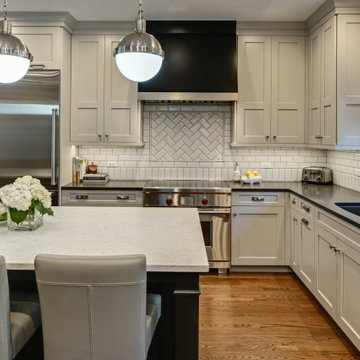
 Drury Design
The existing kitchen was closed off, which necessitated several space-related compromises that affected many aspects of daily life.
Design Objectives:
• Open the tiny kitchen to living space
• Maintain the dining area
• Create a family room/TV space
• Increase kitchen storage and work surface
• Improve lighting
• Upgrade appliances to ‘chef grade’
Biggest Design Challenge:
• Our main challenge was to add a family room/TV area while maintaining a dining space. Prior to the remodel, the homeowners were using a TV room on their third floor, which was less than ideal.
Taking down the kitchen wall and opening up the area to the adjacent living space made a big difference. The repurposed former dining room works well as a TV space. The former breakfast nook was updated with a new table that allows for casual dining on a daily basis, but is expandable for parties and holidays. Kitchen storage was expanded with island and ceiling-height cabinetry. Kitchen island seating and the open floor plan have definitely changed the quality of day-to-day life – the cook no longer feels isolated and now enjoys preparing meals while spending time with friends.
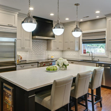 Drury Design
The existing kitchen was closed off, which necessitated several space-related compromises that affected many aspects of daily life.
Design Objectives:
• Open the tiny kitchen to living space
• Maintain the dining area
• Create a family room/TV space
• Increase kitchen storage and work surface
• Improve lighting
• Upgrade appliances to ‘chef grade’
Biggest Design Challenge:
• Our main challenge was to add a family room/TV area while maintaining a dining space. Prior to the remodel, the homeowners were using a TV room on their third floor, which was less than ideal.
Taking down the kitchen wall and opening up the area to the adjacent living space made a big difference. The repurposed former dining room works well as a TV space. The former breakfast nook was updated with a new table that allows for casual dining on a daily basis, but is expandable for parties and holidays. Kitchen storage was expanded with island and ceiling-height cabinetry. Kitchen island seating and the open floor plan have definitely changed the quality of day-to-day life – the cook no longer feels isolated and now enjoys preparing meals while spending time with friends.
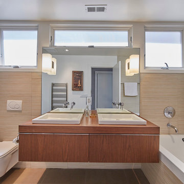 Mark Brand Architecture
Master Bathroom Photo.
"Business in the Front, Party in the Back"
This project provided Mark with the opportunity to revisit a project from the first year of his practice. Our clients were the third owners since Mark first worked on this house in 1987. The original project had consisted of a small addition to the rear of an existing single-story (over garage) house. The new owners wanted to completely remodel the house and add two floors. In addition they wanted it to be MODERN. This was a perfect fit for where the firm had evolved to over the years, but the neighbors weren't having it. The neighbors were very organized and didn’t like the idea of a large modern structure in what was a mostly traditional block. We were able to work with the neighbors to agree to a design that was Craftsman on the front and modern on the interior and rear. Because of this dichotomy, we sometimes refer to this as the "Mullet House". We were able to minimize the apparent height of the facade by hiding the top floor behind a dormered roof. Unique features of this house include a stunning roof deck with glass guardrails, a custom stair with a zigzag edge and a guardrail composed of vertical stainless steel tubes and an asymmetrical fireplace composition.
Photo by Michael David Rose.
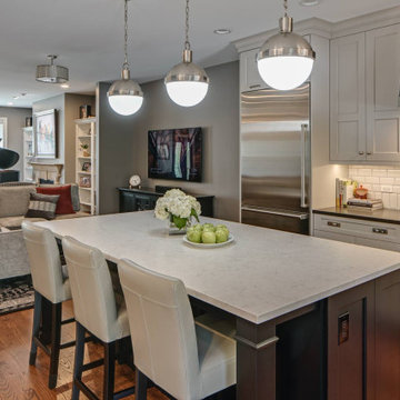 Drury Design
The existing kitchen was closed off, which necessitated several space-related compromises that affected many aspects of daily life.
Design Objectives:
• Open the tiny kitchen to living space
• Maintain the dining area
• Create a family room/TV space
• Increase kitchen storage and work surface
• Improve lighting
• Upgrade appliances to ‘chef grade’
Biggest Design Challenge:
• Our main challenge was to add a family room/TV area while maintaining a dining space. Prior to the remodel, the homeowners were using a TV room on their third floor, which was less than ideal.
Taking down the kitchen wall and opening up the area to the adjacent living space made a big difference. The repurposed former dining room works well as a TV space. The former breakfast nook was updated with a new table that allows for casual dining on a daily basis, but is expandable for parties and holidays. Kitchen storage was expanded with island and ceiling-height cabinetry. Kitchen island seating and the open floor plan have definitely changed the quality of day-to-day life – the cook no longer feels isolated and now enjoys preparing meals while spending time with friends.
 Evok Design Co
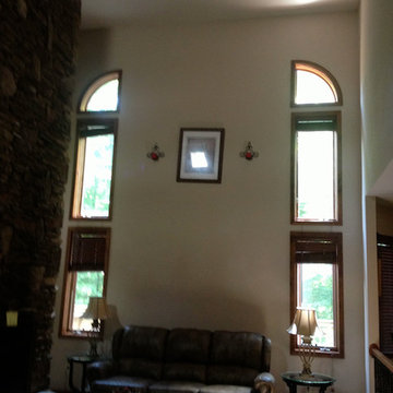
Evok Design Co. Here is the BEFORE PHOTO of a great room redesign for a mountain retreat in the beautiful blue ridge mountains. Our challenge was to make this space feel warm and comfortable despite the amazing high ceilings. Before we got to it, this space felt cold and cavernous! But after we were done, it literally had a warm glow, and we hosted a party of 200 in this home for a wedding reception the night after the install was complete! (whew!) The owners of this home are a celebrity couple, who wish to remain unnamed, but they were thrilled with the results and so were we! The transition was AMAZING! We had the help of the best window treatment creators in town! We brought the ceiling down with some warm lighting, and used local photography. This is the couples third home, so the budget was not astronomical, but it sufficed. We used Bradington Young and Norwalk furniture, and luxury accessories from all over NC. We also had a custom mantle piece built after these photos were taken.
Sponsored
Columbus, OH

Trish Takacs Design
Award Winning & Highly Skilled Kitchen & Bath Designer in Columbus
 Drury Design
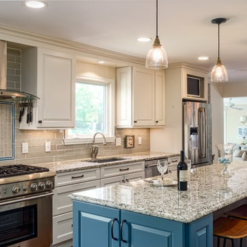
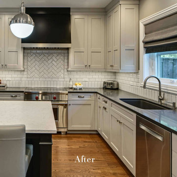
The existing kitchen was closed off, which necessitated several space-related compromises that affected many aspects of daily life.
Design Objectives:
• Open the tiny kitchen to living space
• Maintain the dining area
• Create a family room/TV space
• Increase kitchen storage and work surface
• Improve lighting
• Upgrade appliances to ‘chef grade’
Biggest Design Challenge:
• Our main challenge was to add a family room/TV area while maintaining a dining space. Prior to the remodel, the homeowners were using a TV room on their third floor, which was less than ideal.
Taking down the kitchen wall and opening up the area to the adjacent living space made a big difference. The repurposed former dining room works well as a TV space. The former breakfast nook was updated with a new table that allows for casual dining on a daily basis, but is expandable for parties and holidays. Kitchen storage was expanded with island and ceiling-height cabinetry. Kitchen island seating and the open floor plan have definitely changed the quality of day-to-day life – the cook no longer feels isolated and now enjoys preparing meals while spending time with friends.
 Drury Design
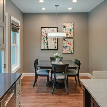
The existing kitchen was closed off, which necessitated several space-related compromises that affected many aspects of daily life.
Design Objectives:
• Open the tiny kitchen to living space
• Maintain the dining area
• Create a family room/TV space
• Increase kitchen storage and work surface
• Improve lighting
• Upgrade appliances to ‘chef grade’
Biggest Design Challenge:
• Our main challenge was to add a family room/TV area while maintaining a dining space. Prior to the remodel, the homeowners were using a TV room on their third floor, which was less than ideal.
Taking down the kitchen wall and opening up the area to the adjacent living space made a big difference. The repurposed former dining room works well as a TV space. The former breakfast nook was updated with a new table that allows for casual dining on a daily basis, but is expandable for parties and holidays. Kitchen storage was expanded with island and ceiling-height cabinetry. Kitchen island seating and the open floor plan have definitely changed the quality of day-to-day life – the cook no longer feels isolated and now enjoys preparing meals while spending time with friends.
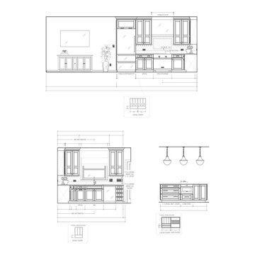 Drury Design
The existing kitchen was closed off, which necessitated several space-related compromises that affected many aspects of daily life.
Design Objectives:
• Open the tiny kitchen to living space
• Maintain the dining area
• Create a family room/TV space
• Increase kitchen storage and work surface
• Improve lighting
• Upgrade appliances to ‘chef grade’
Biggest Design Challenge:
• Our main challenge was to add a family room/TV area while maintaining a dining space. Prior to the remodel, the homeowners were using a TV room on their third floor, which was less than ideal.
Taking down the kitchen wall and opening up the area to the adjacent living space made a big difference. The repurposed former dining room works well as a TV space. The former breakfast nook was updated with a new table that allows for casual dining on a daily basis, but is expandable for parties and holidays. Kitchen storage was expanded with island and ceiling-height cabinetry. Kitchen island seating and the open floor plan have definitely changed the quality of day-to-day life – the cook no longer feels isolated and now enjoys preparing meals while spending time with friends.
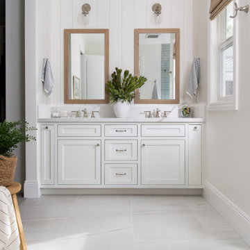
 Sea Pointe Design & Remodel
This Primary Bathroom remodel features a double vanity
Beach style master porcelain tile, white floor and double-sink alcove shower photo in Orange County with shaker cabinets, white cabinets, white walls, an undermount sink, quartzite countertops, a hinged shower door, white countertops and a built-in vanity
Beach style master porcelain tile, white floor and double-sink alcove shower photo in Orange County with shaker cabinets, white cabinets, white walls, an undermount sink, quartzite countertops, a hinged shower door, white countertops and a built-in vanity
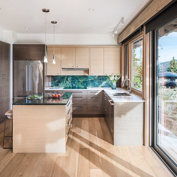
 CRAFT Artisan Wood Floors
Q: Tell us about your Valencia floor.
A: Out of all our interior selections, we began with our choice of flooring. Even though the Valencia Walnut flooring is softer than most wood species, we are careful with it, and Walnut is what we wanted. Our Walnut floor feels almost cushiony underfoot compared to Oak or Hickory. We are careful not to drag furniture over it and we do not wear our outside shoes in the house.
I’ve done a lot of work with Walnut so I knew how it would perform. The feeling you get from Walnut is worth putting up with the risk of damage. I love that it’s like a piece of beautiful furniture. We lie on it and do our stretches on it. It’s super comfortable. The Walnut flooring is the significant feature for creating the luxurious, warm and cozy atmosphere for the house we were wanting.
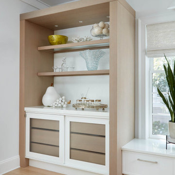
 DEANE Inc | Distinctive Design & Cabinetry
This project is the third collaboration between the client and DEANE. They wanted their kitchen renovation to feel updated, fresh and modern, while also customized to their tastes. Frameless white cabinetry with modern, narrow-framed doors and satin nickel hardware contrasts cleanly against the opposing rift-oak wood cabinetry. The counters are a combination of polished white glass with Caesarstone countertops in Airy Concrete quartz providing durable, functional workspaces. The single-slab, White Calacatta Sapien Stone porcelain backsplash provides a dramatic backdrop for the floating shelves with integrated lighting. The owners selected a dual-fuel, 6 burner Wolf 48" range with griddle, and decided to panel the SubZero refrigerator and freezer columns that flank the message center/charging station. The custom, boxed hood adds bold lines, while the full Waterstone faucet suite is a memorable feature.
It was important to create areas for entertaining, so the pantry features functional, dark navy lower cabinetry for storage with a counter for secondary appliances. The dining area was elevated by the custom furniture piece with sliding doors and wood-framed glass shelves, allowing the display of decorative pieces, as well as buffet serving. The humidity and temperature-controlled custom wine unit holds enough bottles to host the ultimate dinner party
 Advance Design Studio, Ltd.
Jackie and Sean loved the Algonquin neighborhood they lived in with the peaceful neighborhood and the close proximity to work and school. What they didn’t love was how outdated their home had become. With a cramped kitchen and an unused dining room, they decided a remodel was the perfect solution to their problem. They would be able to continue to live in the area they loved, while at the same time they could have the dream home they envisioned.
After a thorough search, Jackie came across Advance Design Studio. She was impressed by all of the positive reviews she saw on the internet and saw herself identifying with all of the project stories she saw on the website. Once they met with designer Scott Christensen and owner Todd Jurs, they knew Advance Design was the right company to make their dreams a reality.
The project consisted of four main areas: the kitchen/dining/powder room, the laundry room, the master bathroom, and the kid’s bathroom. They wanted to expand the kitchen into the seldom used dining room and add a large island for hosting parties and family gatherings. They also wanted new hardwood flooring throughout the first level. The laundry room needed to be more functional, and all three bathrooms were in dire need of updating.
The closed off kitchen was opened up to create a sweeping space between the new eating area and the much larger kitchen. A handsome dry bar complete with a beverage refrigerator and lighted glass door cabinetry makes an elegant transition across from a peninsula area filled with storage. An additional decorative cabinet lighting up elegant dishware through the mullioned glass sits directly across from the drybar.
An expansive island was critical to the kitchen plans. Jackie, Sean and Scott worked closely together to create just the right details for their design. They wanted the island to be functional in addition to being the centerpiece of the room. Added storage for the kid’s school supplies was hidden behind cabinet doors so the children could do their schoolwork right at the island, and a microwave drawer glides open with the touch of a finger hidden inconspicuously within the island space. The easy to care for Cambria Britannica Quartz island top with its sweeping grey and white marble look perched atop hand-carved Craftsman corbels was absolutely what they were hoping for, blending both beauty and function perfectly.
Adding a nice contrast to the brightness of the quartz and the white cabinetry, Kodiak - Leather granite countertops were used to balance the light and dark tones of the space. Dura Supreme Classic White painted cabinets grace the perimeter, while Maple Poppy Seed stained cabinets with a beautiful soft grey woodgrain were used in the beverage center and island. The two tones compliment the large space balancing it out nicely creating interest and elegance with the simple Craftsman style full overlay doors.
A deep warm Barnwood White Oak flooring was added throughout the lower level. The new floor brings additional contrast to the bright kitchen and provides unity with the now open floorplan as it rolls in to the foyer and family room. Final details like the show-stopping lunar like duo light fixtures complete the space and intermix expertly with crisscross details of the glass door mullions, the island bar seating and even accessories in the space.
The small cluttered laundry room needed more space and more storage. With a busy family it seemed to overflow daily and did not have anywhere to hide the families “in and out stuff.” Scott designed the new space with a stackable washer and dryer and much more efficiently organized cabinetry. Doing laundry is now (almost!) a pleasure and keeping everyone’s “stuff” hidden, but readily accessible is now a snap.
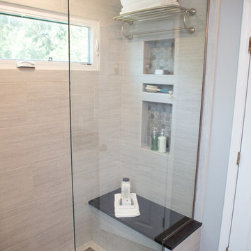
The master bath was not a place where the couple enjoyed spending time getting ready for their day. The tub almost never was used, so removing it made it possible to build an extra-large shower, replacing the small cramped cube of the previous shower they hated. Clean, horizontal lines softly draw your eye around the space with porcelain tile called Driftwood Sea spray. Full overlay cabinetry in a soft white vanity with double sinks makes getting ready for the day much more convenient for the busy couple.
Long floor planks made of porcelain tile mimic real hardwood floors in a soft grey to compliment the shower, but with the ease and care of a tile surface. Cambrian Black Granite counters with a matte finish and under mount porcelain sinks with handsome brushed chrome hardware complete the handsome space. A real bonus in any master bath; a custom built in storage nook was tucked in the corner of the space for linens and heavenly storage.
The kid’s bath was in sad shape because it was original to the house. To keep the budget in control, the tub which was in great condition was retained, but focus was on the new large brick style porcelain charcoal tile on the floor, crisp white new Craftsman style cabinetry with pretty furniture details on the corner base, a striking granite top with white under mount porcelain sinks and fresh hardware and faucets. Some beautiful soft grey wood mirrors to match mom and dads were custom sized and placed under new lighting, and 4 hooks were smartly arranged down the wall for kids’ towels.
This couple was determined not to move, and made their house their dream home. Not only does their home function greatly now, but Jackie says, “When the neighbors come to visit, they’re asking if they can “steal” the design”! The added functionality, elegance, and open floor plan were exactly what this family needed in order to stay.
Advance Design Studio, Joe Nowak
29